Assessing the effect of time series duration
Robert W Schlegel
2018-09-05
time_series_duration.RmdOverview
The purpose of this vignette is to lay out, in detail, how one goes about testing a range of variables, and analysing the effects they have on the detection of MHWs. This has a plurality of meanings, which will be discussed at more depth in the following sections.
Time series shortening
Two different shortening methodologies are proposed here. The first would be to simply take the last n years in a given time series (e.g. 30, 20, 10) and then compare the detected events in the overlapping period of time. This method will help to address the question of how the length of a time series may affect the creation of the climatology, and therefore the events detected. This is an important consideration and one that needs to be investigated to ascertain how large the effect actually is.
The second technique proposed here is re-sampling. The issue with re-sampling the time series at the three different lengths is that it will prevent direct comparison of the resulting climatologies. Rather, re-sampling the time series in this way is useful for the comparison of events in the same time series detected with the differing climatologies.
And that is how this vignette will break down. The first very straightforward investigation will simply be to quantify how much the climatologies and detected events change when historic data are neglected. The second stage of this investigation will look into best practices on how to consistently detect events when time series are not of optimal length. As part of this the following measurement metrics will be quantified:
- for each day-of-year (doy) in the climatology, calculate the SD of the climatological means of the 100 re-samples;
- for each doy, calculate the RMSE of the re-sampled means relative to the true climatology (i.e. the one produced from the real (not re-sampled) 30-year long time series);
- correspondence of detected events when using climatologies calculated from reduced time series vs. when using the full duration time series climatologies.
Finally, this brings us to the direct consideration of the inherent decadal trend in the time series themselves. Ultimately, this tends to come out as the primary driver for much of the event detection changes over time (Oliver et al. 2018). To this end it would also be worthwhile to compare results for the different time series length with and without the long-term trends removed. [ECJO] A key importance here will be if there is any long term trend in the data, let’s say long-term warming. If so then even if 10 years produced an adequate climatology, going longer (20years, 30years) would produce events with larger intensities and longer means since the climatology would be calculated over an on-average cooler time period.
I think an important point to discuss also is that some researchers may be interested in including the trend in their climatology calculation, so that MHWs do get larger/intenser over time reflecting the background warming. While others may want to remove the trend so that they are purely interested in MHWs as variability about a slowly-varying background state. [/ECJO]
First prize for all of this research would be to develop an equation (model) that could look at a time series and determine for the user how best to calculate a climatology. It seems to me that an important ingredient must be the decadal (or annual) trend. So one would then need to take into account everything learned from the methodologies proposed above and investigate what relationship decadal trends have with whatever may be found.
Simply shorter
In this section we will compare the detection of events when we simply nip off the earlier decades in the three pre-packaged time series in heatwaveR.
library(tidyverse)
library(broom)
library(heatwaveR)
library(lubridate) # This is intentionally activated after data.table
library(fasttime)
library(ggpubr)
library(boot)
library(FNN)
library(mgcv)
In order to control more tightly for the effect of shorter time series I am going to standardise the length of the 30 year time series as well. Because the built in time series are actually 32 years long I am going to nip off those last two years. The WMO recommends that climatologies be 30 years in length, starting on the first year of a decade (e.g. 1981). Unfortunately the OISST data from which the built-in time series have been drawn only start in 1982. For this reason we will set the 30 year climatology period as being from 1982 – 2011. To match the output of the shortened time series against this, 2011 will be taken as the last year for comparison and the data from 2012 onward will not be used.
# First put all of the data together and create a site column
sst_ALL <- rbind(sst_Med, sst_NW_Atl, sst_WA) %>%
  mutate(site = rep(c("Med", "NW_Atl", "WA"), each = 12053))

# Then calculate the different clims
sst_ALL_clim <- sst_ALL %>%
  nest(-site) %>%
  mutate(clim_10 = map(data, ts2clm, climatologyPeriod = c("2002-01-01", "2011-12-31")),
         clim_20 = map(data, ts2clm, climatologyPeriod = c("1992-01-01", "2011-12-31")),
         clim_30 = map(data, ts2clm, climatologyPeriod = c("1982-01-01", "2011-12-31"))) %>%
  select(-data) %>%
  gather(key = decades, value = output, -site) %>%
  unnest()

# Then calculate the different decadal trends
# See Schlegel and Smit 2016 for GLS model explanation/validation
decadal_trend <- function(df) {
  if(df$decades[1] == "clim_10"){
    df1 <- df %>%
      filter(t >= as.Date("2002-01-01"),
             t <= as.Date("2011-12-31"))
  } else if(df$decades[1] == "clim_20"){
    df1 <- df %>%
      filter(t >= as.Date("1992-01-01"),
             t <= as.Date("2011-12-31"))
  } else if(df$decades[1] == "clim_30"){
    df1 <- df %>%
      filter(t >= as.Date("1982-01-01"),
             t <= as.Date("2011-12-31"))
  }
  df2 <- df1 %>%
    ungroup() %>%
    mutate(date = floor_date(t, "month")) %>%
    group_by(date) %>%
    summarise(temp = mean(temp,na.rm = T)) %>%
    mutate(year = year(date),
           num = seq(1, n()))
    dt <- round(as.numeric(coef(gls(
      temp ~ num, correlation = corARMA(form = ~ 1 | year, p = 2),
      method = "REML", data = df2, na.action = na.exclude))[2] * 120), 3)
  return(dt)
}

sst_ALL_DT <- sst_ALL_clim %>%
  mutate(decades2 = decades) %>%
  group_by(site, decades2) %>%
  nest() %>%
  mutate(DT = map(data, decadal_trend)) %>%
  select(-data) %>%
  unnest() %>%
  rename(decades = decades2)
# Quick peak at mean seas clims
# This may work better as a figure...
short_table <- sst_ALL_clim %>%
group_by(site, decades) %>%
summarise(seas_mean = mean(seas)) %>%
left_join(sst_ALL_DT, by = c("site", "decades")) %>%
separate(decades, into = c("char", "years")) %>%
select(-char)
knitr::kable(short_table, col.names = c("site", "years", "mean seas. temp.", "dec. trend"), align = "c",
caption = "Table showing the overall mean temperature for the seasonal climatologies detected at the three sites for the most recent 10, 20, or 30 years of data.",
digits = 3)| site | years | mean seas. temp. | dec. trend |
|---|---|---|---|
| Med | 10 | 18.059 | 0.111 |
| Med | 20 | 17.759 | 0.521 |
| Med | 30 | 17.666 | 0.268 |
| NW_Atl | 10 | 8.684 | 1.233 |
| NW_Atl | 20 | 8.570 | 0.593 |
| NW_Atl | 30 | 8.581 | 0.212 |
| WA | 10 | 21.634 | 1.503 |
| WA | 20 | 21.610 | 0.203 |
| WA | 30 | 21.543 | 0.159 |
Quickly take note of the fact that for all three time series, the mean seasonal climatology becomes warmer the shorter (closer to the present) the period used is. This is to be expected due to the overall warming signal present throughout the worlds seas and oceans. We’ll return to the impact of this phenomenon later.
# A clomp of functions used below
# Written out here for tidiness/convenience

# Calculate only events
detect_event_event <- function(df, y = temp){
  ts_y <- eval(substitute(y), df)
  df$temp <- ts_y
  res <- detect_event(df)$event
  return(res)
  }

# Run an ANOVA on each metric of the combined event results and get the p-value
event_aov_p <- function(df){
  aov_models <- df[ , -grep("decades", names(df))] %>%
    map(~ aov(.x ~ df$decades)) %>%
    map_dfr(~ broom::tidy(.), .id = 'metric') %>%
    mutate(p.value = round(p.value, 5)) %>%
    filter(term != "Residuals") %>%
    select(metric, p.value)
  return(aov_models)
  }

# Run an ANOVA on each metric of the combined event results and get CI
event_aov_CI <- function(df){
  aov_models <- df[ , -grep("decades", names(df))] %>%
    map(~ aov(.x ~ df$decades)) %>%
    map_dfr(~ confint_tidy(., parm = ), .id = 'metric') %>%
    mutate(decades = rep(c("clim_10", "clim_20", "clim_30"), nrow(.)/3)) %>%
    select(metric, decades, everything())
  return(aov_models)
  }

# A particular summary output
event_output <- function(df){
  res <- df %>%
    group_by(decades) %>%
    # select(-event_no) %>%
    summarise_all(c("mean", "sd"))
  return(res)
  }
Given that there are perceptible differences in these mean values, let’s see if an ANOVA determines these differences to be significant.
sst_ALL_clim_aov <- sst_ALL_clim %>%
  select(-t, - temp, -doy) %>%
  mutate(decades = as.factor(decades)) %>%
  unique() %>%
  group_by(site) %>%
  nest() %>%
  mutate(res = map(data, event_aov_p)) %>%
  select(-data) %>%
  unnest() #%>%
  # spread(key = metric, value = p.value) #%>%
  # select(names(select(sst_ALL_event, -decades, -event_no)))

ggplot(sst_ALL_clim_aov, aes(x = site, y = metric)) +
  geom_tile(aes(fill = p.value)) +
  geom_text(aes(label = round(p.value, 2))) +
  scale_fill_gradient2(midpoint = 0.1)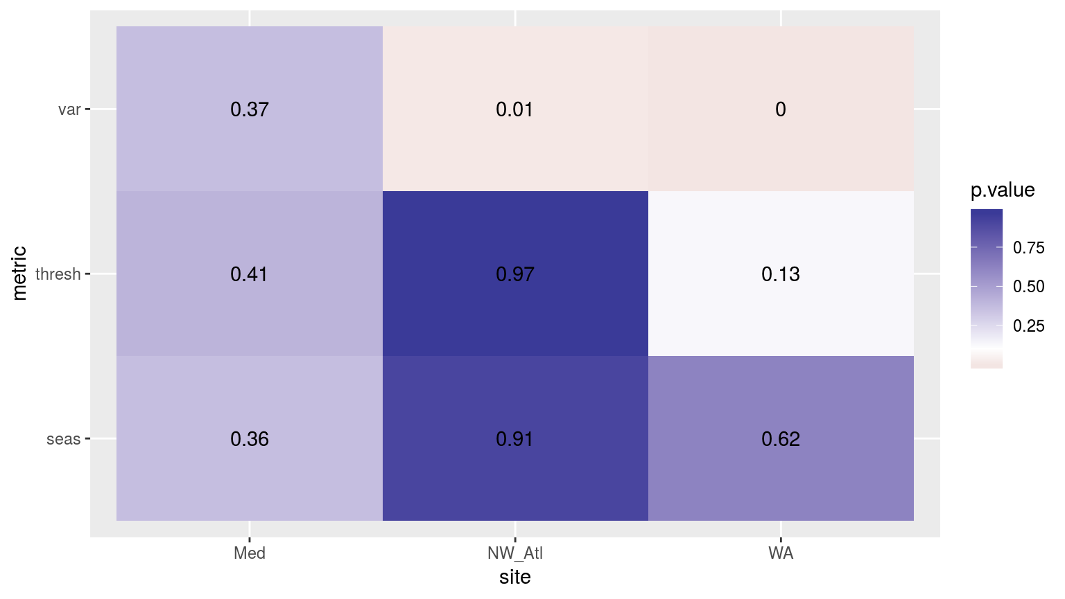
Heatmap showing the ANOVA results for the comparisons of the different clims for the three different time periods. Only the variance in the climatologies are significantly different at p < 0.05.
Now let’s compare the results of the events detected in the final decade of each time series using the different climatologies calculated using 1, 2, or 3 decades. We will make these comparisons using an ANOVA, as above.
# Calculate events and filter only those from 2002 -- 2011
sst_ALL_event <- sst_ALL_clim %>%
  group_by(site, decades) %>%
  nest() %>%
  mutate(res = map(data, detect_event_event)) %>%
  select(-data) %>%
  unnest(res) %>%
  filter(date_start >= "2002-01-01", date_end <= "2011-12-31") %>%
  select(-c(index_start:index_end, date_start:date_end))
# ANOVA p
sst_ALL_aov_p <- sst_ALL_event %>%
select(site, decades, duration, intensity_mean, intensity_max, intensity_cumulative) %>%
nest(-site) %>%
mutate(res = map(data, event_aov_p)) %>%
select(-data) %>%
unnest() #%>%
# spread(key = metric, value = p.value)
# visualise
ggplot(sst_ALL_aov_p, aes(x = site, y = metric)) +
geom_tile(aes(fill = p.value)) +
geom_text(aes(label = round(p.value, 2))) +
scale_fill_gradient2(midpoint = 0.1) +
theme(axis.text.y = element_text(angle = 90, hjust = 0.5))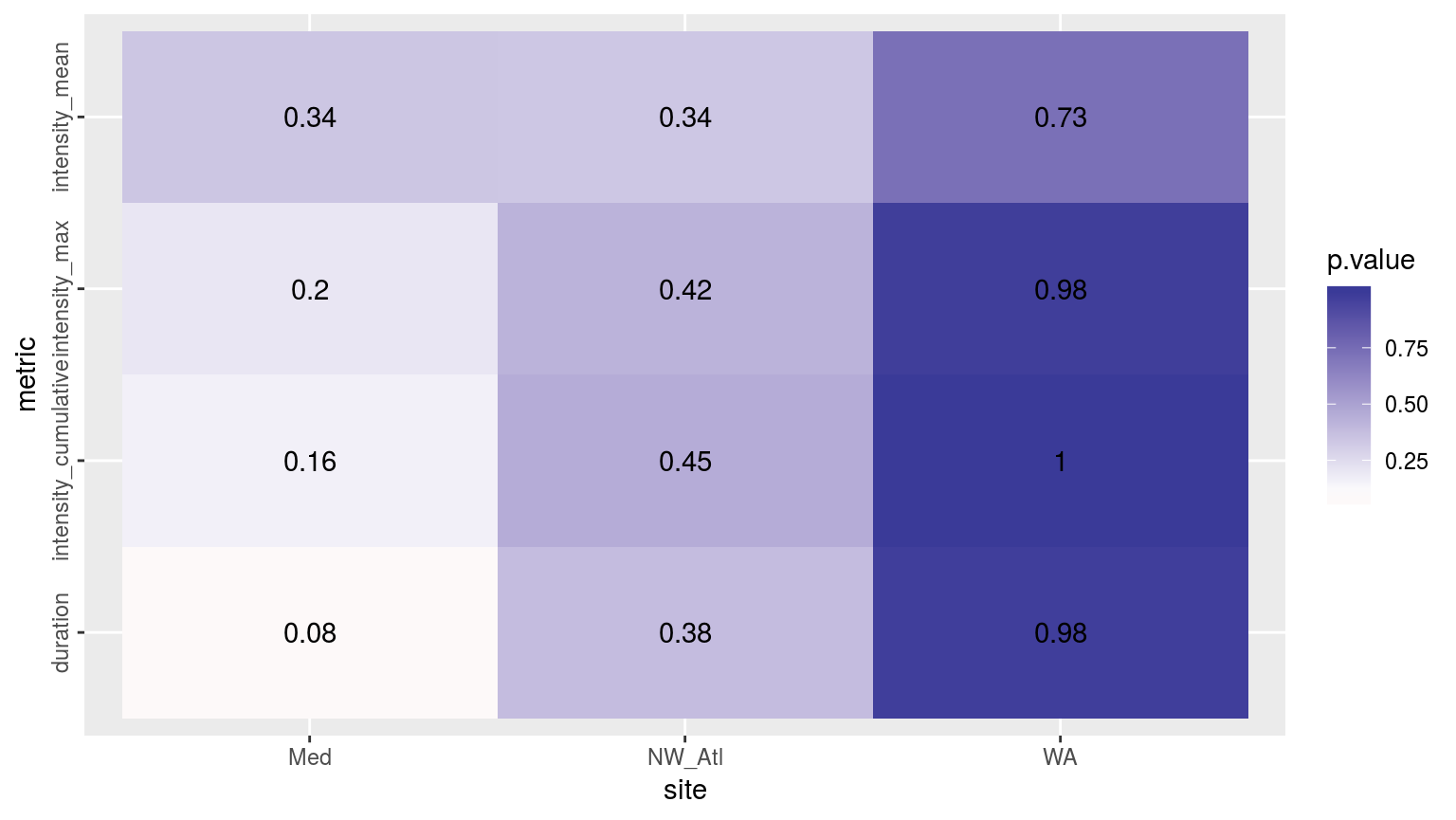
Heatmap showing the ANOVA results for the comparisons of the main four MHW metrics for the three different time periods. There are no significant differences.
# ANOVA CI
sst_ALL_aov_CI <- sst_ALL_event %>%
  select(site, decades, duration, intensity_mean, intensity_max, intensity_cumulative) %>%
  nest(-site) %>%
  mutate(res = map(data, event_aov_CI)) %>%
  select(-data) %>%
  unnest() %>%
  filter(metric != "event_no")
# sst_ALL_aov_CI
Whereas the results for the different metrics do differ, they are not significantly different for any of the three time series for all three sites.
Now that we know that the detected events do not differ significantly, we still want to know by what amounts they do differ. This information will then later be used during the re-sampling to see if this gap can be reduced through the clever use of statistics.
sst_ALL_out <- sst_ALL_event %>%
  select(site, decades, duration, intensity_mean, intensity_max, intensity_cumulative) %>%
  nest(-site) %>%
  mutate(res = map(data, event_output)) %>%
  select(-data) %>%
  unnest()
# sst_ALL_out
# Create long data.frames for plotting
# Mean values
sst_ALL_out_mean_long <- sst_ALL_out %>%
select(site:intensity_cumulative_mean)
colnames(sst_ALL_out_mean_long) <- gsub("_mean", "", names(sst_ALL_out_mean_long))
sst_ALL_out_mean_long <- sst_ALL_out_mean_long %>%
gather(variable, value, -site, -decades)
# SD values
sst_ALL_out_sd_long <- sst_ALL_out %>%
select(site, decades, duration_sd:intensity_cumulative_sd)
colnames(sst_ALL_out_sd_long) <- gsub("_sd", "", names(sst_ALL_out_sd_long))
sst_ALL_out_sd_long <- sst_ALL_out_sd_long %>%
gather(variable, value, -site, -decades)
# Steek'm
sst_ALL_out_mean_long$value_sd <- sst_ALL_out_sd_long$value
# Visuals... man
ggplot(sst_ALL_out_mean_long, aes(x = site, y = value, fill = decades)) +
geom_bar(stat = "identity", position = position_dodge()) +
geom_errorbar(aes(ymin = value - value_sd, ymax = value + value_sd),
stat = "identity", position = position_dodge(0.9), width = 0.3) +
facet_wrap(~variable, scales = "free_y")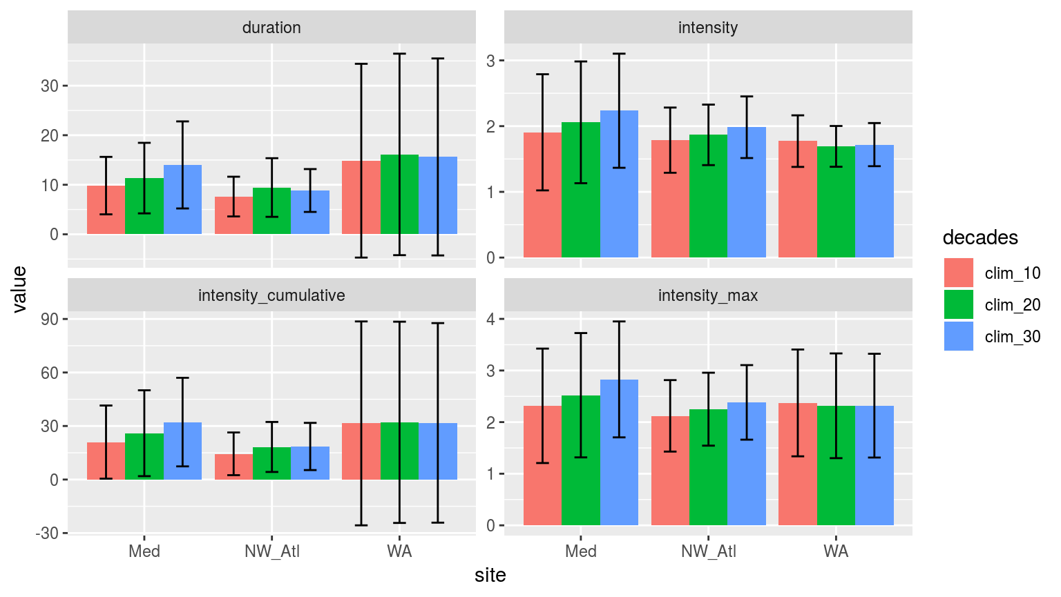
Bar plots of the mean values for each metric of the events detected using one of three different climatology periods. Error bars show the standard deviation of the mean values.
# Long data.frame for plotting
sst_ALL_event_long <- sst_ALL_event %>%
  select(site, decades, duration, intensity_mean, intensity_max, intensity_cumulative) %>%
  # select(-event_no) %>%
  gather(variable, value, -site, -decades)

# Visualisations
  # Notches are unhelpful and noisey here
ggplot(sst_ALL_event_long, aes(x = site, y = value)) +
  geom_boxplot(aes(fill = decades), position = "dodge", notch = FALSE) +
  facet_wrap(~variable, scales = "free_y")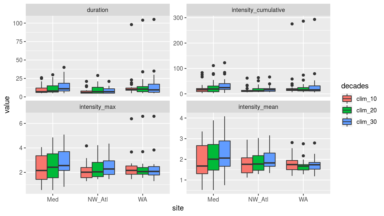
Boxplots showing the spread of the values for the metrics of the events detected with the three different clim periods.
The difference between the three different time series is intriguing. The NW_Atl events have a lower cumulative intensity when one only uses the final decade for the climatology, but there is little difference between two and three decades. The Med data changed over time in a more predictable, linear fashion. Strangest was that the WA data changed very little depending on the number of decades used for the climatology, and that the trend displayed by the other two time series is reversed for some of the metrics. This is most certainly due to that one huge event near the end.
CI_plot_1 <- ggplot(sst_ALL_aov_CI, aes(x = site)) +
  geom_errorbar(position = position_dodge(0.9), width = 0.5,
                aes(ymin = conf.low, ymax = conf.high, linetype = decades)) +
  facet_wrap(~metric, scales = "free_y")
CI_plot_1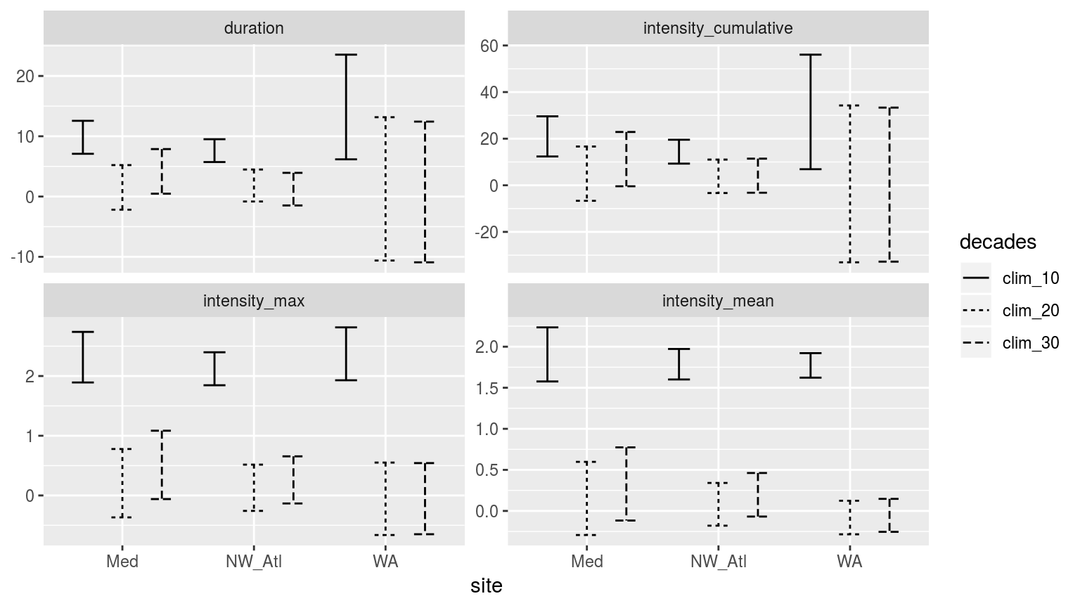
Confidence intervals of the different metrics for the three different clim periods from the population mean.
When we look at the confidence intervals (CI) we see that the max and mean intensities calculated from the 10 year clim periods may be significantly different from those calculated at the 20 and 30 year period. But that the 20 and 30 year values are remarkably similar. This is a good indication that 10 years is too short, but that 20 years appears to be acceptable in place of the (still preferable) 30 year period. [ECJO] This is the important result and the one from which we will make a recommendation (i.e. “30 years (following WMO) is ideal but our results show you can get away with as low as N years”). We should do a formal statistical significance test between the 10-yr/20-yr results and the 30-yr results. You could compare the distributions using a 2-sample KS test to determine they are from the same distribution or not.
This could be done systematically for time series lengths between 5 and 30 years, in 1 year increments, to get better resolution of the results. [/ECJO]
(RWS: Could there be a relationship between normality and change due to decade of choice?)
With these benchmarks established, we will now move on to re-sampling to see if the effect of a shorter time series on the detected climatology can be mitigated.
Re-sampling
With the effect of shortening time series on the detection of events quantified, we will now perform re-sampling to simulate one hundred 10, 20, and 30 year time series in order to quantify how much more variance one may expect from shorter time series. This will be measured through the following statistics:
- for each day-of-year (doy) in the climatology, calculate the SD of the climatological means of the 100 re-samplings;
- for each doy, calculate the RMSE of the re-sampled means relative to the true climatology (i.e. the one produced from the 30-year long time series);
- correspondence of detected events when using climatologies calculated from reduced time series vs. when using the full duration time series climatologies.
The secondary goal of this step in this section of the methodology is to also identify how much more accurate this re-sampling may be able to make the climatologies generated from shorter time series as a technique for addressing this potential short-coming (yes, that was a pun).
sst_repl <- function(sst) {
  sst.sampled <- sst %>%
    mutate(sample_10 = map(data, sample_n, 10, replace = TRUE),
           sample_20 = map(data, sample_n, 20, replace = TRUE),
           sample_30 = map(data, sample_n, 30, replace = TRUE))
  return(sst.sampled)
}

parse_date_sst <- function(data, rep_col, len) {
  parsed <- data %>%
    mutate(id = rep_col,
           y = year(t),
           m = month(t),
           d = day(t)) %>%
    group_by(site, rep, doy) %>%
    mutate(y = seq(2012-len, by = 1, len = len)) %>%
    mutate(t = as.Date(fastPOSIXct(paste(y, m, d, sep = "-")))) %>%
    select(-y, -m, -d) %>%
    na.omit() # because of complications due to leap years
  return(parsed)
}
sst_ALL_doy <- sst_ALL %>%
mutate(doy = yday(as.Date(t))) %>%
nest(-site, -doy)
sst_ALL_repl <- purrr::rerun(100, sst_repl(sst_ALL_doy)) %>%
map_df(as.data.frame, .id = "rep")
sample_10 <- sst_ALL_repl %>%
unnest(sample_10) %>%
parse_date_sst("sample_10", len = 10) %>%
group_by(site, id, rep) %>%
nest() %>%
mutate(smoothed = map(data, function(x) ts2clm(x, climatologyPeriod = c("2002-01-01", "2011-12-31")))) %>%
unnest(smoothed)
sample_20 <- sst_ALL_repl %>%
unnest(sample_20) %>%
parse_date_sst("sample_20", len = 20) %>%
group_by(site, id, rep) %>%
nest() %>%
mutate(smoothed = map(data, function(x) ts2clm(x, climatologyPeriod = c("1992-01-01", "2011-12-31")))) %>%
unnest(smoothed)
sample_30 <- sst_ALL_repl %>%
unnest(sample_30) %>%
parse_date_sst("sample_30", len = 30) %>%
group_by(site, id, rep) %>%
nest() %>%
mutate(smoothed = map(data, function(x) ts2clm(x, climatologyPeriod = c("1982-01-01", "2011-12-31")))) %>%
unnest(smoothed)
sst_ALL_smooth <- bind_rows(sample_10, sample_20, sample_30)
save(sst_ALL_smooth, file = "data/sst_ALL_smooth.Rdata")# This file is not uploaded to GitHub as it is too large
# One must first run the above code locally to generate and save the file
load("data/sst_ALL_smooth.Rdata")With 100 re-sampled climatologies and thresholds created, let’s take a moment to see if this much larger sample size differs significantly.
sst_ALL_smooth_aov <- sst_ALL_smooth %>%
  rename(decades = id) %>%
  select(-rep, -t, -temp, -doy) %>%
  mutate(decades = as.factor(decades)) %>%
  unique() %>%
  group_by(site) %>%
  nest() %>%
  mutate(res = map(data, event_aov_p)) %>%
  select(-data) %>%
  unnest() #%>%
  # spread(key = metric, value = p.value) #%>%
  # select(names(select(sst_ALL_event, -decades, -event_no)))

ggplot(sst_ALL_smooth_aov, aes(x = site, y = metric)) +
  geom_tile(aes(fill = p.value)) +
  geom_text(aes(label = round(p.value, 4))) +
  scale_fill_gradient2(midpoint = 0.1)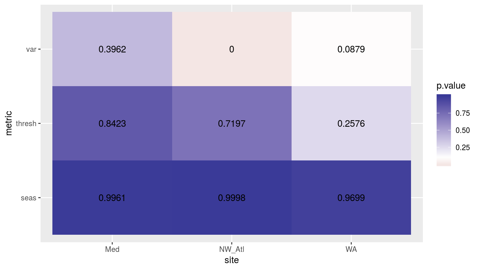
Heatmap showing the p-values from ANOVA’s for the three different clim periods.
# for each day-of-year (doy) in the climatology, calculate the SD of the climatological means of the 100 re-samplings;
sst_ALL_sd <- sst_ALL_smooth %>%
  group_by(site, id, doy) %>%
  summarise(seas_sd = sd(seas),
            thresh_sd = sd(thresh),
            var_sd = sd(var)) %>%
  gather(variable, value, -site, -id, -doy)

ggplot(sst_ALL_sd, aes(x = doy, y = value)) +
  geom_line(aes(colour = id)) +
  facet_grid(variable ~ site)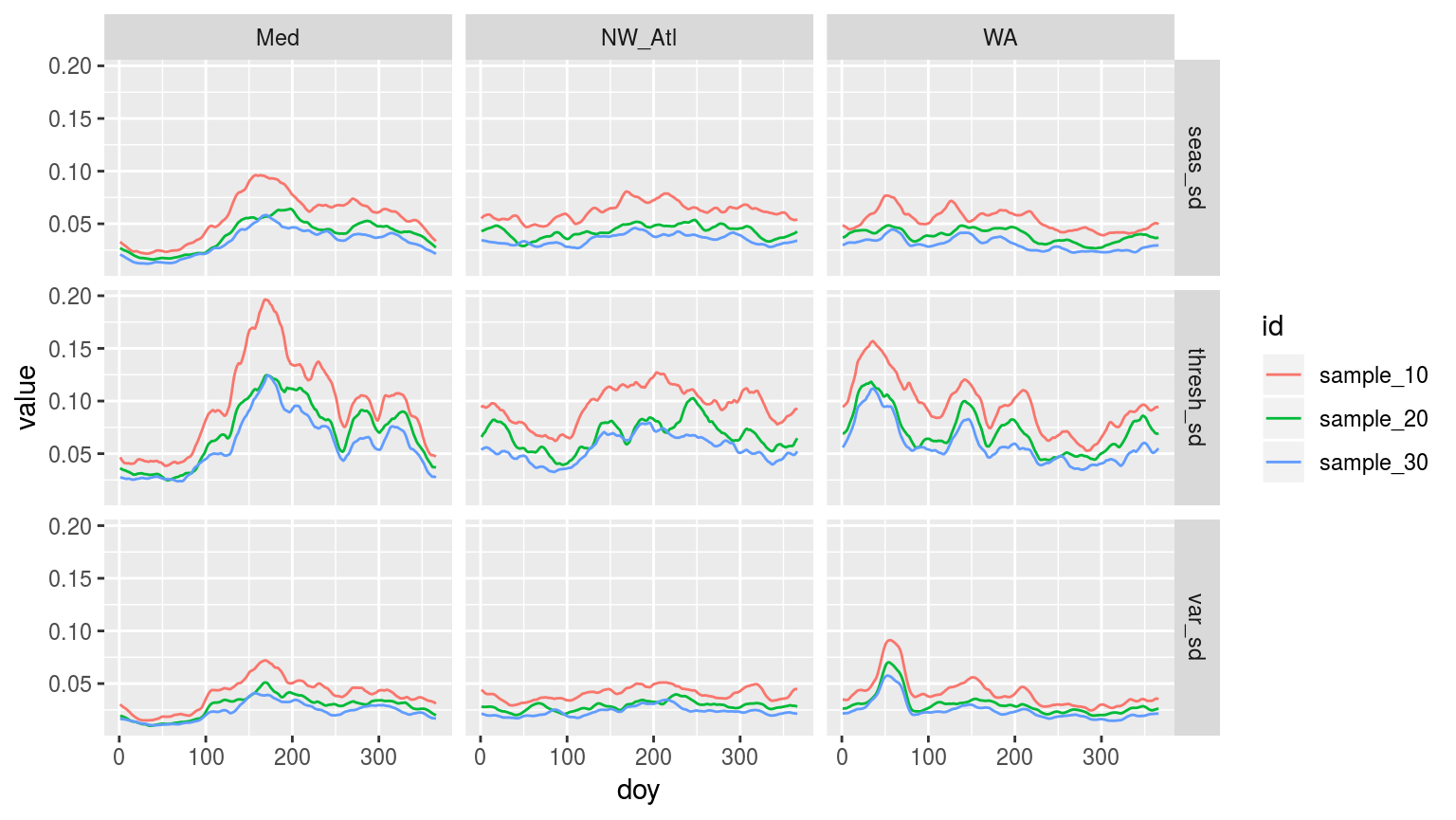
Line plot showing the standard deviation (sd) of each day of the year (doy) for the three different sites. The line colours denote the number of samples used for each doy. All re-samples were run 100 times, thus n = 100 for each sd of each doy for each id.
Hmmm…. Interesting how the seasonal and threshold signals of increased summer variance comes through so nicely in the Med data the fewer samples are taken. The other two time series produce somewhat strange signals. We can see that the 30 year, and to a lesser extent 20 year, re-sampled time series are much smoother than the 10 year re-sample. The WA data are either very strange, or very exposed to particularly intense events.
sst_ALL_sd %>%
  group_by(site, variable, id) %>%
  summarise(sd_mean = mean(value))
## # A tibble: 27 x 4
## # Groups: site, variable [?]
## site variable id sd_mean
## <chr> <chr> <chr> <dbl>
## 1 Med seas_sd sample_10 0.0565
## 2 Med seas_sd sample_20 0.0393
## 3 Med seas_sd sample_30 0.0328
## 4 Med thresh_sd sample_10 0.0969
## 5 Med thresh_sd sample_20 0.0706
## 6 Med thresh_sd sample_30 0.0593
## 7 Med var_sd sample_10 0.0397
## 8 Med var_sd sample_20 0.0283
## 9 Med var_sd sample_30 0.0235
## 10 NW_Atl seas_sd sample_10 0.0621
## # ... with 17 more rowsA quick glimpse at the overall mean of the SD values for each site and re-sample period shows how similar they are. Actually, there is not a linear relationship between increased re-sample size and decreased variance. That being said, an increased re-sample size does appear to produce a more stable variance profile. Meaning that even though the mean SD for the 10 year re-samples are very similar to the 20 and 30 year re-samples, to an extent this is because the variance is more variable, ultimately flattening itself out somewhat. This may be seen in the figure above how the slight peaks come out for the 10 year samples both above and below the other lines based on larger samples. Again, this appears almost negligible.
# Base 30 year clims
sst_ALL_clim_base <- sst_ALL_clim %>%
  filter(decades == "clim_30") %>%
  select(site:doy, seas:var, -decades) %>%
  unique()

# For each doy, calculate the RMSE of the re-sampled means relative to the true climatology (i.e. the one produced from the 30-year long time series);
sst_ALL_error <- sst_ALL_smooth %>%
  select(site:doy, seas:var) %>%
  unique() %>%
  left_join(sst_ALL_clim_base, by = c("site", "doy")) %>%
  mutate(seas.er = seas.x - seas.y,
         thresh.er = thresh.x - thresh.y,
         var.er = var.x - var.y)

sst_ALL_RMSE <- sst_ALL_error %>%
  group_by(site, id, doy) %>%
  summarise(seas_RMSE = sqrt(mean(seas.er^2)),
            thresh_RMSE = sqrt(mean(thresh.er^2)),
            var_RMSE = sqrt(mean(var.er^2))) %>%
  gather(variable, value, -site, -id, -doy)

ggplot(sst_ALL_RMSE, aes(x = doy, y = value)) +
  geom_line(aes(colour = id)) +
  facet_grid(variable ~ site)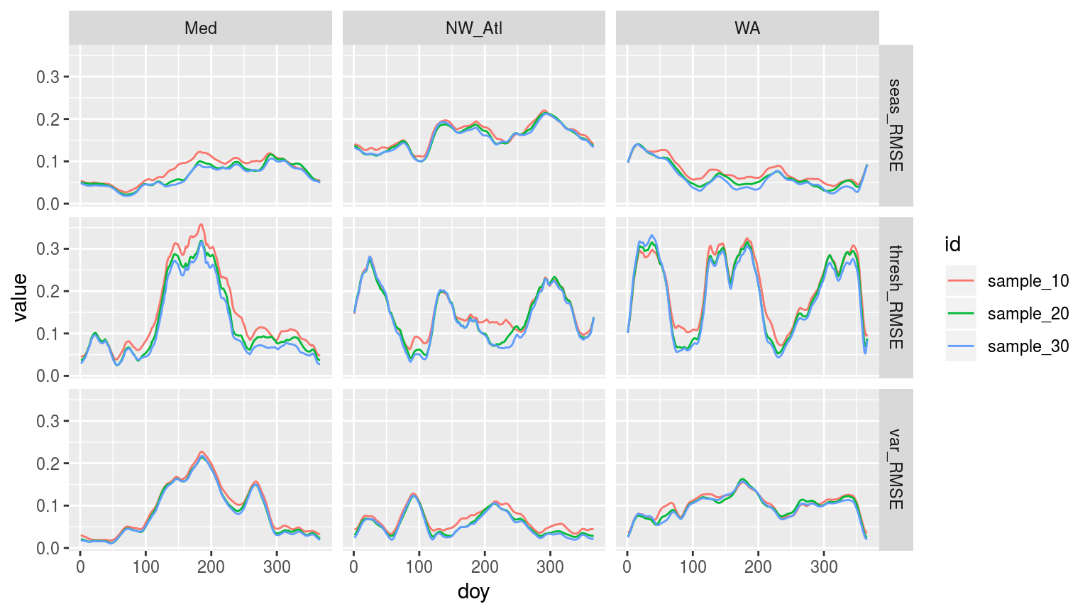
Line graph, as above, but now showing the RMSE for each doy for the three different climatology durations.
# It appears as though the actual time series constructed from re-sampling,
# while useful for creating climatologies, are totally deurmekaar
# and do not actually lend themselves to the detection of heatwaves
# Therefore it is necessary to replace the 'temp' values in the smoothed data with the real values
sst_ALL_smooth_real <- sst_ALL_smooth %>%
  select(-temp) %>%
  left_join(sst_ALL, by = c("site", "t"))
# Then caluclate events using the many re-smapled clims on the real temperature data
sst_ALL_smooth_event <- sst_ALL_smooth_real %>%
group_by(site, id, rep) %>%
nest() %>%
mutate(res = map(data, detect_event_event)) %>%
select(-data) %>%
unnest(res) %>%
filter(date_start >= "2002-01-01", date_end <= "2011-12-31") %>%
select(-c(index_start:index_end, date_start:date_end))
save(sst_ALL_smooth_event, file = "data/sst_ALL_smooth_event.Rdata")# This file is not uploaded to GitHub as it is too large
# One must first run the above code locally to generate and save the file
load("data/sst_ALL_smooth_event.Rdata")
# Rename for project-wide consistency
sst_ALL_smooth_event <- sst_ALL_smooth_event %>%
rename(decades = id)# correspondence of detected events when using climatologies calculated from reduced time series vs. when using the full duration time series climatologies.
# ANOVA p
sst_ALL_smooth_aov_p <- sst_ALL_smooth_event %>%
select(site, decades, duration, intensity_mean, intensity_max, intensity_cumulative) %>%
nest(-site) %>%
mutate(res = map(data, event_aov_p)) %>%
select(-data) %>%
unnest() #%>%
# spread(key = metric, value = p.value) %>%
# select(names(select(sst_ALL_event, -decades, -event_no)))
# sst_ALL_smooth_aov_p
# visualise
ggplot(sst_ALL_smooth_aov_p, aes(x = site, y = metric)) +
geom_tile(aes(fill = p.value)) +
geom_text(aes(label = round(p.value, 2))) +
scale_fill_gradient2(midpoint = 0.1) +
theme(axis.text.y = element_text(angle = 90, hjust = 0.5))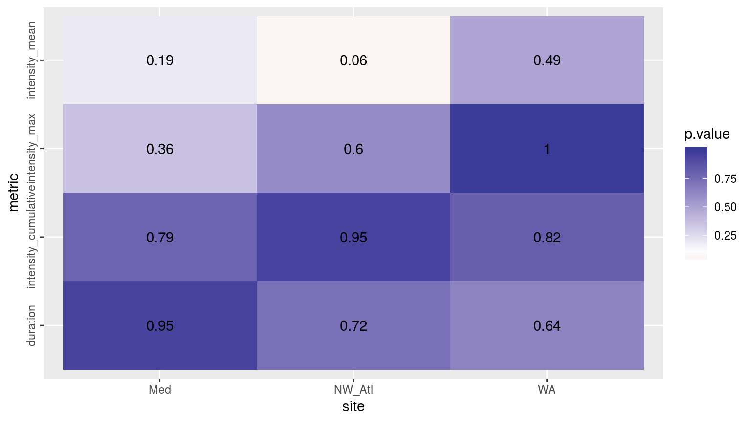
# ANOVA CI
sst_ALL_smooth_aov_CI <- sst_ALL_smooth_event %>%
  select(site, decades, duration, intensity_mean, intensity_max, intensity_cumulative) %>%
  nest(-site) %>%
  mutate(res = map(data, event_aov_CI)) %>%
  select(-data) %>%
  unnest() %>%
  filter(metric != "event_no",
         metric != "rep")
# sst_ALL_smooth_aov_CI
# Long data.frame for plotting
sst_ALL_smooth_event_long <- sst_ALL_smooth_event %>%
select(-event_no) %>%
gather(variable, value, -site, -decades)
# Visualisations
# Notches are unhelpful and noisey here
# ggplot(sst_ALL_smooth_event_long, aes(x = site, y = value)) +
# geom_boxplot(aes(fill = decades), position = "dodge", notch = FALSE) +
# facet_wrap(~variable, scales = "free_y")
# NB: This visualisation is too beefy# CI_plot_2 <- ggplot(sst_ALL_smooth_aov_CI, aes(x = site)) +
# geom_errorbar(position = position_dodge(0.9), width = 0.5,
# aes(ymin = conf.low, ymax = conf.high, linetype = decades)) +
# facet_wrap(~metric, scales = "free_y")
# ggarrange(CI_plot_1, CI_plot_2, ncol = 1, nrow = 2)
ggplot(sst_ALL_aov_CI, aes(x = site)) +
geom_errorbar(position = position_dodge(0.9), width = 0.5, colour = "black",
aes(ymin = conf.low, ymax = conf.high, linetype = decades)) +
geom_errorbar(data = sst_ALL_smooth_aov_CI,
position = position_dodge(0.9), width = 0.5, colour = "red",
aes(ymin = conf.low, ymax = conf.high, linetype = decades)) +
facet_wrap(~metric, scales = "free_y")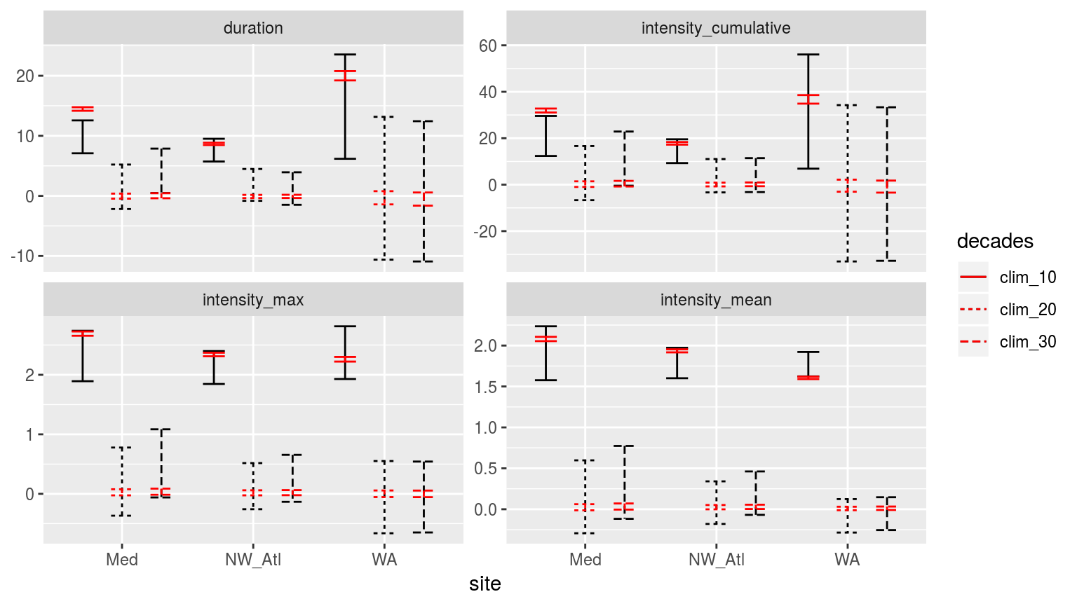
Confidence intervals of the different metrics for the three different clim periods from the population mean based on the 100 times re-sampling of each clim period in red, and the single sample based on the real data in black.
Though I was not able to run the boxplot, because my computer kept falling over, the CI plot above demonstrates that the difference detected in the first round of experiments (when the real 10, 20, and 30 year baselines were used to generate a single clim each) holds up when we re-sample the clim generation 100 times. The centre around which the CI spread may be found remains very similar between the two experiments, with the distance between the upper and lower limits shrinking dramatically with re-sampling. Through re-sampling we see that there is a difference between the 10 year clims and the 20 and 30 year clims. But that there is no difference between the 20 and 30 year clims.
Note that in an earlier version of this vignette bootstrapping was also tested. It has since been removed as it was shown to not be effective. This was because the bootstrapping of random values to create climatologies created much lower values than the real data because while the bootstrapping does sample the data randomly, it then takes those n random samples and creates one mean value from them. This then makes artificially even values and so when one wants to calculate a 90th percentile threshold from this it is almost identical to the seasonal climatology.
Categories
In this section we want to look at how the categories in the different time periods compare. I’ll start out with doing basic calculations and comparisons of the categories of events with the different time periods. And then based on how that looks, see if I can think of a way of quantifying the differences.
# Calculate categories from events in one function for nesting
detect_event_category <- function(df, y = temp){
  ts_y <- eval(substitute(y), df)
  df$temp <- ts_y
  res <- category(detect_event(df))
  res$event_name <- as.character(res$event_name)
  return(res)
  }
First up we compare the category results for the events with the one reduced clim as done before.
# Calculate categories and filter only those from 2002 -- 2011
sst_ALL_clim_category <- sst_ALL_clim %>%
  group_by(site, decades) %>%
  nest() %>%
  mutate(res = map(data, detect_event_category)) %>%
  select(-data) %>%
  unnest(res) %>%
  filter(peak_date >= "2002-01-01", peak_date <= "2011-12-31") #%>%
  # select(-c(index_start:index_end, date_start:date_end))
# Indeed... but how to compare qualitative data?
# Let's start out by counting the occurrence of the categories
sst_ALL_clim_category_count <- sst_ALL_clim_category %>%
group_by(site, decades, category) %>%
summarise(count = n()) %>%
mutate(category = factor(category,
levels = c("I Moderate", "II Strong",
"III Severe", "IV Extreme")))
ggplot(sst_ALL_clim_category_count, aes(x = decades, y = count, fill = decades)) +
geom_bar(stat = "identity", position = position_dodge()) +
geom_text(aes(label = count, y = count/2)) +
facet_grid(category~site)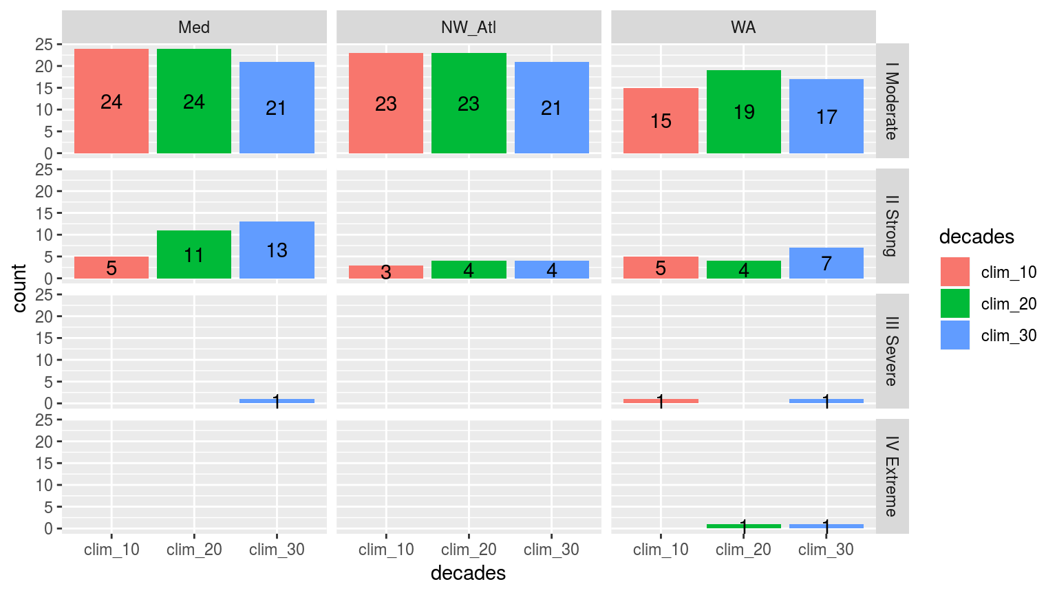
Simple bar plots showing the counts of the different categories of events faceted in a grid with different sites along the top and the different category classifications down the side. The colours of the bars denote the different climatology periods used. Note that the general trend is that more ‘smaller’ events are detected with a 10 year clim period, and more ‘larger’ events detected with the 30 year clim. The 20 year clim tends to rest in the middle.
Those are about the results I was expecting. Now let’s run this same code on our 100 re-samples we created earlier.
# Calculate categories and filter only those from 2002 -- 2011
sst_ALL_smooth_real_category <- sst_ALL_smooth_real %>%
  group_by(site, id, rep) %>%
  nest() %>%
  mutate(res = map(data, detect_event_category)) %>%
  select(-data) %>%
  unnest(res) %>%
  filter(peak_date >= "2002-01-01", peak_date <= "2011-12-31") #%>%
  # select(-c(index_start:index_end, date_start:date_end))
save(sst_ALL_smooth_real_category, file = "data/sst_ALL_smooth_real_category.Rdata")load("data/sst_ALL_smooth_real_category.Rdata")# Indeed... but how to compare qualitative data?
# Let's start out by counting the occurrence of the categories
sst_ALL_smooth_real_category_count <- sst_ALL_smooth_real_category %>%
rename(decades = id) %>%
group_by(site, decades, category) %>%
summarise(count = n()/100) %>%
mutate(category = factor(category,
levels = c("I Moderate", "II Strong",
"III Severe", "IV Extreme")))
ggplot(sst_ALL_smooth_real_category_count, aes(x = decades, y = count, fill = decades)) +
geom_bar(stat = "identity", position = position_dodge()) +
geom_text(aes(label = round(count), y = count/2)) +
facet_grid(category~site)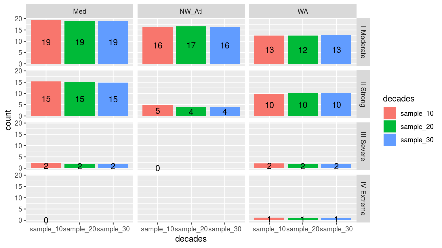
Simple bar plots showing the counts of the different categories of events from 100 re-samplings at the three different clim period lengths (10, 20, and 30 years). The faceted in a grid shows different sites along the top and the different category classifications down the side. The colours of the bars denote the different climatology periods used. Note that the general trend is that more ‘smaller’ events are detected with a 10 year clim period, and more ‘larger’ events detected with the 30 year clim. The 20 year clim tends to rest in the middle.
Interestingly, when re-sampling for potential clims we actually see the detection of more larger category events with the 10 year periods than with either 20 or 30. As noted earlier, this re-sampling removes the decadal trend from the data, which then affects the creation of the climatologies being used. With a shorter period being used to create the threshold, it appears that this allows for the detection of ‘larger’ events. Remember that the real temperature values are being used to detect these events, not the re-sampled temperature values that were used to calculate the climatologies. This was because the re-sampled temperatures were too jumbled to detect events with reliably.
Comparing top events
(AJS: I was thinking about the event categories. What we need to do is detect the top five events using the 30 yr climatology.
# Calculate all event categories, not just the last ten years as done above
sst_ALL_clim_category_ALL <- sst_ALL_clim %>%
  group_by(site, decades) %>%
  nest() %>%
  mutate(res = map(data, detect_event_category)) %>%
  select(-data) %>%
  unnest(res)

# The top 5 events froom 30 years
sst_ALL_clim_category_30_top_5 <- sst_ALL_clim_category_ALL %>%
  filter(decades == "clim_30",
         peak_date >= as.Date("1982-01-01"),
         peak_date <= as.Date("2011-12-31")) %>%
  group_by(site) %>%
  arrange(-i_max) %>%
  slice(1:5)

# The top 5 events froom 20 years
sst_ALL_clim_category_20_top_5 <- sst_ALL_clim_category_ALL %>%
  filter(decades == "clim_20",
         peak_date >= as.Date("1992-01-01"),
         peak_date <= as.Date("2011-12-31")) %>%
  group_by(site) %>%
  arrange(-i_max) %>%
  slice(1:5)

# The top 5 events froom 10 years
sst_ALL_clim_category_10_top_5 <- sst_ALL_clim_category_ALL %>%
  filter(decades == "clim_10",
         peak_date >= as.Date("2002-01-01"),
         peak_date <= as.Date("2011-12-31")) %>%
  group_by(site) %>%
  arrange(-i_max) %>%
  slice(1:5)
Then, using the sections of time series that overlap with these events, use reduced time series, make climatologies, and see how those top five events compare in their event metrics to those detected using the shorter climatologies.
# RWS: This is a bit of a schlep as it requires a much more nuanced take on how to go about comparing relavent lengths of clim periods. The method used throughout here, that of the most recent 10, 20, or 30 years for the clim period won't work here and I hesitate to create a new methodology this late in the section...
# RWS: So for now I'm skipping forward to the next step as that will work with the current methodology.
Then we do the reverse. Detect events in the reduced time series, find the top five, and see what the matching ones in the full time series are like in comparison.
# Function for pulling out comparable events based on closest peak dates
peak_date_index <- function(df){
  sst_30 <- sst_ALL_clim_category_ALL %>%
    filter(decades == "clim_30")
  peak_index <- as.data.frame(knnx.index(as.matrix(sst_30$peak_date),
                                         as.matrix(df$peak_date), k = 1))
  res <- sst_30[as.matrix(peak_index),]
}
# Find matching events based on nearest peak_date
sst_ALL_clim_category_10_top_5_match <- peak_date_index(sst_ALL_clim_category_10_top_5)
sst_ALL_clim_category_20_top_5_match <- peak_date_index(sst_ALL_clim_category_20_top_5)sst_ALL_clim_category_top_5_match <- rbind(data.frame(sst_ALL_clim_category_10_top_5_match, match = "clim_10"),
data.frame(sst_ALL_clim_category_20_top_5_match, match = "clim_20"),
data.frame(sst_ALL_clim_category_30_top_5, match = "clim_30")) %>%
group_by(site, match, category) %>%
summarise(count = n()) %>%
mutate(category = factor(category,
levels = c("I Moderate", "II Strong",
"III Severe", "IV Extreme")))
ggplot(sst_ALL_clim_category_top_5_match, aes(x = match, y = count, fill = match)) +
geom_bar(stat = "identity", position = position_dodge()) +
geom_text(aes(label = count, y = count/2)) +
facet_grid(category~site)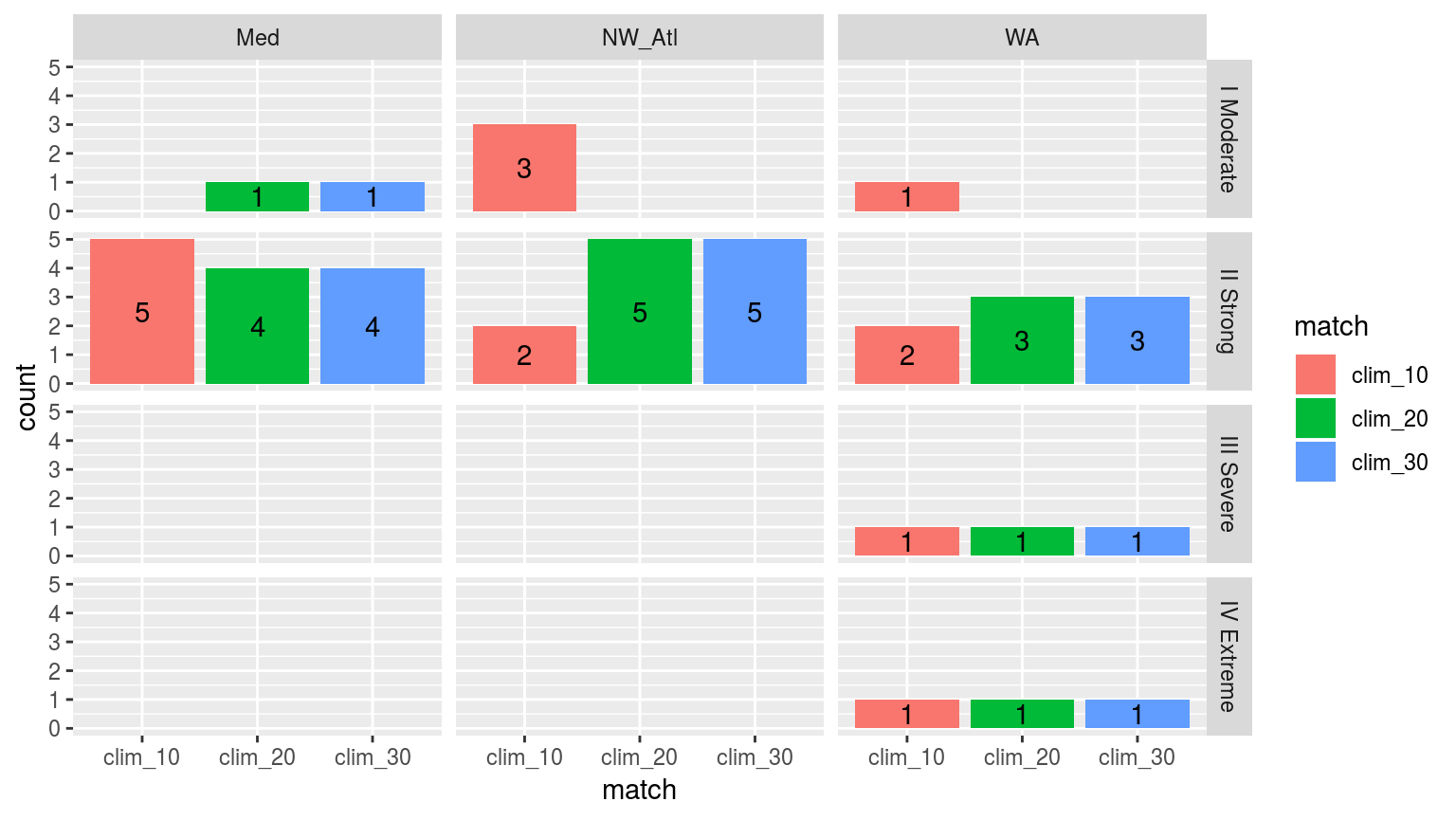
Bar plot showing the categories of events from the 30 year climatology calculations when they are determined by the top five events in the shorter time series. THis isn’t terribly informative as it is effectively showing if larger events happened earlier on in the time series or not. It says little about how the climatology period itself affects the categories of events.
With the differences in the count of categories for the detected events in the given time series lengths shown above, we will now compare the categories of the matching events between the different climatologies used.
sst_ALL_clim_category_10_top_5_compare <- rbind(data.frame(sst_ALL_clim_category_10_top_5, match = "clim_10"),
                                           data.frame(sst_ALL_clim_category_10_top_5_match, match = "clim_30")) %>%
  group_by(site, match, category) %>%
  summarise(count = n()) %>%
  mutate(category = factor(category,
                           levels = c("I Moderate", "II Strong",
                                      "III Severe", "IV Extreme")))

ggplot(sst_ALL_clim_category_10_top_5_compare, aes(x = match, y = count, fill = match)) +
  geom_bar(stat = "identity", position = position_dodge()) +
  geom_text(aes(label = count, y = count/2)) +
  facet_grid(category~site)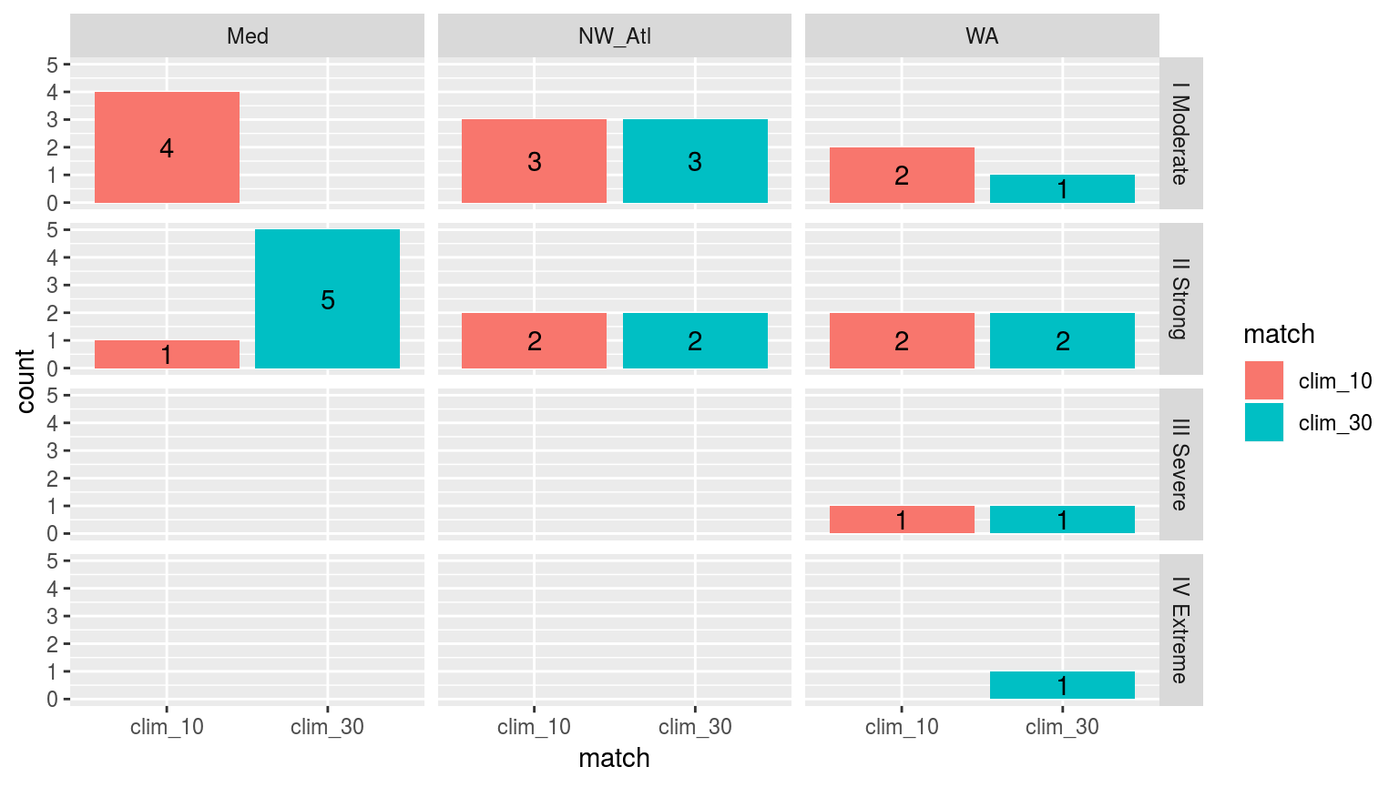
Comparing the categories of the top 5 events detected with a 10 year climatology as oppossed to those detected with the standard 30 we see that the general pattern is that events are larger with the 30 year climatology period.
sst_ALL_clim_category_20_top_5_compare <- rbind(data.frame(sst_ALL_clim_category_20_top_5, match = "clim_20"),
                                           data.frame(sst_ALL_clim_category_20_top_5_match, match = "clim_30")) %>%
  group_by(site, match, category) %>%
  summarise(count = n()) %>%
  mutate(category = factor(category,
                           levels = c("I Moderate", "II Strong",
                                      "III Severe", "IV Extreme")))

ggplot(sst_ALL_clim_category_20_top_5_compare, aes(x = match, y = count, fill = match)) +
  geom_bar(stat = "identity", position = position_dodge()) +
  geom_text(aes(label = count, y = count/2)) +
  facet_grid(category~site)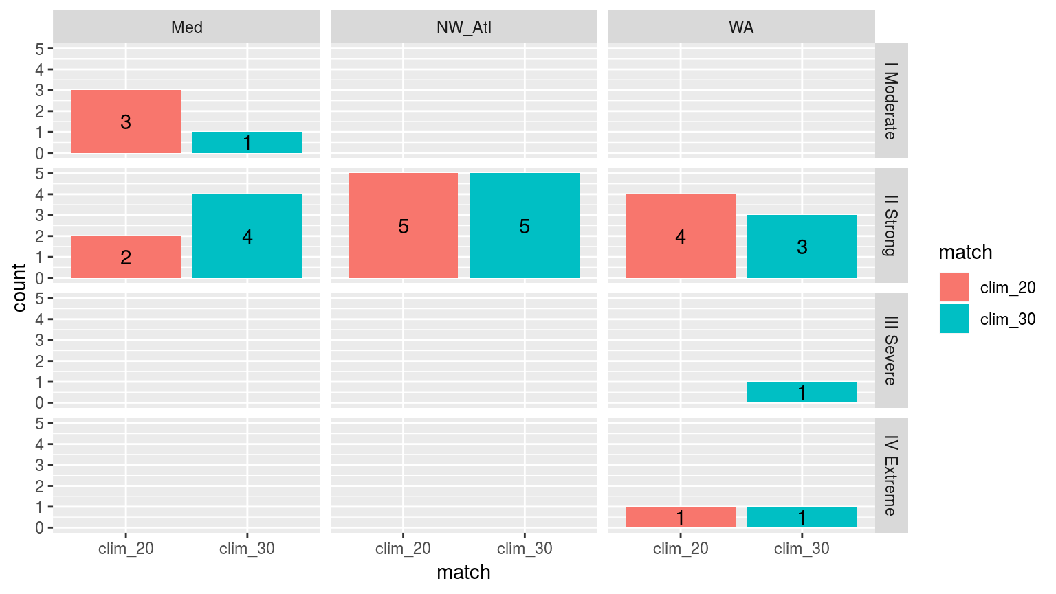
Comparing the categories of the top 5 events detected with a 20 year climatology as oppossed to those detected with the standard 30 we see that the difference in the size of the categories detected with a 30 year climatology is less than when compared against a 10 year climatology.
So, compare specific events in addition to the way in which you have done it. Then do the same for median-sized events,
# RWS: I'm putting this on hold for now until I've editted the text here and in the skeleton.and the smallest ones.
# RWS: Same for this chunk.Maybe even those at the 2nd and 5th quantiles.)
# RWS: Same for this chunk.Arguments
With the amount of variance that may be accounted for through re-sampling and bootstrapping known, we will now look into how we may go about more confidently creating a climatology that will consistently detect events as similarly as possible by experimenting with how the various arguments within the detection pipeline may affect our results, given the different lengths of time series employed. After this has been done we will look into using the Fourier transform climatology generating method (https://robwschlegel.github.io/MHWdetection/articles/Climatologies_and_baselines.html) to see if that can’t be more effective. The efficacy of these techniques will be judged through a number of statistical measurements of variance and similarity.
Seeing as how 20 and 30 year periods produce very similar results, we will be focussing primarily on what may be done about the 10 year period to make it more similar to the 30 year period. I don’t think it is necessary to do so for the 20 year period.
Fourier transform climatologies
Lastly we will now go about reproducing all of the checks made above, but based on a climatology derived from a Fourier transformation, and not the default methodology.
References
Oliver, Eric C.J., Markus G. Donat, Michael T. Burrows, Pippa J. Moore, Dan A. Smale, Lisa V. Alexander, Jessica A. Benthuysen, et al. 2018. “Longer and more frequent marine heatwaves over the past century.” Nature Communications 9 (1). doi:10.1038/s41467-018-03732-9.