TODO:
- Add designer descriptions of mixins to add at the beginning of nn-text-input, with links to tutorials
- Fix mixins descriptions so that at the beginning they have developers API
- Add custom CSS properties for input-text and to the material version of input-text, use it as an examples
- Add list of elements in the elements page
Loading TPE
TPE is loaded by adding three entries to your files:
- The
webcomponentsjspolyfills for old browsers that do not support web components. Note that adding this file depends on your target audience. - A TPE theme file, which will decide the theme of your elements
- TPE itself
Designers using the files in distr do not have the option to load individual elements. For more information, see Loading individual elements
In this guide, it will be assumed that TPE is correctly loaded.
Here are some common ways to load TPE.
Using Unpkg
Add this to the HEAD section of your HTML document:
    <script src="https://unpkg.com/@webcomponents/webcomponentsjs/webcomponents-bundle.js"></script>
    <script src="https://unpkg.com/tpe/distr/theme-material.js"></script>
    <script src="https://unpkg.com/tpe/distr/tpe.js"></script>
And add a simple text input to see if things worked:
<nn-input-text id="input" name="aName" label="The label"></nn-input-text>
Using NPM to install packages locally
If you want to serve TPE from your local web server, install TPE, as well as the webcomponentsjs polyfill, in your node_modules directory:
$ npm install @webcomponents/webcomponentsjs
$ npm install tpe
And add this to your HEAD section:
    <script src="./node_modules/@webcomponents/webcomponentsjs/webcomponents-bundle.js"></script>
    <script src="./node_modules/tpe/distr/material.js"></script>
    <script src="./node_modules/tpe/distr/tpe.js"></script>
The elements
There are three categories of elements.
nn (Nearly Native)
The nn- elements are a thin wrapper to native elements. They include:
All of the “type” variations of the
<input>element. For example,<input type="text">has an equivalentnn-element called nn-input-text. The full list of possible types isbutton,checkbox,color,date,date-time-local,email,file,month,number,password,radio,range,search,submit,tel,text,time,url,week. For each type, there is a correspondingnn-element.The other standard HTML input elements:
<button>,<form>,<meter>,<progress>,<select>,<textarea>,
Every nn- element has a native element with id native in its shadow DOM, . If you know how to use HTML elements, you know how to use nn- ones too. This is the single most important concept of nn- elements: every attribute and every property of the “main” element is mirrored to the native element in the shadow DOM. This means that writing something like this:
<nn-input-text id="inp" name="firstName"></nn-input-text>
<script>
  window.document.querySelector('#inp').value = "Tony Mobily"
</script>
Will have the end result of creating an <input> element in the nn-input-text‘s shadow DOM where the attribute name is firstName and the property value is Tony Mobily. The parent element doesn’t reflect specific properties and values: it reflects nearly everything.
Notes on reflection
In terms of attributes, not everything should be reflected. For example the attributes id, class and style are never reflected from the parent element to the inner native one, since it would most definitely break things.
If you need to assign a specific attribute of the native element in the shadow DOM, you can use a specific syntax:
<nn-input-text native::style="color: red" id="inp" name="firstName"></nn-input-text>
This line will set the native’s style attribute as color: red. You can target any element with an ID in the shadow DOM this way, not just native.
In terms of properties and methods, only the ones that are part of the native element’s API are reflected. For example the properties value and alt are part of the HTML standard for <input> elements, and are therefore reflected.
en (Enhanced Native)
en- elements are very similar to nn- ones, as they also implement full reflection; however, they also extend native elements. For example nn-form is a thin wrap around the standard <form> element, with the advantage of validating all elements (whereas standard <form> elements will only ever validate native HTML form elements, missing anything in the shadow DOM). nn-form, on the other hand, is a form on steroids that implements its own submit logic and is capable of preloading records, setting error messages, running hooks before and after submitting, and much more.
ee (Enhanced Enhanced)
en- elements are those elements that are common in UIs but have no HTML native equivalent. Some examples are the ee-autocomplete decorator, or the ee-header, or ee-tabs.
Using an element: <nn-input-text>
nn-input is a “nearly native” element; this means that it’s a thin wrapper around <input type="text">
Adding it to your page
To add the element to your page, add this to your page source:
<nn-input-text name="field"></nn-input-text>
The element is documented in the elements section of this documentation: nn-input-text. That’s your first stop before using an element.
Change some attributes (native ones)
Adding a native attribute is very simple:
<nn-input-text maxlength="5" name="field" label="The label"></nn-input-text>
Please note that unlike other element libraries, TPE is totally unaware of what maxlength is or does, and it’s not explicitly forwarded to the contained element. You can use any attribute that is part of the HTML standard, since nearly everything is reflected.
Change some attributes (non-standard ones)
The label attribute is not part of the native HTML specifications. To add a label to an element, simply add a “label” attribute:
<nn-input-text name="field" label="The label"></nn-input-text>
Alternatively, for labels containing more than text, add a span:
<nn-input-text name="field">
    <span slot="label">This is a <b>very</b> complex label</span>
</nn-input-text>
Please note that labels, error messages and handling of datalist tags are the extent to which TPE goes in terms of non-native behaviour on native elements.
Changing the way elements look
There are three ways to change the way your elements will look. Please note that the changes you make will largely depend on the theme you use.
Custom CSS properties
The first stop to change how elements look is by changing their custom CSS properties. Each element provides a set of custom CSS properties that can be set and that will influence the way the element looks.
For example, if you have an input field like this in your file:
<nn-input-text name="field" label="The label"></nn-input-text>
The first think you need to see, if
<style>
  nn-input-text {
    --nn-label-color: blue
  }
</style>
Each theme will provide a set of custom properties you can set.
TODO: rework where custom properties are defined, document them.
Add custom styles
Each element can be styled by adding a stylesheet directly into the element’s shadow DOM, by defining a <style part="style">...</style> within the element itself.
For example an nn-input-text declared as such:
<nn-input-text name="field" label="The label"></nn-input-text>
Will contain this in its shadow DOM:
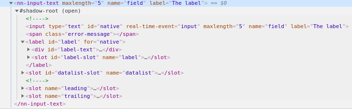
The shadow DOM contains a label, with ID label. This is the critical piece of information you need to then write:
<nn-input-text name="field" label="The label">

  <style part="style">
    #label {
      color: blue
    }
  </style>
</nn-input-text>
The style will be added to the element’s shadow DOM, and will be applied without FOUC.
Add some custom styling (native:style)
Finally, you can style the inner parts of the element by assigning a style attribute to the inner elements.
<nn-input-text name="field" label::style="color: blue" label="The label"></nn-input-text>
Basically, some_id::something will set the attribute something of the element with ID some_id in nn-input-text‘s shadow DOM. This effectively allows you to quickly set a custom style of any element with an ID in the shadow DOM.
Read on
Tutorials