@elaval/owid-vis-poc
A Javascript tool for building visualizations with data from Our World in Data
A Proof of concept
Our World in Data (OWID) is an initiative that aims at research and data to make progress against the world’s largest problems. They collect and mantain hundreds of datasets from worlwide public data that is transformed into meaningful information via evidence based articles and data visualisations.
They currently have a powerful visualization tool - OWID Grapher - that has been designed to easily create, and publish, visualization information on top of their datasets. Grapher is a great tool, but it si possible to complement it with new depelopments.
This respository contains a very simple prototype that I developed to play with some ideas. I imagine an OWID Javascript charting tool that has the following features:
- Is decoupled from the database (can consume data that is provided via Javascript without direct connection to the database)
- Has an architecture and code that is easy to understand, so that other developers can contribute and / or expand its functionalities.
- It is aware of the characteristics of OWID data. This is not "yeat another charting tool" but a tool that works well with data that is organised with time (years / dates) and gographical entities (countries, continents, grouops of countries) with relevant values metrics (which might have specific units and formatting conventions)
- It is easy to intergrate in other systems.
The core of the tool is to build visualizations that could be embedded in other systems (e.g. blogs or notebooks) or used as components for other developments. These visualizations will usually be used within a standard "wrapper" that would handle common functionalities (display sources, export data and images, filters, ...), but this wrapper would be a separate development that consumes the core visualizations.
Characteristics of OWID data
Current OWID Grappher consumes data from a MySQL database that is publicly distributed. When we look at the data model, we can identify some key concepts
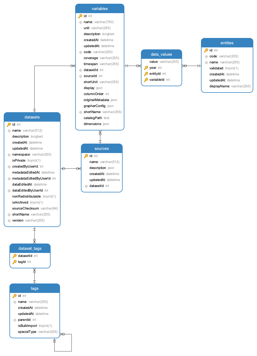
- Datasets: are associated to a specific source and can contain a collection of variables (metrics)
- Tags: descriptors that are associates to datasets (e.g. "Population Growth"). Tags can have tag parents which allows to build a hierarchical structure of tags (e.g. "Population Growth" is a child of "Population Growth & Vital Statistics")
- Variables: multiple variables can be associated to a dataset. Each variable (e.g. "Fertility Rate") has a unit (e.g. "children per woman") and is associated to a table contains a collection of data-values that links values with time (year) and entities (countries, continents, ...).
- Entities have a name (e.g. "United Kingdom") and id (e.g. 1) and a code (e.g. GBR)
Once the user has selected a domain and dataset (e.g. "World Development Indicators - Economic Policy & Debt") and a specific variable from that dataset (e.g. "GDP per capita, PPP (constant 2011 international $)") then we are dealing with data values that can be exemplefied by the following table:
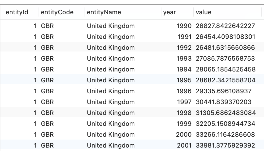
The key dimensions for our visualization purposes are
- entity name (categorical)
- year (ordinal / time)
And we have a numeric variable ("value") with ranges, units and format that will depend on the specific variable (%, people, $, ...)
The most common messages that we would like to communicate in our visualizations are:
- Trends: how the metric evolves on time for a specific entity, and how the trend from different entities can be compared (line charts)
- Rankings: the relative size and order of the metrics for different entities (bar charts)
- Geography: how is the relative size of the metric distributed in the world (maps)
Anatomy of an OWID visualization
A visualization is a conceptual entity that usually contains the following elements:
- A graphical repesentation in a 2D plane that takes advantage of visual variables (size, position, shape , color) to represent magnitudes, trends, relationships, ...
- Axis that communicate the relationship between domain values (e.g. age, income) and phisical ranges in the chart (vertical / horizontal position)
- Legends that map colors to categorical variables (e.g. countries)
- Titles / subtitles
- Annotations
- Tooltips
In contrete "browser" terms, the visualization is represented as a DOM element (e.g. a
Generated using TypeDoc