Assessing the effects of missing data
Robert W Schlegel
2018-09-13
missing_data.RmdOverview
The purpose of this vignette is to quantify the effects that missing data have on the detection of events. Specifically, the relationship between the percentage of missing data, as well as the consecutive number of missing days, on how much the seasonal climatology, the 90th percentile threshold, and the MHW metrics may differ from those detected against the same time series with no missing data.
The missing data will be ‘created’ by striking out existing data from the three pre-packaged time series in the heatwaveR package, which themselves have no missing data. This will be done in two ways:
- the first method will be to simply use a random selection algorithm to indiscriminately remove an increasing proportion of the data;
- the second method will be to systematically remove data from specific days/times of the year to simulate missing data that users may encounter in a real-world scenario
- one method will be to remove only weekend days from the data
- another method is to remove only winter data to simulate ice-cover
It is hypothesised that the more consecutive missing days of data there are, the bigger the effect will be on the results. It is also hypothesised that consecutive missing days will have a more pronounced effect/be a better indicator of time series strength than the simple proportion of missing data. A third hypothesis is that there will be a relatively clear threshold for consecutive missing days that will prevent accurate MHW detection.
library(tidyverse)
library(broom)
library(heatwaveR)
library(lubridate) # This is intentionally activated after data.table
library(fasttime)
library(ggpubr)
library(boot)
library(FNN)
library(mgcv)
library(padr)
# A clomp of functions used below
# Written out here for tidiness/convenience
# Function for knocking out data but maintaing the time series consistency
random_knockout <- function(df, prop){
res <- df %>%
sample_frac(size = prop) %>%
arrange(t) %>%
pad(interval = "day") %>%
full_join(sst_cap, by = c("t", "temp", "site")) %>%
mutate(miss = as.character(1-prop))
return(res)
}
# Quantify consecutive missing days
con_miss <- function(df){
ex1 <- rle(is.na(df$temp))
ind1 <- rep(seq_along(ex1$lengths), ex1$lengths)
s1 <- split(1:nrow(df), ind1)
res <- do.call(rbind,
lapply(s1[ex1$values == TRUE], function(x)
data.frame(index_start = min(x), index_end = max(x))
)) %>%
mutate(duration = index_end - index_start + 1) %>%
group_by(duration) %>%
summarise(count = n())
return(res)
}
# Function that knocks out pre-set amounts of data
# This is then allows for easier replication
# It expects the data passed to it to already be nested
knockout_repl <- function(df) {
res <- df %>%
mutate(prop_10 = map(data, random_knockout, prop = 0.9),
prop_25 = map(data, random_knockout, prop = 0.75),
prop_50 = map(data, random_knockout, prop = 0.5))
return(res)
}
# Calculate only events
detect_event_event <- function(df, y = temp){
ts_y <- eval(substitute(y), df)
df$temp <- ts_y
res <- detect_event(df)$event
return(res)
}
# Run an ANOVA on each metric of the combined event results and get the p-value
event_aov_p <- function(df){
aov_models <- df[ , -grep("miss", names(df))] %>%
map(~ aov(.x ~ df$miss)) %>%
map_dfr(~ broom::tidy(.), .id = 'metric') %>%
mutate(p.value = round(p.value, 5)) %>%
filter(term != "Residuals") %>%
select(metric, p.value)
return(aov_models)
}
# Run an ANOVA on each metric of the combined event results and get CI
event_aov_CI <- function(df){
# Run ANOVAs
aov_models <- df[ , -grep("miss", names(df))] %>%
map(~ aov(.x ~ df$miss)) %>%
map_dfr(~ confint_tidy(.), .id = 'metric') %>%
mutate(miss = as.factor(rep(c("0", "0.1", "0.25", "0.5"), nrow(.)/4))) %>%
select(metric, miss, everything())
# Calculate population means
df_mean <- df %>%
group_by(miss) %>%
summarise_all(.funs = mean) %>%
gather(key = metric, value = conf.mid, -miss)
# Correct CI for first category
res <- aov_models %>%
left_join(df_mean, by = c("metric", "miss")) %>%
mutate(conf.low = if_else(miss == "0", conf.low - conf.mid, conf.low),
conf.high = if_else(miss == "0", conf.high - conf.mid, conf.high)) %>%
select(-conf.mid)
return(res)
}
# A particular summary output
event_output <- function(df){
res <- df %>%
group_by(miss) %>%
# select(-event_no) %>%
summarise_all(c("mean", "sd"))
return(res)
}Random missing data
Knocking out data
First up we begin with the random removal of increasing proportions of the data. We are going to use the full 33 year time series for these missing data experiments. For now we will randomly remove, 0%, 10%, 25%, and 50% of the data from each of the three times series. This is being repeated 100 times to allow for more reproducible results. If this approach looks promising, it will be repeated at every 1% step from 0% to 50% missing data to produce a more precise estimate of where the breakdown in accurate detection begins to occur.
# First put all of the data together and create a site column
sst_ALL <- rbind(sst_Med, sst_NW_Atl, sst_WA) %>%
  mutate(site = rep(c("Med", "NW_Atl", "WA"), each = 12053))

# Create a data.frame with the first and last day of each time series
# to ensure that all time series are the same length
sst_cap <- sst_ALL %>%
  group_by(site) %>%
  filter(t == as.Date("1982-01-01") | t == as.Date("2014-12-31")) %>%
  ungroup()
# Now let's create a few data.frames with increased proportions of missing data
sst_ALL_miss <- sst_ALL %>%
mutate(site2 = site) %>%
nest(-site2)
# For some reason purrr::rerun() does not like being in the middle of a pipe
sst_ALL_miss <- purrr::rerun(100, knockout_repl(sst_ALL_miss)) %>%
map_df(as.data.frame, .id = "rep") %>%
gather(key = prop, value = output, -rep, -site2) %>%
unnest() %>%
select(-site, -prop) %>%
rename(site = site2) %>%
mutate(miss = ifelse(is.na(miss), "0", miss))
save(sst_ALL_miss, file = "data/sst_ALL_miss.Rdata")# This file is not uploaded to GitHub as it is too large
# One must first run the above code locally to generate and save the file
load("data/sst_ALL_miss.Rdata")Consecutive missing days
With some data randomly removed, we now see how consecutive these missing data are.
# Calculate the consecutive missing days
sst_ALL_con <- sst_ALL_miss %>%
  filter(miss != "0") %>%
  group_by(site, miss, rep) %>%
  nest() %>%
  mutate(data2 = map(data, con_miss)) %>%
  select(-data) %>%
  unnest()
save(sst_ALL_con, file = "data/sst_ALL_con.Rdata")load("data/sst_ALL_con.Rdata")# Prep the con results for plotting
sst_ALL_con_plot <- sst_ALL_con %>%
select(-rep) %>%
group_by(site, miss, duration) %>%
summarise(count = round(mean(count)))
# Visualise
ggplot(sst_ALL_con_plot, aes(x = as.factor(duration), y = count, fill = site)) +
geom_bar(stat = "identity", show.legend = F) +
facet_grid(site~miss, scales = "free_x") +
labs(x = "consecutive missing days", y = "count (average)")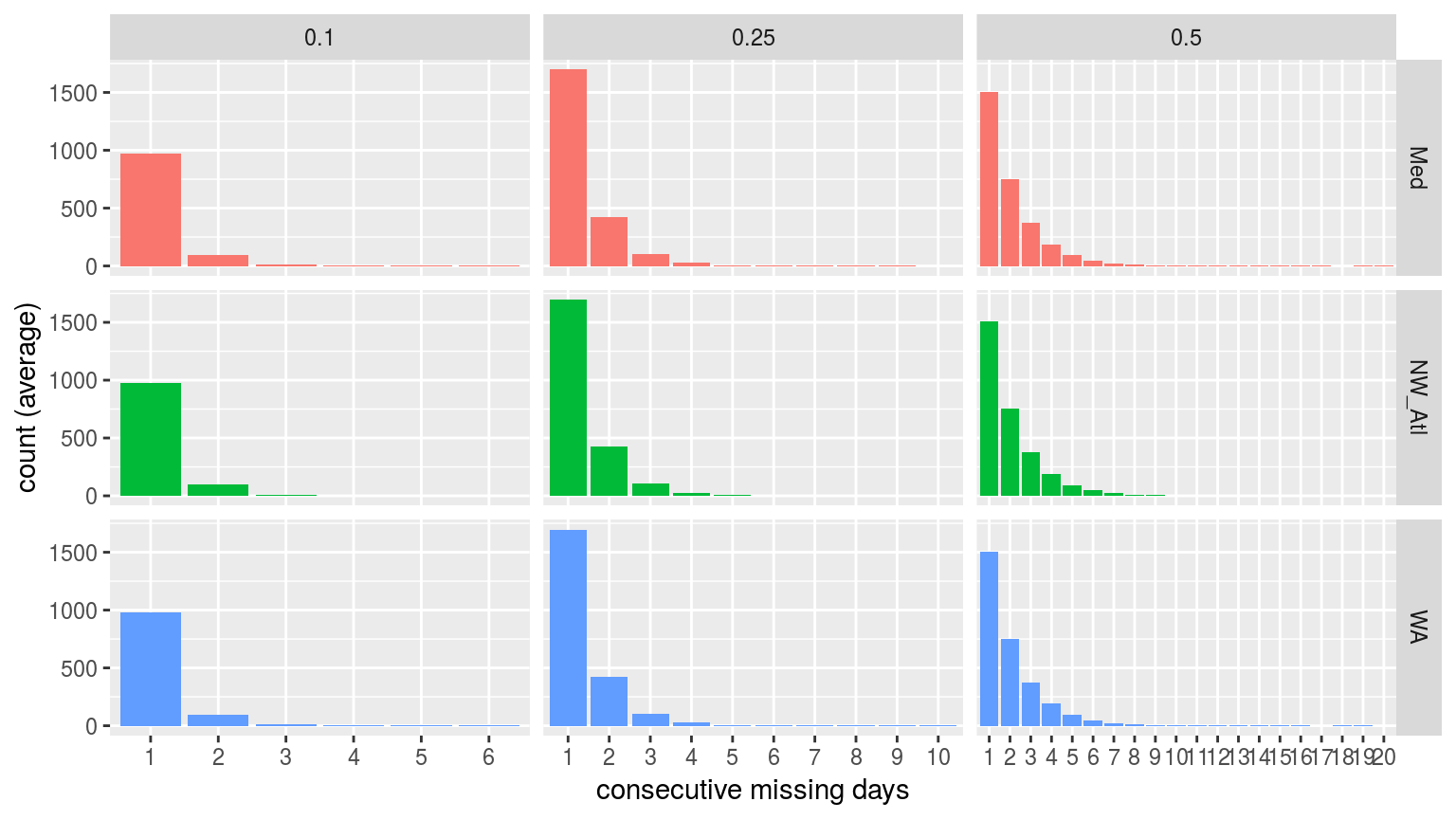
Bar plots showing the average count of consecutive missing days of data per time series at the different missing proportions.
It is reassuring to see that for the 10% and 25% missing data time series there are few instances of consecutive days of missing data greater than two. This is good because the default MHW detection algorithm setting is to interpolate over days with two or fewer missing values. It is therefore unlikely that one or two consecutive days of missing data will affect the resultant clims or MHWs.
Seasonal signal
# Calculate the thresholds for all of the created time series
sst_ALL_clim <- sst_ALL_miss %>%
  group_by(site, miss, rep) %>%
  nest() %>%
  mutate(clim = map(data, ts2clm, climatologyPeriod = c("1982-01-01", "2014-12-31"))) %>%
  select(-data) %>%
  unnest()
save(sst_ALL_clim, file = "data/sst_ALL_clim_miss.Rdata")
# This file is not uploaded to GitHub as it is too large
# One must first run the above code locally to generate and save the file
load("data/sst_ALL_clim_miss.Rdata")# Pull out only seas and thresh for ease of plotting
sst_ALL_clim_only <- sst_ALL_clim %>%
select(site:doy, seas:var) %>%
unique() %>%
arrange(site, miss, rep, doy)
save(sst_ALL_clim_only, file = "data/sst_ALL_clim_only_miss.Rdata")# This file is not uploaded to GitHub as it is too large
# One must first run the above code locally to generate and save the file
load("data/sst_ALL_clim_only_miss.Rdata")# visualise
ggplot(sst_ALL_clim_only, aes(y = seas, x = doy, colour = miss)) +
geom_line(alpha = 0.3) +
facet_wrap(~site, ncol = 1, scales = "free_y") +
labs(x = "calendar day of year", y = "temp (C)")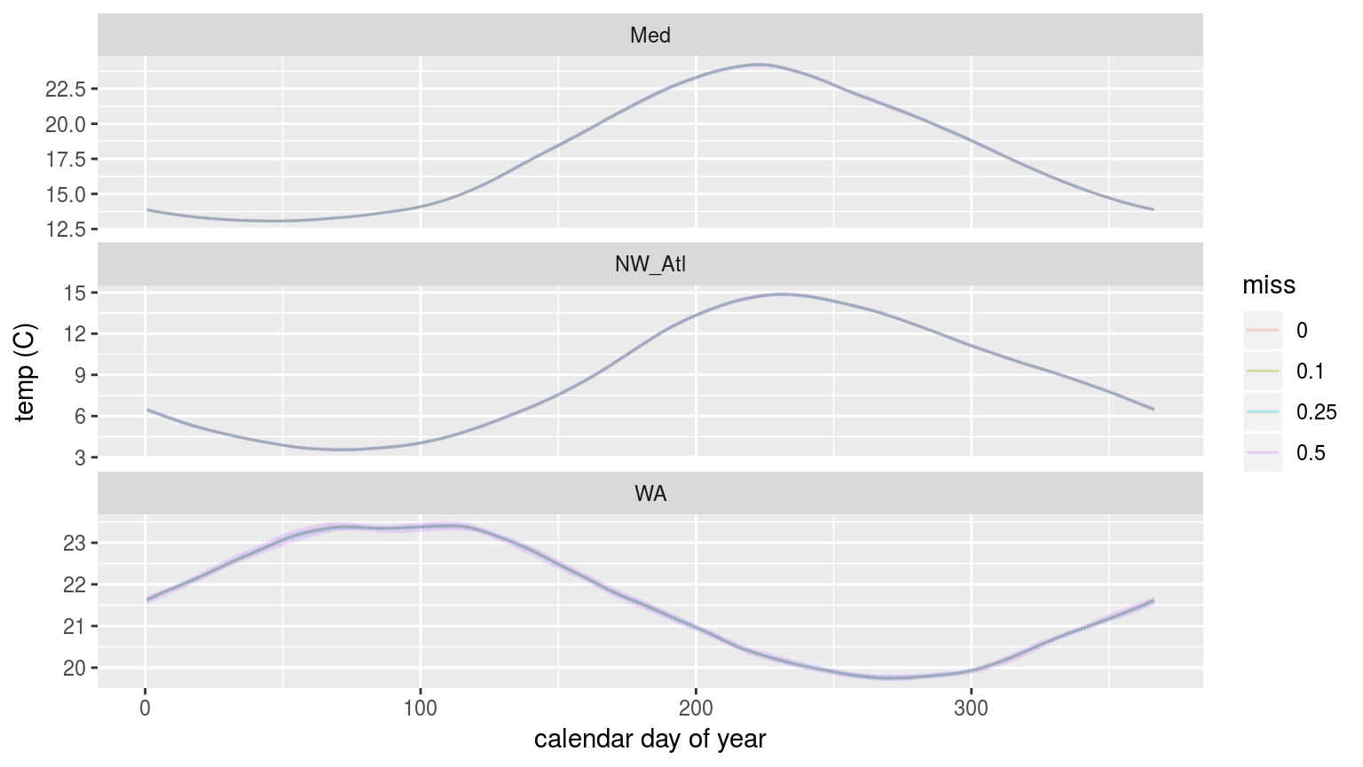
The seasonal signals created from time series with increasingly large proportions of missing data.
As we may see in the figure above, there is no perceptible difference in the seasonal signal created from time series with varying amounts of missing data for the Mediteranean (Med) and North West Atlantic (NW_Atl) times eries. The signal does appear to vary both above and below the real signal at the 50% missing data mark for the Western Australia (WA) time series.
90th percentile threshold
ggplot(sst_ALL_clim_only, aes(y = thresh, x = doy, colour = miss)) +
  geom_line(alpha = 0.3) +
  facet_wrap(~site, ncol = 1, scales = "free_y") +
  labs(x = "calendar day of year", y = "temp (C)")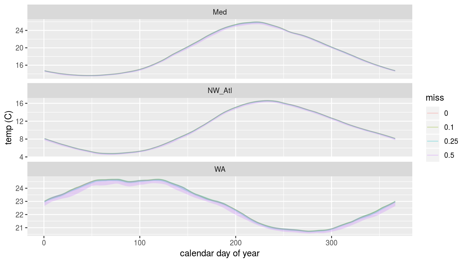
The 90th percentile thresholds created from time series with increasingly large proportions of missing data.
In the figure above we are able to see that the 90th percentile threshold is lower for the time series missing 50% of their data, but that 10% and 25% do not appear different. This is most pronounced for the Western Australia (WA) time series. This will likely have a significant impact on the size of the MHWs detected.
Climatology statistics
ANOVA p-values
Before we calculate the MHW metrics, let’s look at the output of an ANOVA comparing the seasonal and threshold values against one another across the different proportions of missing data for each time series.
# The ANOVA results
sst_ALL_clim_aov_p <- sst_ALL_clim_only %>%
  select(-doy, -rep) %>%
  mutate(miss = as.factor(miss)) %>%
  group_by(site) %>%
  nest() %>%
  mutate(res = map(data, event_aov_p)) %>%
  select(-data) %>%
  unnest()

ggplot(sst_ALL_clim_aov_p, aes(x = site, y = metric)) +
  geom_tile(aes(fill = p.value)) +
  geom_text(aes(label = round(p.value, 2))) +
  scale_fill_gradient2(midpoint = 0.1)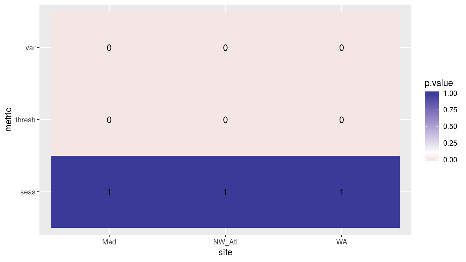
Heatmap showing the ANOVA results for the comparisons of the clim values for the four different proportions of missing data. Both the variance in the climatologies and the 90th percentile thresholds are significantly different at p < 0.05.
If one were to compare this heatmap to those generated by reducing time series length, one would see that the effect of shorter time series on discrepancies between the seasonal signals is much greater than for missing data. The difference for the 90th percentile thresholds from missing data is however significant, and is a more pronounced effect than that created by shorter time series.
Confidence intervals
# The ANOVA confidence intervals
sst_ALL_clim_aov_CI <- sst_ALL_clim_only %>%
  select(-doy, -rep) %>%
  mutate(miss = as.factor(miss)) %>%
  group_by(site) %>%
  nest() %>%
  mutate(res = map(data, event_aov_CI)) %>%
  select(-data) %>%
  unnest()

ggplot(sst_ALL_clim_aov_CI, aes(x = site)) +
  geom_errorbar(position = position_dodge(0.9), width = 0.5,
                aes(ymin = conf.low, ymax = conf.high, linetype = miss)) +
  facet_wrap(~metric, scales = "free_y")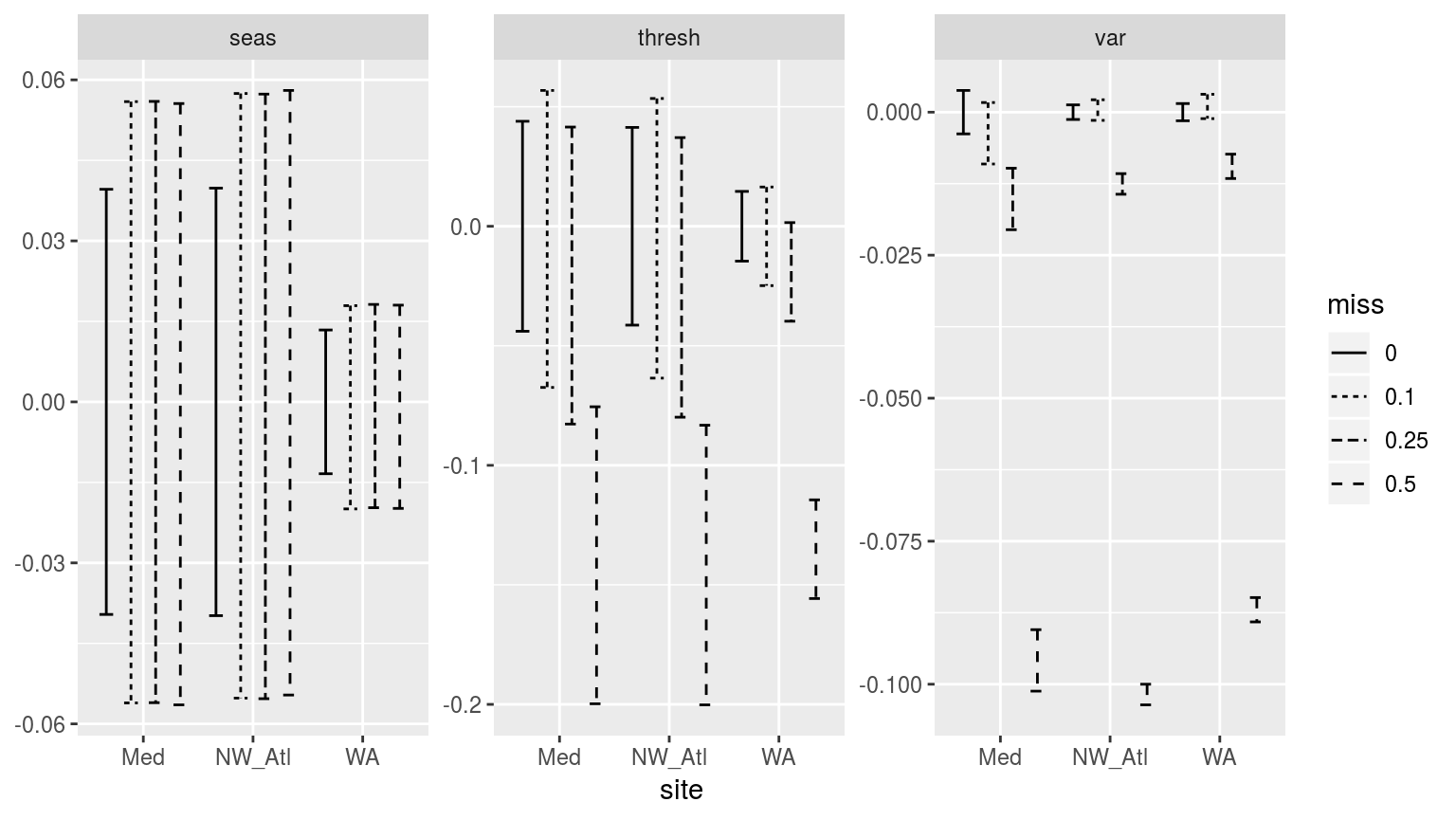
Confidence intervals of the different metrics for the three different clim periods given varrying proportions of missing data.
Whereas p-values do have a use, I find confidence intervals to allow for a better judgement of the relationship between categories of data. In the figure above we see which missing proportions of data set the time eries furthest apart. For the seasonal signals (seas) we see that an increase in missing data does increase the uncertainty in the signal, but it does cause the temperatures in the signal to become warmer or colder. With the 90th percentile threshold (thresh) however, the time series missing 50% of their data have temperature thresholds significantly lower than time series with no missing data. The other missing data proportions also show generally lower thresholds, but they are not significantly so. When we look at the variance (var) panel we see why this may be. At 10% missing data the variance of the measured data does not diverge significantly from the complete data. At 25% it already has, and at 50% the difference is enormous. This appears to show that because the seasonal signal is a smooth composite of the available data the variance in the measurements does not have a large efect on it. The 90th percentile threshold is a different story. For the same reason that bootstrapping did not work for the selection of random years of data in the shorter time series experiments, large amounts of missing data likewise prevent the accurate creation of the 90th percentile thresholds in these experiments. The reason for this is that many of the large (outlier-like, but real) values are not included in the calculation of the 90th percentile, which by necessity requires large values to be calculated accurately.
Kolmogorov-Smirnov
# Extract the true climatologies
sst_ALL_clim_only_0 <- sst_ALL_clim_only %>%
  filter(miss == "0", rep == "1")

# KS function
# Takes one rep of missing data and compares it against the complete signal
## testing...
# df <- sst_ALL_clim_only %>%
#   filter(miss != "0") %>%
#   filter(site == "WA", rep == "23", miss == "0.25") %>%
#   select(-rep, -miss)
clim_KS_p <- function(df){
  df_comp <- sst_ALL_clim_only_0 %>%
    filter(site == df$site[1])
  res <- data.frame(site = df$site[1],
                    seas = ks.test(df$seas, df_comp$seas)$p.value,
                    thresh = ks.test(df$thresh, df_comp$thresh)$p.value,
                    var = ks.test(df$var, df_comp$var)$p.value)
  return(res)
  }

# The KS results
sst_ALL_clim_KS_p <- sst_ALL_clim_only %>%
  filter(miss != "0") %>%
  # select(-doy, -rep) %>%
  mutate(miss = as.factor(miss)) %>%
  mutate(site_i = site) %>%
  group_by(site_i, miss, rep) %>%
  nest() %>%
  mutate(res = map(data, clim_KS_p)) %>%
  select(-data) %>%
  unnest() %>%
  select(site, miss, seas:var) %>%
  gather(key = stat, value = p.value, -site, - miss)

# visualise
ggplot(sst_ALL_clim_KS_p,
       aes(x = p.value, fill = site)) +
  geom_histogram(bins = 20) +
  facet_grid(stat~miss)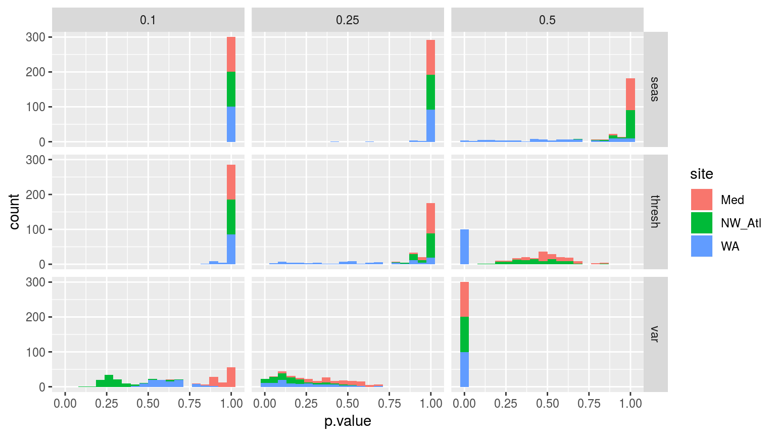
Histograms showing the p-value results from Kolmogorov-Smirnov tests comparing the distributions of each of the 100 replicated climatology statistics against the true (no missing data) climatologies for each of the three sites.
The figure above helps to break down the differences between the climatologies created through randomly missing data. This helps to explain why the seasonal signals do not differ significantly, but why the thresholds and variance distributions do. As we saw in the line graphs above, it is the Western Australia (WA) time series that seems to most quickly deviate from the real signal when missing data are introduced.
It is perhaps a lack of autocorrelation in a time series, or the intra-annual variance in the seasonal signal, that may be a good estimator for the effect that missing data will have on the accuracy of the climatologies calculated.
MHW metrics
Now that we know that missing dara from a time series does produce significantly different 90th percentile thresholds, we want to see what the downstream effects are on the MHW metrics.
# Calculate events
sst_ALL_event <- sst_ALL_clim %>%
  group_by(site, miss, rep) %>%
  nest() %>%
  mutate(res = map(data, detect_event_event)) %>%
  select(-data) %>%
  unnest()
save(sst_ALL_event, file = "data/sst_ALL_event_miss.Rdata")load("data/sst_ALL_event_miss.Rdata")ANOVA
# ANOVA p
sst_ALL_event_aov_p <- sst_ALL_event %>%
  select(site, miss, duration, intensity_mean, intensity_max, intensity_cumulative) %>%
  nest(-site) %>%
  mutate(res = map(data, event_aov_p)) %>%
  select(-data) %>%
  unnest()

# visualise
ggplot(sst_ALL_event_aov_p, aes(x = site, y = metric)) +
  geom_tile(aes(fill = p.value)) +
  geom_text(aes(label = round(p.value, 4))) +
  scale_fill_gradient2(midpoint = 0.1, limits = c(0, 1)) +
  theme(axis.text.y = element_text(angle = 90, hjust = 0.5))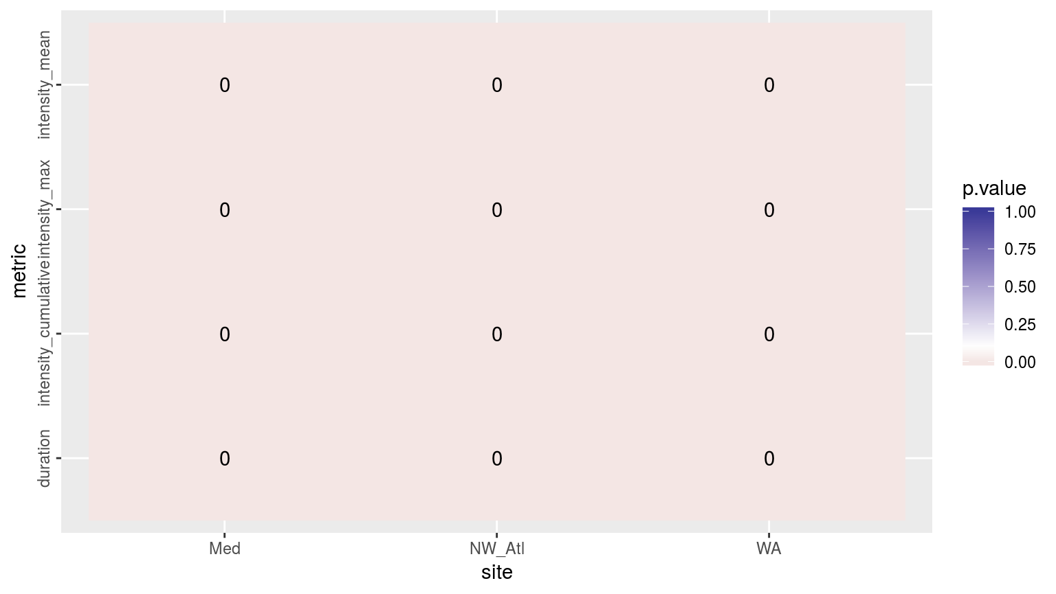
Heatmap showing the ANOVA results for the comparisons of the main four MHW metrics for the four different proportions of missing data. The differences are significant (p <0.05) for all of the metrics.
As we may see in the figure above, all of the metrics differ significantly when various amounts of missing data are introduced into the time series. To see where these differences materialise we will visualise the confidence intervals.
Confidence intervals
# The ANOVA confidence intervals
sst_ALL_event_aov_CI <- sst_ALL_event %>%
  select(site, miss, duration, intensity_mean, intensity_max, intensity_cumulative) %>%
  mutate(miss = as.factor(miss)) %>%
  nest(-site) %>%
  mutate(res = map(data, event_aov_CI)) %>%
  select(-data) %>%
  unnest()

ggplot(sst_ALL_event_aov_CI, aes(x = site)) +
  geom_errorbar(position = position_dodge(0.9), width = 0.5,
                aes(ymin = conf.low, ymax = conf.high, linetype = miss)) +
  facet_wrap(~metric, scales = "free_y")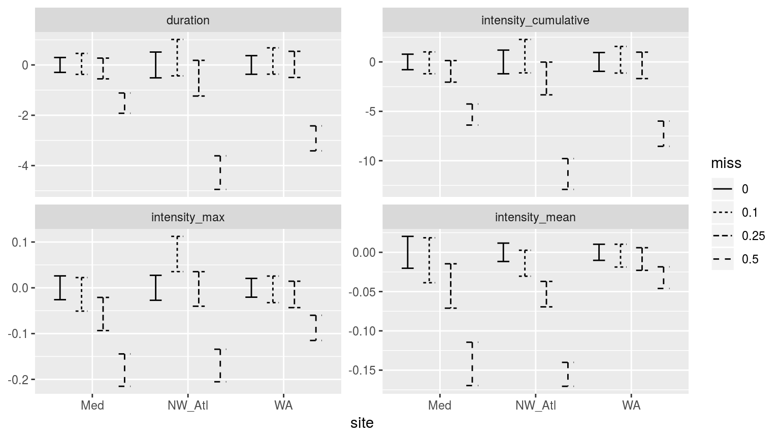
Confidence intervals of the different metrics for the different proportions of missing data. Note that the y-axes are not the same.
As with the climatology values, the MHW metrics from time series missing 50% of their data are significantly different from the control (0% missing), as well as the 10% and 25% missing data groups. There is generally a decrease in the magnitude of the metrics reported as one increases the amounts of missing data, with the exception of the North West Atlantic (NW_Atl) time series, which tends to have larger values reported at 10% missing data. This is important to note as it means that one may not say with certainty that the more data are missing from a time series, the less intense the MHWs detected will be. Though this is generally the case.
Perhaps the increase in max intensity at 10% missing data for the Northwest Atlantic time series is due to many cold-spells pulling the 90th percentile threshold down. Tough it would be odd that this would only emerge at 10% missing data. Remember though that these confidence intervals have been generated from 100 replicates, so it is unlikely this is just a chance effect.
Non-random missing data
There are two realisitic instances of consistent mising data in SST time series. The first is for polar data when satellites cannot collect data because the sea surface is covered in ice. Whereas this would obviously preclude any MHWs from occurring, the question here is how do long stretches of missing data affect the creation of the climatologies, and therefore the detection of MHWs. The other sort of consecutive missing data is for those in situ time series that are collected by hand by (liekly) a government employee that does not work on weekends. In the following two sub-sections we will knock-out data intentionally to simulate these two issues. Lastly, because we have seen above that consecutive missing days of data are problematic, win addition to looking at the effects of missing weekends (2 consecutive days), we wil also look at the effect of 3 and 4 consecutive missing days. I assume that four constant consecutive missing days will render the time series void, but three may be able to squeak by.
Ice-cover
To simulate ice cover we will remove the three winter months from each time series. Because two of the three time series are from the northern hemisphere, the times removed will not be the same for all time series.
# Knock-out ice coverage
sst_WA_ice <- sst_WA %>%
  mutate(month = month(t, label = T),
         site = "WA",
         temp = ifelse(month %in% c("Jul", "Aug", "Sep"), NA, temp)) %>%
  select(-month)
sst_Med_ice <- sst_Med %>%
  mutate(month = month(t, label = T),
         site = "Med",
         temp = ifelse(month %in% c("Jan", "Feb", "Mar"), NA, temp)) %>%
  select(-month)
sst_NW_Atl_ice <- sst_NW_Atl %>%
  mutate(month = month(t, label = T),
         site = "NW_Atl",
         temp = ifelse(month %in% c("Jan", "Feb", "Mar"), NA, temp)) %>%
  select(-month)
sst_ALL_ice <- rbind(sst_WA_ice, sst_NW_Atl_ice, sst_Med_ice)
rm(sst_WA_ice, sst_NW_Atl_ice, sst_Med_ice)

# visualise
ggplot(sst_ALL_ice, aes(x = t, y = temp)) +
  geom_line(data = sst_ALL, alpha = 0.2) +
  geom_line(aes(colour = site)) +
  facet_wrap(~site, scales = "free_y", ncol = 1) +
  labs(x = "", y = "temp. (C)")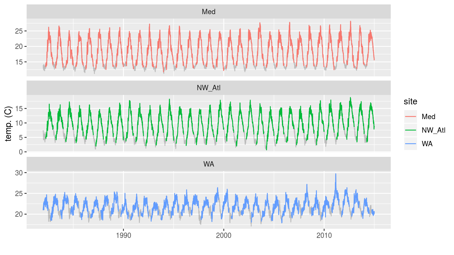
The three time series with artificial ice cover in the winter months removed. The missing data may be seen as a faint grey line filling in the winter months.
In the figure above we see that removing the winter months for the Mediterranean and Northwest Atlantic time series produces relatively even missing gaps near the bottom of each easonal cycle. The Western Australia time series appears to have a much less regular seasonal signal and so the missing data periods vary somehwat more.
# Calculate the thresholds for all of the created time series
sst_ALL_ice_clim <- sst_ALL_ice %>%
  group_by(site) %>%
  nest() %>%
  mutate(clim = map(data, ts2clm, climatologyPeriod = c("1982-01-01", "2014-12-31"))) %>%
  select(-data) %>%
  unnest()
## NB: This throws an error

# Looking at just one specific case
test <- sst_ALL_ice %>%
  filter(site == "WA") %>%
  ts2clm(climatologyPeriod = c("1982-01-01", "2014-12-31"))
## NB: This throws the same error
This is however as far as this experiment may go as the heatwaveR detection algorithm cannot cope with a time series where more than two consecutive DOY’s are missing from a time series.
This is an important finding as it means that any researchers that would like to use a time series with large consecutive missing spans of data may not currently do so. I assume this error would be produced by the python code as well, but I’ve not yet looked.
This may be something we want to fix.
Missing weekends
The detection algorithm may not work with simulated ice cover, but it will work with missing weekends because there not be consecutive missing DOY’s from the times series
sst_ALL_2_day <- sst_ALL %>%
  mutate(weekday = weekdays(t),
         temp = ifelse(weekday %in% c("Saturday", "Sunday"), NA, temp)) %>%
  select(-weekday)

# visualise
ggplot(sst_ALL_2_day, aes(x = t, y = temp)) +
  geom_line(data = sst_ALL, alpha = 0.2) +
  geom_line(aes(colour = site)) +
  facet_wrap(~site, scales = "free_y", ncol = 1) +
  labs(x = "", y = "temp. (C)")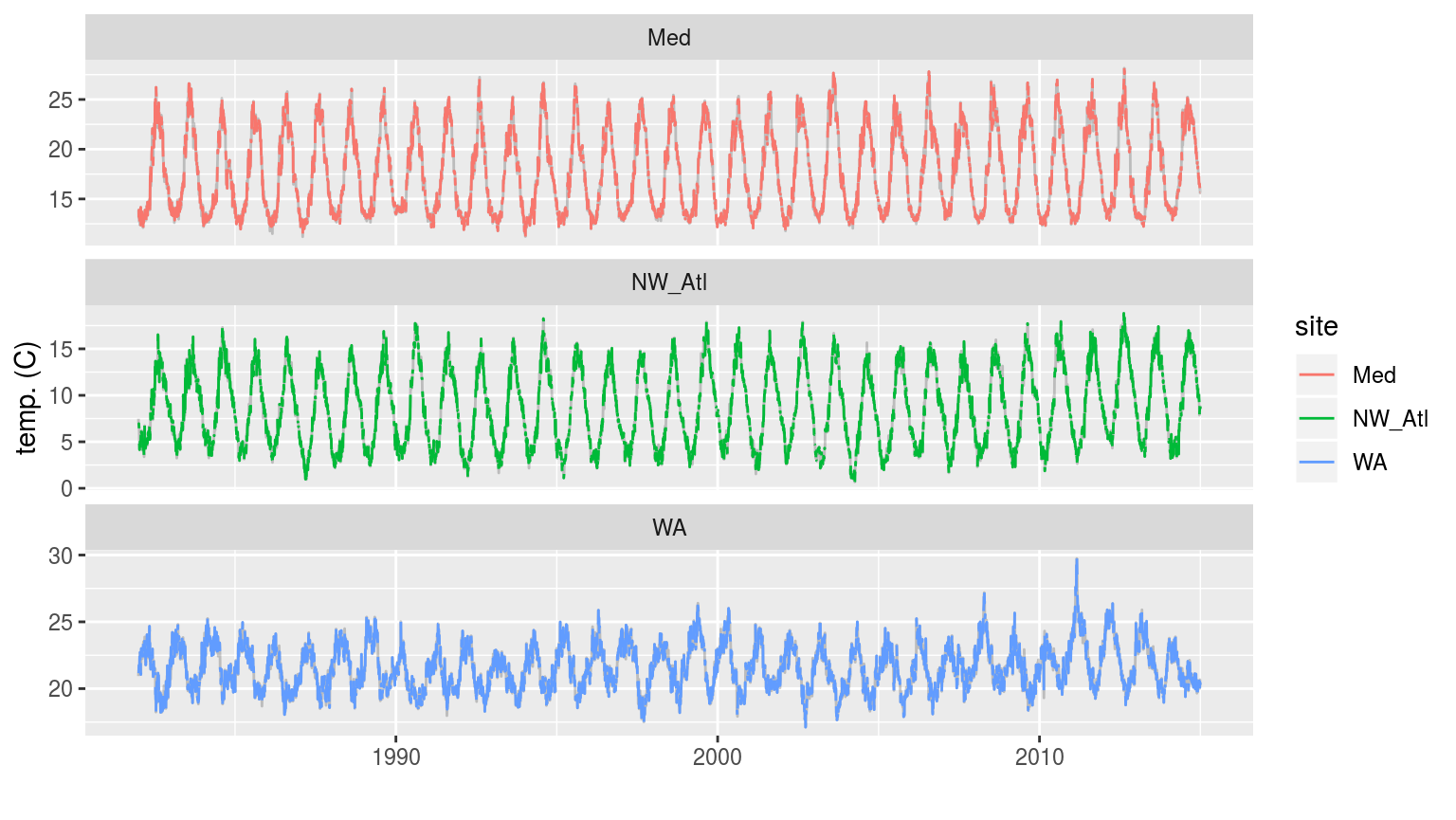
The three time series when weekend days have been removed. The complete time series is shown behind as a faint grey line.
# Calculate the thresholds for all of the created time series
sst_ALL_2_day_clim <- sst_ALL_2_day %>%
  group_by(site) %>%
  nest() %>%
  mutate(clim = map(data, ts2clm, climatologyPeriod = c("1982-01-01", "2014-12-31"))) %>%
  select(-data) %>%
  unnest()

# Pull out the clims only
sst_ALL_2_day_clim_only <- sst_ALL_2_day_clim %>%
  select(-t, -temp) %>%
  unique() %>%
  arrange(site, doy)
Climatology statistics
I’ll not visualise the calculated climatologies here against the control as I don’t expect them to appear much different. Raher I’ll jump straight into the statistical comparisons.
t-test p-values
Because we are only comparing the distribution of two sample sets of data (no missing data vs. missing weekends), we will rather se a t-test to make the comparisons.
clim_ttest_p <- function(df){
  df_comp <- sst_ALL_clim_only %>%
    filter(site == df$site[1])
  res <- data.frame(site = df$site[1],
                    seas = t.test(df$seas, df_comp$seas)$p.value,
                    thresh = t.test(df$thresh, df_comp$thresh)$p.value,
                    var = t.test(df$var, df_comp$var)$p.value)
  return(res)
  }

# The t-test results
sst_ALL_2_day_clim_ttest_p <- sst_ALL_2_day_clim_only %>%
  mutate(site_i = site) %>%
  group_by(site_i) %>%
  nest() %>%
  mutate(res = map(data, clim_ttest_p)) %>%
  select(-data) %>%
  unnest() %>%
  select(site, seas:var) %>%
  gather(key = stat, value = p.value, -site)

# visualise
ggplot(sst_ALL_2_day_clim_ttest_p, aes(x = site, y = stat)) +
  geom_tile(aes(fill = p.value)) +
  geom_text(aes(label = round(p.value, 2))) +
  scale_fill_gradient2(midpoint = 0.1)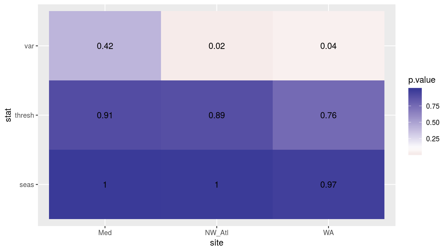
Heatmap showing the t-test results for the comparisons of the clim values for complete time series vs. those missing weekend days.
As with most of the results so far, the variances between the control and the missing weekend time series are significantly different. In this case though for only two of the three time series. The seasonal signals and 90th percentile thresholds do not differ appreciably.
As I’ve run a t-test here and not an ANOVA, I am not going to manually generate CI’s. Also, there are only two time series being compared here so CI’s aren’t as meaningful.
Kolmogorov-Smirnov
# The KS results
sst_ALL_2_day_clim_KS_p <- sst_ALL_2_day_clim_only %>%
  mutate(site_i = site) %>%
  group_by(site_i) %>%
  nest() %>%
  mutate(res = map(data, clim_KS_p)) %>%
  select(-data) %>%
  unnest() %>%
  select(site, seas:var) %>%
  gather(key = stat, value = p.value, -site)

# visualise
ggplot(sst_ALL_2_day_clim_KS_p, aes(x = site, y = stat)) +
  geom_tile(aes(fill = p.value)) +
  geom_text(aes(label = round(p.value, 2))) +
  scale_fill_gradient2(midpoint = 0.1)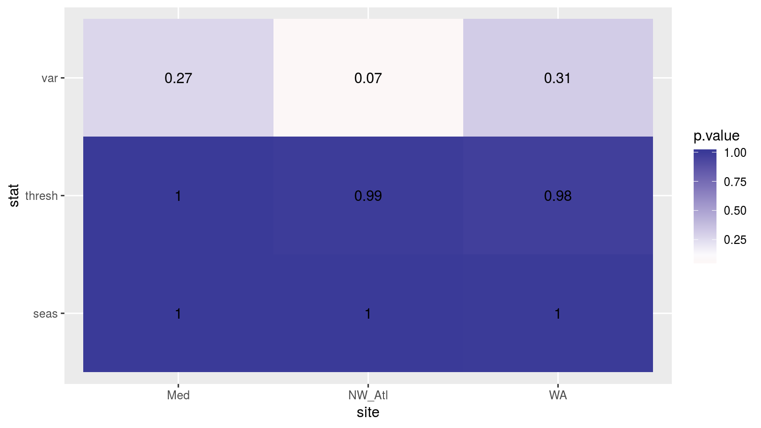
Heatmap showing the Kolmogorov-Smirnov p-values from comparing the climatology distributions for complete against missing weekend time series.
Consistently throughout we see that any minor changes to the time series have appreciable effects on the variance detected in the seasonal signal, but often not on the other climatology values.
MHW metrics
# Calculate events
sst_ALL_2_day_event <- sst_ALL_2_day_clim %>%
  group_by(site) %>%
  nest() %>%
  mutate(res = map(data, detect_event_event)) %>%
  select(-data) %>%
  unnest()

# Function for calculating t-tests on specific event metrics
event_ttest_p <- function(df){
    df_comp <- sst_ALL_event %>%
      filter(site == df$site[1], miss == "0", rep == "1")
    res <- data.frame(site = df$site[1],
                      duration = t.test(df$duration, df_comp$duration)$p.value,
                      intensity_mean = t.test(df$intensity_mean, df_comp$intensity_mean)$p.value,
                      intensity_max = t.test(df$intensity_max, df_comp$intensity_max)$p.value,
                      intensity_cumulative = t.test(df$intensity_cumulative,
                                                    df_comp$intensity_cumulative)$p.value)
  return(res)
}

# The t-test results
sst_ALL_2_day_event_ttest_p <- sst_ALL_2_day_event %>%
  mutate(site_i = site) %>%
  nest(-site_i) %>%
  mutate(res = map(data, event_ttest_p)) %>%
  select(-data) %>%
  unnest() %>%
  select(site:intensity_cumulative) %>%
  gather(key = stat, value = p.value, -site)

# visualise
ggplot(sst_ALL_2_day_event_ttest_p, aes(x = site, y = stat)) +
  geom_tile(aes(fill = p.value)) +
  geom_text(aes(label = round(p.value, 2))) +
  scale_fill_gradient2(midpoint = 0.1, limits = c(0, 1)) +
  theme(axis.text.y = element_text(angle = 90, hjust = 0.5))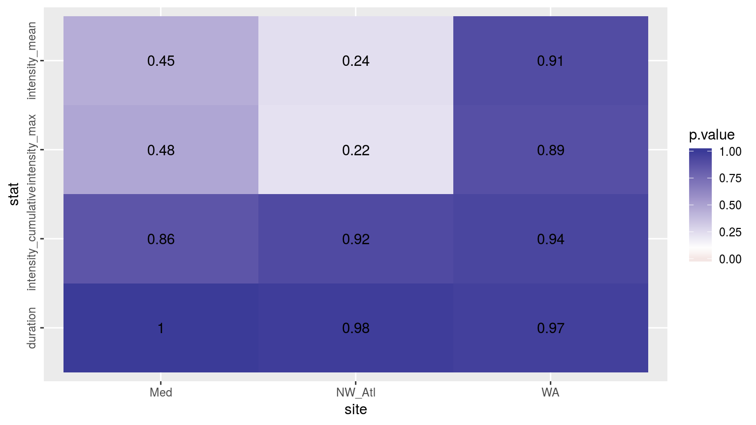
Heatmap showing the t-test results (p-value) comparing MHW metrics for events detected in a complete time series versus one missing weekend days.
The figure above shows the results of t-tests for each metric between the complete time series and when the weekend temperature data have been removed. There is no appreciable impact on the detected duration and cu