Assessing the effects of time series duration
Robert W Schlegel
2019-03-07
time_series_duration.RmdOverview
It has been shown that the length (duration) of a time series may be one of the most important factors in determining the usefulness of those data for any number of applications (Schlegel and Smit 2016). For the detection of MHWs it is recommended that one has at least 30 years of data in order to accurately detect the events therein. This is no longer an issue for most ocean surfaces because many high quality SST products, such as NOAA OISST, are now in exceedence of the 30-year minimum. However, besides issues relating to the coarseness of these older products, there are many other reasons why one would want to detect MHWs in products with shorter records. In situ measurements along the coast are one good example of this, another being the use of the newer higher resolution SST products, a third being the use of reanalysis/model products for the detection of events in 3D. It is therefore necessary to quantify the effects that shorter time series duration (< 30 years) has on the accurate detection of events. Once any discrepancies have been accounted for, best practices must be developed to allow users to improve the precision of the detection of events in their shorter time series.
Time series shortening
A time series derives it’s usefulness from it’s length. This is generally because the greater the number of observations (larger sample size), the more confident one can be about the resultant statistics. This is particularly true for decadal scale measurements and is why the WMO recommends a minimum of 30 years of data before drawing any conclusions about decadal (long-term) trends observed in a time series. We however want to look not at decadal scale trends, but rather at how observed MHWs compare against one another when they have been detected using longer or shorter time series. In order to to quantify this effect we will use the minimum and maximum range of time series available to us. The maximum length will be 37 years, as this is the full extent of the NOAA OISST data included in heatwaveR. The minimum length for comparing the seasonal signal and 90th percentile thresholds will be three years as his is the minimum number of years required to calculate a climatology. For comparing MHWs the minimum will be ten years so that we may still have enough events detected between shortened time series to produce robust statistics.
Before we can discuss shortening techniques, we must first consider the inherent decadal trend in the time series themselves. This is usually the primary driver for much of the event detection changes over time (Oliver et al. 2018). Therefore, if we truly want to understand the effect that a shortened time series may have on event detection, apart from the effect of the decadal trend, we must de-trend the time series first. To this end there is an entire separate vignette that quantifies the effect of long-term trends on the detection of events.
The time series shortening technique proposed here is re-sampling. This methodology takes the full 37 year de-trended time series and randomly samples n years from it to simulate a 3 – 37 year time series. One then uses the jumbled up, randomly selected years of data to create the seasonal signal and 90th percentile threshold (hereafter referred to as “the climatologies”). Re-sampling the time series in this way is useful because it allows us to replicate random climatology creation 100 (or more) times for each time series length in order to produce a more confident estimation of how likely climatologies generated from certain time series lengths are to impact the accuracy of event detection. It also allows us to see how consistent the size of MHWs are in a given time series, or if they very quite a bit depending on the years used.
The WMO recommends that the period used to create a climatology be 30 years in length, starting on the first year of a decade (e.g. 1981), however; because we are going to be running these analyses on many time series shorter than 30 years, for the sake of consistency we will use all of the years present in each re-sampled time series them as the climatology period, regardless of length. For example, if a time series spans 1982 – 2018, that will be the period used for calculating the climatologies. Likewise, should the time series only span the years 2006 – 2018, that will be the period used.
The effect this has on the climatologies will be quantified through the following statistics:
- An ANOVA will compare the climatologies created from different lengths;
- A post-hoc Tukey test to determine where the difference in time series length for climatology creation become significant;
- Correlations between time series length/SD and seas/thresh mean/SD
- Kolmogorov-Smirnov test for where the climatologies diverge significantly from the 30 year climatologies
The effect this has on the MHW metrics will be quantified with the following statistics:
- ANOVA comparing the primary metrics for MHWs detected using different time series lengths;
- A post-hoc Tukey test to show where the difference in time series length for event detection become significant;
- Confidence intervals (CIs) for the measured metrics
- Correlations between time series length/SD and MHW metrics
In addition to checking all of the statistics mentioned above, it is also necessary to record what the overall relationship is with the reduction of time series length and the resultant climatologies/metrics. For example, are MHWs on average more intense in shorter time series or less? We must also look into how the categories of the events are affected. This will form part of the best practice advice later.
Re-sampling
Below we use re-sampling to simulate 100 time series at each length of 3 – 37 years on de-trended data. This is presently being done with the three pre-packaged time series available in the heatwaveR package and the python distribution, but eventually will be run on the global data. The original data are appended to these 100 re-samples as rep = 0.
library(tidyverse)
library(broom)
library(heatwaveR, lib.loc = "../../R-packages/")
# cat(paste0("heatwaveR version = ",packageDescription("heatwaveR")$Version))
library(lubridate) # This is intentionally activated after data.table
library(fasttime)
library(ggpubr)
library(boot)
library(FNN)
library(mgcv)
library(doMC); doMC::registerDoMC(cores = 50)

MHW_colours <- c(
  "I Moderate" = "#ffc866",
  "II Strong" = "#ff6900",
  "III Severe" = "#9e0000",
  "IV Extreme" = "#2d0000"
)
# First put all of the data together and create a site column
sst_ALL <- rbind(sst_Med, sst_NW_Atl, sst_WA) %>%
mutate(site = rep(c("Med", "NW_Atl", "WA"), each = 13514))
save(sst_ALL, file = "data/sst_ALL.Rdata")
# Function to remove the trend from a time series
detrend <- function(df){
resids <- broom::augment(lm(temp ~ t, df))
res <- df %>%
mutate(temp = temp - resids$.fitted)
return(res)
}
# Then create a de-trended version
sst_ALL_detrend <- sst_ALL %>%
group_by(site) %>%
do(detrend(.)) %>%
ungroup() %>%
as.tibble(.) %>%
select(site, t, temp)
save(sst_ALL_detrend, file = "data/sst_ALL_detrend.Rdata")# Function for creating a re-sample from 37 years of data
sample_37 <- function(rep){
year_filter <- c(1,2,3)
while(length(unique(year_filter)) != 37){
year_filter <- factor(sample(1982:2018, size = 37, replace = F))
}
res <- data.frame()
for(i in 1:length(year_filter)){
df_sub <- sst_ALL_detrend %>%
filter(year(t) == year_filter[i],
# Remove leap-days here
paste0(month(t),"-",day(t)) != "2-29") %>%
mutate(year = seq(1982,2018)[i],
month = month(t),
day = day(t),
year_orig = year(t)) %>%
mutate(t = as.Date(fastPOSIXct(paste(year, month, day, sep = "-")))) %>%
select(-year, -month, -day)
res <- rbind(res, df_sub)
}
res$rep <- as.character(rep)
return(res)
}
# Re-sample the data 100 times
doMC::registerDoMC(cores = 25)
sst_ALL_repl <- plyr::ldply(1:100, sample_37, .parallel = T)
# Add the original data as rep = "0"
sst_ALL_0 <- sst_ALL_detrend %>%
mutate(year_orig = year(t),
rep = "0")
sst_ALL_repl <- rbind(sst_ALL_0, sst_ALL_repl)
save(sst_ALL_repl, file = "data/sst_ALL_repl.Rdata")
rm(sst_ALL_0)load("data/sst_ALL_repl.Rdata")
# Calculate climatologies, events, and categories on shrinking time series
shrinking_results <- function(year_begin){
sst_ALL_res <- sst_ALL_repl %>%
select(-year_orig) %>%
filter(year(t) >= year_begin) %>%
mutate(year_index = 2018-year_begin+1) %>%
group_by(rep, site, year_index) %>%
nest() %>%
mutate(clims = map(data, ts2clm,
climatologyPeriod = c(paste0(year_begin,"-01-01"), "2018-12-31")),
events = map(clims, detect_event),
cats = map(events, category)) %>%
select(-data, -clims)
return(sst_ALL_res)
}
# Run this preferably with at least 35 cores for speed, RAM allowing
doMC::registerDoMC(cores = 50)
sst_ALL_smooth <- plyr::ldply(1982:2016, shrinking_results, .parallel = T)
save(sst_ALL_smooth, file = "data/sst_ALL_smooth.Rdata")
rm(sst_ALL_repl)Climatology statistics
We will now see if the 100 re-sampled time series produce significantly different climatologies as they are shortened. If so, we also want to see at what point the climatologies begin to diverge.
ANOVA p-values
# Run an ANOVA on each metric of the combined event results and get the p-value
# df <- res
aov_p <- function(df){
  aov_models <- df[ , -grep("year_index", names(df))] %>%
    map(~ aov(.x ~ df$year_index)) %>%
    map_dfr(~ broom::tidy(.), .id = 'metric') %>%
    mutate(p.value = round(p.value, 4)) %>%
    filter(term != "Residuals") %>%
    select(metric, p.value)
  return(aov_models)
  }

# Run an ANOVA on each metric and then a Tukey test
aov_tukey <- function(df){
  aov_tukey <- df[ , -grep("year_index", names(df))] %>%
    map(~ TukeyHSD(aov(.x ~ df$year_index))) %>%
    map_dfr(~ broom::tidy(.), .id = 'metric') %>%
    mutate(p.value = round(adj.p.value, 4)) %>%
    # filter(term != "Residuals") %>%
    select(metric, comparison, adj.p.value) %>%
    # filter(adj.p.value <= 0.05) %>%
    arrange(metric, adj.p.value)
  return(aov_tukey)
}

# Quick wrapper for getting results for ANOVA and Tukey on clims
# df <- sst_ALL_smooth %>%
#   filter(rep == "1", site == "WA") %>%
#   select(-rep, -site)
clim_aov_tukey <- function(df){
  res <- df %>%
    unnest(events) %>%
    filter(row_number() %% 2 == 1) %>%
    unnest(events) %>%
    select(year_index, seas, thresh) %>%
    mutate(year_index = as.factor(year_index)) %>%
    unique() %>%
    nest() %>%
    mutate(aov = map(data, aov_p),
           tukey = map(data, aov_tukey)) %>%
    select(-data)
  return(res)
}
# This file is not uploaded to GitHub as it is too large
# One must first run the above code locally to generate and save the file
load("data/sst_ALL_smooth.Rdata")
doMC::registerDoMC(cores = 50)
sst_ALL_smooth_aov_tukey <- plyr::ddply(sst_ALL_smooth, c("rep", "site"),
clim_aov_tukey, .parallel = T)
save(sst_ALL_smooth_aov_tukey, file = "data/sst_ALL_smooth_aov_tukey.RData")
# rm(sst_ALL_smooth, sst_ALL_smooth_aov_tukey)load("data/sst_ALL_smooth_aov_tukey.RData")
sst_ALL_smooth_aov <- sst_ALL_smooth_aov_tukey %>%
select(-tukey) %>%
unnest()
label_count_aov_p <- sst_ALL_smooth_aov %>%
group_by(site, metric) %>%
filter(p.value <= 0.05) %>%
summarise(count = n())
knitr::kable(label_count_aov_p,
col.names = c("Time series", "Climatology", "Significantly different"),
caption = "Table 1: This table shows the results of 101 ANOVAs on the real and re-sampled time series with systematically shortened lengths from 37 -- 3 years. Note that the climatologies for the Med time series were never significantly different and so aren't shown here.")| Time series | Climatology | Significantly different |
|---|---|---|
| NW_Atl | seas | 1 |
| NW_Atl | thresh | 15 |
| WA | seas | 54 |
| WA | thresh | 84 |
rm(sst_ALL_smooth_aov, label_count_aov_p)The above figure shows that there are no significant differences in the climatologies for the Mediterannean and relatively few for the North West Atlantic time series. We do however see that of the 100 re-samples for the Western Australia time series, 54 of the seasonal signals and 84 of the thresholds did differ significantly at some point during the shortening.
Post-hoc Tukey test
To get a more precise pictures of where these differences are occurring we will need to look at the post-hoc Tukey test results.
sst_ALL_smooth_tukey <- sst_ALL_smooth_aov_tukey %>%
  select(-aov) %>%
  unnest()

clim_tukey_sig <- sst_ALL_smooth_tukey %>%
  filter(adj.p.value <= 0.05) %>%
  separate(comparison, into = c("year_long", "year_short"), sep = "-") %>%
  mutate(year_long = as.numeric(year_long),
         year_short = as.numeric(year_short)) %>%
  mutate(year_dif = year_long - year_short) %>%
  # select(-adj.p.value, -rep) %>%
  group_by(site, metric, year_long, year_short, year_dif) %>%
  summarise(count = n()) %>%
  ungroup() %>%
  arrange(-year_long, -year_dif) %>%
  mutate(year_index = factor(paste0(year_long,"-",year_dif)),
         year_index = factor(year_index, levels = unique(year_index)))
# levels(clim_tukey_sig$year_index)

ggplot(clim_tukey_sig, aes(x = year_long, y = year_short)) +
  # geom_point() +
  # geom_errorbarh(aes(xmin = year_long, xmax = year_short)) +
  geom_tile(aes(fill = count)) +
  facet_grid(metric~site) +
  scale_x_reverse(breaks = seq(3, 36, 3)) +
  scale_y_reverse(breaks = seq(4 , 16, 2)) +
  scale_fill_viridis_c("count out of \n101 re-samples") +
  labs(x = "Length (years) of long time series",
       y = "Length (years) of short time series")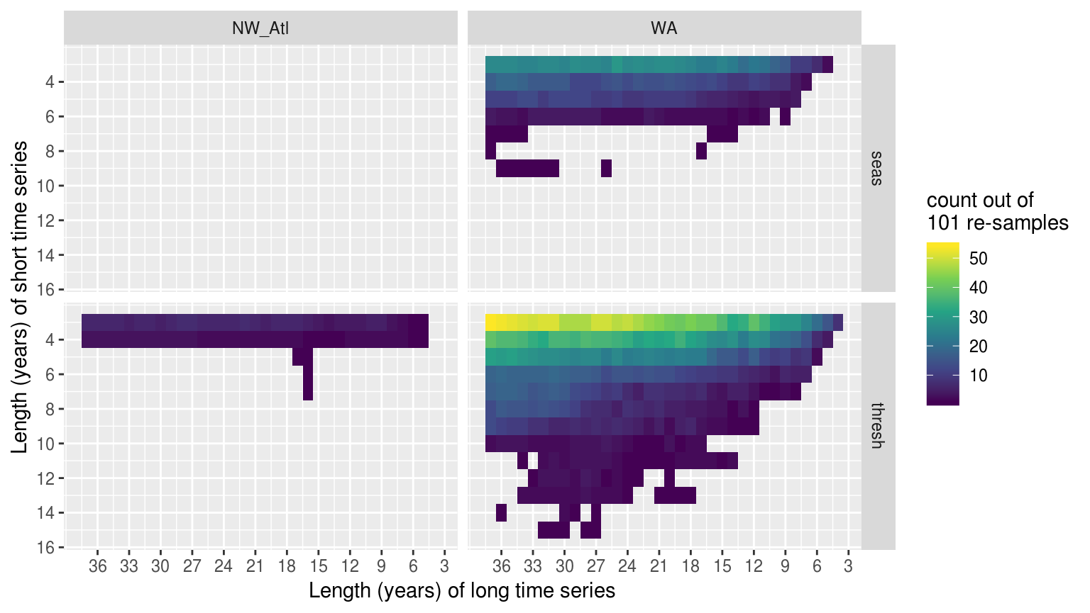
Heatmap showing the distribution of the difference in years for climatologies that were significantly different within the same time series when different lengths of the time series were used to calculate the thresholds. The y axis shows the range of shorter time series lengths that produced significant results when compared to longer time series lengths, which are shown on the x axis. The fill at each pixel shows the count out of 101 re-samples in which the comparison of these two time series lengths were significantly different.
rm(sst_ALL_smooth_aov_tukey, sst_ALL_smooth_tukey, clim_tukey_sig)The above figure shows us that as few as a four year difference in time series length was able to create significantly different thresholds, but that the most common difference was 14 – 17 years with the distribution left-skewed.
Kolmogorov-Smirnov tests
Whereas the above figure does reveal to us that shorter time series are more often significantly different than longer time series, it takes quie a while to decipher this information and it doesn’t seem very helpful to know this level of detail. Rather I think it would be more useful to simply run a series of Kolmogorov-Smirnov tests for each length of each re-sampled time series to see how often the climatology distributions are significantly different from the climatologies at the 30 year length. This is not only a more appropriate test for these climatology data than an ANOVA, it is also a more simplified way of understanding the results.
load("data/sst_ALL_smooth.Rdata")

# Extract climatology values only
sst_ALL_clim_only <- sst_ALL_smooth %>%
  unnest(events) %>%
  filter(row_number() %% 2 == 1) %>%
  unnest(events) %>%
  select(rep:doy, seas:thresh) %>%
  unique() %>%
  arrange(site, rep, -year_index, doy)

save(sst_ALL_clim_only, file = "data/sst_ALL_clim_only.Rdata")
rm(sst_ALL_smooth, sst_ALL_clim_only)load("data/sst_ALL_clim_only.Rdata")
# Function for running a pairwise KS test against the
KS_sub <- function(df_2, df_1){
suppressWarnings( # Suppress warnings about perfect matches
res <- data.frame(seas = round(ks.test(df_1$seas, df_2$seas)$p.value, 4),
thresh = round(ks.test(df_1$thresh, df_2$thresh)$p.value, 4),
year_1 = df_1$year_index[1],
year_2 = df_2$year_index[1])
)
return(res)
}
# Wrapper function to run all pairwise KS tests
df <- sst_ALL_clim_only %>%
filter(rep == "30", site == "WA")
KS_all <- function(df){
# The 30 year clims against which all are compared
df_30 <- df %>%
filter(year_index == 30)
# The results
res <- df %>%
mutate(year_index2 = year_index) %>%
group_by(year_index2) %>%
nest() %>%
mutate(KS = map(data, KS_sub, df_1 = df_30)) %>%
select(-data, -year_index2) %>%
unnest() %>%
tidyr::gather(key = "metric", value = "p.value", -year_1, -year_2)
return(res)
}
doMC::registerDoMC(cores = 50)
sst_ALL_KS <- plyr::ddply(sst_ALL_clim_only, KS_all,
.variables = c("rep", "site"), .parallel = T)
save(sst_ALL_KS, file = "data/sst_ALL_KS.Rdata")
rm(sst_ALL_clim_only, sst_ALL_KS)load("data/sst_ALL_KS.Rdata")
# Filter non-significant results
KS_sig <- sst_ALL_KS %>%
filter(p.value <= 0.05) %>%
group_by(site, metric, year_2) %>%
summarise(count = n()) %>%
ungroup()
# Pad in NA for years with no significant differences
KS_sig <- padr::pad_int(x = KS_sig, by = "year_2", group = c("site", "metric")) %>%
select(site, metric, year_2, count) %>%
rbind(data.frame(site = "Med", metric = "seas", year_2 = 25:37, count = NA))
ggplot(KS_sig, aes(x = year_2, y = site)) +
geom_line(aes(colour = count)) +
geom_vline(aes(xintercept = 30), alpha = 0.7, linetype = "dotted") +
facet_wrap(~metric, ncol = 1) +
scale_colour_viridis_c() +
scale_x_reverse(breaks = seq(5, 35, 5)) +
labs(x = "Climatology period (years)",
y = NULL,
colour = "Sig. dif.\nout of 101")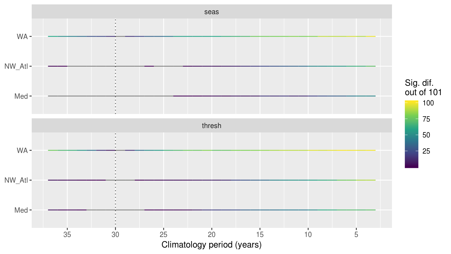
Time series showing the results of pairwise Kolmogorov-Smirnoff tests for the climatologies from the same time series at differing lengths. The colour of the line shows how many times out of 101 re-samples that the location along the y-axis was significantly different from the 30 year climatology. The dotted verticle line denotes the 30 year climatology mark, against which all othe climatologies were compared. If no re-samplings were significantly different this is shown with a grey line.
rm(sst_ALL_KS, KS_sig)The above figure shows that the results of the KS tests were more often significantly different than the ANOVAs. This means that the actual shape of the distributions changes rather quicklky, as shown by how it only takes a few years for the KS test to show the results as being different. The ANOVAs report fewer significant differences because that is a test of central tendency. Meaning that the shape of the climatologies changes rather quickly depending on the climatology period used, but the overall range of values within a climatology does not differ significantly as quickly.
load("data/sst_ALL_clim_only.Rdata")

sst_ALL_clim_0 <- sst_ALL_clim_only %>%
  filter(rep == "0") %>%
  arrange(year_index)

ggplot(data = sst_ALL_clim_0, aes(x = doy, y = thresh)) +
  geom_line(aes(group = year_index, colour = year_index), alpha = 0.8) +
  facet_wrap(~site, ncol = 1) +
  scale_colour_viridis_c()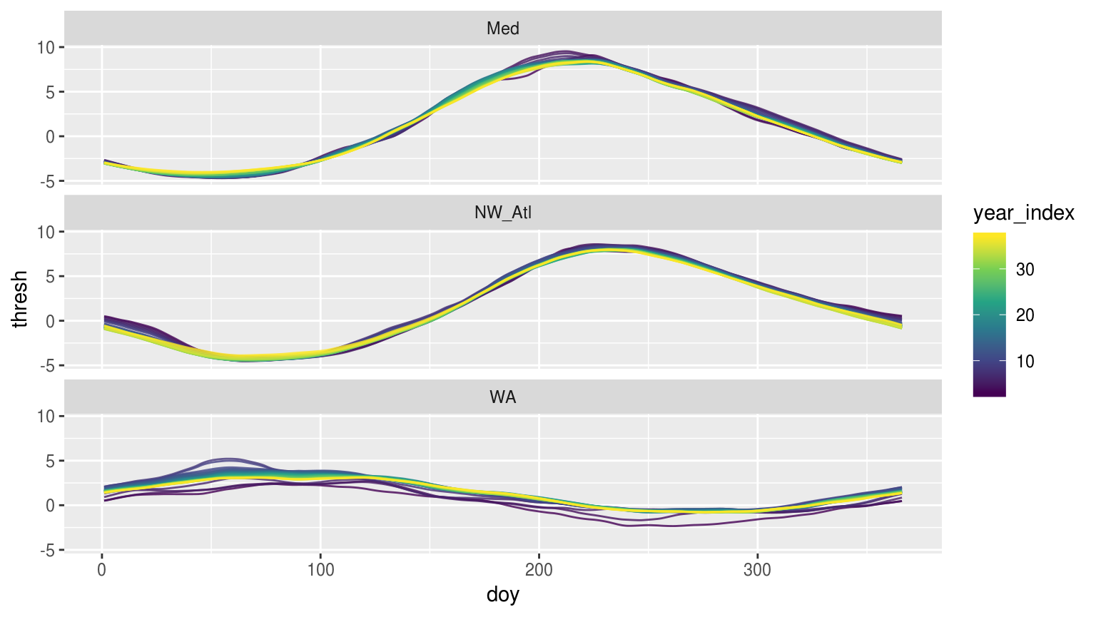
Time series of each of climatology period used form the original data shown overlapping one another to visualise how the climatologies differ depending on the length of the climatology period used.
The above figure shows us that the larger the seasonal signal is, the less effect deviations away from it will likely have.
Correlations
load("data/sst_ALL_smooth.Rdata")
# Summary stats for correlation
sst_ALL_smooth_cor_base <- sst_ALL_smooth %>%
  unnest(events) %>%
  filter(row_number() %% 2 == 1) %>%
  unnest(events) %>%
  select(rep, site, year_index, temp, seas, thresh) %>%
  group_by(rep, site, year_index) %>%
  summarise(temp_sd = sd(temp, na.rm = T),
            seas_mean = mean(seas),
            seas_sd = sd(seas),
            thresh_mean = mean(thresh),
            thresh_sd = sd(thresh)) %>%
  # select(-year_index) %>%
  group_by(rep, site)
save(sst_ALL_smooth_cor_base, file = "data/sst_ALL_smooth_cor_base.RData")
rm(sst_ALL_smooth, sst_ALL_smooth_cor_base)load("data/sst_ALL_smooth_cor_base.RData")
# library(corrr)
sst_ALL_smooth_cor_length <- sst_ALL_smooth_cor_base %>%
do(data.frame(t(cor(.[,5:8], .[,3])))) %>%
gather(key = y, value = r, -rep, -site) %>%
mutate(x = "length")
sst_ALL_smooth_cor_sd <- sst_ALL_smooth_cor_base %>%
do(data.frame(t(cor(.[,c(5:8)], .[,4])))) %>%
gather(key = y, value = r, -rep, -site) %>%
mutate(x = "sd")
sst_ALL_smooth_cor <- rbind(sst_ALL_smooth_cor_length, sst_ALL_smooth_cor_sd)
ggplot(sst_ALL_smooth_cor, aes(x = y, y = r, fill = y)) +
geom_boxplot() +
scale_fill_viridis_d() +
facet_grid(site~x)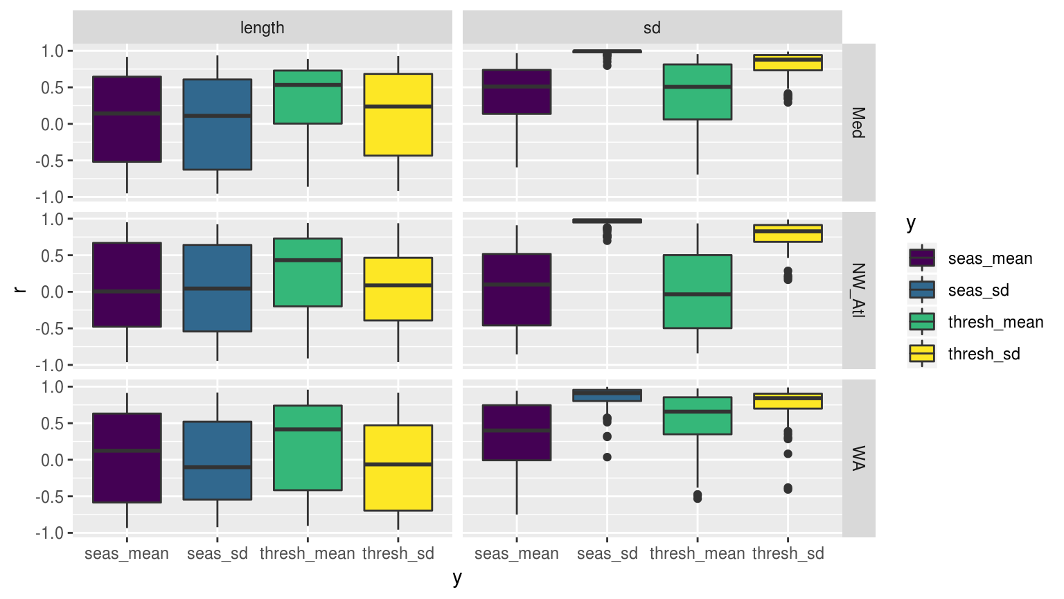
Boxplots showing the distribution of Pearson’s r values for the correlation between the mean and SD of the climatologies for the time series of varying lengths of each of the three reference time series.
rm(sst_ALL_smooth_cor, sst_ALL_smooth_cor_base, sst_ALL_smooth_cor_length, sst_ALL_smooth_cor_sd)The above figure shows us that all three reference time series respond relatively similarly with regards to the correlations of their climatology means and SD to the length and SD of the base temperatures from which the climatologies were derived. Though the patterns observed otherwise tell us little, it is an important finding to know that this dud pattern is consistent across the different reference time series. The other important pattern this figure shows is that the length of a time series appears to not have a consistent relationship with the resultant climatologies. Instead we see that it is the variance in the time series that tends to have a positive relationship with the variance, and to a lesser extent the means, in the climatologies.
The pattern that is beginning to emerge from the results for the climatologies is that what matters most for the difference in the results is how much variance is present in the base time series, meaning how large is the seasonal signal relative to the temperatures in the time series. This variance could also be a representation of the presence of extreme temperature differences. Relating to the reseach question here this means large MHWs. It must therefore be investigated what the relationship is between categories of MHWs and the significant differences detected in the thresholds in the WA time series. It should also be taken into consideration that whenever the re-sampled time series have the year 2011, the massive MHW, these will likely be the ones producing significantly different results.
MHW metrics
With the effects of time series duration on the climatologies now mapped out it is time to apply a similar methodology to the MHW metrics. In order to produce more robust statistics we will now use only results from time series of lengths 37 –10 years and will only compare events that occurred in the most recent 10 years of each time series.
# Quick wrapper for getting results for ANOVA on events
# df <- sst_ALL_smooth %>%
#   filter(rep == "1", site == "WA") %>%
#   select(-rep, -site)
event_aov_tukey <- function(df){
  res <- df %>%
    unnest(events) %>%
    filter(row_number() %% 2 == 0) %>%
    unnest(events) %>%
    filter(year_index >= 10) %>%
    filter(date_start >= "2009-01-02", date_end <= "2018-12-31") %>%
    select(year_index, duration, intensity_mean, intensity_max, intensity_cumulative) %>%
    mutate(year_index = as.factor(year_index)) %>%
    nest() %>%
    mutate(aov = map(data, aov_p),
           tukey = map(data, aov_tukey)) %>%
    select(-data)
  return(res)
}
ANOVA p-values
load("data/sst_ALL_smooth.Rdata")
doMC::registerDoMC(cores = 50)
sst_ALL_event_aov_tukey <- plyr::ddply(sst_ALL_smooth, c("rep", "site"), event_aov_tukey, .parallel = T)
save(sst_ALL_event_aov_tukey, file = "data/sst_ALL_event_aov_tukey.RData")
# This file is not uploaded to GitHub as it is too large
# One must first run the above code locally to generate and save the file
load("data/sst_ALL_event_aov_tukey.RData")
sst_ALL_event_aov <- sst_ALL_event_aov_tukey %>%
select(-tukey) %>%
unnest()
label_count_event_aov_p <- sst_ALL_event_aov %>%
group_by(site, metric) %>%
filter(p.value <= 0.05) %>%
summarise(count = n())
knitr::kable(label_count_event_aov_p,
col.names = c("Time series", "MHW metric", "Significantly different"),
caption = "Table 1: This table shows the results of 101 ANOVAs on event metrics detected in the real and re-sampled time series with systematically shortened lengths from 37 -- 10 years.")| Time series | MHW metric | Significantly different |
|---|---|---|
| NW_Atl | duration | 3 |
| NW_Atl | intensity_cumulative | 3 |
| NW_Atl | intensity_max | 1 |
| NW_Atl | intensity_mean | 5 |
| WA | duration | 1 |
| WA | intensity_max | 1 |
| WA | intensity_mean | 3 |
The above table shows us that generally the length of a time series has no significant effect on the MHWs detected within it. We see that the MHWs in the Mediterranean time series are not affected at all in any of the 101 replicates. Surprisingly the events in the North West Atlantic time series are significantly different more often than the Western Australia time series. This must mean that the event metrics are more sensistive to a number of longer larger events than a single large one, as is the case in the WA time series. This also means that the thresholds between shortened time series may not need to be significantly different in order to produce significantly different events. It must now be investigate just which years are significantly different from one another.
Post-hoc Tukey test
sst_ALL_event_tukey <- sst_ALL_event_aov_tukey %>%
  select(-aov) %>%
  unnest()

event_tukey_sig <- sst_ALL_event_tukey %>%
  filter(adj.p.value <= 0.05) %>%
  separate(comparison, into = c("year_long", "year_short"), sep = "-") %>%
  mutate(year_long = as.numeric(year_long),
         year_short = as.numeric(year_short)) %>%
  mutate(year_dif = year_long - year_short) %>%
  # select(-adj.p.value, -rep) %>%
  group_by(site, metric, year_long, year_short, year_dif) %>%
  summarise(count = n()) %>%
  ungroup() %>%
  arrange(-year_long, -year_dif) %>%
  mutate(year_index = factor(paste0(year_long,"-",year_dif)),
         year_index = factor(year_index, levels = unique(year_index)))

# ggplot(event_tukey_sig, aes(x = year_long, y = year_short)) +
#   # geom_point() +
#   # geom_errorbarh(aes(xmin = year_long, xmax = year_short)) +
#   geom_tile(aes(fill = count)) +
#   facet_grid(~metric) +
#   scale_x_reverse(breaks = seq(3, 36, 3)) +
#   scale_y_reverse(breaks = seq(3 , 7, 1)) +
#   scale_fill_viridis_c("count out of \n101 re-samples", breaks = seq(2,12,2)) +
#   labs(x = "Length (years) of long time series",
#        y = "Length (years) of short time series")
The post-hoc Tukey test revealed that no individual pairings of years profuced significantly different event metrics. This is a bit of a surprise and will require a more in depth analysis.
Correlations
load("data/sst_ALL_smooth.Rdata")

sst_ALL_event_cor <- sst_ALL_smooth %>%
  unnest(events) %>%
  filter(row_number() %% 2 == 0) %>%
  unnest(events) %>%
  filter(year_index >= 10) %>%
  filter(date_start >= "2009-01-01", date_end <= "2018-12-31") %>%
  select(rep, site, year_index, duration, intensity_mean, intensity_max, intensity_cumulative) %>%
  group_by(site, rep, year_index) %>%
  summarise_all(.funs = c("mean", "sd")) %>%
  group_by(site, rep) %>%
  do(data.frame(t(cor(.[,4:11], .[,3])))) %>%
  gather(key = y, value = r, -rep, -site) %>%
  mutate(x = "length")

save(sst_ALL_event_cor, file = "data/sst_ALL_event_cor.Rdata")load("data/sst_ALL_event_cor.Rdata")
ggplot(sst_ALL_event_cor, aes(x = y, y = r, fill = y)) +
geom_boxplot() +
geom_hline(aes(yintercept = 0), colour = "grey20",
size = 1.2, linetype = "dashed") +
scale_fill_viridis_d() +
facet_wrap(~site, ncol = 1) +
labs(x = NULL, y = "Pearson r") +
theme(axis.text.x = element_blank(),
axis.ticks.x = element_blank(),
legend.position = "bottom")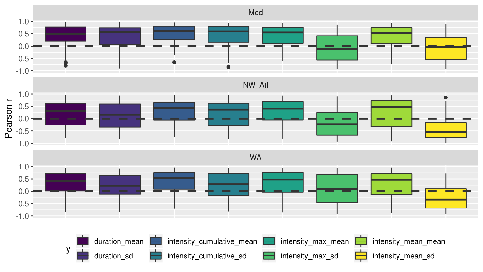
Boxplots showing the distribution of Pearson’s r values for the correlation between the mean and SD of the desired MHW metrics for the time series of varying lengths of each of the three reference time series. The horizontal dashed line helps to denote an r-vlaue of 0.
The figure above shows us that the relationship between the length of all three reference time series and the resultant MHW metrics are similar. Specifically we see that mean duration and intensities of events has a strong (r~-0.5) relationship to the length of the time series. Meaning that longer the climatology period used is, the shorter and less intense MHWs tend to be. This wasto be expected as the original hypothesis was that longer time series would have lower/smoother thresholds and so events detected with them would be longer and more intense. This pattern is a bit less clear for mean intensities.
Confidence intervals
After looking at these correlations it seems as though somehow calculating confidence intervals on something would be worthwhile…
# Calculate CIs using a bootstrapping technique to deal with the non-normal small sample sizes
# df <- sst_ALL_both_event %>%
#   filter(lubridate::year(date_peak) >= 2012,
#          site == "WA",
#          trend == "detrended") %>%
#   select(year_index, duration, intensity_mean, intensity_max, intensity_cumulative) #%>%
  # select(site, trend, year_index, duration, intensity_mean, intensity_max, intensity_cumulative) #%>%
  # nest(-site, -trend)
Bmean <- function(data, indices) {
  d <- data[indices] # allows boot to select sample
    return(mean(d))
}

event_aov_CI <- function(df){
  df_conf <- gather(df, key = "metric", value = "value", -year_index) %>%
    group_by(year_index, metric) %>%
    # ggplot(aes(x = value)) +
    # geom_histogram(aes(fill = metric)) +
    # facet_wrap(~metric, scales = "free_x")
    summarise(lower = boot.ci(boot(data=value, statistic=Bmean, R=1000),
                              type = "basic")$basic[4],
              mid = mean(value),
              upper = boot.ci(boot(data=value, statistic=Bmean, R=1000),
                              type = "basic")$basic[5],
              n = n()) %>%
    mutate_if(is.numeric, round, 4)
  return(df_conf)
  }
Categories
In this section we want to look at how the categories in the different time periods compare. I’ll start out with doing basic calculations and comparisons of the categories of events with the different time periods. After that we will run chi-squared tests. Lastly a post-hoc test of sorts will be used to pull out exactly which categories differ significantly in count with different time series lengths.
Event count
load("data/sst_ALL_smooth.Rdata")

suppressWarnings(
  sst_ALL_category <- sst_ALL_smooth %>%
    select(-events) %>%
    unnest(cats) %>%
    filter(year_index >= 10,
           peak_date >= "2009-01-01", peak_date <= "2018-12-31")
)

# Indeed... but how to compare qualitative data?
# Let's start out by counting the occurrence of the categories
sst_ALL_clim_category_count <- sst_ALL_category %>%
  group_by(site, rep, year_index, category) %>%
  summarise(count = n()) %>%
  mutate(category = factor(category,
                           levels = c("I Moderate", "II Strong",
                                      "III Severe", "IV Extreme")))
save(sst_ALL_clim_category_count, file = "data/sst_ALL_clim_category_count.Rdata")load("data/sst_ALL_clim_category_count.Rdata")
# total_category_count <- sst_ALL_clim_category_count %>%
# ungroup() %>%
# select(-rep) %>%
# group_by(site, category) %>%
# summarise(count = sum(count))
ggplot(sst_ALL_clim_category_count, aes(x = year_index, y = count, fill = category)) +
geom_bar(stat = "identity") +
# geom_label(data = label_category_count, show.legend = F, fill = "white",
# aes(label = count, y = 1000)) +
scale_fill_manual(values = MHW_colours) +
facet_wrap(~site, ncol = 1) +
labs(x = "Tim series length (years)", y = "Total count") +
theme(legend.position = "bottom")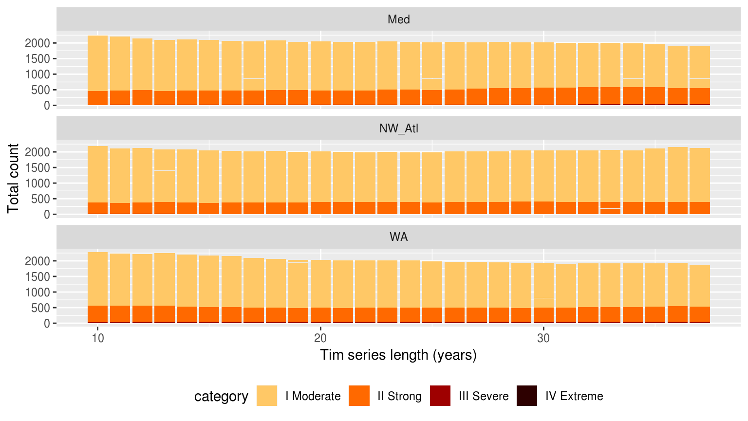
Bar plots showing the counts of the different categories of events faceted in a grid with different sites along the top and the different category classifications down the side. The colours of the bars denote the different climatology periods used. Note that the general trend is that more ‘smaller’ events are detected with a 10 year clim period, and more ‘larger’ events detected with the 30 year clim. The 20 year clim tends to rest in the middle.
The results in the figure above show that we see more larger events when the climatologies are based on 30 years of data, rather than 10, but that we tend to see more events overall when we use only 10 years of data. This is about what would be expected if there were a trend present in the data. SO it is interesting that it still comes through.
chi-squared
In this section we will use pairwise chi-squared tests to see if the count of events in the different re-sampled lengths differ significantly from the same re-sampled time series of 30 years (this serves as the control). We will combine categories 3 and 4 together into one category for a more robust test and because we are interested in how these larger events stand out together against the smaller events.
# Load and extract category data
load("data/sst_ALL_smooth.Rdata")
suppressWarnings( # Suppress warning about category levels not all being present
sst_ALL_cat <- sst_ALL_smooth %>%
  select(-events) %>%
  unnest()
)

# Prep the data for better chi-squared use
sst_ALL_cat_prep <- sst_ALL_cat %>%
  filter(year_index >= 10,
         peak_date >= "2009-01-01", peak_date <= "2018-12-31") %>%
  select(year_index, rep, site, category) %>%
  mutate(category = ifelse(category == "III Severe", "III & IV", category),
         category = ifelse(category == "IV Extreme", "III & IV", category))

# Extract the true climatologies
sst_ALL_cat_only_30 <- sst_ALL_cat_prep %>%
  filter(year_index == 30) %>%
  select(site, year_index, rep, category)

# chi-squared pairwise function
# Takes one rep of missing data and compares it against the complete data
# df <- sst_ALL_miss_cat_prep %>%
  # filter(site == "WA", rep == "20", miss == 0.1)
# df <- unnest(slice(sst_ALL_miss_cat_chi,1)) %>%
  # select(-site2, -rep, -miss2)
chi_pair <- function(df){
  # Prep data
  df_comp <- sst_ALL_cat_only_30 %>%
    filter(site == df$site[1],
           rep == df$rep[1])
  df_joint <- rbind(df, df_comp)
  # Run tests
  res <- chisq.test(table(df_joint$year_index, df_joint$category), correct = FALSE)
  res_broom <- broom::augment(res) %>%
    mutate(p.value = broom::tidy(res)$p.value)
  return(res_broom)
}

# The pairwise chai-squared results
suppressWarnings( # Suppress poor match warnings
sst_ALL_cat_chi <- sst_ALL_cat_prep %>%
  filter(year_index != 30) %>%
  # mutate(miss = as.factor(miss)) %>%
  mutate(site2 = site,
         year_index2 = year_index,
         rep2 = rep) %>%
  group_by(site2, year_index2, rep2) %>%
  nest() %>%
  mutate(chi = map(data, chi_pair)) %>%
  select(-data) %>%
  unnest() %>%
  dplyr::rename(site = site2, year_index = year_index2, rep = rep2,
                year_comp = Var1, category = Var2)
)
save(sst_ALL_cat_chi, file = "data/sst_ALL_cat_chi.Rdata")load("data/sst_ALL_cat_chi.Rdata")
sst_ALL_cat_chi_sig <- sst_ALL_cat_chi %>%
filter(p.value <= 0.05) %>%
select(site, year_index, p.value) %>%
group_by(site, year_index) %>%
unique() %>%
summarise(count = n())
knitr::kable(sst_ALL_cat_chi_sig, caption = "Table showing the count out of 100 for significant differences (_p_-value) for the count of different categories of events for each site based on the amount of missing data present.")load("data/sst_ALL_cat_chi.Rdata")
# Prep data for plotting
chi_sig <- sst_ALL_cat_chi %>%
filter(p.value <= 0.05) %>%
select(site, year_index, p.value) %>%
group_by(site, year_index) %>%
unique() %>%
summarise(count = n())
ggplot(chi_sig, aes(x = as.numeric(year_index), y = site)) +
geom_line(aes(colour = count, group = site)) +
geom_point(aes(colour = count)) +
# facet_wrap(~metric, ncol = 1) +
scale_colour_viridis_c() +
scale_x_reverse() +
labs(x = "Time series length (years)", y = NULL,
colour = "Sig. dif.\nout of 100") +
theme(axis.text.x = element_text(angle = 20))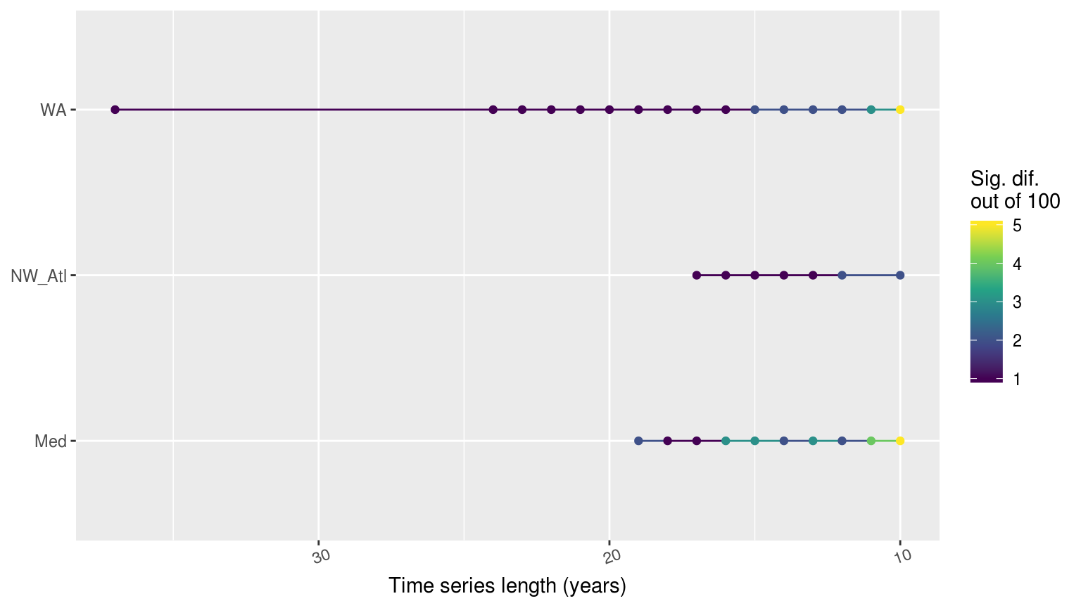
Line graph showing the count of times out of 100 random replicates when a given percentage of missing data led to significant differences in the count of categories of MHWs as determined by a chi-squared test.
The line plot above shows at what point the category counts begin to differ significantly from the matching 30 year time series. It was expected that the WA time series would show sig. dif. more quickly than the other two, though I had expected the Med to be the slowest to change, not the NW_Atl. Over a sample of 100, there were never more than five replicates showing significant differences in count of categories though so it is relatively safe to say that the length of a time series has little effect on the count of events.
Post-hoc chi-squared
It is also necessary to see which of the categories specifically are differing significantly. Unfortunately there is no proper post-hoc chi-squared test. Instead it is possible to look at the standardised residuals for each category within the pairwise comparisons being made.
I still need to do this…
Can we fix it?
Fourier transform climatologies
Lastly we will now go about reproducing all of the checks made above, but based on a climatology derived from a Fourier transformation, and not the default climatology creation method.
(RWS: I’ve not gotten to the Fourier transformations yet either. I’m also not convinced that this is going to be the way forward. I am thinking that it may be better to just increase the smoothing window width to produce a more sinusoidal climatology line. But I suppose that in order to know that it must be tested.)
(ECJO)[One advantage of the Fourier transform method (or, I think equivalently harmonic regression) is that it is VERY fast. Much faster than the method used in the MHW code. I also think you can probably get away with shorter time series using this method than with the “standard MHW climatology” method]
(RWS)[I suppose then that I will need to look into this.]
Best practices
(RWS: I envision this last section distilling everything learned above into a nice bullet list. These bulletted items for each different vignette would then all be added up in one central best practices vignette that would be ported over into the final write-up in the discussion/best-practices section of the paper. Ideally these best-practices could also be incorporated into the R/python distributions of the MHW detection code to allow users to make use of the findings from the paper in their own work.)
References
Oliver, Eric C.J., Markus G. Donat, Michael T. Burrows, Pippa J. Moore, Dan A. Smale, Lisa V. Alexander, Jessica A. Benthuysen, et al. 2018. “Longer and more frequent marine heatwaves over the past century.” Nature Communications 9 (1). doi:10.1038/s41467-018-03732-9.
Schlegel, Robert W., and Albertus J. Smit. 2016. “Climate Change in Coastal Waters: Time Series Properties Affecting Trend Estimation.” Journal of Climate 29 (24): 9113–24. doi:10.1175/JCLI-D-16-0014.1.