On this page you can look at graphs that describe your data, make observations about them, and interpret your observations.
Explore patterns
What to do here
Start by choosing a catalysis report to work with. Then look at the patterns (graphs) NarraFirma has generated. Click on a pattern name in the table to see it below the table. You can also use the arrow buttons to move systematically through the list of patterns.
As you are looking at a graph, hover the mouse to see the stories, thus:
- In a bar graph (one choice question) or histogram (one scale question), hover over any bar segment to see the story there.
- In a table (two choice questions), hover over an ellipse to see a list of story names.
- In a histogram table (two choice questions and a scale question), hover over an square to see a list of story names.
- In a scatterplot (two scale questions), hover over any dot to see the story (or stories) it represents.
- You can't hover to see stories in a correlation map or any of the data integrity graphs. You can hover in a correlation map to see histograms and scatterplots; but you can't hover over those graphs to see stories.
When you are looking at any graph, click and drag to select stories. The selected stories will appear in the list under the graph.
- In a bar graph (one choice question) or histogram (one scale question), select one or more bars by dragging through their horizontal center points. Where you drag vertically doesn't matter. You can't select parts of a bar, just the whole thing.
- In a table (two choice questions), select any number of ellipses by dragging through their center points.
- In a histogram table (two choice questions and a scale question), select any number of squares by dragging through their center points.
- In a scatterplot (two scale questions), select stories by dragging through their center points.
- You can't select stories in a correlation map or in any of the data integrity graphs.
If you think a pattern is worth noting in your report, mark it as remarkable using the "yes" button under the graph. Then create an observation and fill it in. Be sure to give the observation a name, because it will be used as its header in your report.
Next, enter at least two competing interpretations for the observation — that is, two things reasonable people with different viewpoints might say about what the observation means. Give each interpretation a name as well.
You can sort the table of patterns by whether they have been marked as remarkable and whether you have written observations and interpretations for them.
Connections to other pages
In order to use this page, you must first create a catalysis report on the Start catalysis report page. Options you set on the Configure catalysis report page will affect how graphs are drawn and how statistical tests are calculated on this page. The observations, interpretations, and ideas you write on this page will affect the Cluster interpretations and/or observations page and the Print catalysis report page.
Tips for making the most of this page
This is the most complicated page in the entire NarraFirma application. Give yourself some time to learn how to use it effectively. These tips should help you manage the complex task of reviewing patterns and writing observations and interpretations.
- Prioritize by sorting. Each of the columns in the table of patterns (at the top of the page) can be used to sort the patterns generated from your data. At different times in your catalysis work you will want to use this sorting function differently. Early on you might want to sort by type of graph. Later you might want to see which are the most statistically significant trends. After you have started to write observations for your report, you will want to see which patterns you have marked and/or written about.
- Use the "Remarkable?" system. You can mark patterns using any of five buttons (below the graph):
- yes: This pattern is important, and you want to write an observation and interpretations for it (or you already did). You can only create new observations on patterns that have been marked as remarkable.
- no: You have definitely decided not to include this pattern in your report.
- maybe: You might want to include this pattern, and you've marked it to check again later or discuss with your team. You will probably be changing the "maybe" status later on.
- redundant: This pattern is important, but it is similar to another pattern you have written an observation and interpretations for, so you are not going to include it in the report. You might want to add a non-printing note to this observation so you know which observation it is redundant with. You might also want to include its name and/or graph in the pattern you wrote the observation for.
- unmarked: This pattern has not yet been reviewed. You can "unmark" a pattern after you have marked it, perhaps because you think it should be looked at again, or something.
- Start with the simpler patterns. It can help to look at your patterns one type at a time. For example, you might start by looking only at the "data integrity" graphs, to see if there are any systematic biases in the answers people gave to questions. Then you might look at the bar graphs and histograms (which are simple) before moving on to the more complex interactions among questions. If a type of graph is not being shown on this page, it doesn't mean you have lost any observations you wrote about those graphs; you will see them again when you view that type of graph again.
- Eliminate questions that didn't work. It often happens that one or two questions do not result in any useful patterns. The question didn't make sense to people, or it didn't apply to their stories, or (most often) there was little variation in the responses. Once you are sure that a question is not worth considering, you can uncheck its checkbox on the Configure catalysis report page. This will reduce the number of patterns generated and streamline your task.
-
Use observation strengths to triage.
You can use the "strength" question about each observation to create a triage system for writing your
catalysis report. As you write your observations, give each one a strength value.
Create a consistent system, like this one:
- To be marked as strong, a pattern must be both obvious and surprising to everyone who sees it.
- To be marked as medium, a pattern should be difficult (but not impossible) to dispute, and at least moderately interesting.
- To be marked as weak, a pattern should be either easy to dispute (the numbers are small, the relationship is murky) or not meaningful (perhaps it's a foregone conclusion).
Frequently-asked questions
Things you can see
- Can you explain the different graph types?
- What statistical tests are being reported?
- Can I hide the statistical results?
- What is skewness? What is kurtosis?
- Why do some of the table rows say "None (choices not mutually exclusive)"?
Things you can do
- How can I format the texts in my observations and interpretations?
- Can I save the list of stories I'm looking at under a graph?
- How can I write an observation that refers to multiple patterns?
Problems you might have
- Help! I deleted an observation, but I didn't mean to, and now the interpretations I wrote under it are also gone. Can I get it (and them) back?
- I've got some observations written, but I've suddenly realized that I have to change something about my stories. Do I have to start all over again?
- If I asked a question, and it had a lot of possible answers, and some of the answer counts turned out to be really low, is there anything I can do about it?
Things you might not see the point of
- What are linking questions for?
- Why does an interpretation have a main text plus an idea and questions? What should I write there?
- Why should I write two competing interpretations for each observation?
Can you explain the different graph types?
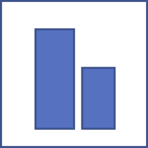 |
A bar graph shows counts of particular answers to a choice question, like "Who acted responsibly in this story?" The height of each bar shows the count of stories for which the question was answered that way. Note that this is not necessarily a count of how many participants answered the question that way, if anyone could or did tell more than one story. |
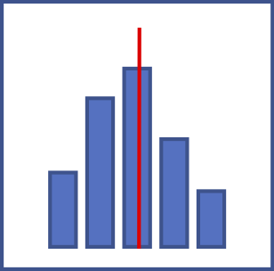 |
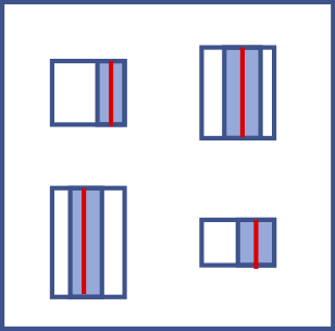
A histogram shows the frequency distribution of answers to a scale question,
like "How much cooperation do you see in this story?"
The height of each bar shows the count of stories for which the question was answered in the range
specified in the scale at the bottom of the graph. For example, a bar drawn between the axis values
of zero and ten shows how many stories had a scale value set to anything between zero and ten, inclusive.
Actually, zero and 100 are special cases. A zero value always gets counted in the first column of the histogram, and a 100 value always gets counted in the last column. For every other column, the upper bound is inclusive and the lower bound is exclusive. Thus, a value of 10 will go into the first column and not the second. The red line on a histogram shows the arithmetic mean of all of the values. The two green lines on either side of the red line show one standard deviation above and below the mean. |
 |
A text listing is just a plain-text record of any free entry (type-in) questions you asked. You can copy and paste from these listings into your observations. |
 |
Write-in texts are answers people wrote in addition to the main answer they chose (or typed) for a question. You can copy and paste from these write-in texts into your observations. |
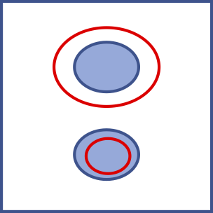 |
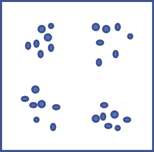
A table shows the counts of stories
for which both questions were answered in the way indicated by the row and column of the grid.
You might know these as contingency tables or contingency charts.
For example, a table might show the concurrence of two questions: "Who acted responsibly in this story?" and
"Who was supposed to have responsibility in this story?"
One bubble on the graph might show how many stories for which participants said someone
took care of someone else's responsibility.
If there are unfilled ellipses on the graph, they indicate how many stories would be expected to have those two answers, if the answers were filled in randomly. The formula for expected counts is (row total x column total) / total number of stories represented in the graph (which is either the row total or column total; they add up to the same number). Expected counts are only shown when both questions have mutually exclusive answer sets. Tables of count results where the expected counts are very different from the observed counts are likely to produce significant test results from the chi-squared test. You can hover your mouse over any of the circles to see how many stories were expected to be found there and how many were actually found there. Or, if you have that option turned on, you can read the counts directly in the table (observed/expected). |
 |
A histogram set shows the frequency distributions of a scale question for subsets of stories for which a choice question was answered in different ways. For example, such a set might show answers to the question "How much cooperation do you see in this story?" divided into two graphs: participants who said "the town council" had responsibility for what happened in the story; and participants who said "all of us" had responsibility for what happened in the story. |
 |
A scatterplot (also known as an XY graph) shows the distribution of answers to two scale
questions considered together, like "How much cooperation do you see in this story?"
and "How much conflict do you see in this story?"
A red line on a scatterplot means that answers to the two questions are significantly correlated. That is, when someone chose a high scale value for one question, they also chose a high scale value for the other question -- on the same story. The slope of the line shows the calculated correlation coefficient. A thin red line shows a correlation that is significant at the p < 0.05 level. A thicker red line shows a correlation that is significant at the p < 0.01 level. |
 |
A histogram table is a table with representations of histograms (frequency distributions) in each cell.
Each cell shows the mean and standard deviation of the distributions of answers to a scale question
for a subset of stories specified by a combination of answers to the two choice questions.
For example, one cell in a table might show how participants answered the scale question "How much cooperation do you see in this story?" -- for the subset of stories in which participants said "a manager" was supposed to be responsible for a situation but "a line employee" took charge of it. The blue line in these mini-histogram representations represents the arithmetic mean of the distribution. The shaded box represents one standard deviation on either side of the mean. The height of each box shows how many stories are in the subset. (The width of the box is constant.) You can hover your mouse over any of the squares to see how many stories are in that combination (of two choice questions and one scale question), and what the exact values are for the mean, standard deviation, skewness, and kurtosis of the distribution. |
 |
A scatterplot set shows answers to two scale questions for subsets of stories for which a choice question was answered in different ways. For example, such a set might show the relationship between answers to the two scale questions "How much cooperation do you see in this story?" and "How much conflict do you see in this story?" divided into two graphs: participants who said "the town council" had responsibility for what happened in the story; and participants who said "all of us" had responsibility for what happened in the story. |
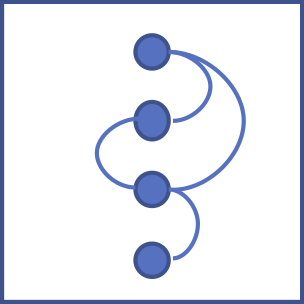 |
A correlation map shows the relationships
among all selected scale questions, either overall or for subsets of stories
for which a choice question was answered in different ways.
For example, a correlation map might show that the question
"How much cooperation do you see in this story?" is negatively correlated with
"How much conflict do you see in this story?" and positively correlated with
"How responsible were the people in this story?" -- but
only in subsets of stories in which the answer to "Who acted responsibly in this story?"
was "parents."
You can only view correlation maps if at least three slider questions exist and are selected. You can choose to see correlation maps in either of two formats: a line of questions with arcs connecting them, or a circle of questions with straight lines connecting them. Change this option on the Configure catalysis report page by answering the question "What shape should correlation maps be?" Only statistically significant correlations are shown (at the level specified in the advanced option "When should correlation lines be drawn on scatter plots?"). The width of each linking line shows the correlation coefficient (r) for that combination of scale questions. When the correlation is perfect (r = 1.0 or r = -1.0), the line thickness is the same as the circle diameter. The sizes of the (inner) question bubbles in a correlation map show the number of stories for which that scale question was answered. If you are looking a series of correlation maps for subsets of stories in a choice question, the comparison is across all the bubbles on the screen, not just one of the maps. That way you can compare the numbers of stories across subsets. |
 |
A data integrity graph is a special kind of graph specifically for checking to make sure
your data holds together. If there are disqualifying biases in your data, you will be able to see
them here. Specifically:
|
What statistical tests are being reported?
- For a contingency table (two choice questions), the statistic is the chi-squared test.
- For multiple histograms with mutually exclusive choices, the test is the Mann-Whitney U test for differences between means. (The lowest significance level for any pair of subsets is reported.)
- For scatter plots, the test is Spearman's ranked correlation coefficient.
The non-parametric Mann-Whitney U test and Spearman's test are used without testing whether the data is normally distributed, to be conservative.
Can I hide the statistical results?
Yes. Go to the "Configure catalysis report" page and uncheck the check box under "Would you prefer to hide statistical results on the Explore Patterns page?" Then come back to the "Explore Patterns" page and look at your graphs again; they will not show any statistical results. You can still see the statistical results by choosing "Show statistical results" in the "things you can do" list and clicking 'Do it.'
Note: when you hide statistical results, the HTML elements (divs) that show the statistical results are actually still on the page. They just have their "display" options set to "none". If you wanted to temporarily show a statistical-results panel (maybe for a screenshot or something), you could open your browser's development console, inspect the graph whose panel you want to show, find the hidden statistical panel, and turn off its "display: none" option.
What is skewness? What is kurtosis?
Skewness is a measure of how far the distribution is skewed away from being symmetrical. Positive skewness means the bulk of the values are on the left (and the right tail is longer). Negative skewness means the bulk of the values are on the right (and the left tail is longer).

Kurtosis is a measure of how peaked or flat a distribution is. Positive kurtosis means the distribution is strongly peaked. Negative kurtosis means the distribution is flattened.

Why do some of the table rows say "None (choices not mutually exclusive)"?
That's because some of the tests (chi-squared, Mann-Whitney U) can only be run on mutually exclusive choices. Any questions where people could choose more than one answer will have no test values when they are combined with other questions.
How can I format the texts in my observations and interpretations?
You can control the formatting of your observation and interpretation texts in three ways.
- You can use these simple markup tags: **bold** and __italic__.
- You can use these HTML tags: address, article, b, big, blockquote, br, caption, cite, code, del, dd, d1, dt, em, h1, h2, h3, h4, h5, h6, hr, i, kbd, li, ol, p, pre, s, small, sup, sub, strong, strike, table, td, th, tr, u, ul.
- You can use custom CSS. See the help page on Printing the catalysis report for an explanation.
Can I save the list of stories I'm looking at under a graph?
Yes you can. If you have made a selection of stories in one part of a graph (say in the upper right corner of a scatter plot), you might want to remember those stories when you look back at your observation again. Under the graph, choose "Save the current selection," then click "Do it." A text representation of what you selected will appear in the "These are the selections you have saved" text box.
When you return to the observation again and want to see the same stories, click inside the text representation of the selection in the "These are the selections you have saved" text box. Then choose "Restore a saved selection" and click "Do it."" The same stories should appear in the list.
You can record and use more than one selection, and you can (carefully) edit the text representations by hand, if you want to.
How can I write an observation that refers to multiple patterns?
- Under the box where you describe your observation, find the box labeled "To include additional patterns."
- For each pattern you want to include, find its line in the patterns table at the top of the page.
- Copy the exact name of each question in the pattern. (Patterns can have one, two, or three question names.)
- If there is only one question in the pattern, just type that exact name into the additional-patterns box.
- If there is more than one question in the pattern, type the names in the same order as they appear in the patterns table (where it says Question 1, Question 2, Question 3). Separate the question names by typing double equals signs between them, for example "Feel about == How long remember."
When NarraFirma prints your report, it will print the additional patterns you specified just after the pattern associated with the observation (in the order you specified them). You can include as many additional patterns as you like; just make sure each one is described on its own line of text.
Help! I deleted an observation, but I didn't mean to, and now the interpretations I wrote under it are also gone. Can I get it (and them) back?
If you deleted only the name and text of an observation, you can get the interpretations back. Just write a new observation name and/or text, and your interpretations will reappear.
However, if you deleted the entire observation using the minus button (-) under the graph, you can't get your interpretations back. Only delete observations using the minus button if you are sure you don't want to keep the interpretations.
Having said that, there is a way to find interpretation texts you lost, even if you have deleted the whole observation. Go to the Project management page and export your entire project history. Then open the JSON file in a text editor and search on some text you remember being in the lost interpretations.
I've got some observations written, but I've suddenly realized that I have to change something about my stories. Do I have to start all over again?
If you need to change your stories but do not need to create a new story collection, you can just go ahead and change your stories. Be sure to go back over your observations to see if you need to revise them.
If you need to start a new story collection, perhaps because you discovered an import mistake, you can still fix the problem. Scroll to the bottom of the "Configure catalysis report" page, and click "Export report elements to CSV." This will write out a CSV file with all of the observations, interpretations, and perspectives you have created in the report. Then create your new story collection, create a new catalyis report, scroll down to the bottom of the "Configure catalysis report" page again, and click "Import report elements from CSV." As long as the question short names match between the two story collections (or both sets of story collections), the report elements will connect up correctly. There is a fuller explanation of this feature in the help page for the Configure catalysis report page.
If I asked a question, and it had a lot of possible answers, and some of the answer counts turned out to be really low, is there anything I can do about it?
Yes there is. You can use display lumping, which is explained in the help for the Configure catalysis report page.
What are linking questions for?
Linking questions help readers of your catalysis report understand how each observation is connected to its interpretations. They do this by framing a question to which your interpretations are answers.
- In a perspectives (clustered-interpretations) report, an observation's linking question is printed just before each of its interpretations. In this case, the question serves as a quick summary of the observation that helps people understand what the interpretation refers to.
- In a themes (clustered-observations) report, an observation's linking question is printed between the observation and its interpretations. In this case, the question is less a summary than an introduction to the array of answers represented by the interpretations.
Without linking questions, you might end up starting each interpretation with the same question. Writing linking questions saves you that bother, and it makes your report more clear.
Why does an interpretation have a main text plus an idea and questions? What should I write there?
The interpretation's main text is exactly that, an interpretation of the observation, a viewpoint on what it means. It is an explanation of the observation from a particular perspective.
Interpretation questions are things people might want to ponder and discuss as they consider the interpretation. Some example questions might be:
- Who might agree with this interpretation of this pattern? Who might not?
- What does this mean about ____?
- What could lead to this?
- Should we ___? Why? Why not?
- How might we learn more about this?
Why should I write two competing interpretations for each observation?
Here is an excerpt from the fourth edition of Working with Stories that explains why writing competing interpretations is worth doing.
The central goal of narrative catalysis is to resolve the paradox that lies at the heart of participatory sensemaking.
| This is true | This is also true |
|---|---|
| Most people are not trained in the interpretation of patterns (especially of graphs and statistics). | Most people are used to being told what patterns mean by those who have power over them. |
| When you don't interpret patterns for people, they have only two options: interpret the patterns themselves, or don't use the patterns. | When you interpret patterns for people, they have only two options: accept your interpretations, or reject them. |
| Participatory Action Research requires that every participant be accepted and included as they are. Forcing people to interpret patterns on their own, with no other option than to put them aside, rejects and excludes those who are not trained in the interpretation of patterns. | The goal of Participatory Action Research is the collective exploration of meaning in an atmosphere of safety and freedom. Forcing people to accept or reject specific interpretations of patterns reduces safety, restricts freedom, and makes exploration impossible. |
| To empower people to make sense of a topic using patterns, you must give them interpretations of the patterns. | To empower people to make sense of a topic using patterns, you must not give them interpretations of the patterns. |
The most effective way to resolve this paradox is to provide people with multiple interpretations of each pattern. That's what catalysis is for: to find patterns and show them to sensemaking participants, but not in a way that promotes only one interpretation of them.