# Genericons Neue
Genericons Neue are generic looking icons, suitable for a blog or simple website.
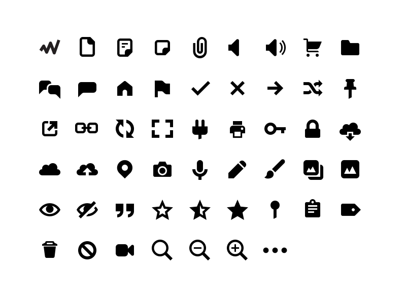
Genericons Neue is a new version of Genericons, with a refreshed look, but no social logos. That means if you use any of the logos from Genericons, *you can't use Genericons Neue as a drop-in replacement*. If you used only icons, you probably can, but be sure to test thoroughly. For a much better set of social logos, please please consider Social Logos.
## Usage
The Genericons Neue icon set comes in three versions:
- Minimized SVG files in the `svg-min` directory
- An SVG sprite (not compatible with IE) in the `svg-sprite` directory
- An icon font (shows up blurry in Chrome) in the `icon-font` directory
## Icon Set Style Guidelines
- 16pt base grid
- mostly straight angles, with occasional rounded edges for style
- flat, bidimensional look
- 2pt lines generally
- 1.5pt lines when necessary for clarity, be sure to have one edge on the pixelgrid
- 2pt corner radius
- no logos
- mostly solid icons
These are not rules, they are guidelines that can be broken with the proper reason.
## Building your own set
Genericons Neue is built semi-automatically. SVG source files in the `svg` directory are processed and converted into minimized SVGs, a sprite, and an icon font using `grunt`. To build your own version of Genericons Neue, follow these instructions:
```
brew install ttfautohint fontforge --with-python
npm install
grunt
```
## Notes
**Pixel grid**
Genericons Neue has been designed for a 16x16px grid. That means it'll look sharp at font-size: 16px exactly. It'll also be crisp at multiples thereof, such as 32px or 64px. It'll look reasonably crisp at in-between font sizes such as 24px or 48px, but not quite as crisp as 16 or 32. Please don't set the font-size to 17px, though, that'll just look terrible blurry.
**Antialiasing**
If you keep intact the `-webkit-font-smoothing: antialiased;` and `-moz-osx-font-smoothing: grayscale;` CSS properties. That'll make the icons look their best possible, in Firefox and WebKit based browsers.
**optimizeLegibility**
Note: On Android browsers with version 4.2, 4.3, and probably later, Genericons Neue will simply not show up if you're using the CSS property "text-rendering" set to "optimizeLegibility.