<div align="center">
    <h1 align="center">Vue3 Skeleton Loader</h1>
    <p align="center">
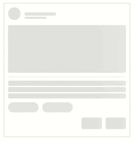
        Creating a loading animation with an attractive appearance and in line with the app design, for a pleasant user experience.
    </p>
    <img src="https://media4.giphy.com/media/v1.Y2lkPTc5MGI3NjExdXA0Mjc0Mzh0cGU0c3RqYmt4ZXpxNzM0c3ppbzAycDJqZjZxZ29hYiZlcD12MV9pbnRlcm5hbF9naWZfYnlfaWQmY3Q9Zw/WHayPi9eE3HW8pz7xa/giphy.gif" alt="Animated GIF" style="width: 500px; height: 528.634px; left: 0px; top: 0px; opacity: 1;"/>
</div>


## Basic Usage

Using [npm](https://npmjs.com/)

```bash
npm install vue3-skeleton-loader
```

Using [yarn](https://yarnpkg.com/)
```bash
yarn add vue3-skeleton-loader
```


Using loader in your <code>.vue</code> file
```tsx
import VueSkeletonLoader from 'vue3-skeleton-loader';
import 'vue3-skeleton-loader/dist/style.css';

<VueSkeletonLoader type="image@2"></VueSkeletonLoader>
```


## Introduction

Skeleton loader provides a simple solution to provide loading variables in your application. \
It prepares the user for content while data is fetched from the server or loaded asynchronously.

## Props

### `Skeleton`

<table> <thead> <tr> <th>Prop</th> <th>Values</th> <th>Default</th> <th>Type</th> </tr> </thead> <tbody> <tr> <td>loading</td> <td align="center"><code>true</code>, <code>false</code></td> <td align="center"><code>true</code></td> <td align="center"><code>Boolean</code></td> </tr> <tr> <td colspan="4">If true, the skeleton loader will be displayed.</td> </tr> <tr> <td>type</td> <td align="center"><code>text</code>, <code>avatar</code>, <code>image</code>, <code>button</code>, <code>chip</code>, <code>divider</code></td> <td align="center"><code>text</code></td> <td align="center"><code>String</code></td> </tr> <tr> <td colspan="4">Specifies the type and number of your skeleton, e.g., <code>text@4</code>. If only the type is written, it defaults to one.</td> </tr> <tr> <td>animation</td> <td align="center"><code>wave</code></td> <td align="center"><code>wave</code></td> <td align="center"><code>String</code></td> </tr> <tr> <td colspan="4">If left empty, no animation will be displayed. To showcase a specific animation, provide its name and define the corresponding keyframes globally.</td> </tr> <tr> <td>duration</td> <td align="center">-</td> <td align="center">1.5s</td> <td align="center"><code>String</code></td> </tr> <tr> <td colspan="4">The duration of the animation.</td> </tr> <tr> <td>timingFunction</td> <td align="center">Common values include: <code>ease</code>, <code>linear</code>, <code>ease-in</code>, <code>ease-out</code>, <code>ease-in-out</code>, ...</td> <td align="center"><code>linear</code></td> <td align="center"><code>String</code></td> </tr> <tr> <td colspan="4">Specifies the speed curve of the animation.</td> </tr> <tr> <td>base-color</td> <td align="center">-</td> <td align="center">#0000001E</td> <td align="center"><code>String</code></td> </tr> <tr> <td colspan="4">Background color of the skeleton.</td> </tr> <tr> <td>highlight-color</td> <td align="center">-</td> <td align="center">#FFFFFF66</td> <td align="center"><code>String</code></td> </tr> <tr> <td colspan="4">Highlight color in the skeleton animation.</td> </tr> <tr> <td>border-radius</td> <td align="center">-</td> <td align="center">varies</td> <td align="center"><code>String</code>, <code>Number</code></td> </tr> <tr> <td colspan="4">Border radius of the skeleton, varies by type.</td> </tr> <tr> <td>height</td> <td align="center">-</td> <td align="center">varies</td> <td align="center"><code>String</code>, <code>Number</code></td> </tr> <tr> <td colspan="4">Height of the skeleton, varies by type.</td> </tr> <tr> <td>width</td> <td align="center">-</td> <td align="center">varies</td> <td align="center"><code>String</code>, <code>Number</code></td> </tr> <tr> <td colspan="4">Width of the skeleton, varies by type.</td> </tr> <tr> <td>direction</td> <td align="center"><code>ltr</code></td> <td align="center"><code>ltr</code>, <code>rtl</code></td> <td align="center"><code>String</code></td> </tr> <tr> <td colspan="4">Direction of the animation.</td> </tr> <tr> <td>skeleton-style</td> <td align="center">-</td> <td align="center">{}</td> <td align="center"><code>Object</code></td> </tr> <tr> <td colspan="4">Custom style for individual skeleton elements.</td> </tr> <tr> <td>skeleton-class-name</td> <td align="center">-</td> <td align="center">""</td> <td align="center"><code>String</code></td> </tr> <tr> <td colspan="4">Custom class name for individual skeleton elements, used alongside default class names.</td> </tr> </tbody> </table>


## Examples 

### Custom animation

To set a custom animation for the <code>VueSkeletonLoader</code>, first, register the animation globally, then pass its 
name to the component using the <code>animation</code> prop.
 
## Troubleshooting

### Skeleton gets width 0 when parent display is <code>flex</code>
In the example below, the issue is demonstrated. To resolve it, you can either set the style <code>flex:1</code> for 
<code>VueSkeletonLoader</code> or enclose the skeleton within a div element, as shown below:
```vue

<script setup lang="ts">
  import VueSkeletonLoader from 'vue3-skeleton-loader';
  import 'vue3-skeleton-loader/dist/style.css';
</script>
<template>
  <div class="container">
    <div class="avatar-container">
      <VueSkeletonLoader type="avatar"/>
      <div>
        <VueSkeletonLoader type="text" width="100px" height="10px"/>
        <VueSkeletonLoader type="text" width="70px" height="6px"/>
      </div>
    </div>
  </div>
</template>

<style lang="scss">
  .container {
    max-width: 400px;
    margin: 30px auto;
    padding: 12px;
    border: 2px solid #0000001E;
    border-radius: 0.25rem;

    .avatar-container {
      display: flex;
      gap: 12px;
      align-items: center;
    }
  }

</style>

```

## License

[MIT](https://opensource.org/license/mit/)
