# Vue Split Grid
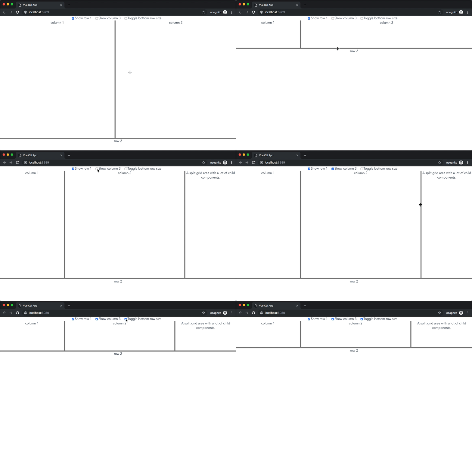



Vue Split Grid is a Vue wrapper for [Split Grid](https://github.com/nathancahill/split/tree/master/packages/split-grid): The spiritual successor of [Split.js](https://github.com/nathancahill/split), built for CSS Grid. Current Split Grid version: `v1.0.9`.
Vue Split Grid also supports animations (with numerous easing functions), Vue transitions and doesn't require any CSS to get a Split Grid working!
## Demo
### Basic
 ## Installation
```Shell
npm install --save vue-split-grid
```
## Usage
ES6 modules, import components manually.
```HTML
## Installation
```Shell
npm install --save vue-split-grid
```
## Usage
ES6 modules, import components manually.
```HTML
Column 1
Column 2
Column 3
Row 2
```
Register SplitGrid\* components globally.
```JavaScript
// main.js
import Vue from 'vue';
import VueSplitGrid from 'vue-split-grid';
import App from './App.vue';
Vue.use(VueSplitGrid);
Vue.config.productionTip = false;
new Vue({
render: h => h(App)
}).$mount('#app');
```
CommonJS
```JavaScript
const SplitGrid = require('vue-split-grid');
```
UMD build in a script tag, this loads the component using the global Vue instance.
```HTML
```
## Components
Instead of initializing SplitGrid by calling a JavaScript function Vue Split Grid uses three different components to accomplish the same end result, these components are ``, `` and ``.
The components accept most of the original Split Grid library it's options as properties. Some of the options are determined automatically by the SplitGrid component, see [How do I configure property X / call API method Y?](#how-do-i-configure-property-x--call-api-method-y).
### SplitGrid
The `` component is the main component for creating Split Grids. `` components may be nested.
#### Wrapper specific properties
##### `animation: { duration: number, easing: string }`
Properties of the animation that should be executed when the size of a SplitGrid or a SplitGridArea child is changed. The `duration` is the number of milliseconds the animation should take and `easing` is the easing function that should be applied.
The `easing` function can be one of: `linear`, `easeInQuad`, `easeOutQuad`, `easeInOutQuad`, `easeInCubic`, `easeOutCubic`, `easeInOutCubic`, `easeInQuart`, `easeOutQuart`, `easeInOutQuart`, `easeInQuint`, `easeOutQuint`, `easeInOutQuint`.
Default: `null`
##### `direction: string`
The direction of the Grid, this is used to determine whether `grid-template-columns` or `grid-template-rows` should be set. Direction can be `column` or `row`.
Default: `column`.
##### `gutterSize: number`
The default gutter size in pixels for the SplitGrid components its gutters.
Default: `5`
##### `render: boolean`
Whether a SplitGrid component should be rendered, this option has to be used instead of using the standard `v-if` directive when you're nesting SplitGrid components and you want to use a transition when toggling a SplitGrid. This uses `v-if` under the hood and allows the use of Vue transitions.
`render` **must not** be used when in combination with `show`.
Default: `null`
##### `show: boolean`
Whether a SplitGrid component should be shown, this option has to be used instead of using the standard `v-show` directive when you're nesting SplitGrid components and you want to use a transition when toggling a SplitGrid. This uses `v-show` under the hood and allows the use of Vue transitions.
`show` **must not** be used when in combination with `render`.
Default: `true`
##### `sizeUnit: string`
Setting the size of a SplitGrid, **which is only necessary when nesting SplitGrids**, requires using two properties. This is the the unit of the size of the SplitGrid component.
Not all size units are supported yet by [Split Grid](https://github.com/nathancahill/split/tree/master/packages/split-grid).
Allowed units: `fr`, `px`, `%`, `repeat`;
Default: `fr`
##### `sizeValue: number`
Setting the size of a SplitGrid, **which is only necessary when nesting SplitGrids**, requires using two properties. This is the the unit size value of the SplitGrid component.
Default: `1`
##### `strictMode: boolean`
Whether strictMode should be enabled. When strictMode is enabled (which is by default) the SplitGrid component only ``, ``, `` are allowed as child components.
Default: `true`
##### `transition:` [Vue Transition options](https://vuejs.org/v2/guide/transitions.html#Overview)
Transition properties which are the same as Vue's `` wrapper properties, Vue Split Grid uses Vue's `` under the hood, this option requires at least the `name` property.
Default: `null`
#### Split Grid properties
The documentation of the following properties and events is from the original library (v1.0.9), which can be found [here](https://github.com/nathancahill/split/tree/52d003dcd49f4d4e0f77ba851f8a03a942c6860f/packages/split-grid).
##### `minSize: number`
The minimum size in pixels for all tracks.
Default: `0`
##### `columnMinSize: number`
The minimum size in pixels for all tracks.
Default: `minSize`
##### `rowMinSize: number`
The minimum size in pixels for all tracks.
Default: `minSize`
##### `columnMinSizes: { [track: number]: number }`
An object keyed by `track` index, with values set to the minimum size in pixels for the
track at that index. Allows individual minSizes to be specified by track.
Note this option is plural with an `s`, while the two fallback options are singular.
Default: `columnMinSize`
##### `rowMinSizes: { [track: number]: number }`
An object keyed by `track` index, with values set to the minimum size in pixels for the
track at that index. Allows individual minSizes to be specified by track.
Note this option is plural with an `s`, while the two fallback options are singular.
Default: `rowMinSize`
##### `snapOffset: number`
Snap to minimum size at this offset in pixels. Set to `0` to disable snap.
Default: `30`
##### `columnSnapOffset: number`
Snap to minimum size at this offset in pixels. Set to `0` to disable snap.
Default: `snapOffset`
##### `rowSnapOffset: number`
Snap to minimum size at this offset in pixels. Set to `0` to disable snap.
Default: `snapOffset`
##### `dragInterval: number`
Drag this number of pixels at a time. Defaults to `1` for smooth dragging,
but can be set to a pixel value to give more control over the resulting sizes.
Default: `1`
##### `columnDragInterval: number`
Drag this number of pixels at a time. Defaults to `1` for smooth dragging,
but can be set to a pixel value to give more control over the resulting sizes.
Default: `dragInterval`
##### `rowDragInterval: number`
Drag this number of pixels at a time. Defaults to `1` for smooth dragging,
but can be set to a pixel value to give more control over the resulting sizes.
Default: `dragInterval`
##### `cursor: string`
Cursor to show while dragging. Defaults to `'col-resize'` for column gutters and
`'row-resize'` for row gutters.
##### `columnCursor: string`
Cursor to show while dragging.
Default: `'col-resize'`
##### `rowCursor: string`
Cursor to show while dragging.
Default: `'row-resize'`
##### `writeStyle: (grid: HTMLElement, gridTemplateProp: 'grid-template-column' | 'grid-template-row', gridTemplateStyle: string) => void`
Called to update the CSS properties of the grid element. Must eventually apply the
CSS value to the CSS prop, or the grid will not change. `gridTemplateStyle` is the computed CSS value of CSS rule `gridTemplateProp`.
Default:
```JavaScript
function writeStyle(grid, gridTemplateProp, gridTemplateStyle) => {
grid.style[gridTemplateProp] = gridTemplateStyle
}
```
#### Events
The following events can be used on your SplitGrid component like so:
```HTML
```
Unlike the callback functions from the original library, these callbacks function only receive **one** parameter object containing all the parameters from the original library.
##### `drag: ({ direction: 'row' | 'column', track: number, gridTemplateStyle: string })`
Called continously on drag. For process intensive code, add a debounce function to rate limit this callback.
`gridTemplateStyle` is the computed CSS value for `grid-template-column` or `grid-template-row`, depending on the `direction` property of the SplitGrid.
##### `drag-start: ({ direction: 'row' | 'column', track: number })`
Called on drag start.
##### `drag-end: ({ direction: 'row' | 'column', track: number })`
Called on drag end.
### SplitGridArea
The `` component should be used inside `` components, these are your columns or rows, depending on the `direction` you specified on the ``.
`` components shouldn't be used on their own.
#### Properties
##### `render: boolean`
Whether a SplitGridArea component should be rendered, this option has to be used instead of using the standard `v-if` directive if you want to use a transition when toggling a SplitGridArea. This uses `v-if` under the hood and allows the use of Vue transitions.
`render` **must not** be used when in combination with `show`.
Default: `null`
##### `show: boolean`
Whether a SplitGridArea component should be shown, this option has to be used instead of using the standard `v-show` directive if you want to use a transition when toggling a SplitGridArea. This uses `v-show` under the hood and allows the use of Vue transitions.
`show` **must not** be used when in combination with `render`.
Default: `true`
##### `sizeUnit: string`
Setting the size of a SplitGridArea requires using two properties. This is the the unit of the size of the SplitGridArea component.
Not all size units are supported yet by [Split Grid](https://github.com/nathancahill/split/tree/master/packages/split-grid).
Allowed units: `fr`, `px`, `%`, `repeat`;
Default: `fr`
##### `sizeValue: number`
Setting the size of a SplitGridArea requires using two properties. This is the the unit size value of the SplitGridArea component.
Default: `1`
##### `transition:` [Vue Transition options](https://vuejs.org/v2/guide/transitions.html#Overview)
Transition properties which are the same as Vue's `` wrapper properties, Vue Split Grid uses Vue's `` under the hood, this option requires at least the `name` property.
Default: `null`
### SplitGridGutter
`` should be used inside `` components, these are your column or row gutters, depending on the `direction` you specified on the ``.
`` components shouldn't be used on their own.
#### Properties
##### `render: boolean`
Whether a SplitGridGutter component should be rendered, this option has to be used instead of using the standard `v-if` directive if you want to use a transition when toggling a SplitGridGutter. This uses `v-if` under the hood and allows the use of Vue transitions.
`render` **must not** be used when in combination with `show`.
Default: `null`
##### `show: boolean`
Whether a SplitGridGutter component should be shown, this option has to be used instead of using the standard `v-show` directive if you want to use a transition when toggling a SplitGridGutter. This uses `v-show` under the hood and allows the use of Vue transitions.
`show` **must not** be used when in combination with `render`.
Default: `true`
##### `size: number`
The size of a gutter in pixels.
Default: [SplitGrid.gutterSize](#`gutterSize:-number`) or `5` when no value at [SplitGrid.gutterSize](#`gutterSize:-number`) was specified.
##### `transition:` [Vue Transition options](https://vuejs.org/v2/guide/transitions.html#Overview)
Transition properties which are the same as Vue's `` wrapper properties, Vue Split Grid uses Vue's `` under the hood, this option requires at least the `name` property.
Default: `null`
## How do I configure property X / call API method Y?
### columnGutters & rowGutters
The `columnGutters` and `rowGutters` properties are determined automatically by the `` component based on the `direction` property and the children the `` component has.
### gridTemplateColumns & gridTemplateRows
The initial CSS of the Grid, for which the original Split Grid library uses the two properties above, is determined automatically by the `` component based on the children that have been provided.
### split.add\*Gutter() & split.remove\*Gutter()
The `.addColumnGutter()`, `.addRowGutter()`, `.removeColumnGutter()` and `.removeRowGutter()` API methods are called automatically when a `` is removed by setting either the `show` or `render` property to `false`.
### split.destroy()
`split.destroy()` is called automatically in the `beforeDestroy` lifecyle method in the `` component.
## Changelog
[Changelog on Github](https://github.com/stijlbreuk/vue-split-grid/blob/master/CHANGELOG.md)
## License
[MIT](https://github.com/stijlbreuk/vue-split-grid/blob/master/LICENSE)