Vue Numeric Input
Number input component based on Vue that is a replacement of native input number which has optional control.
Basic Usage
You can use the v-model to enable a two-way binding on data.
<template>
  <div>
    <vue-numeric-input  v-model="num"></vue-numeric-input>
  </div>
</template>
<script>
  export default {
    data() {
      return {
        num: 10,
      };
    },
  };
</script>
Autofocus
Set autofocus to input field on page load
<vue-numeric-input v-model="num" autofocus></vue-numeric-input>
Name, Placeholder
Setting name and placeholder
<vue-numeric-input name="price" placeholder="Enter Price"></vue-numeric-input>
Max and Min
Limiting the value by setting min and max props.
<vue-numeric-input v-model="num" :min="1" :max="20"></vue-numeric-input>v-model : {{n2}}
Steps
Allows you to define step for incremental/decremental operation. default to 1.
<vue-numeric-input v-model="num" :step="2"></vue-numeric-input>
Align
Align input number inside input box (left, center, right)
<vue-numeric-input v-model="num" align="center" ></vue-numeric-input>
Width
Set the width of VueNumericInput in px, em, rem, % etc.
<vue-numeric-input :value="20" width="100px"></vue-numeric-input>
Size
Set the size of VueNumericInput as small, normal, large
<vue-numeric-input :value="20" size="small"></vue-numeric-input>
<vue-numeric-input :value="20" size="normal"></vue-numeric-input>
<vue-numeric-input :value="20" size="large"></vue-numeric-input>
Precision
Precision of input value to set the decimal places for float value. It should be an integer value.
<vue-numeric-input :value="20.432" precision="2"></vue-numeric-input>
Controls
Show/Hide the controls, default is true.
<vue-numeric-input :value="50" :controls="false"></vue-numeric-input>
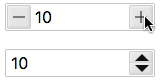
Controls Type
There are two type of controls to display, Plus and Minus(plusminus) and Up and Down arrow(updown)
<vue-numeric-input :value="40" controls-type="updown"></vue-numeric-input>
<vue-numeric-input :value="60" controls-type="plusminus"></vue-numeric-input>
Readonly
To set the readonly
<vue-numeric-input :value="10" readonly></vue-numeric-input>
Disabled
To set disabled
<vue-numeric-input :value="10" disabled></vue-numeric-input>
With float values
You can use step and precision props to make your input working with floating numbers.
<vue-numeric-input :value="4.15" :step="1.25" :precision="2"></vue-numeric-input>
Is Inputable
You can use isInput false prop to disable keyboard input of number.
<vue-numeric-input :value="10" :isInput="false" align="center"></vue-numeric-input>
Enable Mousewheel
To enable increment/decrement with mousewheel event
<vue-numeric-input :value="10" :mousewheel="true" align="center" controls-type="updown" ></vue-numeric-input>
Using Bootstrap Class Style
<form>
 <div class="form-group">
   <label for="age">Age</label>
      <vue-numeric-input
               id="age"
               :value="40"
               className="form-control"
               controls-type="updown">
      </vue-numeric-input>
 </div>
 <div class="form-group">
    <label for="height">Height</label>
    <vue-numeric-input
         id="height"
         :value="6"
         className="form-control"
         controls-type="plusminus">
      </vue-numeric-input>
   </div>
</form>
Styling Component
You can override the styling of the v-numeric-input component by applying !important rule to css properties
Style1
<vue-numeric-input
       class="style1"
       :value="5"
       :min="0"
       :max="10"
       width="60px"
       controls-type="updown">
</vue-numeric-input>
<style>
  .style1.vue-numeric-input.updown {
    display: inline-flex;
    width: 36px;
    height: 80px;
    padding-top: 1.5rem;
    padding-bottom: 1.5rem;
    border-radius: 0;
  }

  .style1.vue-numeric-input.updown .numeric-input {
    height: 100%;
    padding-right: 5px;
    padding-left: 5px;
  }

  .style1.vue-numeric-input .btn-decrement .btn-icon::before{
    content: ""
  }

  .style1.vue-numeric-input .btn-increment .btn-icon::before {
    content: ""
  }

  .style1.vue-numeric-input.updown .btn-increment {
    height: 1.5rem;
    width: 100%;
    right: 0;
    left:0;
    top: 0;
    bottom: auto;
    background: #7fc3ff;
  }

  .style1.vue-numeric-input.updown .btn-decrement {
    height: 1.5rem;
    width: 100%;
    left: 0;
    right: 0;
    top: auto;
    bottom: 0;
    background: #6fbbff;
  }
</style>
Style2
<vue-numeric-input
            class="style2"
            :value="5"
            width="130px"
            :step="1"
            :min="0"
            :max="10"
            align="center">
</vue-numeric-input>
<style>
  .style2.vue-numeric-input .numeric-input {
      height: 100%;
      padding: 2px 60px 2px 2px;
      border-radius: 15px;
  }

  .style2.vue-numeric-input .btn-decrement .btn-icon::before{
      content: ""
  }

  .style2.vue-numeric-input .btn-increment .btn-icon::before {
      content: ""
  }

  .style2.vue-numeric-input button{
      border-radius: 50%;
      width: 25px;
      height: 25px;
      margin:2px;
  }

  .style2.vue-numeric-input .btn-decrement {
      right: 28px;
      left: inherit;
  }
</style>
PROPS:
| Name | Description | Type | Default | Options |
|---|---|---|---|---|
| name | Component name | String | - | - |
| value | Binding value | Number | - | - |
| placeholder | Input placeholder | String | - | - |
| min | Minimum allowed value | Number | -Infinity | - |
| max | Maximum allowed value | Number | Infinity | - |
| step | Incremental Step | Number | 1 | - |
| align | Alignment of Numeric Value | String | left | left, center, right |
| width | Component Width | String | 180px | width in px, em, rem etc e.g. ‘20px’ |
| size | Component Size | String | normal | size value can be 'small', 'normal', 'large' |
| precision | Number of decimals | Number | 0 | Integer value |
| isInput | Enable/Diable keyboard input to Vue Numeric Input | Boolean | true | true/false |
| controls | Enable/Disable Controls | Boolean | true | true/false |
| controlsType | Controls Type | String | plusminus | plusminus/updown |
| className | Class Name | String | null | Name of css class to be assigned to input control |
| mousewheel | Enable Increment/Decrement on Mouse Wheel scroll | Boolean | false | true/false |
| autofocus | Autofocus | Boolean | false | true/false |
| readonly | Is Readonly | Boolean | false | true/false |
| disabled | Is Disabled | Boolean | false | true/false |
EVENTS:
| Event Name | Description | Parameters |
|---|---|---|
| input | triggers when input | (newValue) |
| change | triggers when the value changes | (newValue) |
| blur | triggers when Input blurs | (event: Event) |
| focus | triggers when Input focus | (event: Event) |
METHODS:
| Method | Description | Parameters |
|---|---|---|
| focus | focus the Input component | - |
| blur | blur the Input component | - |