# vite-custom-icons-resolver
Resolver for the Vite config file is designed to create elementary vue components from custom svg icons.
Vue 3 and Vue 2 are supported.
*Examples of Vue custom component-icon using* `vite-custom-icons-resolver`:
## Install
Before installing `vite-custom-icons-resolver`, you must install [*vite-plugin-components*](https://www.npmjs.com/package/vite-plugin-components), if it is not already installed.
``` bash
npm i -D vite-plugin-components
```
Install the plugin `vite-custom-icons-resolver`
``` bash
npm i -D vite-custom-icons-resolver
```
## Configure vite.config.js
Use with [vite-plugin-components](https://github.com/antfu/vite-plugin-components) (`>= v0.5.5`)
`vite-custom-icons-resolver` itself works as a parameter of the `vue-plugins-components` and does not depend on whether the 2nd or 3rd version of Vue is used.
Vue 3
``` js
// vite.config.js (for Vue 3)
import Vue from '@vitejs/plugin-vue'
import Components from 'vite-plugin-components'
import { viteCustomIconsResolver } from 'vite-custom-icons-resolver'
export default {
plugins: [
Vue(),
Components({
customComponentResolvers: [
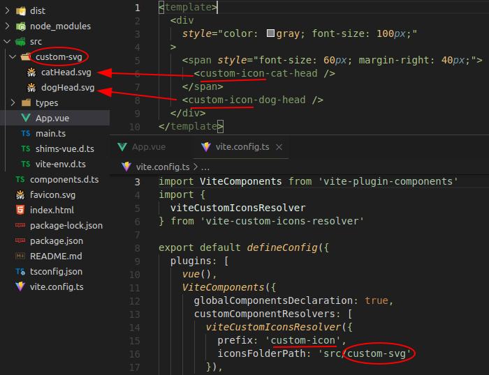
viteCustomIconsResolver({
prefix: 'custom-icon', // 'i' by default
customIconsFolder: 'src/svg-icons', // 'src/icons' by default
}),
],
}),
],
}
```
Vue 2
Vita supports Vue 2 with a `vite-plugin-vue2` plugin.
``` js
// vite.config.js (for Vue 2)
import { createVuePlugin } from 'vite-plugin-vue2'
import Components from 'vite-plugin-components'
import { viteCustomIconsResolver } from 'vite-custom-icons-resolver'
export default {
plugins: [
createVuePlugin(),
Components({
customComponentResolvers: [
viteCustomIconsResolver({
prefix: 'custom-icon', // 'i' by default
iconsFolderPath: 'src/svg-icons', // 'src/icons' by default
}),
],
}),
],
}
```
`viteCustomIconsResolver` has two optional parameters:
* `prefix` has a default value of `'i'`. It can be an empty string.
* `customIconsFolder` specifies the path to the folder where the svg icons files are located, and by default points to `src/icons` folder.
## Requirements for custom svg components
The name of custom svg components should be in the kebab case and look like this: ``. If `prefix` is empty string, the name of the component will be the same as the name of the corresponding svg file, converted to kebab like this: ``.
Custom svg components are global. They should not be registered and imported in the code of the parent component.
## Requirements for svg files
As mentioned above, each custom svg file must be placed in the folder specified via `customIconsFolder` parameter in the `vite.config.js` file or, if this parameter is skipped, in the `src/icons` folder by default.
The name of custom svg file can be in the `PascalCase`, `camelCase` or `kebab-case`, and must correspond to the name of component without a prefix.
Note that icons are mounted to page as inline `svg`. `vite-custom-icons-resolver` wraps svg content in `` tag and saves the resulting component in the file with extension `.vue` in special service folder.
**Note**: Inline svg must not contain declaration tag
``
This tag, if it is present in custom svg file, is necessary to delete manually.
### Managing size and color
The svg in the component will be displayed exactly as in the file.
If you need to manage the size or color, you should prepare `svg` document for this.
#### Size
To control icon size using the css `font-size` property you should set the value of the attributes `width` and `height` equal to `1em` in the svg header.
``` xml