# Viewport Extra [](https://www.jsdelivr.com/package/npm/viewport-extra) [](https://www.npmjs.com/package/viewport-extra) [](https://github.com/dsktschy/viewport-extra/blob/master/LICENSE.txt)
**English** | [日本語](https://github.com/dsktschy/viewport-extra/blob/master/README.ja.md)
> [!IMPORTANT]
>
> **_v3 includes BREAKING CHANGES._**
>
> - Reference: [Migration Guide from v2 to v3](https://github.com/dsktschy/viewport-extra/blob/master/docs/en/migration-from-v2.md)
> - Reference: [Migration Guide from v1 to v3](https://github.com/dsktschy/viewport-extra/blob/master/docs/en/migration-from-v1.md)
>
> v2 and v1 will continue to be maintained and remain available for use.
Viewport Extra is a library that enables setting the minimum / maximum width of the viewport. It reduces the range of the viewport that needs to be considered when styling.
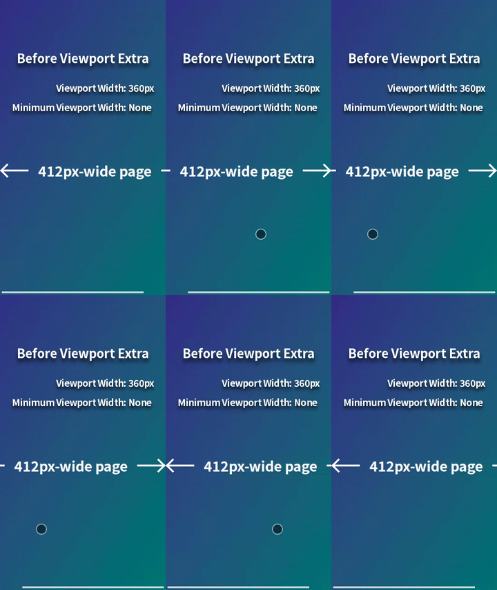
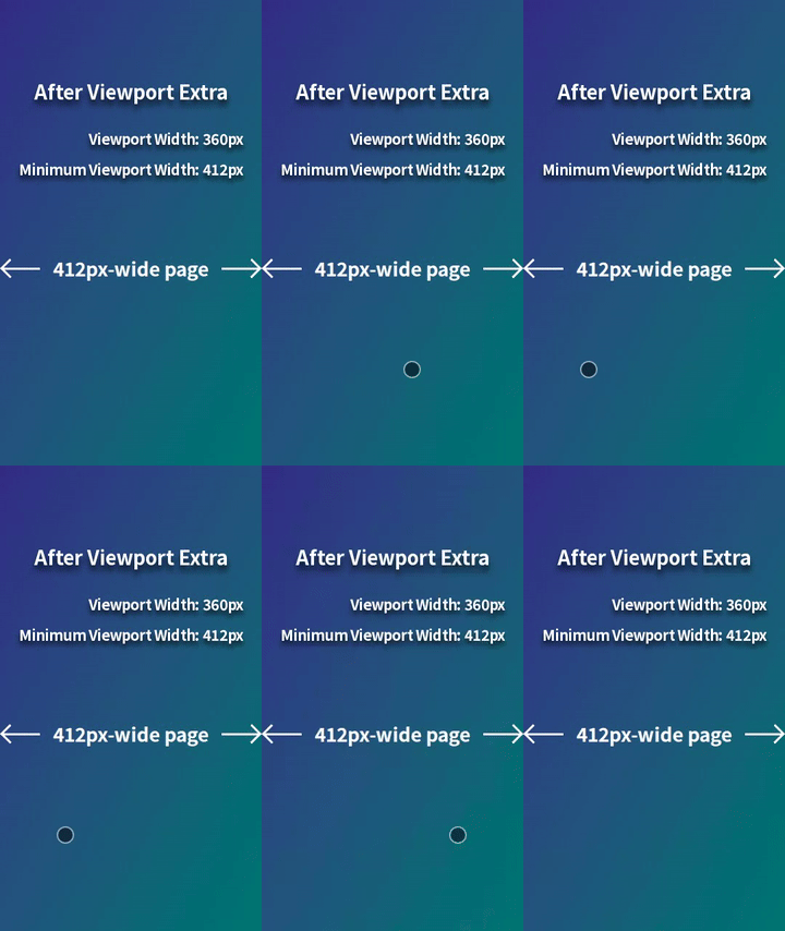
For example, when displaying a 412px-wide page on a mobile browser with a viewport width of 360px (e.g., Chrome on Galaxy S24 in portrait mode), horizontal scrolling occurs. This can be resolved by styling for viewport widths less than 412px, but it's a hassle. However, by using Viewport Extra to set the minimum viewport width to 412px, the page will be scaled down to fit perfectly within 360px, eliminating horizontal scrolling. This provides a simple solution with no styling required.
Page scaling is achieved by updating the `content` attribute of the `` element.
Viewport Extra supports asynchronous loading via the `
```
##### Using Module
```js
import("viewport-extra").then(({ apply }) => {
apply([{ content: { minimumWidth: 412 } }])
})
```
#### Results of Updating `content` Attribute of `` Element
##### Chrome on Galaxy S24 in Portrait Mode (360px)
`initial-scale=0.8737864077669902,width=412`
##### Safari on iPhone 15 in Portrait Mode (393px)
`initial-scale=0.9538834951456311,width=412`
##### Chrome on Google Pixel 8 in Portrait Mode (412px)
`initial-scale=1,width=device-width`
##### Safari on iPhone 15 in Landscape Mode (734px)
`initial-scale=1,width=device-width`
##### Safari on iPad Pro 12.9" in Portrait Mode (1024px)
`initial-scale=1,width=device-width`
### Scale Up Page on Large Viewport Widths
Pages containing the following code are scaled up on mobile browsers with viewport widths greater than 393px, but are not scaled up on other browsers. Whether to scale up is determined only once when the pages are displayed [(Reference)](#rescale-page-when-viewport-width-changes).
#### Implementation
##### Using Script
```html
```
##### Using Module
```js
import("viewport-extra").then(({ apply }) => {
apply([{ content: { maximumWidth: 393 } }])
})
```
#### Results of Updating `content` Attribute of `` Element
##### Chrome on Galaxy S24 in Portrait Mode (360px)
`initial-scale=1,width=device-width`
##### Safari on iPhone 15 in Portrait Mode (393px)
`initial-scale=1,width=device-width`
##### Chrome on Google Pixel 8 in Portrait Mode (412px)
`initial-scale=1.0483460559796438,width=393`
##### Safari on iPhone 15 in Landscape Mode (734px)
`initial-scale=1.8676844783715012,width=393`
##### Safari on iPad Pro 12.9" in Portrait Mode (1024px)
`initial-scale=2.6055979643765905,width=393`
### Set Different Minimum / Maximum Widths per Media Query
Pages containing the following code are scaled down on mobile browsers with viewport widths less than 412px or between 744px (inclusive) and 1024px (exclusive), but are not scaled down on other browsers. Whether to scale down is determined only once when the pages are displayed [(Reference)](#rescale-page-when-viewport-width-changes).
#### Implementation
##### Using Script
```html
```
##### Using Module
```js
import("viewport-extra").then(({ apply }) => {
apply([
{ content: { minimumWidth: 412 } },
{ content: { minimumWidth: 1024 }, media: "(min-width: 744px)" },
])
})
```
#### Results of Updating `content` Attribute of `` Element
##### Chrome on Galaxy S24 in Portrait Mode (360px)
`initial-scale=0.8737864077669902,width=412`
##### Chrome on Google Pixel 8 in Portrait Mode (412px)
`initial-scale=1,width=device-width`
##### Safari on iPad mini 6th Gen in Portrait Mode (744px)
`initial-scale=0.7265625,width=1024`
##### Safari on iPad Pro 12.9" in Portrait Mode (1024px)
`initial-scale=1,width=device-width`
### Rescale Page When Viewport Width Changes
Pages containing the following code determine whether to scale up or down not only when displayed but also when the viewport width changes. This is useful in scenarios such as switching between portrait and landscape modes on mobile devices or screen splitting on tablets.
#### Implementation
##### Using Script
```html
```
##### Using Module
```js
import("viewport-extra").then(({ apply }) => {
const updateViewportMetaEl = () => {
// To prevent infinite resizing
new ResizeObserver((_, observer) => {
observer.unobserve(document.documentElement)
window.addEventListener("resize", updateViewportMetaEl, { once: true })
}).observe(document.documentElement)
apply([
{ content: { minimumWidth: 412 } },
{ content: { minimumWidth: 744 }, media: "(min-width: 640px)" },
])
}
updateViewportMetaEl()
})
```
#### Results of Updating `content` Attribute of `` Element
##### Safari on iPhone 15 in Portrait Mode (393px)
`initial-scale=0.9538834951456311,width=412`
##### Safari on iPhone 15 in Landscape Mode (734px)
`initial-scale=0.9865591397849462,width=744`
### Scale Page Even in Legacy Environments
The standard build used above includes ES2021 syntax and features in the Widely Available stage of the [Web Platform Baseline](https://web.dev/baseline) as of the release of Viewport Extra v3.0.0. To ensure compatibility with environments that do not support these (e.g., iOS Safari < 16, Android Chrome < 108), the ES5 build can be used [(Reference)](https://github.com/dsktschy/viewport-extra/blob/master/docs/en/migration-from-v2.md#build-selection).
#### Implementation
##### Using Script
```html
```
##### Using Module
```js
import("viewport-extra/immediate/es5").then(({ apply }) => {
apply([{ content: { minimumWidth: 412 } }])
})
```
#### Results of Updating `content` Attribute of `` Element
##### Safari on iPhone 7 in Portrait Mode (375px)
`initial-scale=0.9101941747572816,width=412`
##### Safari on iPhone 7 in Landscape Mode (667px)
`initial-scale=1,width=device-width`
### Scale Page Without Using `` Element
Pages containing the following code behave the same as the [implementation using the `` element](#using-script-2).
#### Implementation
```html
```
#### Results of Updating `content` Attribute of `` Element
##### Chrome on Galaxy S24 in Portrait Mode (360px)
`initial-scale=0.8737864077669902,width=412`
##### Chrome on Google Pixel 8 in Portrait Mode (412px)
`initial-scale=1,width=device-width`
##### Safari on iPad mini 6th Gen in Portrait Mode (744px)
`initial-scale=0.7265625,width=1024`
##### Safari on iPad Pro 12.9" in Portrait Mode (1024px)
`initial-scale=1,width=device-width`
## Notes
- `min-width` / `max-width` can be used as alternatives to `minimum-width` / `maximum-width`. However, when both styles are mixed, behavior is not guaranteed, so only one style should be used.
```html
```
Similarly, `minWidth` / `maxWidth` can be used as alternatives to `minimumWidth` / `maximumWidth`. As with the previous case, when both styles are mixed, behavior is not guaranteed, so only one style should be used.
```js
apply([{ content: { minWidth: 412, maxWidth: 640 } }])
```
- Using the following style together is recommended to prevent browsers on small mobile devices from unexpectedly changing the text size [(Reference)](https://stackoverflow.com/q/6210788).
```css
body {
-webkit-text-size-adjust: 100%;
}
```
- When testing with developer tools of desktop browsers, mobile device simulation must be enabled and the viewport must be set to the desired size before navigating to a page that uses Viewport Extra. If the order is reversed, the browser may ignore the `initial-scale` setting of the `` element. This behavior is specific to simulation in developer tools and does not occur in actual mobile browsers.