---
title: 用 Utility Class 写组件
---
上一小节我们学习了如何使用 style-components 实现 `Avatar` 组件。
但当前的 UI 仍然不能让人满意,缺乏专业感,例如列表项内部的布局有点粗糙,很多地方没对齐。
本小节中,我们自己来实现一个更好的 `Item` 组件,实现这样的设计稿:

这次要实现的 UI 更复杂,有内部结构,但另一方面,并没有 `Avatar` 组件的**很粗的亮蓝色边框**这样很特殊的 UI,都是很常规的水平垂直布局、居中、字体样式等。
这种情况下,其实根本没必要写 CSS,有更高效的、跟 styled-components 互补的实现方式:Utility Class。
Modern.js 集成了主流、轻量、通用的 Utility Class 工具库 [Tailwind CSS](https://tailwindcss.com/)。
执行 `pnpm run new`,进行如下选择,开启 Tailwind CSS:
```bash
# 启用可选功能
❯ 启用 Tailwind CSS 支持
启用 Sass 支持
...
```
:::info 注
因为我们之前已经开启了 Less 支持,所以再次添加可选功能时,不再有这个选项。
:::
在 `src/App.tsx` 顶部引入 Tailwind CSS 的 css 文件,就可以开始快速实现专业的 UI:
```js
import 'tailwindcss/base.css';
import 'tailwindcss/components.css';
import 'tailwindcss/utilities.css';
```
先创建 Item 组件:
import Tabs from '@theme/Tabs';
import TabItem from '@theme/TabItem';
```bash
mkdir -p src/components/Item
touch src/components/Item/index.tsx
```
```powershell
mkdir -p src/components/Item
ni src/components/Item/index.tsx
```
修改 `src/App.tsx`,把 `List` 的 `render` 实现交给 `Item` 组件:
```js
import { List } from 'antd';
import 'tailwindcss/base.css';
import 'tailwindcss/components.css';
import 'tailwindcss/utilities.css';
import Item from './components/Item';
const getAvatar = (users: Array<{ name: string; email: string }>) =>
users.map(user => ({
...user,
avatar: `https://avatars.dicebear.com/v2/identicon/${user.name}.svg`,
}));
const mockData = getAvatar([
{ name: 'Thomas', email: 'w.kccip@bllmfbgv.dm' },
{ name: 'Chow', email: 'f.lfqljnlk@ywoefljhc.af' },
{ name: 'Bradley', email: 'd.wfovsqyo@gpkcjwjgb.fr' },
{ name: 'Davis', email: '"t.kqkoj@utlkwnpwk.nu' },
]);
function App() {
return (
);
}
export default App;
```
在父容器的上使用了 [Utility Class](https://tailwindcss.com/docs/container) ,快速实现了最基本的 [RWD](https://tailwindcss.com/docs/responsive-design)(最大宽度、居中)。
接下来实现 `src/components/Item/index.tsx`:
```tsx
import Avatar from '../Avatar';
type InfoProps = {
avatar: string;
name: string;
email: string;
archived?: boolean;
};
const Item = ({ info }: { info: InfoProps }) => {
const { avatar, name, email, archived } = info;
return (
);
};
export default Item;
```
执行 `pnpm run dev`,可以看到预期的运行结果:
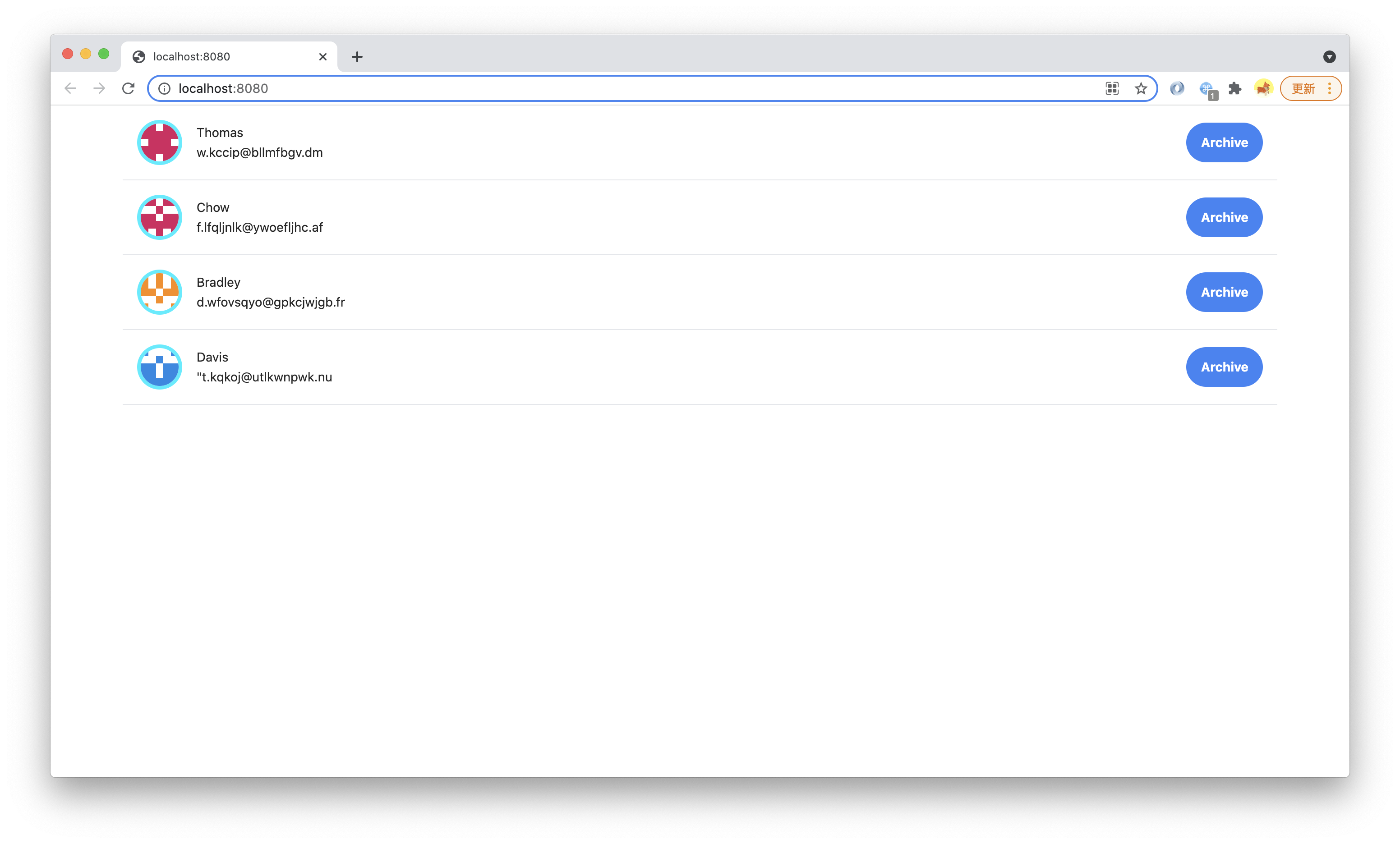
这一小节中,我们只使用了少量 Utiltity Class,比如 [Flex](https://tailwindcss.com/docs/display/)、[Padding](https://tailwindcss.com/docs/padding/)、[Margin](https://tailwindcss.com/docs/margin/)、[Text](https://tailwindcss.com/docs/text-color/)、[Font](https://tailwindcss.com/docs/font-weight/)、[Border](https://tailwindcss.com/docs/border-width),不写一行 CSS 就实现了有【 设计系统(Design System)】的、符合设计稿的专业 UI。
---
> 本小节的代码可以在[这里查看](https://github.com/modern-js-dev/modern-js-examples/tree/main/tutorials/c06/hello-modern-2)。