---
nav_order: 3
permalink: /guide/
---
# UIFactory Guide
## Table of contents
{: .no_toc .text-delta }
1. TOC
{:toc}
## Install from a CDN or npm
You can use UIFactory directly from the CDN:
```html
```
Or you can use [npm](https://www.npmjs.com/get-npm) to install UIFactory locally:
```bash
npm install uifactory
```
... and include it in your HTML file with:
```html
```
## `` creates components as HTML templates
To create this `` component, add a `` like this:
```html
${icon.repeat(+value)}
```
When you add the component to your page:
```html
```
... it renders this output:

You can use [template literals](https://developer.mozilla.org/en-US/docs/Web/JavaScript/Reference/Template_literals)
inside the `` to generate the HTML.
NOTE:
- You **MUST** have a dash (hyphen) in the component name (e.g. `repeat-html`).
[It's a standard](https://developer.mozilla.org/en-US/docs/Web/Web_Components/Using_custom_elements).
- If the `` is empty, the instance's contents are used as the template.
- You cannot use `}` inside the template literal expression. `${ {x: 1} }` is invalid. Keep template literals simple
## `
```
Load multiple files separated by comma and/or spaces. Relative and absolute URLs both work.
```html
```
To import [pre-built components](../components.md), use `import="@component-name"`:
```html
```
Or, if you already loaded UIFactory, use:
```html
```
Note:
- This uses [fetch](https://developer.mozilla.org/en-US/docs/Web/API/Fetch_API/Using_Fetch).
The fetched files must be in the same domain or
[CORS-enabled](https://developer.mozilla.org/en-US/docs/Web/HTTP/CORS).
## `
${result}
```
When you add the component to your page:
```html
```
... it renders this output:
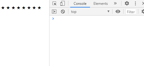
★★★★★★★★ error
Note:
- Add `return` anywhere in the script to stop rendering a component.
(Set [`{parserOptions: {ecmaFeatures: {globalReturn: true}}`](https://eslint.org/docs/2.0.0/user-guide/configuring)
to avoid ESLint errors.)
## Lodash templates are supported
For better control, you can use [Lodash templates](https://lodash.com/docs/#template) like this:
```html
<% for (var j=0; j < +value; j++) { %>
<%= icon %>
<% } %>
```
When you add the component to your page:
```html
```
... it renders this output:
.
There are 3 kinds of template tags you can use:
1. **`<% ... %>` evaluates JavaScript**. e.g., `<% console.log('ok') %>` logs `ok`. This is like `
```
Setting a property, e.g. `.value = ...` *re-renders* the component.
So does `.setAttribute('value', ...)`.
NOTE:
- Inside templates, properties are available as JavaScript variables (e.g. `.icon` or `.value`)
- Attributes with uppercase letters (e.g. `fontSize`) are converted to lowercase properties (e.g. `fontsize`)
- Attributes with a dash/hyphen (e.g. `font-size`) are converted to *camelCase* properties (e.g. `fontSize`).
- Attributes not in the template are **NOT** properties, even if you add them in the component (e.g. `` does not define a `.extra`).
- But [attributes with types (e.g. `extra:string="x"`) are available as properties](#template-attrtype-defines-property-types).
- Properties that cannot be variable names (e.g. `default=""`) can be accessed via [`this.$data`](#thisdataproperty-stores-all-properties) (e.g. `this.$data['default']`).
## `` defines property types
By default, properties are of type `string`. You can specify `number`, `boolean`, `array`,
`object` or `js` like this:
- ``
- ``
- ``
- ``
- ``
The value for `:js=` can include global variables as well as other properties defined just before this property.
For example, when you add this to your page:
```html
${JSON.stringify({x, str, num, bool, arr, obj, expr, rules})}
```
... it renders this output:
```json
{"x":"x","str":"y","num":30,"bool":true,"arr":[3,4],"obj":{"x":1},"expr":63,"rules":{"r":1}}
```
## `attr:=` adds dynamic attributes, classes and styles
To set attribute values dynamically, use `:=` instead of `=` and assign any string or boolean expression:
- `disabled:="true"` becomes "disabled"
- `disabled:="false"` does not add the disabled attribute
- `type:="isNumeric ? 'number' : 'text'"` sets `type="number"` if isNumeric is truthy, else `type="text"`
For dynamic classes, set the `class:=` attribute to a array, object, or string:
- `class:="['x', 'y']"` becomes `class="x y"`
- `class:="{x: true, y: false}"` becomes `class="x"`
- `class:="['x', {y: true, z: false}]"` becomes `class="x y"`
- `class:="${active ? 'yes' : 'no'}"` becomes `class="yes"` is active is true, else `class="no"`
For dynamic styles, set the `style:=` attribute to an object or string:
- ``style:="{'font-size': `${size}px`, color: 'red'}"`` becomes `style="font-size:20px;color:red"` (when size=20).
- `style:="font-size="${size}px; color: red"` also becomes `style="font-size:20px;color:red"` (when size=20).
For example, this defines an `` component:
```html
```
When you add this to your page:
```html
Active:
Inactive:
```
... it renders:

## `` inserts contents from the instance
[Slots](https://developer.mozilla.org/en-US/docs/Web/Web_Components/Using_templates_and_slots)
let you create components in which component users can change content.
For example, this defines a component with 2 slots:
```html
Good = ....
Bad = ....
```
When you add the component to your page:
```html
bonmauvais
```
... it renders this output:
Good = *bon*. Bad = **mauvais**.
- `` is replaced with all `slot="good"` elements.
- `` is replaced with all `slot="bad"` elements.
- `` (without `name=`) is replaced with the whole `` contents.
Slots can [contain variables](#lodash-templates-are-supported) like `${x}`. This
lets component users customize the component further.
Slot contents are also available as `this.$slot[slotName]`. `${this.$slot.good}` is just like
``.
## ``. For example:
```html
<%= one() %>
<%= two({ greeting: 'Ola' }) %>
```
When you add the component to your page:
```html
```
... it renders this output:
```text
one says hello. two says Ola.
```
Note:
- You can use [`this`](#this-is-the-instance-dom-element) and
[all properties](#template-attr-defines-properties) as variables.
- If multiple ``, like this:
```html
Click to count ${count} items in steps of ${step}.
```
When you add the component to your page:
```html
```
... it renders this output:

To add a `click` event listener **to a child**, use ``:
```html
Count: ${count}
```
Now, `` renders:

Listeners can use these variables:
- `e` is the [event object](https://developer.mozilla.org/en-US/docs/Web/API/Event)
- `this` is the [component instance](#this-is-the-instance-dom-element)
- [Any property](#template-attr-defines-properties), e.g. `count`, `step`
To call the listener only once, add the `$once` attribute to `
```
Now, `` renders:

## ``, ``, etc to create listeners.
For example:
```html
```
Now, `` renders this output:

NOTE:
- `` creates multiple listeners
- `this.addEventListener('render', ...)` is exactly the same as ``.
Anything inside it is rendered as a template. (Any HTML outside it is ignored.)
```html
This text is ignored!
This text is ignored too!
```
It renders this output:

## `this.$data[property]` stores all properties
All properties are stored in `this.$data` as an object. You can read and write these values.
For example, this `` component changes the default attribute before rendering:
```html
${this.$data.default}
```
Normally, properties are ALSO accessible as `this.`.
But if you define a ``, will `this.querySelector` be "xx" or the
[this.querySelector()](https://developer.mozilla.org/en-US/docs/Web/API/Element/querySelector) function?
ANS: `this.querySelector` is the function. `this.$data.querySelector` holds "xx".
This is be useful if you don't know whether a property is defined or not.
For example, when you add this to your page:
```html
Properties:
<% for (let key in this.$data) { %>
${key}=${this.$data[key]}
<% } %>
z=${'z' in this.$data ? 'defined' : 'undefined'}
```
... it renders this output:
`Properties: x=10 y=20 z=undefined`
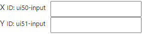
## `this.$id` hold a unique ID for each component
If you generate an `id=` attribute in your component, you need a unique identifier for each
component. `this.$id` has a string that's unique for each component instance.
For example, this creates a label-input combination with a unique ID for each input:
```html
```
Now, if you repeatedly use this component in a page:
```html
```
... it creates elements with different IDs:
## `this.$contents` has component's original DOM
`this.$contents` is a cloned version of the custom element's original DOM. You can access what the
user specified inside your component and use it.
For example, `` repeats everything under `class="x"` x times, and everything under
`class="y"` y times.
```html
${this.$contents.querySelector('.x').innerHTML.repeat(x)}
${this.$contents.querySelector('.y').innerHTML.repeat(y)}
```
```html
🙂😡
```
... it renders this output:
🙂🙂🙂🙂🙂😡😡😡😡
## `
```
When you add the component to your page:
```html
```
... it renders this output:
```text
"back" is 2 steps from "book"
```
All `
```
... adds a `` dynamically into the `
`, and renders this output:
```html
onLine = true
```
This code does the same thing:
```html
```
## `attr:type=` on an instance adds new properties
You can [defining properties on templates](#template-attr-defines-properties). But you can
add properties on an instance too.
For example, if you have a `` with a `base` or `root` attributes like this:
```html
Instance properties:
<% for (let key in this.$data) { %>
${key}=${this.$data[key]}
<% } %>
```
... you can add a custom property when creating the element, by adding a type (e.g. `:number`) like this:
```html
```
This will render:
```text
Instance properties: base=10 root= child=20
```
The `child` JavaScript variable is now available (as a number).
You can update instance property `.child=...` or the attribute `child:number=`
```html
```
The instance types **override** the template. For example, here, `base` and `root` are defined as
`:js`, which overrides the template's `base:number`:
```html
```
This will render:
```text
Instance properties: base=3 src=5 child=20
```
## `uifactory.register()` registers new components
To register a component with full control over the options, use:
```html
```
The object has these keys:
- `name`: component name, e.g. `"g-repeat"`
- `template`: component contents as a [template](#lodash-templates-are-supported)
- `properties`: OPTIONAL: mapping of [properties](#template-attr-defines-properties) as `name: {value, type}` property definitions
- `window`: OPTIONAL: the [Window](https://developer.mozilla.org/en-US/docs/Web/API/Window) on which to register the component. Used to define components on other windows or IFrames
- `compile`: OPTIONAL: the [template compiler](#compile-supports-any-compiler) function to use
## `uifactory.types` lets you add custom types
We define property types on attributes like this: `attr:type="value"`. The default types are
`string` (default), `number`, `boolean`, `array`, `object` or `js`.
You can add a new custom type by extending `uifactory.types`. For example:
```js
uifactory.types.newtype = {
parse: string => ..., // Function to convert string to value
stringify: value => ... // Function to convert value to string
}
```
Each custom type needs a `parse` and `stringify` functions with the following signature:
- `parse(string, name, data)`: Converts the attribute `name:type="string"` into the property `el.$data.name`
- `string`: string value of the attribute
- `name`: name of the attribute. (Property names are in camelCase. This is in kebab-case)
- `data`: all properties of the component, computed so far
- `stringify(value, name, data)`: Converts the property `el.$data.name == value` into a attribute value string
- `value`: JavaScript object holding the property value
- `name`: name of the attribute. (Property names are in camelCase. This is in kebab-case)
- `data`: all properties of the component, computed so far
It can be quite useful to have all properties available as `data`. This lets you parse attributes
based on previous attributes.
Let's add type called `:range`, which creates an array of values:
```js
uifactory.types.range = {
// Parse a string like seq:range="0,10,2" into [0, 2, 4, 6, 8]
parse: string => {
// Pick start, step, end as the first 3 numbers in the string
let [start, end, step] = string.split(/\D+/)
// Convert it into an array
let result = []
for (let val = (+start || 0); val < (+end || 1); val += (+step || 1))
result.push(val)
return result
},
// Stringify an array like [0, 2, 4, 6, 8] into "0,10,2"
stringify: value => {
let start = value[0] // First value, e.g. 0
let step = value[1] - value[0] // 2nd - 1st value, e.g. 2
let end = value[value.length - 1] + step // Last value + step, e.g. 8 + 2 = 10
return `${start},${end},${step}`
}
}
```
When you add a component using this custom type to your page:
```html
Values are ${JSON.stringify(series)}
```
... it renders this output:
`Values are [0,2,4,6,8]`
Let's create a `:formula` type that executes JavaScript. For example:
```js
uifactory.types.formula = {
// Compile string into a JavaScript function, call it with data, return the result
parse: (string, name, data) => {
let fn = new Function('data', `with (data) { return (${string}) }`)
return fn(data)
},
// Convert the value into a JSON string
stringify: value => JSON.stringify(value)
}
```
When you add a component using this custom type to your page:
```html
x=${x}, y=${y}, z=${z}
```
... it renders this output:
`x=10, y=100, z=210`
The `:formula` type evaluates values in the context of previous values.
## `.$ready.then()` when instance is first rendered
You can check if a component is ready (i.e. rendered for the first time), using the
`.$ready` Promise. For example, this component uses an external script. It may time to
get read.
```html
${x} is ${uifactory.textDiff2.distance(x, y)} steps from ${y}
```
When check if it has been ready, use:
```js
let el = await document.querySelector('text-diff2').$ready
// The child will be present only after the component is ready.
el.querySelector('strong').style.color = 'red'
```
It turns the `` element red when it's ready:

## `uifactory.components` lists registered components
If you register a `` component, `uifactory.components['ui-config']` has the component's
configuration, i.e. its name, properties, template, and any other options used to register the
component.
For example, this component renders its own configuration.
```html
${JSON.stringify(uifactory.components['ui-config'])}
```
When you add the component to your page:
```html
```
... it renders this output:
```json
{
"name": "ui-config",
"properties": {
"str": {
"type": "string",
"value": "x"
},
"arr": {
"type": "array",
"value": "[3,4]"
},
"expr": {
"type": "js",
"value": "3 + 2"
}
},
"template": "\n ${JSON.stringify(uifactory.components['ui-config'])}\n"
}
```
## `$render` supports any renderer
Gramex renders the generated HTML into a node by setting `node.innerHTML = html`.
This removes all existing DOM elements and creates new ones.
This is not good if you have event handlers, or want animations. For example, if you want to
rescale a chart's axis smoothly without re-drawing.
You can instead specify a custom `$render:js="myfunction"` where `myfunction(node, html)` updates
the `node` in any way.
For example, here's an SVG component that smoothly animates when an attribute changes:
```html
```
Now, suppose you change the circle's color programmatically and then change the `x=""` attribute:
```html
```
... the circle is not redrawn. It stays blue. It smoothly moves to `x="200"`.
## `compile:` supports any compiler
Instead of [templates](#lodash-templates-are-supported), you can use any function to compile templates.
For example, the `g-name` component below uses [Handlebars](https://handlebarsjs.com/) templates to render the last name in bold:
```html
```
This renders:
Walt **Disney**
`compile:` must be a function that accepts a string that returns a template function.
When rendering, the template function is called with the properties object
(e.g. `{first: "Walt", last: "Disney", this: ...}`).
Its return value is rendered inside the component.
For example, this is a "template" that replaces all words beginning with `$` by looking up the properties object:
```html
```
This renders:
Walt **Disney**
# Reference
## Types
### `:urltext` fetches URLs as text
To fetch a URL as text, specify `:urltext` as the property type. For example, this ``
component displays "Loading..." until a URL is loaded, and then displays its text.
```html
${src}
Loading...
```
... it renders the contents of `page.txt` as text:
```text
Contents of page.txt
```
- To reload the URL and re-render, set `.src` to a string, e.g. `el.src = 'page.txt'`:
- To re-render with a pre-loaded string, set `el.update({src: 'string'}, {noparse: true})`
### `:urljson` fetches URLs as JSON
To fetch a URL as JSON, specify `:urljson` as the property type. For example, this ``
component displays "Loading..." until a URL is loaded, and then displays its JSON.
```html
${JSON.stringify(src)}
Loading...
```
... it renders the contents of `page.json`:
```text
{"text":"abc","number":10,"object":{"x":[1,2,3]}}
```
- To reload the URL and re-render, set `.src` to a string, e.g. `el.src = 'page.json'`:
- To re-render with a pre-loaded value, set `.src` to an object, e.g. `el.src = {x: 1}`
### `:url` fetches URLs
To fetch a URL as text, specify `:url` as the property type. For example, this ``
component displays "Loading..." until a URL is loaded, and then displays it.
```html
${src.text}
Loading...
```
... it renders the contents of `page.txt`:
```text
Contents of page.txt
```
- To reload the URL and re-render, set `.src` to a string, e.g. `el.src = 'page.txt'`:
- To re-render with a pre-loaded value, set `.src` to an object, e.g. `el.src = {text: 'abc'}`
`src` is a [Response](https://developer.mozilla.org/en-US/docs/Web/API/Response) object with these keys:
- `.headers`: response [headers](https://developer.mozilla.org/en-US/docs/Web/API/Response/headers)
- `.status`: HTTP status code
- `.statusText`: HTTP status message corresponding to the status code (e.g., OK for 200)
- `.ok`: `true` if the HTTP status is the range 200-299
- `.url`: The URL of the response -- after any redirections
- `.text`: Text from the loaded page. This is **not a Promise**, but the actual text
## Special attributes
All UIFactory elements have some predefined properties. For an element defined as
```html
${icon.repeat(+value)}
```
- `this.$contents`: a DOM element with the [instance's original contents](#thiscontents-has-components-original-dom)
- `this.$data`: an object with [all properties and values](#thisdataproperty-stores-all-properties), e.g. `{icon: 'X', value: '30'}`
- `this.$id`: a [unique ID for each instance](#thisid-hold-a-unique-id-for-each-component)
- `this.$properties`: an object with component properties and their info, e.g. `{icon: {type: "string", value: "X"}, value: {...}}`
- `this.$ready`: a Promise that's resolved when [instance is first rendered](#readythen-when-instance-is-first-rendered)
- `this.$render`: a `function(element, html)` that inserts the HTML into the element. [``](#render-supports-any-renderer) replaces this
- `this.$slot`: an object with the instance's [slot names as keys and slot contents as values](#slot-inserts-contents-from-the-instance)