# twist-aplayer

Twist APlayer
> A shadcn ui theme aplayer for your React application.
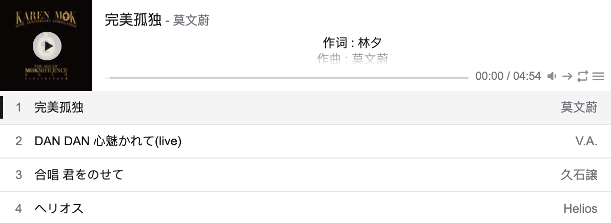
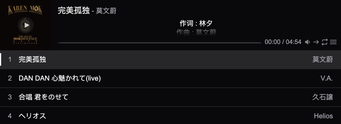
## Features
Twist Aplayer supports:
- Mini mode
- Playlist - Lyrics
- Light or dark theme switch
- Custom theme color with component-level variables
- SSR compatibility
- Accessible friendly
Twist Aplayer icons powered by [twist-icons](https://github.com/twist-space/twist-icons) !
## Usage
```bash
npm i twist-aplayer
```
Import TwistAPlayer component from twist-aplayer package, and import stylesheet.
```tsx
import { TwistAPlayer } from 'twist-aplayer';
import 'twist-aplayer/dist/index.min.css';
render(
);
```
### Interface
```ts
export interface AudioInfo {
name?: string;
artist?: string | ArtistInfo;
url: string;
cover?: string;
lrc?: string;
theme?: string;
type?: 'auto' | 'hls' | 'normal';
}
export interface ArtistInfo {
name?: string;
url?: string;
}
export interface TwistAPlayerProps {
/**
* @description audio info, should be an object or object array
*/
audio: AudioInfo | readonly AudioInfo[];
/**
* Initial volume
* @description default volume
* @default 0.7
*/
volume?: number;
/**
* @description values: 'normal', 'fixed'
* @default "normal"
*/
appearance?: 'normal' | 'fixed';
/**
* @description values: 'all' | 'one' | 'none'
* @default "all"
*/
initialLoop?: PlaylistLoop;
/**
* @description values: 'list' | 'random'
* @default "list"
*/
initialOrder?: PlaylistOrder;
/**
* @description audio autoplay
* @default false
*/
autoPlay?: boolean;
/**
* @description list max height
* @default 250
*/
listMaxHeight?: number;
/**
* @description enable mini mode
* @default false
*/
mini?: boolean;
/**
* @description enable super mini mode for mobile devices, only shows miniswitcher initially
* @default false
*/
superMini?: boolean;
/**
* @default prevent to play multiple player at the same time, pause other players when this player start play
* @default true
*/
mutex?: boolean;
/**
* @description indicate whether list should folded at first
* @default false
*/
listFolded?: boolean;
/**
* @description player theme, values: light, dark
* @default light
*/
theme?: 'light' | 'dark';
/**
* @description user border, it can accent border if use dark mode.
* @default false
*/
border?: boolean;
/**
* @description custom class name for the player container
*/
className?: string;
/**
* @description custom inline styles for the player container
*/
style?: React.CSSProperties;
}
```
## How to make LRC?
I recommand [LRC generator site](https://www.lrcgenerator.com/), it can easy to make LRC!
## Credits
The implementation of this project is inspired by the following prior art project:
- [aplayer-react](https://github.com/SevenOutman/aplayer-react)
- [aplayer](https://github.com/DIYgod/APlayer)