# tldraw Documentation

Version: `5.4.2`

This file is generated during package publishing from the tldraw docs content for this exact package version.

## Introduction

Introduction articles for tldraw.

### Quick start

Have five minutes? Run this command in your terminal to explore tldraw [starter kits](https://tldraw.dev/starter-kits):

```bash
npm create tldraw@latest
```

Have a little more time? Let's try out the tldraw SDK in a React project.

If you're new to React, we recommend using a [Vite template](https://vitejs.dev/guide/#scaffolding-your-first-vite-project) as a starter. We'll assume your project is already running locally.

#### Getting started

First, install the `tldraw` package from npm:

```bash
npm install tldraw
```

Next, in your React project, import the `Tldraw` component and tldraw's CSS styles. Then render the `Tldraw` component inside a full screen container:

```tsx
import { Tldraw } from 'tldraw'
import 'tldraw/tldraw.css'

export default function App() {
	return (
		<div style={{ position: 'fixed', inset: 0 }}>
			<Tldraw />
		</div>
	)
}
```

That's pretty much it! At this point, you should have a complete working single-user canvas. You can draw, write, add images and video, zoom, pan, copy and paste, undo and redo—everything you'd expect from a canvas.

You'll be starting from our default [shapes](https://tldraw.dev/docs/shapes), [tools](https://tldraw.dev/docs/tools), and [user interface](https://tldraw.dev/docs/user-interface), but you can customize all of these things for your project if you wish. For now, let's show off a few more features.

#### Local persistence

Let's add local persistence by passing a `persistenceKey` prop to the `Tldraw` component:

```tsx
export default function App() {
	return (
		<div style={{ position: 'fixed', inset: 0 }}>
			<Tldraw persistenceKey="example" />
		</div>
	)
}
```

The `persistenceKey` prop saves your project to the browser's storage so that it survives a refresh. It also synchronizes the project with other instances that share the same key—even in other browser tabs! Give it a try by opening your app in a second window.

#### Real-time collaboration

To add support for multiple users collaborating in real time, you can use the [**tldraw sync**](https://tldraw.dev/docs/sync) library. Its demo hook connects your app to tldraw's demo server, which hosts temporary rooms.

First, install the `@tldraw/sync` package:

```bash
npm install @tldraw/sync
```

Next, import the `useSyncDemo` hook from the `@tldraw/sync` package. Call it in your component with a unique ID and pass the store that it returns to the `Tldraw` component:

```tsx
import { Tldraw } from 'tldraw'
import { useSyncDemo } from '@tldraw/sync'
import 'tldraw/tldraw.css'

export default function App() {
	const store = useSyncDemo({ roomId: 'insert-any-string-here' })

	return (
		<div style={{ position: 'fixed', inset: 0 }}>
			<Tldraw store={store} />
		</div>
	)
}
```

Try it out by opening your project in a second incognito window, or else access it from another device. You should see all of tldraw's multiplayer features: live cursors, user names, viewport following, cursor chat, and more.

If you want to go further with real-time collaboration, be sure to check out our guide to the [**tldraw sync**](https://tldraw.dev/docs/sync) library.

#### Controlling the canvas

The tldraw [editor](https://tldraw.dev/docs/editor) has a runtime JavaScript API. Everything that can happen in tldraw can be done programmatically through the `Editor` instance.

For simplicity's sake, let's roll back our persistence and sync code. We can then use the `Tldraw` component's `onMount` callback to get access to the Editor instance. We'll use the editor to create a new shape on the canvas, select it, then slowly zoom to it.

```tsx
import { Editor, Tldraw, toRichText } from 'tldraw'
import 'tldraw/tldraw.css'

export default function App() {
	const handleMount = (editor: Editor) => {
		editor.createShape({
			type: 'text',
			x: 200,
			y: 200,
			props: {
				richText: toRichText('Hello world!'),
			},
		})

		editor.selectAll()

		editor.zoomToSelection({
			animation: { duration: 5000 },
		})
	}

	return (
		<div style={{ position: 'fixed', inset: 0 }}>
			<Tldraw onMount={handleMount} />
		</div>
	)
}
```

The Editor is tldraw's main interface for controlling the canvas. Be sure to check out the `Editor` API documentation for more information on what you can do with it, as well as our [guide on using the editor](https://tldraw.dev/docs/editor).

#### Next steps

Now that you've seen how the tldraw canvas works, you can:

- Create your own [shapes](https://tldraw.dev/docs/shapes) and [tools](https://tldraw.dev/docs/tools)
- Customize the [user interface](https://tldraw.dev/docs/user-interface)
- Learn more about the [editor](https://tldraw.dev/docs/editor)
- Explore our [examples](https://tldraw.dev/examples)
- Build with our [starter kits](https://tldraw.dev/starter-kits)

The SDK lets you customize shapes, tools, UI, and more. In addition to our long-form docs, we have dozens of examples in our [examples section](https://tldraw.dev/examples) that cover more of its functionality. You can run these locally with the tldraw [GitHub repository](https://github.com/tldraw/tldraw).

#### Join our community

If you build something great, please share it with us in our [#show-and-tell](https://discord.tldraw.com/?utm_source=docs&utm_medium=organic&utm_campaign=sociallink) channel on Discord. Good luck!

### Installation

To use the tldraw SDK, first install the `tldraw` package:

```bash
npm install tldraw
```

Now import and use the `Tldraw` component inside of any React component. You will need React 18 or 19.

```tsx
import { Tldraw } from 'tldraw'
import 'tldraw/tldraw.css'

export default function () {
	return (
		<div style={{ position: 'fixed', inset: 0 }}>
			<Tldraw />
		</div>
	)
}
```

##### Wrapper

The `Tldraw` component must be wrapped in a parent container with an explicit size. Its height and width are set to `100%`, so it will fill its parent container.

##### Accessing the editor

Use the `onMount` prop to access the `Editor` instance when it's ready:

```tsx
function App() {
	return (
		<div style={{ position: 'fixed', inset: 0 }}>
			<Tldraw
				onMount={(editor) => {
					// Do something with the editor
					editor.selectAll()
				}}
			/>
		</div>
	)
}
```

The callback can return a cleanup function that runs when the editor unmounts.

##### CSS

In addition to the `Tldraw` component itself, you should also import the `tldraw.css` file from the `tldraw` package.

```tsx
import 'tldraw/tldraw.css'
```

You can alternatively import this file inside of another CSS file using the `@import` syntax.

```css
@import url('tldraw/tldraw.css');
```

If you'd like to deeply change the way that tldraw looks, you can copy the `tldraw.css` file into a new CSS file, make your changes, and import that instead.

##### Fonts

The tldraw SDK bundles its own fonts for shapes: IBM Plex (Sans, Serif, Mono) and Shantell Sans (for draw-style text). These are loaded automatically from the CDN or self-hosted [static assets](#Static-assets).

The tldraw UI will inherit its font family. You can set this to any font you like. For example, to use Inter:

```css
@import url('https://fonts.googleapis.com/css2?family=Inter:wght@500;700&display=swap');

.tl-container {
	font-family: 'Inter', sans-serif;
}
```

##### HTML

If you're using the `Tldraw` component in a full-screen app, update your `index.html`'s meta viewport element as shown below.

```html
<meta name="viewport" content="width=device-width, initial-scale=1, viewport-fit=cover" />
```

Without these viewport options, some features like safe area positioning won't work correctly.

#### License

If you have a [license key](https://tldraw.dev/pricing), you can pass your key to the `licenseKey` prop.

```tsx
<Tldraw licenseKey={YOUR_LICENSE_KEY} />
```

To learn more about the license and license key, visit [our pricing page](https://tldraw.dev/pricing).

#### Static assets

To use the `Tldraw` component, the app must be able to find certain assets. These are contained in the `embed-icons`, `fonts`, `icons`, and `translations` folders. We offer a few different ways of making these assets available to your app.

##### Using a bundler

If you're using a bundler like webpack or rollup, you can import the assets directly from the `@tldraw/assets` package. Your bundler will copy the assets with your bundle and insert the correct URLs in their place.

There are three options:

- `import {getAssetUrlsByImport} from '@tldraw/assets/imports'`: import asset files using import statements. You'll need to configure your bundler to treat imports of .svg, .png, .json, and .woff2 files as external assets.
- `import {getAssetUrlsByImport} from '@tldraw/assets/imports.vite'`: import asset files, appending `?url` to the asset path. This works correctly with [vite](https://vitejs.dev/guide/assets#explicit-url-imports) without any extra configuration needed.
- `import {getAssetUrlsByMetaUrl} from '@tldraw/assets/urls'`: get asset urls using `new URL(path, import.meta.url)`. This is a standards-based approach that works natively in most modern browsers & bundlers.

Call the function, and pass the resulting `assetUrls` into the `Tldraw` component:

```tsx
import { getAssetUrlsByMetaUrl } from '@tldraw/assets/urls'

const assetUrls = getAssetUrlsByMetaUrl()

<Tldraw assetUrls={assetUrls} />
```

##### Using a public CDN

By default, we serve these assets from a public CDN. This works without configuration and is a good starting point.

If you would like to customize some of the assets you can pass the customizations to our `Tldraw` component. For example, to use a custom icon for the `hand` tool you can do the following:

```tsx
const assetUrls = {
    icons: {
        'tool-hand': './custom-tool-hand.svg',
    },
}

<Tldraw assetUrls={assetUrls} />
```

This will use the custom icon for the `hand` tool and the default assets for everything else.

##### Self-hosting assets

You can also host these assets yourself:

1. Download the `embed-icons`, `fonts`, `icons`, and `translations` folders from the [assets folder](https://github.com/tldraw/tldraw/tree/main/assets) of the tldraw repository.
2. Place the folders in your project's public path.
3. Pass `assetUrls` prop to our `<Tldraw/>` component to let the component know where the assets live.

You can use our `getAssetUrls` helper function from the `@tldraw/assets` package to generate these urls for you.

```tsx
import { getAssetUrls } from '@tldraw/assets/selfHosted'

const assetUrls = getAssetUrls()

<Tldraw assetUrls={assetUrls} />
```

While these files must be available, you can overwrite the individual files: for example, by placing different icons under the same name or by modifying or adding translations.

If you use a CDN for hosting these files you can specify the base url of your assets. To recreate the above option of serving the assets from our CDN you would do the following:

```ts
import { getDefaultCdnBaseUrl } from 'tldraw'

const assetUrls = getAssetUrls({
	baseUrl: getDefaultCdnBaseUrl(),
})
```

#### Subcomponents

The `Tldraw` component combines two lower-level components: `TldrawEditor` and `TldrawUi`. If you want more granular control, you can use those lower-level components directly. See the [exploded example](https://tldraw.dev/examples/configuration/exploded) for reference.

##### Customizing components

You can customize the appearance of the tldraw editor and UI using the `Tldraw` (or `TldrawEditor`) component's `components` prop. This prop accepts a `TLComponents` object, which combines `TLEditorComponents` (canvas-level components like the background and grid) with `TLUiComponents` (UI elements like toolbar, menus, and panels).

```tsx
import { TLComponents } from 'tldraw'

const components: TLComponents = {
	// Editor components
	Background: YourCustomBackground,
	Grid: YourCustomGrid,

	// UI components
	Toolbar: YourCustomToolbar,
	MainMenu: YourCustomMainMenu,
	StylePanel: YourCustomStylePanel,
	ContextMenu: YourCustomContextMenu,
}

<Tldraw components={components} />
```

Canvas overlay elements like the selection foreground, brush, snap indicators, and scribble are rendered via the `OverlayUtil` system rather than React components. You can customize them by extending the built-in overlay utils and passing them via the `overlayUtils` prop.

See the `TLEditorComponents` and `TLUiComponents` type definitions for the complete list of customizable components.

#### Versioning

The tldraw SDK does not follow semantic versioning. To learn more, read about how we do [release versioning](https://tldraw.dev/releases).

### Releases

Release notes for all tldraw SDK versions. Each minor release has its own page documenting new features, breaking changes, API additions, improvements, and bug fixes. Patch releases are listed within their parent minor release.

For the original releases, see the [GitHub releases page](https://github.com/tldraw/tldraw/releases).

#### How tldraw is versioned

Unlike many JavaScript packages distributed on [NPM](https://www.npmjs.com/), the tldraw SDK does not follow [semantic versioning](https://semver.org/) in its release versions. Instead:

- Major version bumps are rare. We reserve them for fundamental changes to how the SDK works.
- Minor version bumps are released on a regular cadence, approximately monthly. **They may contain breaking changes**. We aim to make breaking changes as minimally disruptive as possible, but tldraw is actively evolving as we add new features. We recommend updating at a similar pace and checking the release notes.
- Patch version bumps are for bugfixes and hotfixes that can't wait for the next cadence release.

#### Latest tldraw versions

- Run `npm install tldraw` to get the latest minor version of tldraw
- Use `npm install tldraw@next` to get the latest version of tldraw that is used on [tldraw.com](https://www.tldraw.com)
- The latest changes to the `main` branch of tldraw are available to test through our [pre-release canary builds](https://www.npmjs.com/package/tldraw?activeTab=versions).

#### Migration skill

We ship an experimental `tldraw-migrate` agent skill that helps a coding agent update your project to the latest version of the SDK. It detects your current version, fetches the relevant release notes, upgrades packages, and works through any type errors using the migration guides in our release notes. See our [migration skill guide](https://tldraw.dev/releases/migration-skill) for details on how to install and use the skill.

#### Next

- [next](https://tldraw.dev/releases/next) - Changes for the upcoming release.

#### v5.x

- [v5.4](https://tldraw.dev/releases/v5.4.0) - A center align operation, a tleditors registry of mounted editors, faster signals and store layers, and a broad reliability pass across the SDK
- [v5.3](https://tldraw.dev/releases/v5.3.0) - Commenting with anchored threads on the canvas, new collaboration packages, geo shape flipping, crop snapping, and faster viewport culling
- [v5.2](https://tldraw.dev/releases/v5.2.0) - Faster freehand ink, a frame selection action, SDK-wide performance improvements, and breaking changes to the collaborator user-id types and Node support
- [v5.1](https://tldraw.dev/releases/v5.1.0) - Page menu redesign, copy-styles shortcut, selectable locked shapes, public translation APIs, and performance improvements
- [v5.0](https://tldraw.dev/releases/v5.0.0) - Custom themes, overlays, performance, extensiblity, and attribution

#### v4.x

- [v4.5](https://tldraw.dev/releases/v4.5.0) - Click-through on transparent pixels, SVG sanitization, configurable embed definitions
- [v4.4](https://tldraw.dev/releases/v4.4.0) - Image pipeline starter kit, performance improvements, quick zoom, canvas indicators
- [v4.3](https://tldraw.dev/releases/v4.3.0) - SQLite sync storage, improved custom shape types, reactive inputs, draw shape encoding
- [v4.2](https://tldraw.dev/releases/v4.2.0) - TipTap v3, dynamic tools, custom socket implementations
- [v4.1](https://tldraw.dev/releases/v4.1.0) - Shader starter kit, localStorage atoms, minimap filtering
- [v4.0](https://tldraw.dev/releases/v4.0.0) - Starter kits, WCAG 2.2 AA compliance, licensing updates

#### v3.x

- [v3.15](https://tldraw.dev/releases/v3.15.0) - `npm create tldraw` CLI, accessibility improvements
- [v3.14](https://tldraw.dev/releases/v3.14.0) - Contextual toolbars, PathBuilder API
- [v3.13](https://tldraw.dev/releases/v3.13.0) - Elbow arrows for technical diagrams
- [v3.12](https://tldraw.dev/releases/v3.12.0) - Accessibility focus, keyboard navigation
- [v3.11](https://tldraw.dev/releases/v3.11.0) - Rich text fixes, zoom improvements
- [v3.10](https://tldraw.dev/releases/v3.10.0) - Rich text as first-class primitive
- [v3.9](https://tldraw.dev/releases/v3.9.0) - Layout improvements, AtomMap class
- [v3.8](https://tldraw.dev/releases/v3.8.0) - React 19 compatibility, i18n expansion
- [v3.7](https://tldraw.dev/releases/v3.7.0) - Presence sync customization
- [v3.6](https://tldraw.dev/releases/v3.6.0) - Expanded action helpers
- [v3.5](https://tldraw.dev/releases/v3.5.0) - Grid snapping, layer improvements
- [v3.4](https://tldraw.dev/releases/v3.4.0) - Excalidraw compatibility
- [v3.3](https://tldraw.dev/releases/v3.3.0) - Readonly mode, sync improvements
- [v3.2](https://tldraw.dev/releases/v3.2.0) - Version alignment release
- [v3.1](https://tldraw.dev/releases/v3.1.0) - Shape visibility, server-side updates
- [v3.0](https://tldraw.dev/releases/v3.0.0) - New licensing, deep links, custom embeds

#### v2.x

- [v2.4](https://tldraw.dev/releases/v2.4.0)
- [v2.3](https://tldraw.dev/releases/v2.3.0)
- [v2.2](https://tldraw.dev/releases/v2.2.0)
- [v2.1](https://tldraw.dev/releases/v2.1.0)
- [v2.0](https://tldraw.dev/releases/v2.0.0) - Initial public release

## Learn tldraw

Learn to use the tldraw SDK.

### Editor

The `Editor` class is the main way of controlling tldraw's editor. You can use it to manage the editor's internal state, make changes to the document, or respond to changes that have occurred.

By design, the editor's surface area is very large. Almost everything is available through it. Need to create some shapes? Use `Editor#createShapes`. Need to delete them? Use `Editor#deleteShapes`. Need a sorted array of every shape on the current page? Use `Editor#getCurrentPageShapesSorted`.

#### Accessing the editor

You can access the editor in two ways:

##### The onMount callback

The `Tldraw` component's `onMount` callback provides the editor as the first argument.

```tsx
function App() {
	return (
		<Tldraw
			onMount={(editor) => {
				// your editor code here
			}}
		/>
	)
}
```

##### The useEditor hook

The `useEditor` hook returns the editor instance. Call it from a component rendered inside `Tldraw` (or `TldrawEditor`).

```tsx
function InsideOfContext() {
	const editor = useEditor()
	// your editor code here
	return null
}

function App() {
	return (
		<Tldraw>
			<InsideOfContext />
		</Tldraw>
	)
}
```

> If you're using the subcomponents as shown in [this example](https://tldraw.dev/examples/configuration/exploded), the editor instance is provided by the `TldrawEditor` component.

#### Reactive state

The editor's state is reactive. Methods like `Editor#getSelectedShapeIds` or `Editor#getCurrentPageShapes` return values that automatically update when the underlying data changes. You can use these values directly in React components with the `track` wrapper or `useValue` hook.

```tsx
import { track, useEditor, useValue } from 'tldraw'

export const SelectedShapeIdsCount = track(() => {
	const editor = useEditor()
	return <div>{editor.getSelectedShapeIds().length}</div>
})

export function CurrentTool() {
	const editor = useEditor()
	const toolId = useValue('current tool', () => editor.getCurrentToolId(), [editor])
	return <div>{toolId}</div>
}
```

See the [Signals](https://tldraw.dev/sdk-features/signals) article for more on tldraw's reactive state system.

#### Batching changes

Each change to the editor happens within a transaction. You can batch multiple changes into a single transaction using the `Editor#run` method. Batching groups the changes into a single undo step and reduces overhead for persisting or distributing changes.

```ts
// myShapes is an array of shape partials, each with an id from createShapeId()
editor.run(() => {
	editor.createShapes(myShapes)
	editor.sendToBack(myShapes.map((shape) => shape.id))
	editor.selectNone()
})
```

The `run` method also accepts options to control history and locked shape behavior. Set `history` to `'ignore'` to leave undo/redo alone, or `'record-preserveRedoStack'` to record without clearing the redo stack:

```ts
// Make changes without affecting undo/redo history
editor.run(
	() => {
		editor.createShapes(myShapes)
	},
	{ history: 'ignore' }
)

// Make changes to locked shapes
editor.run(
	() => {
		editor.updateShapes(myLockedShapes)
	},
	{ ignoreShapeLock: true }
)
```

#### Capabilities

The editor's methods and properties are organized around these areas:

| Area          | Topic                                              | Description                                      |
| ------------- | -------------------------------------------------- | ------------------------------------------------ |
| Data          | [Signals](https://tldraw.dev/sdk-features/signals)                   | Reactive state primitives                        |
|               | [Store](https://tldraw.dev/sdk-features/store)                       | The reactive database holding all records        |
|               | [Shapes](https://tldraw.dev/sdk-features/shapes)                     | Create, read, update, and delete shapes          |
|               | [Bindings](https://tldraw.dev/sdk-features/bindings)                 | Relationships between shapes                     |
|               | [Pages](https://tldraw.dev/sdk-features/pages)                       | Manage document pages                            |
|               | [Assets](https://tldraw.dev/sdk-features/assets)                     | Images, videos, and other media                  |
| Interaction   | [Tools](https://tldraw.dev/sdk-features/tools)                       | The state machine that handles user input        |
|               | [Selection](https://tldraw.dev/sdk-features/selection)               | Manage which shapes are selected                 |
|               | [Input handling](https://tldraw.dev/sdk-features/input-handling)     | Pointer and keyboard state                       |
|               | [Events](https://tldraw.dev/sdk-features/events)                     | Subscribe to user interactions and state changes |
| View          | [Camera](https://tldraw.dev/sdk-features/camera)                     | Control viewport position and zoom               |
|               | [Coordinates](https://tldraw.dev/sdk-features/coordinates)           | Convert between screen and page space            |
| State         | [Instance state](https://tldraw.dev/sdk-features/instance-state)     | Per-editor settings like current tool and focus  |
|               | [Visibility](https://tldraw.dev/sdk-features/visibility)             | Control which shapes are shown                   |
|               | [History](https://tldraw.dev/sdk-features/history)                   | Undo, redo, and history management               |
|               | [Side effects](https://tldraw.dev/sdk-features/side-effects)         | React to record lifecycle changes                |
| Configuration | [User preferences](https://tldraw.dev/sdk-features/user-preferences) | Cross-instance settings like dark mode           |
|               | [Readonly mode](https://tldraw.dev/sdk-features/readonly)            | Disable editing                                  |
|               | [Locked shapes](https://tldraw.dev/sdk-features/locked-shapes)       | Prevent changes to specific shapes               |
| Output        | [Image export](https://tldraw.dev/sdk-features/image-export)         | Export to SVG, PNG, and other formats            |

See the `Editor` API reference for the complete list of methods and properties.

### Shapes

In tldraw, a shape is something that can exist on the page, like an arrow, an image, or some text.

#### Shape basics

Shapes are JSON records stored in the editor's [store](https://tldraw.dev/sdk-features/store). Each shape has base properties (position, rotation, opacity) plus a `props` object for shape-specific data. Each shape type has a `ShapeUtil` class that defines its behavior: how it renders, its geometry for hit testing, and how it responds to interactions.

The `Tldraw` component includes [default shapes](https://tldraw.dev/sdk-features/default-shapes) like geo, text, arrow, and draw. The only core shape (always present) is the [group](https://tldraw.dev/sdk-features/groups). See [Shapes](https://tldraw.dev/sdk-features/shapes) for the full shape system architecture, including ShapeUtil methods, lifecycle hooks, and configuration.

#### Custom shapes

You can create your own shapes by defining a shape type and a ShapeUtil class.

> For a working example, see our [custom shapes example](https://tldraw.dev/examples/shapes/tools/custom-shape).

##### Defining the shape type

Register your shape's props using TypeScript module augmentation:

```ts
import { TLShape } from 'tldraw'

const CARD_TYPE = 'card'

declare module 'tldraw' {
	export interface TLGlobalShapePropsMap {
		[CARD_TYPE]: { w: number; h: number }
	}
}

type CardShape = TLShape<typeof CARD_TYPE>
```

##### Creating a ShapeUtil

Implement the required methods: `getDefaultProps`, `getGeometry`, `component`, and `getIndicatorPath`. Set `static props` so the store validates your shape's props; without it, `props` accepts any JSON value and typos or stale data pass through unchecked.

```tsx
import { HTMLContainer, Rectangle2d, ShapeUtil, T } from 'tldraw'

class CardShapeUtil extends ShapeUtil<CardShape> {
	static override type = CARD_TYPE
	static override props = { w: T.number, h: T.number }

	getDefaultProps(): CardShape['props'] {
		return { w: 100, h: 100 }
	}

	getGeometry(shape: CardShape) {
		return new Rectangle2d({
			width: shape.props.w,
			height: shape.props.h,
			isFilled: true,
		})
	}

	component(shape: CardShape) {
		return <HTMLContainer>Hello</HTMLContainer>
	}

	getIndicatorPath(shape: CardShape) {
		const path = new Path2D()
		path.rect(0, 0, shape.props.w, shape.props.h)
		return path
	}
}
```

See [Geometry](https://tldraw.dev/sdk-features/geometry) for available geometry classes.

##### Registering your shape

Pass your ShapeUtil to the `Tldraw` component:

```tsx
export default function () {
	return (
		<div style={{ position: 'fixed', inset: 0 }}>
			<Tldraw
				shapeUtils={[CardShapeUtil]}
				onMount={(editor) => {
					editor.createShape({ type: 'card' })
				}}
			/>
		</div>
	)
}
```

#### Meta

Every shape has a `meta` property for your own data. Tldraw stores and syncs this data but doesn't use it itself. It's an escape hatch for attaching extra information to shapes, like the name of the user who created a shape or the date it was last changed.

Like `props`, the data in `meta` must be JSON-serializable. Shapes aren't the only records with a `meta` property: pages, bindings, assets, and the document record have one too.

By default, a shape's `meta` is an empty object typed as `JsonObject`. To type your meta data, use an intersection:

```ts
type ShapeWithMyMeta = TLGeoShape & { meta: { createdBy: string } }

const shape = editor.getShape<ShapeWithMyMeta>(myGeoShapeId)
```

You can update a shape's `meta` with `Editor#updateShapes`, the same way you update its props:

```ts
editor.updateShapes<ShapeWithMyMeta>([
	{
		id: myGeoShapeId,
		type: 'geo',
		meta: { createdBy: 'Steve' },
	},
])
```

##### Initial meta

When `Editor#createShapes` creates a shape, it merges the result of `Editor#getInitialMetaForShape` with any `meta` you passed. Your explicit `meta` wins. By default this method returns an empty object. Replace it to provide your own initial meta:

```tsx
editor.getInitialMetaForShape = (shape) => {
	if (shape.type === 'text') {
		return { createdBy: currentUser.id, lastModified: Date.now() }
	}
	return { createdBy: currentUser.id }
}
```

> For a working example, see our [shape meta on create example](https://tldraw.dev/examples/events/meta-on-create).

##### Updating meta with side effects

To keep meta up to date as shapes change, register a side effect that runs before each shape update:

```tsx
editor.sideEffects.registerBeforeChangeHandler('shape', (_prev, next, source) => {
	if (source !== 'user') return next
	return {
		...next,
		meta: { updatedBy: editor.user.getExternalId(), updatedAt: Date.now() },
	}
})
```

Side effects can run on create, update, and delete for shapes and other records. See [Side effects](https://tldraw.dev/sdk-features/side-effects) for the full API.

> For a working example, see our [shape meta on change example](https://tldraw.dev/examples/events/meta-on-change).

##### Validating meta

By default, the store accepts any JSON value in `meta`. To validate meta data at runtime, build your own schema with `createTLSchema` and pass validators for each shape type's meta:

```tsx
import { useState } from 'react'
import { createTLSchema, createTLStore, defaultShapeSchemas, T, Tldraw } from 'tldraw'

const schema = createTLSchema({
	shapes: {
		...defaultShapeSchemas,
		geo: {
			...defaultShapeSchemas.geo,
			meta: { createdBy: T.string },
		},
	},
})

export default function App() {
	const [store] = useState(() => createTLStore({ schema }))
	return <Tldraw store={store} />
}
```

When you build the schema yourself, include your custom shapes' `props` and `migrations` in the `shapes` map too. Bindings, assets, and user records accept meta validators the same way. For user records, see our [custom user metadata example](https://tldraw.dev/examples/users/custom-user).

#### Extending shapes

Extend `BaseBoxShapeUtil` for standard rectangular shape behavior. Use `ShapeUtil#configure` to customize a built-in shape's options without subclassing it.

#### Related topics

| Topic                                          | Description                                                        |
| ---------------------------------------------- | ------------------------------------------------------------------ |
| [Shapes](https://tldraw.dev/sdk-features/shapes)                 | Full shape system architecture, ShapeUtil methods, lifecycle hooks |
| [Default shapes](https://tldraw.dev/sdk-features/default-shapes) | Built-in shape types and their properties                          |
| [Geometry](https://tldraw.dev/sdk-features/geometry)             | Geometry classes for hit testing and bounds                        |
| [Bindings](https://tldraw.dev/sdk-features/bindings)             | Connecting shapes together (like arrows)                           |
| [Rich text](https://tldraw.dev/sdk-features/rich-text)           | Adding text labels to shapes                                       |
| [Shape clipping](https://tldraw.dev/sdk-features/shape-clipping) | Clipping children within shape boundaries                          |
| [Snapping](https://tldraw.dev/sdk-features/snapping)             | Shape snapping behavior                                            |
| [Persistence](https://tldraw.dev/sdk-features/persistence)       | Shape migrations and data persistence                              |
| [Groups](https://tldraw.dev/sdk-features/groups)                 | Grouping shapes together                                           |

### Tools

In tldraw, a **tool** is a top-level state in our state chart. The select tool, draw tool, and arrow tool are all examples of tools—each defines how the editor responds to user input while that tool is active.

#### Default and custom tools

The `<Tldraw>` component includes default tools like `SelectTool`, `HandTool`, `DrawShapeTool`, and `ArrowShapeTool`. The core `@tldraw/editor` package has no built-in tools. If you use `<TldrawEditor>` directly, you provide your own.

You can create custom tools by extending `StateNode` and passing them to the `tools` prop:

```tsx
import { StateNode, Tldraw, toRichText } from 'tldraw'

class StampTool extends StateNode {
	static override id = 'stamp'

	override onPointerDown() {
		const { x, y } = this.editor.inputs.getCurrentPagePoint()
		this.editor.createShape({ type: 'text', x, y, props: { richText: toRichText('❤️') } })
	}
}

export default function App() {
	return <Tldraw tools={[StampTool]} />
}
```

Registering a tool adds it to the state chart but not to the toolbar. To add a toolbar button and keyboard shortcut, see the [add tool to toolbar example](https://tldraw.dev/examples/ui/add-tool-to-toolbar). Tools with multiple states declare child states with `static children()`; see the [Tools](https://tldraw.dev/sdk-features/tools) guide.

#### Changing tools

Change the active tool with `Editor#setCurrentTool`, and read it with `Editor#getCurrentToolId`:

```ts
editor.setCurrentTool('select')
editor.setCurrentTool('hand')
editor.setCurrentTool('draw')
editor.getCurrentToolId() // 'draw'
```

#### Learn more

| Guide                                          | Covers                                                                                                   |
| ---------------------------------------------- | -------------------------------------------------------------------------------------------------------- |
| [Tools](https://tldraw.dev/sdk-features/tools)                   | State hierarchy, event handling, child states, tool lock, creating custom tools, and overriding defaults |
| [Events](https://tldraw.dev/sdk-features/events)                 | How the editor dispatches events and how to subscribe to them                                            |
| [Input handling](https://tldraw.dev/sdk-features/input-handling) | Pointer tracking, keyboard state, and the `editor.inputs` API                                            |
| [Ticks](https://tldraw.dev/sdk-features/ticks)                   | Frame-synchronized updates for animations and continuous interactions                                    |

#### Examples

| Example                                                                 | Description                                          |
| ----------------------------------------------------------------------- | ---------------------------------------------------- |
| [Custom tool](https://tldraw.dev/examples/shapes/tools/custom-tool)                       | A simple tool that adds stickers to the canvas       |
| [Tool with child states](https://tldraw.dev/examples/shapes/tools/tool-with-child-states) | A tool with multiple states for complex interactions |
| [Screenshot tool](https://tldraw.dev/examples/shapes/tools/screenshot-tool)               | A tool for capturing canvas regions                  |

### User interface

The `tldraw` package includes a complete user interface with menus, toolbars, keyboard shortcuts, and style panels. You can hide it entirely, listen to events, or customize individual components.

Each of those is a prop on `<Tldraw>`: `hideUi` hides everything, `components` replaces or removes individual pieces, and `onUiEvent` reports every UI interaction:

```tsx
import { Tldraw } from 'tldraw'
import 'tldraw/tldraw.css'

export default function App() {
	return (
		<div style={{ position: 'fixed', inset: 0 }}>
			<Tldraw
				hideUi={false}
				components={{ PageMenu: null }}
				onUiEvent={(name, data) => console.log(name, data)}
			/>
		</div>
	)
}
```

#### Learn more

- [UI components](https://tldraw.dev/sdk-features/ui-components) — Component architecture, overrides, and customization
- [UI primitives](https://tldraw.dev/sdk-features/ui-primitives) — Buttons, menus, dialogs for building custom interfaces
- [Actions](https://tldraw.dev/sdk-features/actions) — Add or override actions and keyboard shortcuts
- [Styles](https://tldraw.dev/sdk-features/styles) — The style panel and custom style properties
- [Themes](https://tldraw.dev/sdk-features/themes) — Color modes and custom color palettes
- [Accessibility](https://tldraw.dev/sdk-features/accessibility) — Keyboard navigation and screen reader support
- [Internationalization](https://tldraw.dev/sdk-features/internationalization) — Translations and language support

#### Examples

- [Hide UI](https://tldraw.dev/examples/ui/hide-ui) — Hide the entire default interface
- [Custom UI](https://tldraw.dev/examples/ui/custom-ui) — Build a completely custom interface
- [Hide UI components](https://tldraw.dev/examples/ui/ui-components-hidden) — Selectively hide specific components
- [Action overrides](https://tldraw.dev/examples/ui/action-overrides) — Customize actions and shortcuts
- [UI events](https://tldraw.dev/examples/events/ui-events) — Track user interactions

### Handles

In tldraw, handles are interactive control points on shapes that let users manipulate shapes. Arrows have handles at their endpoints, lines have handles at each vertex, and notes have clone handles for quick duplication.

#### Handle basics

Handles appear when a single shape is selected with the select tool. Each handle has a position, type, and optional snapping behavior. You define handles by implementing `getHandles` on your `ShapeUtil`:

```tsx
import { ShapeUtil, TLHandle, ZERO_INDEX_KEY } from 'tldraw'

class MyShapeUtil extends ShapeUtil<MyShape> {
	// ...

	override getHandles(shape: MyShape): TLHandle[] {
		return [
			{
				id: 'point',
				type: 'vertex',
				index: ZERO_INDEX_KEY,
				x: shape.props.pointX,
				y: shape.props.pointY,
			},
		]
	}
}
```

Handle coordinates are in the shape's local coordinate system, where `(0, 0)` is the shape's top-left corner.

#### Handle types

There are four handle types:

| Type      | Description                                                                   |
| --------- | ----------------------------------------------------------------------------- |
| `vertex`  | A primary control point that defines part of the shape's geometry             |
| `virtual` | A secondary handle that isn't a vertex, like the arrow's midpoint bend handle |
| `create`  | A handle for adding new geometry, like inserting a point into a line segment  |
| `clone`   | A handle for duplicating the shape, used by notes for quick adjacent copies   |

Most custom shapes use `vertex` handles. The arrow shape uses a `virtual` handle for its midpoint, and the line shape uses `create` handles to let users add points between vertices.

#### Responding to handle drags

When a user drags a handle, tldraw calls `onHandleDrag` with the updated handle position. Return a partial of the shape with the changed props:

```tsx
import { ShapeUtil, TLHandleDragInfo } from 'tldraw'

class SpeechBubbleUtil extends ShapeUtil<SpeechBubbleShape> {
	// ...

	override onHandleDrag(shape: SpeechBubbleShape, { handle }: TLHandleDragInfo<SpeechBubbleShape>) {
		return {
			props: { tailX: handle.x, tailY: handle.y },
		}
	}
}
```

The `handle` in `TLHandleDragInfo` carries the new `x` and `y` after any snapping. The info object also has these fields:

| Field             | Description                                                             |
| ----------------- | ----------------------------------------------------------------------- |
| `initial`         | The shape as it was when the drag started                               |
| `isPrecise`       | Whether the user is dragging precisely, for example by holding Alt      |
| `isCreatingShape` | Whether the handle drag is part of creating the shape, like a new arrow |

##### Lifecycle callbacks

For more control over handle interactions, implement these additional methods:

| Method               | When it's called                    |
| -------------------- | ----------------------------------- |
| `onHandleDragStart`  | When the user starts dragging       |
| `onHandleDragEnd`    | When the user releases the handle   |
| `onHandleDragCancel` | When the drag is cancelled (escape) |

#### Handle snapping

Handles can snap to other shapes' geometry. Set `snapType` on the handle. Snapping engages while the user holds Ctrl (Cmd on Mac); with snap mode turned on in preferences, it's the reverse: snapping is on and Ctrl disables it. The older `canSnap: true` flag is deprecated; use `snapType: 'point'` instead.

```tsx
{
	id: 'end',
	type: 'vertex',
	index: ZERO_INDEX_KEY,
	x: shape.props.endX,
	y: shape.props.endY,
	snapType: 'point', // Snap to points on other shapes
}
```

The `snapType` options are:

| Value     | Behavior                                                                               |
| --------- | -------------------------------------------------------------------------------------- |
| `'point'` | Snaps to key points on other shapes first, then to the nearest point on their outlines |
| `'align'` | Snaps the handle's x and y independently to the x and y of key points on other shapes  |

##### Angle snapping

When the user holds Shift while dragging, handles snap to 15-degree angles. By default, the angle is measured relative to the next vertex handle on the shape. You can snap relative to a specific handle by setting `snapReferenceHandleId`:

```tsx
{
	id: 'controlPoint',
	type: 'vertex',
	index: indices[1],
	x: shape.props.cpX,
	y: shape.props.cpY,
	snapType: 'align',
	snapReferenceHandleId: 'start', // Angle snaps relative to 'start' handle
}
```

Bezier curves use this so control points snap to angles relative to their associated endpoint.

##### Custom snap geometry

By default, handles snap to a shape's outline (its geometry) and to no key points. Override `getHandleSnapGeometry` to customize what handles snap to:

```tsx
import { HandleSnapGeometry, ShapeUtil } from 'tldraw'

class BezierCurveUtil extends ShapeUtil<BezierCurveShape> {
	// ...

	override getHandleSnapGeometry(shape: BezierCurveShape): HandleSnapGeometry {
		return {
			// Points other shapes' handles can snap to
			points: [shape.props.start, shape.props.end],

			// Points this shape's own handles can snap to (for self-snapping)
			getSelfSnapPoints: (handle) => {
				if (handle.id === 'controlPoint') {
					return [shape.props.start, shape.props.end]
				}
				return []
			},
		}
	}
}
```

The `HandleSnapGeometry` object has these properties:

| Property             | Description                                                               |
| -------------------- | ------------------------------------------------------------------------- |
| `outline`            | Outline geometry to snap to (default: shape geometry; `null` disables it) |
| `points`             | Key points to snap to, like corners or centers (default: none)            |
| `getSelfSnapOutline` | Returns outline for self-snapping given a handle                          |
| `getSelfSnapPoints`  | Returns points for self-snapping given a handle                           |

#### Reading handles

Use `Editor#getShapeHandles` to get the handles for any shape:

```ts
const handles = editor.getShapeHandles(shape)
if (handles) {
	for (const handle of handles) {
		console.log(handle.id, handle.x, handle.y)
	}
}
```

Returns `undefined` if the shape doesn't have handles.

#### Complete example

Here's a speech bubble shape with a draggable tail handle:

```tsx
import {
	Polygon2d,
	ShapeUtil,
	SVGContainer,
	T,
	TLHandle,
	TLHandleDragInfo,
	TLShape,
	Vec,
	ZERO_INDEX_KEY,
} from 'tldraw'

const SPEECH_BUBBLE_TYPE = 'speech-bubble'

declare module 'tldraw' {
	export interface TLGlobalShapePropsMap {
		[SPEECH_BUBBLE_TYPE]: { w: number; h: number; tailX: number; tailY: number }
	}
}

type SpeechBubbleShape = TLShape<typeof SPEECH_BUBBLE_TYPE>

class SpeechBubbleUtil extends ShapeUtil<SpeechBubbleShape> {
	static override type = SPEECH_BUBBLE_TYPE
	static override props = { w: T.number, h: T.number, tailX: T.number, tailY: T.number }

	getDefaultProps(): SpeechBubbleShape['props'] {
		return { w: 200, h: 100, tailX: 100, tailY: 150 }
	}

	getGeometry(shape: SpeechBubbleShape) {
		const { w, h, tailX, tailY } = shape.props
		return new Polygon2d({
			points: [
				new Vec(0, 0),
				new Vec(w, 0),
				new Vec(w, h),
				new Vec(w * 0.7, h),
				new Vec(tailX, tailY),
				new Vec(w * 0.3, h),
				new Vec(0, h),
			],
			isFilled: true,
		})
	}

	override getHandles(shape: SpeechBubbleShape): TLHandle[] {
		return [
			{
				id: 'tail',
				type: 'vertex',
				label: 'Move tail',
				index: ZERO_INDEX_KEY,
				x: shape.props.tailX,
				y: shape.props.tailY,
			},
		]
	}

	override onHandleDrag(shape: SpeechBubbleShape, { handle }: TLHandleDragInfo<SpeechBubbleShape>) {
		return {
			props: { tailX: handle.x, tailY: handle.y },
		}
	}

	component(shape: SpeechBubbleShape) {
		const geometry = this.getGeometry(shape)
		return (
			<SVGContainer>
				<path d={geometry.getSvgPathData()} fill="white" stroke="black" />
			</SVGContainer>
		)
	}

	getIndicatorPath(shape: SpeechBubbleShape) {
		const geometry = this.getGeometry(shape)
		return new Path2D(geometry.getSvgPathData())
	}
}
```

#### Examples

- [Custom shape with handles](https://tldraw.dev/examples/shapes/tools/speech-bubble) — A speech bubble shape with a draggable tail handle
- [Cubic bezier curve shape](https://tldraw.dev/examples/shapes/tools/cubic-bezier-shape) — Multiple handles with custom snapping and control point behavior

### Persistence

Persistence means storing the editor's state to a database and restoring it later. The simplest option is the `persistenceKey` prop, which saves to the browser automatically. Snapshots and the `store` prop give you more control, and migrations bring old data up to date.

#### Local persistence

The simplest approach is the `persistenceKey` prop. This automatically saves the document and any uploaded [assets](https://tldraw.dev/docs/assets) to IndexedDB and syncs across browser tabs:

```tsx
import { Tldraw } from 'tldraw'
import 'tldraw/tldraw.css'

export default function App() {
	return (
		<div style={{ position: 'fixed', inset: 0 }}>
			<Tldraw persistenceKey="my-document" />
		</div>
	)
}
```

Each unique key represents a separate document. Two editors with the same key share the same document and stay synchronized.

#### Snapshots

For custom storage backends, use `getSnapshot` and `loadSnapshot` to save and restore editor state as JSON:

```tsx
import { getSnapshot, loadSnapshot } from 'tldraw'

// Save
const { document, session } = getSnapshot(editor.store)
await saveToDatabase(document)

// Load
const saved = await loadFromDatabase()
loadSnapshot(editor.store, { document: saved })
```

The snapshot has two parts: `document` (shapes, pages, bindings) which you typically save to a server, and `session` (camera, selection, UI state) which you keep per-user locally. Loading a snapshot replaces the current document.

To load a snapshot once on startup, pass it to the `snapshot` prop of `<Tldraw>` instead. See [Persistence](https://tldraw.dev/sdk-features/persistence) for complete coverage of snapshots, async loading with `TLStoreWithStatus`, and auto-save patterns.

#### The store

The editor's [store](https://tldraw.dev/sdk-features/store) is a reactive database that holds all records. You can create a standalone store with `createTLStore`, load data into it, and pass it to the editor:

```tsx
import { useState } from 'react'
import { createTLStore, loadSnapshot, Tldraw } from 'tldraw'

export default function App() {
	const [store] = useState(() => {
		const store = createTLStore()
		const saved = localStorage.getItem('my-drawing')
		if (saved) {
			loadSnapshot(store, JSON.parse(saved))
		}
		return store
	})

	return <Tldraw store={store} />
}
```

See [Store](https://tldraw.dev/sdk-features/store) for details on store operations, listening to changes, queries, and transactions.

#### Multiplayer sync

For real-time collaboration, use the `@tldraw/sync` package and its `useSyncDemo` hook. Multiple users can edit the same document simultaneously, see each other's cursors, and follow each other's viewports:

```tsx
import { useSyncDemo } from '@tldraw/sync'
import { Tldraw } from 'tldraw'

export default function App() {
	const store = useSyncDemo({ roomId: 'my-room-id' })
	return <Tldraw store={store} />
}
```

See [Collaboration](https://tldraw.dev/sdk-features/collaboration) for production setup, custom presence, authentication, and building custom sync solutions.

#### Migrations

When you load a snapshot from an older schema version, the store migrates it automatically. For custom shapes, you can define migrations to handle changes to their props over time.

See [Persistence](https://tldraw.dev/sdk-features/persistence#migrations) for details on shape props migrations and general migrations.

#### Examples

- [Persistence key](https://tldraw.dev/examples/configuration/persistence-key) — Automatic local persistence with a single prop
- [Snapshots](https://tldraw.dev/examples/editor-api/snapshots) — Saving and loading editor state
- [Local storage](https://tldraw.dev/examples/data/assets/local-storage) — Custom persistence with throttled auto-save
- [Store events](https://tldraw.dev/examples/events/store-events) — Listening to store changes
- [Shape with migrations](https://tldraw.dev/examples/shapes/tools/shape-with-migrations) — Migrations for custom shape props

### Assets

Assets are records that store data about shared resources like images and videos. Shapes reference assets by ID rather than embedding files directly, so you can reuse the same image across multiple shapes without duplicating data.

For the complete guide to working with assets, see the [Assets](https://tldraw.dev/sdk-features/assets) reference.

#### Default storage behavior

`TLAssetStore` controls how assets are uploaded and resolved. The default depends on your store setup:

| Setup                                         | Asset store                                  | Where files go                                                                            |
| --------------------------------------------- | -------------------------------------------- | ----------------------------------------------------------------------------------------- |
| In-memory only (default)                      | `inlineBase64AssetStore`                  | Data URLs inside the document                                                             |
| [`persistenceKey`](https://tldraw.dev/sdk-features/persistence) | Built in, overridable with the `assets` prop | The browser's [IndexedDB](https://developer.mozilla.org/en-US/docs/Web/API/IndexedDB_API) |
| [Sync server](https://tldraw.dev/docs/sync)                     | Your own `TLAssetStore`, passed to `useSync` | A storage service like S3 or R2                                                           |

To use your own storage, implement `upload` and `resolve` and pass the store to `<Tldraw>` (or to `useSync`):

```tsx
import { Tldraw, TLAssetStore } from 'tldraw'
import 'tldraw/tldraw.css'

const myAssetStore: TLAssetStore = {
	async upload(asset, file) {
		const url = await uploadToMyServer(file)
		return { src: url }
	},
	resolve(asset) {
		return asset.props.src
	},
}

export default function App() {
	return (
		<div style={{ position: 'fixed', inset: 0 }}>
			<Tldraw assets={myAssetStore} />
		</div>
	)
}
```

`resolve` also receives a `TLAssetContext` with the current screen scale and DPR, so you can serve a resized image instead of the original. Pasted and dropped files go through the [external content](https://tldraw.dev/sdk-features/external-content) handlers before they become assets.

#### Examples

- [Using hosted images](https://tldraw.dev/examples/data/assets/hosted-images) — Reference images by URL without uploading them
- [Customizing default asset options](https://tldraw.dev/examples/configuration/asset-props) — Size and dimension limits for uploaded assets
- [Handling pasted/dropped external content](https://tldraw.dev/examples/data/assets/external-content-sources) — Turn pasted content into assets
- [Simple asset store with server upload](https://github.com/tldraw/tldraw/blob/main/templates/simple-server-example/src/client/App.tsx) — Upload files to a Node server
- [Asset store with image optimization](https://github.com/tldraw/tldraw/blob/main/packages/sync/src/useSyncDemo.ts) — The demo server's `createDemoAssetStore`, which resolves resized images

### Indicators

Indicators are the outlines that appear around shapes when they're selected or hovered.

#### How indicators work

Indicators are drawn on a canvas overlay in the theme's selection color, separate from the shape's own rendering. Each `ShapeUtil` defines its indicator by implementing the required `ShapeUtil#getIndicatorPath` method. It returns a `Path2D` in the shape's local coordinate space; the `ShapeIndicatorOverlayUtil` included with `<Tldraw>` transforms it into page space and strokes it. Return `undefined` to draw no indicator for a shape.

```tsx
class CardShapeUtil extends ShapeUtil<CardShape> {
	// ...

	getIndicatorPath(shape: CardShape) {
		const path = new Path2D()
		path.rect(0, 0, shape.props.w, shape.props.h)
		return path
	}
}
```

For shapes with more complex outlines, build the path from the shape's geometry:

```tsx
getIndicatorPath(shape: MyShape) {
	return new Path2D(this.editor.getShapeGeometry(shape).toSimpleSvgPath())
}
```

See [Shapes](https://tldraw.dev/docs/shapes) for the rest of the ShapeUtil.

#### When indicators appear

The select tool shows indicators in these situations:

| State    | Description                                                                                                        |
| -------- | ------------------------------------------------------------------------------------------------------------------ |
| Selected | The shape is in the current selection                                                                              |
| Hovered  | The pointer is over the shape while the select tool is idle or editing a shape (fine pointers only, not touch)     |
| Hinting  | The shape is in `Editor#getHintingShapeIds`, set with `Editor#setHintingShapes`; drawn with a thicker stroke |

Indicators are hidden while the user is changing styles, while another tool is active, and for locked shapes.

All plain `Path2D` indicators are batched into a single stroke call, so many selected shapes stay cheap to draw.

#### Complex canvas indicators

For indicators that need clipping or multiple paths (like arrows with labels), return a `TLIndicatorPath` object instead of a plain `Path2D`. The `clipPath` is applied as an even-odd clip region before stroking `path`, so to cut a hole for a label, add an outer rectangle plus the label rectangle. `additionalPaths` are stroked afterwards without the clip:

```tsx
override getIndicatorPath(shape: MyShape): TLIndicatorPath | undefined {
	const bodyPath = new Path2D()
	bodyPath.moveTo(0, 0)
	bodyPath.lineTo(100, 100)

	const arrowheadPath = new Path2D()
	arrowheadPath.moveTo(90, 95)
	arrowheadPath.lineTo(100, 100)
	arrowheadPath.lineTo(95, 90)

	// Even-odd: the outer rect keeps everything, the inner rect punches a hole
	const clipPath = new Path2D()
	clipPath.rect(-100, -100, 300, 300)
	clipPath.rect(40, 40, 20, 20)

	return {
		path: bodyPath,
		clipPath,
		additionalPaths: [arrowheadPath],
	}
}
```

#### Collaborator indicators

In multiplayer sessions, `CollaboratorShapeIndicatorOverlayUtil` draws other users' selections in each collaborator's color at reduced opacity, underneath the local indicators.

#### Related topics

| Topic                                                      | Description                                                         |
| ---------------------------------------------------------- | ------------------------------------------------------------------- |
| [Shapes](https://tldraw.dev/docs/shapes)                                     | Creating custom shapes with ShapeUtil                               |
| [User interface](https://tldraw.dev/docs/user-interface)                     | Customizing tldraw's UI components                                  |
| [Custom indicators example](https://tldraw.dev/examples/ui/indicators-logic) | Subclass `ShapeIndicatorOverlayUtil` to change when indicators show |

### Collaboration

The tldraw SDK supports real-time collaboration. Add collaboration to your project with our [tldraw sync](https://tldraw.dev/docs/sync) library, or use our low-level data APIs to integrate other backends.

#### Quick start

The fastest way to add multiplayer is with the `useSyncDemo` hook from [`@tldraw/sync`](https://tldraw.dev/docs/sync). This connects to a hosted demo server that handles synchronization.

```bash
npm install @tldraw/sync
```

```tsx
import { Tldraw } from 'tldraw'
import { useSyncDemo } from '@tldraw/sync'
import 'tldraw/tldraw.css'

export default function App() {
	const store = useSyncDemo({ roomId: 'my-company-my-unique-room-id' })
	return (
		<div style={{ position: 'fixed', inset: 0 }}>
			<Tldraw store={store} />
		</div>
	)
}
```

Any apps connecting to the same room ID will enter a shared collaboration session. The room ID namespace is shared by everyone using the demo server, so prefix it with your company or project name. Open your project in an incognito window or different browser to test it out.

The demo server is great for prototyping, but data is deleted after about a day and rooms are publicly accessible. For production, you'll need to self-host the tldraw sync server. See our full guide on [tldraw sync](https://tldraw.dev/docs/sync).

#### Comments

Collaborators can also leave anchored comments on the canvas. The `@tldraw/commenting` package provides a comment tool and pins that stick to points and shapes. Each pin opens a thread popover with replies, mentions, reactions, and resolving, and a sidebar lists every thread.

```tsx
import {
	CanvasComments,
	CommentAuthor,
	commentToolOverrides,
	commentTools,
} from '@tldraw/commenting'
import { useSync } from '@tldraw/sync'
import { commentSchemaRecords, TLComponents, Tldraw } from 'tldraw'
import '@tldraw/commenting/commenting.css'

// Your app's user directory, however you already hold it.
const AUTHORS: Record<string, CommentAuthor> = {
	'user-123': { name: 'You', color: '#EC5E41' },
}

const components: TLComponents = {
	InFrontOfTheCanvas: () => (
		<CanvasComments currentUserId="user-123" resolveAuthor={(id) => AUTHORS[id]} />
	),
}

function MyApp() {
	const store = useSync({
		uri: 'wss://your-server.com/sync/my-room',
		assets: myAssetStore,
		records: commentSchemaRecords,
	})

	return (
		<Tldraw
			store={store}
			tools={commentTools}
			overrides={[commentToolOverrides]}
			components={components}
		/>
	)
}
```

Comment records are opt-in, so register `commentSchemaRecords` on your server's schema too, and list the comment record types in the room's `objectTypes` (see [Comments and the object-store lane](https://tldraw.dev/docs/sync#comments-and-the-object-store-lane)). Commenting is a licensed feature. See the [commenting overview](https://tldraw.dev/docs/commenting) for an introduction, or the [commenting reference](https://tldraw.dev/sdk-features/commenting) for anchors, options, and server setup.

#### Using other backends

While [tldraw sync](https://tldraw.dev/docs/sync) is our recommended solution, the tldraw SDK works with any real-time data backend. For example, [Liveblocks offers a tldraw integration](https://liveblocks.io/examples/tldraw-whiteboard), and many teams have connected tldraw to their own infrastructure.

A custom backend has to handle a few things. Document changes need to get in and out of the [store](https://tldraw.dev/sdk-features/store); see [Persistence](https://tldraw.dev/docs/persistence) for the basics and the [collaboration deep dive](https://tldraw.dev/sdk-features/collaboration) for building custom sync. Presence (cursor positions, selections, viewports) is shared through presence records, covered in the same deep dive; [Cursors](https://tldraw.dev/sdk-features/cursors) explains how to customize collaborator cursors, and [User following](https://tldraw.dev/sdk-features/user-following) covers tracking another user's viewport.

The visual side is handled by the default UI. Override components like `SharePanel` through [UI components](https://tldraw.dev/sdk-features/ui-components). The `OverlayUtil` system renders collaborator cursors, brushes, scribbles, and selection indicators; see [Overlay utils](https://tldraw.dev/sdk-features/overlay-utils).

### AI integrations

You can use language models to read the tldraw canvas and to create shapes on it. This page covers three patterns for doing that: using the canvas as an output surface for generated content, building visual workflows where AI models are nodes in a graph, and giving an agent direct control of the editor. It also covers exporting canvas content so a model can read it.

If you're feeding the docs themselves to a model, see [LLM documentation](https://tldraw.dev/docs/llm-docs). To turn model-generated diagram text into shapes, see [Mermaid diagrams](https://tldraw.dev/docs/mermaid). To let an agent simulate user input instead of calling editor methods, see [Driving the editor](https://tldraw.dev/docs/driver).

#### Canvas as output

The simplest AI integration uses the canvas as a surface for displaying generated content. When an AI model generates an image, website preview, or other visual output, you can place it on the canvas as a shape.

##### Embedding generated content

Use the `EmbedShapeUtil` to display websites, or create custom shapes to render generated images and HTML content:

```tsx
editor.createShape({
	type: 'embed',
	x: 100,
	y: 100,
	props: {
		url: 'https://generated-preview.example.com/abc123',
		w: 800,
		h: 600,
	},
})
```

Embeds from hosts that aren't in the util's embed definitions render in a restricted sandbox. To allow a host of your own, use `EmbedShapeUtil.configure({ embedDefinitions })`. For content you generate yourself, a custom shape (below) is usually the better fit.

For generated images, use the `AssetRecordType` to create an asset from a blob or URL, then create an image shape:

```tsx
const asset = AssetRecordType.create({
	id: AssetRecordType.createId(),
	type: 'image',
	props: {
		src: generatedImageUrl,
		w: 512,
		h: 512,
		mimeType: 'image/png',
		name: 'generated-image.png',
		isAnimated: false,
	},
})

editor.createAssets([asset])
editor.createShape({
	type: 'image',
	x: 100,
	y: 100,
	props: {
		assetId: asset.id,
		w: 512,
		h: 512,
	},
})
```

##### Custom preview shapes

For richer AI output, create a custom shape that renders generated content. This approach works well for live HTML previews, interactive prototypes, or any content that needs special rendering:

```tsx
import { HTMLContainer, ShapeUtil } from 'tldraw'

// Abbreviated: a full ShapeUtil also needs getDefaultProps, getGeometry, and
// getIndicatorPath. See the Shapes docs for a complete custom shape.
class PreviewShapeUtil extends ShapeUtil<PreviewShape> {
	static override type = 'preview' as const

	component(shape: PreviewShape) {
		return (
			<HTMLContainer>
				<iframe
					srcDoc={shape.props.html}
					sandbox="allow-scripts"
					style={{ width: '100%', height: '100%', border: 'none' }}
				/>
			</HTMLContainer>
		)
	}
}
```

This pattern is useful for "make real" style applications where users sketch a UI and an AI model generates working code to preview alongside the original drawing. See [Shapes](https://tldraw.dev/docs/shapes) for how to write the rest of the util.

#### Visual workflows

The tldraw binding system enables node-based visual programming where AI models can be part of a larger workflow. Shapes represent operations or data sources, and bindings connect them to form processing pipelines.

##### Workflow architecture

In a visual workflow, each node is a custom shape with input and output ports. Connections between nodes are bindings that track relationships as shapes move. When data flows through the system, each node processes its inputs and produces outputs for downstream nodes.

See the [Workflow starter kit](https://tldraw.dev/starter-kits/workflow) for a complete implementation of this pattern. The starter kit includes:

- Custom node shapes with configurable ports
- A binding system for smart connections that update as nodes move
- An execution engine that resolves dependencies and runs nodes in order
- Tools for creating and managing connections

##### Adding AI to workflows

To add AI capabilities to a workflow, create node types that call AI models:

```tsx
// Abbreviated: a real NodeDefinition also declares a validator, ports, a default
// value, and a body height. See the workflow starter kit for the full interface.
class LLMNode extends NodeDefinition<LLMNodeData> {
	static type = 'llm'

	async execute(shape, node, inputs) {
		const response = await fetch('/api/generate', {
			method: 'POST',
			body: JSON.stringify({ prompt: inputs.prompt }),
		})
		const result = await response.json()
		return { output: result.text }
	}
}
```

Workflow systems let users compose AI operations visually: connect a prompt source to a model, route its output to other steps, and build a pipeline without writing code.

#### AI agents

For full canvas control, you can give AI models direct access to read and manipulate shapes. An agent can observe what's on the canvas, understand spatial relationships, and create or modify shapes to accomplish tasks.

##### Agent architecture

The [Agent starter kit](https://tldraw.dev/starter-kits/agent) is a complete implementation. The agent gathers context from screenshots and structured shape data, applies the model's responses through a set of typed actions, and streams results onto the canvas as they arrive. Chat history carries across prompts.

##### Using the agent programmatically

The agent exposes a simple API for triggering canvas operations:

```tsx
// Inside a component wrapped by the starter kit's TldrawAgentAppProvider
const agent = useAgent()

// Simple prompt
agent.prompt('Draw a flowchart showing user authentication')

// With additional context
agent.prompt({
	message: 'Add labels to these shapes',
	bounds: { x: 0, y: 0, w: 500, h: 400 },
})
```

##### How agents see the canvas

The agent builds context from multiple sources:

- A screenshot of the current viewport
- Simplified representations of shapes within view
- Information about shape clusters outside the viewport
- The user's current selection and recent actions
- Conversation history from the session

##### How agents manipulate the canvas

Agents perform operations through typed action schemas. Each action has a defined structure, and the agent system validates, sanitizes, and applies actions to the editor:

```tsx
// Abbreviated from CreateActionUtil in the agent starter kit. The model describes
// shapes in a simplified format that the util converts to a real shape record.
class CreateActionUtil extends AgentActionUtil<CreateAction> {
	override applyAction(action: Streaming<CreateAction>, helpers: AgentHelpers) {
		const { shape } = action
		if (!shape || !shape._type) return

		// Translate from the model's coordinate space back to the page
		const shapePartial = helpers.removeOffsetFromShapePartial(shape)
		const result = convertPartialFocusedShapeToTldrawShape(this.editor, shapePartial, {
			defaultShape: getDefaultShape(shape._type, action.complete),
			complete: action.complete,
		})
		if (!result.shape) return

		this.editor.createShape(result.shape)
	}
}
```

The sanitization layer handles common LLM mistakes. It corrects shape IDs that don't exist, ensures new IDs are unique, and normalizes coordinates.

#### Reading canvas content

For applications where AI reads but doesn't modify the canvas, you can export canvas content for analysis.

##### Screenshots

Use `Editor#getSvgString` or `Editor#toImage` to export the current view or specific regions:

```tsx
const svg = await editor.getSvgString(editor.getCurrentPageShapes())
const { blob } = await editor.toImage(editor.getCurrentPageShapes(), { format: 'png' })
```

##### Structured data

Access shape data directly from the store for text extraction or structured analysis. Use `ShapeUtil#getText` to extract a shape's text content as a plain string. It returns `undefined` for shapes with no text:

```tsx
const shapes = editor.getCurrentPageShapes()

const textContent = shapes.map((shape) => ({
	id: shape.id,
	type: shape.type,
	text: editor.getShapeUtil(shape).getText(shape),
	bounds: editor.getShapePageBounds(shape),
}))
```

Sending both to the model works best: the image shows spatial relationships and styling, and the structured data gives exact text and positions.

#### Starter kits

We provide several starter kits for AI integrations:

| Kit                                            | Description                                                      |
| ---------------------------------------------- | ---------------------------------------------------------------- |
| [Agent](https://tldraw.dev/starter-kits/agent)                   | Full agent system with visual context and canvas manipulation    |
| [Chat](https://tldraw.dev/starter-kits/chat)                     | Canvas for sketching and annotation as context for chat          |
| [Branching chat](https://tldraw.dev/starter-kits/branching-chat) | Visual conversation trees with AI responses                      |
| [Workflow](https://tldraw.dev/starter-kits/workflow)             | Node-based visual programming that can incorporate AI operations |

#### Related

- [LLM documentation](https://tldraw.dev/docs/llm-docs) — Feeding the tldraw docs to a model
- [Mermaid diagrams](https://tldraw.dev/docs/mermaid) — Turning diagram text into shapes
- [Driving the editor](https://tldraw.dev/docs/driver) — Simulating user input programmatically
- [Shapes](https://tldraw.dev/docs/shapes) — Creating custom shapes for AI-generated content
- [Bindings](https://tldraw.dev/sdk-features/bindings) — Connecting shapes for workflow systems
- [Image export](https://tldraw.dev/sdk-features/image-export) — Exporting canvas content for AI analysis

### Commenting

In tldraw, a comment is a message pinned to a place on the canvas. Comments group into threads, one conversation per pin. Every comment records who wrote it, as an id your app resolves to a name.

The `@tldraw/commenting` package works at two levels. `CanvasComments` is a comments layer you render in front of the canvas, and it handles the whole flow. Everything it's built from is exported too, so you can replace any part of it.

Commenting is a licensed feature. It runs in development without a key. In production it needs a tldraw license that includes commenting.

#### Quick start

Three pieces: register the comment record types, register the comment tool, and render the layer.

```tsx
import {
	CanvasComments,
	CommentAuthor,
	commentToolOverrides,
	commentTools,
} from '@tldraw/commenting'
import { useMemo } from 'react'
import { commentSchemaRecords, createTLSchema, createTLStore, TLComponents, Tldraw } from 'tldraw'
import '@tldraw/commenting/commenting.css'
import 'tldraw/tldraw.css'

const AUTHORS: Record<string, CommentAuthor> = { me: { name: 'You', color: '#EC5E41' } }
const resolveAuthor = (id: string) => AUTHORS[id]

const components: TLComponents = {
	InFrontOfTheCanvas: () => <CanvasComments currentUserId="me" resolveAuthor={resolveAuthor} />,
}

export default function App() {
	const store = useMemo(
		() => createTLStore({ schema: createTLSchema({ records: commentSchemaRecords }) }),
		[]
	)

	return (
		<div style={{ position: 'fixed', inset: 0 }}>
			<Tldraw
				licenseKey={YOUR_LICENSE_KEY}
				store={store}
				tools={commentTools}
				overrides={[commentToolOverrides]}
				components={components}
			/>
		</div>
	)
}
```

Pick the comment tool from Quick Actions, or press `C`, then click the canvas to start a thread.

The layer's two required inputs are both about identity. `currentUserId` is the id stamped on whatever the user posts. `resolveAuthor` turns an author id into a name, plus an optional color and avatar image. Commenting reads no user directory of its own, so these are where you connect it to whatever your app already knows about its users. Together with the read-status and mention callbacks they make up the `CommentingContext`, which the sidebar takes too.

#### Comments are records

Comment threads and comments are records in the editor's store, exactly like shapes. They aren't in the default schema, so you opt in by registering `commentSchemaRecords`. Once you have, comments persist and sync however your document already does. Adding a `persistenceKey` or a sync backend carries them along with no extra work.

It also means you can read and write them yourself: query the store for threads, seed a document with review notes, or build a panel that does something the built-in sidebar doesn't. Comment records aren't part of the `TLRecord` union, so use the package's typed helpers and hooks rather than `editor.store` directly.

```tsx
import { useCommentThreads } from '@tldraw/commenting'
import { useEditor } from 'tldraw'

function OpenThreadCount() {
	const editor = useEditor()
	const threads = useCommentThreads(editor)
	return <div>{threads.filter((thread) => !thread.resolved).length} open threads</div>
}
```

#### Anchors

What pins a thread to the canvas is its anchor. A thread can anchor to a point on the page, to a shape it then follows as that shape moves and resizes, to a rectangular region, or to the page as a whole.

Clicking empty canvas gives you a point anchor and clicking a shape gives you a shape anchor. Region anchors are off by default (`enableRegions`); with them on, dragging the tool out covers an area.

Shape-anchored threads outlive their shape. Delete the shape and the thread converts to a point anchor where its pin last sat, so the conversation doesn't disappear along with the thing it was about.

#### What you get

The comments layer covers the whole flow out of the box:

| Feature      | Description                                                             |
| ------------ | ----------------------------------------------------------------------- |
| Threads      | Pins on the canvas, opening to replies, edit, resolve, and delete.      |
| Shortcuts    | `C` picks the tool, `Shift+C` hides the pins, `Escape` closes a thread. |
| Mentions     | `@`-mentions in composers, resolved against a roster you supply.        |
| Reactions    | Emoji reactions on comments, with a pluggable palette.                  |
| A sidebar    | A filterable list of threads beside the canvas.                         |
| Clustering   | Nearby pins fold into count badges as you zoom out.                     |
| Unread state | Pin badges and an unread filter, driven by your app's read data.        |

Each of these has options, and each visible piece is a component slot you can replace. See [Commenting](https://tldraw.dev/sdk-features/commenting) for the full guide.

#### Configuring

Commenting options live on the tool. `CommentTool.configure()` returns a configured subclass to register, mirroring `ShapeUtil.configure`:

```tsx
import { CommentTool } from '@tldraw/commenting'

const tools = [CommentTool.configure({ enableRegions: true })]
```

The option worth knowing about first is `history`. Comment writes default to `'ignore'`, which keeps them off the undo stack, and that default matters in a shared document: an undoable resolve would revert a thread a collaborator has since reopened. Deletes are never undoable, whatever `history` says. See [Comments and undo](https://tldraw.dev/sdk-features/commenting#comments-and-undo).

#### Permissions

`canComment` decides whether the viewer may participate, and the UI follows it: composers give way to a fallback slot and the action affordances hide. `canModifyComment` decides the writes that belong to someone in particular: editing a comment, deleting a comment, deleting a thread. Unset, only the comment's author may edit or delete it, and only the thread's creator may delete the thread. A callback widens that, say for a workspace admin who may remove anyone's comment, or narrows it.

They're UI-level controls and nothing more. Comment records carry a client-supplied author id, so rules about who may post, edit, or delete belong on your sync server, which checks each incoming record against the session's identity.

#### Syncing

Comments sync like the rest of your document, with one registration on each side. Pass `records: commentSchemaRecords` to your sync hook, and the same map to `createTLSchema` on the server.

On the server you can go a step further and serve comments through the room's object-store lane. Lane records are gated by their own per-session permission rather than by `isReadonly`, which is how a viewer who can't edit the document can still comment. See [Syncing comments](https://tldraw.dev/sdk-features/commenting#syncing-comments).

#### Related

- [Commenting](https://tldraw.dev/sdk-features/commenting) — The full guide: anchors, options, components, and sync
- [Collaboration](https://tldraw.dev/docs/collaboration) — Adding multiplayer to your project
- [tldraw sync](https://tldraw.dev/docs/sync) — Running a sync server
- [Commenting example](https://tldraw.dev/examples/collaboration/commenting) — The flow end to end

### tldraw sync

You can add realtime multi-user collaboration to your tldraw app by using **tldraw sync**. It's our library for fast, fault-tolerant shared document syncing. We use it in production on our flagship app [tldraw.com](https://tldraw.com).

We offer a [hosted demo](https://tldraw.dev/docs/collaboration) of tldraw sync which is suitable for prototyping. To use tldraw sync in production, you will need to host it yourself.

#### Deploying tldraw sync

There are two main ways to go about hosting tldraw sync:

1. Deploy a full backend to Cloudflare using our template (recommended).
2. Integrate tldraw sync into your own JavaScript backend using our examples and docs as a guide.

##### Use our Cloudflare template

The best way to get started hosting your own backend is to clone and deploy [our Cloudflare template](https://github.com/tldraw/tldraw/tree/main/templates/sync-cloudflare). The template provides the same setup that runs on tldraw.com.

It uses:

- [Durable Objects](https://developers.cloudflare.com/durable-objects/) to provide a unique WebSocket server per room. Room state is persisted automatically to the durable object's built-in SQLite storage.
- [R2](https://developers.cloudflare.com/r2/) to store large binary assets like images and videos.

There are some features that we have not provided and you might want to add yourself, such as authentication and authorization, rate limiting and size limiting for asset uploads, storing snapshots of documents over time for long-term history, and listing and searching for rooms.

Make sure you also read the section below about [deployment concerns](#deployment-concerns).

[Get started with the Cloudflare template](https://github.com/tldraw/tldraw/tree/main/templates/sync-cloudflare).

##### Integrate tldraw sync into your own backend

We recommend Cloudflare. The `@tldraw/sync-core` library also integrates tldraw sync into any JavaScript server environment that supports WebSockets.

We have a [simple Node.js server example](https://github.com/tldraw/tldraw/tree/main/templates/simple-server-example) to use as a reference for how things should be stitched together.

#### What does a tldraw sync backend do?

A backend for tldraw sync consists of two or three parts:

- A **WebSocket server** that provides rooms for each shared document, and is responsible for synchronizing and persisting document state.
- An **asset storage** provider for large binary files like images and videos.
- (If using the built-in bookmark shape) An **unfurling service** to extract metadata about bookmark URLs.

On the frontend, there is just one part: the **sync client**, created using the `useSync` hook from the `@tldraw/sync` package.

Here's a simple client implementation:

```tsx
import { Tldraw, TLAssetStore, Editor } from 'tldraw'
import { useSync } from '@tldraw/sync'
import 'tldraw/tldraw.css'
import { uploadFileAndReturnUrl } from './assets'
import { convertUrlToBookmarkAsset } from './unfurl'

function MyEditorComponent({ myRoomId }: { myRoomId: string }) {
	// This hook creates a sync client that manages the websocket connection to the server
	// and coordinates updates to the document state.
	const store = useSync({
		// This is how you tell the sync client which server and room to connect to.
		uri: `wss://my-custom-backend.com/connect/${myRoomId}`,
		// This is how you tell the sync client how to store and retrieve blobs.
		assets: myAssetStore,
	})
	// When the tldraw Editor mounts, you can register an asset handler for the bookmark URLs.
	return <Tldraw store={store} onMount={registerUrlHandler} />
}

const myAssetStore: TLAssetStore = {
	upload(asset, file) {
		return uploadFileAndReturnUrl(file)
	},
	resolve(asset) {
		return asset.props.src
	},
}

function registerUrlHandler(editor: Editor) {
	editor.registerExternalAssetHandler('url', async ({ url }) => {
		return await convertUrlToBookmarkAsset(url)
	})
}
```

And [here's a full working example](https://github.com/tldraw/tldraw/blob/main/templates/simple-server-example/src/client/App.tsx) of the client-side code.

##### WebSocket server

The `@tldraw/sync-core` package exports a class called `TLSocketRoom` that should be created server-side on a per-document basis.

`TLSocketRoom` stores the authoritative copy of the document, relays changes between sync clients over WebSockets, and exposes hooks for persisting the document when it changes.

Attach each incoming WebSocket to the room and forward its events:

```tsx
room.handleSocketConnect({ sessionId, socket })
// If your platform doesn't let the room add listeners to the socket itself
// (Bun.serve, Cloudflare hibernation), forward events by hand:
room.handleSocketMessage(sessionId, message)
room.handleSocketClose(sessionId)
```

	You should make sure that there's only ever one `TLSocketRoom` globally for each room in your app.
	If there's more than one, users won't see each other and will overwrite others' changes. We use
	[Durable Objects](https://developers.cloudflare.com/durable-objects/) to achieve this on
	tldraw.com.

Read the reference docs for `TLSocketRoom`, and see an example of how to use it in the [simple server example](https://github.com/tldraw/tldraw/blob/main/templates/simple-server-example/src/server/rooms.ts).

##### Storage backends

`TLSocketRoom` requires a storage backend to persist document state. The `@tldraw/sync-core` package provides two options:

###### InMemorySyncStorage (default)

`InMemorySyncStorage` keeps all document state in memory. It's simple to use, but data is lost when the process restarts. To persist data, pass an `onChange` callback to the constructor and save snapshots to your database.

```tsx
import { InMemorySyncStorage, TLSocketRoom } from '@tldraw/sync-core'

const storage = new InMemorySyncStorage({
	snapshot: existingData, // optional: load from your database
	onChange() {
		// Save to your database when changes occur
		saveToDatabase(storage.getSnapshot())
	},
})

const room = new TLSocketRoom({ storage })
```

###### SQLiteSyncStorage (recommended for persistence)

`SQLiteSyncStorage` stores document state in SQLite. Data survives process restarts automatically. This is the recommended approach for production deployments.

###### Cloudflare Durable Objects

```tsx
import { DurableObject } from 'cloudflare:workers'
import { SQLiteSyncStorage, DurableObjectSqliteSyncWrapper, TLSocketRoom } from '@tldraw/sync-core'

export class TLSyncDurableObject extends DurableObject {
	private room: TLSocketRoom

	constructor(ctx: DurableObjectState, env: Env) {
		super(ctx, env)
		const sql = new DurableObjectSqliteSyncWrapper(ctx.storage)
		const storage = new SQLiteSyncStorage({ sql })
		this.room = new TLSocketRoom({ storage })
	}
}
```

###### Node.js with better-sqlite3 or node:sqlite

```tsx
import Database from 'better-sqlite3' // replace with 'node:sqlite' if using
import { SQLiteSyncStorage, NodeSqliteWrapper, TLSocketRoom } from '@tldraw/sync-core'

const db = new Database('rooms.db')
const sql = new NodeSqliteWrapper(db)
const storage = new SQLiteSyncStorage({ sql })
const room = new TLSocketRoom({ storage })
```

	`SQLiteSyncStorage` automatically creates and manages its database tables. You can pass a
	`tablePrefix` option to the SQL wrapper to avoid conflicts if you're sharing a database with other
	data.

##### WebSocket hibernation

Some serverless platforms let WebSocket connections survive while the surrounding object hibernates. [Cloudflare Durable Objects](https://developers.cloudflare.com/durable-objects/best-practices/websockets/) is the most common example. The platform keeps the sockets open, but your in-memory state (including the `TLSocketRoom`) is gone when the object wakes back up. Without help, every wake forces every client to reconnect.

`TLSocketRoom` exposes three APIs for hibernation. The `onSessionSnapshot` callback fires when a session has had no message activity for about 5 seconds, so you can persist its state. `TLSocketRoom#getSessionSnapshot` returns that snapshot on demand. `TLSocketRoom#handleSocketResume` restores a session straight into `Connected` state when the object wakes back up.

Here's the pattern in a Cloudflare Durable Object that uses the WebSocket Hibernation API:

```tsx
import {
	DurableObjectSqliteSyncWrapper,
	type SessionStateSnapshot,
	SQLiteSyncStorage,
	TLSocketRoom,
} from '@tldraw/sync-core'
import { TLRecord } from '@tldraw/tlschema'
import { DurableObject } from 'cloudflare:workers'

interface SocketAttachment {
	sessionId: string
	snapshot?: SessionStateSnapshot
}

export class TldrawDurableObject extends DurableObject {
	private room: TLSocketRoom<TLRecord, void> | null = null
	// Maps sessionId → ws. Populate this in your webSocketMessage handler.
	private readonly sessionIdToWs = new Map<string, WebSocket>()

	private getOrCreateRoom() {
		if (this.room) return this.room

		const sql = new DurableObjectSqliteSyncWrapper(this.ctx.storage)
		const storage = new SQLiteSyncStorage<TLRecord>({ sql })

		this.room = new TLSocketRoom<TLRecord, void>({
			storage,
			// Cloudflare keeps WebSockets alive across hibernation, so let it manage timeouts.
			clientTimeout: Infinity,
			// Persist each session's snapshot to its WebSocket attachment when it goes idle.
			onSessionSnapshot: (sessionId, snapshot) => {
				const ws = this.sessionIdToWs.get(sessionId)
				if (ws) ws.serializeAttachment({ sessionId, snapshot })
			},
		})

		// Resume any sessions whose sockets survived hibernation.
		for (const ws of this.ctx.getWebSockets()) {
			const attachment = ws.deserializeAttachment() as SocketAttachment | null
			if (attachment?.snapshot) {
				this.room.handleSocketResume({
					sessionId: attachment.sessionId,
					socket: ws,
					snapshot: attachment.snapshot,
				})
			}
		}

		return this.room
	}
}
```

Three pieces make this work. The `onSessionSnapshot` callback persists each session's state to its WebSocket's attachment so the snapshot is still around after hibernation. When the object wakes up with sockets still open, `handleSocketResume` replays each saved snapshot and the session lands straight in `Connected` state; the client never sees a reconnect. Setting `clientTimeout: Infinity` disables the room's idle timer; hibernating platforms handle keep-alive themselves and would otherwise see the room disconnect healthy clients.

For a complete implementation, including the hibernation event handlers that populate `sessionIdToWs`, see the [sync-cloudflare template](https://github.com/tldraw/tldraw/tree/main/templates/sync-cloudflare).

For non-hibernating environments (Node servers, long-lived processes), you don't need any of this. The in-memory `TLSocketRoom` outlives individual sockets, and the default `clientTimeout` (20 seconds) removes idle sessions.

##### Asset storage

Tldraw also needs a way to store and retrieve large binary assets like images and videos.

You'll need to make sure your backend can handle asset uploads & downloads, then implement
`TLAssetStore` to connect it to tldraw.

- Read about [how assets work in tldraw](https://tldraw.dev/docs/assets).
- Read the `TLAssetStore` reference docs.
- See a complete example of an asset store in the
  [`sync-cloudflare`](https://github.com/tldraw/tldraw/blob/main/templates/sync-cloudflare/client/multiplayerAssetStore.tsx)
  template.

##### Unfurling service

If you want to use the built-in bookmark shape, you'll need to use or implement an unfurling service that returns metadata about URLs.

This should be registered with the `Editor` when it loads.

```tsx
<Tldraw
	store={store}
	onMount={(editor) => {
		editor.registerExternalAssetHandler('url', unfurlBookmarkUrl)
	}}
/>
```

Refer to the simple server example for example [client](https://github.com/tldraw/tldraw/blob/main/templates/simple-server-example/src/client/App.tsx) and [server](https://github.com/tldraw/tldraw/blob/main/templates/simple-server-example/src/server/unfurl.ts) code.

#### Using tldraw sync in your app

##### Custom shapes & bindings

`@tldraw/sync` validates the contents of your document and runs migrations to make sure clients of
different versions can collaborate without issue. To support this, you need to make sure that both
the sync client and server know about any custom shapes or bindings you've added.

###### On the client

You can pass `shapeUtils` and `bindingUtils` props to `useSync`. Unlike `<Tldraw />`,
these don't automatically include tldraw's default shapes like arrows and rectangles. You should
pass those in explicitly if you're using them:

```tsx
import { useMemo } from 'react'
import { Tldraw, defaultShapeUtils, defaultBindingUtils } from 'tldraw'
import { useSync } from '@tldraw/sync'

function MyApp() {
	const store = useSync({
		uri: '...',
		assets: myAssetStore,
		shapeUtils: useMemo(() => [...customShapeUtils, ...defaultShapeUtils], []),
		bindingUtils: useMemo(() => [...customBindingUtils, ...defaultBindingUtils], []),
	})

	return <Tldraw store={store} shapeUtils={customShapeUtils} bindingUtils={customBindingUtils} />
}
```

###### On the server

Use `createTLSchema` to create a store schema, and pass that into `TLSocketRoom`. You can
use shape/binding utils here, but the schema only reads three properties:
[`props`](https://tldraw.dev/reference/editor/ShapeUtil#props), `meta`, and
[`migrations`](https://tldraw.dev/sdk-features/persistence#migrations). You need to provide the default shape
schemas if you're using them.

```tsx
import { createTLSchema, defaultShapeSchemas, defaultBindingSchemas } from '@tldraw/tlschema'
import { TLSocketRoom } from '@tldraw/sync-core'

const schema = createTLSchema({
	shapes: {
		...defaultShapeSchemas,

		myCustomShape: {
			// Validations for this shape's `props`.
			props: myCustomShapeProps,
			// Migrations between versions of this shape.
			migrations: myCustomShapeMigrations,
		},

		// The schema knows about this shape, but it has no migrations or validation.
		mySimpleShape: {},
	},
	bindings: defaultBindingSchemas,
})

// Later, in your app server:
const room = new TLSocketRoom({
	schema: schema,
	// ...
})
```

Both `props` and `migrations` are optional. If you omit `props`, you won't have any server-side
validation for your shape, which could result in bad data being stored. If you omit `migrations`,
clients on different versions won't be able to collaborate without errors.

##### Comments and the object-store lane

A room can serve some record types through a second partition, the object-store lane, which is persisted and permissioned separately from the document. Comments are the main use for it.

Comment threads, comments, and reactions are record types that aren't in the default schema. Register
them with the `records` option on both ends: `useSync` on the client, `createTLSchema` on the
server. Both sides must register the same types, or the connection will fail schema validation.

```ts
import { TLSocketRoom } from '@tldraw/sync-core'
import { commentSchemaRecords, createTLSchema } from '@tldraw/tlschema'

const schema = createTLSchema({ records: commentSchemaRecords })

const room = new TLSocketRoom({
	schema,
	objectTypes: ['comment', 'comment-thread', 'comment-reaction'],
})
```

`objectTypes` serves those record types through the room's object-store lane instead of the document
lane. Lane records are persisted separately from the document, left out of document snapshots, and
gated by a per-session `objectAccess` permission rather than by `isReadonly`. That's how a session
can be allowed to comment without being allowed to edit:

```ts
room.handleSocketConnect({
	sessionId,
	socket,
	isReadonly: true,
	objectAccess: 'write',
})
```

`objectAccess` is `'read'` or `'write'` and defaults to `'write'` on connect. Read the lane's contents with
`TLSocketRoom#getCurrentObjectsSnapshot`, and use the room's `onCommittedChanges` callback to
mirror committed records into your own database. That callback only fires for client pushes, not for
`updateStore`, `loadSnapshot`, or direct storage writes. For per-record rules like "only the author
may edit a comment", pass authorizers to the room's `authorizeRecord` option (see `TLRecordAuthorizers`).
See [Commenting](https://tldraw.dev/sdk-features/commenting) for the client side and the ready-made comment authorizers.

##### Deployment concerns

	You must make sure that the tldraw version in your client matches the version on the server. We
	don't guarantee server backwards compatibility forever, and very occasionally we might release a
	version where the backend cannot meaningfully support older clients, in which case tldraw will
	display a "please refresh the page" message. So you should make sure that the backend is updated
	at the same time as the client, and that the new backend is up and running just before the new
	client rolls out.

##### Migrating data from a legacy system

If you have been using some other solution for data sync, you can migrate your existing data to the tldraw sync format.

`SQLiteSyncStorage` accepts a `TLStoreSnapshot` directly, and `TLSocketRoom#loadSnapshot` accepts one for any storage backend, so you can add a backwards-compatibility layer that lazily imports data from your old system and converts it to a `TLStoreSnapshot`.

###### With SQLiteSyncStorage (recommended)

```tsx
import { SQLiteSyncStorage, NodeSqliteWrapper, TLSocketRoom } from '@tldraw/sync-core'
import Database from 'better-sqlite3'

function loadOrMakeRoom(roomId: string, db: Database.Database) {
	const sql = new NodeSqliteWrapper(db, { tablePrefix: `room_${roomId}_` })

	// Check if we already have data in SQLite
	if (SQLiteSyncStorage.hasBeenInitialized(sql)) {
		const storage = new SQLiteSyncStorage({ sql })
		return new TLSocketRoom({ storage })
	}

	// Try to load from legacy system
	const legacyData = loadRoomDataFromLegacyStore(roomId)
	if (legacyData) {
		const snapshot = convertOldDataToSnapshot(legacyData)
		const storage = new SQLiteSyncStorage({ sql, snapshot })
		deleteLegacyRoomData(roomId)
		return new TLSocketRoom({ storage })
	}

	// No data - create a new empty room
	return new TLSocketRoom({ storage: new SQLiteSyncStorage({ sql }) })
}
```

###### With InMemorySyncStorage

```tsx
import { InMemorySyncStorage, TLSocketRoom } from '@tldraw/sync-core'

async function loadOrMakeRoom(roomId: string) {
	// InMemorySyncStorage takes a RoomSnapshot, which is what getSnapshot() returns.
	const data = await loadRoomDataFromCurrentStore(roomId)
	if (data) {
		const storage = new InMemorySyncStorage({ snapshot: data })
		return new TLSocketRoom({ storage })
	}
	const legacyData = await loadRoomDataFromLegacyStore(roomId)
	if (legacyData) {
		// Convert your old data to a TLStoreSnapshot.
		const snapshot = convertOldDataToSnapshot(legacyData)
		// Load it into the room. loadSnapshot accepts a TLStoreSnapshot.
		const storage = new InMemorySyncStorage()
		const room = new TLSocketRoom({ storage })
		room.loadSnapshot(snapshot)
		// Save an updated copy of the snapshot in the new place
		// so that next time we can load it directly.
		await saveRoomData(roomId, storage.getSnapshot())
		// Optionally delete the old data.
		await deleteLegacyRoomData(roomId)
		// And finally return the room.
		return room
	}
	// If there's no data at all, just make a new blank room.
	return new TLSocketRoom({ storage: new InMemorySyncStorage() })
}
```

##### Migrating from R2 to SQLite on Cloudflare

If you were previously using R2 to store room snapshots (as shown in earlier versions of the sync-cloudflare template), you can migrate to SQLite storage while preserving existing data.

###### Step 1: Update wrangler.toml if needed

If your Durable Object class was originally created _without_ SQLite support, you need to add a new migration with a new Durable Object class that uses SQLite storage.
You need to keep the old class for at least one release because it can't be deleted while it's still being used, but you can convert it to an empty class.

```toml
# Keep existing migration for old class
[[migrations]]
tag = "v1"
new_classes = ["TldrawDurableObject"]

# Add new migration for SQLite-backed class
[[migrations]]
tag = "v2"
new_sqlite_classes = ["TldrawDurableObjectSqlite"]

[durable_objects]
bindings = [
    # Point to the new SQLite-backed class
    { name = "TLDRAW_DURABLE_OBJECT", class_name = "TldrawDurableObjectSqlite" },
]
```

###### Step 2: Rename your Durable Object and add fallback loading

Rename your existing class (e.g. `TldrawDurableObject` → `TldrawDurableObjectSqlite`) and update the loading logic to check SQLite first, then fall back to R2:

```tsx
import {
	DurableObjectSqliteSyncWrapper,
	RoomSnapshot,
	SQLiteSyncStorage,
	TLSocketRoom,
} from '@tldraw/sync-core'
import { TLRecord, createTLSchema, defaultShapeSchemas } from '@tldraw/tlschema'
import { AutoRouter, error, IRequest } from 'itty-router'

// Empty stub for the old class name - required until migration is complete
export class TldrawDurableObject {}

const schema = createTLSchema({ shapes: defaultShapeSchemas })

// Renamed from TldrawDurableObject
export class TldrawDurableObjectSqlite {
	private roomPromise: Promise<TLSocketRoom<TLRecord, void>> | null = null
	private roomId: string | null = null

	constructor(
		private ctx: DurableObjectState,
		private env: Env
	) {
		// Load roomId from DO storage (needed for R2 fallback)
		ctx.blockConcurrencyWhile(async () => {
			this.roomId = (await ctx.storage.get('roomId')) as string | null
		})
	}

	// ... handleConnect, router, etc. stay the same ...

	private async loadRoom(): Promise<TLSocketRoom<TLRecord, void>> {
		const sql = new DurableObjectSqliteSyncWrapper(this.ctx.storage)

		// If SQLite already has data, use it directly
		if (SQLiteSyncStorage.hasBeenInitialized(sql)) {
			const storage = new SQLiteSyncStorage<TLRecord>({ sql })
			return new TLSocketRoom<TLRecord, void>({ schema, storage })
		}

		// Try to load from R2 (legacy storage, only happens once per room)
		if (this.roomId) {
			const r2Object = await this.env.TLDRAW_BUCKET.get(`rooms/${this.roomId}`)
			if (r2Object) {
				const snapshot = (await r2Object.json()) as RoomSnapshot
				const storage = new SQLiteSyncStorage<TLRecord>({ sql, snapshot })

				// Optionally delete the R2 object after successful migration
				// await this.env.TLDRAW_BUCKET.delete(`rooms/${this.roomId}`)

				return new TLSocketRoom<TLRecord, void>({ schema, storage })
			}
		}

		// No existing data - create fresh room
		const storage = new SQLiteSyncStorage<TLRecord>({ sql })
		return new TLSocketRoom<TLRecord, void>({ schema, storage })
	}
}
```

###### Step 3: Update your worker exports

Make sure both classes are exported from your worker entry point:

```tsx
export { TldrawDurableObject, TldrawDurableObjectSqlite } from './TldrawDurableObject'
```

The `loadRoom` function checks SQLite first (fast path for already-migrated rooms), falls back to R2 if SQLite is empty (one-time migration), and creates fresh storage for new rooms. You can optionally delete R2 data after migration to save storage costs.

Once all your rooms have been accessed at least once, the migration is complete. You can then remove the R2 fallback code and the stub `TldrawDurableObject` class.

### Driving the editor

You can drive the tldraw editor programmatically with the `@tldraw/driver` package. It wraps an `Editor` with an imperative, fluent API for simulating user input, using only public editor methods. You can use it for scripting, automation, REPL sessions, and writing tests.

#### Quick start

Install the package alongside `tldraw`:

```bash
npm install @tldraw/driver
```

Wrap an `Editor` instance with a `Driver` and dispatch input:

```tsx
import { Driver } from '@tldraw/driver'
import { Tldraw } from 'tldraw'
import 'tldraw/tldraw.css'

export default function App() {
	return (
		<div style={{ position: 'fixed', inset: 0 }}>
			<Tldraw
				onMount={(editor) => {
					const driver = new Driver(editor)

					driver.click(100, 200).pointerDown(300, 400).pointerMove(500, 600).pointerUp()
					driver.keyPress('a')

					return () => driver.dispose()
				}}
			/>
		</div>
	)
}
```

Every input method returns `this`, so calls can be chained. Coordinates default to the current pointer position when omitted, which is why `pointerUp()` needs none. Call `dispose` when you're done so the driver can clean up its side-effect handlers.

#### Simulating input

Pointer, keyboard, wheel, and pinch events all flow through `editor.dispatch`, so they go through the editor's normal tool state machines. A pointerDown, pointerMove, pointerUp sequence with the draw tool active creates real draw shapes:

```ts
editor.setCurrentTool('draw')
driver.pointerDown(100, 100)
driver.pointerMove(150, 120)
driver.pointerMove(200, 140)
driver.pointerUp()
```

Pointer coordinates are in screen space. For page-space positions, use `editor.pageToScreen` to convert before dispatching.

Pointer methods take two optional trailing arguments. The third is either a partial `TLPointerEventInfo` or a shape id, which targets that shape. The fourth overrides modifier keys for that one event:

```ts
driver.click(100, 100, shapeId, { shiftKey: true })
```

Modifiers pressed with `keyDown` carry into later pointer events, because the driver reads modifier state from `editor.inputs`:

```ts
driver.keyDown('Shift')
driver.click(100, 100, { target: 'canvas' })
driver.keyUp('Shift')
```

Each input method emits a tick after dispatching. Tools that do work over several frames may need more; call `forceTick(count)` to emit extra ticks.

#### Manipulating the selection

Selection helpers work in page coordinates and convert to screen space internally, so you can move, rotate, and resize the current selection without computing pointer paths by hand:

```ts
driver.translateSelection(50, 0)
driver.rotateSelection(Math.PI / 4)
driver.resizeSelection({ scaleX: 2 }, 'bottom_right')
```

#### Clipboard

The driver keeps its own in-memory clipboard, independent of the system clipboard. Useful for scripted copy, cut, and paste flows and testing:

```ts
driver.copy() // copies the current selection
driver.paste({ x: 400, y: 400 }) // page point; ignored while Shift is held
```

#### Queries

The driver registers an `editor.sideEffects` handler that records every shape created while it's attached, whatever created it, so you can grab the most recent result of a scripted action:

```ts
const shape = driver.getLastCreatedShape()
const lastFive = driver.getLastCreatedShapes(5)
```

See `Driver` for the full list of query helpers: shape and selection page centers, rotations, and arrows bound to a shape.

#### Related

- `Driver` — Full reference for every input, selection, clipboard, and query method
- `Editor` — The editor class the driver wraps
- [Shapes](https://tldraw.dev/docs/shapes) — Defining shape types that driver-produced input will interact with
- [Tools](https://tldraw.dev/docs/tools) — Understanding the tool state machines that process simulated events

### Mermaid diagrams

You can turn [Mermaid](https://mermaid.js.org/) diagram syntax into native, editable tldraw shapes with the `@tldraw/mermaid` package. Instead of rendering a static SVG, it parses Mermaid text and creates real geo shapes, arrows, and groups on the canvas. Users can move, resize, restyle, and connect them like any other shape.

#### Quick start

Install the package alongside `tldraw`:

```bash
npm install @tldraw/mermaid
```

Then call `createMermaidDiagram` with an `Editor` and a Mermaid source string:

```tsx
import { createMermaidDiagram } from '@tldraw/mermaid'

await createMermaidDiagram(
	editor,
	`
  flowchart TD
    A[Start] --> B{Decision}
    B -->|Yes| C[Do something]
    B -->|No| D[Do something else]
`
)
```

By default the diagram is centered on the viewport, or on the pointer when the user's paste-at-cursor preference is on. Pass a `blueprintRender.position` to place it at a specific page point, and set `centerOnPosition: false` to anchor its top-left corner instead of its center. The finished diagram is a single group. Pass `mermaidConfig` to override Mermaid's layout settings, such as node spacing or font size.

#### Supported diagram types

| Diagram type     | Mermaid keyword                   | What you get                                                            |
| ---------------- | --------------------------------- | ----------------------------------------------------------------------- |
| Flowchart        | `flowchart`, `graph`              | Geo shapes, arrows, subgraph containers                                 |
| Sequence diagram | `sequenceDiagram`                 | Actor shapes, lifelines, signal arrows, fragment containers             |
| State diagram    | `stateDiagram`, `stateDiagram-v2` | State shapes, transitions, compound state containers, fork/join, choice |
| Mindmap          | `mindmap`                         | Colored geo shapes, parent-child edges, tree hierarchy                  |

Subgraphs, fragments, and compound states become geo rectangles with their child shapes parented to them.

For unsupported types such as pie, gantt, class, and ER, pass an `onUnsupportedDiagram` callback. Here it falls back to importing Mermaid's rendered SVG:

```tsx
await createMermaidDiagram(editor, text, {
	async onUnsupportedDiagram(svgString) {
		await editor.putExternalContent({ type: 'svg-text', text: svgString })
	},
})
```

Without a callback, `createMermaidDiagram` throws a `MermaidDiagramError` for unsupported types and parse failures.

#### Handling pasted Mermaid text

The most common integration is converting Mermaid text when users paste it onto the canvas. Register an external content handler that sniffs for a Mermaid keyword and dynamically imports the package:

```tsx
import { useEffect } from 'react'
import { defaultHandleExternalTextContent, useEditor } from 'tldraw'

const MERMAID_KEYWORD =
	/^\s*(flowchart|graph|sequenceDiagram|stateDiagram|classDiagram|erDiagram|gantt|pie|gitGraph|mindmap)/

export function MermaidPasteHandler() {
	const editor = useEditor()

	useEffect(() => {
		editor.registerExternalContentHandler('text', async (content) => {
			if (!MERMAID_KEYWORD.test(content.text)) {
				await defaultHandleExternalTextContent(editor, content)
				return
			}

			try {
				const { createMermaidDiagram } = await import('@tldraw/mermaid')
				await createMermaidDiagram(editor, content.text, {
					async onUnsupportedDiagram(svgString) {
						await editor.putExternalContent({ type: 'svg-text', text: svgString })
					},
				})
			} catch {
				await defaultHandleExternalTextContent(editor, content)
			}
		})
	}, [editor])

	return null
}
```

Drop `<MermaidPasteHandler />` inside your `Tldraw` component and pasting Mermaid text will render it as shapes. The [Mermaid pasting example](https://tldraw.dev/examples/use-cases/mermaid-pasting) extends this with markdown fence stripping and a toast for unsupported diagrams.

	The `mermaid` dependency is ~2 MB. `createMermaidDiagram` loads it lazily on first call, and the
	regex above keeps it from being called for ordinary text, so users who never paste Mermaid don't
	pay the cost.

#### Customizing node shapes

By default, blueprint nodes are materialized as tldraw geo shapes. To render them as your own custom shape type instead, pass `mapNodeToRenderSpec` on `blueprintRender`:

```tsx
await createMermaidDiagram(editor, text, {
	blueprintRender: {
		mapNodeToRenderSpec(input) {
			if (input.diagramKind === 'flowchart') {
				return {
					variant: 'shape',
					type: 'pipeline-step',
					props: { mermaidNodeId: input.nodeId },
				}
			}
			// Return undefined to keep the package default for this node.
			return undefined
		},
	},
})
```

The callback receives `diagramKind`, `nodeId`, `kind`, and the full `MermaidBlueprintNode`, and returns a `MermaidBlueprintNodeRenderSpec`: either a `geo` variant or a custom `shape` type that's registered on the editor. The package sets `w`, `h`, `fill`, `color`, `dash`, `size`, `richText`, `align`, and `verticalAlign` on every node it creates, so a custom shape's props must accept those keys or validation will fail. See `createMermaidDiagram` and `renderBlueprint` in the reference for the full API.

#### Examples

- [Hundreds of Mermaid diagrams](https://tldraw.dev/examples/use-cases/hundred-mermaids) — A runnable demo rendering many diagram types at once
- [Customize Mermaid diagrams](https://tldraw.dev/examples/use-cases/custom-shape-mermaids) — Converting Mermaid diagram nodes into custom shapes
- [Pasting Mermaid code as shapes](https://tldraw.dev/examples/use-cases/mermaid-pasting) — The paste handler above, end to end

#### Related

- `createMermaidDiagram`, `renderBlueprint`, `MermaidDiagramError` — Entry points and errors
- `DiagramMermaidBlueprint`, `MermaidBlueprintNode`, `MermaidBlueprintNodeRenderSpec` — The data model you can customize
- [Shapes](https://tldraw.dev/docs/shapes) — Define a custom shape you can map Mermaid nodes to
- [External content handlers](https://tldraw.dev/sdk-features/external-content) — More on `registerExternalContentHandler` for the paste integration

### LLM documentation

The tldraw docs are available in formats built for large language models (LLMs): plain-text bundles you can hand to a coding assistant or agent, and a copy-as-markdown button on every article.

#### llms.txt

We publish [tldraw.dev/llms.txt](https://tldraw.dev/llms.txt), following the [llms.txt convention](https://llmstxt.org/). It indexes the SDK feature articles, the examples, and the release notes, and links to several bundles of the same content. The bundles are regenerated on every docs build.

| File                                                      | Contents                                     |
| --------------------------------------------------------- | -------------------------------------------- |
| [llms.txt](https://tldraw.dev/llms.txt)                   | Index with links to all resources            |
| [llms-full.txt](https://tldraw.dev/llms-full.txt)         | SDK feature articles, releases, and examples |
| [llms-docs.txt](https://tldraw.dev/llms-docs.txt)         | SDK feature articles only                    |
| [llms-releases.txt](https://tldraw.dev/llms-releases.txt) | Release notes only                           |
| [llms-examples.txt](https://tldraw.dev/llms-examples.txt) | Examples with full source code               |

The guides in this section of the site (under `/docs`) aren't in the bundles. Use the copy button below for those.

##### Using llms.txt with AI assistants

When working with an AI coding assistant, you can provide context by including the relevant llms.txt file in your prompt or conversation. For example:

- Use `llms-docs.txt` when asking about SDK features, APIs, or implementation patterns
- Use `llms-examples.txt` when looking for code examples or implementation references
- Use `llms-releases.txt` when asking about recent changes or migration between versions
- Use `llms-full.txt` when you need comprehensive context across all documentation

Many AI tools fetch URLs directly, so you can reference these files by URL in your prompts:

```
Read https://tldraw.dev/llms-docs.txt, then add a custom shape to my app.
```

#### Copy markdown button

Every article on tldraw.dev has a "Copy markdown" button in its header. Click it to copy the article as markdown, ready to paste into an LLM conversation. The copy keeps headings, code blocks, and links, and strips the site navigation.

#### Related

- [AI integrations](https://tldraw.dev/docs/ai) — Using the canvas with AI models: generated content, workflows, and agents
- [Mermaid diagrams](https://tldraw.dev/docs/mermaid) — Turning model-generated diagram text into shapes

## Starter Kits

Ready-to-use templates to jumpstart your tldraw projects.

### Starter kits

Starter kits provide example implementations of common canvas-based use cases. Use them to prototype ideas or as the foundation for new projects. The source code is yours to hack on.

---

#### Create with tldraw

You can access starter kits using the `npm create tldraw@latest` command:

```bash
npm create tldraw@latest
```

Or by using a template repository on [GitHub](https://github.com/orgs/tldraw/repositories).

---

#### Available kits

##### [Workflow](https://tldraw.dev/starter-kits/workflow)

Build visual tools where users drag, connect, and execute nodes on the canvas. Includes node and connection shapes, automatic connection routing, and a replaceable execution engine.

##### [Chat](https://tldraw.dev/starter-kits/chat)

A canvas for sketching, annotating, and marking up images before sending them to an AI chat.

##### [Agent](https://tldraw.dev/starter-kits/agent)

An AI agent that interprets and manipulates drawings and other elements on the canvas.

##### [Image pipeline](https://tldraw.dev/starter-kits/image-pipeline)

Visual node-based builder for AI image generation pipelines. Chain prompts, models, and processing steps to create complex image workflows with real-time preview.

##### [Branching chat](https://tldraw.dev/starter-kits/branching-chat)

A visual branching conversation interface for creating interactive chat trees with AI integration.

##### [Multiplayer](https://tldraw.dev/starter-kits/multiplayer)

Self-hosted tldraw with real-time multiplayer collaboration powered by tldraw sync and Cloudflare Durable Objects.

##### [Shader](https://tldraw.dev/starter-kits/shader)

WebGL shader backgrounds that respond to shapes and interactions on the canvas.

---

#### Why build with starter kits

- Complete starter code built around the tldraw SDK
- Ready for real-time collaboration
- Custom shape systems and tool implementations

**Ship features in weeks, not months**
    Skip the months of research and implementation. Each kit provides tested solutions for complex canvas interactions.

**Production-ready from day one**
    Start further, prototype faster. Get extra features, patterns, and components relevant to your use-case.

**Built for customization**
    Use as a reference or the foundation for something new. The starter kit code is MIT licensed and free to hack with.

**Validated by engineering teams**
    Built around common use cases. Every component uses the SDK's extensible APIs. Add custom shapes, tools, and behaviors on top.

---

Starter kits use the same [license](https://tldraw.dev/community/license) as the tldraw SDK.

### Workflow starter kit

To build with a workflow starter kit, run this command in your terminal:

```bash
npm create tldraw@latest -- --template workflow
```

---

#### Use cases

Use the workflow starter kit to build:

---

#### How it works
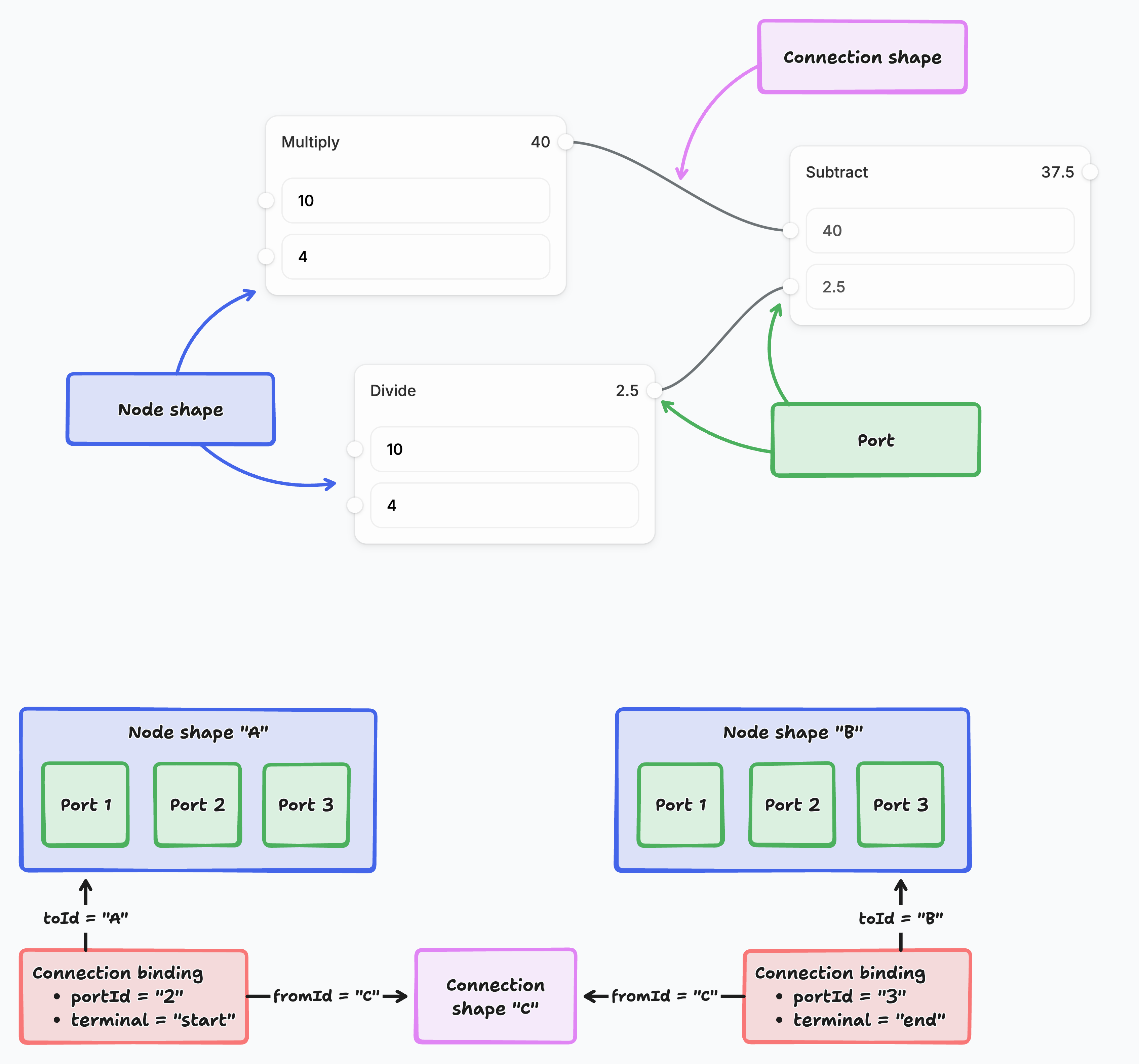
![Diagram showing how nodes, ports, and connections form a flow of operations. Nodes like Multiply, Divide, and Subtract take inputs and produce outputs through ports. Results are passed via connections (arrows) between ports: Multiply outputs 40, Divide outputs 2.5, and Subtract combines them to get 37.5. At the bottom, abstract Node A and Node B illustrate that connections link specific ports, defined as start or end points.](https://tldraw.dev/images/starter-kits/chart-workflow.png)

##### 1. Shape system: Nodes and connections

Nodes are custom tldraw shapes that represent workflow steps. Each node has input and output ports defined in its shape utility, and new node types can be created or customized. Nodes accept inputs and produce outputs, which can be joined together with connections. Connections are also shapes, but they use tldraw's binding system to stay attached to specific ports on nodes.

##### 2. Binding system: Smart connections

When you create a connection between nodes, tldraw's binding system tracks the relationship. To create a connection, drag from a port. If you move a node, its connections update automatically. You can also drag an existing connection to reconnect it elsewhere or disconnect it entirely. The binding utilities handle connection lifecycle as nodes change.

##### 3. Interaction layer: Port tools

The starter kit extends tldraw's select tool with custom port interactions. When you click or drag near a port, the `PointingPort` tool activates. You can create connections by dragging from any port, or click an output port to open a node picker and insert a new connected node. These behaviors are implemented using tldraw's state machine system, where tools are organized as states that can have child states.

##### 4. Execution engine

The execution system is designed to be replaced by your own business logic. It reads your node graph, resolves dependencies (which nodes need to run before others), and executes them in the correct order. Nodes expose their computation through a simple interface, and the engine handles the orchestration. You can run a workflow graph (for example, using a "Play" action) to see how information flows between nodes.

##### 5. Data flow and processing

You control the data that flows through your workflow and what happens to it. The starter kit provides the infrastructure: nodes update instantly to show their results as data flows through the connections. The framework moves data between nodes and triggers updates when values change. Your data can come from user inputs, external APIs, databases, or file uploads.

---

#### Customization

##### Adding custom nodes

To add custom node types, create a new file in `src/nodes/types`. The easiest way is to duplicate an existing node, like `MultiplyNode.tsx`.

Start by defining the type of your node:

```tsx
import { T } from 'tldraw'

// First, we create a validator for our node type
export const CustomNode = T.object({
	type: T.literal('custom'), // each node needs a unique "type"
	someData: T.number,
	// ...
})

// Then, we can derive a typescript type from the validator
export type CustomNode = T.TypeOf<typeof CustomNode>
```

Once you have your node’s type definition, create a node definition for it:

```tsx
export class CustomNodeDefinition extends NodeDefinition<CustomNode> {
	static type = 'custom' // This must match "type" from above
	static validator = CustomNode

	// How to label your node in the UI
	title = 'My custom node'
	heading = 'Custom' // Shown in the node header
	icon = <span>🐝</span>

	// Return a default version of your node
	getDefault() { ... }

	// Return the height of your node, in pixels
	getBodyHeightPx(shape, node) { ... }

	// Return all ports for your node. Each port has a terminal:
	// 'end' = input port (receives data), 'start' = output port (sends data)
	getPorts(shape, node) { ... }

	// Run this node! Work through the input port values and
	// produce values for the output ports.
	async execute(shape, node, inputs) { ... }

	// Get values to use as outputs when we're NOT running
	// this node. Often, you might return a previously computed
	// value from `execute`.
	getOutputInfo(shape, node, inputs) { ... }

	// A react component for rendering your node on the canvas.
	Component = CustomNodeComponent
}

function CustomNodeComponent({ shape, node }) {
  return <div>...</div>
}
```

Next, add your node definition to the system. In `src/nodes/nodeTypes.tsx`, include it in `NodeDefinitions`. Finally, add your node to the UI: open `src/components/WorkflowToolbar.tsx` and insert a `<ToolbarItem tool="node-custom" />` wherever you’d like your node to appear in the toolbar. If your node has any input ports (terminal = end), you can also add an `OnCanvasComponentPickerItem` for it in `src/components/OnCanvasComponentPicker`.

##### Data fetching and integrations

Adding data fetching or integrations to a node is straightforward. You can make `fetch` requests from your custom node’s `execute` method. See `src/nodes/types/EarthquakeNode.tsx` for an example of a node that, when run, fetches recent earthquakes from the [USGS API](https://earthquake.usgs.gov/fdsnws/event/1/). Once fetched, it picks a random earthquake, displays some data, and outputs the magnitude to be used in downstream nodes.

You may also want to store data from the last execution to display in the UI. In the earthquake example, the data is stashed in an `earthquakeData` prop in the node definition. In `execute`, the shape is updated to store this data. Then, both the UI and `getOutputInfo` can reference it.

##### Extending execution

Because it’s just a demo, this starter kit has a very minimal execution model: values are either numbers or a special `STOP_EXECUTION` flag used to implement conditionals.

If you want to change the type of data flowing through the system, edit `WorkflowValue` in `src/nodes/types/shared.tsx`. You’ll need to resolve type errors elsewhere, since several places assume the system only works with numbers.

The execution system is defined in `src/execution/ExecutionGraph.tsx`. It’s designed to be easily replaced by your own custom engine. For example, you might want executions to run entirely server-side, or you might want to “test” nodes individually from the canvas and then “deploy” a running workflow as an automation on a server.

##### UI customization

Customizing tldraw’s UI mostly works by replacing specific components. Take a look at `src/App.tsx` to see how we diverge from tldraw’s default UI:

- We add the on-canvas component picker and workflow outline/play buttons in `InFrontOfTheCanvas`.
- We add a custom vertical toolbar to the left of the screen and some extra actions in the bottom of the screen in `Toolbar`.
- We remove the `MenuPanel` entirely.
- We selectively hide the `StylePanel` depending on what’s selected.

To further customize the UI of this starter kit, read up on [customizing tldraw’s UI as a whole](https://tldraw.dev/docs/user-interface).

---

#### Further reading

- **[Shape utilities](https://tldraw.dev/docs/shapes)**: Learn how to create custom shapes and extend tldraw's shape system with advanced geometry, rendering, and interaction patterns.
- **[Binding system](https://tldraw.dev/sdk-features/bindings)**: Learn more about tldraw's binding system for creating relationships between shapes, automatic updates, and connection management.
- **[Editor state management](https://tldraw.dev/docs/editor)**: Learn how to work with tldraw's reactive state system, editor lifecycle, and event handling for complex canvas applications.
- **[Customize the user interface](https://tldraw.dev/docs/user-interface)**: Learn how to customize the user interface of your tldraw application.

---

#### Building with this starter kit?

If you build something great, please share it with us in our [#show-and-tell](https://discord.tldraw.com/?utm_source=docs&utm_medium=organic&utm_campaign=sociallink) channel on Discord. We want to see what you've built!

### Chat starter kit

To build with a chat starter kit, run this command in your terminal:

```bash
npm create tldraw@latest -- --template chat
```

Once you've followed the instructions, you'll need to create a `.env.local` file with an API key from [Google AI Studio](https://aistudio.google.com/apikey):

```
GOOGLE_GENERATIVE_AI_API_KEY=<your key>
```

---

#### Use cases

This starter kit shows how to add visual capabilities to:

---

#### How it works

This starter kit demonstrates how to add tldraw's visual capabilities to an existing chat application. The integration uses a modal to bring annotation tools directly into your chat UI.
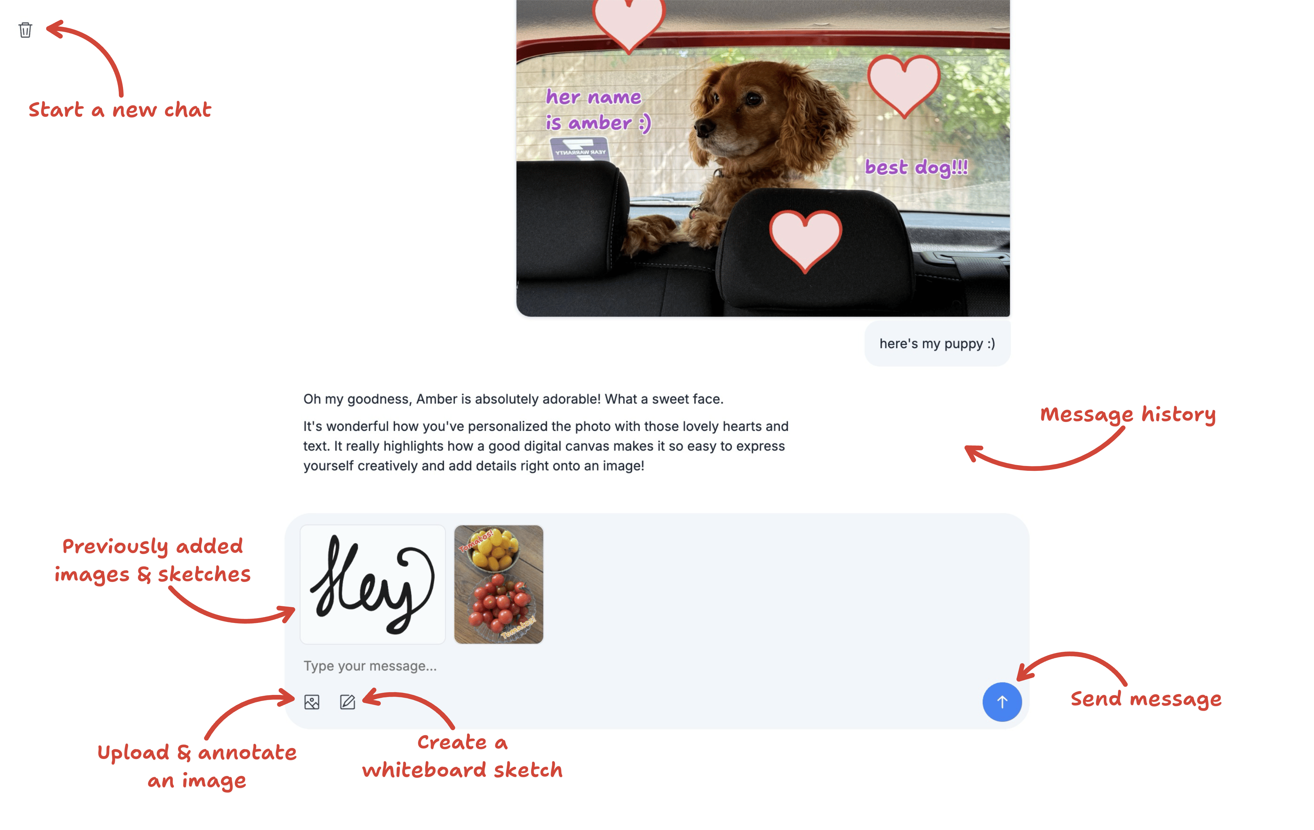
![A screenshot of a chat interface with labels pointing to different features. The interface includes a text box with two previously added sketches/images, and icons to upload and annotate an image, create a whiteboard sketch, and send a message. Red arrows with labels point to features: “Start a new chat,” “Message history,” “Previously added images & sketches,” “Upload & annotate an image,” “Create a whiteboard sketch,” and “Send message.”](https://tldraw.dev/images/starter-kits/chat-screenshot.png)

##### 1. Whiteboard modal

The whiteboard opens a modal tldraw editor whenever users want to create or edit visual content. The modal supports uploaded images, freehand drawing, and editing of images from chat history.

##### 2. Automatic image annotation

When an image is uploaded for the first time, the editor places it on the canvas, centers the camera on it, and switches into cropping mode using `editor.setCurrentTool('select.crop')`. From there, users can quickly crop their image to the desired section or add annotations on top.

##### 3. Snapshot saving

Once the user has finished sketching or annotating, the editor exports the work as a PNG ready to send to the LLM. At the same time, it saves a tldraw snapshot of the session. This allows users to reopen the image as a whiteboard and continue working from where they left off, without flattening the individual shapes into pixels.

---

#### Customization

This starter kit provides a minimal integration between tldraw and a chat app. You can tailor the modal's appearance, available tools, and overall behavior.

##### Modifying the upload workflow

You can customize the automatic crop behavior, add image processing steps, or extend support for additional file types to match your app's needs.

See `src/components/WhiteboardModal.tsx:195` for the automatic crop activation and `src/components/Chat.tsx:148` for drag-and-drop handling.

##### Adapting to your design system

Since tldraw is built with React, you can adapt both the modal behavior and its appearance to integrate with your chat interface. This includes controlling when the modal opens, how it looks, and which tools are available.

For example, see `src/components/WhiteboardModal.tsx:92` for UI component overrides, `src/components/Chat.tsx:113` for the history image click handler, and `src/app/styles.css` for styling.

---

#### Further reading

- **[Custom shape utilities](https://tldraw.dev/docs/shapes#custom-shapes)**: Learn how to create custom shapes with their own interactions.

- **[Editor API](https://tldraw.dev/docs/editor)**: Learn about the tldraw Editor.

- **[Customize the user interface](https://tldraw.dev/docs/user-interface)**: Learn how to customize the user interface of your tldraw application.

---

#### Building with this starter kit?

If you build something great, please share it with us in our [#show-and-tell](https://discord.tldraw.com/?utm_source=docs&utm_medium=organic&utm_campaign=sociallink) channel on Discord. We want to see what you've built!

### Agent starter kit

To build with an agent starter kit, run this command in your terminal:

```bash
npm create tldraw@latest -- --template agent
```

Then create a `.dev.vars` file in the project root with API keys for the model providers you want to use:

```
ANTHROPIC_API_KEY=<your key>
GOOGLE_API_KEY=<your key>
OPENAI_API_KEY=<your key>
```

We recommend Anthropic for best results. Get an API key from the [Anthropic dashboard](https://console.anthropic.com/settings/keys).

---

#### Use cases

Use the agent starter kit to build visual AI assistants that read and modify drawings, diagram generators that turn text descriptions into flowcharts or architecture diagrams, and tools that convert hand-drawn sketches into structured digital content.

#### How it works

##### What the agent can do

With its default configuration, the agent can perform the following actions:

- Create, update and delete shapes.
- Draw freehand pen strokes.
- Use higher-level operations on multiple shapes at once: rotate, resize, align, distribute, stack and reorder shapes.
- Write out its thinking and send messages to the user.
- Keep track of its task by writing and updating a todo list.
- Move its viewport to look at different parts of the canvas.
- Count shapes matching a given expression.
- Schedule further work and reviews to be carried out in follow-up requests.
- Call external APIs.

##### Architecture
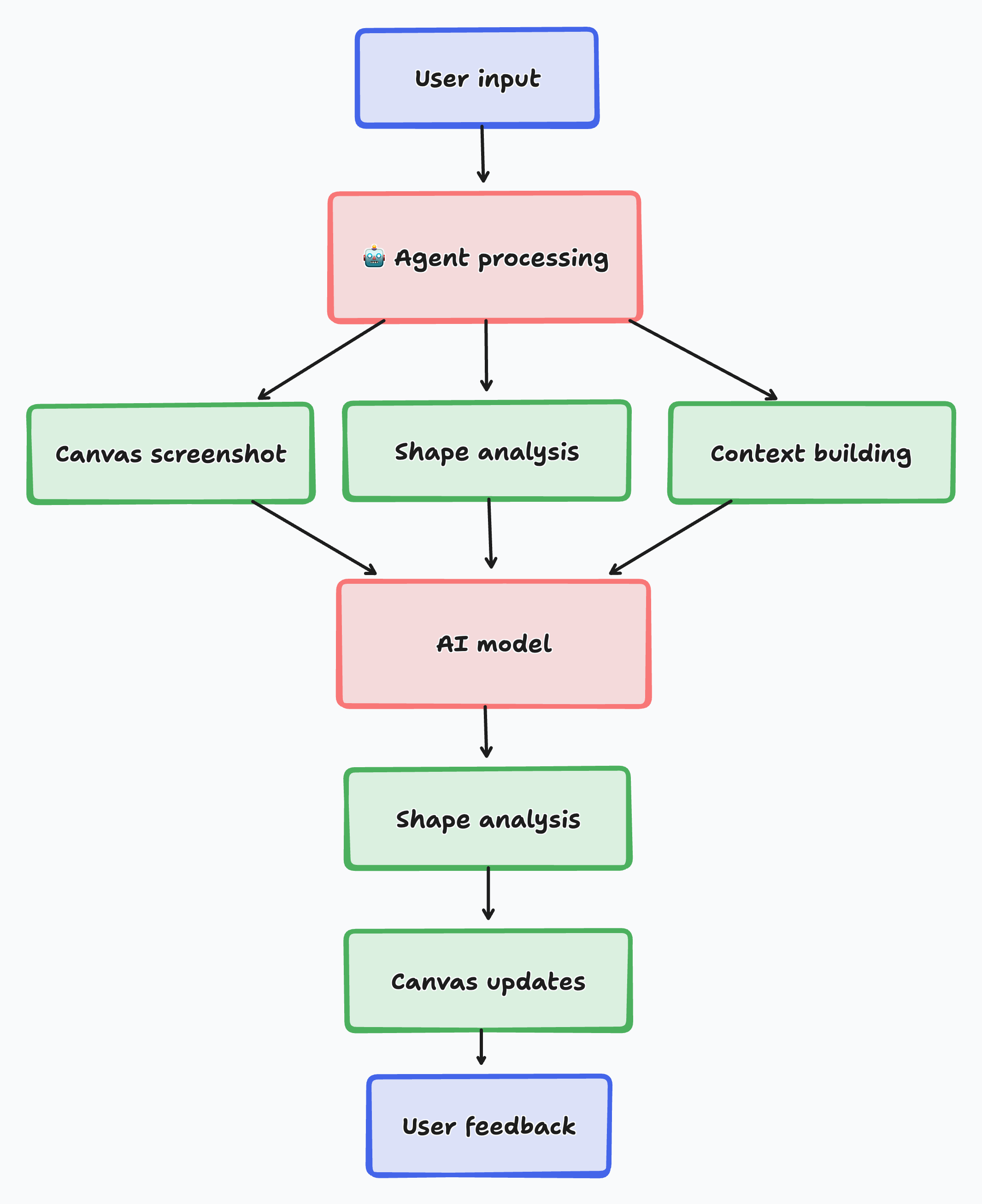
![Flowchart showing how user input is processed by an agent, which gathers a canvas screenshot, analyzes shapes, and builds context. These feed into an AI model, which performs further shape analysis, updates the canvas, and produces results that go back to the user as feedback.](https://tldraw.dev/images/starter-kits/chart-agent.png)

##### 1. User input

To make decisions on what to do, the agent gathers information from various sources:

- The user's message.
- The user's current selection of shapes.
- What the user can currently see on their screen.
- Any additional context the user has provided, such as specific shapes or a particular position or area on the canvas.
- Actions the user has recently taken.
- A screenshot of the agent's current view of the canvas.
- A simplified format of all shapes within the agent's viewport.
- Information about clusters of shapes outside the agent's viewport.
- The history of the current session, including the user's messages and all of the agent's actions.
- Lints identifying potential issues with shapes on the canvas.

##### 2. Visual context system: Canvas understanding

The agent captures both visual screenshots and structured shape data from the canvas. This dual approach means the model understands both the visual layout and the underlying data structure, including spatial relationships between shapes.

The agent's "eyes" are defined by `PromptPartUtil` classes that gather different types of context, from user messages and canvas screenshots to shape data and interaction history.

##### 3. Action system: Canvas manipulation

The agent performs canvas operations through a modular action system. Each action type handles a specific kind of canvas modification, from creating shapes to multi-step operations like aligning or distributing groups of shapes. Every action includes its own validation, execution, and chat-panel presentation logic.

The agent's "hands" are defined by `AgentActionUtil` classes that specify what operations the agent can perform on the canvas.

##### 4. Mode system: Contextual capabilities

The agent operates in one of several modes, each with its own set of capabilities tailored to a specific kind of task. The default `working` mode has full access to the canvas. A narrower mode might strip away drawing actions and add critique-specific ones for reviewing work, or swap in different tools for a planning phase. Modes let the same agent take on different roles at different points in a task.

##### 5. Streaming system: Real-time AI responses

AI responses stream in real time. Users see the agent's thinking and its canvas modifications as they happen. Shapes get created, updated, and deleted incrementally as each action finishes streaming, so the canvas stays responsive throughout long, multi-step tasks.

##### 6. Manager architecture: State decomposition

The agent's state is organized into focused managers, each responsible for a single concern: chat history, model selection, contextual shapes, the todo list, mode transitions, and more. This decomposition keeps the agent's behavior easy to reason about as the template grows, and adding a new capability means adding a new manager rather than expanding a monolith.

##### 7. Integration system: Model flexibility

This starter kit supports multiple AI providers (Anthropic, OpenAI, Google) with consistent interfaces. The system abstracts provider differences, so you can switch models or use different providers for different operations. Adding support for a new provider doesn't require changes to the rest of the system.

#### Use the agent programmatically

Aside from using the chat panel UI, you can also prompt the agent programmatically.

Call the `prompt()` method to start an agentic loop. The agent will continue until it has finished the task you've given it.

```tsx
// Inside a component wrapped by TldrawAgentAppProvider
const agent = useAgent()
agent.prompt('Draw a cat')
```

You can optionally specify further details about the request in the form of an `AgentInput` object:

```tsx
agent.prompt({
	message: 'Draw a cat in this area',
	bounds: {
		x: 0,
		y: 0,
		w: 300,
		h: 400,
	},
})
```

There are more methods on the `TldrawAgent` class that can help when building an agentic app:

- `agent.cancel()` - Cancel the agent's current task.
- `agent.reset()` - Reset the agent's chat and memory.
- `agent.request(input)` - Send a single request to the agent and handle its response _without_ entering into an agentic loop.

---

#### Customize the agent

The agent's behavior is defined in `client/modes/AgentModeDefinitions.ts`. The `AGENT_MODE_DEFINITIONS` array contains mode definitions. Each mode has two arrays:

- `parts` determine what the agent can **see**.
- `actions` determine what the agent can **do**.

Add, edit or remove an entry in either array to change what the agent can see or do in a given mode.

##### The mode system

Modes control which parts and actions the agent has access to at any given time. They're defined in `client/modes/AgentModeDefinitions.ts`.

The default `working` mode includes all standard capabilities. You can create additional modes with different subsets of parts and actions.

Call `agent.mode.setMode(modeType)` to change modes during a prompt. To control each mode's lifecycle, implement any of the lifecycle hooks in `client/modes/AgentModeChart.ts`:

- `onEnter(agent, fromMode)` - runs when the agent enters a mode.
- `onExit(agent, toMode)` - runs when the agent exits a mode.
- `onPromptStart(agent, request)` - runs when a prompt commences.
- `onPromptEnd(agent, request)` - runs when a prompt ends.
- `onPromptCancel(agent, request)` - runs when a prompt is canceled.

##### Change what the agent can see

**Change what the agent can see by adding, editing or removing a prompt part.**

Prompt parts assemble the prompt that the model receives, with each part adding a different piece of information. This includes the user's message, the model name, the system prompt, chat history and more.

A prompt part has two pieces: a `PromptPartUtil` class on the client that gathers data, and a `PromptPartDefinition` on the worker that turns that data into messages.

This example shows how to let the model see what the current time is.

First, define a prompt part type:

```tsx
interface TimePart extends BasePromptPart<'time'> {
	time: string
}
```

Then, create a prompt part util in `client/parts/`:

```tsx
export const TimePartUtil = registerPromptPartUtil(
	class TimePartUtil extends PromptPartUtil<TimePart> {
		static override type = 'time' as const

		override getPart(): TimePart {
			return {
				type: 'time',
				time: new Date().toLocaleTimeString(),
			}
		}
	}
)
```

Next, create the prompt part definition in `shared/schema/PromptPartDefinitions.ts`:

```tsx
export const TimePartDefinition: PromptPartDefinition<TimePart> = {
	type: 'time',
	priority: -100,
	buildContent({ time }: TimePart) {
		return [`The user's current time is: ${time}`]
	},
}
```

To enable the prompt part, import its util in `client/modes/AgentModeDefinitions.ts` and add `TimePartUtil.type` to a mode's `parts` array. Its methods will be used to assemble its data and send it to the model.

- `getPart()` - Gather any data needed to construct the prompt.
- `buildContent()` - Turn the data into messages to send to the model.

There are other fields available on the `PromptPartDefinition` interface that you can override for more granular control.

- `priority` - Control where this prompt part will appear in the list of messages sent to the model. Higher priority appears later in the prompt.
- `getModelName()` - Determine which AI model to use.
- `buildMessages()` - Manually override how prompt messages are constructed from the prompt part.

##### Change what the agent can do

**Change what the agent can do by adding, editing or removing an `AgentActionUtil`.**

Agent action utils define which actions the agent can perform. Each `AgentActionUtil` adds a different capability.

This example shows how to allow the agent to clear the screen.

First, define an agent action by creating a schema for it in `shared/schema/AgentActionSchemas.ts`:

```tsx
export const ClearAction = z
	// All agent actions must have a _type field
	// The underscore encourages the model to put this field first
	.object({
		_type: z.literal('clear'),
	})
	// A title and description tell the model what the action does
	.meta({
		title: 'Clear',
		description: 'The agent deletes all shapes on the canvas.',
	})

// Infer the action's type
export type ClearAction = z.infer<typeof ClearAction>
```

Then, create an agent action util in `client/actions/`:

```tsx
export const ClearActionUtil = registerActionUtil(
	class ClearActionUtil extends AgentActionUtil<ClearAction> {
		static override type = 'clear' as const

		override applyAction(action: Streaming<ClearAction>) {
			// Don't do anything until the action has finished streaming
			if (!action.complete) return

			// Get the editor
			const { editor } = this

			// Delete all shapes on the page
			const shapes = editor.getCurrentPageShapes()
			editor.deleteShapes(shapes)
		}
	}
)
```

To enable the agent action, import its util in `client/modes/AgentModeDefinitions.ts` and add `ClearActionUtil.type` to a mode's `actions` array. Its method will be used to execute the action.

- `applyAction()` - Execute the action.

There are other methods available on the `AgentActionUtil` class that you can override for more granular control.

- `getInfo()` - Determine how the action gets displayed in the chat panel UI.
- `savesToHistory()` - Control whether actions get saved to chat history or not.
- `sanitizeAction()` - Apply transformations to the action before saving it to history and applying it. More details on transformations below.

##### Change how actions appear in chat history

**Configure the icon and description of an action in the chat panel UI using the `getInfo()` method.**

```tsx
override getInfo() {
	return {
		icon: 'trash' as const,
		description: 'Cleared the canvas',
	}
}
```

You can make an action collapsible by adding a `summary` property.

```tsx
override getInfo() {
	return {
		summary: 'Cleared the canvas',
		description: 'After much consideration, the agent decided to clear the canvas',
	}
}
```

To customize an action's appearance via CSS, define styles for the `agent-action-type-{TYPE}` class where `{TYPE}` is the type of the action.

```css
.agent-action-type-clear {
	color: red;
}
```

##### Managers

Managers are classes that extend `TldrawAgent` or `TldrawAgentApp` with a focused responsibility, such as chat history, model selection, or context management. They're available as properties on the agent instance, for example `agent.chat`, `agent.modelName`, and `agent.context`.

To add a custom manager, extend `BaseAgentManager` or `BaseAgentAppManager` and attach it to the agent in `client/agent/TldrawAgent.ts`.

##### Registering utils

Utils use a self-registration pattern. When you create a new `PromptPartUtil` or `AgentActionUtil`, wrap it with a registration function:

```tsx
export const MyPartUtil = registerPromptPartUtil(
	class MyPartUtil extends PromptPartUtil<MyPart> {
		// ...
	}
)
```

This ensures the util is discovered automatically when its module is imported in `AgentModeDefinitions.ts`.

##### Mode-scoped actions

Different modes can implement actions with the same `_type`. For example, a `team-member` mode and a `solo` mode might both have a `mark-task-done` action, but with different implementations.

To register a mode-specific action util, pass the `forModes` option:

```tsx
export const MarkTeamMemberTaskDoneActionUtil = registerActionUtil(
	class MarkTeamMemberTaskDoneActionUtil extends AgentActionUtil<MarkTeamMemberTaskDoneAction> {
		static override type = 'mark-task-done' as const
		override applyAction(action: Streaming<MarkTeamMemberTaskDoneAction>) {
			// Team member-specific implementation
		}
	},
	{ forModes: ['team-member'] }
)
```

Default schemas are auto-registered when exported from `AgentActionSchemas.ts`. For mode-specific schemas, call `registerActionSchema` explicitly with the `forModes` option.

See the [template README](https://github.com/tldraw/tldraw/blob/main/templates/agent/README.md#mode-scoped-actions) for a full worked example.

##### Schedule further work

You can let the agent work over multiple turns by scheduling further work using the `schedule` method as part of an action.

This example shows how to schedule an extra step for adding detail to the canvas.

```tsx
override applyAction(action: Streaming<AddDetailAction>) {
	if (!action.complete) return
	if (!this.agent) return
	this.agent.schedule('Add more detail to the canvas.')
}
```

As with the `prompt` method, you can specify further details about the request.

```tsx
agent.schedule({
	message: 'Add more detail in this area.',
	bounds: { x: 0, y: 0, w: 100, h: 100 },
})
```

You can schedule multiple things by calling the `schedule()` method more than once.

```tsx
agent.schedule('Add more detail to the canvas.')
agent.schedule('Check for spelling mistakes.')
```

To interrupt the agent with a new prompt instead of waiting for the current prompt to end, use the `interrupt` method. `interrupt` also lets you specify a mode to transition into.

```tsx
override applyAction(action: Streaming<EnterReviewingModeAction>) {
	if (!action.complete) return
	this.agent.interrupt({
		mode: 'reviewing',
		input: {
			message: 'Review the new area thoroughly for any mistakes',
			bounds: action.bounds,
		},
	})
}
```

##### Retrieve data from an external API

To let the agent retrieve information from an external API, fetch the data within `applyAction` and schedule a follow-up request with any data you want the agent to have access to.

```tsx
override async applyAction(action: Streaming<CountryInfoAction>) {
	if (!action.complete) return
	if (!this.agent) return

	// Fetch from the external API
	const data = await fetchCountryInfo(action.code)

	// Schedule a follow-up request with the data
	this.agent.schedule({ data: [data] })
}
```

##### Sanitize data received from the model

The model can make mistakes. Sometimes this is due to hallucinations, and sometimes this is due to the canvas changing since the last time the model saw it. Either way, an incoming action might contain invalid data by the time you receive it.

To correct incoming mistakes, apply fixes in the `sanitizeAction()` method of an action util. They'll get carried out before the action is applied to the editor or saved to chat history.

For example, ensure that a shape ID received from the model refers to an existing shape by using the `ensureShapeIdExists()` method.

```tsx
override sanitizeAction(action: Streaming<DeleteAction>, helpers: AgentHelpers) {
	if (!action.complete) return action

	// Ensure the shape ID refers to an existing shape
	action.shapeId = helpers.ensureShapeIdExists(action.shapeId)

	// If the shape ID doesn't refer to an existing shape, cancel the action
	if (!action.shapeId) return null

	return action
}
```

The `AgentHelpers` class contains more helpers for sanitizing data received from the model.

- `ensureShapeIdExists()` - Ensure that a shape ID refers to a real shape. Useful for interacting with existing shapes.
- `ensureShapeIdIsUnique()` - Ensure that a shape ID is unique. Useful for creating new shapes.
- `ensureValueIsVec()`, `ensureValueIsNumber()` - Ensure that a value is a certain type. Useful for more complex actions where the model is more likely to make mistakes.

##### Send positions to and from the model

By default, every position sent to the model is offset by the starting position of the current chat.

**To apply this offset to a position sent to the model, use the `applyOffsetToVec` method.**

```tsx
override getPart(request: AgentRequest, helpers: AgentHelpers): ViewportCenterPart {
	if (!this.editor) return { part: 'user-viewport-center', center: null }

	// Get the center of the user's viewport
	const viewportCenter = this.editor.getViewportBounds().center

	// Apply the chat's offset to the vector
	const offsetViewportCenter = helpers.applyOffsetToVec(viewportCenter)

	// Return the prompt part
	return {
		part: 'user-viewport-center',
		center: offsetViewportCenter,
	}
}
```

**To remove the offset from a position received from the model, use the `removeOffsetFromVec` method.**

```tsx
override applyAction(action: Streaming<MoveAction>, helpers: AgentHelpers) {
	if (!action.complete) return

	// Remove the offset from the position
	const position = helpers.removeOffsetFromVec({ x: action.x, y: action.y })

	// Do something with the position...
}
```

It's a good idea to round numbers before sending them to the model. If you want to be able to restore the original number later, use the `roundAndSaveNumber` and `unroundAndRestoreNumber` methods.

```tsx
// In `getPart`...
const roundedX = helpers.roundAndSaveNumber(x, 'my_key_x')
const roundedY = helpers.roundAndSaveNumber(y, 'my_key_y')

// In `applyAction`...
const unroundedX = helpers.unroundAndRestoreNumber(x, 'my_key_x')
const unroundedY = helpers.unroundAndRestoreNumber(y, 'my_key_y')
```

To round all the numbers on a shape, use the `roundShape` and `unroundShape` methods. See the [Send shapes to the model](#send-shapes-to-the-model) section below for more details.

##### Send shapes to the model

By default, the agent converts tldraw shapes to various simplified formats to improve the model's understanding and performance.

There are three main formats used in this starter:

- `BlurryShape` - The format for shapes within the agent's viewport. It contains a shape's bounds, its ID, its type, and any text it contains. The "blurry" name refers to the fact that the agent can't make out the details of shapes from this format. Instead, it gives the model an overview of what it's looking at.
- `FocusedShape` - The format for shapes that the agent is focusing on, such as shapes you've manually added to its context. The format contains most of a shape's properties, including color, fill, alignment, and any other shape-specific information. This is also the format the model outputs when creating shapes.
- `PeripheralShapeCluster` - The format for shapes outside the agent's viewport. Nearby shapes are grouped together into clusters, each with the group's bounds and a count of how many shapes are inside it. This is the least detailed format. Its role is to give the model an awareness of shapes elsewhere on the page.

To send the model some shapes in one of these formats, use one of the conversion functions found within the `shared/format` folder, such as `convertTldrawShapeToFocusedShape()`.

This example picks one random shape on the canvas and sends it to the model in the Focused format.

```tsx
override getPart(request: AgentRequest, helpers: AgentHelpers): RandomShapePart {
	const { editor } = this
	if (!this.editor) return { type: 'random-shape', shape: null}

	// Get a random shape
	const shapes = editor.getCurrentPageShapes()
	const randomShape = shapes[Math.floor(Math.random() * shapes.length)]

	// Convert the shape to the Focused format
	const focusedShape = convertTldrawShapeToFocusedShape(editor, randomShape)

	// Normalize the shape's position
	const offsetShape = helpers.applyOffsetToShape(focusedShape)
	const roundedShape = helpers.roundShape(offsetShape)

	return {
		type: 'random-shape',
		shape: roundedShape,
	}
}
```

##### Change the system prompt

To change the default system prompt, edit the sections in `worker/prompt/sections/`. These sections are assembled by `worker/prompt/buildSystemPrompt.ts`.

The system prompt is rebuilt for each step in the agentic loop depending on which actions and parts are available in the agent's current mode. To give the model more detailed instructions for how to use any custom actions or parts you add, edit `worker/prompt/sections/rules-section.ts`.

##### Change to a different model

You can set an agent's model by calling `setModelName` on the `modelName` manager.

```tsx
agent.modelName.setModelName('gemini-3-flash-preview')
```

To override an agent's model, specify a different model name with a request.

```tsx
agent.prompt({
	modelName: 'gemini-3-flash-preview',
	message: 'Draw a diagram of a volcano.',
})
```

You can conditionally override the model name by overriding the `getModelName()` method on any `PromptPartDefinition`.

```tsx
override getModelName(part: MyCustomPromptPart) {
	return part.fastMode ? 'gemini-3-flash-preview' : 'claude-sonnet-4-5'
}
```

##### Support a different model

To add support for a different model, add the model's definition to `AGENT_MODEL_DEFINITIONS` in the `shared/models.ts` file.

```tsx
'claude-sonnet-4-5': {
	name: 'claude-sonnet-4-5',
	id: 'claude-sonnet-4-5',
	provider: 'anthropic',
}
```

If you need to add any extra setup or configuration for your provider, you can add it to the `worker/do/AgentService.ts` file.

##### Support custom shapes

If your app includes [custom shapes](https://tldraw.dev/docs/shapes#custom-shapes), the agent will be able to see, move, delete, resize, rotate and arrange them with no extra setup. However, you might want to also let the agent create and edit them, and read their custom properties.

To support custom shapes, you have two main options:

1. Add an action that lets the agent create your custom shape.

   See the [Let the agent create custom shapes with an action](#let-the-agent-create-a-custom-shape-with-an-action) section below.

2. Add your custom shape to the schema so that the agent read, edit and create it like any other shape.

   See the [Add your custom shape to the schema](#add-a-custom-shape-to-the-schema) section below.

###### Let the agent create a custom shape with an action

To add partial support for a custom shape, let the agent create it with an [agent action](#change-what-the-agent-can-do). For example, this action lets the agent create a custom "sticker" shape:

```tsx
// In shared/schema/AgentActionSchemas.ts
export const StickerAction = z
	.object({
		_type: z.literal('sticker'),
		stickerType: z.enum(['❤️', '⭐']),
		x: z.number(),
		y: z.number(),
	})
	.meta({
		title: 'Sticker',
		description: 'Add a sticker to the canvas.',
	})

export type StickerAction = z.infer<typeof StickerAction>
```

Define how the action gets applied to the canvas by creating an action util:

```tsx
// In client/actions/StickerActionUtil.ts
export const StickerActionUtil = registerActionUtil(
	class StickerActionUtil extends AgentActionUtil<StickerAction> {
		static override type = 'sticker' as const

		// Tell the model how to display the action in chat history
		override getInfo(action: Streaming<StickerAction>) {
			return {
				icon: 'pencil' as const,
				description: 'Added a sticker',
			}
		}

		// Execute the action
		override applyAction(action: Streaming<StickerAction>, helpers: AgentHelpers) {
			if (!action.complete) return
			if (!this.editor) return

			// Normalize the position
			const position = helpers.removeOffsetFromVec({ x: action.x, y: action.y })

			// Create the custom shape
			this.editor.createShape({
				type: 'sticker',
				id: createShapeId(),
				x: position.x,
				y: position.y,
				props: { stickerType: action.stickerType },
			})
		}
	}
)
```

###### Add a custom shape to the schema

To let the agent see the custom properties of your custom shape, add it to the schema in `shared/format/FocusedShape.ts`.

For example, here's a schema for a custom sticker shape.

```tsx
const FocusedStickerShape = z
	.object({
		// Required properties
		_type: z.literal('sticker'),
		note: z.string(),
		shapeId: z.string(),

		// Custom properties
		stickerType: z.enum(['❤️', '⭐']),
		x: z.number(),
		y: z.number(),
	})
	.meta({
		// Information about the shape to give to the agent
		title: 'Sticker Shape',
		description:
			'A sticker shape is a small symbol stamped onto the canvas. There are two types of stickers: heart and star.',
	})
```

The `_type` and `shapeId` properties are required so that the app can identify your shape. The `note` property is also required. The agent uses it to leave notes for itself.

For optional properties, it's worth considering how the agent should see your custom shape. You might want to leave out some properties and focus on showing the most important ones. It's also best to keep them in alphabetical order for better performance with Gemini models.

Enable your custom shape schema by adding it to the list of `FOCUSED_SHAPES` in the same file.

```tsx
const FOCUSED_SHAPES = [
	FocusedDrawShape,
	FocusedGeoShape,
	FocusedLineShape,
	FocusedTextShape,
	FocusedArrowShape,
	FocusedNoteShape,
	FocusedUnknownShape,

	// Our custom shape
	FocusedStickerShape,
] as const
```

Tell the app how to convert your custom shape into the `FocusedShape` format by adding a case in `shared/format/convertTldrawShapeToFocusedShape.ts`:

```tsx
export function convertTldrawShapeToFocusedShape(editor: Editor, shape: TLShape): FocusedShape {
	switch (shape.type) {
		// ...
		case 'sticker':
			const bounds = getShapeBounds(shape)
			return {
				_type: 'sticker',
				note: (shape.meta.note as string) ?? '',
				shapeId: convertTldrawIdToSimpleId(shape.id),
				stickerType: shape.props.stickerType,
				x: bounds.x,
				y: bounds.y,
			}
		// ...
	}
}
```

To allow the agent to edit your custom shape's properties, tell the app how to convert your shape from the `FocusedShape` format that the model outputs to the actual format of your shape:

```tsx
export function convertFocusedShapeToTldrawShape(
	editor: Editor,
	focusedShape: FocusedShape,
	{ defaultShape }: { defaultShape: Partial<TLShape> }
) {
	switch (focusedShape._type) {
		// ...
		case 'sticker':
			const shapeId = convertSimpleIdToTldrawId(focusedShape.shapeId)
			return {
				shape: {
					id: shapeId,
					x: focusedShape.x,
					y: focusedShape.y,
					// ...
					props: {
						// ...
						stickerType: focusedShape.stickerType,
					},
					meta: {
						note: focusedShape.note ?? '',
					},
				},
			}
		// ...
	}
}
```

---

#### Further reading

- **[Multiplayer starter kit](https://tldraw.dev/starter-kits/multiplayer)**: Use the tldraw multiplayer sync starter kit to build multi-user agent environments.

- **[Shape utilities](https://tldraw.dev/docs/shapes#custom-shapes)**: Learn how to create custom shapes and extend tldraw's shape system with advanced geometry, rendering, and interaction patterns.

- **[Editor state management](https://tldraw.dev/docs/editor)**: Learn how to work with tldraw's reactive state system, editor lifecycle, and event handling for complex canvas applications.

---

#### Building with this starter kit?

If you build something great, please share it with us in our [#show-and-tell](https://discord.tldraw.com/?utm_source=docs&utm_medium=organic&utm_campaign=sociallink) channel on Discord. We want to see what you've built!

### Image pipeline starter kit

To build with an image pipeline starter kit, run this command in your terminal:

```bash
npm create tldraw@latest -- --template image-pipeline
```

The template works out of the box with placeholder images. To connect real AI providers, create a `.dev.vars` file:

```
REPLICATE_API_TOKEN=<your key>
```

---

#### Use cases

Use the image pipeline starter kit to build:

---

#### How it works
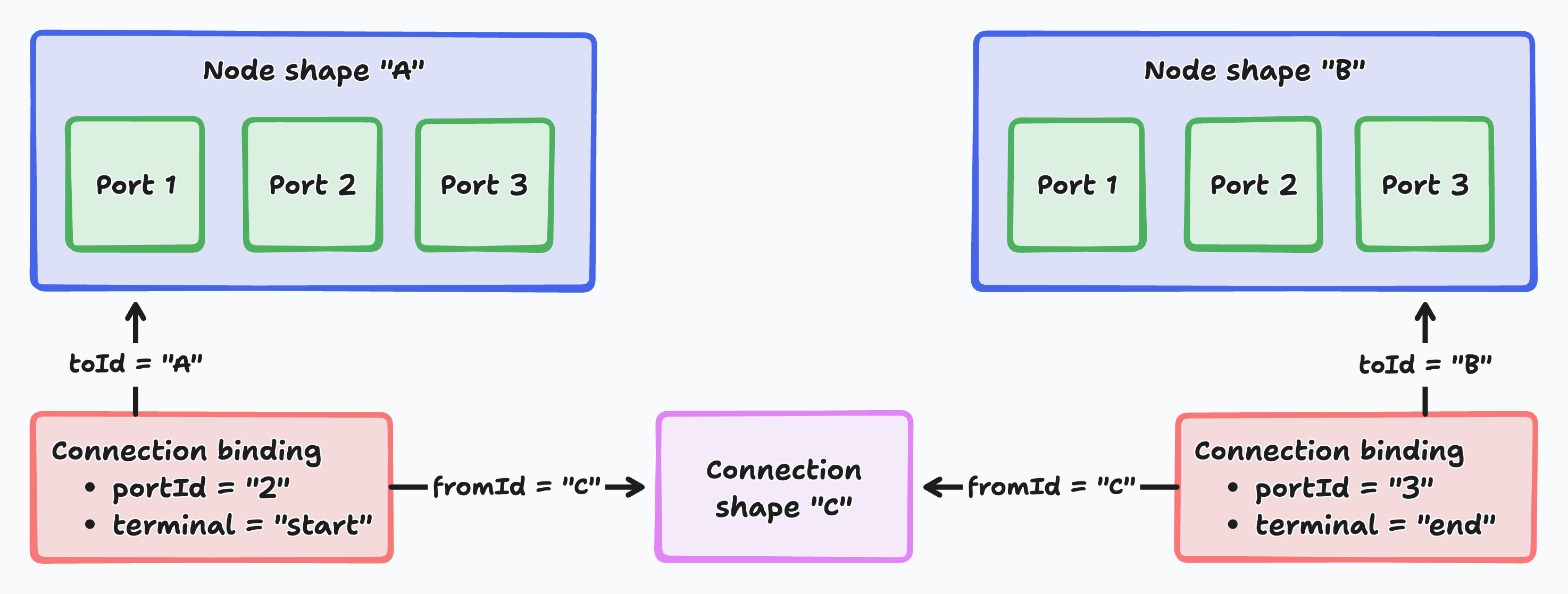
##### 1. Shape system: Nodes and connections

Nodes are custom tldraw shapes that represent pipeline steps. Each node has typed input and output ports — there are six port data types (image, text, model, number, latent, and any) that enforce connection compatibility. Connections are also shapes, rendered as color-coded bezier curves that use tldraw's binding system to stay attached to specific ports.

##### 2. Type-safe port system

Ports are color-coded by data type and enforce compatibility during connection. When you drag a connection, only compatible ports highlight as valid targets. The system also prevents cycles, replaces existing connections on single-input ports, and supports multi-input ports that accept multiple connections.

##### 3. Pipeline execution

The execution engine builds a DAG (directed acyclic graph) from your node connections and resolves dependencies automatically. Independent branches execute in parallel. Each node receives its input values, runs its operation, and passes results downstream. Nodes show loading states during execution and cache their results.

##### 4. AI image generation

The starter kit integrates with AI providers through a Cloudflare Worker backend. The Generate node sends prompts, model selection, and parameters (steps, CFG scale, seed) to the worker, which dispatches to providers like Replicate. When no backend is configured, the system returns placeholder SVGs so you can explore the full UI without API credentials.

##### 5. Image processing pipeline

Beyond generation, the template includes processing nodes for upscaling, style transfer, ControlNet-guided generation, IP-Adapter reference images, blending, and image adjustments. These can be chained together to build complex multi-step image processing workflows.

---

#### Customization

##### Adding custom nodes

To add a custom node type, create a new file in `src/nodes/types/`. The easiest approach is to duplicate an existing node like `AdjustNode.tsx`.

Define your node's data shape:

```tsx
import { T } from 'tldraw'

export const CustomNode = T.object({
	type: T.literal('custom'),
	// your node's parameters...
})

export type CustomNode = T.TypeOf<typeof CustomNode>
```

Then create a node definition:

```tsx
export class CustomNodeDefinition extends NodeDefinition<CustomNode> {
	static type = 'custom'
	static validator = CustomNode

	title = 'My custom node'
	icon = <span>🔧</span>
	category = 'process'

	getDefault() { ... }
	getBodyHeightPx(shape, node) { ... }
	getPorts(shape, node) { ... }
	async execute(shape, node, inputs) { ... }
	getOutputInfo(shape, node, inputs) { ... }
	Component = CustomNodeComponent
}
```

Register your node in `src/nodes/nodeTypes.tsx` by adding it to `NodeDefinitions`, and add it to the sidebar in `src/components/ImagePipelineSidebar.tsx`.

##### Adding AI providers

The worker uses a provider abstraction. To add a new provider, create a class implementing the `ImageProvider` interface in `worker/providers/`. The provider receives generation parameters and returns image URLs. Register it in the provider resolution logic so it can be selected from the Model node.

##### UI customization

The template overrides several tldraw UI components:

- A sidebar node palette replaces the default toolbar, organized by category (input, process, output, utility)
- Region overlays detect connected node groups and provide per-region play/stop controls
- An on-canvas node picker appears when dragging a connection to empty space, filtered to show only type-compatible nodes
- A template system lets users save and restore workflow configurations

To further customize the UI, read up on [customizing tldraw's UI as a whole](https://tldraw.dev/docs/user-interface).

---

#### Further reading

- **[Shape utilities](https://tldraw.dev/docs/shapes)**: Learn how to create custom shapes and extend tldraw's shape system with advanced geometry, rendering, and interaction patterns.
- **[Binding system](https://tldraw.dev/sdk-features/bindings)**: Learn more about tldraw's binding system for creating relationships between shapes, automatic updates, and connection management.
- **[Editor state management](https://tldraw.dev/docs/editor)**: Learn how to work with tldraw's reactive state system, editor lifecycle, and event handling for complex canvas applications.
- **[Customize the user interface](https://tldraw.dev/docs/user-interface)**: Learn how to customize the user interface of your tldraw application.

---

#### Building with this starter kit?

If you build something great, please share it with us in our [#show-and-tell](https://discord.tldraw.com/?utm_source=docs&utm_medium=organic&utm_campaign=sociallink) channel on Discord. We want to see what you've built!

### Branching chat starter kit

To build with a branching chat starter kit, run this command in your terminal:

```bash
npm create tldraw@latest -- --template branching-chat
```

Then create a `.env` file in the project root with an API key from [Google AI Studio](https://aistudio.google.com/apikey):

```
GOOGLE_GENERATIVE_AI_API_KEY=<your key>
```

---

#### Use cases

Use the branching chat starter kit to build:

---

#### How it works

![Diagram showing how nodes, ports, and connections form a flow of operations. Two shapes, Node A and Node B illustrate that connections link specific ports, defined as start or end points.](https://tldraw.dev/images/starter-kits/chart-branching-chat.png)

##### 1. Visual node system: Interactive message containers

Each conversation message appears as a draggable node on the infinite canvas. The `NodeShapeUtil` class extends tldraw's shape system to create custom chat message containers. These containers dynamically resize based on content length and provide input fields for user messages, areas for AI responses, and connection ports for linking conversations. You can also create nodes directly from the toolbar.

##### 2. Connection architecture: Conversation flow management

The `ConnectionBindingUtil` manages relationships between message nodes and creates visual lines that represent conversation flow. You create connections by dragging between node ports to branch conversations and link context. When users send a message, the system traces backwards through connected nodes to build complete conversation history. This gives AI responses the full dialogue context.

##### 3. AI streaming integration: Real-time response handling

The backend uses Cloudflare Workers with the Vercel AI SDK to stream responses from Google's Gemini API. As AI text generates, the streaming fetch implementation decodes response chunks and updates the tldraw document state in real time. Users see responses appear progressively within the connected node.

##### 4. Port-based connection system: Visual conversation linking

Nodes feature input and output ports that let users create branching dialogue structures by dragging connections between messages. You can build complex conversation trees where multiple messages feed into a single AI response or diverge into parallel branches. Connected nodes automatically establish context relationships across different paths in the dialogue graph.

---

#### Customization

This starter kit is built on top of tldraw's extensible architecture. You can customize everything. The canvas renders using React DOM, so you can use familiar React patterns, components, and state management across your conversation interface. Let's have a look at some ways to change this starter kit.

##### Adding custom node types

To create new types of conversation nodes beyond basic messages, you can extend the node system with custom node definitions. The system uses a pluggable architecture where each node type defines its own behavior, rendering, and port configuration.

See `client/nodes/types/MessageNode.tsx` as an example. This file shows how to define a complete node type with TypeScript validation, React component rendering, AI streaming integration, and dynamic sizing based on content length.

##### Customizing AI integration

To integrate with different AI providers or modify response behavior, you can customize the streaming implementation and API endpoints. The system uses the Vercel AI SDK which supports multiple providers including OpenAI, Anthropic, and Google.

See `worker/worker.ts` as an example. This file demonstrates how to configure AI providers, handle streaming responses, and process conversation context from connected nodes.

##### Customizing node appearance

To modify how conversation nodes look and behave, you can override the node rendering and styling system. Each node type has complete control over its visual presentation while maintaining integration with tldraw's interaction system.

See `client/nodes/NodeShapeUtil.tsx` as an example. This file shows how the shape utility defines node geometry, interaction behavior, and visual indicators including port positioning and selection bounds.

##### Customizing connection behavior

To modify how conversation flows connect and interact, you can customize the connection and binding system. This controls how nodes link together, how context flows between connected messages, and how the visual connections appear.

See `client/connection/ConnectionBindingUtil.tsx` as an example. This file demonstrates how to define binding behavior between shapes, including automatic cleanup when nodes are deleted and visual feedback during connection creation.

---

#### Further reading

- [Workflow starter kit](https://tldraw.dev/starter-kits/workflow): Learn how to build visual programming interfaces with node-based workflows on infinite canvas.
- [Shape utilities](https://tldraw.dev/docs/shapes#custom-shapes): Learn how to create custom shapes and extend tldraw's shape system with advanced geometry, rendering, and interaction patterns.
- [Binding system](https://tldraw.dev/sdk-features/bindings): Learn more about tldraw's binding system for creating relationships between shapes, automatic updates, and connection management.
- [Editor state management](https://tldraw.dev/docs/editor): Learn how to work with tldraw's reactive state system, editor lifecycle, and event handling for complex canvas applications.

---

#### Building with this starter kit?

If you build something great, please share it with us in our [#show-and-tell](https://discord.tldraw.com/?utm_source=docs&utm_medium=organic&utm_campaign=sociallink) channel on Discord. We want to see what you've built!

### Multiplayer starter kit

The multiplayer starter kit provides a production-ready foundation for building collaborative tldraw applications with real-time synchronization. It uses Cloudflare Durable Objects for room management, WebSocket connections for instant updates, and SQLite storage for automatic persistence.

To build with this starter kit, run this command in your terminal:

```bash
npm create tldraw@latest -- --template multiplayer
```

---

#### Use cases

This starter kit is perfect for building:

---

#### How it works

##### 1. Durable Objects: Room management

Each collaborative room runs in its own Cloudflare Durable Object instance. There's only ever one authoritative copy of each room's data, and all users connect to that same instance. This ensures strong consistency. Presence indicators (avatars and names) show who is currently in the room, and real-time cursors show where other users are pointing or selecting.

##### 2. WebSocket synchronization: Real-time updates

Changes are synchronized instantly via WebSocket connections. When a user draws or modifies content, the change is sent to the Durable Object, applied to the in-memory document, and broadcast to all connected clients. The sync protocol keeps state consistent across all clients. If a connection drops, the client automatically reconnects and replays missed changes to restore consistency.

##### 3. Persistent storage: SQLite

Room data is automatically persisted to Durable Object SQLite storage. Every change is saved immediately, so data survives restarts without manual save logic.

##### 4. Asset management: Scalable file handling

Images, videos, and other files are uploaded directly to R2 storage and served through Cloudflare's global edge network. Shared assets are synchronized across all connected users. Pasted URLs automatically unfurl into link previews.

---

#### Customization

This starter kit is built on top of tldraw's extensible architecture, which means that everything can be customized. The canvas renders using React DOM, so you can use familiar React patterns, components, and state management. Here are some ways to customize this starter kit.

##### Custom shapes integration

To add custom shapes that work with multiplayer sync, you need to configure both the client-side shape utilities and the server-side schema. Both sides must know about your custom shapes so that validation, synchronization, and version compatibility work correctly.

See `worker/TldrawDurableObject.ts` and `client/pages/Room.tsx` as examples. The server file shows schema configuration while the client shows how to connect custom shapes to the sync client.

In the code example below, we add a custom sticky note shape on both client and server:

```tsx
// 1. Server-side: Add custom shape schema in worker/TldrawDurableObject.ts
import { createTLSchema, defaultShapeSchemas } from '@tldraw/tlschema'

const schema = createTLSchema({
	shapes: {
		...defaultShapeSchemas,
		'sticky-note': {
			props: {
				text: { type: 'string', default: '' },
				color: { type: 'string', default: 'yellow' },
			},
			migrations: {
				currentVersion: 1,
				migrators: {},
			},
		},
	},
})

// 2. Client-side: Create ShapeUtil class in client/StickyNoteShapeUtil.tsx
import { ShapeUtil, Rectangle2d, HTMLContainer } from 'tldraw'

class StickyNoteShapeUtil extends ShapeUtil<StickyNoteShape> {
	static override type = 'sticky-note' as const

	getDefaultProps() {
		return { text: '', color: 'yellow' }
	}

	getGeometry(shape: StickyNoteShape) {
		return new Rectangle2d({ width: 200, height: 200, isFilled: true })
	}

	component(shape: StickyNoteShape) {
		return <HTMLContainer>{shape.props.text}</HTMLContainer>
	}

	getIndicatorPath(shape: StickyNoteShape) {
		const path = new Path2D()
		path.rect(0, 0, 200, 200)
		return path
	}
}

// 3. Client-side: Pass ShapeUtil to Tldraw in client/pages/Room.tsx
;<Tldraw store={store} shapeUtils={[StickyNoteShapeUtil]} />
```

##### Asset upload customization

To customize how assets are uploaded and served, modify the asset store configuration. You can add authentication, preprocessing, or serve different asset variants based on user permissions.

See `client/multiplayerAssetStore.tsx` as an example. This file shows how to upload assets to your Cloudflare Worker and retrieve them for display.

In the code example below, we add authentication to asset uploads:

```tsx
// Custom asset store with authentication
export const authenticatedAssetStore: TLAssetStore = {
	async upload(asset, file) {
		const id = uniqueId()
		const objectName = `${id}-${file.name}`.replace(/[^a-zA-Z0-9.]/g, '-')

		const response = await fetch(`/api/uploads/${objectName}`, {
			method: 'POST',
			body: file,
			headers: {
				Authorization: `Bearer ${getAuthToken()}`,
				'X-User-ID': getCurrentUserId(),
			},
		})

		if (!response.ok) {
			throw new Error(`Upload failed: ${response.statusText}`)
		}

		return { src: `/api/uploads/${objectName}` }
	},

	resolve(asset) {
		return `${asset.props.src}?token=${getAuthToken()}`
	},
}
```

##### Deployment configuration

Modify the Cloudflare Worker configuration to customize your deployment. You can adjust resource limits, add custom domains, and set environment-specific variables.

See `wrangler.toml` as an example. This configuration file controls how your worker is deployed, including bucket names, environment variables, and routing rules.

In the code example below, we configure production deployment settings:

```toml
# Production deployment configuration
name = "my-multiplayer-app"
main = "worker/worker.ts"
compatibility_date = "2024-08-01"

[env.production]
vars = { ENVIRONMENT = "production" }

[[env.production.r2_buckets]]
binding = "TLDRAW_BUCKET"
bucket_name = "my-app-production-bucket"

[[env.production.durable_objects.bindings]]
name = "TLDRAW_DURABLE_OBJECT"
class_name = "TldrawDurableObject"

[[env.production.routes]]
pattern = "myapp.com/api/*"
zone_name = "myapp.com"
```

##### Room persistence

Room data is automatically persisted via SQLite storage in the Durable Object. The `SQLiteSyncStorage` class handles all persistence logic. You don't need to implement custom save logic.

See `worker/TldrawDurableObject.ts` as an example. The room is created lazily and supports WebSocket hibernation:

```tsx
import {
	DurableObjectSqliteSyncWrapper,
	type SessionStateSnapshot,
	SQLiteSyncStorage,
	TLSocketRoom,
} from '@tldraw/sync-core'
import { DurableObject } from 'cloudflare:workers'

export class TldrawDurableObject extends DurableObject {
	// Room is created lazily on first connection
	private room: TLSocketRoom<TLRecord, void> | null = null

	private getOrCreateRoom(): TLSocketRoom<TLRecord, void> {
		if (!this.room) {
			const sql = new DurableObjectSqliteSyncWrapper(this.ctx.storage)
			const storage = new SQLiteSyncStorage<TLRecord>({ sql })

			this.room = new TLSocketRoom<TLRecord, void>({
				schema,
				storage,
				// Disable idle timeout — Cloudflare handles keep-alive via auto-response
				clientTimeout: Infinity,
				// Persist session state to WebSocket attachments for hibernation recovery
				onSessionSnapshot: (sessionId, snapshot) => {
					const ws = this.sessionIdToWs.get(sessionId)
					if (ws) ws.serializeAttachment({ sessionId, snapshot })
				},
			})

			// Resume any sessions that survived hibernation
			for (const ws of this.ctx.getWebSockets()) {
				const attachment = ws.deserializeAttachment() as SocketAttachment | null
				if (!attachment?.sessionId) continue
				if (attachment.snapshot) {
					this.room.handleSocketResume({
						sessionId: attachment.sessionId,
						socket: ws,
						snapshot: attachment.snapshot,
					})
				}
			}
		}
		return this.room
	}
}
```

---

#### Further reading

- **[Sync documentation](https://tldraw.dev/docs/sync)**: Learn how to integrate tldraw sync into existing applications and customize the synchronization behavior.
- **[Editor state management](https://tldraw.dev/docs/editor)**: Learn how to work with tldraw's reactive state system, editor lifecycle, and event handling for complex canvas applications.

---

#### Building with this starter kit?

If you build something great, please share it with us in our [#show-and-tell](https://discord.tldraw.com/?utm_source=docs&utm_medium=organic&utm_campaign=sociallink) channel on Discord. We want to see what you've built!

### Shader starter kit

To build with a shader starter kit, run this command in your terminal:

```bash
npm create tldraw@latest -- --template shader
```

---

#### Use cases

Use the shader starter kit to build:

---

#### How it works

##### WebGLManager lifecycle

The reusable `WebGLManager` class ([`src/WebGLManager.ts`](https://github.com/tldraw/tldraw/tree/main/templates/shader/src/WebGLManager.ts)) creates and manages a WebGL2 context that is synchronized with the tldraw canvas. It owns the render loop and exposes lifecycle hooks—`onInitialize()`, `onUpdate()`, `onRender()`, and `onDispose()`. Each shader manager can focus on its effect-specific logic while sharing viewport coordination, resolution control, and animation timing. The Minimal, Rainbow, and Shadows examples extend this base class; the Fluid example uses a different architecture with its own simulation system.

##### Config panel system

The config panel components ([`src/config-panel/`](https://github.com/tldraw/tldraw/tree/main/templates/shader/src/config-panel/)) provide ready-made UI controls for editing shader uniforms. Each panel stores settings in reactive atoms and persists them to `localStorage`, so your shader parameters survive reloads without extra wiring.

##### Example gallery

The template ships with four complete demos that follow the same pattern of manager, renderer, config panel, and GLSL files:

- **Fluid simulation** ([`src/fluid/`](https://github.com/tldraw/tldraw/tree/main/templates/shader/src/fluid/)) — Navier-Stokes-based flow, built on Pavel Dobryakov's WebGL fluid implementation, that turns shape and pointer movement into velocity splats. Includes an in-depth [guide](https://github.com/tldraw/tldraw/tree/main/templates/shader/src/fluid/fluid.md).
- **Rainbow** ([`src/rainbow/`](https://github.com/tldraw/tldraw/tree/main/templates/shader/src/rainbow/)) — Gradient animation that demonstrates time-based uniforms and color cycling.
- **Shadows** ([`src/shadow/`](https://github.com/tldraw/tldraw/tree/main/templates/shader/src/shadow/)) — Raymarched shadow effect using signed distance fields derived from canvas geometry.
- **Minimal** ([`src/minimal/`](https://github.com/tldraw/tldraw/tree/main/templates/shader/src/minimal/)) — Dark-mode-aware solid color shader that makes it easy to start your own effect, with a [step-by-step walkthrough](https://github.com/tldraw/tldraw/tree/main/templates/shader/src/minimal/minimal-example.md).

Switch between demos from the example menu next to the style panel to see how different managers plug into the same infrastructure.

---

#### Customization

##### Start from the minimal template

Copy the minimal shader to create a new effect:

```bash
cp -r src/minimal src/my-shader
```

Then update:

- `config.ts` — Define uniforms and UI controls for your shader.
- `fragment.glsl` / `vertex.glsl` — Implement rendering logic.
- `MyShaderManager.ts` — Extend `WebGLManager` and coordinate buffers, uniforms, and lifecycle hooks.
- `MyRenderer.tsx` — Mount the manager from React and handle cleanup.
- `MyConfigPanel.tsx` — Customize the controls exposed to users.

Finally, register the new manager in [`src/App.tsx`](https://github.com/tldraw/tldraw/tree/main/templates/shader/src/App.tsx).

##### Extend WebGLManager hooks

Each manager can override lifecycle hooks to add render targets, resize behavior, or post-processing passes. Use `onInitialize()` to set up buffers, textures, and framebuffers; `onUpdate()` for per-frame uniform updates (such as time, resolution, or editor-driven state); and `onRender()` to issue draw calls. The base class also exposes helpers for handling pixel density and canvas resizes.

##### Integrate with tldraw data

Every manager receives the live tldraw editor instance, which lets you:

- Access shapes with `editor.getCurrentPageShapes()`.
- Subscribe to document changes through `editor.store.listen()`.
- Read the current camera via `editor.getCamera()`.
- Convert coordinates with `editor.pageToViewport()`.
- Track pointer data from `editor.inputs.getCurrentScreenPoint()`.

See [`src/fluid/FluidManager.ts`](https://github.com/tldraw/tldraw/tree/main/templates/shader/src/fluid/FluidManager.ts) for a full example of mixing editor state with GPU simulation.

#### Resources

- [WebGL2 Fundamentals](https://webgl2fundamentals.org/) - WebGL tutorials
- [The Book of Shaders](https://thebookofshaders.com/) - GLSL shader programming
- [Shadertoy](https://www.shadertoy.com/) - Shader examples

---

#### Further reading

For multi-user shader environments, see the [Multiplayer starter kit](https://tldraw.dev/starter-kits/multiplayer). To create custom shapes with advanced geometry and rendering, see [Shape utilities](https://tldraw.dev/docs/shapes#custom-shapes). For working with tldraw's reactive state system and event handling, see [Editor state management](https://tldraw.dev/docs/editor).

---

#### Building with this starter kit?

If you build something great, please share it with us in our [#show-and-tell](https://discord.tldraw.com/?utm_source=docs&utm_medium=organic&utm_campaign=sociallink) channel on Discord. We want to see what you've built!

## SDK features

Detailed guides to tldraw's features and capabilities.

### Accessibility

Tldraw includes accessibility features for keyboards and assistive technologies. The SDK announces shape selections to screen readers, supports keyboard navigation between shapes, respects reduced motion preferences, and provides hooks for custom shapes to supply descriptive text.

#### Screen reader announcements

When users select shapes, tldraw announces the selection to screen readers through a live region. The announcement includes the shape type, any descriptive text, and the shape's position in reading order.

For a single shape selection, the announcement follows this pattern: "[description], [shape type]. [position] of [total]". For example, selecting an image with alt text might announce "A team photo, image. 3 of 7". Multiple selections announce the count: "4 shapes selected".

The announcement system uses the `DefaultA11yAnnouncer` component, which renders a visually hidden live region that screen readers monitor for changes. The `useA11y` hook provides programmatic access to announce custom messages:

```tsx
import { Tldraw, useA11y } from 'tldraw'
import 'tldraw/tldraw.css'

function CustomAnnouncement() {
	const a11y = useA11y()

	const handleCustomAction = () => {
		a11y.announce({ msg: 'Custom action completed', priority: 'polite' })
	}

	return <button onClick={handleCustomAction}>Do action</button>
}

export default function App() {
	return (
		<div style={{ position: 'fixed', inset: 0 }}>
			<Tldraw>
				<CustomAnnouncement />
			</Tldraw>
		</div>
	)
}
```

The `priority` option accepts `'polite'` or `'assertive'` and defaults to `'assertive'`. Polite announcements wait for a pause in speech, while assertive announcements interrupt immediately. See `TLUiA11y` for the message type.

> See the [screen reader accessibility example](https://tldraw.dev/examples/ui/screen-reader-accessibility) for custom shape descriptions and announcements.

#### Keyboard navigation

Users can navigate between shapes using the keyboard. With a shape selected, Tab moves selection to the next shape in reading order and Shift+Tab moves to the previous shape. Arrow keys with Ctrl/Cmd move selection to the nearest shape in that direction, and Ctrl/Cmd+Shift+Down or Up select a group's first child or its parent. `Editor#selectAdjacentShape` is the programmatic equivalent.

Tldraw determines reading order by analyzing shape positions on the canvas. Shapes are grouped into rows based on their vertical position, then sorted left-to-right within each row. This creates a natural top-to-bottom, left-to-right reading order similar to text. You can access this order programmatically with `Editor#getCurrentPageShapesInReadingOrder`.

A "Skip to main content" link appears when users Tab into the editor. It selects the first shape on the canvas and zooms to it.

##### Excluding shapes from keyboard navigation

Exclude custom shapes from keyboard navigation by overriding `ShapeUtil#canTabTo`:

```tsx
class DecorativeShapeUtil extends ShapeUtil<DecorativeShape> {
	// Decorative shapes don't receive keyboard focus
	canTabTo() {
		return false
	}

	// ...
}
```

Shapes that return `false` from `canTabTo()` are skipped during Tab navigation and excluded from reading order calculations.

#### Shape descriptions for screen readers

When a shape is selected, the announcement includes descriptive text from two sources: the shape's text content and its ARIA descriptor. `ShapeUtil#getText` returns the shape's primary text content, while `ShapeUtil#getAriaDescriptor` provides alternative text specifically for accessibility purposes.

For most shapes, `getText()` is sufficient. The default implementation returns `undefined`, which produces announcements with just the shape type and position.

##### Providing alt text for media shapes

Image and video shapes support an `altText` property that `getAriaDescriptor()` returns. Users can set alt text through the media toolbar when an image or video is selected:

```tsx
// Setting alt text programmatically
editor.updateShapes([
	{
		id: imageShape.id,
		type: 'image',
		props: { altText: 'A diagram showing the system architecture' },
	},
])
```

##### Custom shape descriptions

Give custom shapes screen reader descriptions by overriding `ShapeUtil#getAriaDescriptor`:

```tsx
class CardShapeUtil extends ShapeUtil<CardShape> {
	getAriaDescriptor(shape: CardShape) {
		// Return a description that makes sense when read aloud
		return `${shape.props.title}: ${shape.props.summary}`
	}

	// ...
}
```

If your shape has visible text, override `ShapeUtil#getText` instead. The announcement system checks `getAriaDescriptor()` first, then falls back to `getText()`:

```tsx
class CardShapeUtil extends ShapeUtil<CardShape> {
	getText(shape: CardShape) {
		return shape.props.title
	}

	// ...
}
```

#### Reduced motion

The SDK respects user motion preferences through the `animationSpeed` user preference. When set to 0, animations are disabled. By default, this value matches the operating system's `prefers-reduced-motion` setting.

Use `usePrefersReducedMotion` in custom shape components to check whether to show animations:

```tsx
import { usePrefersReducedMotion } from 'tldraw'

function AnimatedIndicator() {
	const prefersReducedMotion = usePrefersReducedMotion()

	if (prefersReducedMotion) {
		return <StaticIndicator />
	}

	return <PulsingIndicator />
}
```

The hook returns `true` when:

- The `animationSpeed` preference is 0 (the default when the OS prefers reduced motion)
- When used outside an editor context, the operating system's reduced motion preference is enabled

Users can toggle reduced motion through the accessibility menu, found under Preferences in the main menu.

> See the [reduced motion example](https://tldraw.dev/examples/configuration/reduced-motion) for a custom shape that respects motion preferences.

#### Enhanced accessibility mode

The `enhancedA11yMode` user preference adds visible labels to UI elements that normally rely on icons alone. When enabled, the style panel shows text labels for each section like "Color", "Opacity", and "Align". This helps users who need more context than an icon provides.

Toggle this setting programmatically:

```tsx
editor.user.updateUserPreferences({
	enhancedA11yMode: true,
})
```

#### Disabling keyboard shortcuts

Assistive technologies often have their own keyboard commands that conflict with tldraw's shortcuts. The `areKeyboardShortcutsEnabled` preference lets users turn tldraw's shortcuts off:

```tsx
editor.user.updateUserPreferences({
	areKeyboardShortcutsEnabled: false,
})
```

When disabled, tldraw's keyboard shortcuts don't interfere with assistive technology shortcuts. Basic navigation with Tab and arrow keys still works for shape selection.

#### Accessibility menu

The default UI includes an accessibility submenu under Preferences in the main menu, with toggles for:

| Setting                     | Effect                                        |
| --------------------------- | --------------------------------------------- |
| Reduce motion               | Disables animations                           |
| Keyboard shortcuts          | Enables or disables tldraw keyboard shortcuts |
| Enhanced accessibility mode | Shows visible labels on UI elements           |

You can use these components individually to build custom accessibility controls:

```tsx
import {
	ToggleReduceMotionItem,
	ToggleKeyboardShortcutsItem,
	ToggleEnhancedA11yModeItem,
} from 'tldraw'
```

See `AccessibilityMenu` for the default implementation.

#### Best practices for custom shapes

Override `getAriaDescriptor()` or `getText()` to give screen reader users context about what the shape contains. A shape announced as "card" is less useful than "Meeting notes: Q4 planning session".

The shape's `component()` renders inside an HTML container, so the usual web accessibility rules apply: use semantic elements rather than styled divs, make interactive elements focusable and operable with the keyboard, and check `usePrefersReducedMotion()` before showing animations.

For more on creating custom shapes, see [Custom shapes](https://tldraw.dev/docs/shapes).

#### Debugging accessibility

Enable the `a11y` debug flag to log accessibility announcements to the console:

```tsx
import { debugFlags } from 'tldraw'

debugFlags.a11y.set(true)
```

With this flag enabled, the console shows each announcement and logs the accessible name of elements as they receive keyboard focus. This is useful for verifying that your custom shapes provide appropriate descriptions.

### Actions

Actions are named operations that users trigger from menus, keyboard shortcuts, or custom UI. Each action bundles an identifier, display metadata (label, icon, keyboard shortcut), and a handler function. Actions let you define operations like "undo", "group", or "export as PNG" once and invoke them from multiple places with consistent behavior.

```tsx
import { Tldraw, TLUiOverrides } from 'tldraw'
import 'tldraw/tldraw.css'

const overrides: TLUiOverrides = {
	actions(editor, actions, helpers) {
		// Add a custom action
		actions['show-selection-count'] = {
			id: 'show-selection-count',
			label: 'action.show-selection-count',
			kbd: 'shift+c',
			onSelect(source) {
				const count = editor.getSelectedShapeIds().length
				helpers.addToast({ title: `${count} shapes selected` })
			},
		}
		return actions
	},
}

export default function App() {
	return (
		<div style={{ position: 'fixed', inset: 0 }}>
			<Tldraw overrides={overrides} />
		</div>
	)
}
```

The `tldraw` package includes nearly 100 default actions covering editing, arrangement, export, zoom, and preferences. You can override any of these or add your own through the `overrides` prop, typed as `TLUiOverrides`.

#### How actions work

Actions live in a React context inside the tldraw UI. When the UI mounts, it registers all default actions, applies any overrides you've provided, and makes them available through the `useActions` hook. Menus and toolbars look up actions by ID and render them with their labels, icons, and keyboard shortcuts.

Each action has an `onSelect` handler that receives a source parameter indicating where it was triggered:

```tsx
const actions = useActions()
const duplicateAction = actions['duplicate']

// Trigger programmatically
duplicateAction.onSelect('toolbar')
```

Keyboard shortcuts are bound automatically. The `useKeyboardShortcuts` hook parses each action's `kbd` property and registers hotkey handlers. When a shortcut fires, it calls the action's `onSelect` with `'kbd'` as the source.

#### Action structure

The `TLUiActionItem` interface defines what an action contains:

| Property               | Description                                                                                                                                                   |
| ---------------------- | ------------------------------------------------------------------------------------------------------------------------------------------------------------- |
| `id`                   | Unique identifier for the action (e.g., `'duplicate'`, `'zoom-in'`)                                                                                           |
| `label`                | Translation key for display text. Can be a string or an object mapping contexts to different keys (see [Context-sensitive labels](#context-sensitive-labels)) |
| `icon`                 | Icon name from tldraw's icon set, or a custom React element                                                                                                   |
| `kbd`                  | Keyboard shortcut string. Use commas to bind several combinations, e.g. `'cmd+g,ctrl+g'` (see [Keyboard shortcuts](#keyboard-shortcuts))                      |
| `readonlyOk`           | When `true`, the action works in readonly mode. Defaults to `false`                                                                                           |
| `checkbox`             | When `true`, renders as a toggle with a checkmark indicator in menus                                                                                          |
| `isRequiredA11yAction` | When `true`, the keyboard shortcut works even when shortcuts are normally disabled (e.g., while editing a shape). Used for accessibility actions              |
| `onSelect`             | Handler called when the action is triggered. Receives a `TLUiEventSource` indicating the trigger origin (`'kbd'`, `'menu'`, `'toolbar'`, etc.)             |

#### Accessing actions

Use the `useActions` hook to get all registered actions:

```typescript
import { useActions } from 'tldraw'

function MyComponent() {
	const actions = useActions()

	return (
		<button onClick={() => actions['undo'].onSelect('toolbar')}>
			Undo
		</button>
	)
}
```

The hook returns a record mapping action IDs to action objects. You can iterate over it to build custom menus or filter actions by property.

#### Default actions

The default actions cover most editing operations you'd expect in a canvas application. Some common ones, by category:

| Category    | Action ids                                                                                                                                                                 |
| ----------- | -------------------------------------------------------------------------------------------------------------------------------------------------------------------------- |
| Editing     | `undo`, `redo`, `duplicate`, `delete`, `copy`, `cut`, `paste`                                                                                                              |
| Grouping    | `group`, `ungroup`                                                                                                                                                         |
| Arrangement | `bring-to-front`, `bring-forward`, `send-backward`, `send-to-back`, `align-left`, `align-center-horizontal`, `align-right`, `distribute-horizontal`, `distribute-vertical` |
| Export      | `export-as-svg`, `export-as-png`, `copy-as-svg`, `copy-as-png`                                                                                                             |
| Zoom        | `zoom-in`, `zoom-out`, `zoom-to-100`, `zoom-to-fit`, `zoom-to-selection`, `select-zoom-tool`                                                                               |
| Preferences | `toggle-dark-mode`, `toggle-snap-mode`, `toggle-grid`, `toggle-focus-mode`                                                                                                 |

The full list is in the [default actions source](https://github.com/tldraw/tldraw/blob/main/packages/tldraw/src/lib/ui/context/actions.tsx). Most actions guard themselves inside their handlers. For example, `group` and the arrangement actions do nothing unless shapes are selected and the select tool is active.

#### Overriding actions

Pass an `overrides` prop to customize actions. The override function receives the editor, the default actions, and helper utilities:

```typescript
import { Tldraw, TLUiOverrides } from 'tldraw'

const overrides: TLUiOverrides = {
	actions(editor, actions, helpers) {
		// Modify existing action
		actions['duplicate'].kbd = 'cmd+shift+d,ctrl+shift+d'

		// Disable an action by removing it
		delete actions['print']

		return actions
	},
}

function App() {
	return <Tldraw overrides={overrides} />
}
```

The `copy`, `cut`, and `paste` shortcuts are handled by native clipboard events rather than the `kbd` system, so changing their `kbd` has no effect.

##### Modifying behavior

To change what an action does, replace its `onSelect` handler:

```typescript
const overrides: TLUiOverrides = {
	actions(editor, actions, helpers) {
		const originalDuplicate = actions['duplicate'].onSelect

		actions['duplicate'].onSelect = async (source) => {
			console.log('Duplicating shapes...')
			await originalDuplicate(source)
			console.log('Done!')
		}

		return actions
	},
}
```

You can call the original handler before or after your custom logic, or replace it entirely.

##### Adding custom actions

Add new actions by inserting them into the actions record:

```typescript
const overrides: TLUiOverrides = {
	actions(editor, actions, helpers) {
		actions['my-custom-action'] = {
			id: 'my-custom-action',
			label: 'action.my-custom-action',
			kbd: 'cmd+shift+k,ctrl+shift+k',
			icon: 'external-link',
			onSelect(source) {
				const shapes = editor.getSelectedShapes()
				console.log('Custom action on', shapes.length, 'shapes')
			},
		}

		return actions
	},
}
```

Custom actions integrate with the keyboard shortcut system automatically. To add them to menus, override the menu components; see [Actions in menus](#actions-in-menus) and the [custom menus example](https://tldraw.dev/examples/ui/custom-menus).

##### Using helper utilities

The override function receives a `helpers` object (`TLUiOverrideHelpers`, the return value of `useDefaultHelpers`):

```typescript
const overrides: TLUiOverrides = {
	actions(editor, actions, helpers) {
		actions['show-toast'] = {
			id: 'show-toast',
			label: 'action.show-toast',
			onSelect(source) {
				helpers.addToast({
					title: 'Hello!',
					description: 'This is a custom action.',
				})
			},
		}

		return actions
	},
}
```

Available helpers:

| Helper                  | Description                          |
| ----------------------- | ------------------------------------ |
| `addToast`              | Show a toast notification            |
| `removeToast`           | Remove a specific toast              |
| `clearToasts`           | Remove all toasts                    |
| `addDialog`             | Open a dialog                        |
| `removeDialog`          | Close a specific dialog              |
| `clearDialogs`          | Close all dialogs                    |
| `msg`                   | Get a translated string by key       |
| `isMobile`              | Boolean indicating mobile breakpoint |
| `insertMedia`           | Open file picker and insert media    |
| `replaceImage`          | Replace selected image with new file |
| `replaceVideo`          | Replace selected video with new file |
| `printSelectionOrPages` | Print selection or all pages         |
| `cut`                   | Cut selected shapes to clipboard     |
| `copy`                  | Copy selected shapes to clipboard    |
| `paste`                 | Paste from clipboard                 |
| `copyAs`                | Copy shapes as SVG or PNG            |
| `exportAs`              | Export shapes as SVG, PNG, or JSON   |
| `getEmbedDefinition`    | Get embed info for a URL             |

#### Keyboard shortcuts

Shortcuts use a simple string format with modifier keys separated by `+`. Use commas to bind several combinations to the same action. Every combination is active on every platform; the conventional `cmd+…,ctrl+…` pair covers Mac and everything else, and only the shortcut hint shown in menus (`TldrawUiKbd`) is platform-specific:

```typescript
kbd: 'cmd+g,ctrl+g' // Cmd+G or Ctrl+G
kbd: 'shift+1' // Shift+1
kbd: 'cmd+shift+s,ctrl+shift+s' // Cmd+Shift+S or Ctrl+Shift+S
```

Modifiers are `cmd` (alias `meta`), `ctrl`, `shift`, and `alt` (alias `option`). Special keys include `del`, `backspace`, `enter`, `escape`, `space`, and the arrow keys (`left`, `right`, `up`, `down`).

Shortcuts only fire while the editor is focused and the key event does not target a text input. They are also disabled when a menu is open, a shape is being edited, the editor has a crashing error, or the user has disabled keyboard shortcuts in preferences. In readonly mode, only actions with `readonlyOk` are bound. Actions marked with `isRequiredA11yAction: true` bypass the disabled check for accessibility purposes.

#### Actions in menus

The default UI uses `TldrawUiMenuActionItem` to render actions in menus:

```typescript
import { TldrawUiMenuActionItem, TldrawUiMenuGroup } from 'tldraw'

function CustomMenu() {
	return (
		<TldrawUiMenuGroup id="edit">
			<TldrawUiMenuActionItem actionId="undo" />
			<TldrawUiMenuActionItem actionId="redo" />
			<TldrawUiMenuActionItem actionId="duplicate" />
		</TldrawUiMenuGroup>
	)
}
```

This component looks up the action by ID and renders it with the correct label, icon, and shortcut hint. Pass `disabled` yourself if the item should be disabled. For toggle actions, use `TldrawUiMenuActionCheckboxItem` with a `checked` prop.

#### Context-sensitive labels

Some actions show different labels depending on where they appear. The `label` property can be an object mapping menu context types (`TLUiMenuContextType`, plus `default`) to translation keys:

```typescript
actions['export-as-svg'] = {
	id: 'export-as-svg',
	label: {
		default: 'action.export-as-svg',
		menu: 'action.export-as-svg.short',
		'context-menu': 'action.export-as-svg.short',
	},
	// ...
}
```

The menu component uses the appropriate label based on its context. If no specific label exists for a context, it falls back to `default`.

#### Tracking action usage

The `source` parameter tells you where the action was triggered. Use this for analytics:

```tsx
actions['custom-action'] = {
	id: 'custom-action',
	label: 'action.custom',
	kbd: 'cmd+k,ctrl+k',
	onSelect(source) {
		trackEvent('custom-action', { source })
		// source: 'kbd', 'menu', 'context-menu', 'toolbar', 'quick-actions', 'zoom-menu', etc.
	},
}
```

#### Related examples

- [Action overrides](https://tldraw.dev/examples/ui/action-overrides) - Add custom actions and modify existing action shortcuts using the overrides prop.
- [Keyboard shortcuts](https://tldraw.dev/examples/ui/keyboard-shortcuts) - Change keyboard shortcuts for tools and actions.
- [Custom menus](https://tldraw.dev/examples/ui/custom-menus) - Build custom menus that use actions with proper labels and shortcuts.

### Animation

The animation system drives smooth transitions for shapes and for the camera. Shape animations interpolate a shape's position, rotation, opacity, and props. Camera animations move the viewport for pans and zooms.

#### How it works

Animations run on the editor's [tick system](https://tldraw.dev/sdk-features/ticks). When you call `Editor#animateShape` or a camera method with an `animation` option, the editor subscribes to `tick` events, applies the easing function to the elapsed time, and interpolates between the start and end values until the animation completes.

Camera animations respect the user's animation speed preference; shape animations don't. See [User preferences](#user-preferences) below.

#### Shape animations

Use `Editor#animateShape` to animate a single shape or `Editor#animateShapes` to animate several at once. The editor tracks each animating shape independently, so multiple animations can run at the same time:

```typescript
import { createShapeId, EASINGS } from 'tldraw'

const shapeId = createShapeId('myshape')

editor.animateShape(
	{ id: shapeId, type: 'geo', x: 200, y: 100 },
	{ animation: { duration: 500, easing: EASINGS.easeOutCubic } }
)
```

##### Animated properties

The editor linearly interpolates the properties common to every shape: `x`, `y`, `rotation` (in radians), and `opacity` (0 to 1).

For shape-specific props like width and height, the shape util implements `ShapeUtil#getInterpolatedProps`. If a util doesn't implement it, the props jump to their end values on the first frame. This is how `BaseBoxShapeUtil` interpolates its dimensions (`lerp` is exported from `tldraw`):

```typescript
getInterpolatedProps(startShape: Shape, endShape: Shape, t: number) {
	return {
		...endShape.props,
		w: lerp(startShape.props.w, endShape.props.w, t),
		h: lerp(startShape.props.h, endShape.props.h, t),
	}
}
```

##### Animation lifecycle

Shape animations default to a duration of 500 ms and `linear` easing. Intermediate frames don't create history entries; when the animation finishes the editor calls `updateShapes()` with the final values, so a single undo restores the starting state.

You can interrupt an animation in two ways. Calling `updateShapes()` on an animating shape cancels its animation and applies the new values immediately. Starting a new animation for a shape cancels the existing one.

User interaction wins over ongoing animations. If you drag a shape that's animating, the animation stops and the shape follows your pointer.

#### Camera animations

The camera-move methods (`Editor#setCamera`, `Editor#zoomToBounds`, `Editor#zoomToFit`, and the rest) accept an `animation` option in `TLCameraMoveOptions`. Without it, or with a `duration` of `0`, the camera jumps straight to the target. See [Camera](https://tldraw.dev/sdk-features/camera) for the full set of methods.

```typescript
editor.setCamera(
	{ x: 0, y: 0, z: 1 },
	{ animation: { duration: 320, easing: EASINGS.easeInOutCubic } }
)
```

Camera animations default to `easeInOutCubic` easing. They stop as soon as the user pans, zooms, or pinches, and you can stop them yourself with `Editor#stopCameraAnimation`. If the camera is locked, camera methods do nothing unless you pass `force: true`.

##### Zooming to bounds

Use `zoomToBounds()` to animate the camera so a specific area fills the viewport, for example to focus on shapes or build slideshow-style transitions. You can also cap the zoom with `targetZoom` and add screen-space padding with `inset`:

```typescript
const bounds = { x: 0, y: 0, w: 800, h: 600 }
editor.zoomToBounds(bounds, {
	animation: { duration: 500 },
	targetZoom: 1, // zoom to 100%
	inset: 50, // padding around the bounds in pixels
})
```

`zoomToFit()` is a convenience wrapper that zooms to fit all shapes on the current page:

```typescript
editor.zoomToFit({ animation: { duration: 200 } })
```

##### Camera slide

`Editor#slideCamera` creates momentum-based camera movement that decelerates under friction:

```typescript
editor.slideCamera({
	speed: 1,
	direction: { x: 1, y: 0 },
	friction: 0.1,
})
```

#### Easing functions

Easing functions control the rate of change during an animation. Use an `easeOut` curve when responding to user actions (fast start, gentle settle), `easeIn` for exits (gentle start, quick finish), and `easeInOut` for autonomous moves like camera transitions.

`EASINGS` provides `linear` plus the standard `easeIn`, `easeOut`, and `easeInOut` variants of `Quad`, `Cubic`, `Quart`, `Quint`, `Sine`, and `Expo`, for example `EASINGS.easeOutCubic` or `EASINGS.easeInOutSine`.

#### User preferences

Camera animations check `editor.user.getAnimationSpeed()` before running. This value is a speed multiplier: the editor divides animation durations by it, so users can speed up, slow down, or disable animations entirely. It defaults to `0` when the operating system reports `prefers-reduced-motion`.

When animation speed is zero, `setCamera()`, `zoomToBounds()`, `zoomToFit()`, and the other camera-move methods jump straight to the target, and `slideCamera()` does nothing. `animateShape()` and `animateShapes()` do not check this preference. If you need reduced motion support for shape animations, check the animation speed yourself:

```typescript
if (editor.user.getAnimationSpeed() > 0) {
	editor.animateShape(
		{ id: shapeId, type: 'geo', x: 200, y: 100 },
		{ animation: { duration: 500 } }
	)
} else {
	editor.updateShape({ id: shapeId, type: 'geo', x: 200, y: 100 })
}
```

#### Related examples

- [Shape animation](https://tldraw.dev/examples/editor-api/shape-animation) - Animate shapes with `animateShape` and easing functions.
- [Slideshow](https://tldraw.dev/examples/use-cases/slideshow) - Transition between slides with `zoomToBounds` and animation options.
- [Reduced motion](https://tldraw.dev/examples/configuration/reduced-motion) - Respect the user's animation speed preference and `prefers-reduced-motion`.

### Assets

Assets are external resources like images, videos, and bookmarks that shapes display on the canvas. They're stored as separate records in the store and referenced by ID from shapes. This lets you reuse the same image across multiple shapes without duplicating data, and swap out storage backends without touching your shapes.

The SDK includes three asset types: image, video, and bookmark. Each asset record holds metadata (dimensions, MIME type, source URL) while the actual file lives wherever you want to put it. You provide upload and resolve handlers that tell tldraw how to store files and fetch them for rendering.

#### How it works

##### Asset records and the store

Assets live in the store alongside shapes and pages. Each asset record contains metadata (dimensions, MIME type, name) but not the actual file bytes—those live in your storage backend.

When someone drops an image onto the canvas, tldraw creates two records: an asset record with dimensions and metadata, and a shape record with position and size. The shape references the asset through its `assetId` property. Multiple shapes can reference the same asset. Deleting a shape never deletes its asset: call `Editor#deleteAssets` yourself when you know an asset is no longer referenced.

Asset records have a `props` object for type-specific properties and a `meta` object for your custom data. The `src` property in props holds the URL returned by your upload handler. This can be an HTTP URL, a data URL, or any string your resolve handler understands.

##### Asset types

The SDK defines three built-in asset types.

**Image assets** store raster images like PNG, JPEG, or GIF. They track width, height, MIME type, animation status, file size, and an optional `pixelRatio` for @2x images. The `isAnimated` flag is true for animated GIF, WebP, AVIF, and APNG files.

```typescript
const imageAsset: TLImageAsset = {
	id: 'asset:image123' as TLAssetId,
	typeName: 'asset',
	type: 'image',
	props: {
		w: 1920,
		h: 1080,
		name: 'photo.jpg',
		isAnimated: false,
		mimeType: 'image/jpeg', // can be null if unknown
		src: 'https://storage.example.com/uploads/photo.jpg', // can be null before upload
		fileSize: 245000, // optional
		pixelRatio: 2, // optional
	},
	meta: {},
}
```

**Video assets** store video files like MP4 or WebM. They have the same structure as image assets: dimensions, MIME type, source URL, and `isAnimated` (which is typically true for videos).

```typescript
const videoAsset: TLVideoAsset = {
	id: 'asset:video456' as TLAssetId,
	typeName: 'asset',
	type: 'video',
	props: {
		w: 1920,
		h: 1080,
		name: 'clip.mp4',
		isAnimated: true,
		mimeType: 'video/mp4',
		src: 'https://storage.example.com/uploads/clip.mp4',
		fileSize: 5242880,
	},
	meta: {},
}
```

**Bookmark assets** store web page previews. When someone pastes a URL, tldraw fetches metadata from the page and creates a bookmark that renders as a preview card.

```typescript
const bookmarkAsset: TLBookmarkAsset = {
	id: 'asset:bookmark1' as TLAssetId,
	typeName: 'asset',
	type: 'bookmark',
	props: {
		title: 'Example Website',
		description: 'A great example of web design',
		image: 'https://example.com/preview.jpg',
		favicon: 'https://example.com/favicon.ico',
		src: 'https://example.com',
	},
	meta: {},
}
```

##### The TLAssetStore interface

`TLAssetStore` defines how tldraw talks to your storage backend. You provide an implementation when creating the editor, and tldraw calls your handlers whenever someone adds or accesses assets.

The default behavior depends on your store setup. With an in-memory store (the default), `inlineBase64AssetStore` converts every uploaded file to a data URL: quick for prototyping, but nothing persists across sessions. With a [`persistenceKey`](https://tldraw.dev/sdk-features/persistence#The-persistenceKey-prop), assets are stored in the browser's [IndexedDB](https://developer.mozilla.org/en-US/docs/Web/API/IndexedDB_API) alongside the document. With a [sync server](https://tldraw.dev/docs/sync), implement `TLAssetStore` yourself to upload files to S3, Google Cloud Storage, or your own API.

The interface has three methods:

| Method    | Purpose                                                                           |
| --------- | --------------------------------------------------------------------------------- |
| `upload`  | Store a file and return its URL                                                   |
| `resolve` | Return the URL to use when rendering an asset (optional, defaults to `props.src`) |
| `remove`  | Clean up files when assets are deleted (optional)                                 |

The **upload** method receives an asset record (with metadata already populated) and the File to store. Return an object with `src` (the URL) and optionally `meta` (custom metadata to merge into the asset record). You also get an AbortSignal for cancellation.

```typescript
async upload(asset: TLAsset, file: File, abortSignal?: AbortSignal): Promise<{ src: string; meta?: JsonObject }>
```

The **resolve** method receives an asset and a `TLAssetContext` describing how the asset is being displayed. It can be sync or async. Return the URL to use for rendering, or `null` if the asset is unavailable (shapes then render a broken-asset placeholder). This is where you can get clever: return optimized thumbnails when zoomed out, high-resolution images for export, or add authentication tokens.

```typescript
resolve(asset: TLAsset, ctx: TLAssetContext): Promise<string | null> | string | null
```

The **remove** method receives asset IDs that are no longer needed. Clean up the stored files to free space. This method is optional.

```typescript
async remove(assetIds: TLAssetId[]): Promise<void>
```

Here's a minimal implementation that converts files to data URLs (good for prototyping, not so great for production):

```typescript
import { Tldraw, TLAssetStore } from 'tldraw'
import 'tldraw/tldraw.css'

const assetStore: TLAssetStore = {
	async upload(asset, file) {
		const dataUrl = await new Promise<string>((resolve) => {
			const reader = new FileReader()
			reader.onload = () => resolve(reader.result as string)
			reader.readAsDataURL(file)
		})
		return { src: dataUrl }
	},

	resolve(asset, ctx) {
		return asset.props.src
	},
}

export default function App() {
	return (
		<div style={{ position: 'fixed', inset: 0 }}>
			<Tldraw assets={assetStore} />
		</div>
	)
}
```

##### The TLAssetContext

When resolving assets, tldraw gives you a `TLAssetContext` with information about the current render environment. Use this to optimize asset delivery.

| Property                  | Type             | Description                                                                                                       |
| ------------------------- | ---------------- | ----------------------------------------------------------------------------------------------------------------- |
| `screenScale`             | `number`         | How much the asset is scaled relative to native dimensions. A 1000px image rendered at 500px has screenScale 0.5. |
| `steppedScreenScale`      | `number`         | screenScale rounded up to the next power of 2, useful for tiered caching.                                         |
| `dpr`                     | `number`         | Device pixel ratio. Retina displays are 2 or 3.                                                                   |
| `networkEffectiveType`    | `string \| null` | Browser's connection type: 'slow-2g', '2g', '3g', or '4g'.                                                        |
| `shouldResolveToOriginal` | `boolean`        | True for copy/paste and for SVG exports without an explicit `pixelRatio`. Return full quality.                    |

Here's a resolve handler that serves optimized images based on network conditions and zoom level:

```typescript
resolve(asset, ctx) {
	const baseUrl = asset.props.src
	if (!baseUrl) return null

	// For exports, always return original
	if (ctx.shouldResolveToOriginal) {
		return baseUrl
	}

	// On slow connections, serve lower quality
	if (ctx.networkEffectiveType === 'slow-2g' || ctx.networkEffectiveType === '2g') {
		return `${baseUrl}?quality=low`
	}

	// Serve resolution appropriate for current zoom
	const targetWidth = Math.ceil(asset.props.w * ctx.steppedScreenScale * ctx.dpr)
	return `${baseUrl}?w=${targetWidth}`
}
```

#### Key components

##### Editor asset methods

The `Editor` class provides methods for managing assets:

| Method                      | Description                               |
| --------------------------- | ----------------------------------------- |
| `Editor#createAssets`    | Add asset records to the store            |
| `Editor#updateAssets`    | Update existing assets                    |
| `Editor#deleteAssets`    | Remove assets and call the remove handler |
| `Editor#getAsset`        | Get an asset by ID                        |
| `Editor#getAssets`       | Get all assets in the store               |
| `Editor#resolveAssetUrl` | Resolve an asset ID to a renderable URL   |

Asset operations happen outside the undo/redo history since they're typically part of larger operations like pasting images. You don't want "undo" to magically un-upload a file.

```typescript
// Create an asset
editor.createAssets([imageAsset])

// Update an asset. updateAssets shallow-merges the record, so spread the existing props
editor.updateAssets([
	{
		...imageAsset,
		props: { ...imageAsset.props, name: 'new-name.jpg' },
	},
])

// Get an asset with type safety
const asset = editor.getAsset<TLImageAsset>(imageAsset.id)

// Resolve to a URL for rendering
const url = await editor.resolveAssetUrl(imageAsset.id, { screenScale: 0.5 })

// Delete assets
editor.deleteAssets([imageAsset.id])
```

##### Shape and asset relationships

Shapes reference assets through an `assetId` property in their props. Image shapes, video shapes, and bookmark shapes all follow this pattern. The shape stores position, size, rotation, and crop settings while the asset stores the media metadata and source URL.

This separation pays off:

- Update an asset's `src` and every shape referencing it updates immediately
- Duplicate a shape without duplicating storage
- Implement lazy loading where assets only load when shapes become visible

When you delete an asset, shapes referencing it render a broken-asset placeholder.

#### Extension points

##### Custom storage backends

Implement `TLAssetStore` to integrate with any storage backend. For local development, convert files to data URLs. For production, upload to S3, Google Cloud Storage, or your own API.

Here's an example that uploads to a custom API:

```typescript
const assetStore: TLAssetStore = {
	async upload(asset, file, abortSignal) {
		const formData = new FormData()
		formData.append('file', file)
		formData.append('assetId', asset.id)

		const response = await fetch('/api/upload', {
			method: 'POST',
			body: formData,
			signal: abortSignal,
		})

		const { url, uploadedAt } = await response.json()
		return {
			src: url,
			meta: { uploadedAt }, // Custom metadata gets merged into the asset
		}
	},

	resolve(asset, ctx) {
		// Add auth token for private content
		const token = getAuthToken()
		return `${asset.props.src}?token=${token}`
	},

	async remove(assetIds) {
		await fetch('/api/assets', {
			method: 'DELETE',
			body: JSON.stringify({ ids: assetIds }),
		})
	},
}
```

##### Custom asset types

`AssetUtil` is the asset-side counterpart to `ShapeUtil`. Each asset type has one, and it defines which MIME types the type accepts, how to derive an asset record from a dropped file, and what default props new instances start with. The built-in `ImageAssetUtil`, `VideoAssetUtil`, and `BookmarkAssetUtil` live in `defaultAssetUtils`.

To add your own type, register its props on `TLGlobalAssetPropsMap` via TypeScript module augmentation, then implement an `AssetUtil` for it. Set `static props` so the store validates and migrates your records:

```typescript
import { AssetUtil, T, TLAsset, TLAssetId } from 'tldraw'

const AUDIO_TYPE = 'audio'

declare module 'tldraw' {
	export interface TLGlobalAssetPropsMap {
		[AUDIO_TYPE]: {
			src: string | null
			mimeType: string | null
			name: string
		}
	}
}

type TLAudioAsset = TLAsset<typeof AUDIO_TYPE>

class AudioAssetUtil extends AssetUtil<TLAudioAsset> {
	static override type = AUDIO_TYPE
	static override props = {
		src: T.string.nullable(),
		mimeType: T.string.nullable(),
		name: T.string,
	}

	override getDefaultProps(): TLAudioAsset['props'] {
		return { src: null, mimeType: null, name: '' }
	}

	override getSupportedMimeTypes() {
		return ['audio/mpeg', 'audio/wav', 'audio/ogg']
	}

	override async getAssetFromFile(file: File, assetId: TLAssetId): Promise<TLAudioAsset | null> {
		return {
			id: assetId,
			typeName: 'asset',
			type: AUDIO_TYPE,
			props: {
				src: null, // populated by the asset store after upload
				mimeType: file.type,
				name: file.name,
			},
			meta: {},
		}
	}
}
```

Pass the util to the `<Tldraw>` component. The default asset utils are always included; a custom util with the same `type` replaces the built-in one:

```tsx
import { Tldraw } from 'tldraw'

const assetUtils = [AudioAssetUtil]

export default function App() {
	return <Tldraw assetUtils={assetUtils} />
}
```

When a file is dropped or pasted, the editor checks it against `maxAssetSize`, then finds the first registered util whose `acceptsMimeType()` returns true for the file's MIME type and calls its `getAssetFromFile()`. The returned asset record then flows through your `TLAssetStore.upload` handler, which assigns the final `src`. To place the asset on the canvas, a shape util must declare the asset type in `static handledAssetTypes` and implement `createShapeForAsset()`; that shape reads the resolved URL through `editor.resolveAssetUrl()` like the built-in shapes do. See the [custom asset type example](https://tldraw.dev/examples/data/assets/custom-asset-type) for the full pattern.

##### Configuring built-in asset utils

The simplest way to configure the built-in utils is through the `<Tldraw>` props `maxAssetSize`, `maxImageDimension`, `acceptedImageMimeTypes`, and `acceptedVideoMimeTypes`. For anything else, use `AssetUtil#configure` to tweak options on a built-in util without subclassing it. For example, lock image uploads down to PNG:

```tsx
import { ImageAssetUtil, defaultAssetUtils, Tldraw } from 'tldraw'

const PngOnlyImageAssetUtil = ImageAssetUtil.configure({
	supportedMimeTypes: ['image/png'],
})

const assetUtils = defaultAssetUtils.map((util) =>
	util === ImageAssetUtil ? PngOnlyImageAssetUtil : util
)

<Tldraw assetUtils={assetUtils} />
```

`ImageAssetUtil` exposes `maxDimension` and `supportedMimeTypes` options. `VideoAssetUtil` exposes `supportedMimeTypes`. If you also pass the matching `<Tldraw>` props, those win.

##### Asset validation and migrations

Asset records use the migration system to evolve their schema. Each asset type has its own migration sequence that handles adding properties, renaming fields, and validating data. When you load a document with old asset records, migrations transform them to the current schema automatically.

Validators ensure asset data matches the expected structure at runtime. Setting `static props` on your `AssetUtil` is enough for the store to validate it. If you need a standalone validator, `createAssetValidator` builds one for a single asset type (id, `typeName`, `type` literal, props, and meta). Add migration sequences via `static migrations` to handle schema changes over time.

#### Security

##### SVG sanitization

SVG files can contain scripts, event handlers, and external resource references that execute during rendering. tldraw automatically sanitizes all SVGs on paste and file drop using an allowlist-based sanitizer that:

- Strips `<script>`, `<iframe>`, `<object>`, `<embed>`, and other dangerous elements
- Removes all `on*` event handler attributes (`onerror`, `onload`, etc.)
- Allows only `http:`, `https:`, and `mailto:` links
- Restricts `<image>` and `<feImage>` hrefs to `data:` URIs only
- Restricts `<use>` hrefs to fragment references (`#id`) only
- Sanitizes CSS to remove `@import`, `expression()`, and external `url()` references
- Preserves `<foreignObject>` content (needed for text rendering) with a separate HTML allowlist
- Preserves `<style>` elements with `data:` font URLs (needed for embedded fonts)

For stronger guarantees, we recommend [DOMPurify](https://github.com/cure53/DOMPurify), a widely used and audited sanitizer. We don't bundle it (it's a ~17KB dependency), but if your app already uses it you can wire it into your external content handlers. Note that DOMPurify's default SVG profile strips `<foreignObject>` and `<style>` elements, which tldraw uses for text rendering and embedded fonts. Configure it to preserve those so tldraw's SVG output round-trips correctly.

If you're implementing custom external content handlers, you can also import our built-in sanitizer directly:

```typescript
import { sanitizeSvg } from 'tldraw'

const sanitized = sanitizeSvg(svgText)
if (!sanitized) {
	// SVG contained no safe content
}
```

##### Recommended CSP policy

For defense in depth, we recommend deploying a Content Security Policy. This protects against attack vectors that sanitization alone cannot cover:

```
Content-Security-Policy:
  default-src 'self';
  script-src 'self';
  style-src 'self' 'unsafe-inline';
  img-src 'self' data: blob: https://your-asset-domain.com;
  font-src 'self' data:;
  connect-src 'self' https://your-api.com;
  object-src 'none';
  base-uri 'self';
```

- **`script-src 'self'`** prevents inline scripts in SVGs from executing
- **`style-src 'self' 'unsafe-inline'`** allows tldraw's runtime inline styles while blocking external stylesheets
- **`img-src 'self' data: blob:`** allows data URLs for embedded images and blob URLs for asset previews, while blocking loads to arbitrary external origins
- **`object-src 'none'`** blocks `<object>` and `<embed>` elements entirely
- **`base-uri 'self'`** prevents `<base>` tag injection that could redirect relative URLs

##### Hosting assets on a separate domain

We recommend serving user-uploaded assets from a completely separate domain (e.g. `example-assets.com` rather than a subdomain like `assets.example.com`). This provides an extra layer of protection: if a malicious file somehow bypasses sanitization, browser same-origin policies prevent it from accessing cookies, storage, or APIs on your main domain.

#### Related examples

- [Hosted images](https://tldraw.dev/examples/data/assets/hosted-images) - Implement a TLAssetStore that uploads images to a server
- [Local images](https://tldraw.dev/examples/editor-api/local-images) - Create image shapes from local asset records
- [Local videos](https://tldraw.dev/examples/editor-api/local-videos) - Create video shapes from local asset records
- [Asset options](https://tldraw.dev/examples/configuration/asset-props) - Control allowed asset types, max size, and dimensions
- [Custom asset type](https://tldraw.dev/examples/data/assets/custom-asset-type) - Register a custom AssetUtil and a shape that renders it
- [Static assets](https://tldraw.dev/examples/data/assets/static-assets) - Pre-load custom fonts and icons

### Attribution

The attribution system lets you track which users create or edit shapes. Connect tldraw to your auth system through a `TLUserStore` to resolve display names, render attribution labels, and persist user records alongside your document data. The built-in note shape uses attribution to show who last edited a note's text, and you can add similar tracking to custom shapes.

#### User store

A `TLUserStore` provides a reactive `currentUser` signal for the active user and an optional `resolve` method for looking up other users by ID. Pass it as the `users` prop on the `Tldraw` component or the `useSync` hook:

```tsx
import { computed, createUserId, Tldraw, TLUserStore, UserRecordType } from 'tldraw'
import 'tldraw/tldraw.css'

const currentUser = computed('currentUser', () =>
	UserRecordType.create({
		id: createUserId('user-123'),
		name: 'Alice',
		color: '#e03131',
	})
)

const users: TLUserStore = {
	currentUser,
}

export default function App() {
	return (
		<div style={{ position: 'fixed', inset: 0 }}>
			<Tldraw users={users} />
		</div>
	)
}
```

When no `users` prop is provided, the editor derives the current user from [user preferences](https://tldraw.dev/sdk-features/user-preferences). With `useSync`, other users are resolved from collaborator presence.

##### Resolving other users

The optional `resolve` method looks up users by their raw ID string. The editor calls it first whenever it needs a display name or user record for an ID:

```tsx
import {
	computed,
	createCachedUserResolve,
	createUserId,
	TLUserStore,
	UserRecordType,
} from 'tldraw'

const users: TLUserStore = {
	currentUser: computed('currentUser', () =>
		UserRecordType.create({
			id: createUserId('user-123'),
			name: 'Alice',
			color: '#e03131',
		})
	),
	resolve: createCachedUserResolve((userId) => {
		// Look up the user from your auth system
		return myUserCache.get(userId) ?? null
	}),
}
```

The `createCachedUserResolve` helper wraps a lookup function so that each user ID gets a single stable reactive signal. If you write your own `resolve`, return the same signal for repeated calls with the same ID.

#### How attribution works

Attribution is opt-in per shape type. Each shape util decides what to track and when to stamp a user ID. When you stamp a user ID with `Editor#getAttributionUserId`, the editor also writes a corresponding `user:` record to the store so that display names survive across sessions, clipboard paste, and `.tldr` file exports.

##### Note shape attribution

The built-in note shape tracks who last edited its text. Whenever a note's rich text changes and is non-empty, `NoteShapeUtil` sets the `textLastEditedBy` prop to the current user's ID via `editor.getAttributionUserId()`. Clearing the text resets it to `null`, and duplicating or pasting a note with text re-stamps the copy to the current user. The note renders the last editor's first name as a small label in the corner.

#### Reading attribution

The `Editor` provides three methods for working with attribution. `Editor#getAttributionUserId` returns the current user's raw ID string (without the `user:` prefix). `Editor#getAttributionDisplayName` and `Editor#getAttributionUser` check the `TLUserStore` first, then fall back to `user:` records in the store:

```tsx
import { useEditor, useValue } from 'tldraw'

function AttributionLabel({ userId }: { userId: string }) {
	const editor = useEditor()

	const name = useValue('attribution-name', () => editor.getAttributionDisplayName(userId), [
		editor,
		userId,
	])

	if (!name) return null
	return <span>{name}</span>
}
```

#### Custom shape attribution

Add attribution tracking to your own shapes by storing a user ID in your shape's props and overriding `ShapeUtil#getReferencedUserIds`:

```tsx
import { ShapeUtil, T, TLBaseShape } from 'tldraw'

type MyShape = TLBaseShape<
	'my-shape',
	{
		createdBy: string | null
	}
>

class MyShapeUtil extends ShapeUtil<MyShape> {
	static override type = 'my-shape' as const
	static override props = {
		createdBy: T.string.nullable(),
	}

	override getReferencedUserIds(shape: MyShape) {
		return shape.props.createdBy ? [shape.props.createdBy] : []
	}

	// ... other ShapeUtil methods
}
```

When shapes are copied to the clipboard or exported, the editor includes the `user:` records returned by `getReferencedUserIds`. Display names then remain available on the other side.

To stamp the current user when creating shapes:

```tsx
const userId = editor.getAttributionUserId()

editor.createShape({
	type: 'my-shape',
	props: {
		createdBy: userId,
	},
})
```

#### Extensible user records

Extend user records with custom metadata by passing validators to `createTLSchema`:

```tsx
import { createTLSchema, T } from 'tldraw'

const schema = createTLSchema({
	user: {
		meta: {
			department: T.string,
			isAdmin: T.boolean,
		},
	},
})
```

Custom metadata is validated and persisted alongside the standard user fields. Access it through the `meta` property on `TLUser` records.

#### API reference

| Symbol                                | Description                                                             |
| ------------------------------------- | ----------------------------------------------------------------------- |
| `Editor#getAttributionUserId`      | Get the current user's ID for stamping shapes. Returns `string \| null` |
| `Editor#getAttributionDisplayName` | Resolve a display name from a user ID. Returns `string \| null`         |
| `Editor#getAttributionUser`        | Resolve a full `TLUser` record from a user ID                        |
| `TLUserStore`                      | Interface for connecting to your auth/user system                       |
| `TLUser`                           | A user record in the store                                              |
| `UserRecordType`                   | The default user record type                                            |
| `createUserId`                     | Create a typed user ID                                                  |
| `createCachedUserResolve`          | Create a cached resolve function for `TLUserStore`                      |
| `createUserRecordType`             | Build a user record type with custom meta validators                    |

For setting up user identity in multiplayer, see the [Collaboration](https://tldraw.dev/sdk-features/collaboration#user-identity) page.

#### Related examples

- [Attribution](https://tldraw.dev/examples/users/attribution): basic attribution with a user switcher and attribution inspector
- [Attribution timeline](https://tldraw.dev/examples/users/attribution-timeline): timeline scrubber with per-user filtering

### Bindings

Bindings create persistent relationships between shapes. When you draw an arrow to a rectangle, a binding stores that connection so the arrow stays attached when you move the rectangle. Bindings power features like arrows that follow shapes, stickers that stick to other shapes, and layout constraints that keep shapes aligned.

The SDK handles bookkeeping for you: when you delete a shape, its bindings are cleaned up automatically, and lifecycle hooks on the binding's `BindingUtil` let you react to changes.

#### How it works

When you create a binding, the editor stores it as a record with `fromId` and `toId` fields pointing to shape IDs. The editor maintains an index of all bindings touching each shape. When either shape changes position, transforms, or gets deleted, the binding's `BindingUtil` receives callbacks that can update the bound shapes accordingly.

The system handles several scenarios automatically:

- When a shape is deleted, all its bindings are removed and their binding utils receive isolation and deletion callbacks
- When shapes are copied, only bindings between copied shapes are duplicated
- When shapes are moved to different pages, cross-page bindings are automatically removed
- When both bound shapes are copied or duplicated together, the binding is copied with them

The bindings index is a computed value that updates incrementally as bindings change. Lookups are fast and never scan all records.

#### Key concepts

##### Directional relationships

Every binding has direction. The `fromId` points to the source shape, and the `toId` points to the target shape. For arrows, the arrow is always the "from" shape and the shape it points to is the "to" shape. This directionality determines which lifecycle hooks fire and lets the system know which shape "owns" the relationship.

The distinction matters when shapes change. If you move a rectangle that an arrow points to, the arrow binding's `onAfterChangeToShape` hook fires. If you move the arrow itself, `onAfterChangeFromShape` fires instead.

##### Binding records

A binding record (`TLBaseBinding`) contains just enough information to identify the relationship and store relationship-specific data:

```typescript
interface TLBaseBinding<Type, Props> {
	id: TLBindingId
	typeName: 'binding'
	type: Type
	fromId: TLShapeId
	toId: TLShapeId
	props: Props
	meta: JsonObject
}
```

The `props` field holds binding-specific data. Arrow bindings store the normalized anchor point on the target shape and whether the attachment is "precise" or should snap to the shape's edge. Custom bindings can store any data appropriate to the relationship type.

##### BindingUtil lifecycle

Each binding type implements a `BindingUtil` class that responds to events throughout the binding's lifetime:

| Hooks                                                                | When they fire                                                                                                                                                                         |
| -------------------------------------------------------------------- | -------------------------------------------------------------------------------------------------------------------------------------------------------------------------------------- |
| `onBeforeCreate`, `onAfterCreate`, `onBeforeChange`, `onAfterChange` | The binding record itself is created or modified. The `onBefore*` hooks can return a replacement binding record.                                                                       |
| `onAfterChangeFromShape`, `onAfterChangeToShape`                     | A bound shape changes. These are the most common hooks for keeping shapes synchronized. Arrow bindings use them to update the arrow's position and parent when the target shape moves. |
| `onBeforeDelete`, `onAfterDelete`                                    | The binding record is removed.                                                                                                                                                         |
| `onBeforeDeleteFromShape`, `onBeforeDeleteToShape`                   | A bound shape is about to be deleted.                                                                                                                                                  |
| `onBeforeIsolateFromShape`, `onBeforeIsolateToShape`                 | The bound shapes are about to be separated (one is deleted, copied, or duplicated without the other). Use these to "bake in" the binding's current state before it disappears.         |
| `onOperationComplete`                                                | All binding operations in a transaction have finished. Use it to compute aggregate updates across many related bindings.                                                               |

##### Isolation vs deletion

Isolation callbacks handle a specific problem: when an arrow's target shape is deleted, the arrow shouldn't suddenly point to empty space. The `onBeforeIsolateFromShape` hook receives the binding and the `removedShape`, and lets the arrow update its terminal position to match the current attachment point before the binding is removed. The arrow then appears to "let go" of the shape naturally.

Isolation also occurs during copy and duplicate operations. If you copy an arrow but not its target, the copied arrow needs to convert its binding into a fixed position. The isolation callback handles this transformation.

Use isolation callbacks for consistency updates that should happen whenever shapes separate. Use `onBeforeDeleteFromShape` and `onBeforeDeleteToShape` for actions specific to deletion, like removing a sticker when its parent shape is deleted.

#### API patterns

##### Creating bindings

Create bindings using `Editor#createBinding` or `Editor#createBindings`. You must provide the binding type, `fromId`, and `toId`. The BindingUtil supplies default props for anything you leave out. The editor checks both shapes' `canBind()` first and skips the binding if either refuses.

```typescript
editor.createBinding({
	type: 'arrow',
	fromId: arrowShape.id,
	toId: targetShape.id,
	props: {
		terminal: 'end',
		normalizedAnchor: { x: 0.5, y: 0.5 },
		isPrecise: false,
		isExact: false,
		snap: 'none',
	},
})
```

##### Querying bindings

The editor provides several methods for finding bindings: `Editor#getBinding`, `Editor#getBindingsFromShape`, `Editor#getBindingsToShape`, and `Editor#getBindingsInvolvingShape`.

```typescript
// Get a specific binding by ID
const binding = editor.getBinding(bindingId)

// Get all bindings where this shape is the source
const outgoing = editor.getBindingsFromShape(shape.id, 'arrow')

// Get all bindings where this shape is the target
const incoming = editor.getBindingsToShape(shape.id, 'arrow')

// Get all bindings involving this shape (either direction)
const all = editor.getBindingsInvolvingShape(shape.id, 'arrow')
```

##### Updating and deleting bindings

Update bindings with `Editor#updateBinding`, passing a partial with the binding's `id` and `type`:

```typescript
editor.updateBinding({
	id: binding.id,
	type: 'arrow',
	props: { normalizedAnchor: { x: 0.8, y: 0.2 } },
})
```

Delete bindings with `Editor#deleteBinding`, or let the system remove them automatically when shapes are deleted. Pass `isolateShapes: true` to trigger isolation callbacks:

```typescript
editor.deleteBinding(binding.id, { isolateShapes: true })
```

##### Controlling which shapes can bind

Shapes control whether they accept bindings by implementing `ShapeUtil#canBind`:

```typescript
class MyShapeUtil extends ShapeUtil<MyShape> {
	static override type = 'my-shape' as const

	override canBind({ toShape, bindingType }: TLShapeUtilCanBindOpts) {
		// Only allow arrow bindings where this shape is the target
		return bindingType === 'arrow' && toShape.type === 'my-shape'
	}
}
```

The editor calls both shapes' `canBind()` methods before creating or updating a binding. If either returns false, the binding is skipped. Use `Editor#canBindShapes` to run the same check yourself.

#### Extension points

Custom binding types let you create new kinds of relationships between shapes.

##### Defining the binding type

First, extend the type system to include your binding's props. Use TypeScript's module augmentation to add your binding type to `TLGlobalBindingPropsMap`, then derive the binding type from `TLBinding`:

```typescript
import { TLBinding, VecModel } from 'tldraw'

declare module 'tldraw' {
	export interface TLGlobalBindingPropsMap {
		myBinding: {
			anchor: VecModel
			strength: number
		}
	}
}

type MyBinding = TLBinding<'myBinding'>
```

##### Implementing BindingUtil

Create a class extending `BindingUtil` with your binding type. At minimum, implement `getDefaultProps()`. Add lifecycle hooks based on what behavior you need:

```typescript
import {
	BindingOnShapeChangeOptions,
	BindingOnShapeIsolateOptions,
	BindingUtil,
	RecordProps,
	T,
	vecModelValidator,
} from 'tldraw'

class MyBindingUtil extends BindingUtil<MyBinding> {
	static override type = 'myBinding' as const
	static override props: RecordProps<MyBinding> = {
		anchor: vecModelValidator,
		strength: T.number,
	}

	override getDefaultProps() {
		return { anchor: { x: 0.5, y: 0.5 }, strength: 1 }
	}

	override onAfterChangeToShape({ binding, shapeAfter }: BindingOnShapeChangeOptions<MyBinding>) {
		// Update the "from" shape when the "to" shape moves
	}

	override onBeforeIsolateFromShape({
		binding,
		removedShape,
	}: BindingOnShapeIsolateOptions<MyBinding>) {
		// Bake in current state before the binding is removed
	}
}
```

##### Registering the binding

Pass your BindingUtil to the editor via the `bindingUtils` prop:

```tsx
<Tldraw bindingUtils={[MyBindingUtil]} />
```

#### Related examples

The examples app includes several binding implementations that demonstrate different use cases:

- [Sticker bindings](https://tldraw.dev/examples/shapes/tools/sticker-bindings) - Shapes that stick to other shapes and follow them when moved. Demonstrates `onAfterChangeToShape` for position updates and `onBeforeDeleteToShape` for cascading deletion.
- [Pin bindings](https://tldraw.dev/examples/shapes/tools/pin-bindings) - Pins that connect networks of shapes together, moving them as a group. Demonstrates `onOperationComplete` for computing aggregate updates across multiple related bindings.
- [Layout bindings](https://tldraw.dev/examples/shapes/tools/layout-bindings) - Constraining shapes to layout positions. Demonstrates using bindings to enforce spatial relationships between shapes.
- [Arrow binding options](https://tldraw.dev/examples/shapes/tools/arrow-binding-options) - Configuring how the built-in arrow binding attaches to shapes.

### Camera system

The camera controls which part of the infinite canvas is visible. It holds the viewport's position and zoom, converts between screen space and page space, and responds to user input like wheel, trackpad, keyboard, and touch. You can constrain it to a bounded area, move it programmatically with animation, and follow other users' viewports in collaborative sessions.

#### How it works

The camera represents the viewport's position and zoom using three values: `x` and `y` for position in page space, and `z` for zoom level. A zoom of `1` means 100%, `0.5` is 50%, and `2` is 200%. The camera's `x` and `y` are the page-space offset of the viewport: the page point at the viewport's top-left corner is `(-x, -y)`.

The camera converts between screen space (browser pixels) and page space (the canvas). Use `Editor#screenToPage` to turn a mouse position into a canvas point and `Editor#pageToScreen` to go the other way. See [Coordinates](https://tldraw.dev/sdk-features/coordinates) for the full set of conversions.

```typescript
const pagePoint = editor.screenToPage({ x: event.clientX, y: event.clientY })
const screenPoint = editor.pageToScreen({ x: shape.x, y: shape.y })
```

Read the camera with `Editor#getCamera` or `Editor#getZoomLevel`, and read the visible page area with `Editor#getViewportPageBounds`. All of these are reactive, so you can use them in `track` components or `useValue`.

#### Camera options

Configure the camera with `TLCameraOptions`. Pass the initial options through the `options.camera` prop, or change them at runtime with `Editor#setCameraOptions`, which re-applies the constraints to the current camera immediately:

```tsx
<Tldraw options={{ camera: { wheelBehavior: 'zoom' } }} />
```

```typescript
editor.setCameraOptions({
	isLocked: false,
	wheelBehavior: 'pan',
	panSpeed: 1,
	zoomSpeed: 1,
	zoomSteps: [0.1, 0.25, 0.5, 1, 2, 4, 8],
})
```

Set `isLocked` to freeze the camera for fixed-viewport apps. Camera methods then do nothing unless you pass `force: true`.

`wheelBehavior` decides what the mouse wheel or trackpad scroll does: `'pan'`, `'zoom'`, or `'none'`. If the user has set an input mode in their preferences, that preference wins: `'trackpad'` pans and `'mouse'` zooms.

`panSpeed` and `zoomSpeed` are multipliers on input sensitivity. Values below 1 slow movement down, values above 1 speed it up.

`zoomSteps` lists the discrete zoom levels used by zoom in and zoom out. The first value is the minimum zoom and the last is the maximum; the camera clamps to this range even without constraints.

#### Camera constraints

Camera constraints limit where users can navigate. Use them for presentations, guided experiences, or applications with fixed content areas:

```typescript
editor.setCameraOptions({
	constraints: {
		bounds: { x: 0, y: 0, w: 1920, h: 1080 },
		padding: { x: 50, y: 50 },
		origin: { x: 0.5, y: 0.5 },
		initialZoom: 'fit-min',
		baseZoom: 'default',
		behavior: 'inside',
	},
})
```

The `bounds` define the constrained area in page space. The camera restricts panning outside this rectangle based on the `behavior` setting.

The `padding` adds a screen-space margin inside the viewport so content doesn't touch the edges.

The `origin` positions the bounds within the viewport when an axis uses `'fixed'` behavior, when `'contain'` is zoomed out below the fit zoom, and when the camera resets. `{ x: 0.5, y: 0.5 }` centers the bounds; `{ x: 0, y: 0 }` aligns them top-left.

##### Zoom fitting

`initialZoom` is the zoom the camera starts at and returns to on reset. `baseZoom` is the zoom that `zoomSteps` are multiplied by, so a step of `1` means "the base zoom" rather than 100%. Both accept the same values:

| Value           | Description                                                             |
| --------------- | ----------------------------------------------------------------------- |
| `'default'`     | 100% zoom                                                               |
| `'fit-x'`       | The bounds' width fills the viewport width                              |
| `'fit-y'`       | The bounds' height fills the viewport height                            |
| `'fit-min'`     | The smaller axis fills the viewport; the larger axis may extend past it |
| `'fit-max'`     | The larger axis fills the viewport, so the full bounds stay visible     |
| `'fit-x-100'`   | `fit-x` or 100%, whichever is smaller                                   |
| `'fit-y-100'`   | `fit-y` or 100%, whichever is smaller                                   |
| `'fit-min-100'` | `fit-min` or 100%, whichever is smaller                                 |
| `'fit-max-100'` | `fit-max` or 100%, whichever is smaller                                 |

##### Constraint behaviors

The `behavior` option controls how the bounds constrain camera movement:

| Value       | Description                                                                     |
| ----------- | ------------------------------------------------------------------------------- |
| `'free'`    | The bounds are ignored                                                          |
| `'fixed'`   | The bounds are pinned at the origin; the user can't pan                         |
| `'inside'`  | The bounds stay completely within the viewport                                  |
| `'outside'` | The bounds stay touching the viewport                                           |
| `'contain'` | `'fixed'` when zoomed out below the fit zoom, `'inside'` when zoomed in past it |

Set behavior per axis for asymmetric constraints:

```typescript
behavior: {
  x: 'free',    // Horizontal panning unrestricted
  y: 'inside',  // Vertical panning keeps bounds visible
}
```

#### Camera methods

The camera-move methods below (`Editor#setCamera`, `Editor#centerOnPoint`, `Editor#zoomIn`, `Editor#zoomOut`, `Editor#zoomToFit`, `Editor#zoomToSelection`, `Editor#zoomToBounds`, and `Editor#resetZoom`) accept optional `TLCameraMoveOptions`:

- `animation` - animate the move with `duration` and `easing`
- `immediate` - move the camera immediately rather than on the next tick
- `force` - move the camera even when `isLocked` is true
- `reset` - reset the camera to the constraints' initial zoom and origin

##### Basic navigation

Move the camera to a specific position and zoom:

```typescript
editor.setCamera({ x: -500, y: -300, z: 1.5 })
```

Center the viewport on a point:

```typescript
editor.centerOnPoint({ x: 1000, y: 500 })
```

Zoom in or out. Both methods accept an optional screen point to zoom toward:

```typescript
editor.zoomIn()
editor.zoomOut()
editor.zoomIn(editor.inputs.getCurrentScreenPoint(), { animation: { duration: 200 } })
```

##### Zoom to content

Focus the camera on shapes or bounds:

```typescript
// Fit all shapes on the current page
editor.zoomToFit()

// Fit the current selection
editor.zoomToSelection()

// Reset zoom to 100%. With constraints, toggles between the initial zoom and 100%
editor.resetZoom()

// Fit specific bounds with padding
const bounds = { x: 0, y: 0, w: 1000, h: 800 }
editor.zoomToBounds(bounds, { inset: 100 })
```

`zoomToBounds` accepts `inset` to add screen-space padding around the bounds and `targetZoom` to cap the zoom level.

##### Animated movement

Add smooth transitions with the `animation` option. The `EASINGS` object provides common easing functions:

```typescript
import { EASINGS } from 'tldraw'

editor.setCamera(
	{ x: 0, y: 0, z: 1 },
	{
		animation: {
			duration: 500,
			easing: EASINGS.easeInOutCubic,
		},
	}
)
```

Camera animations stop automatically when the user pans or zooms: user input takes precedence over programmatic movement. You can also stop them at any time with `Editor#stopCameraAnimation`. See [Animation](https://tldraw.dev/sdk-features/animation) for more on animation options and user preferences.

##### Momentum scrolling

Use `Editor#slideCamera` for kinetic scrolling, for example to keep the camera moving after a gesture ends:

```typescript
editor.slideCamera({
	speed: 1,
	direction: { x: 1, y: 0 },
	friction: 0.1,
	speedThreshold: 0.01,
})
```

`speed` is clamped to a maximum of `1` and `direction` sets the initial velocity. A `z` component on `direction` slides the zoom as well. `friction` controls how fast the camera decelerates (higher stops sooner) and defaults to `editor.options.cameraSlideFriction`. The slide ends once the speed drops below `speedThreshold`.

##### Quick zoom navigation

The default tldraw UI has a quick zoom mode. Press `z` to select the zoom tool, then hold Shift. The camera zooms out to show your current viewport plus everything on the page, and a brush marks where you'll land. Move the cursor to place the brush and release Shift to zoom there. Press Escape to cancel and return to the original view.

#### Collaboration features

Call `Editor#startFollowingUser` to track another user's viewport, or `Editor#zoomToUser` to jump to their cursor once. While following, the camera fits the other user's viewport inside yours: if the aspect ratios differ, the zoom adjusts so their whole viewport stays visible.

See [User following](https://tldraw.dev/sdk-features/user-following) for details.

#### Related examples

- [Camera options](https://tldraw.dev/examples/configuration/camera-options) - Configure the camera's options and constraints, including zoom behavior, pan speed, and camera bounds.
- [Image annotator](https://tldraw.dev/examples/use-cases/image-annotator) - Configure camera options for a fixed-viewport annotation app.
- [Slideshow (fixed camera)](https://tldraw.dev/examples/use-cases/slideshow) - A slideshow with a fixed camera using camera constraints.
- [Lock camera zoom](https://tldraw.dev/examples/editor-api/lock-camera-zoom) - Lock the camera at a specific zoom level.
- [Zoom to bounds](https://tldraw.dev/examples/editor-api/zoom-to-bounds) - Zoom the camera to specific bounds with `zoomToBounds`.
- [Scrollable container](https://tldraw.dev/examples/layout/scroll) - Use the editor inside a scrollable container with mousewheel handling.

### Click detection

In tldraw, the click detection system turns a pair of nearby clicks into a `double_click` event. The `ClickManager` tracks consecutive pointer downs with a small state machine and emits `double_click` when the timing and distance thresholds are met.

After a double-click, extra nearby clicks are treated as overflow. Overflow clicks do not dispatch additional click events; they suppress the sequence long enough to prevent a rapid double-double-click from becoming two double-clicks.

#### How it works

When a pointer down event occurs, the manager either starts a new sequence, detects a double-click, or moves the sequence into overflow. Each state has a timeout that determines how long to wait before returning to idle.

Two timeout durations control the detection speed. The first click uses `doubleClickDurationMs` (450ms by default), which is how long the user has to make the second click. After a double-click, `multiClickDurationMs` (200ms by default) controls both the settle delay and the overflow suppression window. The option name is historical; it now controls only the post-double-click window.

##### State transitions

The click state machine progresses through these states:

| State             | Description                                   |
| ----------------- | --------------------------------------------- |
| `idle`            | No active click sequence                      |
| `pendingDouble`   | First click registered, waiting for second    |
| `pendingOverflow` | Double-click registered, waiting for overflow |
| `overflow`        | Extra clicks detected after the double-click  |

The second pointer down still reaches the state chart as a `pointer_down`, followed immediately by a `double_click` event, and the manager starts waiting for overflow. If the timeout expires before another click, the manager dispatches a double-click settle event and returns to idle. If another pointer down arrives first, the sequence moves to overflow and no further click events are dispatched until the overflow timeout expires.

##### Distance validation

Consecutive clicks must occur within a maximum distance of 40 pixels (screen space). If pointer down events are farther apart, the new pointer down starts a fresh click sequence instead.

##### Click event phases

Each click event carries a `phase` that says when in the sequence it fired:

| Phase         | When it fires                                                       |
| ------------- | ------------------------------------------------------------------- |
| `down`        | On the second pointer down, when the double-click is detected       |
| `up`          | On the matching pointer up while the double-click is still pending  |
| `settle-down` | When the timeout expires without overflow while the pointer is down |
| `settle-up`   | When the timeout expires without overflow after the pointer is up   |

The phase system lets tools respond at different points in the click sequence. Most default selection and cropping behavior responds on the `down` phase, so it starts on the second pointer down. The hand tool's double-click zoom responds on `settle-up`, so an overflow click can still cancel the pending zoom.

##### Movement cancellation

If the pointer moves too far during a pending click sequence, the system cancels the sequence and returns to idle. This prevents double-click detection during click-drag operations. The movement threshold is `dragDistanceSquared` for fine pointers (mouse, stylus) and `coarseDragDistanceSquared` for coarse pointers (touchscreens), both editor [options](https://tldraw.dev/sdk-features/options).

The manager only sees pointer events that match the current pen mode: in pen mode, finger taps don't produce double-clicks, and outside pen mode, pen taps don't.

#### Handling click events

Tools receive click events through handler methods defined in the `TLEventHandlers` interface. Here's a complete example of a custom tool that zooms in as soon as a double-click is detected:

```tsx
import { StateNode, TLClickEventInfo, Tldraw } from 'tldraw'
import 'tldraw/tldraw.css'

class ZoomTool extends StateNode {
	static override id = 'zoom'

	override onDoubleClick(info: TLClickEventInfo) {
		if (info.phase !== 'down') return
		// info.point is in client space; zoomIn wants a point relative to the viewport
		const screenPoint = this.editor.inputs.getCurrentScreenPoint()
		this.editor.zoomIn(screenPoint, { animation: { duration: 200 } })
	}
}

const customTools = [ZoomTool]

export default function App() {
	return (
		<div style={{ position: 'fixed', inset: 0 }}>
			<Tldraw
				tools={customTools}
				onMount={(editor) => {
					editor.setCurrentTool('zoom')
				}}
			/>
		</div>
	)
}
```

Use `phase: 'down'` for behavior that should start on the second pointer down, or a settle phase for behavior that should wait until the overflow window has passed.

The select tool routes shape double-clicks to `ShapeUtil#onDoubleClick`, and double-clicks on handles, edges, and corners to `ShapeUtil#onDoubleClickHandle`, `ShapeUtil#onDoubleClickEdge`, and `ShapeUtil#onDoubleClickCorner`. Return a partial shape object to apply changes:

```tsx
override onDoubleClick(shape: MyShape) {
	return {
		id: shape.id,
		type: shape.type,
		props: { expanded: !shape.props.expanded },
	}
}
```

The `TLClickEventInfo` type includes these properties:

| Property    | Type                                                          | Description                                            |
| ----------- | ------------------------------------------------------------- | ------------------------------------------------------ |
| `type`      | `'click'`                                                     | Event type identifier                                  |
| `name`      | `'double_click'`                                              | Which click event this is                              |
| `point`     | `VecLike`                                                     | Pointer position in client space                       |
| `pointerId` | `number`                                                      | Unique identifier for the pointer                      |
| `button`    | `number`                                                      | Mouse button (0 = left, 1 = middle, 2 = right)         |
| `phase`     | `'down' \| 'up' \| 'settle-down' \| 'settle-up'`              | When in the click sequence this fired                  |
| `target`    | `'canvas' \| 'selection' \| 'shape' \| 'handle' \| 'overlay'` | What was clicked                                       |
| `shape`     | `TLShape \| undefined`                                        | The shape, when target is `'shape'` or `'handle'`      |
| `handle`    | `TLHandle \| TLSelectionHandle \| undefined`                  | The handle, when target is `'handle'` or `'selection'` |
| `overlay`   | `TLOverlay \| undefined`                                      | The overlay, when target is `'overlay'`                |
| `shiftKey`  | `boolean`                                                     | Whether Shift was held                                 |
| `altKey`    | `boolean`                                                     | Whether Alt/Option was held                            |
| `ctrlKey`   | `boolean`                                                     | Whether Control (or Command) was held                  |
| `metaKey`   | `boolean`                                                     | Whether Meta/Command was held                          |
| `accelKey`  | `boolean`                                                     | Platform accelerator key (Cmd on Mac, Ctrl on Windows) |

#### Timing configuration

Click timing is configured through the editor's [options](https://tldraw.dev/sdk-features/options):

| Option                  | Default | Description                                               |
| ----------------------- | ------- | --------------------------------------------------------- |
| `doubleClickDurationMs` | 450ms   | Time window for the first click to become a double-click  |
| `multiClickDurationMs`  | 200ms   | Double-click settle delay and overflow suppression window |

#### Related examples

- [Canvas events](https://tldraw.dev/examples/events/canvas-events) — logs pointer events including click sequences to understand the event flow
- [Custom double-click behavior](https://tldraw.dev/examples/events/custom-double-click-behavior) — overrides the default double-click handler in the SelectTool
- [Shape with onDoubleClickEdge](https://tldraw.dev/examples/shapes/tools/shape-with-onDoubleClickEdge) — implements `onDoubleClickEdge` in a custom shape

### Clipboard

The clipboard lets you copy, cut, and paste shapes within a single editor or between different editor instances. When you copy shapes, the editor serializes them along with their bindings and assets into a `TLContent` object. This format preserves document structure and relationships so shapes paste correctly elsewhere.

#### How clipboard operations work

Clipboard operations have two flows: extracting content (copy/cut) and placing content (paste).

##### Extracting content

When you copy or cut shapes, the editor calls `Editor#getContentFromCurrentPage` to serialize them into a `TLContent` object (or `undefined` if the selection is empty):

```ts
const content = editor.getContentFromCurrentPage(editor.getSelectedShapeIds())
// content contains shapes, bindings, assets, and schema
```

This method collects the selected shapes and their descendants, gathers bindings between them, and includes any referenced assets. Root shapes (those whose parents aren't in the selection) get transformed to page coordinates so they paste at the correct position.

The method keeps only bindings where both the `fromId` and `toId` shapes are in the copied set. This prevents dangling references to shapes that won't exist in the pasted content.

##### Placing content

`Editor#putContentOntoCurrentPage` handles paste operations. It takes `TLContent` and reconstructs shapes on the current page:

```ts
// Paste at a specific point
editor.putContentOntoCurrentPage(content, {
	point: { x: 100, y: 100 },
	select: true,
})

// Paste and preserve original positions
editor.putContentOntoCurrentPage(content, {
	preservePosition: true,
})
```

The method migrates the content through the store's schema system to handle version differences (it throws if `content.schema` is missing), remaps shape and binding IDs to prevent collisions, and finds an appropriate parent for the pasted shapes.

Parent selection depends on how you paste. With a `point`, the editor uses the deepest shape under that point that can receive every pasted root shape (via `ShapeUtil#canReceiveNewChildrenOfType`). Without a point, it looks at the current selection: for each selected shape it takes the nearest container that accepts the content (the shape itself, an accepting ancestor, or its parent), and if the selection spans several containers it uses their deepest common accepting ancestor. A shape is never pasted into itself. Shapes that land on the page are then reparented into any frame that contains their center.

##### Browser clipboard integration

The editor writes clipboard data in multiple formats. For HTML-aware applications, it embeds serialized `TLContent` in a `<div data-tldraw>` element. For plain text, it extracts the text of the copied shapes.

The clipboard uses a versioned format with compression. Version 3 (the current format) stores assets as plain JSON and compresses other data using LZ compression. This keeps the payload small while asset information stays quickly accessible. Older version 1 and 2 payloads are still read on paste.

When pasting, the editor tries the browser's Clipboard API first because it preserves metadata that the clipboard event API strips out. If that fails, it falls back to reading from the paste event's clipboard data, and it prefers the event's files when the API only returned file names. The editor handles images, files, URLs, HTML, and plain text, routing each through the appropriate handler. To copy shapes as an image instead, use `copyAs`, which shares the same pipeline.

Three hooks on `TldrawOptions` let you intercept these flows. `onClipboardPasteRaw` fires before tldraw parses the clipboard, so you can read the raw `ClipboardEvent` yourself; return `false` to short-circuit the default pipeline. `onBeforePasteFromClipboard` receives the parsed external content and can transform it or return `false` to cancel. `onBeforeCopyToClipboard` receives the `TLContent` about to be written and can transform it or return `false` to cancel the copy (for a cut, nothing is deleted).

##### Asset resolution

Before writing to the clipboard, the editor calls `Editor#resolveAssetsInContent`. Image and video assets whose `src` isn't already a data or http URL (for example, assets stored in IndexedDB) are resolved and inlined as data URLs; hosted URLs are copied unchanged:

```ts
const content = editor.getContentFromCurrentPage(editor.getSelectedShapeIds())
const resolved = await editor.resolveAssetsInContent(content)
// local assets in resolved.assets now have data URLs for src
```

This makes the content portable across editor instances without relying on URLs that only work in the source app.

##### Cut operations

Cut combines copy and delete. The editor first copies the selected shapes to the clipboard, then deletes the originals, so a failed copy leaves your shapes intact.

##### Plain text paste

`Cmd+Shift+V` (or `Ctrl+Shift+V` on Windows and Linux) pastes the clipboard as plain text. HTML and rich formatting are stripped. This is the standard "paste without formatting" shortcut. It's handy when styled text from a browser or word processor would otherwise bring its fonts and colors onto the canvas with it. If the clipboard has no plain text (a copied PNG, say), the shortcut falls through to the normal paste.

#### Content structure

The `TLContent` type defines the clipboard payload:

```ts
interface TLContent {
	shapes: TLShape[]
	bindings: TLBinding[] | undefined
	rootShapeIds: TLShapeId[]
	assets: TLAsset[]
	schema: SerializedSchema
	users?: TLUser[]
}
```

- `shapes` contains all copied shapes in serialized form
- `rootShapeIds` identifies which shapes have no parent in the copied set, distinguishing top-level shapes from nested children
- `bindings` holds relationships between shapes, like arrows connected to boxes
- `assets` includes images, videos, and other external resources
- `schema` preserves the store schema version, so content from a different editor version can be migrated on paste
- `users` carries any user records referenced by the copied shapes, so [attribution](https://tldraw.dev/sdk-features/attribution) display names survive the paste; on paste, only users not already in the store are created

#### Position handling

`Editor#putContentOntoCurrentPage` offers flexible positioning:

- By default, shapes paste in place if any of them is on screen; otherwise the group is centered in the viewport
- When pasting into a selected container, shapes are centered in that container
- With the `point` option, shapes are centered on that point. The UI passes the cursor position when the paste-at-cursor preference is on, when you paste from the context menu, or when you press `Cmd+Option+V` (`Ctrl+Alt+V`), which inverts the preference for one paste
- The `preservePosition` option places shapes at their exact stored coordinates

The editor uses `preservePosition` internally when moving shapes between pages, where position preservation matters.

#### ID remapping

Shape and binding IDs get remapped during paste to prevent collisions with existing shapes. The editor creates a mapping from old IDs to new IDs, then updates parent-child relationships and binding endpoints to match. Asset IDs are not remapped: assets already in the store are reused, and new ones are created under their original IDs.

The `preserveIds` option disables remapping. The editor uses it when moving shapes between pages, where the shapes should keep their existing IDs.

#### External content handling

For non-tldraw content (images, URLs, plain text), use `Editor#putExternalContent` to route it through registered handlers:

```ts
// Paste files at a specific point
await editor.putExternalContent({
	type: 'files',
	files: droppedFiles,
	point: { x: 100, y: 200 },
})

// Paste a URL
await editor.putExternalContent({
	type: 'url',
	url: 'https://example.com/image.png',
	point: editor.inputs.getCurrentPagePoint(),
})

// Paste text
await editor.putExternalContent({
	type: 'text',
	text: 'Hello world',
	point: { x: 100, y: 100 },
})
```

Serialized tldraw content goes through the same route: `editor.putExternalContent({ type: 'tldraw', content })` marks a history stopping point, pastes with `Editor#putContentOntoCurrentPage`, and selects the result. Register custom handlers with `Editor#registerExternalContentHandler` to customize how different content types are processed. See [External content](https://tldraw.dev/sdk-features/external-content) for details on the handler system.

#### Related examples

- [Custom paste behavior](https://tldraw.dev/examples/data/assets/custom-paste) shows how to customize paste by registering an external content handler that changes where pasted shapes are positioned.
- [External content sources](https://tldraw.dev/examples/data/assets/external-content-sources) shows how to handle different content types when pasting into tldraw, including custom handling for HTML content.

### Collaboration

The `@tldraw/sync` package provides real-time multiplayer collaboration for tldraw. Multiple users can edit the same document simultaneously, see each other's cursors, and follow each other's viewports. The sync system handles connection management, conflict resolution, and presence.

Collaboration requires a server component to coordinate changes between clients. Use tldraw's demo server for prototyping, or run your own server for production.

#### Quick start with the demo server

The fastest way to add multiplayer is with `useSyncDemo`. This hook connects to a hosted demo server that handles synchronization:

```tsx
import { useSyncDemo } from '@tldraw/sync'
import { Tldraw } from 'tldraw'
import 'tldraw/tldraw.css'

export default function App() {
	const store = useSyncDemo({ roomId: 'my-room-id' })

	return (
		<div style={{ position: 'fixed', inset: 0 }}>
			<Tldraw store={store} />
		</div>
	)
}
```

Anyone who opens the app with the same `roomId` will see the same document and each other's cursors. The demo server is great for prototyping, but data is deleted after a day and rooms are publicly accessible by ID. Don't use it in production.

#### Production setup with useSync

For production, use the `useSync` hook with your own server:

```tsx
import { useSync } from '@tldraw/sync'
import { Tldraw } from 'tldraw'
import 'tldraw/tldraw.css'

export default function Room({ roomId }: { roomId: string }) {
	const store = useSync({
		uri: `wss://your-server.com/sync/${roomId}`,
		assets: myAssetStore,
	})

	if (store.status === 'loading') {
		return <div>Connecting...</div>
	}

	if (store.status === 'error') {
		return <div>Connection error: {store.error.message}</div>
	}

	return (
		<div style={{ position: 'fixed', inset: 0 }}>
			<Tldraw store={store.store} />
		</div>
	)
}
```

The `useSync` hook returns a `RemoteTLStoreWithStatus` object with three possible states:

| Status          | Description                                                    |
| --------------- | -------------------------------------------------------------- |
| `loading`       | Establishing connection and performing initial sync            |
| `synced-remote` | Connected and syncing. Includes `store` and `connectionStatus` |
| `error`         | Connection failed. Includes `error` with details               |

##### Asset storage

Production setups require a `TLAssetStore` for handling images, videos, and other files:

```tsx
const myAssetStore: TLAssetStore = {
	upload: async (asset, file) => {
		const response = await fetch('/api/upload', {
			method: 'POST',
			body: file,
		})
		const { url } = await response.json()
		return { src: url }
	},
	resolve: (asset, context) => {
		// context includes dpr, networkEffectiveType, and shouldResolveToOriginal
		return asset.props.src
	},
}

const store = useSync({
	uri: `wss://your-server.com/sync/${roomId}`,
	assets: myAssetStore,
})
```

See the [Assets](https://tldraw.dev/docs/assets) documentation for more on implementing asset stores.

#### User identity

By default, users get a default name and a random color, stored in localStorage. To customize this, pass a `TLUserStore` as `users`, whose methods return reactive `Signal` values:

```tsx
import { computed, UserRecordType, createUserId } from 'tldraw'

const currentUser = computed('currentUser', () =>
	UserRecordType.create({
		id: createUserId('user-123'),
		name: 'Alice',
		color: '#ff0000',
	})
)

const store = useSyncDemo({
	roomId: 'my-room',
	users: {
		currentUser,
	},
})
```

The `users` store is also used for shape attribution — the same `currentUser` signal stamps shapes with user IDs. See the [Attribution](https://tldraw.dev/sdk-features/attribution) page for details on tracking which users create or edit shapes. Provide a `resolve` method to look up other users by ID:

```tsx
const users: TLUserStore = {
	currentUser: myAuth.currentUser$,
	resolve: (userId) => myUserCache.getSignal(userId),
}
```

##### Integrating with useTldrawCurrentUser

If you need to let users edit their preferences through tldraw's UI, use `useTldrawCurrentUser`:

```tsx
import { useSyncDemo } from '@tldraw/sync'
import { useEffect, useMemo, useRef, useState } from 'react'
import {
	atom,
	computed,
	createUserId,
	TLUserPreferences,
	TLUserStore,
	Tldraw,
	UserRecordType,
	useTldrawCurrentUser,
} from 'tldraw'

export default function App({ roomId }: { roomId: string }) {
	const [userPreferences, setUserPreferences] = useState<TLUserPreferences>({
		id: 'user-123',
		name: 'Alice',
		color: 'coral',
		colorScheme: 'dark',
	})

	const userPrefsAtom = useRef(atom('userPrefs', userPreferences)).current
	useEffect(() => {
		userPrefsAtom.set(userPreferences)
	}, [userPreferences, userPrefsAtom])

	const users: TLUserStore = useMemo(() => {
		const currentUser = computed('currentUser', () => {
			const p = userPrefsAtom.get()
			return UserRecordType.create({
				id: createUserId(p.id),
				name: p.name ?? '',
				color: p.color ?? '',
			})
		})
		return { currentUser }
	}, [userPrefsAtom])

	const store = useSyncDemo({ roomId, users })
	const user = useTldrawCurrentUser({ userPreferences, setUserPreferences })

	return (
		<div style={{ position: 'fixed', inset: 0 }}>
			<Tldraw store={store} user={user} />
		</div>
	)
}
```

#### Connection status

When using `useSync`, the store object includes connection status information:

```tsx
const store = useSync({ uri, assets })

if (store.status === 'synced-remote') {
	// store.connectionStatus is 'online' or 'offline'
	console.log('Connection:', store.connectionStatus)
}
```

The connection status reflects the WebSocket connection state. When offline, changes are queued locally and sync when the connection resumes.

#### Custom presence

The presence system controls what information is shared with other users. By default, it includes cursor position, selected shapes, and viewport bounds. You can customize this with `getUserPresence`, starting from `getDefaultUserPresence`:

```tsx
import { getDefaultUserPresence } from 'tldraw'

const store = useSyncDemo({
	roomId: 'my-room',
	getUserPresence(store, user) {
		const defaults = getDefaultUserPresence(store, user)
		if (!defaults) return null

		return {
			...defaults,
			// Remove camera/viewport to disable follow functionality
			camera: undefined,
		}
	},
})
```

Return `null` from `getUserPresence` to hide this user's presence entirely. This is useful for spectator modes where you want a user to observe without appearing in the room.

#### Authentication

To add authentication, generate the WebSocket URI dynamically:

```tsx
const store = useSync({
	uri: async () => {
		const token = await getAuthToken()
		return `wss://your-server.com/sync/${roomId}?token=${token}`
	},
	assets: myAssetStore,
})
```

The `uri` option accepts a function that returns a string or Promise. This runs when establishing the connection and on reconnection, so tokens can refresh automatically.

#### Running your own server

For production, you'll need to run a sync server. The `@tldraw/sync-core` package provides `TLSocketRoom` for server-side room management.

Our [Cloudflare Workers template](https://github.com/tldraw/tldraw/tree/main/templates/sync-cloudflare) is the same setup that runs tldraw.com. It includes:

- WebSocket sync via Durable Objects (one per room)
- Asset storage with R2
- Bookmark unfurling for URL previews

Get started with the template:

```bash
npm create tldraw@latest -- --template multiplayer
```

Or copy the relevant pieces into your existing infrastructure. See [Sync](https://tldraw.dev/docs/sync) for other server setups.

##### Server architecture

The sync server uses a room-based model:

1. Each document has a unique room ID
2. Clients connect via WebSocket to their room
3. The server maintains one `TLSocketRoom` per active room
4. Changes broadcast to all connected clients in real-time
5. The server is authoritative for conflict resolution

```
┌─────────┐     ┌─────────────────┐     ┌─────────┐
│ Client  │────▶│   TLSocketRoom  │◀────│ Client  │
└─────────┘     │   (per room)    │     └─────────┘
                └────────┬────────┘
                         │
                    ┌────▼────┐
                    │ Storage │
                    └─────────┘
```

#### Custom shapes and bindings

If you use custom shapes or bindings, register them with the sync hooks using schema options:

```tsx
import { useSyncDemo } from '@tldraw/sync'
import { Tldraw } from 'tldraw'
import { MyCustomShapeUtil } from './MyCustomShape'
import { MyCustomBindingUtil } from './MyCustomBinding'

const customShapes = [MyCustomShapeUtil]
const customBindings = [MyCustomBindingUtil]

export default function App({ roomId }: { roomId: string }) {
	const store = useSyncDemo({
		roomId,
		shapeUtils: customShapes,
		bindingUtils: customBindings,
	})

	return (
		<div style={{ position: 'fixed', inset: 0 }}>
			<Tldraw store={store} shapeUtils={customShapes} bindingUtils={customBindings} />
		</div>
	)
}
```

Pass the shape and binding utilities to both the sync hook (for schema registration) and the Tldraw component (for rendering). If they don't match, shapes may fail to sync or render correctly.

`useSyncDemo` adds tldraw's default utilities for you. `useSync` doesn't: when you pass `shapeUtils` or `bindingUtils` to `useSync`, include the defaults yourself, for example `shapeUtils: [...defaultShapeUtils, MyCustomShapeUtil]`.

#### Comments

Comment threads sync the same way, through record types you opt into with the `records` option:

```tsx
import { useSync } from '@tldraw/sync'
import { commentSchemaRecords } from 'tldraw'

const store = useSync({
	uri: `wss://your-server.com/sync/${roomId}`,
	assets: myAssetStore,
	records: commentSchemaRecords,
})
```

Your server's schema needs the same registration. On the server you can also serve comments through the room's object-store lane, which gates them by their own per-session permission. A viewer who can't edit the document can still comment. See [Commenting](https://tldraw.dev/sdk-features/commenting) for the tool, the canvas layer, and the server setup.

#### Building custom sync

The `@tldraw/sync` package handles connection management, reconnection, conflict resolution, and protocol versioning. For most applications, it's the right choice. You might need custom sync when integrating with existing infrastructure, using a different transport (like WebRTC), or implementing specialized conflict resolution.

tldraw's store provides the primitives you need to build your own sync layer.

##### Listening to changes

The store's `Store#listen` method notifies you when records change:

```tsx
const unsubscribe = editor.store.listen(
	(entry) => {
		// entry.changes contains all modifications
		// entry.source is 'user' (local) or 'remote'
		console.log('Changes:', entry.changes)
	},
	{ source: 'user', scope: 'document' }
)

// Later: stop listening
unsubscribe()
```

Filter options narrow what changes you receive:

| Filter   | Values                                           | Description               |
| -------- | ------------------------------------------------ | ------------------------- |
| `source` | `'user'`, `'remote'`, `'all'`                    | Who made the change       |
| `scope`  | `'document'`, `'session'`, `'presence'`, `'all'` | What type of data changed |

For sync, you typically want `source: 'user'` (only local changes) and `scope: 'document'` (only persistent data).

##### Change structure

Changes arrive as a `RecordsDiff` object with three categories:

```tsx
interface RecordsDiff<R> {
	added: Record<string, R> // New records
	updated: Record<string, [from: R, to: R]> // Changed records (before/after)
	removed: Record<string, R> // Deleted records
}
```

Each entry is keyed by record ID. For updates, you get both the previous and current state, which is useful for conflict detection or generating patches.

##### Applying remote changes

When you receive changes from other clients, wrap them in `Store#mergeRemoteChanges`:

```tsx
function applyRemoteChanges(records: TLRecord[], deletedIds: TLRecord['id'][]) {
	editor.store.mergeRemoteChanges(() => {
		if (records.length > 0) {
			editor.store.put(records)
		}
		if (deletedIds.length > 0) {
			editor.store.remove(deletedIds)
		}
	})
}
```

This marks the changes as `'remote'` source, so your own listener won't echo them back to the server. It also batches the operations into a single transaction, and remote changes never enter the undo/redo history.

##### Snapshots and serialization

For initial sync or persistence, serialize the entire store:

```tsx
// Get all document records as a plain object
const data = editor.store.serialize('document')
// Returns: { 'shape:abc': {...}, 'page:xyz': {...}, ... }

// Get a snapshot with schema information (recommended for persistence)
const snapshot = editor.store.getStoreSnapshot('document')
// Returns: { store: {...}, schema: {...} }

// Restore from snapshot (handles migrations automatically)
editor.store.loadStoreSnapshot(snapshot)
```

The snapshot format includes schema information, so tldraw can automatically migrate old data when your schema evolves.

##### Presence records

User presence (cursors, selections, viewports) uses `InstancePresenceRecordType` records. Only `userId`, `userName`, and `currentPageId` are required; everything else has a default:

```tsx
import { createUserId, InstancePresenceRecordType } from 'tldraw'

// Create a presence record for a remote user, keyed by that client's session id
const presence = InstancePresenceRecordType.create({
	id: InstancePresenceRecordType.createId(remoteSessionId),
	userId: createUserId('user-123'),
	userName: 'Alice',
	color: '#ff6b6b',
	currentPageId: editor.getCurrentPageId(),
	cursor: { x: 100, y: 200, type: 'default', rotation: 0 },
	lastActivityTimestamp: Date.now(),
})

// Add to store
editor.store.put([presence])

// Update cursor position
editor.store.update(presence.id, (record) => ({
	...record,
	cursor: { x: 150, y: 250, type: 'default', rotation: 0 },
}))

// Remove when user disconnects
editor.store.remove([presence.id])
```

Listen for presence changes separately from document changes:

```tsx
editor.store.listen(
	(entry) => {
		// Broadcast presence to other clients
		sendPresence(entry.changes)
	},
	{ source: 'user', scope: 'presence' }
)
```

##### Example: simple broadcast sync

Here's a minimal example using a WebSocket for broadcast sync (no conflict resolution):

```tsx
import { useEffect, useRef, useState } from 'react'
import { Tldraw, createTLStore, defaultBindingUtils, defaultShapeUtils } from 'tldraw'

function App() {
	const [store] = useState(() =>
		createTLStore({ shapeUtils: defaultShapeUtils, bindingUtils: defaultBindingUtils })
	)
	const wsRef = useRef<WebSocket | null>(null)

	useEffect(() => {
		const ws = new WebSocket('wss://your-server.com/room/123')
		wsRef.current = ws

		// Send local changes to server
		const unsubscribe = store.listen(
			(entry) => {
				ws.send(
					JSON.stringify({
						type: 'changes',
						added: Object.values(entry.changes.added),
						updated: Object.values(entry.changes.updated).map(([, to]) => to),
						removed: Object.keys(entry.changes.removed),
					})
				)
			},
			{ source: 'user', scope: 'document' }
		)

		// Apply remote changes
		ws.onmessage = (event) => {
			const msg = JSON.parse(event.data)
			if (msg.type === 'changes') {
				store.mergeRemoteChanges(() => {
					if (msg.added.length || msg.updated.length) {
						store.put([...msg.added, ...msg.updated])
					}
					if (msg.removed.length) {
						store.remove(msg.removed)
					}
				})
			}
		}

		return () => {
			unsubscribe()
			ws.close()
		}
	}, [store])

	return <Tldraw store={store} />
}
```

This example omits initial state sync, reconnection handling, and conflict resolution. For production, start with `@tldraw/sync` and customize it, or study its implementation for how it handles these cases.

#### Related examples

- [Multiplayer sync](https://tldraw.dev/examples/collaboration/sync-demo) — Basic multiplayer setup with the demo server
- [Custom user](https://tldraw.dev/examples/users/sync-custom-user) — Setting custom user identity for multiplayer
- [Custom presence](https://tldraw.dev/examples/collaboration/sync-custom-presence) — Customizing presence data sent to collaborators
- [Custom shapes](https://tldraw.dev/examples/collaboration/sync-custom-shape) — Syncing custom shapes with multiplayer
- [User presence](https://tldraw.dev/examples/collaboration/user-presence) — Manually creating and updating presence records

### Commenting

In tldraw, a comment is a message pinned to a place on the canvas. Comments group into threads, one conversation per pin. Every comment records who wrote it and comments can mention other people.

The `@tldraw/commenting` package works at two levels. `CanvasComments` is a comments layer you render in front of the canvas: it draws the pins, opens the threads, and reads and writes the records itself. The parts it's built from are exported too, so you can replace any of them or assemble your own layer from the pieces.

Commenting is a licensed feature. It runs in development without a key. In production it needs a tldraw license that includes commenting.

#### Setup

There are three pieces: register the comment record types with your store, register the comment tool, and render the comments layer.

```tsx
import {
	CanvasComments,
	CommentAuthor,
	commentTools,
	commentToolOverrides,
} from '@tldraw/commenting'
import { useMemo } from 'react'
import { commentSchemaRecords, createTLSchema, createTLStore, TLComponents, Tldraw } from 'tldraw'
import '@tldraw/commenting/commenting.css'
import 'tldraw/tldraw.css'

// In production, a tldraw license key that includes commenting. Not needed in development.
const YOUR_LICENSE_KEY = undefined

// Your app's user directory. Any id you can't resolve renders as an anonymous user.
const AUTHORS: Record<string, CommentAuthor> = {
	me: { name: 'You', color: '#EC5E41' },
	ada: { name: 'Ada Lovelace', color: '#0E9F6E' },
}
const resolveAuthor = (id: string) => AUTHORS[id]

const components: TLComponents = {
	InFrontOfTheCanvas: () => <CanvasComments currentUserId="me" resolveAuthor={resolveAuthor} />,
}

export default function App() {
	const store = useMemo(
		() => createTLStore({ schema: createTLSchema({ records: commentSchemaRecords }) }),
		[]
	)

	return (
		<div style={{ position: 'fixed', inset: 0 }}>
			<Tldraw
				licenseKey={YOUR_LICENSE_KEY}
				store={store}
				tools={commentTools}
				overrides={[commentToolOverrides]}
				components={components}
			/>
		</div>
	)
}
```

Comments are records in the editor's store, exactly like shapes. `commentSchemaRecords` registers the `comment-thread`, `comment`, and `comment-reaction` types, which aren't in the default schema. Once they're registered, comments persist and sync however your document already does: add a `persistenceKey` or a sync backend and they come along with it.

`CanvasComments` needs two things, and both are about identity. `currentUserId` is the id of the person commenting, or `null` for a viewer who can read comments but not post them. `resolveAuthor` maps an author id to a `CommentAuthor`: a `name`, an optional `color` for their avatar and pin, and an optional `image`. Return `undefined` for an id you can't resolve and the layer falls back to an anonymous user.

These two props, plus the read-status and mention callbacks below, make up the `CommentingContext`. The sidebar takes the same context, so a host mounting both surfaces builds one object and spreads it into each.

Mount the layer through the `InFrontOfTheCanvas` component slot so it sits above the canvas but below the UI, and import `commenting.css` alongside `tldraw.css`.

	Without a license key that includes commenting, every commenting component renders nothing in
	production. The feature is fully enabled in development, so a missing key shows up as a blank
	canvas after you deploy. See [License key](https://tldraw.dev/sdk-features/license-key).

#### Placing comments

`commentToolOverrides` puts the comment tool in Quick Actions with the `C` shortcut. With the tool active, clicking empty canvas starts a thread anchored to that point, and clicking a shape anchors a comment to the shape. You can also turn on region comments, where dragging the tool out covers an area. Either way the click only opens a composer: nothing is written to the store until the comment is posted.

Once a comment thread exists, its pin is the handle for everything else.

| Input       | Result                                                               |
| ----------- | -------------------------------------------------------------------- |
| Click a pin | Opens the thread, with its replies and a reply composer.             |
| Drag a pin  | Re-anchors the thread. Drop it on a shape to attach it to the shape. |
| `Escape`    | Closes the open thread.                                              |
| `Shift+C`   | Hides and shows the pins on the canvas.                              |

In the built-in layer, resolve and delete-thread sit in the thread's header, and the edit and delete controls for a single comment appear only on the author's own comments by default. [`canModifyComment`](#who-can-edit-and-delete) changes who gets those controls, and [Syncing comments](#syncing-comments) covers enforcing the same rules on the server.

To put the show and hide toggle in a menu of your own, use `CommentsMenuItem`. It's a checkbox item wired to the same state as the `Shift+C` shortcut.

```tsx
import { CommentsMenuItem } from '@tldraw/commenting'
import { DefaultMainMenu, TldrawUiMenuGroup } from 'tldraw'

function MainMenu() {
	return (
		<DefaultMainMenu>
			<TldrawUiMenuGroup id="comments">
				<CommentsMenuItem />
			</TldrawUiMenuGroup>
		</DefaultMainMenu>
	)
}
```

#### Configuring the tool

Commenting options live on the comment tool. Set them with `CommentTool.configure()`, which mirrors `ShapeUtil.configure` and returns a configured subclass to register:

```tsx
import { CommentTool, commentToolOverrides } from '@tldraw/commenting'
import { Tldraw } from 'tldraw'

const tools = [CommentTool.configure({ enableRegions: true })]

function App() {
	return <Tldraw tools={tools} overrides={[commentToolOverrides]} components={components} />
}
```

Options are fixed once the tool is registered, so this is static configuration only. Live values, like the current user and the author resolver, are the `CommentingContext` instead, passed as props to each surface. Calls to `configure` can be chained, and each one layers over the last.

The sections below introduce the relevant comment options, and [All options](#all-options) lists every one together.

#### Anchors

A thread's `anchor` says where it lives. It's a discriminated union, so new anchor kinds can arrive without breaking existing threads.

| Anchor   | Description                                                                                                              |
| -------- | ------------------------------------------------------------------------------------------------------------------------ |
| `point`  | A fixed page point. What a click on empty canvas produces.                                                               |
| `shape`  | A shape, with `x`/`y` as a normalized (0–1) offset in its bounds. The pin keeps its spot as the shape moves and resizes. |
| `region` | A rectangular area of the page, with the pin on one corner.                                                              |
| `page`   | The page itself, with no spatial anchor. These threads have no pin and surface in a list instead.                        |

Shape-anchored threads outlive their shape. Delete the shape and the thread converts to a `point` anchor where its pin last sat, so the conversation doesn't vanish with the thing it was about. Bring the shape back, whether by undoing the delete or by a page move that re-creates it, and the shape anchor is restored. The exception is a pin someone moved by hand in the meantime: a manual placement wins over the restore.

Threads follow their shape across pages too. Move the shape to another page and the thread's `pageId`, along with the denormalized `pageId` on each of its comments, updates to match. Comments do not move when you cut or copy a shape.

##### Shape anchor precision

A comment that lands on a shape anchors in one of two ways. A **precise** anchor pins to the exact clicked spot. An **imprecise** one addresses the shape as a whole and renders its pin at a spot you choose, the `impreciseShapeAnchor`, which is the shape's top-right corner by default. Both track the shape as it moves and resizes, and both store the clicked `x`/`y`, so precision governs rendering rather than data.

Shape comments are precise by default. `shouldBePrecise` makes the call, and it receives the gesture: the target shape, the release point, and whether Alt was held.

```tsx
// Precise on notes, shape-level everywhere else
const tools = [
	CommentTool.configure({
		shouldBePrecise: (editor, { shapeId }) => editor.getShape(shapeId)?.type === 'note',
	}),
]
```

Return `() => false` for shape-level anchoring throughout, or `(editor, { altKey }) => altKey` to make precision a per-placement choice the user holds Alt for. The predicate governs new placements only. Anchors already stored render the way they were made.

#### Comments and undo

Comment writes are not undoable by default. The `history` option governs all of them, including posting, replying, editing and resolving, and it defaults to `'ignore'`. It covers your own writes too: a record you write with `putCommentRecords` lands on the undo stack, or doesn't, exactly like one the built-in UI writes.

In a shared document an undoable delete resurrects a thread a collaborator already removed, and an undoable resolve reverts their newer state. `'record'` is safe in a single-player app, or when the comment store isn't synced.

Deleting is the one write `history` doesn't reach. It's never undoable, because of how deletes work: see [Deleting is a soft delete](#deleting-is-a-soft-delete).

Pin drags are the exception worth configuring separately. Re-anchoring a comment is a spatial edit that may reasonably undo alongside the shape move that prompted it, so `dragHistory` overrides `history` for drags alone:

```tsx
CommentTool.configure({ dragHistory: 'record' })
```

The [comments and undo example](https://tldraw.dev/examples/collaboration/comment-history) lets you feel the difference: post a comment, press undo, and watch whether the thread count moves.

#### Who can comment

Left unset, `canComment` allows participation whenever `currentUserId` is set. Participation covers composing threads and replies, editing and deleting your own comments, resolving threads, and moving pins. Pass a callback to decide for yourself:

```tsx
CommentTool.configure({
	canComment: ({ currentUserId }) => currentUserId !== null && getRole() !== 'viewer',
	components: {
		ComposerFallback: ({ context }) => (context === 'thread' ? <SignInPrompt /> : null),
	},
})
```

When `canComment` returns false, composers give way to the `ComposerFallback` slot and the action affordances hide. That slot's `context` says which surface is asking: the bottom of an open thread (`'thread'`), or the placement popover the tool opens (`'pending'`). Leave the slot unset and those surfaces render nothing.

`canComment` is read during render through `useCanComment`, so a callback that reads signals re-evaluates when they change.

#### Who can edit and delete

`canComment` is about the viewer; `canModifyComment` is about the viewer and one particular record. It's asked for three writes: editing a comment, deleting a comment, and deleting a thread. Where it returns false, that affordance isn't rendered.

By default, only a comment's author can edit or delete it, and only a thread's creator can delete the thread. Pass a callback to widen that, composing with `defaultCanModifyComment` so the owner keeps what they already had:

```tsx
import { CommentTool, defaultCanModifyComment } from '@tldraw/commenting'

CommentTool.configure({
	canModifyComment: (ctx) =>
		// Moderators may remove anything. Editing stays the author's, whoever you are.
		(ctx.action !== 'edit-comment' && isModerator(ctx.currentUserId)) ||
		defaultCanModifyComment(ctx),
})
```

The `ctx` carries the editor, the viewer's `currentUserId`, and the write itself as a discriminated union: `{ action: 'edit-comment' | 'delete-comment', comment }` or `{ action: 'delete-thread', thread }`. Narrowing works too — return false to close edits after an hour, or on a resolved thread.

Resolving, reopening, reacting, and moving a pin aren't asked about: none of them is anyone's in particular, so `canComment` is the only gate on them. `canModifyComment` is checked after `canComment`, so a viewer who may not participate gets no action affordances whatever it returns. Like `canComment`, it's read during render (through `useCanModifyComment`), so a callback that reads signals re-evaluates when they change.

Enforce the same rule on the server: `createCommentAuthorizers` takes a `canModifyComment` of its own, and that one is authoritative. See [Syncing comments](#syncing-comments).

	`canComment` and `canModifyComment` hide UI. They don't enforce anything. Comment records carry a
	client-supplied `createdBy` and `authorId`, and a client can write whatever your sync server
	accepts. Enforce permissions in your server's record authorization, and verify author ids against
	the session's authenticated identity. See [Syncing comments](#syncing-comments).

#### Mentions

Composers support `@`-mentions. Supply the roster with `getMentionSuggestions`, which can be synchronous or async:

```tsx
import { CanvasComments, filterMentionMembers, MentionMember } from '@tldraw/commenting'

const MEMBERS: MentionMember[] = [
	{ id: 'me', name: 'You', color: '#EC5E41', you: true },
	{ id: 'ada', name: 'Ada Lovelace', color: '#0E9F6E' },
	{ id: 'grace', name: 'Grace Hopper', color: '#4465E9', secondary: 'grace@example.com' },
]

function Comments() {
	return (
		<CanvasComments
			currentUserId="me"
			resolveAuthor={resolveAuthor}
			getMentionSuggestions={(query) => filterMentionMembers(MEMBERS, query)}
		/>
	)
}
```

A `MentionMember` is a `CommentAuthor` plus an `id`, an optional `secondary` line for the picker, and `you` to mark the current user. `filterMentionMembers` does the matching; supply your own filter to query a server instead. To change how a row looks, pass `renderMentionSuggestion`.

A mention is a node in the body rather than text in it, so you can't find one by searching the string. To detect a mention, look for `{ type: 'mention', attrs: { id } }` in the body's `content` tree.

The mention components come from `@tldraw/mentions` and are re-exported here. That package also powers mentions in shape rich text. See [Rich text](https://tldraw.dev/sdk-features/rich-text).

#### Reactions

Hover a comment and open the picker to react with an emoji. A pill appears with a live count, and hovering it names who reacted.

Each reaction is its own `comment-reaction` record, one per (comment, user, emoji), rather than a field on the comment. Two people reacting at once therefore write different records and neither can clobber the other. The record id is derived from the triple, so re-picking an emoji toggles it. Registering `commentSchemaRecords` registers the reaction type along with the rest.

Reactions are multi-select by default, where each emoji toggles independently. Set `allowMultipleReactions: false` for single-select, where a new emoji replaces your existing one.

The palette is pluggable. A reaction's emoji is treated as an opaque token: the layer stores it, syncs it, and hands it to a renderer, and never assumes it's a glyph. So you can swap in tokens of your own.

```tsx
CommentTool.configure({
	components: {
		ReactionContent: MyTokenRenderer, // how a token is drawn
		ReactionPalette: MyPalette, // what the add-reaction button opens
	},
	isAllowedReaction: (token) => isMyToken(token) || isAllowedReactionEmoji(token),
})
```

`isAllowedReaction` is enforced client-side. If arbitrary tokens would be a problem for you, validate them on your server too.

#### Region comments

A region thread covers a rectangular area rather than a point. Regions are off by default, so the tool stays click-only until you turn them on:

```tsx
CommentTool.configure({ enableRegions: true })
```

That's the whole configuration. A region reveals its dashed box and resize handles while the pointer is inside it, moves by its pin, and resizes from its corners. The pin sits on whichever corner the creating drag was released on, which the anchor remembers.

#### The sidebar

`CanvasCommentsSidebar` lists comment threads in a panel beside the canvas. Clicking a row brings that thread's pin into view and opens it.

Its open state is a signal you drive, so the toggle lives wherever your app wants it. `useCommentsSidebarOpen` reads it and `toggleCommentsSidebar` flips it; the underlying `commentsSidebarOpen` atom is exported too, for code that has an editor but no React context:

```tsx
import {
	CanvasComments,
	CanvasCommentsSidebar,
	CommentingContext,
	toggleCommentsSidebar,
	useCommentsSidebarOpen,
} from '@tldraw/commenting'
import { TldrawUiButton, TldrawUiButtonLabel, useEditor } from 'tldraw'

function SidebarToggle() {
	const editor = useEditor()
	const open = useCommentsSidebarOpen()
	return (
		<TldrawUiButton type="normal" onClick={() => toggleCommentsSidebar(editor)}>
			<TldrawUiButtonLabel>{open ? 'Hide comments' : 'Comments'}</TldrawUiButtonLabel>
		</TldrawUiButton>
	)
}

// Both surfaces read the same context, so build it once and spread it into each.
const commenting: CommentingContext = { currentUserId: 'me', resolveAuthor }

const components: TLComponents = {
	InFrontOfTheCanvas: () => (
		<>
			<CanvasComments {...commenting} />
			<CanvasCommentsSidebar {...commenting} />
		</>
	),
	SharePanel: SidebarToggle,
}
```

The sidebar's filters cover resolved threads, only comments you made, only unread comments, and only the current page. They're held per editor, so a user's choices survive the panel closing. Pass `header` and `empty` to replace the chrome around the list.

#### Unread state

The layer doesn't track who has read what. That data lives in your app. Supply it as two callbacks. `isCommentUnread` reports whether a comment is unread, and `onCommentsRead` fires once per report with every unread comment the user actually sees in an open thread, so you can record read receipts in one write.

```tsx
<CanvasComments
	currentUserId="me"
	resolveAuthor={resolveAuthor}
	isCommentUnread={(commentId) => !readReceipts.has(commentId)}
	onCommentsRead={(commentIds) => markCommentsRead(commentIds)}
	onPostComment={(comment) => notifyMentionedUsers(comment)}
/>
```

Unread state drives the sidebar's unread filter and the receipts reported through `onCommentsRead`. Without `isCommentUnread`, the filter is hidden and nothing is reported. `onPostComment` fires when this user posts a comment through one of the built-in composers, whether a new thread or a reply. This is where notifications and mention emails belong. It does not fire for comments arriving over sync, so the sender is the one who notifies. See the [comment notifications example](https://tldraw.dev/examples/collaboration/comment-notifications).

#### Custom components

Every visible piece of the layer is a slot. Set them through the `components` option, and leave a slot unset to keep its default.

| Slot               | Replaces                                                               |
| ------------------ | ---------------------------------------------------------------------- |
| `CommentBody`      | A comment's body, normally the rich-text renderer.                     |
| `PinContent`       | A pin's inner content, normally the author's initial.                  |
| `ThreadPreview`    | A sidebar row's preview, normally the body as plain text.              |
| `ThreadRow`        | A whole sidebar row, normally `CommentListItem`.                       |
| `ThreadActions`    | Adds controls to an open thread's header. Additive, not a replacement. |
| `ComposerFallback` | What shows where a composer would sit when the viewer can't comment.   |
| `ReactionContent`  | How a reaction token is drawn.                                         |
| `ReactionPalette`  | What the add-reaction button opens.                                    |
| `ReactionTooltip`  | The list of who reacted, shown on a reaction pill.                     |

```tsx
import { CommentTool, richTextToPlaintext } from '@tldraw/commenting'
import { TLComment } from 'tldraw'

function PriorityBody({ comment }: { comment: TLComment }) {
	const urgent = comment.meta.priority === 'urgent'
	return (
		<div className={urgent ? 'urgent-comment' : 'comment'}>{richTextToPlaintext(comment.body)}</div>
	)
}

const tools = [CommentTool.configure({ components: { CommentBody: PriorityBody } })]
```

Every comment record type carries a `meta` field the layer never reads. Use it for priorities, categories, external ticket ids, or anything else your app tracks alongside a comment.

`ThreadRow` and `ThreadActions` are the two slots that add to a surface rather than replace a piece of it, so they get the records behind what's on screen.

`ThreadRow` receives the summarized row along with the thread record, and the default row is exported. A row that only adds something can spread the props into `CommentListItem` rather than start over:

```tsx
import { CommentListItem, CommentListItemRenderProps, CommentTool } from '@tldraw/commenting'
import { TLCommentThread } from 'tldraw'

function StatusRow({ thread, ...row }: CommentListItemRenderProps & { thread: TLCommentThread }) {
	return (
		<div className="status-row">
			<CommentListItem {...row} />
			{thread.meta.status === 'blocked' && <span className="blocked">Blocked</span>}
		</div>
	)
}

const tools = [CommentTool.configure({ components: { ThreadRow: StatusRow } })]
```

`ThreadActions` adds controls to an open thread's header, ahead of the built-in resolve and dismiss buttons. This is where host verbs go: assign a thread, link it to a ticket, mark it as a to-do. It adds alongside the built-in actions rather than replacing them, so a thread never loses the ability to be resolved.

```tsx
import { CommentTool } from '@tldraw/commenting'
import { TLCommentThread } from 'tldraw'

function AssignAction({ thread }: { thread: TLCommentThread }) {
	return (
		<button type="button" className="tlui-cmt-thread__action" onClick={() => assign(thread.id)}>
			Assign
		</button>
	)
}

const tools = [CommentTool.configure({ components: { ThreadActions: AssignAction } })]
```

A link affordance doesn't need this slot: see [Linking to a thread](#linking-to-a-thread).

#### Working with comment records

Comment records aren't part of the `TLRecord` union, so `editor.store` doesn't know their types statically. These helpers own that reinterpretation and keep your call sites typed.

| Helper                  | Description                                                                          |
| ----------------------- | ------------------------------------------------------------------------------------ |
| `getLiveCommentThreads` | The threads that render.                                                             |
| `getLiveComments`       | The comments that render.                                                            |
| `getCommentThreads`     | Every thread in the store, including deleted ones.                                   |
| `getComments`           | Every comment in the store, including deleted ones.                                  |
| `getCommentRecord`      | One record by id, or `undefined`.                                                    |
| `putCommentRecords`     | Write threads and comments.                                                          |
| `removeCommentRecords`  | Remove them by id. Rarely what you want — see [Writing comments](#writing-comments). |

Prefer the live reads. Deleting a comment doesn't remove its record: it flags it and lets the server prune it, as [Writing comments](#writing-comments) explains. So the unfiltered reads include records that nothing renders. `getLiveCommentThreads` also drops threads whose comments have all gone, which have no surface left.

Those reads are non-reactive. In React use the hooks instead, which read the live set: `useCommentThreads`, `useComments`, and `useThreadComments` for one thread's replies, oldest first.

```tsx
import { useCommentThreads } from '@tldraw/commenting'
import { useEditor } from 'tldraw'

function OpenThreadCount() {
	const editor = useEditor()
	const threads = useCommentThreads(editor)
	const open = threads.filter((thread) => !thread.resolved)
	return <div>{open.length} open threads</div>
}
```

#### Writing comments

To post a thread yourself, whether you're seeding a document with review notes or importing comments from another system, build the records and write them:

```tsx
import { putCommentRecords } from '@tldraw/commenting'
import { createComment, createCommentThread, toRichText } from 'tldraw'

const thread = createCommentThread({
	pageId: editor.getCurrentPageId(),
	anchor: { type: 'point', x: 120, y: 240 },
	createdBy: 'ada',
})

const comment = createComment({
	threadId: thread.id,
	pageId: thread.pageId,
	authorId: 'ada',
	body: toRichText('Can we make this arrow dashed?'),
})

putCommentRecords(editor, [thread, comment])
```

The other writes each have a rule attached (a timestamp to stamp, or the delete protocol below), so they come as functions. The built-in thread view calls exactly these, so a UI of your own behaves like the one in the box.

| Helper                          | Description                                            |
| ------------------------------- | ------------------------------------------------------ |
| `editComment`                   | Replace a comment's body and mark it edited.           |
| `resolveThread`, `reopenThread` | Resolve a thread, stamping who and when, or reopen it. |
| `deleteComment`                 | Delete a comment.                                      |
| `deleteThread`                  | Delete a thread and its whole conversation.            |

```tsx
import { deleteComment, resolveThread } from '@tldraw/commenting'

resolveThread(editor, thread, currentUserId)
deleteComment(editor, comment)
```

The record you pass says which comment or thread to act on; the change itself lands on the version currently in the store. So a record you took a copy of earlier is safe to pass. It won't put back a field that has moved since, such as a thread's anchor after its pinned shape moved, or a comment's body after its author edited it elsewhere. And it won't re-create a record that has already been deleted, which a plain `putCommentRecords` of a stale copy would. If the record is gone, the call does nothing.

##### Deleting is a soft delete

`deleteComment` and `deleteThread` don't remove records. They set an `isDeleted` flag and leave the pruning to the server, which then removes the thread, its comments, and their reactions.

That indirection is what makes deleting safe in a shared document. A reaction belongs to whoever left it, not to whoever is deleting the comment underneath it, so no client should be removing it. And a server enforcing per-record permissions gets a write it can check against the session's identity rather than a deletion it can only refuse. `removeCommentRecords` is a hard delete, and such a server rejects it. Reach for it on a local, unsynced comment store.

The flag is write-once server-side, so deletes are never undoable, whatever `history` says: an undo clearing the flag would be vetoed and rebased rather than bring the comment back.

Deleting a thread's last comment leaves the thread with nothing to render. The record stays for the server to prune, since whoever deleted the comment may not be the thread's creator.

#### Revealing a thread

To open a thread from outside the canvas, whether from a notification, a shared link, or a list of your own, call `revealThread` with a thread or comment id. `CanvasComments` serves the request: it waits for the records to arrive, switches pages if it needs to, zooms in if the pin is inside a cluster, then opens the thread.

```tsx
import { revealThread } from '@tldraw/commenting'

// e.g. from a ?comment=<id> search param
revealThread(editor, commentId)
```

An unserved request is inert, so it's safe to call before the records have synced in. `useRevealThreadPending` returns the id of a request that hasn't been served yet, which is how you notice a deep link to a comment that no longer exists. Give it a grace period first, since a request also sits there while its records are still arriving. When the grace period elapses, re-check with `getRevealThreadPending(editor)` so you don't act on a request that cleared inside it.

For a thread you already hold, `focusThread(editor, thread)` centers and opens it directly.

#### Linking to a thread

The other half of a deep link is producing one. Give the commenting context a `getThreadHref` and every surface that can link to a thread does:

```tsx
<CanvasComments
	currentUserId="me"
	resolveAuthor={resolveAuthor}
	getThreadHref={(threadId) => `/file/${fileId}?comment=${encodeURIComponent(threadId)}`}
/>
```

Sidebar rows become anchors, so ctrl/cmd-click and middle-click open a thread in a new tab, and an open thread's header menu offers **Copy link**. A relative href is resolved against the current document before it reaches the clipboard, so what gets pasted is a whole URL.

Without `getThreadHref`, neither appears.

#### Pin clustering

Zoom out far enough and pins pile on top of each other. Clustering folds nearby pins into a count badge as you zoom out, then splits them apart as you zoom back in. Splits happen at a wider spacing than merges, so pins don't flicker at the boundary. Clicking a badge zooms to just past the point where that cluster breaks up.

Clustering is on by default. Turn it off with `enableClustering: false`.

The work is precomputed once per comment add, remove, or move, so per-frame camera changes cost a single walk over a sorted event table. See the [comment clustering example](https://tldraw.dev/examples/collaboration/comment-clustering).

#### Syncing comments

Comment records don't ship in the default schema, so both ends of the connection have to register them, and they have to match. A client with the types talking to a server without them will fail schema validation.

On the client, pass `records` to the sync hook:

```tsx
const store = useSync({
	uri: `wss://your-server.com/sync/${roomId}`,
	assets: myAssetStore,
	records: commentSchemaRecords,
})
```

On the server, pass the same map to `createTLSchema`:

```ts
import { TLSocketRoom } from '@tldraw/sync-core'
import { commentSchemaRecords, createTLSchema } from '@tldraw/tlschema'

const schema = createTLSchema({ records: commentSchemaRecords })

const room = new TLSocketRoom({
	schema,
	// Serve comments through the object-store lane rather than the document
	objectTypes: ['comment', 'comment-thread', 'comment-reaction'],
})
```

`objectTypes` moves those record types onto a separate lane. Lane records are stored apart from the document and left out of document snapshots. More usefully, they're gated by their own per-session permission rather than by `isReadonly`, so a session can be allowed to comment without being allowed to edit:

```ts
room.handleSocketConnect({
	sessionId,
	socket,
	isReadonly: true, // can't touch the document
	objectAccess: 'write', // but can still comment
})
```

`objectAccess` is `'read'` or `'write'` and defaults to `'write'`. To persist the lane separately, read it with `TLSocketRoom#getCurrentObjectsSnapshot`. To mirror comments into your own database as they commit, use the room's `onCommittedChanges` callback:

```ts
const room = new TLSocketRoom({
	schema,
	objectTypes: ['comment', 'comment-thread', 'comment-reaction'],
	onCommittedChanges({ diff }) {
		// Project comment records into Postgres for notifications and search
		projectComments(diff)
	},
})
```

`onCommittedChanges` only fires for client pushes. Server-initiated writes don't trigger it, including `updateStore`, `loadSnapshot`, and writing to storage directly, so anything mirroring room state has to handle those paths itself.

This is also where per-record permissions belong. The lane's write access is all or nothing, so rules like "only the author may edit a comment" or "only the thread's creator may delete it" are enforced as your server validates each incoming record against the session's identity. `createCommentAuthorizers` is that validation, ready-made — pass it to the room's `authorizeRecord`:

```ts
import { createCommentAuthorizers } from '@tldraw/sync-collaboration'

const room = new TLSocketRoom({
	schema,
	objectTypes: ['comment', 'comment-thread', 'comment-reaction'],
	authorizeRecord: {
		...createCommentAuthorizers<SessionMeta>({
			getUserId: (session) => session.meta.userId,
			// Moderators may take anything down. Editing stays the author's, whoever you are.
			canModifyComment: (ctx) =>
				(ctx.action !== 'edit-comment' && isModerator(ctx.session.meta)) ||
				ctx.userId === ctx.ownerId,
		}),
	},
})
```

It stamps authorship from the session so nothing can be posted or resolved in someone else's name, keeps `isDeleted` write-once, and, through `canModifyComment`, decides who may edit a comment, delete a comment, or delete a thread. Left unset, `canModifyComment` defaults to the record's owner, matching the client. It's asked after the structural rules, so widening it grants those three writes and nothing else: attribution stays immutable, a soft delete stays write-once, and clients still can't hard-delete a record.

This is the same question the client's [`canModifyComment`](#who-can-edit-and-delete) answers, and the server's answer is the one that counts: the client's only decides which affordances the UI offers. Widen the two together. A moderator offered a delete the server then rejects sees the comment disappear and come back, with nothing to explain it.

`createCommentAuthorizers` also takes a `canComment` callback, checked before every comment write. It defaults to `({ isReadonly }) => !isReadonly`, so a read-only session can't post even with `objectAccess: 'write'`. To let read-only viewers comment, as in the `handleSocketConnect` example above, pass `canComment: () => true` (or a rule based on the session's `meta`).

#### Building your own comments UI

`CanvasComments` is one way to assemble the parts, and every part it uses is exported. You can rebuild it, or build something quite different, from the same pieces.

| Export                                   | Description                                                 |
| ---------------------------------------- | ----------------------------------------------------------- |
| `CommentTool`, `commentToolOverrides`    | Placement: the tool state machine and its toolbar entry.    |
| `CommentPin`, `CountBadge`               | The pin marker and the clustered-count badge.               |
| `CommentThread`, `CommentCard`, `Byline` | A thread and its comments.                                  |
| `CommentComposer`, `SendButton`          | The composer and its send control.                          |
| `CommentsList`, `CommentListItem`        | A list of threads and one row of it.                        |
| `EmptyState`, `sortSidebarRows`          | The list's empty state, and the sidebar's ordering.         |
| `Avatar`, `Mention`, `MentionList`       | Author avatars and the mention picker.                      |
| `Reaction`, `Reactions`                  | A reaction pill and a comment's row of them.                |
| `anchorPagePoint`, `shapeAnchorAt`       | Anchor math: page position from an anchor, and the reverse. |
| `editComment`, `deleteComment`           | The write verbs. See [Writing comments](#writing-comments). |
| `registerCommentAnchorLifecycle`         | Keeps shape-anchored threads alive across shape deletion.   |

The presentational components take plain props and know nothing about the editor. The canvas layer, the tool, and the hooks build on them. `CanvasComments` registers the anchor lifecycle for you, so call `registerCommentAnchorLifecycle` yourself only if you're replacing the layer wholesale.

#### All options

Every option below is set with `CommentTool.configure()`. Anything you leave unset falls back to `defaultCommentingOptions`.

##### History

| Option        | Default     | Description                                                             |
| ------------- | ----------- | ----------------------------------------------------------------------- |
| `history`     | `'ignore'`  | How comment writes interact with the undo stack.                        |
| `dragHistory` | `undefined` | History mode for pin drags specifically. Unset, drags follow `history`. |

##### Anchoring

| Option                 | Default        | Description                                               |
| ---------------------- | -------------- | --------------------------------------------------------- |
| `shouldBePrecise`      | `() => true`   | Whether a shape placement anchors precisely.              |
| `impreciseShapeAnchor` | `{x: 1, y: 0}` | Where imprecise shape pins sit within the shape's bounds. |

##### Permissions

| Option             | Default     | Description                                                                         |
| ------------------ | ----------- | ----------------------------------------------------------------------------------- |
| `canComment`       | `undefined` | Whether the viewer may participate. Unset, allowed whenever `currentUserId` is set. |
| `canModifyComment` | `undefined` | Whether the viewer may edit or delete a record. Unset, each is its owner's to make. |

##### Reactions

| Option                   | Default       | Description                                                  |
| ------------------------ | ------------- | ------------------------------------------------------------ |
| `allowMultipleReactions` | `true`        | Whether a user can hold more than one reaction on a comment. |
| `isAllowedReaction`      | emoji palette | Which reaction tokens may be written.                        |

##### Regions

| Option          | Default | Description                                                |
| --------------- | ------- | ---------------------------------------------------------- |
| `enableRegions` | `false` | Whether dragging the comment tool creates a region anchor. |

##### Clustering

| Option             | Default | Description                                                 |
| ------------------ | ------- | ----------------------------------------------------------- |
| `enableClustering` | `true`  | Fold nearby pins into count badges as the camera zooms out. |

##### Components

| Option       | Default | Description                                                       |
| ------------ | ------- | ----------------------------------------------------------------- |
| `components` | `{}`    | Component overrides. See [Custom components](#custom-components). |

#### Related articles

- [Commenting](https://tldraw.dev/docs/commenting) — A shorter introduction to the feature
- [Collaboration](https://tldraw.dev/sdk-features/collaboration) — Presence, sync hooks, and custom sync
- [tldraw sync](https://tldraw.dev/docs/sync) — Running a sync server
- [Rich text](https://tldraw.dev/sdk-features/rich-text) — The `TLRichText` format comment bodies use
- [License key](https://tldraw.dev/sdk-features/license-key) — Enabling licensed features in production

#### Related examples

- [Commenting](https://tldraw.dev/examples/collaboration/commenting) — The full flow: tool, pins, threads, mentions
- [Commenting sidebar](https://tldraw.dev/examples/collaboration/commenting-sidebar) — A thread list panel beside the canvas
- [Comment clustering](https://tldraw.dev/examples/collaboration/comment-clustering) — Merging pins into count badges as you zoom out
- [Comment anchors](https://tldraw.dev/examples/collaboration/comment-anchors) — The ways a comment can attach to the canvas
- [Shape comment precision](https://tldraw.dev/examples/collaboration/comment-shape-precision) — Precise, shape-level, and Alt-gated anchoring
- [Comments and undo](https://tldraw.dev/examples/collaboration/comment-history) — How comment writes interact with the undo stack
- [Region comments](https://tldraw.dev/examples/collaboration/comment-regions) — Commenting on an area, and tuning the interaction

### Coordinates

The editor uses three coordinate systems: screen space, viewport space, and page space. When you move the mouse over the canvas, the browser gives you screen coordinates. To create a shape at that location, you need to convert those coordinates to page space.

The editor provides methods to convert between these coordinate systems. You'll use these when building custom tools, positioning DOM overlays, or responding to pointer events. The [Camera](https://tldraw.dev/sdk-features/camera) article explains the camera values these conversions depend on.

| Method                     | Description                                                         |
| -------------------------- | ------------------------------------------------------------------- |
| `Editor#screenToPage`   | Convert a screen point to page space.                               |
| `Editor#pageToScreen`   | Convert a page point to screen space.                               |
| `Editor#pageToViewport` | Convert a page point to viewport space (relative to the container). |

#### The three coordinate systems

##### Screen space

Screen space uses pixel coordinates from the browser window's top-left corner. These are the values you get from `MouseEvent.clientX` and `MouseEvent.clientY`. Screen coordinates include any space outside the editor container, like browser chrome or other page content.

##### Viewport space

Viewport space uses pixel coordinates from the editor container's top-left corner. This accounts for where the editor sits on the page. If the editor is embedded in a scrollable element or positioned away from the browser's origin, viewport coordinates differ from screen coordinates by that offset.

The editor tracks the container's position in `Editor#getViewportScreenBounds`.

##### Page space

Page space is the infinite canvas itself. A shape at `x: 100, y: 200` stays at those coordinates regardless of how the user pans or zooms. Top-level shapes store their position in page space; children of frames and groups store it relative to their parent. See [Parenting](https://tldraw.dev/sdk-features/parenting) for the helpers that convert between shape space and page space.

The camera determines which part of page space is visible. When you zoom in, the same page-space region takes up more screen pixels. When you pan, different page-space coordinates come into view.

#### Coordinate transformations

##### Screen to page space

Use `Editor#screenToPage` to convert screen coordinates to page coordinates. This is the most common transformation. It accounts for the editor container's position, the camera position, and the zoom level:

```typescript
// Convert mouse event coordinates to page space
const pagePoint = editor.screenToPage({ x: event.clientX, y: event.clientY })

// Create a shape at the clicked location
editor.createShape({
	type: 'geo',
	x: pagePoint.x,
	y: pagePoint.y,
	props: { w: 100, h: 100, geo: 'rectangle' },
})
```

##### Page to screen space

Use `Editor#pageToScreen` to convert page coordinates to screen coordinates, for example to position a DOM element that lives outside the editor container:

```typescript
// Convert shape position to screen coordinates
const shape = editor.getShape(shapeId)
if (!shape) return
const screenPoint = editor.pageToScreen({ x: shape.x, y: shape.y })

// Position a DOM element at the shape's screen location
element.style.left = `${screenPoint.x}px`
element.style.top = `${screenPoint.y}px`
```

##### Page to viewport space

Use `Editor#pageToViewport` to convert page coordinates to viewport coordinates. This is `pageToScreen()` without the container offset, so use it for canvas rendering or for positioning elements inside the editor container:

```typescript
// Get viewport coordinates for a page point
const viewportPoint = editor.pageToViewport({ x: 500, y: 300 })

// Check if a point is visible in the viewport
const viewportBounds = editor.getViewportScreenBounds()
const isVisible =
	viewportPoint.x >= 0 &&
	viewportPoint.x <= viewportBounds.w &&
	viewportPoint.y >= 0 &&
	viewportPoint.y <= viewportBounds.h
```

#### Viewport bounds

Use `Editor#getViewportScreenBounds` to get the editor container's position and size in screen space:

```typescript
const screenBounds = editor.getViewportScreenBounds()
// screenBounds.x, screenBounds.y - container position in screen space
// screenBounds.w, screenBounds.h - container dimensions in pixels
```

Use `Editor#getViewportPageBounds` to get the visible area in page space:

```typescript
const pageBounds = editor.getViewportPageBounds()
// pageBounds.x, pageBounds.y - top-left corner of visible area in page space
// pageBounds.w, pageBounds.h - visible area dimensions in page units
```

Both are reactive, so you can read them inside `track` components or `useValue` and re-render when the user pans or zooms. At higher zoom levels, the visible page-space area is smaller.

#### Using the inputs manager

The editor's inputs manager tracks the current pointer position, so you can read it from anywhere in your code:

```typescript
// Get the current pointer position
const screenPoint = editor.inputs.getCurrentScreenPoint()
const pagePoint = editor.inputs.getCurrentPagePoint()

// Get the position where the current drag started
const originScreenPoint = editor.inputs.getOriginScreenPoint()
const originPagePoint = editor.inputs.getOriginPagePoint()
```

Despite the name, the inputs manager's "screen point" is relative to the editor container, which this article calls viewport space. Don't pass it to `screenToPage()` and don't subtract `getViewportScreenBounds()` from it.

Pointer event info is different: its `point` property holds `clientX`/`clientY`, so it is in screen space and converts with `screenToPage()`:

```typescript
editor.on('event', (event) => {
	if (event.type === 'pointer' && event.name === 'pointer_down') {
		const pagePoint = editor.screenToPage(event.point)
		// Use pagePoint for shape manipulation
	}
})
```

#### Related examples

- [Reactive inputs](https://tldraw.dev/examples/editor-api/reactive-inputs) - Display page and screen coordinates reactively as the pointer moves.
- [Selection UI](https://tldraw.dev/examples/ui/selection-ui) - Use selection bounds in screen space to position custom UI around shapes.

### Culling

The culling system optimizes rendering performance by hiding shapes that are outside the viewport.

Culled shapes stay in the DOM with `display: none`, so they cost nothing to render, and they stay in the store, so they can still be selected, hit-tested, and exported. The culling set is an incremental derivation that updates as the camera moves or shapes change. See [Performance](https://tldraw.dev/sdk-features/performance) for how culling fits with the other rendering optimizations.

#### Using the culling APIs

The editor exposes two sets of shape IDs. `Editor#getNotVisibleShapes` returns the shapes whose page bounds don't intersect the viewport and whose shape util allows culling. `Editor#getCulledShapes` removes the selected shapes and the shape being edited from that set, so users can always see what they're working with. Both are reactive, and `getCulledShapes()` returns the same `Set` instance while its contents are unchanged, so it's cheap to read in `track` components or `useValue`.

```tsx
import { Tldraw } from 'tldraw'
import 'tldraw/tldraw.css'

export default function CullingExample() {
	return (
		<div style={{ position: 'fixed', inset: 0 }}>
			<Tldraw
				onMount={(editor) => {
					// Get the IDs of shapes outside the viewport (before selection filtering)
					const notVisible = editor.getNotVisibleShapes()

					// Get the IDs of shapes that should not render (excludes selected/editing shapes)
					const culled = editor.getCulledShapes()

					console.log('Not visible:', notVisible.size)
					console.log('Actually culled:', culled.size)
				}}
			/>
		</div>
	)
}
```

#### How it works

The first layer queries the editor's spatial index for shapes whose page bounds intersect the viewport and marks everything else as not visible, skipping shapes whose util's `canCull` returns `false`. The second layer removes the selected shapes and the editing shape, so a user can scroll a shape partly or fully out of view while still seeing and interacting with it.

#### Shape-level control

A shape type opts out of culling by overriding `ShapeUtil#canCull`. The default returns `true`. When your override returns `false`, the shape never enters the not-visible set, so it never gets `display: none`:

```tsx
import { ShapeUtil, TLBaseShape, RecordProps, T, Rectangle2d } from 'tldraw'

type MyShape = TLBaseShape<'my-shape', { w: number; h: number; hasGlow: boolean }>

class MyShapeUtil extends ShapeUtil<MyShape> {
	static override type = 'my-shape' as const
	static override props: RecordProps<MyShape> = {
		w: T.number,
		h: T.number,
		hasGlow: T.boolean,
	}

	getDefaultProps(): MyShape['props'] {
		return { w: 100, h: 100, hasGlow: false }
	}

	getGeometry(shape: MyShape) {
		return new Rectangle2d({ width: shape.props.w, height: shape.props.h, isFilled: true })
	}

	override canCull(shape: MyShape): boolean {
		// Shapes with glow effects shouldn't be culled because
		// the glow might be visible even when the shape bounds aren't
		if (shape.props.hasGlow) {
			return false
		}
		return true
	}

	component(shape: MyShape) {
		return <div style={{ width: shape.props.w, height: shape.props.h }} />
	}

	getIndicatorPath(shape: MyShape) {
		const path = new Path2D()
		path.rect(0, 0, shape.props.w, shape.props.h)
		return path
	}
}
```

Shapes whose util overrides `canCull` are subscribed to individually inside the culling derivation, so a `canCull` that reads many props re-runs the derivation more often. Shapes using the default fast path don't pay this cost. Disable culling only for shapes that need it: visual effects that extend past the bounds, shapes that measure their DOM, or animations that should keep running off-screen. See [Performance](https://tldraw.dev/sdk-features/performance#disable-culling-only-when-necessary) for guidance.

#### Related examples

- [Size from DOM](https://tldraw.dev/examples/shapes/tools/size-from-dom) - A shape that disables culling because it measures its DOM element to determine size.

### Cursor chat

Cursor chat lets users send short messages that appear as bubbles near their cursor. It's designed for quick, ephemeral communication during collaborative sessions: a fast "look here" or "nice work" that doesn't interrupt the canvas workflow.

Cursor chat only appears when collaboration UI is enabled, which means the store has to be collaborative. The simplest way to get one is `useSyncDemo`:

```tsx
import { useSyncDemo } from '@tldraw/sync'
import { Tldraw } from 'tldraw'
import 'tldraw/tldraw.css'

export default function App() {
	const store = useSyncDemo({ roomId: 'my-cursor-chat-room' })

	return (
		<div style={{ position: 'fixed', inset: 0 }}>
			<Tldraw
				store={store}
				onMount={(editor) => {
					// Show a message bubble at the cursor
					editor.updateInstanceState({ chatMessage: 'Hello from the canvas!' })
				}}
			/>
		</div>
	)
}
```

On desktop, users press `/` to open the chat input, type their message (up to 64 characters), and press Enter to send. The message follows their cursor. Once the input closes, the message stays visible for two seconds and then clears.

#### Chat state

Chat state lives in instance state with two properties:

| Property      | Type      | Description                             |
| ------------- | --------- | --------------------------------------- |
| `isChatting`  | `boolean` | Whether the user is actively typing     |
| `chatMessage` | `string`  | The current message (max 64 characters) |

Read the current state with `Editor#getInstanceState`:

```tsx
const { isChatting, chatMessage } = editor.getInstanceState()
```

Update it with `Editor#updateInstanceState`:

```tsx
// Start chatting
editor.updateInstanceState({ isChatting: true })

// Update the message
editor.updateInstanceState({ chatMessage: 'Looking at this shape' })

// Stop chatting and clear the message
editor.updateInstanceState({ isChatting: false, chatMessage: '' })
```

Both properties are ephemeral—they don't persist to storage or survive page reloads.

#### How it works

When a user starts chatting:

1. The `CursorChatBubble` component renders an input field at the cursor position
2. The input tracks the cursor via `pointermove` events
3. As the user types, `chatMessage` updates in instance state
4. When they press Enter with text in the input, the input clears and the message becomes its placeholder; the input stays open for another message
5. When they press Escape, press Enter with an empty input, or the input loses focus, `isChatting` becomes `false`
6. The message stays visible for 2 seconds, then clears automatically

While the input is open, chat times out after 5 seconds of inactivity.

#### Keyboard shortcuts

The default keyboard action for cursor chat is `/`. You can find it under the action ID `open-cursor-chat`. The action is only registered when collaboration UI is enabled, and the default context menu shows it as `CursorChatItem`:

```tsx
import { Tldraw, useActions } from 'tldraw'

function ChatButton() {
	const actions = useActions()

	return (
		<button onClick={() => actions['open-cursor-chat'].onSelect('menu')}>Open cursor chat</button>
	)
}
```

Inside the chat input:

| Key      | Action                                                                 |
| -------- | ---------------------------------------------------------------------- |
| `Enter`  | Send the message (if content exists) or stop chatting (if input empty) |
| `Escape` | Stop chatting                                                          |

#### Presence synchronization

In multiplayer sessions, chat messages synchronize automatically through presence records. The `chatMessage` field in `TLInstancePresence` contains the message other users see:

```tsx
import { createUserId, InstancePresenceRecordType } from 'tldraw'

// Inside onMount: create a remote user's presence with a chat message
const peerPresence = InstancePresenceRecordType.create({
	id: InstancePresenceRecordType.createId(editor.store.id),
	currentPageId: editor.getCurrentPageId(),
	userId: createUserId('peer-1'),
	userName: 'Alice',
	cursor: { x: 100, y: 200, type: 'default', rotation: 0 },
	chatMessage: 'Check out this arrow!',
})

editor.store.mergeRemoteChanges(() => {
	editor.store.put([peerPresence])
})
```

The presence derivation includes the local user's `chatMessage` from instance state, so changes broadcast to other users without any extra work.

#### Customizing the chat bubble

You can replace the default chat bubble by providing a custom `CursorChatBubble` component through `TLUiComponents`. The slot is only rendered when collaboration UI is enabled, so this example needs a collaborative store too:

```tsx
import { useSyncDemo } from '@tldraw/sync'
import { Tldraw, TLUiComponents, useEditor, track } from 'tldraw'
import 'tldraw/tldraw.css'

const CustomCursorChat = track(function CustomCursorChat() {
	const editor = useEditor()
	const { isChatting, chatMessage } = editor.getInstanceState()

	if (!isChatting && !chatMessage) return null

	return (
		<div
			style={{
				position: 'fixed',
				bottom: 20,
				left: '50%',
				transform: 'translateX(-50%)',
				padding: '8px 16px',
				background: editor.user.getColor(),
				borderRadius: 8,
				color: 'white',
			}}
		>
			{isChatting ? 'Typing...' : chatMessage}
		</div>
	)
})

const components: TLUiComponents = {
	CursorChatBubble: CustomCursorChat,
}

export default function App() {
	const store = useSyncDemo({ roomId: 'my-cursor-chat-room' })
	return (
		<div style={{ position: 'fixed', inset: 0 }}>
			<Tldraw store={store} components={components} />
		</div>
	)
}
```

Remote users' chat messages render as part of the collaborator cursor, in the DOM cursor layer. To customize how they appear, replace the `CollaboratorCursor` component. See [Cursors](https://tldraw.dev/sdk-features/cursors#rendering-collaborator-cursors) for details.

#### Availability

Cursor chat requires:

- Collaboration enabled (`editor.store.props.collaboration !== undefined`)
- A non-touch device (disabled on mobile/tablet)

Setting `isChatting` isn't gated, but the bubble won't render without both, so check availability before triggering chat programmatically:

```tsx
const hasCollaboration = editor.store.props.collaboration !== undefined
const isTouchDevice = editor.getInstanceState().isCoarsePointer

if (hasCollaboration && !isTouchDevice) {
	editor.updateInstanceState({ isChatting: true })
}
```

#### Related articles

- [Cursors](https://tldraw.dev/sdk-features/cursors) — Cursor types, colors, and collaborator cursor customization
- [Collaboration](https://tldraw.dev/sdk-features/collaboration) — Presence synchronization and multiplayer setup
- [User preferences](https://tldraw.dev/sdk-features/user-preferences) — User colors and identity

#### Related examples

- [User presence](https://tldraw.dev/examples/collaboration/user-presence) — Display collaborator cursors and chat messages

### Cursors

The cursor system controls what cursor users see when interacting with the canvas. The current cursor is stored in instance state and changes automatically as users hover over different elements or use different tools. You can also set the cursor manually for custom tools.

#### Cursor state

The cursor state is a `TLCursor`: a `TLCursorType` and a rotation angle. Access it through `Editor#getInstanceState`:

```typescript
const { type, rotation } = editor.getInstanceState().cursor
```

The `type` determines the visual appearance—like `'default'`, `'grab'`, or `'nwse-resize'`. The `rotation` is an angle in radians that rotates the cursor icon. Rotation is mainly used for resize and rotate cursors so they align with the shape being manipulated.

#### Cursor types

tldraw supports these cursor types:

| Type          | Description                                    |
| ------------- | ---------------------------------------------- |
| `default`     | Standard pointer arrow                         |
| `pointer`     | Hand indicating clickable element              |
| `cross`       | Crosshair for precise positioning              |
| `comment`     | Speech bubble for placing comments             |
| `grab`        | Open hand for draggable content                |
| `grabbing`    | Closed hand while dragging                     |
| `text`        | I-beam for text editing                        |
| `move`        | Four-way arrow for moving elements             |
| `zoom-in`     | Magnifying glass with plus                     |
| `zoom-out`    | Magnifying glass with minus                    |
| `ew-resize`   | Horizontal resize (east-west)                  |
| `ns-resize`   | Vertical resize (north-south)                  |
| `nesw-resize` | Diagonal resize (northeast-southwest)          |
| `nwse-resize` | Diagonal resize (northwest-southeast)          |
| `nesw-rotate` | Rotation handle (northeast-southwest position) |
| `nwse-rotate` | Rotation handle (northwest-southeast position) |
| `senw-rotate` | Rotation handle (southeast-northwest position) |
| `swne-rotate` | Rotation handle (southwest-northeast position) |
| `none`        | Hidden cursor                                  |

Static cursors like `default`, `pointer`, and `grab` are prerendered SVG cursors defined as CSS custom properties in tldraw's stylesheet (`--tl-cursor-default`, `--tl-cursor-grab`, and so on). Dynamic cursors like the resize and rotate types are generated at runtime as SVGs with the current rotation applied. The canvas reads the result from the `--tl-cursor` variable.

> `TLCursorType` also includes `resize-edge`, `resize-corner`, and `rotate` for schema compatibility. The default cursor rendering doesn't support them, so don't pass them to `setCursor`.

#### Setting the cursor

Use `Editor#setCursor` to change the cursor:

```typescript
editor.setCursor({ type: 'cross', rotation: 0 })
```

You can update just the type or just the rotation—the other property keeps its current value:

```typescript
// Change only the type
editor.setCursor({ type: 'grab' })

// Change only the rotation
editor.setCursor({ rotation: Math.PI / 4 })
```

##### Cursor rotation

Rotation is specified in radians. When users resize or rotate shapes that are themselves rotated, the cursor rotates to match:

```typescript
// Get the selection's rotation and apply it to a resize cursor
const selectionRotation = editor.getSelectionRotation()
editor.setCursor({
	type: 'nwse-resize',
	rotation: selectionRotation,
})
```

This keeps the cursor aligned with the shape's edges rather than the screen axes. The default tools handle cursor rotation automatically. You only need to set it manually for custom tools.

#### Cursors in custom tools

Custom tools typically set the cursor when entering a state and reset it when exiting:

```typescript
import { StateNode } from 'tldraw'

export class MyCustomTool extends StateNode {
	static override id = 'my-tool'

	override onEnter() {
		this.editor.setCursor({ type: 'cross', rotation: 0 })
	}

	override onExit() {
		this.editor.setCursor({ type: 'default', rotation: 0 })
	}
}
```

For tools with child states, each state can set its own cursor. A drawing state might use `'cross'`, while a dragging state uses `'grabbing'`.

#### Cursor colors

Dynamic cursors (resize and rotate types) receive the active [theme](https://tldraw.dev/sdk-features/themes)'s `cursor` color for the current color mode: black in the default light theme, white in the default dark theme. The built-in SVGs use fixed black and white fills for contrast, so this color only shows in custom cursor SVGs.

#### Collaborator cursors

In multiplayer sessions, each user's cursor appears on other users' canvases. These remote cursors use the user's presence color—a randomly assigned color from the user color palette.

##### User color palette

When a user first loads tldraw, they're assigned a random color from the built-in `USER_COLORS` palette:

```typescript
const USER_COLORS = [
	'#FF802B',
	'#EC5E41',
	'#F2555A',
	'#F04F88',
	'#E34BA9',
	'#BD54C6',
	'#9D5BD2',
	'#7B66DC',
	'#02B1CC',
	'#11B3A3',
	'#39B178',
	'#55B467',
]
```

You can read or change a user's color through user preferences:

```typescript
// Get the user's color
const color = editor.user.getColor()

// Set a specific color
editor.user.updateUserPreferences({ color: '#FF802B' })
```

##### Rendering collaborator cursors

Remote cursors render as DOM elements in a dedicated layer stacked above the canvas and below the UI panels. Each visible collaborator gets a cursor showing:

- The cursor arrow in the user's color
- The user's name as a label next to the cursor
- Any active chat message in a bubble

A collaborator whose cursor is outside your viewport shows as a small hint arrow clamped to the viewport edge, pointing toward them. `CollaboratorHintOverlayUtil` draws the hints on the overlay canvas rather than as DOM elements.

To customize the cursor, pass your own component via the `components` prop's `CollaboratorCursor` slot (see `DefaultCursor` and `TLCursorProps`):

```tsx
import { TLCursorProps, Tldraw } from 'tldraw'
import 'tldraw/tldraw.css'

function CustomCollaboratorCursor({ point, color, name, zoom }: TLCursorProps) {
	if (!point) return null
	return (
		<div
			style={{
				position: 'absolute',
				// The layer is scaled by the camera, so counter-scale by 1 / zoom to keep the
				// cursor a constant on-screen size (the default components do the same).
				transform: `translate(${point.x}px, ${point.y}px) scale(${1 / zoom})`,
				transformOrigin: 'top left',
				pointerEvents: 'none',
			}}
		>
			{/* A dot instead of the default arrow */}
			<div style={{ width: 16, height: 16, borderRadius: '50%', backgroundColor: color }} />
			{name && <div style={{ color }}>{name}</div>}
		</div>
	)
}

export default function App() {
	return (
		<div style={{ position: 'fixed', inset: 0 }}>
			<Tldraw components={{ CollaboratorCursor: CustomCollaboratorCursor }} />
		</div>
	)
}
```

##### Cursor position in presence

Collaborator cursor positions are stored in presence records (`TLInstancePresence`). The cursor field includes position, type, and rotation:

```typescript
{
  cursor: {
    x: number
    y: number
    type: TLCursorType
    rotation: number
  } | null
}
```

The editor automatically broadcasts cursor position updates to other users in the same room. `cursor` is `null` only when presence hasn't been populated yet or a custom presence derivation omits it. The editor hides a collaborator's cursor when it's outside your viewport or the user has been inactive.

#### Related articles

- [Cursor chat](https://tldraw.dev/sdk-features/cursor-chat) - Send ephemeral chat messages at the cursor position
- [Tools](https://tldraw.dev/sdk-features/tools) - Learn how tools handle input and set cursors
- [Collaboration](https://tldraw.dev/sdk-features/collaboration) - User presence and multiplayer features
- [User preferences](https://tldraw.dev/sdk-features/user-preferences) - Manage user colors and other preferences
- [Overlay utils](https://tldraw.dev/sdk-features/overlay-utils) - Canvas overlays, including the collaborator cursor hint overlay

#### Related examples

- [Custom tool](https://tldraw.dev/examples/shapes/tools/custom-tool) - Build a custom tool with cursor handling
- [User presence](https://tldraw.dev/examples/collaboration/user-presence) - Display collaborator cursors and presence

### Deep links

Deep links serialize editor state into URL-safe strings. They let users share links that open the editor at specific locations: individual shapes, viewport positions, or entire pages.

The simplest way to enable deep links is with the `deepLinks` option:

```tsx
import { Tldraw } from 'tldraw'
import 'tldraw/tldraw.css'

export default function App() {
	return (
		<div style={{ position: 'fixed', inset: 0 }}>
			<Tldraw persistenceKey="example" options={{ deepLinks: true }} />
		</div>
	)
}
```

With `deepLinks` enabled, the editor reads the `d` query parameter on mount and navigates to it, then keeps the URL up to date as users navigate. Anyone opening the URL sees the same page and viewport position.

For more control, use the editor methods directly. `Editor#createDeepLink` generates URLs with encoded state, `Editor#navigateToDeepLink` moves the editor to a specified location, and `Editor#registerDeepLinkListener` updates URLs automatically as users navigate.

#### Deep link types

A `TLDeepLink` is one of three types:

| Type       | Purpose                                             | Encoded prefix |
| ---------- | --------------------------------------------------- | -------------- |
| `shapes`   | Links to specific shapes, zooming to fit them       | `s`            |
| `viewport` | Links to a bounding box view, with an optional page | `v`            |
| `page`     | Links to a specific page, zoomed to fit its content | `p`            |

#### How it works

Deep links are encoded as compact strings with a single-character prefix identifying the type:

- Shape links (`s`) encode shape IDs separated by dots: `s<id1>.<id2>.<id3>`
- Viewport links (`v`) encode rounded bounding box coordinates: `v<x>.<y>.<w>.<h>` with optional page ID
- Page links (`p`) encode a page ID: `p<pageId>`

All IDs are URL-encoded to handle special characters. The default query parameter is `d`, but you can customize this with the `param` option. When navigating to a shapes deep link, the editor switches to the page containing the most shapes and zooms to fit them. Viewport links set the camera to the exact specified bounds. If the parameter is missing or invalid, or the shapes or page no longer exist, the editor zooms to fit the page content instead. Use `createDeepLinkString` and `parseDeepLinkString` to encode and decode these strings without an editor.

#### API methods

##### createDeepLink

Creates a URL with a deep link query parameter encoding the current viewport and page:

```ts
// Create a link to the current viewport
const url = editor.createDeepLink()
navigator.clipboard.writeText(url.toString())
```

Specify a target to link to specific shapes:

```ts
// Link to currently selected shapes
const url = editor.createDeepLink({
	to: { type: 'shapes', shapeIds: editor.getSelectedShapeIds() },
})
```

##### navigateToDeepLink

Navigates the editor to the location specified by a deep link URL or object:

```ts
import { TLShapeId } from 'tldraw'

// Navigate using the current URL's query parameter
editor.navigateToDeepLink()

// Navigate to a specific URL
editor.navigateToDeepLink({ url: 'https://example.com?d=v100.100.200.200' })

// Navigate directly to shapes
editor.navigateToDeepLink({
	type: 'shapes',
	shapeIds: ['shape:abc' as TLShapeId, 'shape:xyz' as TLShapeId],
})
```

##### registerDeepLinkListener

Sets up automatic URL updates as the viewport changes. The listener debounces updates (500ms by default) to avoid excessive history entries:

```ts
// Use default behavior (replaces the current URL without adding history entries)
const unlisten = editor.registerDeepLinkListener()

// Custom change handler with longer debounce
const unlisten = editor.registerDeepLinkListener({
	onChange(url) {
		window.history.replaceState({}, document.title, url.toString())
	},
	debounceMs: 1000,
})

// Clean up when done
unlisten()
```

The `deepLinks` option on the Tldraw component calls this for you. Pass a `TLDeepLinkOptions` object instead of `true` to customize it; both the option and the method accept the same fields:

| Option       | Description                                                                                  |
| ------------ | -------------------------------------------------------------------------------------------- |
| `param`      | The query parameter name. Defaults to `'d'`                                                  |
| `debounceMs` | How long to wait before updating the URL. Defaults to `500`                                  |
| `getTarget`  | Returns the `TLDeepLink` to encode. Defaults to the current page and viewport             |
| `getUrl`     | Returns the URL to add the parameter to. If you supply this, you must also supply `onChange` |
| `onChange`   | Called with the updated URL. Defaults to `window.history.replaceState`                       |

```tsx
<Tldraw
	options={{
		deepLinks: {
			param: 'view',
			getUrl: () => window.location.href,
			onChange: (url) => router.replace(url.toString()),
		},
	}}
/>
```

#### Related examples

- [Deep links](https://tldraw.dev/examples/configuration/deep-links) - Using the `deepLinks` option and creating, parsing, and handling deep links manually with the editor methods.

### Default shapes

The tldraw package includes thirteen shape types that cover common diagramming and whiteboarding needs. Each shape type has a corresponding `ShapeUtil` that defines its rendering, geometry, and interaction behavior. You can use these shapes as-is, configure their behavior through options, or use them as reference when building custom shapes.

#### Shape overview

The default shapes loosely fall into five categories based on their primary function:

| Category   | Shape types                           | Description                                                           |
| ---------- | ------------------------------------- | --------------------------------------------------------------------- |
| Text       | `text`, `note`                        | Text labels and sticky notes                                          |
| Drawing    | `geo`, `draw`, `line`, `highlight`    | Freehand strokes, multi-point lines, geometric shapes, and highlights |
| Media      | `image`, `video`, `bookmark`, `embed` | External content and media files                                      |
| Structural | `frame`, `group`                      | Organization and containment                                          |
| Connectors | `arrow`                               | Lines that connect shapes together                                    |

#### Basic shapes

##### Geo

The geo shape renders geometric primitives with optional text labels. It supports 20 different geometric forms—rectangles, ellipses, triangles, stars, polygons, directional arrows, and special shapes like clouds and hearts. Geo shapes can display rich text labels with configurable alignment, which makes them the usual building block for flowcharts and diagrams.

For complete documentation on geometric forms, label positioning, tool interactions, and configuration, see [Geo shape](https://tldraw.dev/sdk-features/geo-shape).

Quick reference:

| Property        | Type                            | Description                                 |
| --------------- | ------------------------------- | ------------------------------------------- |
| `geo`           | `TLGeoShapeGeoStyle`            | The geometric form                          |
| `w`             | `number`                        | Width in pixels                             |
| `h`             | `number`                        | Height in pixels                            |
| `richText`      | `TLRichText`                    | Text label displayed inside the shape       |
| `color`         | `TLDefaultColorStyle`           | Stroke/outline color                        |
| `labelColor`    | `TLDefaultColorStyle`           | Text label color (separate from stroke)     |
| `fill`          | `TLDefaultFillStyle`            | Fill style                                  |
| `dash`          | `TLDefaultDashStyle`            | Stroke pattern                              |
| `size`          | `TLDefaultSizeStyle`            | Size preset affecting stroke width          |
| `font`          | `TLDefaultFontStyle`            | Font family for the label                   |
| `align`         | `TLDefaultHorizontalAlignStyle` | Horizontal text alignment                   |
| `verticalAlign` | `TLDefaultVerticalAlignStyle`   | Vertical text alignment                     |
| `growY`         | `number`                        | Additional vertical space for text overflow |
| `url`           | `string`                        | Optional hyperlink URL                      |
| `scale`         | `number`                        | Scale factor applied to the shape           |
| `flipX`         | `boolean`                       | Mirror the shape horizontally               |
| `flipY`         | `boolean`                       | Mirror the shape vertically                 |

##### Text

The text shape displays formatted text content with automatic sizing. Text shapes resize to fit their content by default, or you can set them to a fixed width with text wrapping. The shape supports rich text formatting including bold, italic, and other inline styles.

For a complete guide to text shapes, including auto-size vs fixed-width modes, the text tool's interaction patterns, and configuration options, see [Text shape](https://tldraw.dev/sdk-features/text-shape).

```tsx
editor.createShape({
	type: 'text',
	x: 100,
	y: 100,
	props: {
		richText: toRichText('Hello world'),
		color: 'black',
		size: 'm',
		font: 'draw',
		textAlign: 'start',
		autoSize: true,
		w: 200,
	},
})
```

Quick reference:

| Property    | Type                      | Description                                     |
| ----------- | ------------------------- | ----------------------------------------------- |
| `richText`  | `TLRichText`              | The text content with formatting                |
| `color`     | `TLDefaultColorStyle`     | Text color                                      |
| `size`      | `TLDefaultSizeStyle`      | Font size preset (`s`, `m`, `l`, `xl`)          |
| `font`      | `TLDefaultFontStyle`      | Font family (`draw`, `sans`, `serif`, `mono`)   |
| `textAlign` | `TLDefaultTextAlignStyle` | Horizontal alignment (`start`, `middle`, `end`) |
| `autoSize`  | `boolean`                 | When true, shape resizes to fit content         |
| `w`         | `number`                  | Width when autoSize is false                    |
| `scale`     | `number`                  | Scale factor applied to the shape               |

##### Note

The note shape renders as a sticky note with a colored background and rich text content. Notes have special interaction behaviors: clone handles on the edges let you quickly create adjacent notes, and keyboard shortcuts navigate between them. Notes have a fixed base size but grow vertically to fit their content.

For a complete guide to note interactions, clone handles, keyboard navigation, and configuration, see [Note shape](https://tldraw.dev/sdk-features/note-shape).

```tsx
editor.createShape({
	type: 'note',
	x: 100,
	y: 100,
	props: {
		color: 'yellow',
		labelColor: 'black',
		richText: toRichText('Remember this'),
		size: 'm',
		font: 'draw',
		align: 'middle',
		verticalAlign: 'middle',
	},
})
```

#### Drawing shapes

##### Draw

The draw shape captures freehand strokes and straight line segments. It supports pressure-sensitive input from pens and styluses, automatic shape closing, angle snapping when holding Shift, and hybrid freehand/straight-line drawing modes. Points are stored in a delta-encoded base64 format; strokes from devices without pressure are stored as 2D (`dim: 2`) and pen strokes keep the pressure value.

For complete documentation on the draw shape and draw tool, including drawing modes, pen support, angle snapping, and programmatic creation, see the [Draw shape](https://tldraw.dev/sdk-features/draw-shape) article.

Quick reference:

| Property     | Type                   | Description                                                                           |
| ------------ | ---------------------- | ------------------------------------------------------------------------------------- |
| `color`      | `TLDefaultColorStyle`  | Stroke color                                                                          |
| `fill`       | `TLDefaultFillStyle`   | Fill style (applies when `isClosed` is true)                                          |
| `dash`       | `TLDefaultDashStyle`   | Stroke pattern                                                                        |
| `size`       | `TLDefaultSizeStyle`   | Stroke width preset                                                                   |
| `segments`   | `TLDrawShapeSegment[]` | Array of segments with `type`, base64-encoded `path`, and optional `dim` (`2` or `3`) |
| `isComplete` | `boolean`              | Whether the user has finished drawing this stroke                                     |
| `isClosed`   | `boolean`              | Whether the path forms a closed shape                                                 |
| `isPen`      | `boolean`              | Whether drawn with a stylus (enables pressure-based width)                            |
| `scale`      | `number`               | Scale factor applied to the shape                                                     |
| `scaleX`     | `number`               | Horizontal scale factor for lazy resize                                               |
| `scaleY`     | `number`               | Vertical scale factor for lazy resize                                                 |

##### Line

The line shape creates multi-point lines with draggable handles. Unlike draw shapes, line shapes have explicit control points that you can manipulate after creation. Each point has an ID and a fractional index for ordering. You can add, remove, or reposition points. Lines support both straight segments and smooth cubic spline interpolation.

```tsx
import { IndexKey } from 'tldraw'

editor.createShape({
	type: 'line',
	x: 100,
	y: 100,
	props: {
		color: 'black',
		dash: 'solid',
		size: 'm',
		spline: 'line',
		points: {
			a1: { id: 'a1', index: 'a1' as IndexKey, x: 0, y: 0 },
			a2: { id: 'a2', index: 'a2' as IndexKey, x: 100, y: 50 },
			a3: { id: 'a3', index: 'a3' as IndexKey, x: 200, y: 0 },
		},
		scale: 1,
	},
})
```

Properties:

| Property | Type                               | Description                                                   |
| -------- | ---------------------------------- | ------------------------------------------------------------- |
| `color`  | `TLDefaultColorStyle`              | Stroke color                                                  |
| `dash`   | `TLDefaultDashStyle`               | Stroke pattern                                                |
| `size`   | `TLDefaultSizeStyle`               | Stroke width preset                                           |
| `spline` | `TLLineShapeSplineStyle`           | Interpolation: `line` for straight, `cubic` for curves        |
| `points` | `Record<string, TLLineShapePoint>` | Dictionary of control points with IDs, indices, and positions |
| `scale`  | `number`                           | Scale factor applied to the shape                             |

Line shapes don't have configuration options.

##### Highlight

The highlight shape works like draw but renders semi-transparently for marking up content. It draws two passes with configurable opacities to imitate a highlighter pen. Like draw shapes, highlights support pressure-sensitive input and automatic shape splitting for long strokes.

```tsx
import { b64Vecs } from 'tldraw'

editor.createShape({
	type: 'highlight',
	x: 100,
	y: 100,
	props: {
		color: 'yellow',
		size: 'l',
		segments: [
			{
				type: 'free',
				path: b64Vecs.encodePoints([
					{ x: 0, y: 0, z: 0.5 },
					{ x: 100, y: 10, z: 0.5 },
					{ x: 200, y: 0, z: 0.5 },
				]),
			},
		],
		isComplete: true,
		isPen: false,
		scale: 1,
	},
})
```

Properties:

| Property     | Type                   | Description                                                                               |
| ------------ | ---------------------- | ----------------------------------------------------------------------------------------- |
| `color`      | `TLDefaultColorStyle`  | Highlight color (yellow, green, blue, etc.)                                               |
| `size`       | `TLDefaultSizeStyle`   | Stroke width preset                                                                       |
| `segments`   | `TLDrawShapeSegment[]` | Array of segments with base64-encoded points (see [Draw shape](https://tldraw.dev/sdk-features/draw-shape)) |
| `isComplete` | `boolean`              | Whether the user has finished this stroke                                                 |
| `isPen`      | `boolean`              | Whether drawn with a stylus                                                               |
| `scale`      | `number`               | Scale factor applied to the shape                                                         |
| `scaleX`     | `number`               | Horizontal scale factor for lazy resize                                                   |
| `scaleY`     | `number`               | Vertical scale factor for lazy resize                                                     |

Configuration options:

| Option              | Type     | Default | Description                                                               |
| ------------------- | -------- | ------- | ------------------------------------------------------------------------- |
| `maxPointsPerShape` | `number` | `600`   | Maximum points before starting a new shape. Same behavior as draw shapes. |

The highlight's `underlayOpacity` (default `0.82`) and `overlayOpacity` (default `0.35`) are display values that can be overridden via `getCustomDisplayValues`:

```tsx
const ConfiguredHighlightUtil = HighlightShapeUtil.configure({
	maxPointsPerShape: 800,
	getCustomDisplayValues() {
		return { underlayOpacity: 0.7, overlayOpacity: 0.4 }
	},
})
```

#### Media shapes

##### Image

The image shape displays raster images with support for cropping and flipping. Images link to asset records that store the actual image data (either as base64 or URLs). The shape maintains aspect ratio during resize and supports circular cropping.

```tsx
editor.createShape({
	type: 'image',
	x: 100,
	y: 100,
	props: {
		w: 400,
		h: 300,
		assetId: 'asset:abc123' as TLAssetId,
		url: '',
		crop: null,
		flipX: false,
		flipY: false,
		playing: true,
		altText: 'Description for accessibility',
	},
})
```

Properties:

| Property  | Type                  | Description                                                                                           |
| --------- | --------------------- | ----------------------------------------------------------------------------------------------------- |
| `w`       | `number`              | Display width in pixels                                                                               |
| `h`       | `number`              | Display height in pixels                                                                              |
| `assetId` | `TLAssetId \| null`   | Reference to asset record containing image data                                                       |
| `url`     | `string`              | Direct URL (used when no asset)                                                                       |
| `crop`    | `TLShapeCrop \| null` | Crop region with `topLeft`, `bottomRight` (0-1), and `isCircle`                                       |
| `flipX`   | `boolean`             | Mirror the image horizontally                                                                         |
| `flipY`   | `boolean`             | Mirror the image vertically                                                                           |
| `playing` | `boolean`             | Whether animated images (GIFs) should play (stored on the record; the default util always plays them) |
| `altText` | `string`              | Accessibility description                                                                             |

Image shapes don't have configuration options. Image handling behavior is controlled through the editor's asset management system.

##### Video

The video shape displays video content with playback controls. Like images, videos link to asset records. Videos autoplay by default and respect the user's `prefers-reduced-motion` setting. The `time` and `playing` props are stored on the record, but the default util does not drive playback from them.

```tsx
editor.createShape({
	type: 'video',
	x: 100,
	y: 100,
	props: {
		w: 640,
		h: 480,
		assetId: 'asset:video123' as TLAssetId,
		url: '',
		time: 0,
		playing: false,
		autoplay: true,
		altText: 'Video description',
	},
})
```

Properties:

| Property   | Type                | Description                            |
| ---------- | ------------------- | -------------------------------------- |
| `w`        | `number`            | Display width in pixels                |
| `h`        | `number`            | Display height in pixels               |
| `assetId`  | `TLAssetId \| null` | Reference to asset record              |
| `url`      | `string`            | Direct URL (used when no asset)        |
| `time`     | `number`            | Current playback position in seconds   |
| `playing`  | `boolean`           | Whether the video is currently playing |
| `autoplay` | `boolean`           | Whether to start playing automatically |
| `altText`  | `string`            | Accessibility description              |

Configuration options:

| Option     | Type      | Default | Description                                     |
| ---------- | --------- | ------- | ----------------------------------------------- |
| `autoplay` | `boolean` | `true`  | Default autoplay behavior for new video shapes. |

```tsx
const ConfiguredVideoUtil = VideoShapeUtil.configure({
	autoplay: false,
})
```

##### Bookmark

The bookmark shape displays a URL as a card with metadata including title, description, and preview image. The editor creates a bookmark when you paste a URL onto the canvas. It fetches metadata from the URL and stores it in an associated asset record. Bookmark shapes have fixed dimensions and can't be resized.

```tsx
editor.createShape({
	type: 'bookmark',
	x: 100,
	y: 100,
	props: {
		url: 'https://example.com',
		assetId: 'asset:bookmark123' as TLAssetId,
		w: 300,
		h: 320,
	},
})
```

Properties:

| Property  | Type                | Description                                             |
| --------- | ------------------- | ------------------------------------------------------- |
| `url`     | `string`            | The bookmarked URL                                      |
| `assetId` | `TLAssetId \| null` | Reference to asset containing title, description, image |
| `w`       | `number`            | Width (fixed, not user-resizable)                       |
| `h`       | `number`            | Height (fixed, not user-resizable)                      |

Bookmark shapes don't have configuration options. URL metadata fetching is handled by the editor's external content handlers.

##### Embed

The embed shape displays interactive content from external services (YouTube, Figma, CodeSandbox, and more) within an iframe. When you paste a URL from a supported service, tldraw automatically converts it to an interactive embed with appropriate dimensions.

For complete documentation on supported services, URL transformation, iframe security, custom embed definitions, and interaction modes, see [Embed shape](https://tldraw.dev/sdk-features/embed-shape).

```tsx
editor.createShape({
	type: 'embed',
	x: 100,
	y: 100,
	props: {
		url: 'https://www.youtube.com/watch?v=dQw4w9WgXcQ',
		w: 560,
		h: 315,
	},
})
```

Properties:

| Property | Type     | Description                                          |
| -------- | -------- | ---------------------------------------------------- |
| `url`    | `string` | The original URL (converted to embed URL internally) |
| `w`      | `number` | Width of the embed container                         |
| `h`      | `number` | Height of the embed container                        |

#### Structural shapes

##### Frame

The frame shape provides a visual container for organizing shapes. Shapes inside a frame are clipped to its bounds and move with the frame when it's repositioned. Frames display a header with the frame's name, and optionally colored borders and backgrounds. They're useful for creating sections, organizing content into logical groups, or defining artboard-like regions for export.

For a complete guide, see [Frame shape](https://tldraw.dev/sdk-features/frame-shape).

```tsx
editor.createShape({
	type: 'frame',
	x: 100,
	y: 100,
	props: {
		w: 800,
		h: 600,
		name: 'Header Section',
		color: 'blue',
	},
})
```

Properties:

| Property | Type                  | Description                                           |
| -------- | --------------------- | ----------------------------------------------------- |
| `w`      | `number`              | Frame width in pixels                                 |
| `h`      | `number`              | Frame height in pixels                                |
| `name`   | `string`              | Label displayed in the frame header                   |
| `color`  | `TLDefaultColorStyle` | Color for border and header (when colors are enabled) |

Configuration options:

| Option           | Type      | Default | Description                                                                                     |
| ---------------- | --------- | ------- | ----------------------------------------------------------------------------------------------- |
| `showColors`     | `boolean` | `false` | When true, frames display colored borders and header backgrounds based on the `color` property. |
| `resizeChildren` | `boolean` | `false` | When true, resizing the frame also scales the frame's children proportionally.                  |

When `showColors` is enabled, the frame's `color` property becomes a style that users can change from the style panel. When disabled, all frames appear with the same neutral styling.

```tsx
const ConfiguredFrameUtil = FrameShapeUtil.configure({
	showColors: true,
	resizeChildren: true,
})
```

To build your own container shape that behaves like a frame, extend `BaseFrameLikeShapeUtil` rather than re-implementing every behavior on `FrameShapeUtil`. The base class provides defaults for clipping children, full-brush selection, blocking erasure from inside, and drag-and-drop reparenting — see [Shapes](https://tldraw.dev/sdk-features/shapes#frames) for details and the [portal shapes example](https://tldraw.dev/examples/shapes/tools/portal-shapes) for a working implementation.

##### Group

The group shape logically combines multiple shapes without visual representation. Groups let you move and transform shapes together while preserving their relative positions. The group's geometry is computed as the union of all child shapes' geometries. You create groups through the editor API rather than directly. A group deletes itself when it has one child or none left.

```tsx
// Create a group from selected shapes
editor.groupShapes(editor.getSelectedShapeIds())

// Ungroup a group
editor.ungroupShapes([groupId])

// Access group children
const children = editor.getSortedChildIdsForParent(groupId)
```

Groups have no visual properties; their `props` object is empty. All visual characteristics come from their child shapes. Arrows can't bind to groups. Double-click a group to enter it and edit its children directly.

Group shapes don't have configuration options. For a complete guide, see [Groups](https://tldraw.dev/sdk-features/groups).

#### Connectors

##### Arrow

The arrow shape creates lines that can bind to other shapes. Arrows update automatically when their connected shapes move. They support two routing modes: `arc` for smooth curves controlled by a bend parameter, and `elbow` for right-angle routing that navigates around obstacles. Arrows can display text labels positioned along their length, and offer multiple arrowhead styles for both terminals.

The arrow binding system creates connections automatically when arrow terminals are dragged near other shapes. Bindings can be "precise" (connecting to a specific point) or "imprecise" (connecting to the shape's center or edge).

```tsx
editor.createShape({
	type: 'arrow',
	x: 100,
	y: 100,
	props: {
		kind: 'arc',
		start: { x: 0, y: 0 },
		end: { x: 200, y: 100 },
		bend: 0,
		color: 'black',
		fill: 'none',
		dash: 'solid',
		size: 'm',
		arrowheadStart: 'none',
		arrowheadEnd: 'arrow',
		font: 'draw',
		richText: toRichText(''),
		labelPosition: 0.5,
		labelColor: 'black',
		scale: 1,
		elbowMidPoint: 0.5,
	},
})
```

Properties:

| Property         | Type                         | Description                                             |
| ---------------- | ---------------------------- | ------------------------------------------------------- |
| `kind`           | `TLArrowShapeKind`           | Routing mode: `arc` for curved, `elbow` for right-angle |
| `start`          | `VecModel`                   | Start terminal position (relative to shape origin)      |
| `end`            | `VecModel`                   | End terminal position                                   |
| `bend`           | `number`                     | Curvature for arc arrows (0 = straight)                 |
| `color`          | `TLDefaultColorStyle`        | Stroke color                                            |
| `fill`           | `TLDefaultFillStyle`         | Fill style (for arrowheads)                             |
| `dash`           | `TLDefaultDashStyle`         | Stroke pattern                                          |
| `size`           | `TLDefaultSizeStyle`         | Stroke width preset                                     |
| `arrowheadStart` | `TLArrowShapeArrowheadStyle` | Start terminal style                                    |
| `arrowheadEnd`   | `TLArrowShapeArrowheadStyle` | End terminal style                                      |
| `font`           | `TLDefaultFontStyle`         | Font family for label                                   |
| `richText`       | `TLRichText`                 | Optional text label                                     |
| `labelPosition`  | `number`                     | Label position along arrow (0 = start, 1 = end)         |
| `labelColor`     | `TLDefaultColorStyle`        | Label text color                                        |
| `scale`          | `number`                     | Scale factor                                            |
| `elbowMidPoint`  | `number`                     | Position of the midpoint handle for elbow arrows        |

The available arrowhead styles are: `none`, `arrow`, `triangle`, `square`, `dot`, `pipe`, `diamond`, `inverted`, `bar`

Configuration options control snap behavior, timing, and rendering:

| Option                                      | Type                                              | Default                              | Description                                                                                          |
| ------------------------------------------- | ------------------------------------------------- | ------------------------------------ | ---------------------------------------------------------------------------------------------------- |
| `expandElbowLegLength`                      | `Record<TLDefaultSizeStyle, number>`              | `{ s: 28, m: 36, l: 44, xl: 66 }`    | How far elbow arrows extend from target shapes, per size.                                            |
| `minElbowLegLength`                         | `Record<TLDefaultSizeStyle, number>`              | Based on stroke width × 3            | Minimum length of an elbow arrow's leg segment.                                                      |
| `minElbowHandleDistance`                    | `number`                                          | `16`                                 | Minimum screen pixels between two elbow handles. Closer handles are hidden.                          |
| `arcArrowCenterSnapDistance`                | `number`                                          | `16`                                 | Screen pixels at which arc arrows snap to target shape centers. Set to 0 to disable.                 |
| `elbowArrowCenterSnapDistance`              | `number`                                          | `24`                                 | Screen pixels at which elbow arrows snap to target shape centers.                                    |
| `elbowArrowEdgeSnapDistance`                | `number`                                          | `20`                                 | Screen pixels at which elbow arrows snap to target shape edges.                                      |
| `elbowArrowPointSnapDistance`               | `number`                                          | `24`                                 | Screen pixels at which elbow arrows snap to directional points (top, right, bottom, left) of shapes. |
| `elbowArrowAxisSnapDistance`                | `number`                                          | `16`                                 | Screen pixels at which elbow arrows snap to axes through shape centers.                              |
| `labelCenterSnapDistance`                   | `number`                                          | `10`                                 | Screen pixels at which arrow labels snap to the arrow's center when dragged.                         |
| `elbowMidpointSnapDistance`                 | `number`                                          | `10`                                 | Screen pixels at which elbow midpoint handles snap to the midpoint between shapes.                   |
| `elbowMinSegmentLengthToShowMidpointHandle` | `number`                                          | `20`                                 | Minimum segment length before showing the midpoint drag handle.                                      |
| `hoverPreciseTimeout`                       | `number`                                          | `600`                                | Milliseconds to wait while hovering before switching to precise targeting.                           |
| `pointingPreciseTimeout`                    | `number`                                          | `320`                                | Milliseconds to wait while pointing/dragging before switching to precise targeting.                  |
| `shouldBeExact`                             | `(editor: Editor, isPrecise: boolean) => boolean` | Returns `editor.inputs.getAltKey()`  | Function determining whether arrows stop exactly at pointer vs. at shape edges.                      |
| `shouldIgnoreTargets`                       | `(editor: Editor) => boolean`                     | Returns `editor.inputs.getCtrlKey()` | Function determining whether to skip binding to target shapes.                                       |
| `showTextOutline`                           | `boolean`                                         | `true`                               | Whether to show a text outline on arrow labels for readability.                                      |

```tsx
const ConfiguredArrowUtil = ArrowShapeUtil.configure({
	arcArrowCenterSnapDistance: 24,
	hoverPreciseTimeout: 400,
	showTextOutline: false,
	shouldBeExact: (editor) => editor.inputs.getAltKey() || editor.inputs.getShiftKey(),
})
```

#### Common properties

All shapes share base properties defined in `TLBaseShape`:

```typescript
interface TLBaseShape {
	id: TLShapeId
	type: string
	x: number // Position relative to parent
	y: number
	rotation: number // Rotation in radians
	index: IndexKey // Fractional index for z-ordering
	parentId: TLParentId // Page ID or parent shape ID
	isLocked: boolean
	opacity: number // 0-1
	props: object // Shape-specific properties
	meta: object // Custom metadata (for your application)
}
```

Most shapes also support common style properties through the style system:

| Style   | Values                                                   | Description       |
| ------- | -------------------------------------------------------- | ----------------- |
| `color` | `black`, `grey`, `light-violet`, etc.                    | Stroke/text color |
| `fill`  | `none`, `semi`, `solid`, `pattern`, `fill`, `lined-fill` | Fill style        |
| `dash`  | `draw`, `solid`, `dashed`, `dotted`, `none`              | Stroke pattern    |
| `size`  | `s`, `m`, `l`, `xl`                                      | Size preset       |
| `font`  | `draw`, `sans`, `serif`, `mono`                          | Font family       |

#### Using configured shapes

To use configured shape utilities, pass them to the `shapeUtils` prop when initializing tldraw. Configured utilities replace the default utilities for their shape type:

```tsx
import { Tldraw, ArrowShapeUtil, FrameShapeUtil, NoteShapeUtil } from 'tldraw'
import 'tldraw/tldraw.css'

const ConfiguredArrowUtil = ArrowShapeUtil.configure({
	showTextOutline: false,
	hoverPreciseTimeout: 400,
})

const ConfiguredFrameUtil = FrameShapeUtil.configure({
	showColors: true,
})

const ConfiguredNoteUtil = NoteShapeUtil.configure({
	resizeMode: 'scale',
})

export default function App() {
	return (
		<div style={{ position: 'fixed', inset: 0 }}>
			<Tldraw shapeUtils={[ConfiguredArrowUtil, ConfiguredFrameUtil, ConfiguredNoteUtil]} />
		</div>
	)
}
```

You can also extend shape utilities to add custom behavior beyond configuration options. See the [custom shapes](https://tldraw.dev/docs/shapes) guide for details.

#### Related examples

- [Custom shape](https://github.com/tldraw/tldraw/tree/main/apps/examples/src/examples/shapes/tools/custom-shape): Create a custom shape utility to understand how default shapes are implemented.
- [Custom styles](https://github.com/tldraw/tldraw/tree/main/apps/examples/src/examples/shapes/tools/shape-with-custom-styles): Add custom style properties similar to those used by default shapes.
- [Shape options](https://github.com/tldraw/tldraw/tree/main/apps/examples/src/examples/configuration/configure-shape-util): Configure shape utility behavior using the configure() method.

### Drag and drop

The drag and drop system lets shapes respond when other shapes are dragged over them. Frames use this to reparent shapes when you drag them inside. You can use the same callbacks in your `ShapeUtil` to build custom container shapes or any shape that should react to shapes being dragged over it.

If you want frame-like behavior (accept children, reparent them on drag in and out, clip them), extend `BaseFrameLikeShapeUtil`, which implements all of the callbacks below. Implement them yourself when you need something different.

#### Drag callbacks

While the select tool translates shapes, it tracks which shape (if any) is under the cursor using `Editor#getDraggingOverShape`. Your shape util can implement these callbacks to respond:

| Callback                        | When it fires                                                                     |
| ------------------------------- | --------------------------------------------------------------------------------- |
| `ShapeUtil#onDragShapesIn`   | Shapes are first dragged over this shape                                          |
| `ShapeUtil#onDragShapesOver` | Shapes continue being dragged over this shape (on an interval, when cursor moves) |
| `ShapeUtil#onDragShapesOut`  | Shapes are dragged away from this shape                                           |
| `ShapeUtil#onDropShapesOver` | Shapes are dropped onto this shape                                                |

The callbacks receive the target shape (the one being dragged over), an array of the shapes being dragged, and an info object with context about the drag operation. Locked shapes are never dragged, and if every child of a group is being dragged, the group is dragged instead of its children.

##### onDragShapesIn

Called once when shapes first enter this shape's bounds. Use it to reparent shapes into a container:

```typescript
override onDragShapesIn(shape: MyContainerShape, draggingShapes: TLShape[]) {
	// Only reparent if not already a child
	const newShapes = draggingShapes.filter((s) => s.parentId !== shape.id)
	if (newShapes.length > 0) {
		this.editor.reparentShapes(newShapes, shape.id)
	}
}
```

##### onDragShapesOver

Called on an interval while shapes are being dragged over this shape, but only when the cursor moves. Use it for visual feedback or custom snapping:

```typescript
override onDragShapesOver(shape: MyGridShape, draggingShapes: TLShape[]) {
	// Snap shapes to grid cells while dragging
	for (const dragging of draggingShapes) {
		const snappedX = Math.round(dragging.x / CELL_SIZE) * CELL_SIZE
		const snappedY = Math.round(dragging.y / CELL_SIZE) * CELL_SIZE

		if (dragging.x !== snappedX || dragging.y !== snappedY) {
			this.editor.updateShape({
				id: dragging.id,
				type: dragging.type,
				x: snappedX,
				y: snappedY,
			})
		}
	}
}
```

##### onDragShapesOut

Called when shapes are dragged away from this shape, including when the drag moves into another shape. Use it to reparent shapes back to the page:

```typescript
override onDragShapesOut(
	shape: MyContainerShape,
	draggingShapes: TLShape[],
	info: TLDragShapesOutInfo
) {
	// Check if we're dragging into another container
	if (info.nextDraggingOverShapeId) {
		// Let the next container handle it
		return
	}

	// Reparent back to the page
	const children = draggingShapes.filter((s) => s.parentId === shape.id)
	if (children.length > 0) {
		this.editor.reparentShapes(children, this.editor.getCurrentPageId())
	}
}
```

##### onDropShapesOver

Called when shapes are dropped (mouse up) while over this shape. Use it for finalization logic:

```typescript
override onDropShapesOver(shape: MySlotShape, draggingShapes: TLShape[]) {
	// Lock shapes in place after dropping
	for (const dragging of draggingShapes) {
		this.editor.updateShape({
			id: dragging.id,
			type: dragging.type,
			isLocked: true,
		})
	}
}
```

#### The info object

All drag callbacks receive an info object with context about the drag operation. The exact type varies by callback:

| Callback           | Info type                 |
| ------------------ | ------------------------- |
| `onDragShapesIn`   | `TLDragShapesInInfo`   |
| `onDragShapesOver` | `TLDragShapesOverInfo` |
| `onDragShapesOut`  | `TLDragShapesOutInfo`  |
| `onDropShapesOver` | `TLDropShapesOverInfo` |

All info types share these common properties:

| Property                     | Description                                           |
| ---------------------------- | ----------------------------------------------------- |
| `initialDraggingOverShapeId` | The shape that was under the cursor when drag started |
| `initialParentIds`           | Map of each shape's parent ID at drag start           |
| `initialIndices`             | Map of each shape's z-index at drag start             |

Some callbacks have additional properties:

| Property                  | Available in      | Description                              |
| ------------------------- | ----------------- | ---------------------------------------- |
| `prevDraggingOverShapeId` | `onDragShapesIn`  | The previous shape that was dragged over |
| `nextDraggingOverShapeId` | `onDragShapesOut` | The next shape being dragged into        |

The `initialParentIds` and `initialIndices` maps let you restore shapes to their original positions. Frames use them to preserve z-ordering when shapes are dragged back to their original parent.

#### Determining what's under the cursor

`Editor#getDraggingOverShape` determines which shape is being dragged over by checking which shape's geometry contains the cursor point. It tests shapes from front to back, skipping locked shapes, hidden shapes, and the shapes being dragged, and returns the first hit.

Only shapes that implement drag callbacks are considered as drop targets. If your shape util doesn't override any drag callbacks, shapes will pass through it when being dragged. While shapes are dragged over a target that accepts them, the editor hints the target with `Editor#setHintingShapes`.

#### Controlling which shapes can be dropped

Use the `ShapeUtil#canReceiveNewChildrenOfType` method to control which shape types your container accepts. The editor uses it to decide whether `onDragShapesIn` and `onDropShapesOver` fire for a dragged shape:

```typescript
override canReceiveNewChildrenOfType(shape: MyContainerShape, type: TLShape['type']) {
	// Only accept specific shape types
	return type === 'my-item' || type === 'geo'
}
```

The default is `false`, so any shape that should accept dropped children must override this method. `onDragShapesOver` is not gated by this method, which lets you provide visual feedback even when the target won't accept the drop.

#### Controlling which shapes can be dragged out

Use the `ShapeUtil#canRemoveChildrenOfType` method to control which child shape types can be dragged out of your container. The editor uses it to decide whether `onDragShapesOut` fires for a child shape, and to decide whether to automatically [reparent](https://tldraw.dev/sdk-features/parenting) a child that has moved outside its parent's geometry:

```typescript
override canRemoveChildrenOfType(shape: MyContainerShape, type: TLShape['type']) {
	// Pin certain children in place; allow others to be removed
	return type !== 'pinned-item'
}
```

The default is `true`, so children can be dragged out of any container unless this method is overridden.

#### Example: slot container

Here's a complete example of a slot-based container that accepts dropped shapes:

```tsx
import {
	HTMLContainer,
	Rectangle2d,
	ShapeUtil,
	TLBaseShape,
	TLDragShapesOutInfo,
	TLShape,
	T,
} from 'tldraw'

type SlotContainerShape = TLBaseShape<'slot-container', { slots: number }>

class SlotContainerShapeUtil extends ShapeUtil<SlotContainerShape> {
	static override type = 'slot-container' as const
	static override props = { slots: T.number }

	getDefaultProps() {
		return { slots: 4 }
	}

	getGeometry(shape: SlotContainerShape) {
		return new Rectangle2d({
			width: shape.props.slots * 100,
			height: 100,
			isFilled: true,
		})
	}

	override canReceiveNewChildrenOfType(_shape: SlotContainerShape, type: string) {
		return type === 'geo' || type === 'text'
	}

	override onDragShapesIn(shape: SlotContainerShape, draggingShapes: TLShape[]) {
		const newShapes = draggingShapes.filter((s) => s.parentId !== shape.id)
		if (newShapes.length > 0) {
			this.editor.reparentShapes(newShapes, shape.id)
		}
	}

	override onDragShapesOut(
		shape: SlotContainerShape,
		draggingShapes: TLShape[],
		info: TLDragShapesOutInfo
	) {
		if (!info.nextDraggingOverShapeId) {
			const children = draggingShapes.filter((s) => s.parentId === shape.id)
			this.editor.reparentShapes(children, this.editor.getCurrentPageId())
		}
	}

	component(shape: SlotContainerShape) {
		return (
			<HTMLContainer
				style={{
					backgroundColor: '#f0f0f0',
					border: '2px dashed #ccc',
					display: 'grid',
					gridTemplateColumns: `repeat(${shape.props.slots}, 100px)`,
				}}
			>
				{Array.from({ length: shape.props.slots }).map((_, i) => (
					<div
						key={i}
						style={{
							width: 100,
							height: 100,
							borderRight: i < shape.props.slots - 1 ? '1px dashed #ccc' : undefined,
						}}
					/>
				))}
			</HTMLContainer>
		)
	}

	getIndicatorPath(shape: SlotContainerShape) {
		const path = new Path2D()
		path.rect(0, 0, shape.props.slots * 100, 100)
		return path
	}
}
```

#### Related examples

- [Drag and drop](https://tldraw.dev/examples/shapes/tools/drag-and-drop) - Custom shapes that can be dragged onto each other.
- [Drag and drop tray](https://tldraw.dev/examples/ui/drag-and-drop-tray) - Drag items from a custom UI into the canvas.

#### Related docs

- [External content handling](https://tldraw.dev/sdk-features/external-content) - Handle files, URLs, and other content dragged from outside the browser. The callbacks on this page are for shape-to-shape drag and drop within the canvas.
- [Parenting and ancestors](https://tldraw.dev/sdk-features/parenting) - Learn about parent-child relationships and the `Editor#reparentShapes` method.

### Draw shape

The draw shape captures freehand strokes and straight line segments. The draw tool produces pressure-sensitive strokes from pens and styluses, snaps straight lines to 15° angles when you hold Shift, and closes shapes automatically when a stroke ends near its start. Its keyboard shortcuts are D, B, and X, and holding Ctrl (or Cmd) while pressing down switches temporarily to the eraser.

#### Drawing modes

The draw tool supports two segment types that you can switch between while drawing:

| Mode     | Trigger                  | Behavior                                                                     |
| -------- | ------------------------ | ---------------------------------------------------------------------------- |
| Freehand | Default                  | Captures natural hand motion with optional pressure sensitivity              |
| Straight | Hold Shift while drawing | Creates straight line segments that snap to 15° angle increments (see below) |

You can mix both modes in a single stroke. Start drawing freehand, then hold Shift to switch to straight lines. Release Shift to return to freehand. Each mode change creates a new segment in the shape.

##### Freehand drawing

Freehand mode captures your natural hand motion. The tool records points as you drag and interpolates them into smooth curves. When you draw with a pen or stylus, the tool captures pressure data and produces variable-width strokes.

The stroke appearance depends on the dash style. The `draw` style uses the freehand algorithm to create hand-drawn strokes with natural width variation. The `solid`, `dashed`, and `dotted` styles render uniform-width strokes.

##### Straight line mode

Hold Shift while drawing to create straight line segments. The line snaps to 15° angle increments (24 divisions of a full circle) relative to the previous point, which covers horizontal and vertical lines, 45° diagonals, and the 30° and 60° angles used in isometric drawings. Hold Ctrl to disable angle snapping temporarily.

Release Shift to continue with freehand drawing from the current endpoint. The transition creates a smooth connection between the straight segment and the freehand stroke.

##### Extending previous strokes

If you've already drawn a stroke and want to continue from it, hold Shift and click to connect. The draw tool creates a straight line segment from the previous stroke's endpoint to your click position. Continue holding Shift and drag to extend with more straight segments, or release Shift to switch to freehand.

This connect-the-dots behavior only activates when you Shift+click after completing a previous stroke with the same draw tool session. It won't connect across different shapes or after switching tools.

#### Pen and stylus support

The draw tool distinguishes between mouse/touch input and pen/stylus input. When it detects a pen or stylus, it enables pressure-sensitive rendering:

| Input type  | Pressure behavior                                                  |
| ----------- | ------------------------------------------------------------------ |
| Mouse/touch | Simulates pressure based on velocity—faster strokes appear thinner |
| Pen/stylus  | Uses actual pressure data for variable stroke width                |

The tool treats input as a pen when the browser reports a pen pointer with non-zero pressure, or when the pressure value is strictly between 0 and 0.5 or between 0.5 and 1. Mice report exactly 0.5.

The shape stores pen detection in the `isPen` property. This affects how the stroke renders—pen strokes use a different stroke profile optimized for real pressure data.

#### Automatic shape closing

Draw shapes can automatically close when you bring the endpoint near the starting point. This creates filled shapes when combined with a fill style other than "none".

The shape closes when:

- The path length exceeds 4× the scaled stroke width
- The endpoint is within a small distance of the starting point (roughly the stroke width plus a margin, boosted at low zoom levels)

When a shape closes, the shape sets `isClosed` to true and fills according to its fill style. Highlight shapes don't support closing.

#### Line snapping

When drawing straight lines with Shift held, you can snap to previous segments in the current stroke. This helps create precise geometric constructions:

- Enable snap mode in user preferences, or hold Ctrl (when snap mode is disabled) to temporarily enable snapping
- Hold Ctrl (when snap mode is enabled) to temporarily disable snapping
- The tool snaps to the nearest point on earlier straight segments (excluding the current and previous segment) within 8 screen pixels

Visual snap indicators appear when snapping is active.

#### Dynamic resize mode

When dynamic resize mode is enabled in user preferences, new draw shapes scale inversely with zoom level. Drawing while zoomed out creates shapes that appear the same size on screen as they would at 100% zoom. The shape's `scale` property stores this adjustment.

Access dynamic resize mode through `Editor#user`:

```typescript
// Check current mode
const isDynamic = editor.user.getIsDynamicResizeMode()

// Enable dynamic resize mode
editor.user.updateUserPreferences({ isDynamicSizeMode: true })
```

#### Shape properties

Draw shapes store their path data in a delta-encoded base64 format. Segments from pens and styluses store x, y, and z (pressure): the first point uses full Float32 precision (12 bytes) and each subsequent point is a Float16 delta (6 bytes). Segments from mice and touch input drop the constant pressure value and store only x and y, marked with `dim: 2` (8 bytes for the first point, 4 bytes per delta).

| Property     | Type                   | Description                                                              |
| ------------ | ---------------------- | ------------------------------------------------------------------------ |
| `color`      | `TLDefaultColorStyle`  | Stroke color                                                             |
| `fill`       | `TLDefaultFillStyle`   | Fill style (applies when `isClosed` is true)                             |
| `dash`       | `TLDefaultDashStyle`   | Stroke pattern: `draw`, `solid`, `dashed`, `dotted`, `none`              |
| `size`       | `TLDefaultSizeStyle`   | Stroke width preset: `s`, `m`, `l`, `xl`                                 |
| `segments`   | `TLDrawShapeSegment[]` | Array of segments with `type`, base64-encoded `path`, and optional `dim` |
| `isComplete` | `boolean`              | Whether the user has finished drawing this stroke                        |
| `isClosed`   | `boolean`              | Whether the path forms a closed shape                                    |
| `isPen`      | `boolean`              | Whether drawn with a stylus (enables pressure-based width)               |
| `scale`      | `number`               | Scale factor applied to the shape                                        |
| `scaleX`     | `number`               | Horizontal scale factor for lazy resize                                  |
| `scaleY`     | `number`               | Vertical scale factor for lazy resize                                    |

Each segment has a `type` of `'free'` or `'straight'`, a `path` containing the encoded points, and an optional `dim` of `2` (x and y only) or `3` (x, y, and pressure; the default when omitted). Resizing a draw shape doesn't re-encode its points; it updates `scaleX` and `scaleY` instead.

#### Configuration options

Configure `DrawShapeUtil` to adjust behavior:

| Option              | Type     | Default | Description                                              |
| ------------------- | -------- | ------- | -------------------------------------------------------- |
| `maxPointsPerShape` | `number` | `600`   | Maximum points before automatically starting a new shape |

```tsx
import { DrawShapeUtil } from 'tldraw'

const ConfiguredDrawUtil = DrawShapeUtil.configure({
	maxPointsPerShape: 1000,
})
```

When a stroke exceeds the maximum point count, the draw tool completes the current shape and creates a new one at the current position. This prevents performance issues with very long strokes.

#### Creating draw shapes programmatically

To create a draw shape through the editor API, you need to encode the point data:

```tsx
import { b64Vecs, createShapeId } from 'tldraw'

// Define your points with x, y, and z (pressure)
const points = [
	{ x: 0, y: 0, z: 0.5 },
	{ x: 50, y: 30, z: 0.5 },
	{ x: 100, y: 10, z: 0.5 },
]

editor.createShape({
	id: createShapeId(),
	type: 'draw',
	x: 100,
	y: 100,
	props: {
		color: 'black',
		fill: 'none',
		dash: 'draw',
		size: 'm',
		segments: [
			{
				type: 'free',
				path: b64Vecs.encodePoints(points),
			},
		],
		isComplete: true,
		isClosed: false,
		isPen: false,
		scale: 1,
		scaleX: 1,
		scaleY: 1,
	},
})
```

`b64Vecs``.encodePoints` converts an array of point objects to the delta-encoded base64 format; pass `2` as the second argument to store x and y only. Use `b64Vecs.decodePoints(segment.path, segment.dim)` to read points back.

#### Stroke rendering

The draw shape uses a freehand stroke algorithm to render organic-looking lines. Streamlining reduces jitter by interpolating each new point toward the previous one, smoothing rounds the outline, and thinning varies stroke width by velocity (for mouse) or pressure (for pen).

When `dash` is set to `'draw'`, the shape renders using the full freehand algorithm. Other dash styles use simpler uniform-width strokes with the appropriate dash pattern.

At low zoom levels, the shape switches to solid rendering for performance. This happens when the zoom level is below 50% and also below a threshold based on the scaled stroke width.

#### Geometry

The shape's geometry depends on its content:

| Content                          | Geometry                                                         |
| -------------------------------- | ---------------------------------------------------------------- |
| Tiny single-segment stroke (dot) | A `Circle2d` with a radius of roughly the scaled stroke width |
| Closed path                      | A `Polygon2d` that can be filled                              |
| Open path                        | A `Polyline2d` following the stroke's center line             |

The geometry uses the processed stroke points (after applying streamline and smoothing), not the raw input points.

#### Related shapes

- [Highlight](https://tldraw.dev/sdk-features/default-shapes#highlight) uses the same point capture system but renders semi-transparently for marking up content
- [Line](https://tldraw.dev/sdk-features/default-shapes#line) creates editable multi-point lines with draggable handles

#### Related articles

- [Default shapes](https://tldraw.dev/sdk-features/default-shapes) — Overview of all built-in shapes
- [Tools](https://tldraw.dev/sdk-features/tools) — How tools handle user input
- [Styles](https://tldraw.dev/sdk-features/styles) — Working with shape styles like color and size

### Edge scrolling

Edge scrolling pans the camera automatically when you drag shapes toward the viewport edges. This lets you move shapes across the canvas without releasing the drag to scroll manually.

#### How it works

Tool states that support edge scrolling call `EdgeScrollManager#updateEdgeScrolling` on every tick while the user is dragging. The manager reads the pointer position from the editor's inputs, works out how close it is to each viewport edge, and moves the camera. It does nothing while the camera is locked.

The built-in select tool does this in its Translating (moving shapes), Brushing (selection box), and Resizing (dragging handles) states. The tool state, not the manager, decides when edge scrolling applies: the built-in states skip the call unless `editor.inputs.getIsDragging()` is true and `editor.inputs.getIsPanning()` is false.

#### Tool integration

To add edge scrolling to a custom tool, call `updateEdgeScrolling()` from the tick handler of the state where dragging happens, and only while the user is dragging:

```typescript
import { StateNode, TLTickEventInfo } from 'tldraw'

export class CustomDragState extends StateNode {
	static override id = 'dragging'

	override onTick({ elapsed }: TLTickEventInfo) {
		const { editor } = this
		if (!editor.inputs.getIsDragging() || editor.inputs.getIsPanning()) return
		editor.edgeScrollManager.updateEdgeScrolling(elapsed)
	}
}
```

`EdgeScrollManager#getIsEdgeScrolling` returns true while the pointer is inside the edge zone, including during the start delay, and false once it leaves. Use it to show an indicator in your own UI.

#### Configuration options

Customize edge scrolling through `TldrawOptions`. Set `edgeScrollSpeed` to `0` to turn it off entirely.

| Option                   | Default | Description                                                             |
| ------------------------ | ------- | ----------------------------------------------------------------------- |
| `edgeScrollDelay`        | 200     | Milliseconds the pointer must stay in the edge zone before scrolling    |
| `edgeScrollEaseDuration` | 200     | Milliseconds to ramp up to full speed after the delay                   |
| `edgeScrollSpeed`        | 25      | Base scroll speed in pixels per tick                                    |
| `edgeScrollDistance`     | 8       | Width of the edge scroll zone in pixels                                 |
| `coarsePointerWidth`     | 12      | Extra pointer width on each side for coarse (touch) pointers, in pixels |

Set these options when creating the editor:

```tsx
import { Tldraw } from 'tldraw'
import 'tldraw/tldraw.css'

const options = {
	edgeScrollSpeed: 50, // Double the default speed
	edgeScrollDelay: 100, // Start scrolling sooner
}

export default function App() {
	return (
		<div style={{ position: 'fixed', inset: 0 }}>
			<Tldraw options={options} />
		</div>
	)
}
```

##### User preferences

Edge scroll speed is also a user preference. `editor.user.getEdgeScrollSpeed()` returns a multiplier that defaults to 1, and you can change it with `editor.user.updateUserPreferences({ edgeScrollSpeed: 2 })`. The preference persists across sessions and scales all edge scrolling without changing the base configuration.

#### Edge detection and speed

The edge zone extends inward from each edge of the viewport by `edgeScrollDistance`. Inside it, the manager computes a signed proximity factor per axis between -1 and 1: 0 at the zone boundary, ±1 at the screen edge or beyond, with the sign giving the scroll direction. For coarse pointers (`isCoarsePointer` in the instance state) the pointer is widened by `coarsePointerWidth` on each side, so touch reaches the zone sooner.

Edge detection respects the instance state's `insets` array, in CSS order `[top, right, bottom, left]`. An entry is `true` when that edge of the editor is inset from the browser window rather than flush with it. For a flush edge the pointer can't move past the window, so the zone extends inward from the edge. For an inset edge the zone starts at the editor's boundary instead, and scrolling begins once the pointer moves outside the editor.

Once the pointer enters the zone, the manager waits `edgeScrollDelay` before moving the camera, which prevents accidental scrolling when the pointer briefly crosses the edge. It then ramps up over `edgeScrollEaseDuration` using `EASINGS.easeInCubic`. Leaving the zone stops scrolling and resets the timer.

The scroll delta per tick is `edgeScrollSpeed` multiplied by the user's edge scroll speed preference, the proximity factor, and a 0.612 factor on any axis where the viewport is narrower than 1000 pixels. It is divided by the zoom level so canvas-space velocity stays constant across zoom levels.

#### Related examples

See the [custom tool](https://tldraw.dev/examples/shapes/tools/custom-tool) example for building tools that can implement edge scrolling. For complex tools with multiple states, see the [tool with child states](https://tldraw.dev/examples/shapes/tools/tool-with-child-states) example.

### Editor

The `Editor` class is the main way of controlling tldraw's editor. It has methods for creating, reading, updating, and deleting shapes, for managing selection and history, for controlling the camera, and for responding to user input. By design, the editor's surface area is very large: almost everything is available through it.

Need to create some shapes? Use `Editor#createShapes`. Need to delete them? Use `Editor#deleteShapes`. Want a sorted array of every shape on the current page? Use `Editor#getCurrentPageShapesSorted`. The editor is your primary interface for interacting with the canvas.

#### Accessing the editor

You can access the editor in two ways:

1. From the `Tldraw` component's `onMount` callback:

```tsx
import { Tldraw } from 'tldraw'
import 'tldraw/tldraw.css'

export default function App() {
	return (
		<div style={{ position: 'fixed', inset: 0 }}>
			<Tldraw
				onMount={(editor) => {
					// Your editor code here
					editor.createShape({ type: 'geo', x: 100, y: 100 })
				}}
			/>
		</div>
	)
}
```

2. Via the `useEditor` hook, which must be called from within the `Tldraw` component tree:

```tsx
function InsideOfContext() {
	const editor = useEditor()
	// Your editor code here
	return null
}

function App() {
	return (
		<Tldraw>
			<InsideOfContext />
		</Tldraw>
	)
}
```

#### Architecture overview

The editor coordinates several interconnected systems.

##### Store

The editor holds document data in its `Editor#store` property. The store is a reactive database containing records for shapes, pages, bindings, assets, and editor state. All records are JSON-serializable.

```ts
// Access a shape record directly from the store
const shape = editor.store.get(shapeId)

// Listen to store changes
editor.store.listen((entry) => {
	console.log('Changed:', entry.changes)
})
```

The store is reactive: when data changes, the UI updates automatically. The editor wraps the store with higher-level methods like `createShapes()` and `deleteShapes()`, so you rarely need to interact with it directly.

See [Store](https://tldraw.dev/sdk-features/store) for details on working with the store directly.

##### Signals

Tldraw uses a signals-based reactive system. The editor exposes many of its internal values as signals—methods like `editor.getSelectedShapeIds()` and `editor.getCurrentPageShapes()` return reactive values that update automatically when the underlying state changes.

```tsx
import { track, useEditor } from 'tldraw'

const SelectedCount = track(function SelectedCount() {
	const editor = useEditor()
	return <div>{editor.getSelectedShapeIds().length} shapes selected</div>
})
```

The `track` higher-order component automatically subscribes to signals accessed during render. When those signals change, the component re-renders.

See [Signals](https://tldraw.dev/sdk-features/signals) for the full reactive API.

##### State chart

The editor uses a hierarchical state machine for handling user interactions. Tools like the select tool, draw tool, and hand tool are implemented as `StateNode` instances. Each node can have child states, and the active state determines how the editor responds to events.

```ts
// Change the current tool
editor.setCurrentTool('draw')
editor.setCurrentTool('hand')

// Check the current tool
editor.getCurrentToolId() // 'select', 'draw', 'hand', etc.

// Check the full state path
editor.root.getPath() // 'root.select.idle', 'root.draw.drawing', etc.

// Check if a state is active
editor.isIn('select') // true if select tool is active
editor.isIn('select.idle') // true if in idle state of select tool

// Check if any of several states are active
editor.isInAny('select.idle', 'hand.idle') // true if in either state
```

###### State transitions

Tools transition between child states as the user interacts. For example, the select tool has states like `idle`, `pointing_canvas`, `pointing_shape`, `brushing`, and `translating`. When you click and drag on empty canvas, the state flows like this:

1. `select.idle` — waiting for input
2. `select.pointing_canvas` — pointer down on the canvas, waiting to see if this is a click or drag
3. `select.brushing` — dragging to create a selection box
4. `select.idle` — pointer up, back to waiting

Each state handles events differently. The `idle` state responds to `pointer_down` on the canvas by transitioning to `pointing_canvas`. The `brushing` state updates the brush bounds on `pointer_move` and completes the selection on `pointer_up`.

###### Event flow

Events flow from the root state down through active children: `root` → `select` → `idle`. Each state runs its own handler first, then passes the event to its active child. If a handler transitions to a different child, the new child does not receive the same event.

States define handlers for events like `onPointerDown`, `onPointerMove`, `onKeyDown`, and `onEnter`/`onExit` for state transitions. The active state chain determines which handlers run.

See [Tools](https://tldraw.dev/sdk-features/tools) for building custom tools.

##### Managers

The editor delegates specialized functionality to manager classes:

| Manager                     | Responsibility                                   |
| --------------------------- | ------------------------------------------------ |
| `HistoryManager`         | Undo/redo stack and history marks                |
| `SnapManager`            | Shape snapping during transforms                 |
| `TextManager`            | Text measurement and layout                      |
| `FontManager`            | Font loading and management                      |
| `InputsManager`          | Pointer position and modifier key tracking       |
| `ClickManager`           | Click, double-click, and long-press detection    |
| `ScribbleManager`        | Scribble trails (eraser, laser, scribble select) |
| `EdgeScrollManager`      | Auto-scroll at viewport edges                    |
| `UserPreferencesManager` | User settings persistence                        |

Access managers through properties on the editor instance:

```ts
editor.snaps.getIndicators()
editor.inputs.getCurrentPagePoint()
editor.user.getUserPreferences()
editor.scribbles.addScribble({ color: 'accent' })
editor.edgeScrollManager.updateEdgeScrolling(elapsed)
```

#### Working with shapes

Shapes are the content on your canvas. Each shape has a type, position, rotation, and type-specific props.

##### Creating shapes

```ts
// Create a shape with auto-generated ID
editor.createShape({
	type: 'geo',
	x: 100,
	y: 100,
	props: {
		geo: 'rectangle',
		w: 200,
		h: 150,
		color: 'blue',
	},
})

// Create with a specific ID
import { createShapeId } from 'tldraw'

const id = createShapeId('my-shape')
editor.createShape({
	id,
	type: 'geo',
	x: 100,
	y: 100,
})
```

##### Reading shapes

```ts
// Get a shape by ID
const shape = editor.getShape(shapeId)

// Get all shapes on the current page
const shapes = editor.getCurrentPageShapes()

// Get selected shapes
const selected = editor.getSelectedShapes()
```

##### Updating shapes

```ts
editor.updateShape({
	id: shape.id,
	type: shape.type, // Required
	x: 200,
	props: {
		color: 'red',
	},
})
```

##### Deleting shapes

```ts
// Delete by ID
editor.deleteShapes([shapeId])

// Delete by shape record
editor.deleteShapes([shape])
```

See [Shapes](https://tldraw.dev/sdk-features/shapes) for the complete shape system.

#### Selection

The editor tracks which shapes are selected. Selection drives transform handles, copy/paste, and delete.

```ts
// Select shapes
editor.select(shapeId)
editor.select(shapeId1, shapeId2)

// Add to selection
editor.setSelectedShapes([...editor.getSelectedShapeIds(), newId])

// Clear selection
editor.selectNone()

// Select all on current page
editor.selectAll()

// Get selection
editor.getSelectedShapeIds()
editor.getSelectedShapes()
```

See [Selection](https://tldraw.dev/sdk-features/selection) for selection details.

#### History

The editor maintains an undo/redo stack through its history manager. Changes to the store accumulate until you create a mark, which becomes an undo stopping point.

```ts
// Mark before an operation
editor.markHistoryStoppingPoint('rotate shapes')
editor.rotateShapesBy(editor.getSelectedShapeIds(), Math.PI / 4)

// Undo returns to the mark
editor.undo()

// Redo reapplies changes
editor.redo()
```

See [History](https://tldraw.dev/sdk-features/history) for the full history API.

#### Transactions

Use `Editor#run` to batch changes into a single transaction. This improves performance and reduces intermediate renders.

```ts
editor.run(() => {
	editor.createShapes(shapes)
	editor.sendToBack(shapes)
	editor.selectNone()
})
```

The `run` method also accepts options for controlling history:

```ts
// Ignore changes (don't add to undo stack)
editor.run(
	() => {
		editor.updateShape({ id, type: 'geo', x: 100 })
	},
	{ history: 'ignore' }
)

// Allow editing locked shapes
editor.run(
	() => {
		editor.updateShapes(lockedShapes)
	},
	{ ignoreShapeLock: true }
)
```

See [History](https://tldraw.dev/sdk-features/history) for more on how transactions interact with undo/redo.

#### Camera and viewport

The editor manages a camera that determines which part of the infinite canvas is visible. The camera has x, y, and z (zoom) coordinates.

```ts
// Move camera to specific coordinates
editor.setCamera({ x: 0, y: 0, z: 1 })

// Zoom controls
editor.zoomIn()
editor.zoomOut()
editor.resetZoom()

// Fit content in view
editor.zoomToFit()
editor.zoomToSelection()

// Center on a point
editor.centerOnPoint({ x: 500, y: 500 })

// Lock the camera
editor.setCameraOptions({ isLocked: true })
```

The viewport is the visible area of the canvas. Get its bounds in screen or page coordinates:

```ts
// Screen coordinates (component size)
editor.getViewportScreenBounds()

// Page coordinates (what's visible on the canvas)
editor.getViewportPageBounds()
```

See [Camera](https://tldraw.dev/sdk-features/camera) and [Coordinates](https://tldraw.dev/sdk-features/coordinates) for the full camera API.

#### Input state

The `Editor#inputs` object tracks the user's current input state: cursor position, pressed keys, and drag state. All values on the inputs object are reactive signals. When you read them inside a tracked component or computed, your code re-runs when they change.

```ts
// Cursor position in page coordinates (reactive)
editor.inputs.getCurrentPagePoint()

// Cursor position in screen coordinates (reactive)
editor.inputs.getCurrentScreenPoint()

// Where the current drag started (reactive)
editor.inputs.getOriginPagePoint()

// Interaction state (reactive)
editor.inputs.getIsDragging()
editor.inputs.getIsPointing()
editor.inputs.getIsPinching()

// Modifier keys (reactive)
editor.inputs.getShiftKey()
editor.inputs.getCtrlKey()
editor.inputs.getAltKey()
```

See [Input handling](https://tldraw.dev/sdk-features/input-handling) for input details.

#### Instance state

The editor maintains per-instance state in a `TLInstance` record. This includes which page is current, whether the editor is in readonly mode, tool lock state, and UI state. See [Instance state](https://tldraw.dev/sdk-features/instance-state) and [Readonly mode](https://tldraw.dev/sdk-features/readonly).

```ts
// Get instance state
const instance = editor.getInstanceState()

// Update instance state
editor.updateInstanceState({ isReadonly: true })

// Enable tool lock (keeps current tool active after creating shapes)
editor.updateInstanceState({ isToolLocked: true })
```

See [Tools](https://tldraw.dev/sdk-features/tools#tool-lock) for more on tool lock.

Each page also has instance state (`TLInstancePageState`) tracking selection, hovered shape, and editing shape for that page:

```ts
// Get current page state
const pageState = editor.getCurrentPageState()
```

#### User preferences

User preferences are shared across all editor instances. They control things like color scheme and locale.

```ts
// Turn on dark mode
editor.user.updateUserPreferences({ colorScheme: 'dark' })

// Use system color scheme
editor.user.updateUserPreferences({ colorScheme: 'system' })

// Get current preferences
editor.user.getUserPreferences()
```

See [User preferences](https://tldraw.dev/sdk-features/user-preferences) for all preference options.

#### Side effects

Register callbacks to respond to record lifecycle events. Side effects let you maintain relationships, enforce constraints, or sync external state.

```ts
// After a shape is created
editor.sideEffects.registerAfterCreateHandler('shape', (shape) => {
	if (shape.type === 'arrow') {
		console.log('Arrow created:', shape.id)
	}
})

// Before a shape is deleted
editor.sideEffects.registerBeforeDeleteHandler('shape', (shape) => {
	// Return false to prevent deletion
})
```

See [Side effects](https://tldraw.dev/sdk-features/side-effects) for the complete API.

#### Events

The editor receives events through `Editor#dispatch`. You typically don't call this directly—the canvas handles DOM events and dispatches them for you. But you can listen for events on the editor:

```ts
editor.on('event', (info) => {
	if (info.name === 'pointer_down') {
		console.log('Pointer down at', info.point)
	}
})
```

See [Events](https://tldraw.dev/sdk-features/events) for event types.

#### Related examples

- **[Controlling the canvas](https://github.com/tldraw/tldraw/tree/main/apps/examples/src/examples/editor-api/api)** — Create and manipulate shapes, selection, and camera through the editor API.
- **[Minimal editor](https://github.com/tldraw/tldraw/tree/main/apps/examples/src/examples/configuration/only-editor)** — Use `TldrawEditor` for a bare-bones editor without default shapes or UI.
- **[Sublibraries](https://github.com/tldraw/tldraw/tree/main/apps/examples/src/examples/configuration/exploded)** — Compose tldraw from individual sublibraries for full customization.
- **[Canvas events](https://github.com/tldraw/tldraw/tree/main/apps/examples/src/examples/events/canvas-events)** — Listen to editor events including pointer, keyboard, and shape changes.
- **[Editor focus](https://github.com/tldraw/tldraw/tree/main/apps/examples/src/examples/editor-api/editor-focus)** — Control editor focus state.

### Embed shape

The embed shape displays interactive content from external services within an iframe. When you paste a URL from a supported service onto the canvas, tldraw converts it to an embed with the appropriate dimensions and settings. See `EmbedShapeUtil` and `TLEmbedShape`.

#### Creating embeds

Paste a supported URL onto the canvas, or create an embed shape programmatically:

```tsx
editor.createShape({
	type: 'embed',
	x: 100,
	y: 100,
	props: {
		url: 'https://www.youtube.com/watch?v=dQw4w9WgXcQ',
		w: 560,
		h: 315,
	},
})
```

The embed system recognizes URLs from supported services and converts them to their embeddable equivalents. A YouTube watch URL becomes an embed URL automatically.

##### Pasting iframe code

You can also paste raw `<iframe>` HTML directly onto the canvas to create an embed shape, even when the source URL doesn't match a known provider. tldraw extracts the iframe's `src` attribute and creates an embed pointing at it. For size, it reads the `width` and `height` attributes, then pixel values from the `style` attribute, and otherwise uses 425×350.

This covers services tldraw doesn't know about (OpenStreetMap, SoundCloud, Loom, internal tools) without a custom embed definition. Iframes pasted this way receive a stricter sandbox than the built-in providers (`unknownEmbedShapePermissionOverrides`: no `allow-same-origin`, no forms, no popups), since tldraw can't make any safety guarantees about the source.

#### Supported services

| Service         | Hostnames                                   | Resizable | Aspect ratio locked |
| --------------- | ------------------------------------------- | --------- | ------------------- |
| tldraw          | tldraw.com, beta.tldraw.com, localhost:3000 | Yes       | No                  |
| Figma           | figma.com                                   | Yes       | No                  |
| YouTube         | youtube.com, \*.youtube.com, youtu.be       | Yes       | Yes                 |
| Google Maps     | google.\*                                   | Yes       | No                  |
| Google Calendar | calendar.google.\*                          | Yes       | No                  |
| Google Slides   | docs.google.\*                              | Yes       | No                  |
| CodeSandbox     | codesandbox.io                              | Yes       | No                  |
| CodePen         | codepen.io                                  | Yes       | No                  |
| Scratch         | scratch.mit.edu                             | No        | No                  |
| Val Town        | val.town                                    | Yes       | No                  |
| GitHub Gist     | gist.github.com                             | Yes       | No                  |
| Replit          | replit.com                                  | Yes       | No                  |
| Felt            | felt.com                                    | Yes       | No                  |
| Spotify         | open.spotify.com                            | Yes       | No                  |
| Vimeo           | vimeo.com, player.vimeo.com                 | Yes       | Yes                 |
| Observable      | observablehq.com                            | Yes       | No                  |
| Desmos          | desmos.com                                  | Yes       | No                  |
| Canva           | canva.com                                   | Yes       | No                  |

Each service has default dimensions appropriate for its content type. YouTube embeds default to 800×450 (16:9), while Spotify defaults to 720×500. Vimeo starts at 640×360 and corrects itself to the video's real aspect ratio after creation (`sizeToContentAspectRatio`). Google Maps takes an API key through `EmbedShapeUtil.configure({ embedConfig: { google_maps: { apiKey } } })`.

#### Interacting with embeds

Embed shapes behave differently from other shapes because they contain live interactive content. Clicking an embed selects the shape rather than interacting with the content. Double-click it (or press Enter while it's selected) to enter editing mode. In editing mode, pointer events pass through to the iframe so you can scroll, click buttons, and use the embedded application. Click outside the shape or press Escape to exit.

Locking an embed doesn't block this: `ShapeUtil#canEditWhileLocked` returns `true` for embeds (unless the definition sets `canEditWhileLocked: false`), so a locked embed can still enter editing mode and stays put while you use it. Editing also works in readonly mode.

#### URL transformation

The embed system converts user-facing URLs to embed URLs automatically. When you paste `https://www.youtube.com/watch?v=dQw4w9WgXcQ`, the embed shape stores the original URL and renders `https://www.youtube.com/embed/dQw4w9WgXcQ`.

Each embed definition includes two transformation functions:

- `toEmbedUrl`: Converts a shareable URL to an embeddable URL
- `fromEmbedUrl`: Converts an embed URL back to the original URL

The shape stores the original URL and renders the embed version.

#### Fallback to bookmarks

When you paste a URL that no embed definition recognizes, the default URL handler creates a [bookmark shape](https://tldraw.dev/sdk-features/default-shapes#bookmark) instead of an embed. An existing embed shape whose URL doesn't match any definition still renders the URL in an iframe, using the stricter sandbox for unknown sources.

Use `getEmbedInfo` to check whether a URL is embeddable before creating a shape:

```tsx
import { getEmbedInfo, DEFAULT_EMBED_DEFINITIONS } from 'tldraw'

const embedInfo = getEmbedInfo(DEFAULT_EMBED_DEFINITIONS, 'https://youtube.com/watch?v=abc123')

if (embedInfo) {
	// URL is embeddable
	console.log(embedInfo.definition.title) // "YouTube"
	console.log(embedInfo.embedUrl) // "https://www.youtube.com/embed/abc123"
} else {
	// URL is not embeddable, will render as bookmark
}
```

#### Iframe security

Embeds run in sandboxed iframes with restricted permissions. The defaults live in `embedShapePermissionDefaults`:

| Permission                                | Default | Description                                       |
| ----------------------------------------- | ------- | ------------------------------------------------- |
| `allow-scripts`                           | Yes     | Allow JavaScript execution                        |
| `allow-same-origin`                       | Yes     | Allow access to same-origin storage and APIs      |
| `allow-forms`                             | Yes     | Allow form submission                             |
| `allow-popups`                            | Yes     | Allow opening new windows (for linking to source) |
| `allow-popups-to-escape-sandbox`          | No      | Popups inherit the sandbox                        |
| `allow-downloads`                         | No      | Block file downloads                              |
| `allow-downloads-without-user-activation` | No      | Block automatic downloads                         |
| `allow-modals`                            | No      | Block modal dialogs like `window.prompt()`        |
| `allow-orientation-lock`                  | No      | Block screen orientation lock                     |
| `allow-pointer-lock`                      | No      | Block pointer lock API                            |
| `allow-presentation`                      | No      | Block the Presentation API                        |
| `allow-top-navigation`                    | No      | Block navigating away from tldraw                 |
| `allow-top-navigation-by-user-activation` | No      | Block navigating away, even on user gesture       |
| `allow-storage-access-by-user-activation` | No      | Block access to parent storage                    |

Individual embed definitions override these defaults with `overridePermissions`. YouTube and Google Maps allow `allow-presentation` for fullscreen; YouTube, Google Calendar, and Google Slides allow `allow-popups-to-escape-sandbox`; tldraw embeds allow `allow-top-navigation` so users can open rooms in new tabs.

GitHub Gist embeds receive special handling: they use `srcDoc` instead of `src` to load the gist script, drop `allow-same-origin`, and restrict gist IDs to hexadecimal characters. This prevents JSONP callback attacks. See the [embed permissions example](https://tldraw.dev/examples/configuration/embed-permissions).

#### Custom embed definitions

Replace or extend the default embed definitions using `EmbedShapeUtil.configure()`. Type custom definitions as `CustomEmbedDefinition` and give them an `icon` so they show up in the Insert embed dialog:

```tsx
import { Tldraw, EmbedShapeUtil, DEFAULT_EMBED_DEFINITIONS, CustomEmbedDefinition } from 'tldraw'
import 'tldraw/tldraw.css'

const myService: CustomEmbedDefinition = {
	type: 'myservice',
	title: 'My Service',
	hostnames: ['myservice.com'],
	width: 600,
	height: 400,
	doesResize: true,
	icon: 'https://myservice.com/favicon.png',
	toEmbedUrl: (url) => {
		const match = url.match(/myservice\.com\/item\/(\w+)/)
		if (match) {
			return `https://myservice.com/embed/${match[1]}`
		}
		return undefined
	},
	fromEmbedUrl: (url) => {
		const match = url.match(/myservice\.com\/embed\/(\w+)/)
		if (match) {
			return `https://myservice.com/item/${match[1]}`
		}
		return undefined
	},
	embedOnPaste: true,
}

const shapeUtils = [
	EmbedShapeUtil.configure({ embedDefinitions: [...DEFAULT_EMBED_DEFINITIONS, myService] }),
]

export default function App() {
	return (
		<div style={{ position: 'fixed', inset: 0 }}>
			<Tldraw shapeUtils={shapeUtils} />
		</div>
	)
}
```

##### Embed definition properties

| Property                   | Type                                   | Required | Description                                                               |
| -------------------------- | -------------------------------------- | -------- | ------------------------------------------------------------------------- |
| `type`                     | `string`                               | Yes      | Unique identifier for this embed type                                     |
| `title`                    | `string`                               | Yes      | Display name shown in the UI                                              |
| `hostnames`                | `string[]`                             | Yes      | URL hostnames to match (supports glob patterns like `*.youtube.com`)      |
| `width`                    | `number`                               | Yes      | Default width in pixels                                                   |
| `height`                   | `number`                               | Yes      | Default height in pixels                                                  |
| `doesResize`               | `boolean`                              | Yes      | Whether the shape can be resized                                          |
| `toEmbedUrl`               | `(url: string) => string \| undefined` | Yes      | Convert shareable URL to embed URL                                        |
| `fromEmbedUrl`             | `(url: string) => string \| undefined` | Yes      | Convert embed URL to shareable URL                                        |
| `minWidth`                 | `number`                               | No       | Minimum width when resizing                                               |
| `minHeight`                | `number`                               | No       | Minimum height when resizing                                              |
| `isAspectRatioLocked`      | `boolean`                              | No       | Lock aspect ratio when resizing                                           |
| `canEditWhileLocked`       | `boolean`                              | No       | Allow interaction when shape is locked (default: true)                    |
| `overridePermissions`      | `TLEmbedShapePermissions`              | No       | Custom iframe sandbox permissions                                         |
| `sizeToContentAspectRatio` | `boolean`                              | No       | Correct the size to the content's real aspect ratio after creation        |
| `icon`                     | `string`                               | No       | Icon URL for the Insert embed dialog (`CustomEmbedDefinition` only)       |
| `backgroundColor`          | `string`                               | No       | Background color for the embed container                                  |
| `overrideOutlineRadius`    | `number`                               | No       | Custom border radius (Spotify uses 12px)                                  |
| `embedOnPaste`             | `boolean`                              | No       | When true, URLs are auto-converted to embeds on paste                     |
| `instructionLink`          | `string`                               | No       | Help URL for services requiring setup (like Google Calendar public links) |

#### Embed-on-paste behavior

By default, pasting a URL from a supported service creates an embed shape. Set `embedOnPaste: false` in the embed definition to create a bookmark instead.

The tldraw embed definition sets `embedOnPaste: false`, so pasting a tldraw.com URL creates a bookmark. Separately, embed shapes refuse to render a nested tldraw canvas when the page itself is running inside an iframe, which prevents infinite nesting.

#### Shape properties

| Property | Type     | Description                                                        |
| -------- | -------- | ------------------------------------------------------------------ |
| `url`    | `string` | The original URL (converted to embed URL internally); default `''` |
| `w`      | `number` | Width of the embed container; default `300`                        |
| `h`      | `number` | Height of the embed container; default `300`                       |

#### SVG export

Embed shapes render as blank rectangles in SVG exports. The iframe content can't be captured directly, so exports show a placeholder with the embed's background color and border radius.

#### Related articles

- [Default shapes](https://tldraw.dev/sdk-features/default-shapes) — Overview of all built-in shape types
- [Bookmark shape](https://tldraw.dev/sdk-features/default-shapes#bookmark) — URL link cards (fallback for non-embeddable URLs)
- [External content handling](https://tldraw.dev/sdk-features/external-content) — Handling pasted and dropped content
- [Custom embeds example](https://tldraw.dev/examples/configuration/custom-embed) — Add a custom embed definition for a new service

### Environment detection

The tldraw SDK provides two objects for detecting the user's environment. `tlenv` holds fixed browser and platform information. `tlenvReactive` holds values that change during a session, like whether the user is currently using touch input. We use these internally to work around browser quirks, and you can use them in custom shapes or tools.

#### Static environment: tlenv

The `tlenv` object contains values detected at page load. These don't change during a session.

```typescript
import { tlenv } from 'tldraw'

// Browser detection
tlenv.isSafari // true if Safari (excluding Chrome on iOS)
tlenv.isFirefox // true if Firefox
tlenv.isChromeForIos // true if Chrome running on iOS

// Platform detection
tlenv.isIos // true if iPad or iPhone
tlenv.isAndroid // true if Android device
tlenv.isDarwin // true if macOS

// Capability detection
tlenv.hasCanvasSupport // true if Promise and HTMLCanvasElement exist
tlenv.isTouchDevice // true if the device has a touch screen
```

`isTouchDevice` reflects the hardware, so it stays true on a touchscreen laptop even while the user is using a mouse. For the pointer currently in use, read `isCoarsePointer` from `tlenvReactive` below.

##### Common patterns

**Platform-specific keyboard shortcuts:**

```typescript
import { isAccelKey } from 'tldraw'

// Cmd on Mac, Ctrl elsewhere
if (isAccelKey(e)) {
	// Handle the shortcut
}
```

**Mobile detection:**

```typescript
const isMobile = tlenv.isIos || tlenv.isAndroid
if (isMobile) {
	// Adjust UI for mobile
}
```

**Browser-specific workarounds:**

```typescript
// Safari needs extra time for SVG image export
if (tlenv.isSafari) {
	await new Promise((r) => setTimeout(r, 250))
}
```

#### Reactive environment: tlenvReactive

The `tlenvReactive` atom contains values that can change during a session: `isCoarsePointer` (the current pointer type) and `supportsP3ColorSpace` (whether the current display supports the P3 color gamut). Use `useValue` to subscribe to changes in React components.

```tsx
import { tlenvReactive, useValue } from 'tldraw'

function TouchFriendlyButton() {
	const { isCoarsePointer } = useValue(tlenvReactive)

	return (
		<button style={{ padding: isCoarsePointer ? 16 : 8 }}>
			{/* Larger touch target when using touch input */}
			Click me
		</button>
	)
}
```

##### Coarse pointer detection

The `isCoarsePointer` value tracks whether the user is currently using touch input. We detect this two ways: by listening to the `(any-pointer: coarse)` media query, and by checking `pointerType` on each pointer down event. Any pointer that isn't a mouse counts as coarse, so pen input switches to coarse mode too. Laptops with touchscreens can switch input methods mid-session; the pointer down check catches that.

```typescript
import { tlenvReactive, react } from 'tldraw'

// Access the current value directly
const isCoarse = tlenvReactive.get().isCoarsePointer

// Subscribe to changes outside React
react('pointer type changed', () => {
	const { isCoarsePointer } = tlenvReactive.get()
	console.log('Coarse pointer:', isCoarsePointer)
})
```

Note: We force fine pointer mode on Firefox desktop regardless of the actual input device, since Firefox's coarse pointer reporting is unreliable there.

#### Cross-window contexts

When the editor is mounted inside an iframe, an Electron pop-out window, or an Obsidian plugin, the global `document` and `window` aren't necessarily the ones the editor's DOM lives in. Reading `document.activeElement` or attaching a listener to the global `window` will silently fail or target the wrong frame.

Use the editor's container helpers instead of bare globals. They are marked internal, so their signatures may change, but they are what the SDK itself uses:

```typescript
const doc = editor.getContainerDocument() // the document the editor is mounted in
const win = editor.getContainerWindow() // the window the editor is mounted in
```

When you have a DOM node and want the document or window that owns it (rather than where the editor lives), use the standalone helpers:

```typescript
import { getOwnerDocument, getOwnerWindow } from 'tldraw'

const doc = getOwnerDocument(node)
const win = getOwnerWindow(node)
```

These are what the editor uses internally for export, measurement, focus tracking, and event listeners. Custom shapes and tools that touch the DOM directly should use them too. Anything that calls `document` or `window` directly will target the wrong realm once your app is embedded in an iframe or pop-out window.

#### Browser quirks we handle

Here's a sample of what we use environment detection for internally.

**Safari** has the most workarounds. During SVG-to-image export, Safari fires the image's load event before the fonts inside the SVG have loaded, so we wait an extra 250ms—a WebKit bug that's been open for years. Text outlines are a performance problem on Safari, so we disable them there.

**iOS** support for coalesced pointer events is unreliable (`getCoalescedEvents` is sometimes missing entirely), so we skip coalesced events on iOS and dispatch individual pointer events instead. We also skip Safari's proprietary `GestureEvent` on iOS.

**Firefox** desktop's `(any-pointer: coarse)` media query reports false positives when a touchscreen is present but not in use. We force fine pointer mode on Firefox desktop to avoid jumpy UI.

**Chrome for iOS** has its own print implementation that doesn't trigger the standard `beforeprint` event, so we call our print handler manually before printing. Safari desktop needs `document.execCommand('print')` instead of `window.print()`.

See [Instance state](https://tldraw.dev/sdk-features/instance-state) for `isCoarsePointer` on the instance record, which mirrors `tlenvReactive`.

### Error handling

The editor uses multiple layers of React error boundaries to isolate failures. When a shape throws during render, only that shape shows a fallback. The rest of the editor keeps working. This matters because custom shapes are a common extension point, and third-party code should not crash the whole editor.

#### Error boundary layers

Error boundaries exist at two levels.

At the application level, a boundary wraps the entire editor. If something throws here, the editor shows a full-screen error with options to refresh or reset local data. This is the last resort. There are actually two of these: an outer one that catches errors before the `Editor` exists, and an inner one that has access to the editor, so it can annotate the error and still try to render your document behind the error screen.

At the shape level, each shape's component (and its background component, if it has one) renders inside its own boundary. A broken shape shows a fallback, but the user can still interact with everything else. ShapeUtil code is the most likely place for bugs, especially in custom shapes.

#### Default fallbacks

Each boundary level has a default fallback component.

`DefaultErrorFallback` shows a modal with the error message and stack trace. It tries to render the canvas behind the modal so users can see their work is probably still there. The modal offers buttons to copy the error, refresh the page, or reset local data.

The default shape fallback renders a div with the class `tl-shape-error-boundary`, which the default CSS styles as a muted box labeled "Error" in the shape's place. Override this class if you want broken shapes to look different.

#### Customizing error components

Replace either fallback through the `ErrorFallback` and `ShapeErrorFallback` keys of the `TLEditorComponents` `components` prop:

```tsx
import { Tldraw, TLErrorFallbackComponent, TLShapeErrorFallbackComponent } from 'tldraw'

const MyErrorFallback: TLErrorFallbackComponent = ({ error, editor }) => {
	return (
		<div className="my-error-screen">
			<h1>Oops!</h1>
			<p>{error instanceof Error ? error.message : String(error)}</p>
			<button onClick={() => window.location.reload()}>Refresh</button>
		</div>
	)
}

const MyShapeErrorFallback: TLShapeErrorFallbackComponent = ({ error }) => {
	return <div className="broken-shape">This shape failed to render</div>
}

;<Tldraw
	components={{
		ErrorFallback: MyErrorFallback,
		ShapeErrorFallback: MyShapeErrorFallback,
	}}
/>
```

Passing `null` for a fallback (with a cast, since the props are typed as components) disables the error boundary at that level. Errors propagate to the parent boundary instead.

#### Crash handling

When an error is thrown inside a store transaction (anything wrapped in `Editor#run`, which includes most editor methods), the history manager catches it, annotates it, and puts the editor into a crashed state. Listen for this with the `crash` event:

```tsx
editor.on('crash', ({ error }) => {
	console.error('Editor crashed:', error)
	// Report to error tracking service
})
```

When crashed, the editor stops processing new events to prevent further damage and marks the store as possibly corrupted. The application-level error boundary then shows the fallback UI with its refresh and reset options.

#### Error annotations

The SDK attaches debugging metadata to errors it catches, and you can add your own with `annotateError` from `@tldraw/utils`. Use `getErrorAnnotations` to read the tags and extras back, which is useful for error tracking services like Sentry:

```tsx
import { getErrorAnnotations, TLErrorFallbackComponent } from 'tldraw'

const MyErrorFallback: TLErrorFallbackComponent = ({ error }) => {
	const annotations = error instanceof Error ? getErrorAnnotations(error) : null

	// Send to error tracking
	if (annotations) {
		Sentry.setTags(annotations.tags)
		Sentry.setExtras(annotations.extras)
	}

	return (
		<div>
			<h1>Something went wrong</h1>
			<pre>{JSON.stringify(annotations, null, 2)}</pre>
		</div>
	)
}
```

Annotations include `tags` (key-value pairs for categorization) and `extras` (additional context data). `getErrorAnnotations` is currently marked internal, so its signature may change between versions.

#### ErrorBoundary component

Use the exported `ErrorBoundary` component directly in your own code:

```tsx
import { ErrorBoundary, TLErrorFallbackComponent } from 'tldraw'

const MyFallback: TLErrorFallbackComponent = ({ error }) => (
	<div>Error: {error instanceof Error ? error.message : String(error)}</div>
)

function MyComponent() {
	return (
		<ErrorBoundary fallback={MyFallback} onError={(error) => console.error('Caught:', error)}>
			<RiskyComponent />
		</ErrorBoundary>
	)
}
```

The `fallback` prop accepts a `TLErrorFallbackComponent`, which receives `{ error: unknown; editor?: Editor }`. `ErrorBoundary` itself only passes `error`; `editor` is provided by the editor's inner application-level boundary. The `onError` callback fires when an error is caught, before the fallback renders.

#### API reference

| Symbol                             | Description                                                                    |
| ---------------------------------- | ------------------------------------------------------------------------------ |
| `ErrorBoundary`                 | Reusable error boundary component; see `TLErrorBoundaryProps`               |
| `DefaultErrorFallback`          | Default application-level error screen                                         |
| `TLErrorFallbackComponent`      | `ComponentType<{ error: unknown; editor?: Editor }>`, used for `ErrorFallback` |
| `TLShapeErrorFallbackComponent` | `ComponentType<{ error: any }>`, used for `ShapeErrorFallback`                 |
| `annotateError`                    | Attach tags and extras to an error                                             |
| `getErrorAnnotations(error)`       | Read tags and extras from an error; marked internal                            |
| `crash` event                      | Emitted with `{ error: unknown }` when the editor enters the crashed state     |

#### Related examples

- [Error boundary](https://tldraw.dev/examples/ui/error-boundary): customize `ShapeErrorFallback` to display a custom message when shapes throw errors.
- [Custom error capture](https://tldraw.dev/examples/ui/custom-error-capture): override `ErrorFallback` to create a custom error screen with annotations for debugging.

### Events

The editor emits events for input, store changes, and lifecycle moments. Subscribe with `editor.on()` and unsubscribe with `editor.off()`. Use events to build analytics, sync external state, or extend editor behavior.

#### Subscribing to events

The `Editor` extends EventEmitter, and every event name and payload is typed by `TLEventMap`:

```tsx
import { Tldraw } from 'tldraw'
import 'tldraw/tldraw.css'

export default function App() {
	return (
		<div style={{ position: 'fixed', inset: 0 }}>
			<Tldraw
				onMount={(editor) => {
					editor.on('event', (info) => {
						console.log('Event:', info.type, info.name)
					})
				}}
			/>
		</div>
	)
}
```

Unsubscribe by calling `off()` with the same handler:

```tsx
const handleEvent: TLEventMapHandler<'event'> = (info) => {
	console.log('Event:', info.type)
}

editor.on('event', handleEvent)
editor.off('event', handleEvent)
```

Unsubscribe when the listener outlives the code that registered it. In React, return a cleanup function from your effect:

```tsx
useEffect(() => {
	const handleChange: TLEventMapHandler<'change'> = (entry) => {
		console.log('Store changed:', entry.changes)
	}

	editor.on('change', handleChange)
	return () => editor.off('change', handleChange)
}, [editor])
```

#### Event categories

##### Input events

The `event` and `before-event` events fire for every event the editor dispatches: user input plus the `misc` events (`cancel`, `complete`, `interrupt`, `tick`) that tools use internally. Each receives a `TLEventInfo` object describing the event.

```tsx
editor.on('event', (info) => {
	if (info.type === 'pointer' && info.name === 'pointer_down') {
		console.log('Clicked at', info.point)
	}
})
```

`before-event` fires before the event reaches the tool state machine, and `event` fires after the tools have handled it.

Events have different types:

| Type       | Names                                                                                     | Description                         |
| ---------- | ----------------------------------------------------------------------------------------- | ----------------------------------- |
| `pointer`  | `pointer_down`, `pointer_move`, `pointer_up`, `right_click`, `middle_click`, `long_press` | Mouse, touch, and pen interactions  |
| `click`    | `double_click`                                                                            | Double-click sequences              |
| `keyboard` | `key_down`, `key_up`, `key_repeat`                                                        | Keyboard input                      |
| `wheel`    | `wheel`                                                                                   | Scroll wheel and trackpad scrolling |
| `pinch`    | `pinch_start`, `pinch`, `pinch_end`                                                       | Two-finger pinch gestures           |
| `misc`     | `cancel`, `complete`, `interrupt`, `tick`                                                 | Internal tool lifecycle events      |

Pointer events include the target—what the pointer is over: `canvas`, `shape`, `selection`, `handle`, or `overlay`.

```tsx
editor.on('event', (info) => {
	if (info.type === 'pointer' && info.name === 'pointer_down') {
		switch (info.target) {
			case 'canvas':
				console.log('Clicked empty canvas')
				break
			case 'shape':
				console.log('Clicked shape:', info.shape.id)
				break
			case 'selection':
				console.log('Clicked selection bounds')
				break
			case 'handle':
				console.log('Clicked handle on:', info.shape.id)
				break
			case 'overlay':
				console.log('Clicked overlay:', info.overlay.type)
				break
		}
	}
})
```

##### Shape events

Shape events fire from `Editor#createShapes`, `Editor#updateShapes`, and `Editor#deleteShapes`, just before the store is written. Changes from other sources (remote sync, undo/redo, direct `store.put` calls) don't fire them—use the `change` event for those.

| Event            | Payload       | Description                      |
| ---------------- | ------------- | -------------------------------- |
| `created-shapes` | `TLRecord[]`  | Shapes about to be added         |
| `edited-shapes`  | `TLRecord[]`  | Shapes about to be updated       |
| `deleted-shapes` | `TLShapeId[]` | Shapes about to be removed       |
| `edit`           | None          | Fires alongside any of the above |

```tsx
editor.on('created-shapes', (shapes) => {
	console.log('Created:', shapes.length, 'shapes')
})

editor.on('deleted-shapes', (ids) => {
	console.log('Deleted:', ids.length, 'shapes')
})
```

##### Store changes

The `change` event fires whenever the store updates. It receives a `HistoryEntry` containing the diff and source:

```tsx
editor.on('change', (entry) => {
	const { added, updated, removed } = entry.changes

	for (const record of Object.values(added)) {
		if (record.typeName === 'shape') {
			console.log('Added shape:', record.type)
		}
	}

	for (const [from, to] of Object.values(updated)) {
		if (from.typeName === 'shape') {
			console.log('Updated shape:', from.id)
		}
	}

	for (const record of Object.values(removed)) {
		if (record.typeName === 'shape') {
			console.log('Removed shape:', record.id)
		}
	}
})
```

The `source` property indicates where the change originated:

```tsx
editor.on('change', (entry) => {
	if (entry.source === 'user') {
		// Change from local user interaction
		scheduleAutosave()
	} else if (entry.source === 'remote') {
		// Change from collaboration sync
	}
})
```

##### Frame events

Two events fire on every animation frame, both carrying the milliseconds elapsed since the previous frame:

| Event   | Payload  | Description                                              |
| ------- | -------- | -------------------------------------------------------- |
| `frame` | `number` | Fires first; used internally (for example, for velocity) |
| `tick`  | `number` | Fires immediately after `frame`                          |

```tsx
editor.on('tick', (elapsed) => {
	// Update animations, physics, etc.
	updateParticleSystem(elapsed)
})
```

These fire frequently (60+ times per second). Keep handlers fast to avoid dropping frames.

##### Lifecycle events

| Event     | Payload              | Description                  |
| --------- | -------------------- | ---------------------------- |
| `mount`   | None                 | Editor finished initializing |
| `unmount` | None                 | Editor component unmounted   |
| `dispose` | None                 | Editor is being cleaned up   |
| `crash`   | `{ error: unknown }` | Editor encountered an error  |
| `update`  | None                 | A store operation completed  |

```tsx
editor.on('mount', () => {
	console.log('Editor ready')
})

editor.on('crash', ({ error }) => {
	reportError(error)
})
```

##### UI and camera events

| Event                   | Payload                   | Description                            |
| ----------------------- | ------------------------- | -------------------------------------- |
| `resize`                | `BoxModel`                | Viewport dimensions changed            |
| `stop-camera-animation` | None                      | Camera animation interrupted           |
| `stop-following`        | None                      | Stopped following another user         |
| `select-all-text`       | `{ shapeId: TLShapeId }`  | Editing started with all text selected |
| `place-caret`           | `{ shapeId, point }`      | Text caret positioned                  |
| `max-shapes`            | `{ name, pageId, count }` | Page reached shape limit               |

```tsx
editor.on('resize', (bounds) => {
	console.log('Canvas size:', bounds.w, 'x', bounds.h)
})

editor.on('max-shapes', ({ pageId, count }) => {
	showWarning(`Page has reached the ${count} shape limit`)
})
```

#### UI events

The `Tldraw` component's `onUiEvent` prop captures high-level UI interactions separately from canvas events. This includes toolbar selections, menu actions, and keyboard shortcuts.

```tsx
<Tldraw
	onUiEvent={(name, data) => {
		console.log('UI event:', name, data)
	}}
/>
```

UI events track actions like selecting tools, grouping shapes, toggling dark mode, and zooming. They fire regardless of whether the action came from a click or keyboard shortcut. For the full list of events, see `TLUiEventMap`.

#### Listening to store changes directly

The `change` event is `editor.store.listen()` with no filters. For fine-grained control, call `listen()` directly:

```tsx
const cleanup = editor.store.listen(
	(entry) => {
		// Handle changes
	},
	{ source: 'user', scope: 'all' }
)

// Later, unsubscribe
cleanup()
```

The `listen()` method accepts filter options:

- `source`: `'user'`, `'remote'`, or `'all'`—filter by change origin
- `scope`: `'all'`, `'document'`, `'session'`, or `'presence'`—filter by record scope

See [Side effects](https://tldraw.dev/sdk-features/side-effects) for registering handlers that can intercept and modify changes.

#### Related examples

- [Canvas events](https://tldraw.dev/examples/events/canvas-events) - Log pointer, keyboard, and wheel events as you interact with the canvas.
- [Store events](https://tldraw.dev/examples/events/store-events) - Track shape creation, updates, and deletion through store change events.
- [UI events](https://tldraw.dev/examples/events/ui-events) - Capture high-level UI interactions like tool selection and menu actions.

### External content handling

The external content system handles content from outside the editor: pasted text, dropped files, embedded URLs, and more. You register handlers for specific content types, and the editor routes incoming content to the appropriate handler.

```tsx
import { Tldraw, Editor, defaultHandleExternalTextContent, toRichText } from 'tldraw'
import 'tldraw/tldraw.css'

export default function App() {
	function handleMount(editor: Editor) {
		editor.registerExternalContentHandler('text', async (content) => {
			// Check if this is HTML content
			const htmlSource = content.sources?.find((s) => s.type === 'text' && s.subtype === 'html')
			if (htmlSource) {
				// Handle HTML specially
				const center = content.point ?? editor.getViewportPageBounds().center
				editor.createShape({
					type: 'text',
					x: center.x,
					y: center.y,
					props: { richText: toRichText('Custom HTML handling!') },
				})
			} else {
				// Fall back to default behavior
				await defaultHandleExternalTextContent(editor, content)
			}
		})
	}

	return (
		<div style={{ position: 'fixed', inset: 0 }}>
			<Tldraw onMount={handleMount} />
		</div>
	)
}
```

#### How it works

Two systems handle external content. Content handlers transform external content into shapes: when a user pastes text, drops an image, or embeds a URL, the content handler for that type creates shapes on the canvas. Asset handlers turn external files and URLs into asset records: when an image file arrives, the asset handler extracts dimensions, uploads the file, and returns an asset record with the uploaded URL. The content handler then creates a shape referencing that asset.

The flow works like this:

1. Content arrives (paste, drop, or API call)
2. The editor calls `putExternalContent` with the content object (a no-op in readonly mode unless you pass `{ force: true }`)
3. The registered handler for that content type processes it
4. The handler creates shapes, assets, or both

`<Tldraw>` registers the default handlers before it runs your `onMount`, so any handler you register in `onMount` replaces the default for that type.

#### Content types

Every content type carries an optional `point` (where to place the content) and `sources`, the other formats found on the clipboard alongside it (`text` with a `subtype` of `html`, `text`, `url`, or `json`, plus `tldraw`, `excalidraw`, and `error`).

```typescript
interface TLBaseExternalContent {
	sources?: TLExternalContentSource[]
	point?: VecLike
}
```

##### Text

Text content comes from clipboard paste operations. The handler receives `text` (plain text) and optional `html`. The default handler creates a text shape, converting HTML to rich text when it's present, detecting right-to-left languages, and left-aligning multi-line text.

```typescript
interface TLTextExternalContent extends TLBaseExternalContent {
	type: 'text'
	text: string
	html?: string
}
```

##### Files

File content represents one or more files dropped onto the canvas. The handler receives an array of `File` objects and validates file types and sizes before creating shapes. The `<Tldraw>` props `maxAssetSize`, `maxImageDimension`, `acceptedImageMimeTypes`, and `acceptedVideoMimeTypes` control those limits, and `editor.options.maxFilesAtOnce` caps the batch.

```typescript
interface TLFilesExternalContent extends TLBaseExternalContent {
	type: 'files'
	files: File[]
}
```

The default handler creates temporary previews for images, uploads the files, and creates image or video shapes arranged horizontally from the drop point.

##### File replace

File replace content swaps an existing image or video shape's asset. The Replace media action dispatches it through `Editor#replaceExternalContent`.

```typescript
interface TLFileReplaceExternalContent extends TLBaseExternalContent {
	type: 'file-replace'
	file: File
	shapeId: TLShapeId
	isImage: boolean // Deprecated: no longer used by the default handler
}
```

The default handler validates the file, creates a new asset, and updates the target shape to reference the new asset while preserving any existing crop settings.

##### URLs

URL content represents a URL to insert. The default handler rejects invalid URLs with a toast, then checks if the URL matches a known embed pattern (YouTube, Figma, etc.) and creates an embed shape. Otherwise, it fetches Open Graph metadata and creates a bookmark shape.

```typescript
interface TLUrlExternalContent extends TLBaseExternalContent {
	type: 'url'
	url: string
}
```

##### SVG text

SVG text content handles raw SVG markup. The handler sanitizes and parses the SVG, extracts dimensions, creates an image asset, and inserts an image shape.

```typescript
interface TLSvgTextExternalContent extends TLBaseExternalContent {
	type: 'svg-text'
	text: string
}
```

##### Embeds

Embed content creates embed shapes for embeddable URLs like YouTube videos. This content type is usually invoked by the URL handler when it detects an embeddable URL.

```typescript
interface TLEmbedExternalContent<EmbedDefinition> extends TLBaseExternalContent {
	type: 'embed'
	url: string
	embed: EmbedDefinition
}
```

##### tldraw and excalidraw content

These handlers process serialized content from other tldraw editors or Excalidraw. The `tldraw` handler calls `putContentOntoCurrentPage` to insert shapes. The `excalidraw` handler converts Excalidraw shapes to tldraw equivalents.

```typescript
interface TLTldrawExternalContent extends TLBaseExternalContent {
	type: 'tldraw'
	content: TLContent
}
```

#### Asset handling

Asset handlers turn external files and URLs into asset records. There are two asset handler types:

| Type   | Input         | Output                                                                                          |
| ------ | ------------- | ----------------------------------------------------------------------------------------------- |
| `file` | `File` object | An asset record from whichever `AssetUtil` accepts the MIME type (image or video by default) |
| `url`  | URL string    | Bookmark asset with Open Graph metadata                                                         |

The default `file` handler checks the file's type and size, sanitizes SVGs, asks the matching asset util for an asset record, uploads the file via `editor.uploadAsset`, and returns the record. To support a new file type, register a custom `AssetUtil` (see [Assets](https://tldraw.dev/sdk-features/assets)) rather than replacing this handler. The `url` handler fetches the page's Open Graph metadata (title, description, image) and creates a bookmark asset.

```typescript
import { AssetRecordType, MediaHelpers } from 'tldraw'

editor.registerExternalAssetHandler('file', async ({ file, assetId }) => {
	const size = await MediaHelpers.getImageSize(file)

	const asset = {
		id: assetId ?? AssetRecordType.createId(),
		type: 'image' as const,
		typeName: 'asset' as const,
		props: {
			name: file.name,
			src: '',
			w: size.w,
			h: size.h,
			mimeType: file.type,
			isAnimated: await MediaHelpers.isAnimated(file),
			fileSize: file.size,
		},
		meta: {},
	}

	const result = await editor.uploadAsset(asset, file)
	asset.props.src = result.src

	return AssetRecordType.create(asset)
})
```

#### API methods

| Method                           | Purpose                                                 |
| -------------------------------- | ------------------------------------------------------- |
| `registerExternalContentHandler` | Register a handler for a content type                   |
| `registerExternalAssetHandler`   | Register a handler for an asset type                    |
| `putExternalContent`             | Process external content through the registered handler |
| `getAssetForExternalContent`     | Create an asset from external content                   |

Use `putExternalContent` to programmatically insert content:

```typescript
// Insert text at a specific point
editor.putExternalContent({
	type: 'text',
	text: 'Hello, world!',
	point: { x: 100, y: 100 },
})

// Insert a URL (creates embed or bookmark)
editor.putExternalContent({
	type: 'url',
	url: 'https://www.youtube.com/watch?v=dQw4w9WgXcQ',
	point: { x: 200, y: 200 },
})
```

Use `getAssetForExternalContent` when you need an asset without creating a shape:

```typescript
const asset = await editor.getAssetForExternalContent({
	type: 'file',
	file: myFile,
})
```

Remove a handler by passing `null`:

```typescript
editor.registerExternalContentHandler('text', null)
```

#### Customizing handlers

Register a new handler to replace the default behavior for any content type. Your handler receives the content object and can create shapes, insert assets, or do anything else. To extend rather than replace, call the default handler from your custom handler, as the example at the top of this page does for text.

The default handlers are exported from `tldraw`. Some of them take a third `TLDefaultExternalContentHandlerOpts` argument carrying `toasts`, `msg`, and the file limits from `<Tldraw>`; get `toasts` and `msg` from `useToasts` and `useTranslation` (or `useDefaultHelpers`) inside the UI.

| Handler                                   | Extra options |
| ----------------------------------------- | ------------- |
| `defaultHandleExternalTextContent`        | No            |
| `defaultHandleExternalSvgTextContent`     | No            |
| `defaultHandleExternalEmbedContent`       | No            |
| `defaultHandleExternalTldrawContent`      | No            |
| `defaultHandleExternalExcalidrawContent`  | No            |
| `defaultHandleExternalFileContent`        | Yes           |
| `defaultHandleExternalFileReplaceContent` | Yes           |
| `defaultHandleExternalUrlContent`         | Yes           |
| `defaultHandleExternalFileAsset`          | Yes           |
| `defaultHandleExternalUrlAsset`           | Yes           |

```typescript
import { defaultHandleExternalFileContent, useToasts, useTranslation } from 'tldraw'

const toasts = useToasts()
const msg = useTranslation()

editor.registerExternalContentHandler('files', async (content) => {
	const small = content.files.filter((file) => file.size < 1024 * 1024)
	await defaultHandleExternalFileContent(editor, { ...content, files: small }, { toasts, msg })
})
```

For clipboard-only hooks that run before parsing or before the handler (`onClipboardPasteRaw`, `onBeforePasteFromClipboard`, `onBeforeCopyToClipboard`), see [Clipboard](https://tldraw.dev/sdk-features/clipboard).

#### Related examples

- [External content sources](https://tldraw.dev/examples/data/assets/external-content-sources) - Handle pasted HTML by creating custom shapes.
- [Hosted images](https://tldraw.dev/examples/data/assets/hosted-images) - Upload images to your own server using a custom asset store.

### Focus

Focus determines whether the editor receives keyboard shortcuts and scroll wheel gestures. When focused, these inputs go to the editor. When unfocused, they pass through to the rest of your page.

```tsx
import { Tldraw } from 'tldraw'
import 'tldraw/tldraw.css'

export default function App() {
	return (
		<div style={{ position: 'fixed', inset: 0 }}>
			<Tldraw
				autoFocus={false}
				onMount={(editor) => {
					// Focus later, for example when the user clicks the canvas
					const container = editor.getContainer()
					const focus = () => editor.focus()
					container.addEventListener('pointerdown', focus)
					return () => container.removeEventListener('pointerdown', focus)
				}}
			/>
		</div>
	)
}
```

#### Controlling focus

Use `Editor#focus` and `Editor#blur` to programmatically control focus:

```typescript
editor.focus()
editor.blur()
editor.getIsFocused() // true or false
```

Both methods accept options to control whether the container element should also receive or lose DOM focus:

```typescript
editor.focus({ focusContainer: false })
editor.blur({ blurContainer: false })
```

Both are no-ops when the editor is already in that state. If the editor is focused but the container has lost DOM focus, call `editor.getContainer().focus()` directly.

##### Focus/blur options

| Method  | Option           | Default | Description                                             |
| ------- | ---------------- | ------- | ------------------------------------------------------- |
| `focus` | `focusContainer` | `true`  | Whether to also call `focus()` on the container element |
| `blur`  | `blurContainer`  | `true`  | Whether to also call `blur()` on the container element  |

#### Why focus is separate from DOM focus

The editor tracks focus separately from the browser's DOM focus. The browser's focus model isn't reliable enough for an editor like tldraw: iframes aren't considered descendants of their parent elements, and many menus are portalled into other parts of the document tree.

The editor maintains its own `isFocused` state in the instance record, readable with the reactive `Editor#getIsFocused`. This lets you distinguish between "editor focus" (whether the editor responds to keyboard shortcuts) and "element focus" (which HTML element is active in the DOM).

When `isFocused` changes, the editor adds or removes the `tl-container__focused` CSS class on the container. Use this class for styling instead of `:focus` or `:focus-within` pseudo-selectors, which can't reliably detect editor focus.

#### Auto-focus

The `autoFocus` prop controls whether the editor focuses when it mounts. It defaults to `true`. Set it to `false` when embedding the editor in a page where you don't want it to capture keyboard input immediately.

```tsx
<Tldraw autoFocus={false} />
```

#### Focus ring visibility

The editor manages focus ring visibility for accessibility. Focus rings appear around focused elements during keyboard navigation but are hidden during mouse interactions.

When you press Tab, ArrowUp, or ArrowDown, the editor removes the `tl-container__no-focus-ring` class to show focus rings. Mouse clicks add the class back to hide them. Focus rings stay hidden while editing a shape, and while the container itself is focused with shapes selected (arrow keys nudge shapes then).

#### Completing interactions on blur

When you call `editor.blur()`, it calls `editor.complete()` to finish any ongoing interaction like a drag or draw operation. This prevents the editor from being left mid-interaction when focus is lost.

#### Multiple editors

When you have multiple editors on the same page, you'll need to manage focus yourself. The browser's DOM focus alone isn't enough to reliably switch which editor receives keyboard input.

```tsx
import { useState } from 'react'
import { Editor, Tldraw } from 'tldraw'
import 'tldraw/tldraw.css'

function MultipleEditors() {
	const [editors, setEditors] = useState<Editor[]>([])

	function handleEditorFocus(focusedEditor: Editor) {
		for (const editor of editors) {
			if (editor === focusedEditor) {
				editor.focus()
			} else {
				editor.blur()
			}
		}
	}

	return (
		<>
			<div onFocus={() => editors[0] && handleEditorFocus(editors[0])}>
				<Tldraw autoFocus={false} onMount={(e) => setEditors((prev) => [...prev, e])} />
			</div>
			<div onFocus={() => editors[1] && handleEditorFocus(editors[1])}>
				<Tldraw autoFocus={false} onMount={(e) => setEditors((prev) => [...prev, e])} />
			</div>
		</>
	)
}
```

This switches focus when a wrapper receives DOM focus. To also blur when the user clicks elsewhere on the page, listen for pointer down on the page as the [multiple editors example](https://tldraw.dev/examples/layout/multiple) does.

#### Related examples

- [Editor focus](https://tldraw.dev/examples/editor-api/editor-focus) - Control editor focus with focus and blur methods.
- [Multiple editors](https://tldraw.dev/examples/layout/multiple) - Manage focus between multiple tldraw instances.

### Frame shape

The frame shape is a container with a labeled header that holds other shapes. Children of a frame are clipped to its bounds, follow the frame when it moves, and export together as a single image. Frames are useful for laying out artboards, screen mockups, slides, and any visual region that should travel as one unit. See `FrameShapeUtil` and `TLFrameShape`.

```tsx
editor.createShape({
	type: 'frame',
	x: 100,
	y: 100,
	props: {
		w: 800,
		h: 600,
		name: 'Login screen',
		color: 'black',
	},
})
```

#### Creating frames

You can create a frame programmatically with `Editor#createShape`, or interactively with the frame tool. The frame tool ships in the default toolbar; users can also press `F` to switch to it. The **Frame selection** action (`Cmd/Ctrl+Alt+G`) wraps the current selection in a new frame.

When the user drags a frame around existing shapes, the frame tool reparents any sibling shapes that fall fully inside the frame's bounds. Locked shapes are skipped. This is what makes "draw a frame around the things I want to group" work as a single gesture.

Children inside a frame use coordinates relative to the frame's origin. Moving the frame moves every descendant; rotating the frame rotates them too.

#### Frame header

Every frame renders a heading above its top edge that displays the frame's `name` property. Click the heading to edit the name; pressing Enter with a frame selected does not enter edit mode. The heading rotates with the frame to stay above whichever edge is currently "up", so it remains readable.

Empty names render as `Frame` so unnamed frames still get a label. The shape's `name` is also exposed via `ShapeUtil#getAriaDescriptor` so screen readers announce it during keyboard navigation.

#### Child clipping

Frames clip their children to the frame's rectangle during rendering. A shape that extends past the frame edge is rendered up to the boundary and then cut off. Clipping doesn't change the child's geometry or its own bounds, but hit testing respects the mask: you can't click the clipped-off part of a shape, and `Editor#getShapeMaskedPageBounds` returns only the visible portion. Arrows are exempt from clipping so connectors can leave a frame.

The `BaseFrameLikeShapeUtil` base class implements clipping via `getClipPath` and the arrow exemption via `shouldClipChild`. If you need clipping for a custom container shape, see the [Frames](https://tldraw.dev/sdk-features/shapes#frames) section in the Shapes guide.

#### Shape properties

| Property | Type                  | Description                                          |
| -------- | --------------------- | ---------------------------------------------------- |
| `w`      | `number`              | Frame width in pixels (default: `320`)               |
| `h`      | `number`              | Frame height in pixels (default: `180`)              |
| `name`   | `string`              | Label displayed in the frame header                  |
| `color`  | `TLDefaultColorStyle` | Color for the border and heading (when `showColors`) |

#### Configuration options

`FrameShapeUtil` exposes two configuration options:

| Option           | Type      | Default | Description                                                                                             |
| ---------------- | --------- | ------- | ------------------------------------------------------------------------------------------------------- |
| `showColors`     | `boolean` | `false` | When true, frames display a colored border and header background based on the frame's `color` property. |
| `resizeChildren` | `boolean` | `false` | When true, resizing a frame scales its children proportionally instead of leaving them in place.        |

```tsx
import { FrameShapeUtil, Tldraw } from 'tldraw'
import 'tldraw/tldraw.css'

const ConfiguredFrameUtil = FrameShapeUtil.configure({
	showColors: true,
	resizeChildren: true,
})

export default function App() {
	return (
		<div style={{ position: 'fixed', inset: 0 }}>
			<Tldraw shapeUtils={[ConfiguredFrameUtil]} />
		</div>
	)
}
```

When `showColors` is on, `color` becomes a real style property: users can change it from the style panel and it syncs across selections like other styles. With `showColors` off (the default), `color` still validates and persists, but the frame renders with a neutral palette so it doesn't compete visually with the shapes inside it.

#### Frame helpers

The editor exposes helpers that work with frames and any other shape that opts into frame-like behavior. Use `Editor#isShapeFrameLike` to check whether a shape is a frame or a custom frame-like shape.

##### Fitting a frame to its content

`fitFrameToContent` resizes a frame so it tightly wraps its children, with a configurable padding (50 by default). Double-clicking a frame's corner handle does the same with a padding of 10; double-clicking an edge handle fits only that axis.

```tsx
import { fitFrameToContent } from 'tldraw'

fitFrameToContent(editor, frameId)

// Or with a custom padding
fitFrameToContent(editor, frameId, { padding: 24 })
```

##### Removing a frame

`removeFrame` deletes a frame but preserves its children: they're moved out of the frame and reselected.

```tsx
import { removeFrame } from 'tldraw'

removeFrame(editor, [frameId])
```

The **Remove frame** and **Fit frame to content** actions in the main menu and the context menu's Edit submenu call these helpers when a frame is selected. **Frame selection** (`Cmd/Ctrl+Alt+G`) also removes frames when every selected shape is a frame.

#### Exporting frames

Frames are export bounds containers: `ShapeUtil#isExportBoundsContainer` returns `true`. When a frame contains all the other shapes in an export, the export pipeline skips the usual padding around the result and uses the frame's bounds exactly. The export still includes every descendant of the frame.

This suits mockup workflows where you need output at a specific aspect ratio: design the frame, drop content inside, export.

#### Frames vs. groups

Frames and groups both contain other shapes, but they solve different problems:

|                              | Frame                                    | Group                                   |
| ---------------------------- | ---------------------------------------- | --------------------------------------- |
| Visible on the canvas        | Yes, a bordered rectangle with a heading | No                                      |
| Clips children to its bounds | Yes                                      | No                                      |
| Has a fixed size and shape   | Yes (`w`, `h`, position)                 | No (geometry follows children)          |
| Used for export bounds       | Yes                                      | No                                      |
| Auto-deletes when empty      | No                                       | Yes (collapses at one or zero children) |
| Created by                   | Frame tool or `editor.createShape`       | `Editor#groupShapes`                 |

Reach for a frame when you want a labeled, bounded region: a slide, a screen, an artboard. Reach for a group when you need to move several shapes together without changing their visual layout.

#### Related articles

- [Shapes](https://tldraw.dev/sdk-features/shapes#frames) — How to build your own container shape with `BaseFrameLikeShapeUtil`
- [Default shapes](https://tldraw.dev/sdk-features/default-shapes#frame) — Overview of all built-in shapes
- [Shape clipping](https://tldraw.dev/sdk-features/shape-clipping) — How custom shapes can clip their children
- [Image export](https://tldraw.dev/sdk-features/image-export) — Exporting frames and selections as images
- [Parenting](https://tldraw.dev/sdk-features/parenting) — How shapes are nested inside containers

#### Related examples

- [Portal shapes](https://tldraw.dev/examples/shapes/tools/portal-shapes) — A custom frame-like shape that teleports children between instances

### Geo shape

The geo shape is one of the default shapes in tldraw. It renders one of 20 built-in geometric forms (rectangles, ellipses, stars, clouds, and more) with an optional rich text label. Geo shapes are the usual building blocks for flowcharts and diagrams.

#### Geometric forms

The geo shape supports a variety of built-in forms, grouped by type:

##### Basic shapes

| Form        | Description                                  |
| ----------- | -------------------------------------------- |
| `rectangle` | Four-sided shape with right angles (default) |
| `ellipse`   | Oval or circular shape                       |
| `triangle`  | Three-sided shape pointing upward            |
| `diamond`   | Square rotated 45 degrees                    |
| `oval`      | Stadium shape (rectangle with rounded ends)  |

##### Polygons

| Form       | Description                 |
| ---------- | --------------------------- |
| `pentagon` | Five-sided regular polygon  |
| `hexagon`  | Six-sided regular polygon   |
| `octagon`  | Eight-sided regular polygon |
| `star`     | Five-pointed star           |

##### Parallelograms

| Form        | Description                                   |
| ----------- | --------------------------------------------- |
| `rhombus`   | Parallelogram slanted to the right            |
| `rhombus-2` | Parallelogram slanted to the left             |
| `trapezoid` | Four-sided shape with parallel top and bottom |

##### Directional arrows

| Form          | Description                   |
| ------------- | ----------------------------- |
| `arrow-up`    | Block arrow pointing upward   |
| `arrow-down`  | Block arrow pointing downward |
| `arrow-left`  | Block arrow pointing left     |
| `arrow-right` | Block arrow pointing right    |

##### Special shapes

| Form        | Description                                    |
| ----------- | ---------------------------------------------- |
| `cloud`     | Organic cloud shape with randomly varied bumps |
| `heart`     | Heart shape                                    |
| `x-box`     | Rectangle with an X through it                 |
| `check-box` | Rectangle with a checkmark inside              |

#### Creating geo shapes

Create a geo shape using `Editor#createShape`:

```tsx
import { toRichText } from 'tldraw'

editor.createShape({
	type: 'geo',
	x: 100,
	y: 100,
	props: {
		geo: 'rectangle',
		w: 200,
		h: 150,
		color: 'blue',
		fill: 'solid',
		dash: 'draw',
		size: 'm',
	},
})
```

##### Adding text labels

Geo shapes support rich text labels positioned inside the shape:

```tsx
editor.createShape({
	type: 'geo',
	x: 100,
	y: 100,
	props: {
		geo: 'ellipse',
		w: 200,
		h: 150,
		richText: toRichText('Process step'),
		labelColor: 'black',
		align: 'middle',
		verticalAlign: 'middle',
		font: 'draw',
	},
})
```

The label text wraps within the shape bounds. When text overflows the shape height, the shape grows vertically and tracks the extra height in `growY`. If the label's minimum width is wider than the shape, the shape widens to fit it.

##### Changing the geometric form

Switch between forms by updating the `geo` property:

```tsx
// Change a rectangle to an ellipse
editor.updateShape({
	id: shapeId,
	type: 'geo',
	props: {
		geo: 'ellipse',
	},
})
```

You can also set the default geometric form for the geo tool by updating the style for the next shape:

```tsx
import { GeoShapeGeoStyle } from 'tldraw'

// Set the default geo style to star
editor.setStyleForNextShapes(GeoShapeGeoStyle, 'star')
```

The geo tool's toolbar shortcuts are R for rectangle and O for ellipse.

#### Using the geo tool

The geo tool creates shapes through click or click-and-drag interactions.

##### Click to create

Click anywhere on the canvas to create a shape at the default size. The shape centers on your click position. Different geometric forms have different default sizes:

| Form    | Default size |
| ------- | ------------ |
| `star`  | 200 × 190    |
| `cloud` | 300 × 180    |
| Other   | 200 × 200    |

##### Click and drag to create

Click and drag to create a shape at a custom size. The shape's corner follows your pointer as you drag. Release to complete the shape.

##### Editing labels

Press Enter while a geo shape is selected to edit its label. The shape enters edit mode, where you can type or modify the rich text content. Press Escape to exit edit mode.

##### Tool lock

When tool lock is enabled (via the toolbar or `editor.updateInstanceState({ isToolLocked: true })`), you can create multiple shapes without returning to the select tool after each one.

#### Shape properties

| Property        | Type                            | Description                                                 |
| --------------- | ------------------------------- | ----------------------------------------------------------- |
| `geo`           | `TLGeoShapeGeoStyle`            | The geometric form                                          |
| `w`             | `number`                        | Width in pixels                                             |
| `h`             | `number`                        | Height in pixels                                            |
| `richText`      | `TLRichText`                    | Text label displayed inside the shape                       |
| `color`         | `TLDefaultColorStyle`           | Stroke/outline color                                        |
| `labelColor`    | `TLDefaultColorStyle`           | Text label color (separate from stroke)                     |
| `fill`          | `TLDefaultFillStyle`            | Fill style, e.g. `none`, `semi`, `solid`, `pattern`         |
| `dash`          | `TLDefaultDashStyle`            | Stroke pattern: `draw`, `solid`, `dashed`, `dotted`, `none` |
| `size`          | `TLDefaultSizeStyle`            | Size preset affecting stroke width                          |
| `font`          | `TLDefaultFontStyle`            | Font family for the label                                   |
| `align`         | `TLDefaultHorizontalAlignStyle` | Horizontal text alignment                                   |
| `verticalAlign` | `TLDefaultVerticalAlignStyle`   | Vertical text alignment                                     |
| `growY`         | `number`                        | Additional vertical space for text overflow                 |
| `url`           | `string`                        | Optional hyperlink URL                                      |
| `scale`         | `number`                        | Scale factor applied to the shape                           |
| `flipX`         | `boolean`                       | Mirror the shape horizontally                               |
| `flipY`         | `boolean`                       | Mirror the shape vertically                                 |

#### Configuration options

Configure `GeoShapeUtil` to adjust rendering behavior:

| Option            | Type      | Default | Description                                                                                      |
| ----------------- | --------- | ------- | ------------------------------------------------------------------------------------------------ |
| `showTextOutline` | `boolean` | `true`  | Whether to show a text outline (using the canvas background color) to improve label readability. |

```tsx
import { GeoShapeUtil } from 'tldraw'

const ConfiguredGeoUtil = GeoShapeUtil.configure({
	showTextOutline: false,
})
```

Pass the configured utility to the `shapeUtils` prop:

```tsx
<Tldraw shapeUtils={[ConfiguredGeoUtil]} />
```

#### Custom geo types

Register custom geo types via `customGeoTypes` to add new forms without forking `GeoShapeUtil`. Custom types inherit all standard geo behavior (labels, fill/dash/color styling, resizing, SVG export, and hyperlinks) and provide their own path geometry, snap behavior, creation size, and style panel icon.

```tsx
import { GeoShapeUtil, PathBuilder } from 'tldraw'

const MyGeoShapeUtil = GeoShapeUtil.configure({
	customGeoTypes: {
		'rounded-rect': {
			getPath: (w, h, shape, strokeWidth) => {
				const r = Math.min(w, h) * 0.2
				return new PathBuilder()
					.moveTo(r, 0, { geometry: { isFilled: shape.props.fill !== 'none' } })
					.lineTo(w - r, 0)
					.circularArcTo(r, false, true, w, r)
					.lineTo(w, h - r)
					.circularArcTo(r, false, true, w - r, h)
					.lineTo(r, h)
					.circularArcTo(r, false, true, 0, h - r)
					.lineTo(0, r)
					.circularArcTo(r, false, true, r, 0)
					.close()
			},
			snapType: 'polygon',
			icon: 'geo-rectangle',
			defaultSize: { w: 200, h: 150 },
		},
	},
})
```

Each entry in `customGeoTypes` is a `GeoTypeDefinition`. Keys that collide with a built-in form are ignored with a console warning.

| Field           | Type                                        | Description                                                                                          |
| --------------- | ------------------------------------------- | ---------------------------------------------------------------------------------------------------- |
| `getPath`       | `(w, h, shape, strokeWidth) => PathBuilder` | Returns the path geometry for this type at the given dimensions.                                     |
| `snapType`      | `'polygon' \| 'blobby'`                     | `'polygon'` snaps to vertices and center; `'blobby'` snaps to center only.                           |
| `icon`          | `string`                                    | Icon name used in the style panel's geo picker.                                                      |
| `defaultSize`   | `{ w: number; h: number }` (optional)       | Size used when the shape is created via click rather than drag. Defaults to 200 × 200.               |
| `onDoubleClick` | `(shape) => { props } \| void` (optional)   | Custom double-click handler. Return a partial props update to mutate the shape, or nothing to no-op. |

Custom types appear in the style panel's geo picker alongside the built-in shapes. See the [custom geo types example](https://tldraw.dev/examples/shapes/tools/custom-geo-types) for a full implementation.

#### Label positioning

The `align` and `verticalAlign` properties control where labels appear within the shape:

##### Horizontal alignment

| Value    | Position              |
| -------- | --------------------- |
| `start`  | Left edge of shape    |
| `middle` | Horizontally centered |
| `end`    | Right edge of shape   |

##### Vertical alignment

| Value    | Position            |
| -------- | ------------------- |
| `start`  | Top of shape        |
| `middle` | Vertically centered |
| `end`    | Bottom of shape     |

When the label text exceeds the shape's height, the shape automatically grows by adding to `growY`. The shape never shrinks below its original `h` value to accommodate shorter text—instead, `growY` returns to 0.

#### Resizing behavior

Geo shapes resize from any corner or edge handle. When resizing a shape with a label:

- The shape won't shrink smaller than the label's measured dimensions
- `growY` resets to 0 when you resize, and the shape recalculates the needed height
- Dragging a handle past the opposite edge flips the shape by toggling `flipX` or `flipY`

When you first add a label to a shape smaller than 51 × 51 unscaled pixels, the shape grows to at least that size and becomes square.

#### Special interactions

##### Rectangle/checkbox toggle

Double-click a rectangle while holding Alt to convert it to a checkbox. Double-click the checkbox with Alt held to convert it back to a rectangle. This lets you quickly add checkmarks to items.

##### Cloud shape variation

The cloud shape generates its bumps procedurally based on the shape's ID. Each cloud has unique bump positions, giving visual variety while maintaining a consistent style. Larger clouds have more bumps; smaller clouds have fewer but at least six.

##### Handle snap geometry

When you drag a line handle (or any custom handle with `snapType` set) near a geo shape, it snaps to the shape's outline. Polygon-based forms (rectangle, triangle, pentagon, and so on) also snap to each vertex and the center; curved forms (ellipse, oval, cloud, heart) snap only to the center. Arrow terminals bind to geo shapes through a separate system; see [Bindings](https://tldraw.dev/sdk-features/bindings).

#### Dynamic resize mode

When dynamic resize mode is enabled in user preferences, new geo shapes scale inversely with zoom level. Drawing while zoomed out creates shapes that appear the same size on screen as they would at 100% zoom.

```tsx
// Enable dynamic resize mode
editor.user.updateUserPreferences({ isDynamicSizeMode: true })
```

#### Hyperlinks

Geo shapes can link to URLs. When a shape has a URL, a link button appears on the shape:

```tsx
editor.createShape({
	type: 'geo',
	x: 100,
	y: 100,
	props: {
		geo: 'rectangle',
		w: 200,
		h: 100,
		url: 'https://tldraw.dev',
	},
})
```

Click the link button to open the URL in a new tab.

#### Path rendering

Geo shapes use a path-based rendering system. Each geometric form, built-in or custom, has a `GeoTypeDefinition` whose `getPath` method generates the outline used for both fills and strokes. The same path drives solid, semi-transparent, and pattern fills as well as solid, dashed, and dotted stroke styles. Path calculations are cached per shape.

When the `dash` property is set to `'draw'`, the shape renders with organic, hand-drawn strokes. The randomness is seeded by the shape's ID, so each shape's hand-drawn look stays stable across renders.

#### Geometry

The shape's geometry returns a `Group2d` containing:

1. The outline path geometry (polygon or curve depending on the form)
2. A label rectangle for hit testing text interactions

The label rectangle is excluded from the shape's bounds but used for hit testing.

#### Related articles

- [Default shapes](https://tldraw.dev/sdk-features/default-shapes) — Overview of all built-in shapes
- [Rich text](https://tldraw.dev/sdk-features/rich-text) — Working with formatted text content
- [Styles](https://tldraw.dev/sdk-features/styles) — Working with shape styles like color and fill
- [Tools](https://tldraw.dev/sdk-features/tools) — How tools handle user input

### Geometry

Geometry in tldraw is a mathematical description of a shape's form. Each shape has a `Geometry2d` that defines its outline, bounds, and spatial properties. The editor uses it to decide whether a click hit the shape, whether a selection brush intersects it, and where an arrow should snap to its edge. For the broader shape system, see [Shapes](https://tldraw.dev/sdk-features/shapes).

#### How geometry works

Each `ShapeUtil` implements a `ShapeUtil#getGeometry` method that returns a `Geometry2d` instance. The editor calls this method to calculate bounds, test hits, find intersections, and measure distances. It receives an optional `TLGeometryOpts` with a `context` string, and callers can pass the same option to `Editor#getShapeGeometry` to request context-specific geometry.

```typescript
class MyShapeUtil extends ShapeUtil<MyShape> {
	getGeometry(shape: MyShape): Geometry2d {
		return new Rectangle2d({
			width: shape.props.w,
			height: shape.props.h,
			isFilled: true,
		})
	}
}
```

The `isFilled` property controls hit testing behavior. A filled geometry registers hits inside its area. An unfilled geometry only responds to hits on its outline—useful for shapes like frames where you want to click through the middle.

Geometry also powers [snapping](https://tldraw.dev/sdk-features/snapping). When you drag shapes, the snapping system uses geometry to find edges, centers, and corners to align to. Custom shapes can provide additional snap points by implementing `ShapeUtil#getBoundsSnapGeometry`.

#### Geometry primitives

The SDK includes geometry classes for common shapes.

##### Rectangle2d

Axis-aligned rectangles. The most common geometry for box-shaped elements.

```typescript
new Rectangle2d({
	width: 200,
	height: 100,
	isFilled: true,
})
```

You can offset the rectangle from the origin:

```typescript
new Rectangle2d({
	x: 10,
	y: 10,
	width: 200,
	height: 100,
	isFilled: true,
})
```

##### Ellipse2d

Circles and ellipses.

```typescript
new Ellipse2d({
	width: 100,
	height: 100, // circle
	isFilled: true,
})

new Ellipse2d({
	width: 200,
	height: 100, // ellipse
	isFilled: true,
})
```

##### Circle2d

A specialized circle geometry that stores radius directly. The `x` and `y` parameters offset the circle's bounding box, not its center.

```typescript
new Circle2d({
	radius: 50,
	isFilled: true,
})

// Offset from origin
new Circle2d({
	x: 10,
	y: 10,
	radius: 50,
	isFilled: true,
})
```

##### Polygon2d

Arbitrary closed polygons defined by vertices.

```typescript
new Polygon2d({
	points: [new Vec(0, 50), new Vec(100, 0), new Vec(100, 100), new Vec(0, 100)],
	isFilled: true,
})
```

Polygon2d requires at least three points and automatically closes the path.

##### Polyline2d

Open paths defined by vertices. Use this for lines that don't form closed shapes. Requires at least two points.

```typescript
new Polyline2d({
	points: [new Vec(0, 0), new Vec(50, 100), new Vec(100, 0)],
})
```

Polylines are never filled since they don't enclose an area. Polygon2d extends Polyline2d but sets `isClosed` to true.

##### Edge2d

A single line segment between two points.

```typescript
new Edge2d({
	start: new Vec(0, 0),
	end: new Vec(100, 100),
})
```

Arrows use Edge2d for straight arrow bodies.

##### Arc2d

A circular arc defined by center, start, end, and arc flags. All parameters are required.

```typescript
new Arc2d({
	center: new Vec(50, 50),
	start: new Vec(0, 50),
	end: new Vec(100, 50),
	sweepFlag: 1,
	largeArcFlag: 0,
})
```

The `sweepFlag` and `largeArcFlag` follow SVG arc conventions: `sweepFlag` controls clockwise vs counterclockwise direction, and `largeArcFlag` chooses between the two possible arcs. Arrows use Arc2d for curved arrow bodies.

##### Stadium2d

A pill or capsule shape (rectangle with semicircular ends). The shorter dimension determines the radius of the rounded ends.

```typescript
new Stadium2d({
	width: 200,
	height: 50,
	isFilled: true,
})
```

##### CubicBezier2d

A single cubic bezier curve segment.

```typescript
new CubicBezier2d({
	start: new Vec(0, 0),
	cp1: new Vec(30, 100),
	cp2: new Vec(70, 100),
	end: new Vec(100, 0),
})
```

##### CubicSpline2d

A smooth curve through multiple points, automatically generating smooth cubic bezier segments between them.

```typescript
new CubicSpline2d({
	points: [new Vec(0, 0), new Vec(50, 100), new Vec(100, 50), new Vec(150, 100)],
})
```

##### Point2d

A single point. The constructor requires both `point` and `margin` parameters.

```typescript
new Point2d({
	point: new Vec(50, 50),
	margin: 10,
})
```

The `margin` option doesn't expand the hit area: hit-test margins are supplied by the editor at query time, like every other geometry.

##### Group2d

Combines multiple geometries into a single composite geometry. The children don't need to be the same type.

```typescript
new Group2d({
	children: [
		new Rectangle2d({ width: 100, height: 80, isFilled: true }),
		new Circle2d({ x: 50, y: -20, radius: 20, isFilled: true }),
	],
})
```

Use Group2d for shapes with multiple parts. The geo shape uses it to combine its outline with its label bounds. The arrow shape uses it to combine the arrow body with its label. Nested groups are flattened: a Group2d passed as a child contributes its own children.

#### Geometry operations

All Geometry2d classes provide methods for spatial queries.

##### Bounds and center

Get the axis-aligned bounding box:

```typescript
const geometry = editor.getShapeGeometry(shape)
const bounds = geometry.bounds // Box { x, y, w, h, ... }
const center = geometry.center // Vec at center of bounds
```

##### Vertices

Get the points that define the geometry's outline:

```typescript
const vertices = geometry.vertices // Vec[]
```

For curves, this returns a discretized approximation. By default `vertices` excludes label geometry.

##### Hit testing

Test if a point hits the geometry:

```typescript
geometry.hitTestPoint(point, margin, hitInside)
```

The `margin` expands the hit area. The `hitInside` parameter controls whether points inside unfilled shapes count as hits.

Test if a line segment passes within `distance` of the geometry:

```typescript
geometry.hitTestLineSegment(A, B, distance)
```

After a hit succeeds, the editor calls `geometry.ignoreHit(point)`. Override it to reject hits at specific points and let shapes behind this one be selected instead; the image shape uses this for transparent pixels.

##### Distance and intersection

Find the nearest point on the geometry to a given point:

```typescript
const nearest = geometry.nearestPoint(point)
```

Get the distance from a point to the geometry:

```typescript
const distance = geometry.distanceToPoint(point)
```

Negative distances mean the point is inside a filled geometry.

Get intersection points with a line segment, circle, polygon, or polyline:

```typescript
const intersections = geometry.intersectLineSegment(A, B)
const circleHits = geometry.intersectCircle(center, radius)
const polygonHits = geometry.intersectPolygon(points)
```

##### Length, area, and interpolation

Get the perimeter length and area:

```typescript
const length = geometry.length // perimeter length
const area = geometry.area // enclosed area (0 for open paths)
```

A Group2d reports the area of its first child, not the union of its children.

Find a point at a fraction along the edge:

```typescript
const point = geometry.interpolateAlongEdge(0.5) // midpoint
```

Convert a point back to a fraction:

```typescript
const t = geometry.uninterpolateAlongEdge(point)
```

Generate an SVG path:

```typescript
const pathData = geometry.toSimpleSvgPath() // "M0,0 L100,0 L100,100 L0,100 Z"
```

#### Implementing getGeometry

The `getGeometry` method receives the shape and returns geometry in shape-local coordinates (origin at top-left of shape).

##### Simple shapes

For shapes with a single outline:

```typescript
getGeometry(shape: MyShape) {
	return new Rectangle2d({
		width: shape.props.w,
		height: shape.props.h,
		isFilled: shape.props.fill !== 'none',
	})
}
```

##### Shapes with labels

Shapes that have text labels typically return a Group2d with the main geometry and a label rectangle:

```typescript
getGeometry(shape: MyShape) {
	const outline = new Rectangle2d({
		width: shape.props.w,
		height: shape.props.h,
		isFilled: shape.props.fill !== 'none',
	})

	const label = new Rectangle2d({
		x: labelX,
		y: labelY,
		width: labelWidth,
		height: labelHeight,
		isFilled: true,
		isLabel: true,
	})

	return new Group2d({
		children: [outline, label],
	})
}
```

The `isLabel` property marks geometry that represents text labels; see [Geometry filtering](#Geometry-filtering).

##### Custom polygons

For non-rectangular shapes, calculate vertices and use Polygon2d:

```typescript
getGeometry(shape: HouseShape) {
	const { w, h } = shape.props
	const roofPeak = h * 0.3

	return new Polygon2d({
		points: [
			new Vec(0, roofPeak),
			new Vec(w / 2, 0),
			new Vec(w, roofPeak),
			new Vec(w, h),
			new Vec(0, h),
		],
		isFilled: true,
	})
}
```

##### Composite shapes

For shapes with multiple distinct parts:

```typescript
getGeometry(shape: HouseShape) {
	const house = new Polygon2d({
		points: getHouseVertices(shape),
		isFilled: true,
	})

	const door = new Rectangle2d({
		x: shape.props.w / 2 - 15,
		y: shape.props.h - 40,
		width: 30,
		height: 40,
		isFilled: true,
	})

	return new Group2d({
		children: [house, door],
	})
}
```

#### Geometry caching

The editor caches geometry computations. Without caching, dragging a selection box over hundreds of shapes would recompute each shape's geometry on every frame.

Access cached geometry through the editor:

```typescript
const geometry = editor.getShapeGeometry(shape)
const pageBounds = editor.getShapePageBounds(shape)
```

The cache invalidates automatically when a shape's props or meta change. You don't need to manage invalidation yourself.

#### Geometry filtering

Group2d supports filtering to include or exclude certain geometry children during operations. This lets you mark parts of a shape's geometry for different purposes.

The `isLabel` flag marks geometry that represents text label bounds. Label geometry participates in click-to-edit detection but is typically excluded from outline calculations and snapping.

The `isInternal` flag marks geometry that exists for internal calculations but shouldn't be part of the shape's visible outline.

```typescript
// Mark geometry as a label
new Rectangle2d({
	// ...
	isLabel: true,
})

// Mark geometry as internal (not part of main outline)
new Rectangle2d({
	// ...
	isInternal: true,
})
```

The geometry system provides filter presets for common scenarios:

| Filter                 | Includes labels | Includes internal |
| ---------------------- | --------------- | ----------------- |
| `EXCLUDE_NON_STANDARD` | No              | No                |
| `INCLUDE_ALL`          | Yes             | Yes               |
| `EXCLUDE_LABELS`       | No              | Yes               |
| `EXCLUDE_INTERNAL`     | Yes             | No                |

The `vertices` and `length` getters, and Group2d's hit tests, default to `EXCLUDE_LABELS`: labels are left out but internal geometry is included. Arrow routing passes `EXCLUDE_NON_STANDARD` to get the bare outline. Pass a filter explicitly to any method that accepts one when you need something else.

#### Advanced options

Geometry2d has additional options for special cases.

##### excludeFromShapeBounds

When set, the geometry won't contribute to the shape's bounding box calculation. The geometry still participates in hit testing and other operations, but `getBoundsVertices()` returns an empty array for it.

```typescript
const label = new Rectangle2d({
	x: labelX,
	y: labelY,
	width: labelWidth,
	height: labelHeight,
	isFilled: true,
	isLabel: true,
	excludeFromShapeBounds: true, // label won't affect shape bounds
})
```

##### ignore

When set on geometry inside a Group2d, that geometry is placed in an `ignoredChildren` array and won't participate in the group's hit testing, bounds, or other queries. The geometry debug view still draws it.

```typescript
new Group2d({
	children: [
		mainGeometry,
		new Rectangle2d({
			// ...
			ignore: true, // won't participate in group operations
		}),
	],
})
```

##### debugColor

A color string used when rendering geometry in the debug view. Defaults to red if not specified.

```typescript
new Rectangle2d({
	width: 100,
	height: 100,
	isFilled: true,
	debugColor: 'blue', // shows as blue in geometry debugging view
})
```

Turn on the `debugGeometry` flag in the debug menu to draw shape geometry on the canvas during development.

#### Transformed geometry

The `TransformedGeometry2d` class wraps a geometry with a transformation matrix, so you can query it in a different coordinate space without rebuilding it. Group shapes use this to combine their children's geometry in the group's local space.

```typescript
const transformed = geometry.transform(matrix)
```

All operations on the transformed geometry apply the transformation automatically. One limitation: transformed geometry throws from `getSvgPathData()`. Call it on the source geometry and transform the result if you need path data.

#### Related examples

- **[Custom shape geometry](https://tldraw.dev/examples/shapes/tools/shape-with-geometry)** - A house-shaped custom shape using Polygon2d and Group2d geometry.
- **[Cubic bezier curve shape](https://tldraw.dev/examples/shapes/tools/cubic-bezier-shape)** - Interactive bezier curve editing with CubicBezier2d geometry and custom handles.
- **[Custom bounds snapping](https://tldraw.dev/examples/shapes/tools/bounds-snapping-shape)** - Playing card shapes with custom snap geometry so they stack with visible icons.

### Groups

Groups are logical containers that combine multiple shapes into a single selectable unit. Unlike frames, groups draw nothing of their own apart from a dashed outline while the group is focused. Their geometry is the union of their children's geometries, their bounds update automatically as children change, and they clean themselves up when their contents are deleted. Groups can be nested inside other groups.

#### Creating groups

Use `Editor#groupShapes` to combine shapes into a group. Pass an array of shape IDs or shape objects, and the method creates a new group containing those shapes:

```typescript
import { createShapeId } from 'tldraw'

// Group selected shapes
editor.groupShapes(editor.getSelectedShapeIds())

// Group specific shapes
editor.groupShapes([shapeId1, shapeId2, shapeId3])

// Group with options
editor.groupShapes([shapeId1, shapeId2], {
	groupId: createShapeId('my-group'), // Custom ID for the group
	select: false, // Don't select the group after creation
})
```

Grouping requires at least two shapes. The method does nothing if you pass fewer, and it skips [locked shapes](https://tldraw.dev/sdk-features/locked-shapes). Users can also group shapes with Ctrl+G (Cmd+G on Mac); when the only selected shape is a group, the same shortcut ungroups it.

The new group is positioned at the top-left of the combined bounds of all grouped shapes. It takes the z-index of the topmost grouped shape, so it sits where that shape was in its parent's layer stack.

#### Ungrouping

Use `Editor#ungroupShapes` to dissolve groups and release their children:

```typescript
// Ungroup selected groups
editor.ungroupShapes(editor.getSelectedShapeIds())

// Ungroup specific groups
editor.ungroupShapes([groupId])

// Ungroup without selecting the released children
editor.ungroupShapes([groupId], { select: false })
```

Ungrouping moves children to the group's parent and preserves their page positions and rotations. Layer order is maintained: children appear where the group was in the z-stack. If you pass a mix of groups and non-groups, only the groups are ungrouped and the non-groups stay selected. Users can ungroup with Ctrl+Shift+G (Cmd+Shift+G on Mac).

Ungrouping is not recursive. If a group contains other groups, those inner groups remain intact. Ungroup them separately if needed.

#### Focused groups

The editor tracks a focused group that defines the current editing scope. When you're focused inside a group, you can select and manipulate the shapes within it. Without focus, clicking a shape inside a group selects the group itself, not the individual shape.

Use `Editor#getFocusedGroup`, `Editor#getFocusedGroupId`, `Editor#setFocusedGroup`, and `Editor#popFocusedGroupId`:

```typescript
// Get the current focused group
const focusedGroup = editor.getFocusedGroup()

// Get the focused group ID (returns page ID if no group is focused)
const focusedId = editor.getFocusedGroupId()

// Focus a specific group
editor.setFocusedGroup(groupId)

// Exit the current focused group and select it
editor.popFocusedGroupId()
```

The editor manages focus automatically based on selection:

- Selecting a shape inside a group focuses that group
- Selecting shapes across multiple groups focuses their common ancestor
- Pressing Escape pops focus one level up (or back to the page)
- Pressing Enter with only groups selected selects their children
- Clearing selection keeps the current focus

##### Layered selection

Clicking shapes inside groups follows a layered pattern:

1. First click selects the outermost group
2. Second click focuses the group and selects the parent of the target shape (or the shape if directly inside)
3. Further clicks drill down through nested groups

This lets you work at different levels of the hierarchy without keyboard modifiers.

#### Nested groups

Groups can contain other groups, creating hierarchies:

```typescript
// Create a nested structure
editor.select(boxA, boxB)
editor.groupShapes(editor.getSelectedShapeIds())
const innerGroupId = editor.getOnlySelectedShapeId()

editor.select(innerGroupId, boxC, boxD)
editor.groupShapes(editor.getSelectedShapeIds())
const outerGroupId = editor.getOnlySelectedShapeId()

// Result:
// outerGroup
// ├── innerGroup
// │   ├── boxA
// │   └── boxB
// ├── boxC
// └── boxD
```

When grouping shapes that already have different parents, the editor finds their common ancestor and creates the group there. This prevents orphaning shapes from their natural hierarchy.

#### Automatic cleanup

Groups maintain themselves through the `ShapeUtil#onChildrenChange` lifecycle hook. If you delete all children of a group, the group is removed. If a group ends up with only one child, it dissolves and reparents that child to the group's parent.

This cleanup happens immediately when children change, so you never end up with degenerate groups.

```typescript
// Start with a group containing boxA and boxB
editor.deleteShapes([boxA])
// Group now has only boxB, so it auto-ungroups
// boxB is now a direct child of the page (or the group's former parent)
```

#### Bounds and transforms

Group bounds are computed from their children's geometries. The `Group2d` geometry class aggregates all child geometries for hit testing and bounds calculation:

```typescript
// Get a group's bounds
const bounds = editor.getShapePageBounds(groupId)

// Bounds update automatically when children move
editor.updateShape({ id: childId, type: 'geo', x: newX, y: newY })
const updatedBounds = editor.getShapePageBounds(groupId)
```

When you transform a group (move, rotate, resize), all children transform with it. The group's position and rotation are applied to children through the standard parent-child transform composition.

Position preservation works both ways. When you group shapes, their page positions are preserved—only their `parentId` and local coordinates change. When you ungroup, shapes return to their original page positions even if the group was rotated.

#### Creating shapes inside groups

When you create new shapes while focused inside a group, those shapes become children of the focused group unless they're positioned over a container such as a frame, which takes precedence:

```typescript
// Focus a group by selecting a shape inside it
editor.select(shapeInsideGroup)
// Now getFocusedGroupId() returns the group's ID

// Create a new shape - it becomes a child of the focused group
editor.createShape({
	type: 'geo',
	x: 100,
	y: 100,
	props: { w: 50, h: 50 },
})
// The new shape's parentId is the focused group
```

If no group is focused, new shapes are created on the current page.

#### Limitations

Arrows can't bind to groups. `ShapeUtil#canBind` returns `false` for group shapes, so arrows must bind to individual shapes within the group.

Groups have no visual properties. You can't style a group itself, only its children.

Both grouping and ungrouping require the select tool to be active, and do nothing in readonly mode. If you're in the middle of another interaction, the editor cancels it before running the operation.

#### Related examples

- [Layer panel](https://tldraw.dev/examples/ui/layer-panel) - Build a hierarchical layer panel that shows shape and group structure with visibility controls.

### Handles

In tldraw, handles are interactive control points on shapes that let users manipulate shape geometry. Arrows have handles at their endpoints, lines have handles at each vertex, and notes have clone handles for quick duplication.

#### Handle basics

Handles appear when a single shape is selected with the select tool. Each handle has a position, type, and optional snapping behavior. You define handles by implementing `ShapeUtil#getHandles` on your `ShapeUtil`:

```tsx
import { ShapeUtil, TLHandle, ZERO_INDEX_KEY } from 'tldraw'

class MyShapeUtil extends ShapeUtil<MyShape> {
	// ...

	override getHandles(shape: MyShape): TLHandle[] {
		return [
			{
				id: 'point',
				type: 'vertex',
				index: ZERO_INDEX_KEY,
				x: shape.props.pointX,
				y: shape.props.pointY,
			},
		]
	}
}
```

Handle coordinates are in the shape's local coordinate system, where `(0, 0)` is the shape's top-left corner.

#### Handle types

There are four handle types:

| Type      | Description                                                                   |
| --------- | ----------------------------------------------------------------------------- |
| `vertex`  | A primary control point that defines part of the shape's geometry             |
| `virtual` | A secondary handle that isn't a vertex, like the arrow's midpoint bend handle |
| `create`  | A handle for adding new geometry, like inserting a point into a line segment  |
| `clone`   | A handle for duplicating the shape, used by notes for quick adjacent copies   |

Most custom shapes use `vertex` handles. The arrow shape uses a `virtual` handle for its midpoint, and the line shape uses `create` handles to let users add points between vertices.

#### Responding to handle drags

When a user drags a handle, tldraw calls `ShapeUtil#onHandleDrag` with the updated handle position. Return a partial of the shape with the changed props:

```tsx
import { ShapeUtil, TLHandleDragInfo } from 'tldraw'

class SpeechBubbleUtil extends ShapeUtil<SpeechBubbleShape> {
	// ...

	override onHandleDrag(shape: SpeechBubbleShape, { handle }: TLHandleDragInfo<SpeechBubbleShape>) {
		return {
			props: { tailX: handle.x, tailY: handle.y },
		}
	}
}
```

The `handle` in `TLHandleDragInfo` carries the new `x` and `y` after any snapping. The info object also has these fields:

| Field             | Description                                                             |
| ----------------- | ----------------------------------------------------------------------- |
| `initial`         | The shape as it was when the drag started                               |
| `isPrecise`       | Whether the user is dragging precisely, for example by holding Alt      |
| `isCreatingShape` | Whether the handle drag is part of creating the shape, like a new arrow |

##### Lifecycle callbacks

For more control over handle interactions, implement these additional methods:

| Method               | When it's called                    |
| -------------------- | ----------------------------------- |
| `onHandleDragStart`  | When the user starts dragging       |
| `onHandleDragEnd`    | When the user releases the handle   |
| `onHandleDragCancel` | When the drag is cancelled (escape) |

#### Handle snapping

Handles can snap to other shapes' geometry. Set `snapType` on the handle. Snapping engages while the user holds Ctrl (Cmd on Mac); with snap mode turned on in preferences, it's the reverse: snapping is on and Ctrl disables it. The older `canSnap: true` flag is deprecated; use `snapType: 'point'` instead. See [Snapping](https://tldraw.dev/sdk-features/snapping) for how snapping works across the editor.

```tsx
{
	id: 'end',
	type: 'vertex',
	index: ZERO_INDEX_KEY,
	x: shape.props.endX,
	y: shape.props.endY,
	snapType: 'point', // Snap to points on other shapes
}
```

The `snapType` options are:

| Value     | Behavior                                                                               |
| --------- | -------------------------------------------------------------------------------------- |
| `'point'` | Snaps to key points on other shapes first, then to the nearest point on their outlines |
| `'align'` | Snaps the handle's x and y independently to the x and y of key points on other shapes  |

##### Angle snapping

When the user holds Shift while dragging, handles snap to 15-degree angles. By default, the angle is measured relative to the next vertex handle on the shape. You can snap relative to a specific handle by setting `snapReferenceHandleId`:

```tsx
{
	id: 'controlPoint',
	type: 'vertex',
	index: getIndexAbove(ZERO_INDEX_KEY),
	x: shape.props.cpX,
	y: shape.props.cpY,
	snapType: 'align',
	snapReferenceHandleId: 'start', // Angle snaps relative to 'start' handle
}
```

Bezier curves use this so control points snap to angles relative to their associated endpoint.

##### Custom snap geometry

By default, handles snap to a shape's outline (its geometry) and to no key points. Override `ShapeUtil#getHandleSnapGeometry` to customize what handles snap to:

```tsx
import { HandleSnapGeometry, ShapeUtil } from 'tldraw'

class BezierCurveUtil extends ShapeUtil<BezierCurveShape> {
	// ...

	override getHandleSnapGeometry(shape: BezierCurveShape): HandleSnapGeometry {
		return {
			// Points other shapes' handles can snap to
			points: [shape.props.start, shape.props.end],

			// Points this shape's own handles can snap to (for self-snapping)
			getSelfSnapPoints: (handle) => {
				if (handle.id === 'controlPoint') {
					return [shape.props.start, shape.props.end]
				}
				return []
			},
		}
	}
}
```

The `HandleSnapGeometry` object has these properties:

| Property             | Description                                                    |
| -------------------- | -------------------------------------------------------------- |
| `outline`            | Custom outline geometry for snapping (default: shape geometry) |
| `points`             | Key points to snap to (default: none)                          |
| `getSelfSnapOutline` | Returns outline for self-snapping given a handle               |
| `getSelfSnapPoints`  | Returns points for self-snapping given a handle                |

#### Complete example

Here's a speech bubble shape with a draggable tail handle:

```tsx
import {
	Polygon2d,
	ShapeUtil,
	TLHandle,
	TLHandleDragInfo,
	TLShape,
	Vec,
	ZERO_INDEX_KEY,
} from 'tldraw'

const SPEECH_BUBBLE_TYPE = 'speech-bubble'

declare module 'tldraw' {
	export interface TLGlobalShapePropsMap {
		[SPEECH_BUBBLE_TYPE]: { w: number; h: number; tailX: number; tailY: number }
	}
}

type SpeechBubbleShape = TLShape<typeof SPEECH_BUBBLE_TYPE>

class SpeechBubbleUtil extends ShapeUtil<SpeechBubbleShape> {
	static override type = SPEECH_BUBBLE_TYPE

	getDefaultProps(): SpeechBubbleShape['props'] {
		return { w: 200, h: 100, tailX: 100, tailY: 150 }
	}

	getGeometry(shape: SpeechBubbleShape) {
		const { w, h, tailX, tailY } = shape.props
		return new Polygon2d({
			points: [
				new Vec(0, 0),
				new Vec(w, 0),
				new Vec(w, h),
				new Vec(w * 0.7, h),
				new Vec(tailX, tailY),
				new Vec(w * 0.3, h),
				new Vec(0, h),
			],
			isFilled: true,
		})
	}

	override getHandles(shape: SpeechBubbleShape): TLHandle[] {
		return [
			{
				id: 'tail',
				type: 'vertex',
				label: 'Move tail', // Accessible name for the handle
				index: ZERO_INDEX_KEY,
				x: shape.props.tailX,
				y: shape.props.tailY,
			},
		]
	}

	override onHandleDrag(shape: SpeechBubbleShape, { handle }: TLHandleDragInfo<SpeechBubbleShape>) {
		return {
			props: { tailX: handle.x, tailY: handle.y },
		}
	}

	component(shape: SpeechBubbleShape) {
		const geometry = this.getGeometry(shape)
		return (
			<svg className="tl-svg-container">
				<path d={geometry.getSvgPathData()} fill="white" stroke="black" />
			</svg>
		)
	}

	getIndicatorPath(shape: SpeechBubbleShape) {
		const geometry = this.getGeometry(shape)
		return new Path2D(geometry.getSvgPathData())
	}
}
```

#### Reading handles

Use `Editor#getShapeHandles` to get the handles for any shape:

```ts
const handles = editor.getShapeHandles(shape)
if (handles) {
	for (const handle of handles) {
		console.log(handle.id, handle.x, handle.y)
	}
}
```

Returns `undefined` if the shape doesn't have handles.

#### Examples

- [Custom shape with handles](https://tldraw.dev/examples/shapes/tools/speech-bubble) — A speech bubble shape with a draggable tail handle
- [Cubic bezier curve shape](https://tldraw.dev/examples/shapes/tools/cubic-bezier-shape) — Multiple handles with custom snapping and control point behavior

### Highlighting

Shape highlighting shows visual indicators on shapes to provide feedback during user interactions. The editor tracks two types of highlighting: **hover** (the shape under the pointer) and **hints** (shapes you want to emphasize programmatically).

```tsx
import { Tldraw } from 'tldraw'
import 'tldraw/tldraw.css'

export default function App() {
	return (
		<div style={{ position: 'fixed', inset: 0 }}>
			<Tldraw
				onMount={(editor) => {
					// Highlight specific shapes with a visual indicator
					const shapes = editor.getCurrentPageShapes()
					if (shapes.length > 0) {
						editor.setHintingShapes([shapes[0]])
					}
				}}
			/>
		</div>
	)
}
```

#### Hover highlighting

The editor automatically tracks which shape is under the pointer and displays a selection-style indicator around it. Hovering a child of a group hovers the group, unless that group is focused or selected, in which case the child itself is hovered.

##### Reading hover state

Use `Editor#getHoveredShapeId` or `Editor#getHoveredShape` to check which shape is currently hovered:

```typescript
// Get the hovered shape ID
const hoveredId = editor.getHoveredShapeId()

// Get the full shape object
const hoveredShape = editor.getHoveredShape()

if (hoveredShape) {
	console.log('Hovering over:', hoveredShape.type)
}
```

##### Setting hover manually

Use `Editor#setHoveredShape` to set the hover state yourself:

```typescript
// Set hover by shape or ID
editor.setHoveredShape(myShape)
editor.setHoveredShape(myShape.id)

// Clear hover
editor.setHoveredShape(null)
```

The select tool overwrites this value on the next pointer move while it's idle or editing, so a manual hover only sticks inside your own tool or state. For programmatic emphasis, use hints instead.

##### Automatic hover detection

The select tool updates hover state as the pointer moves (throttled to 32ms, and paused while the camera is moving). The hover indicator appears when:

- The select tool is in `idle` or `editing_shape`
- The pointer is over the canvas (not UI elements)
- The pointer is not coarse (touch, and pen on some devices)
- The editor is not changing styles
- The shape is not already selected

Touch devices don't show hover indicators because touch has no hovering concept.

#### Hint highlighting

Hints let you highlight multiple shapes programmatically. Unlike hover (single shape, automatic), hints are set explicitly and can include any number of shapes. The select tool uses them too: it hints the drop target during drag-and-drop and the shapes a new frame will enclose, so hints you set may be replaced while the user is dragging.

##### Reading hints

Use `Editor#getHintingShapeIds` or `Editor#getHintingShape` to get currently hinted shapes:

```typescript
// Get array of hinted shape IDs
const hintedIds = editor.getHintingShapeIds()

// Get array of hinted shape objects
const hintedShapes = editor.getHintingShape()
```

##### Setting hints

Use `Editor#setHintingShapes` to highlight shapes:

```typescript
// Highlight shapes by ID or shape object
editor.setHintingShapes([shape1, shape2])
editor.setHintingShapes([shape1.id, shape2.id])

// Clear all hints
editor.setHintingShapes([])
```

Hinted shapes render with a thicker stroke (2.5 screen pixels) than selected or hovered shapes (1.5). Setting hints never creates an undo entry, and ids are deduplicated on write.

For example, to hint the arrows bound to the selected shape, react to the selection:

```typescript
import { react } from 'tldraw'

const stop = react('hint bound arrows', () => {
	const selected = editor.getOnlySelectedShape()
	if (selected) {
		const bindings = editor.getBindingsToShape(selected, 'arrow')
		editor.setHintingShapes(bindings.map((b) => b.fromId))
	} else {
		editor.setHintingShapes([])
	}
})
```

#### Visual rendering

Both hover and hint indicators use the theme's selection color. The `ShapeIndicatorOverlayUtil` strokes them on a canvas overlay using each shape's `ShapeUtil#getIndicatorPath`. Collaborator selections render at 1.5px in the collaborator's color at 0.7 opacity. See [Indicators](https://tldraw.dev/sdk-features/indicators) for the stroke widths and how to customize them.

#### Page state storage

Hover and hint state are stored in `TLInstancePageState`, which tracks per-page interaction state. Each page maintains its own hover and hint values.

```typescript
const pageState = editor.getCurrentPageState()

pageState.hoveredShapeId // TLShapeId | null
pageState.hintingShapeIds // TLShapeId[]
```

Both properties are ephemeral—they don't persist across sessions or sync between collaborators.

#### Related articles

- [Indicators](https://tldraw.dev/sdk-features/indicators) — How indicator outlines are drawn and customized
- [Instance state](https://tldraw.dev/sdk-features/instance-state) — Session state including page state
- [Selection](https://tldraw.dev/sdk-features/selection) — Working with selected shapes
- [Cursors](https://tldraw.dev/sdk-features/cursors) — Cursor types and customization

#### API reference

| Method                         | Description                            |
| ------------------------------ | -------------------------------------- |
| `Editor#getHoveredShapeId`  | Get the ID of the shape under pointer  |
| `Editor#getHoveredShape`    | Get the shape object under pointer     |
| `Editor#setHoveredShape`    | Manually set or clear hover state      |
| `Editor#getHintingShapeIds` | Get IDs of shapes with hint indicators |
| `Editor#getHintingShape`    | Get shapes with hint indicators        |
| `Editor#setHintingShapes`   | Set shapes to show hint indicators     |

### History (undo/redo)

The editor's history system tracks changes to the [store](https://tldraw.dev/sdk-features/store) and provides undo/redo. Changes are organized into batches separated by marks, which act as stopping points, so a complex interaction undoes as one step instead of many.

The history manager captures all user-initiated store changes automatically and batches rapid changes into single undo steps. You control which changes are recorded with history options. The default UI binds undo to Cmd/Ctrl+Z and redo to Cmd/Ctrl+Shift+Z.

#### How it works

The history manager maintains two stacks: one for undos and one for redos. Each stack contains entries that are either diffs (record changes) or marks (stopping points).

When you modify the store, the history manager captures the change as a diff. Changes accumulate until you create a mark, then the pending changes are flushed to the undo stack as a single entry. This batching prevents every keystroke or mouse movement from becoming a separate undo step.

```typescript
editor.updateShape({ id: myShapeId, type: 'geo', x: 100, y: 100 })
editor.updateShape({ id: myShapeId, type: 'geo', x: 110, y: 100 })
editor.updateShape({ id: myShapeId, type: 'geo', x: 120, y: 100 })
// All three updates are batched together until a mark is created
```

When you undo, the manager reverses all changes back to the previous mark, moves them to the redo stack, and applies the reversed diff atomically. Redo does the inverse.

#### Marks and stopping points

Marks define where undo and redo operations stop. Create marks with `Editor#markHistoryStoppingPoint` at the start of user interactions so that complex operations can be undone in one step. The optional name only shows up in the mark id, which is useful for debugging.

```typescript
const markId = editor.markHistoryStoppingPoint('rotate shapes')
editor.rotateShapesBy(editor.getSelectedShapeIds(), Math.PI / 4)
// Undoing will return to this mark
```

Each mark has a unique identifier that you can use with [bailToMark](#bailing) or [squashToMark](#squashing). Creating a mark flushes pending changes onto the undo stack. It doesn't clear the redo stack; the next recorded change does that.

#### Basic operations

##### Undo and redo

Use `Editor#undo` and `Editor#redo` to move through history marks.

```typescript
editor.undo() // Reverse to previous mark
editor.redo() // Reapply changes
```

Both methods return the editor instance for chaining.

The `Editor#canUndo` and `Editor#canRedo` methods are reactive, so you can use them to update UI button states automatically:

```tsx
import { useEditor, useValue } from 'tldraw'

function UndoButton() {
	const editor = useEditor()
	const canUndo = useValue('canUndo', () => editor.canUndo(), [editor])
	return (
		<button disabled={!canUndo} onClick={() => editor.undo()}>
			Undo
		</button>
	)
}
```

##### Running operations with history options

The `Editor#run` method executes a function while controlling how changes affect history. Use it to make changes that don't pollute the undo stack or that preserve the redo stack for special operations.

```typescript
// Ignore changes (don't add to undo stack)
editor.run(
	() => {
		editor.updateShape({ id: myShapeId, type: 'geo', x: 100 })
	},
	{ history: 'ignore' }
)

// Record but preserve redo stack
editor.run(
	() => {
		editor.updateShape({ id: myShapeId, type: 'geo', x: 100 })
	},
	{ history: 'record-preserveRedoStack' }
)
```

The three history modes are:

| Mode                       | Undo stack | Redo stack |
| -------------------------- | ---------- | ---------- |
| `record`                   | Add        | Clear      |
| `record-preserveRedoStack` | Add        | Keep       |
| `ignore`                   | Skip       | Keep       |

> We use `record-preserveRedoStack` when selecting shapes. This way you can undo, select some shapes, copy them, and then redo back to where you were. The selection goes on the undo stack, but existing redos aren't cleared.

> We use `ignore` when writing your own pointer position for collaborators to see. Where your cursor was doesn't need to be undoable. (Changes that arrive from other users are marked `'remote'` and are never recorded.)

Nested `run` calls keep the outer mode unless they set their own, and no mode is applied while an undo or redo is in progress.

#### Advanced features

##### Bailing

Bailing reverses changes without adding them to the redo stack. The changes are discarded entirely. Use this when canceling an interaction.

```typescript
const markId = editor.markHistoryStoppingPoint('begin drag')
// User drags shapes around
// User presses escape to cancel
editor.bailToMark(markId) // Roll back and discard all changes since mark
```

`Editor#bail` reverts to the most recent mark. `Editor#bailToMark` reverts to a specific mark by ID.

> We use bailing while cloning shapes. A user can switch between translating and cloning by pressing or releasing the alt (option) key during a drag. When this changes, we bail on the changes since the interaction started, then apply the new mode's changes.

##### Squashing

`Editor#squashToMark` combines all changes since a mark into a single undo step. Intermediate marks are removed. This simplifies the undo experience for complex multi-step operations.

```typescript
const markId = editor.markHistoryStoppingPoint('bump shapes')
editor.nudgeShapes(shapes, { x: 10, y: 0 })
editor.nudgeShapes(shapes, { x: 0, y: 10 })
editor.nudgeShapes(shapes, { x: -5, y: -5 })
editor.squashToMark(markId) // All three nudges become one undo step
```

Squashing doesn't change the current state, only how history is organized. If the mark isn't on the undo stack, `squashToMark` logs an error and does nothing.

> We use squashing during image cropping. While the user adjusts the crop, each change is recorded and can be undone individually. When the user exits crop mode, we squash the intermediate changes into one history entry. A single undo restores the image to its state before cropping began.

##### Clearing history

`Editor#clearHistory` removes all undo and redo entries. Use this when loading new documents or resetting the editor state.

```typescript
editor.loadSnapshot(snapshot)
editor.clearHistory() // Start with clean history
```

#### Integration with the store

The history manager listens to [store](https://tldraw.dev/sdk-features/store) changes through a history interceptor. It only captures changes with source `'user'`; changes merged from other clients (source `'remote'`) are ignored, and internal writes that shouldn't be undoable use `history: 'ignore'`. Only store records take part in undo/redo; state held outside the store, like your own atoms, does not.

The three history modes map onto three internal states: `Recording`, `RecordingPreserveRedoStack`, and `Paused`. The manager pauses itself while applying an undo or redo so those writes don't create new entries.

#### Related examples

- [Timeline scrubber](https://tldraw.dev/examples/use-cases/timeline-scrubber) - A visual timeline that lets users scrub through document history.
- [Store events](https://tldraw.dev/examples/events/store-events) - Listen to store changes, which is how the history manager tracks modifications.

### Image export

The export system converts shapes to SVG and raster image formats for download, embedding, or integration with external tools. The editor handles the full pipeline from rendering shapes as SVG to converting those SVGs into PNG, JPEG, or WebP images. Exports are fully self-contained: the editor embeds fonts, inlines styles, and converts media elements to data URLs.

#### How it works

Export has two stages: SVG generation and optional raster conversion. The SVG stage renders shapes into a self-contained SVG document, while the raster stage converts that SVG into a bitmap image.

##### SVG generation

The editor gathers the shapes to export, calculates their bounding box, creates a React tree representing the SVG, renders it into a temporary DOM element, and processes it to be self-contained.

Each shape defines how it renders to SVG through its `ShapeUtil`. If the shape implements `ShapeUtil#toSvg` or `ShapeUtil#toBackgroundSvg`, those methods return React SVG elements. Otherwise the editor renders the shape's normal HTML inside an SVG `<foreignObject>` element.

```tsx
override toSvg(shape: MyShape, ctx: SvgExportContext) {
	const fill = ctx.isDarkMode ? '#333' : '#eee'
	return <rect width={shape.props.w} height={shape.props.h} fill={fill} />
}
```

The `SvgExportContext` tells you the color mode, `scale`, and `pixelRatio` of the export, resolves asset URLs at the right size via `resolveAssetUrl`, and lets you defer the snapshot with `waitUntil` while an image loads. Shapes rendered through `<foreignObject>` can do the same with `useDelaySvgExport`.

The temporary render step is necessary because CSS and layout aren't computed until elements are in the document. `<foreignObject>` elements in particular need their styles and content inlined to work when the SVG is extracted.

##### Making SVG self-contained

SVG files must be self-contained to work outside the document. The editor processes the rendered SVG to embed all external resources:

Fonts come first. The `FontEmbedder` finds `@font-face` declarations in the document's stylesheets, fetches the font files, and inlines them as data URLs, so text renders identically regardless of what the viewer has installed.

Then styles. The `StyleEmbedder` reads computed styles from every element inside `<foreignObject>` sections and writes them as inline styles. Pseudo-elements like `::before` and `::after` can't be inlined, so their rules go into a `<style>` tag within the SVG.

Finally media. `embedMedia` converts images to data URLs, videos to a single captured frame, and canvas elements to images via `toDataURL()`.

##### Raster conversion

Once the editor generates the SVG, it can convert it to a raster image. The `getSvgAsImage` function loads the SVG into an `Image` element, draws it to a canvas at the requested resolution, and exports the canvas as a blob.

The `pixelRatio` option controls output resolution. The default of 2 is sharp on high-DPI displays; raise it for print. The editor automatically clamps dimensions to browser canvas limits to avoid out-of-memory errors.

#### Export options

SVG export methods (`getSvgElement`, `getSvgString`) accept `TLSvgExportOptions`. Raster export methods (`toImage`, `toImageDataUrl`) accept `TLImageExportOptions`, which extends `TLSvgExportOptions` with format-specific options.

**Shared options (all export methods):**

| Option                | Description                                                                                                                                                                                            |
| --------------------- | ------------------------------------------------------------------------------------------------------------------------------------------------------------------------------------------------------ |
| `bounds`              | The bounding box in page coordinates to export. If omitted, the editor calculates bounds from the shapes.                                                                                              |
| `scale`               | Logical scale multiplier. A scale of 2 doubles the SVG size. Defaults to `1`.                                                                                                                          |
| `pixelRatio`          | For SVG exports, passed to the asset store so it can provide appropriately sized assets. For raster exports, multiplies output dimensions. Defaults to `undefined` for SVG and `2` for raster formats. |
| `background`          | Whether to include the background color. If `false`, the export is transparent (for formats that support it). Defaults to the `exportBackground` instance state.                                       |
| `padding`             | Space around the shape bounds: `'auto'` (default), a `number` of pixels, or `0`. See below.                                                                                                            |
| `darkMode`            | Whether to render in dark mode. Defaults to the current theme setting.                                                                                                                                 |
| `preserveAspectRatio` | The SVG `preserveAspectRatio` attribute.                                                                                                                                                               |

In `'auto'` padding mode the editor renders with `editor.options.defaultSvgPadding` (32px), then trims to the visual content bounds. This captures overflow like thick strokes and arrowheads without extra whitespace. A numeric value adds fixed padding and clips overflow beyond it; `0` means no padding and no trimming. Padding is skipped when exporting a single frame, and when a shape whose `ShapeUtil#isExportBoundsContainer` returns true (images and frames by default) contains every other exported shape.

**`toImage` and `toImageDataUrl` options:**

| Option    | Description                                                                                               |
| --------- | --------------------------------------------------------------------------------------------------------- |
| `format`  | Output format: `'png'`, `'jpeg'`, `'webp'`, or `'svg'`. Defaults to `'png'`. `'svg'` returns an SVG blob. |
| `quality` | Compression quality for lossy formats (JPEG, WebP) as a number between 0 and 1.                           |

#### Editor export methods

The `Editor` class provides four methods for exporting shapes. All methods accept either shape IDs or shape objects, and an empty array exports all shapes on the current page.

##### getSvgElement

`Editor#getSvgElement` returns the SVG as a DOM element along with its width and height. Use this when you need to manipulate the SVG programmatically or insert it into the DOM.

```typescript
const result = await editor.getSvgElement(shapes, { scale: 2 })
if (result) {
	document.body.appendChild(result.svg)
}
```

##### getSvgString

`Editor#getSvgString` returns the SVG as a serialized string. Use this for saving to a file or sending to a server.

```typescript
const result = await editor.getSvgString(shapes, { background: true })
if (result) {
	console.log(result.svg) // SVG markup as string
}
```

##### toImage

`Editor#toImage` returns a blob of the exported image in the specified format. This is the primary method for raster images. For a ready-made download or copy-to-clipboard flow, use `exportAs` and `copyAs` from `tldraw`, which wrap it.

```typescript
const result = await editor.toImage(shapes, {
	format: 'png',
	pixelRatio: 2,
	background: true,
})

// Download the image
const link = document.createElement('a')
link.href = URL.createObjectURL(result.blob)
link.download = 'export.png'
link.click()
```

##### toImageDataUrl

`Editor#toImageDataUrl` returns the exported image as a data URL string. Use this when you need the image as a base64-encoded string, for example to display in an `<img>` element or store in a database.

```typescript
const result = await editor.toImageDataUrl(shapes, { format: 'png' })
const img = document.createElement('img')
img.src = result.url
```

#### Error handling

The SVG methods (`Editor#getSvgElement` and `Editor#getSvgString`) return `undefined` when there's nothing to export. Check the result before using it:

```typescript
const result = await editor.getSvgString(shapes)
if (!result) {
	console.error('Nothing to export')
	return
}
// result.svg is available
```

The raster methods (`Editor#toImage` and `Editor#toImageDataUrl`) throw instead. Wrap them in a try/catch when the export might fail:

```typescript
try {
	const { blob } = await editor.toImage(shapes, { format: 'png' })
} catch (e) {
	console.error('Export failed', e)
}
```

The raster conversion automatically clamps dimensions to stay within browser canvas limits, which vary by browser. Very large exports at high pixel ratios are scaled down to fit rather than failing.

#### Related examples

- [Export canvas as image](https://tldraw.dev/examples/data/assets/export-canvas-as-image) - Export the entire canvas using `Editor#toImage` and download it.
- [Export canvas as image (with settings)](https://tldraw.dev/examples/data/assets/export-canvas-settings) - Export with configurable format, scale, background, and other options.
- [Custom shape SVG export](https://tldraw.dev/examples/shapes/tools/toSvg-method-example) - Define how custom shapes render when exported using `ShapeUtil#toSvg` and `ShapeUtil#toBackgroundSvg`.

### Indicators

Indicators are the colored outlines that appear around shapes when they're selected, hovered, or being interacted with. Every shape defines its own indicator through the `ShapeUtil#getIndicatorPath` method.

#### How indicators work

When you hover over or select a shape, tldraw draws an outline that matches the shape's geometry. The indicator is separate from the shape itself: the `ShapeIndicatorOverlayUtil` strokes it on a canvas overlay above the shapes, in the theme's selection color.

Indicators appear in three contexts:

| Context  | When it appears                                                                                   | Stroke weight |
| -------- | ------------------------------------------------------------------------------------------------- | ------------- |
| Selected | Shape is in the current selection                                                                 | 1.5px         |
| Hovered  | Pointer is over an unselected shape while the select tool is idle (fine pointers only, not touch) | 1.5px         |
| Hinting  | Shape is a drop target during drag operations                                                     | 2.5px         |

For collaborative editing, `CollaboratorShapeIndicatorOverlayUtil` also shows which shapes other users have selected, in each collaborator's cursor color. Locked shapes never show indicators.

#### Defining an indicator

Every `ShapeUtil` must implement the `getIndicatorPath` method. This method returns a `Path2D`, a richer `TLIndicatorPath` object for indicators that need clipping or additional stroked paths, or `undefined` to draw no indicator:

```tsx
import { ShapeUtil, TLShape, Rectangle2d, T, RecordProps } from 'tldraw'

declare module 'tldraw' {
	export interface TLGlobalShapePropsMap {
		myshape: { w: number; h: number }
	}
}

type MyShape = TLShape<'myshape'>

class MyShapeUtil extends ShapeUtil<MyShape> {
	static override type = 'myshape' as const
	static override props: RecordProps<MyShape> = {
		w: T.number,
		h: T.number,
	}

	getDefaultProps() {
		return { w: 100, h: 100 }
	}

	getGeometry(shape: MyShape) {
		return new Rectangle2d({
			width: shape.props.w,
			height: shape.props.h,
			isFilled: true,
		})
	}

	component(shape: MyShape) {
		return <div style={{ width: shape.props.w, height: shape.props.h }} />
	}

	getIndicatorPath(shape: MyShape) {
		const path = new Path2D()
		path.rect(0, 0, shape.props.w, shape.props.h)
		return path
	}
}
```

The `getIndicatorPath` method receives the shape and returns paths in the shape's local coordinate space. You don't need to set stroke color or width—tldraw applies those automatically based on context.

##### Common indicator patterns

For circular shapes, use an ellipse path:

```tsx
getIndicatorPath(shape: MyShape) {
	const { w, h } = shape.props
	const path = new Path2D()
	path.ellipse(w / 2, h / 2, w / 2, h / 2, 0, 0, Math.PI * 2)
	return path
}
```

For complex paths, use the shape's geometry:

```tsx
getIndicatorPath(shape: MyShape) {
	const geometry = this.editor.getShapeGeometry(shape)
	return new Path2D(geometry.toSimpleSvgPath())
}
```

##### Indicators with labels

Shapes with labels may need to clip the indicator where the label appears. Arrow shapes do this to prevent the indicator from overlapping label text. Return an object with `path`, an optional `clipPath`, and optional `additionalPaths`. The clip is applied even-odd before stroking `path`, so an outer rectangle plus the label rectangle punches a hole for the label. `additionalPaths` are stroked afterwards without the clip:

```tsx
override getIndicatorPath(shape: MyShape) {
	const path = new Path2D()
	path.moveTo(0, 0)
	path.lineTo(shape.props.w, shape.props.h)

	// Even-odd: the outer rect keeps everything, the inner rect punches a hole
	const clipPath = new Path2D()
	clipPath.rect(-100, -100, shape.props.w + 200, shape.props.h + 200)
	clipPath.rect(40, 40, 20, 20)

	return { path, clipPath }
}
```

#### Hinting shapes

Hinting shapes are shapes that receive a highlighted indicator during drag operations. Use `Editor#setHintingShapes` to mark shapes as drop targets:

```tsx
// Highlight a shape as a potential drop target
editor.setHintingShapes([targetShapeId])

// Clear hinting
editor.setHintingShapes([])
```

#### Customizing indicators

The stroke widths and paint order live on `ShapeIndicatorOverlayUtil.options` (`lineWidth`, `hintedLineWidth`, `zIndex`). Adjust them with `configure`, or subclass the util and override `getOverlays()` to change which shapes get indicators, then pass it through the `overlayUtils` prop. See [Overlay utils](https://tldraw.dev/sdk-features/overlay-utils) for how overlay utils are registered and replaced.

```tsx
import { ShapeIndicatorOverlayUtil, Tldraw } from 'tldraw'

const ThickIndicators = ShapeIndicatorOverlayUtil.configure({ lineWidth: 3 })

function App() {
	return <Tldraw overlayUtils={[ThickIndicators]} />
}
```

#### Related articles

- [Shapes](https://tldraw.dev/sdk-features/shapes) - Learn how to create custom shapes with their own indicators
- [Selection](https://tldraw.dev/sdk-features/selection) - Understand how selection state controls indicator visibility
- [Overlay utils](https://tldraw.dev/sdk-features/overlay-utils) - The overlay system that draws indicators

#### Related examples

- [Custom shape](https://tldraw.dev/examples/shapes/tools/custom-shape) - Create a custom shape with an indicator
- [Custom indicators](https://tldraw.dev/examples/ui/indicators-logic) - Control which shapes show indicators

### Input handling

The `InputsManager` class tracks pointer and keyboard state for the editor. It stores pointer positions in both screen space and page space, tracks pressed keys and buttons, detects device types (mouse, touch, pen), and calculates pointer velocity. Access it through `editor.inputs`.

All input state is reactive. The manager stores values as atoms from `@tldraw/state`, so components that read input state automatically update when those values change. The manager updates on every input event, converting coordinates between screen space and page space.

#### Pointer position tracking

The manager tracks pointer positions in two coordinate spaces. Screen space is pixels relative to the canvas container's origin. Page space is the position on the infinite canvas, adjusted for camera position and zoom.

In each space, the manager keeps three positions: current, previous, and origin.

##### Current and previous positions

```typescript
editor.inputs.getCurrentScreenPoint() // Current position in screen space
editor.inputs.getCurrentPagePoint() // Current position in page space

editor.inputs.getPreviousScreenPoint() // Previous position in screen space
editor.inputs.getPreviousPagePoint() // Previous position in page space
```

The current position updates on every pointer event. The previous position stores where the pointer was before the most recent update. You can use these together to calculate deltas for dragging and panning:

```typescript
const delta = Vec.Sub(editor.inputs.getCurrentPagePoint(), editor.inputs.getPreviousPagePoint())
```

##### Origin positions

The origin position captures where the most recent `pointer_down` event occurred:

```typescript
editor.inputs.getOriginScreenPoint() // Where pointer_down occurred in screen space
editor.inputs.getOriginPagePoint() // Where pointer_down occurred in page space
```

Tools use the origin to calculate drag distances and determine whether an interaction has moved far enough to trigger behaviors like dragging. The origin resets on every `pointer_down` event and continuously while a pinch is in progress.

##### Coordinate space conversion

The manager converts screen coordinates to page coordinates using the camera's position and zoom:

```typescript
// Screen to page conversion
const pageX = screenX / camera.z - camera.x
const pageY = screenY / camera.z - camera.y
```

#### Pointer velocity

The manager tracks pointer velocity for gesture detection:

```typescript
editor.inputs.getPointerVelocity() // Vec with x/y velocity in pixels per millisecond
```

The manager listens to the editor's `frame` event and recomputes velocity once per frame (not on each pointer event) from the screen-space distance traveled since the previous frame. It smooths the result against the previous value and clamps components below 0.01 to zero to prevent jitter.

Tools use velocity to distinguish between slow, precise interactions and fast flick gestures. Velocity resets to zero on `pointer_down` events and continuously while a pinch is in progress.

#### Input device detection

The manager tracks whether the most recent pointer event came from a pen (`pointerType === 'pen'`):

```typescript
editor.inputs.getIsPen() // true for stylus input
```

Pen mode ignores non-pen input to prevent accidental touch interactions while using a stylus. The editor only turns pen mode on automatically for direct-display pens (Apple Pencil, Surface Pen), flagged as `isPenDirect` on the pointer event; desktop graphics tablets still draw as pens without enabling it.

#### Modifier keys and button states

The manager tracks modifier key states:

```typescript
editor.inputs.getShiftKey()
editor.inputs.getAltKey()
editor.inputs.getCtrlKey()
editor.inputs.getMetaKey()
editor.inputs.getAccelKey() // Cmd on Mac, Ctrl elsewhere
```

The `getAccelKey()` method returns true for Command on macOS and Control on other platforms. Use this for cross-platform shortcuts.

##### Button tracking

The manager tracks currently pressed pointer buttons in a reactive set:

```typescript
editor.inputs.buttons.has(0) // Primary button (left click)
editor.inputs.buttons.has(1) // Middle button
editor.inputs.buttons.has(2) // Secondary button (right click)
```

Buttons are added on `pointer_down` events and removed on `pointer_up` events.

##### Keyboard key tracking

The manager tracks pressed keyboard keys in a reactive set:

```typescript
editor.inputs.keys.has('Space')
editor.inputs.keys.has('ShiftLeft')
```

The editor adds keys on `key_down` and removes them on `key_up`. Tools can use this to detect held keys during pointer operations. For example, the editor checks `keys.has('Space')` on pointer up to decide whether to keep spacebar panning active.

#### Interaction state flags

The manager tracks the current interaction state:

```typescript
editor.inputs.getIsPointing() // Pointer button is down
editor.inputs.getIsRightPointing() // Right button is down, before the drag threshold
editor.inputs.getIsDragging() // Pointer moved beyond drag threshold while pointing
editor.inputs.getIsPinching() // Two-finger pinch gesture active
editor.inputs.getIsEditing() // Editing text or other content
editor.inputs.getIsPanning() // Panning the canvas
editor.inputs.getIsSpacebarPanning() // Panning via spacebar (vs. other panning modes)
```

The editor sets these flags during event processing. For example, `isPointing` becomes true on `pointer_down` and false on `pointer_up`. The `isDragging` flag becomes true when the pointer moves beyond the drag distance threshold (`dragDistanceSquared` or `coarseDragDistanceSquared` in the editor's [options](https://tldraw.dev/sdk-features/options)) while pointing.

#### Event processing flow

When an input event occurs, the editor processes it through these stages:

1. The browser fires a native DOM event
2. The canvas event handlers transform it into a typed event info object and call `Editor#dispatch`
3. `pointer_move`, `wheel`, and `pinch` events are queued and flushed once per frame; other events flush immediately
4. The editor emits `before-event`, then updates modifier key state
5. For pointer, pinch, and wheel events, the editor calls `updateFromEvent()` on the `InputsManager`
6. For pointer events, the editor updates buttons and interaction flags, then hands the event to the `ClickManager` for double-click detection
7. The editor sends the event to the state machine via `root.handleEvent()`, which propagates it through active tool states, then emits `event`

See [Events](https://tldraw.dev/sdk-features/events) for subscribing to `before-event` and `event`.

The typed event info objects are:

| Event type      | Info type             |
| --------------- | --------------------- |
| Pointer events  | `TLPointerEventInfo`  |
| Click events    | `TLClickEventInfo`    |
| Keyboard events | `TLKeyboardEventInfo` |
| Wheel events    | `TLWheelEventInfo`    |
| Pinch events    | `TLPinchEventInfo`    |

In collaborative sessions, `updateFromEvent()` also updates the user's pointer presence record in the store, broadcasting pointer position to other users.

#### Input normalization

The editor listens to Pointer Events, so mouse, touch, and pen input arrive through the same handlers, and the manager tracks the device type through the `isPen` flag.

Pointer positions include a `z` coordinate carrying the pointer event's pressure; synthetic events without a `z` default to 0.5. The manager subtracts the container's screen bounds from client coordinates, so the editor works correctly in nested layouts and scrolled containers.

#### State serialization

The manager provides a `toJson()` method for debugging:

```typescript
const state = editor.inputs.toJson()
// Returns all position vectors, modifier key states, interaction flags,
// device type, and the contents of the keys and buttons sets
```

We use this serialized form when generating crash reports.

#### Related examples

- [Reactive inputs](https://tldraw.dev/examples/editor-api/reactive-inputs) - Display pointer positions, velocity, and other input state reactively
- [Canvas events](https://tldraw.dev/examples/events/canvas-events) - Log pointer, keyboard, and wheel events to see the event flow

### Instance state

Instance state is the per-tab state that tracks your current session. It includes which page you're viewing, whether the grid is visible, if debug mode is on, and transient interaction state like the current cursor.

Unlike document state (shapes, pages, assets), instance state belongs to a single browser tab and isn't synced between collaborators.

```tsx
import { Tldraw } from 'tldraw'
import 'tldraw/tldraw.css'

export default function App() {
	return (
		<div style={{ position: 'fixed', inset: 0 }}>
			<Tldraw
				onMount={(editor) => {
					// Enable grid mode and debug mode
					editor.updateInstanceState({
						isGridMode: true,
						isDebugMode: true,
					})
				}}
			/>
		</div>
	)
}
```

#### Reading instance state

Use `Editor#getInstanceState` to access the current instance state. The returned object contains all session properties:

```typescript
const instance = editor.getInstanceState()

// Check modes
instance.isGridMode // true if grid is visible
instance.isDebugMode // true if debug overlays are shown
instance.isFocusMode // true if UI is minimized
instance.isPenMode // true once a direct-display stylus (e.g. Apple Pencil) is used
instance.isToolLocked // true if tool stays active after creating shapes
instance.isReadonly // true if editing is disabled

// Current state
instance.currentPageId // which page is active
instance.cursor // cursor type and rotation
instance.isFocused // whether the editor has focus

// Screen information
instance.screenBounds // viewport dimensions
instance.devicePixelRatio // display scaling factor
instance.isCoarsePointer // true for touch input
```

The result is reactive. When you access it inside a `track` component or `react` callback, your code re-runs when the state changes:

```tsx
import { track, useEditor } from 'tldraw'

const DebugIndicator = track(function DebugIndicator() {
	const editor = useEditor()
	const { isDebugMode, isGridMode } = editor.getInstanceState()

	return (
		<div>
			Debug: {isDebugMode ? 'on' : 'off'}, Grid: {isGridMode ? 'on' : 'off'}
		</div>
	)
})
```

#### Updating instance state

Use `Editor#updateInstanceState` to modify instance properties:

```typescript
// Enable grid mode
editor.updateInstanceState({ isGridMode: true })

// Enable multiple options at once
editor.updateInstanceState({
	isDebugMode: true,
	isToolLocked: true,
})

// Toggle a mode
const { isGridMode } = editor.getInstanceState()
editor.updateInstanceState({ isGridMode: !isGridMode })
```

Changes take effect immediately. By default they are not added to the undo stack; pass `{ history: 'record' }` as the second argument to record them. When using a `persistenceKey`, some properties persist across sessions (see [Session persistence](#session-persistence) below).

Note that `currentPageId` cannot be changed through `updateInstanceState`. Use `Editor#setCurrentPage` instead.

#### Available properties

##### Mode flags

These boolean flags control major editor behaviors:

| Property       | Description                                                                                           | Persists |
| -------------- | ----------------------------------------------------------------------------------------------------- | -------- |
| `isGridMode`   | Show grid overlay on the canvas                                                                       | Yes      |
| `isDebugMode`  | Show the debug panel (current tool state, debug menu)                                                 | Yes      |
| `isFocusMode`  | Minimize the UI to just the canvas                                                                    | Yes      |
| `isToolLocked` | Keep current tool active after creating a shape                                                       | Yes      |
| `isReadonly`   | Prevent document edits, except for shapes whose util allows editing in readonly                       | No       |
| `isPenMode`    | Set automatically when a direct-display stylus (e.g. Apple Pencil) is used; touch is ignored while on | No       |
| `isFocused`    | Whether the editor currently has keyboard focus                                                       | No       |

##### Display state

Properties that track the current display environment:

| Property           | Description                                                                                      | Persists |
| ------------------ | ------------------------------------------------------------------------------------------------ | -------- |
| `screenBounds`     | Viewport position and dimensions (x, y, w, h)                                                    | No       |
| `devicePixelRatio` | Display scaling factor (e.g., 2 for Retina)                                                      | No       |
| `isCoarsePointer`  | Indicates touch or low-precision input is active; mirrors `tlenvReactive`                        | No       |
| `isHoveringCanvas` | Whether pointer is over the canvas (null if no hover support)                                    | No       |
| `insets`           | Whether the container is inset from the document edge on each side, `[top, right, bottom, left]` | No       |

##### Navigation state

| Property        | Description                                            | Persists |
| --------------- | ------------------------------------------------------ | -------- |
| `currentPageId` | ID of the currently active page                        | Yes      |
| `openMenus`     | Unused by the SDK; open menus are tracked by `tlmenus` | No       |

##### Interaction state

Temporary state used during user interactions:

| Property          | Description                                                  | Persists |
| ----------------- | ------------------------------------------------------------ | -------- |
| `cursor`          | Current cursor type and rotation                             | No       |
| `brush`           | Selection brush bounds during drag selection                 | No       |
| `zoomBrush`       | Zoom brush bounds during zoom-to-area                        | No       |
| `scribbles`       | Active scribble animations (eraser trails, etc.)             | No       |
| `isChangingStyle` | Set after a style change; resets after 1s or on pointer move | No       |
| `cameraState`     | Whether the camera is `'idle'` or `'moving'`                 | No       |

##### Shape creation

Settings that affect newly created shapes:

| Property              | Description                         | Persists |
| --------------------- | ----------------------------------- | -------- |
| `opacityForNextShape` | Opacity applied to new shapes (0-1) | No       |
| `stylesForNextShape`  | Style values applied to new shapes  | No       |
| `duplicateProps`      | State for smart duplicate offset    | No       |

##### Collaboration

Properties for multiplayer features:

| Property             | Description                                | Persists |
| -------------------- | ------------------------------------------ | -------- |
| `followingUserId`    | ID of user being followed, or null         | No       |
| `highlightedUserIds` | IDs of users whose cursors are highlighted | No       |
| `chatMessage`        | Current chat message being composed        | No       |
| `isChatting`         | Whether chat input is active               | No       |

##### Custom data

| Property           | Description                              | Persists |
| ------------------ | ---------------------------------------- | -------- |
| `meta`             | Arbitrary JSON data for your application | No       |
| `exportBackground` | Include background color when exporting  | Yes      |

The "Persists" column shows what a `persistenceKey` saves between sessions. Separately, when you call `loadSnapshot`, a wider set of instance properties (screen bounds, pointer type, readonly, and the mode flags above) is preserved from the existing store rather than overwritten by the snapshot; see `TLSessionStateSnapshot`.

#### Common patterns

##### Focus mode

Focus mode hides most of the UI for presentation or distraction-free editing:

```typescript
editor.updateInstanceState({ isFocusMode: true })
```

##### Grid mode

Show a grid overlay to help with alignment:

```typescript
editor.updateInstanceState({ isGridMode: true })
```

The grid respects the camera zoom level. You can customize the grid appearance by overriding the `Grid` component via the `components` prop.

##### Debug mode

Debug mode shows the debug panel: the current tool state path, an optional FPS counter, and the debug menu:

```typescript
editor.updateInstanceState({ isDebugMode: true })
```

##### Tool lock

When tool lock is enabled, the current tool stays active after creating a shape instead of returning to the select tool:

```typescript
editor.updateInstanceState({ isToolLocked: true })
```

Custom tools should check this property to decide whether to return to select after completing their action. See [Tools](https://tldraw.dev/sdk-features/tools#tool-lock) for implementation details.

##### Cursor customization

Set a custom cursor type and rotation:

```typescript
// Use the setCursor helper
editor.setCursor({ type: 'cross', rotation: 0 })

// Or update directly
editor.updateInstanceState({
	cursor: { type: 'grab', rotation: 0 },
})
```

See [Cursors](https://tldraw.dev/sdk-features/cursors) for the full list of cursor types and rotation handling.

##### Detecting touch input

Check `isCoarsePointer` to adapt your UI for touch:

```tsx
const { isCoarsePointer } = editor.getInstanceState()
const buttonSize = isCoarsePointer ? 48 : 32 // Larger touch targets
```

The value updates automatically when the user switches between mouse and touch.

#### Session persistence

When you use a `persistenceKey` on the `Tldraw` component, some instance properties persist across browser sessions. Properties marked "Persists: Yes" in the tables above are saved and restored, along with each page's camera and selection.

Temporary state like cursor position, selection brushes, and scribbles always resets when the page reloads. `currentPageId` is restored only if that page still exists in the document.

#### Instance state vs page state

Instance state (`TLInstance`) is global to the editor: there's one instance record per browser tab. Page state (`TLInstancePageState`) is per-page and tracks selection, hover, editing, cropping, and focused group for that page. See [Selection](https://tldraw.dev/sdk-features/selection).

```typescript
// Instance state: global to the editor
const instance = editor.getInstanceState()
instance.currentPageId // which page is active
instance.isGridMode // applies to all pages

// Page state: specific to the current page
const pageState = editor.getCurrentPageState()
pageState.selectedShapeIds // selection on this page
pageState.editingShapeId // shape being edited on this page
pageState.hoveredShapeId // shape under cursor on this page
```

When you switch pages, the instance's `currentPageId` changes, but each page retains its own selection and editing state.

#### Related articles

- [Cursors](https://tldraw.dev/sdk-features/cursors) — Cursor types and rotation handling
- [Readonly mode](https://tldraw.dev/sdk-features/readonly) — Disable editing with `isReadonly`
- [Focus](https://tldraw.dev/sdk-features/focus) — Editor focus state with `isFocused`
- [Tools](https://tldraw.dev/sdk-features/tools#tool-lock) — Tool lock behavior with `isToolLocked`
- [User preferences](https://tldraw.dev/sdk-features/user-preferences) — Global preferences that persist across editor instances

#### Related examples

- **[Focus mode](https://github.com/tldraw/tldraw/tree/main/apps/examples/src/examples/editor-api/focus-mode)** — Enable focus mode to minimize the UI.
- **[Custom grid](https://github.com/tldraw/tldraw/tree/main/apps/examples/src/examples/ui/custom-grid)** — Use `isGridMode` with a custom grid component.
- **[Read-only](https://github.com/tldraw/tldraw/tree/main/apps/examples/src/examples/configuration/readonly)** — Disable editing with `isReadonly`.

### Internationalization

Tldraw's UI supports 49 languages out of the box, including right-to-left languages like Arabic, Hebrew, Farsi, and Urdu. The translation system loads language files on demand, detects the user's browser language, and lets you override any translation string or add custom ones.

#### Setting the locale

The user's locale is stored in [user preferences](https://tldraw.dev/sdk-features/user-preferences). By default, tldraw detects the browser's language and selects the closest match from supported languages. The default main menu also includes a language submenu where users can change it.

To set the locale from your application, update the user's locale preference. The UI reads its language from `editor.user.getLocale()`, so this takes effect immediately:

```tsx
import { Tldraw } from 'tldraw'
import 'tldraw/tldraw.css'

export default function App() {
	return (
		<div style={{ position: 'fixed', inset: 0 }}>
			<Tldraw
				onMount={(editor) => {
					// Change the locale to French
					editor.user.updateUserPreferences({ locale: 'fr' })

					// Get the current locale
					const locale = editor.user.getLocale() // "fr"
				}}
			/>
		</div>
	)
}
```

The `locale` value uses lowercase language codes: `'en'`, `'fr'`, `'de'`, `'ja'`, `'zh-cn'`, `'ar'`, and so on.

The `Tldraw` component also has a `locale` prop. Today it only sets the language for the outer translation provider (used by the loading screen); the editor UI itself keeps reading the user preference, so prefer `updateUserPreferences` to change the visible language.

##### Automatic detection

When no locale is set, tldraw uses `getDefaultTranslationLocale` to detect the user's preferred language from the browser:

```ts
import { getDefaultTranslationLocale } from 'tldraw'

// Returns 'fr', 'en', 'zh-cn', etc. based on browser settings
const locale = getDefaultTranslationLocale()
```

For each entry in the browser's `navigator.languages` array, in order, it:

1. Tries an exact match against supported languages
2. Falls back to a language-only match (e.g., `'fr-CA'` → `'fr'`)
3. Applies region defaults for Chinese (`'zh'` → `'zh-cn'`), Portuguese (`'pt'` → `'pt-br'`), Korean (`'ko'` → `'ko-kr'`), and Hindi (`'hi'` → `'hi-in'`)

The first entry that matches wins. If none match, it defaults to `'en'`.

#### Using translations in components

The `useTranslation` hook returns a function for looking up translation strings. Unknown keys are returned as-is, so you can pass plain text or your own keys:

```tsx
import { useTranslation } from 'tldraw'

function CopyButton() {
	const msg = useTranslation()
	return <button>{msg('action.copy')}</button>
}
```

Use `useCurrentTranslation` for the full translation object, including locale and text direction:

```tsx
import { useCurrentTranslation } from 'tldraw'

function LocaleInfo() {
	const translation = useCurrentTranslation()
	return (
		<div dir={translation.dir}>
			<p>Locale: {translation.locale}</p>
			<p>Label: {translation.label}</p>
		</div>
	)
}
```

The `TLUiTranslation` object contains a `locale` code (e.g., `'fr'`), a `label` in the native script (e.g., `'Français'`), a `messages` record with all translation strings, and a `dir` indicating text direction (`'ltr'` or `'rtl'`).

#### Overriding translations

Pass translation overrides through the `overrides` prop on `Tldraw`:

```tsx
import { Tldraw } from 'tldraw'

function App() {
	return (
		<Tldraw
			overrides={{
				translations: {
					en: {
						'action.copy': 'Copy to clipboard',
						'action.paste': 'Paste from clipboard',
					},
					fr: {
						'action.copy': 'Copier dans le presse-papiers',
					},
				},
			}}
		/>
	)
}
```

Overrides are merged with the base translations for each language. English is the fallback: any key missing from the target language uses the English string. If you add your own keys (for example a custom tool label), provide at least an `en` override for them.

##### Translation keys

Translation keys follow a hierarchical naming convention. Common prefixes include `action.*` for user actions like copy and paste, `tool.*` for tool names, `menu.*` for menu labels, `style-panel.*` for style panel UI, and `a11y.*` for accessibility announcements.

The `TLUiTranslationKey` type provides autocomplete for all available keys:

```ts
import type { TLUiTranslationKey } from 'tldraw'

const key: TLUiTranslationKey = 'action.copy'
```

#### Supported languages

Import `LANGUAGES` from `tldraw` for the complete list of supported languages:

```tsx
import { LANGUAGES } from 'tldraw'

function LanguageSelector() {
	return (
		<select>
			{LANGUAGES.map(({ locale, label }) => (
				<option key={locale} value={locale}>
					{label}
				</option>
			))}
		</select>
	)
}
```

Each entry in `LANGUAGES` is a `TLLanguage` with a `locale` code and a `label` in that language's native script. Translation files are only loaded for locales in this list, so you can't add a new language by supplying a translation file alone.

The supported languages include: English, Spanish, French, German, Italian, Portuguese (Brazilian and European), Dutch, Russian, Polish, Czech, Danish, Finnish, Swedish, Hungarian, Norwegian, Romanian, Turkish, Ukrainian, Greek, Croatian, Slovenian, Arabic, Hebrew, Farsi, Urdu, Hindi, Tamil, Telugu, Malayalam, Kannada, Bengali, Gujarati, Nepali, Marathi, Punjabi, Thai, Khmer, Vietnamese, Indonesian, Malay, Filipino, Somali, Japanese, Korean, Simplified Chinese, Traditional Chinese (Taiwan), Catalan, and Galician.

#### Right-to-left support

Languages like Arabic, Hebrew, Farsi, and Urdu automatically set `dir: 'rtl'` in the translation object. The tldraw UI respects this direction. Layout and text alignment mirror automatically. The `dir` attribute is set on the editor's root container, and the built-in components use CSS logical properties (`margin-inline-start`, `inset-inline-end`, and so on) so they flip without per-component code.

When building custom UI components, use the `useDirection` hook to get the current text direction. It returns `'ltr'` or `'rtl'` from the active translation context, the same value as `useCurrentTranslation().dir`:

```tsx
import { useDirection } from 'tldraw'

function CustomPanel() {
	const dir = useDirection()
	return <aside dir={dir}>{/* Panel content */}</aside>
}
```

Use `useCurrentTranslation` instead when you also need the locale, label, or `messages` from the same render.

#### Building a language picker

Here's a language picker that updates the user's locale preference:

```tsx
import { LANGUAGES, useEditor, useValue } from 'tldraw'

function LanguagePicker() {
	const editor = useEditor()
	const currentLocale = useValue('locale', () => editor.user.getLocale(), [editor])

	return (
		<select
			value={currentLocale}
			onChange={(e) => {
				editor.user.updateUserPreferences({ locale: e.target.value })
			}}
		>
			{LANGUAGES.map(({ locale, label }) => (
				<option key={locale} value={locale}>
					{label}
				</option>
			))}
		</select>
	)
}
```

The language change applies immediately without a page reload. The preference persists to localStorage and synchronizes across browser tabs.

#### Translation loading

Translations load asynchronously when the locale changes. The system:

1. Fetches the translation JSON file for the selected locale
2. Merges it with English translations (ensuring all keys have values)
3. Applies any custom overrides
4. Updates the translation context

During loading, the UI uses the previous translations to avoid flicker. If loading fails, English remains as the fallback.

To use translations outside the full tldraw UI, wrap your components in `TldrawUiTranslationProvider` (inside an `AssetUrlsProvider`).

#### Related examples

- [Custom translations and overrides](https://tldraw.dev/examples/ui/custom-language-translations) - Override translation strings and use them in custom UI.

### License key

The tldraw SDK requires a license key to work in production. Without a valid key, the SDK runs in development mode only. License keys unlock production deployment and, depending on your license type, may remove the "made with tldraw" watermark.

```tsx
import { Tldraw } from 'tldraw'
import 'tldraw/tldraw.css'

export default function App() {
	return (
		<div style={{ position: 'fixed', inset: 0 }}>
			<Tldraw licenseKey="your-license-key" />
		</div>
	)
}
```

#### How license keys work

License keys are validated on the client. They can be public: you can safely include them in your frontend code. The SDK decodes and verifies the key's signature locally without making network requests to a license server.

Each key encodes the allowed hosts (the domains where the license is valid), the license type (trial, commercial, or hobby), and the expiration date.

#### Using the license key

Pass the key to the `licenseKey` prop on `Tldraw`, `TldrawEditor`, or `TldrawImage`:

```tsx
<Tldraw licenseKey="tldraw-abc123..." />
```

```tsx
<TldrawImage snapshot={snapshot} licenseKey="tldraw-abc123..." />
```

You can also reference an environment variable explicitly:

```tsx
<Tldraw licenseKey={process.env.NEXT_PUBLIC_TLDRAW_LICENSE_KEY} />
```

##### Automatic environment variable detection

The SDK also checks for license keys in common environment variables. If you set one of these, you don't need to pass the `licenseKey` prop:

- `TLDRAW_LICENSE_KEY`
- `NEXT_PUBLIC_TLDRAW_LICENSE_KEY` (Next.js)
- `REACT_APP_TLDRAW_LICENSE_KEY` (Create React App)
- `GATSBY_TLDRAW_LICENSE_KEY` (Gatsby)
- `VITE_TLDRAW_LICENSE_KEY` (Vite)
- `PUBLIC_TLDRAW_LICENSE_KEY` (SvelteKit, etc.)

The SDK checks both `process.env` and `import.meta.env` versions of each variable.

#### License types

| Type       | Watermark | Duration | Purpose                           |
| ---------- | --------- | -------- | --------------------------------- |
| Trial      | No        | 100 days | Evaluate before purchasing        |
| Commercial | No        | Annual   | Production use in commercial apps |
| Hobby      | Yes       | Varies   | Non-commercial projects           |

##### Trial licenses

Get a free 100-day trial by completing the [trial license form](https://tldraw.dev/get-a-license/trial). You'll receive a license key immediately by email. One trial per company or project.

##### Commercial licenses

Request a commercial license through the [plans form](https://tldraw.dev/get-a-license/plans). The sales team will discuss your requirements and pricing. Commercial licenses remove the watermark and are required for any commercial use in production.

##### Hobby licenses

For non-commercial projects, request a [hobby license](https://tldraw.dev/get-a-license/hobby). Hobby licenses keep the "made with tldraw" watermark visible. They're discretionary: we review each request.

#### Development vs production

In development environments, the SDK works without a license key. The SDK treats the environment as development if any of these are true: the protocol is not HTTPS, the hostname is `localhost` or a loopback address (`127.x.x.x`, `::1`), or `NODE_ENV` is not `'production'`.

In production (HTTPS on a non-loopback domain with `NODE_ENV=production`), the SDK requires a valid license key. Without one, the SDK logs errors to the console and, after five seconds, stops rendering the editor.

Keys are only verified when `crypto.subtle` is available. On plain HTTP in development, the browser doesn't expose it, so the SDK skips verification and logs a note asking you to check the key in production separately.

#### Domain validation

License keys specify which domains they work on. The SDK validates the current hostname against the allowed hosts in the key.

An exact host like `example.com` matches `example.com` and `www.example.com`. A wildcard like `*.example.com` matches any subdomain. Some enterprise licenses allow `*` for any domain.

If you deploy to a domain not covered by your license, the SDK treats it as unlicensed.

#### Grace period

Annual and perpetual licenses have a 30-day grace period after expiration. During this period, the SDK continues working but logs a message to the console. This gives you time to renew without service interruption. After the grace period the SDK stops rendering the editor.

Evaluation (trial) licenses have no grace period. They stop working immediately on expiration.

#### Perpetual licenses

Perpetual licenses don't have a time-based expiration. Instead, they're tied to a version: they work with any patch release indefinitely, but major or minor versions released after the license expiration date (plus the 30-day grace period) require renewal.

Early versions of tldraw were sold with a perpetual license. While we no longer sell these licenses (except in exceptional cases), we still support them for existing customers.

#### Data collection

Data collection differs by license type:

| License type | Data sent                                           |
| ------------ | --------------------------------------------------- |
| Commercial   | None                                                |
| Hobby        | License ID, license type, SDK version, and page URL |
| Trial        | License ID, license type, SDK version, and page URL |
| Unlicensed   | SDK version and page URL (production only)          |

Trial and hobby licenses ping tldraw's servers with the license ID, license type, SDK version, build environment, and deployment URL for analytics. No user data, canvas content, or personally identifiable information is collected. Nothing is sent from development environments.

#### Troubleshooting

**Console shows "No tldraw license key provided" and "A license is required for production deployments"**: You're in production without a key, and the editor will stop rendering after five seconds. Add a valid `licenseKey` prop or set an environment variable.

**Console shows "License key is not valid for this domain"**: Your key doesn't include the current domain. Contact sales@tldraw.com to update your allowed domains.

**Console shows "Your tldraw evaluation license has expired"**: Trial licenses have no grace period. Contact sales@tldraw.com to purchase a full license.

**Console shows "Your tldraw license has been expired for more than 30 days"**: Your license is past the 30-day grace period. Contact sales@tldraw.com to renew.

**Key works locally but not in production**: Development mode doesn't require a key. Make sure you're passing the key correctly in your production build and that the domain matches your license.

#### Learn more

See the [License](https://tldraw.dev/community/license) page for full details on the tldraw license terms, including information about open source usage and trademark guidelines.

### Locked shapes

Locked shapes can't be selected, moved, resized, edited, or deleted through normal interactions. Lock a shape when you want it to stay exactly where it is: background elements, reference images, or layout guides that shouldn't move while you work on other parts of the canvas.

#### The isLocked property

Every [shape](https://tldraw.dev/docs/shapes) has an `isLocked` boolean property. When `true`, the shape is protected from most modifications:

```typescript
// Create a locked shape
editor.createShape({
	type: 'geo',
	x: 100,
	y: 100,
	isLocked: true,
	props: { w: 200, h: 150, geo: 'rectangle' },
})

// Check if a shape is locked
const shape = editor.getShape(shapeId)
if (shape.isLocked) {
	// Shape is locked
}
```

#### Toggling lock state

Use `Editor#toggleLock` to flip the lock state of shapes. If shapes have mixed lock states, they all become locked:

```typescript
// Lock selected shapes
editor.toggleLock(editor.getSelectedShapeIds())

// Lock specific shapes by ID
editor.toggleLock([shapeId1, shapeId2])
```

When you lock shapes that were all previously unlocked, they automatically deselect. This prevents accidentally manipulating them while they're protected.

#### What locking prevents

Locked shapes resist most operations:

| Operation    | Behavior                                                                                                 |
| ------------ | -------------------------------------------------------------------------------------------------------- |
| Selection    | Clicking a locked shape doesn't select it. Brush selection and `Editor#selectAll` skip locked shapes. |
| Movement     | Pointer drags pass through locked shapes to the canvas.                                                  |
| Modification | `Editor#updateShape` ignores locked shapes, except for an update that unlocks them.                   |
| Deletion     | `Editor#deleteShapes` and `Editor#duplicateShapes` skip locked shapes.                             |
| Grouping     | `Editor#groupShapes` and `Editor#ungroupShapes` skip locked shapes.                                |
| Editing      | Double-clicking a locked shape doesn't enter edit mode.                                                  |

Right-clicking a locked shape still selects it so the context menu can offer an unlock option. If you want left-click, brush, and scribble selection to include locked shapes too, set the `selectLockedShapes` option in `TldrawOptions`. The shapes stay protected from moves, edits, and deletes; `selectAll` still skips them.

#### Ancestor locking

Lock state inherits through the shape hierarchy. If a shape's ancestor is locked, the shape behaves as locked too. Check this with `Editor#isShapeOrAncestorLocked`:

```typescript
// True if the shape or any of its parents is locked
const isProtected = editor.isShapeOrAncestorLocked(shape)
```

Locking a frame or group protects its children from pointer interactions and `Editor#updateShapes` without locking each shape individually. Bulk operations such as `Editor#deleteShapes` only check each shape's own `isLocked`, so a child of a locked frame can still be deleted programmatically.

#### Bypassing locks programmatically

Sometimes you need to modify locked shapes from code: migrations, admin tools, or automated operations. Wrap your operations in `Editor#run` with `ignoreShapeLock: true`:

```typescript
editor.run(
	() => {
		// These operations affect locked shapes
		editor.updateShape({ id: lockedShapeId, type: 'geo', x: 200 })
		editor.deleteShapes([lockedShapeId])
	},
	{ ignoreShapeLock: true }
)
```

This bypasses the lock check for all operations inside the callback.

Even with `ignoreShapeLock: true`, some behaviors remain unchanged: locked shapes still can't be selected by clicking, pointer events still pass through to the canvas, and `selectAll()` still skips locked shapes. The flag affects `Editor#updateShapes`, `Editor#deleteShapes`, `Editor#duplicateShapes`, `Editor#groupShapes`, and `Editor#ungroupShapes`, not the selection and interaction model.

#### Shapes that can be edited while locked

Some shapes have interactive content that should remain usable even when locked. Embed shapes (YouTube videos, Figma files, interactive maps) are a good example: you might want the embed locked in place but still playable or navigable.

[ShapeUtils](https://tldraw.dev/sdk-features/shapes#shapeutil) can override `ShapeUtil#canEditWhileLocked` (default `false`) to allow editing interactions on locked shapes. The built-in embed shape returns `true` unless its embed definition says otherwise:

```typescript
class MyInteractiveShapeUtil extends ShapeUtil<MyShape> {
	override canEditWhileLocked(shape: MyShape): boolean {
		return true
	}
}
```

When this returns `true`, `Editor#canEditShape` allows the shape to enter edit mode while locked, so users can interact with its content without moving or resizing it. It doesn't make the shape hit-testable on its own: with default options a double-click on a locked shape still passes through to the canvas. The shape enters edit mode when you call `Editor#setEditingShape`, or when the user selects it (for example with `selectLockedShapes` enabled) and presses Enter or double-clicks.

#### Locking in the UI

In the default tldraw UI, users can lock shapes through the context menu or the keyboard shortcut (`Shift+L`). Right-clicking a locked shape opens the context menu with an unlock option, and the main menu has an "Unlock all" action.

#### Related examples

- [Locked shapes](https://tldraw.dev/examples/editor-api/locked-shapes) - Create locked shapes and modify them with `ignoreShapeLock`.

### Note shape

The note shape is a sticky note: a colored square with text. Notes are built for brainstorming: you can spawn new notes next to existing ones with clone handles or keyboard shortcuts, and they snap into a grid beside their neighbors. See `NoteShapeUtil` and `TLNoteShape`.

```tsx
import { toRichText } from 'tldraw'

editor.createShape({
	type: 'note',
	x: 100,
	y: 100,
	props: {
		color: 'yellow',
		labelColor: 'black',
		richText: toRichText('My note'),
		size: 'm',
		font: 'draw',
		align: 'middle',
		verticalAlign: 'middle',
	},
})
```

#### Sizing behavior

Notes have a fixed base width of 200 pixels (the `noteWidth` display value). Unlike most shapes, you can't manually resize a note by default. Instead, notes grow vertically to fit their text. The `growY` property tracks how much extra height the note needs beyond its base size.

When text is too wide, the note shrinks the font size (down to a minimum of 14px) before allowing text to wrap. This keeps notes compact without hiding content.

#### Clone handles

Notes display clone handles on their edges—small plus buttons at the top, right, bottom, and left sides. These handles let you quickly create adjacent notes.

Click a clone handle to create a new note in that direction. If a note already exists there, tldraw selects it and starts editing instead. Drag a clone handle to create a new note and immediately start moving it; when you release, the new note enters edit mode.

Clone handles only appear when the note is selected and the effective zoom (zoom × note `scale`) is high enough. Below 25% they're hidden entirely, and between 25% and 50% only the bottom handle appears. Touch input never shows clone handles.

The handles come from `ShapeUtil#getHandles`: each has `type: 'clone'` and an id of `top`, `right`, `bottom`, or `left`.

#### Adjacent snapping

When you create a note with the note tool (`N` key) or drag an existing note, tldraw checks whether you're near an "adjacent position": an empty slot next to another note. If you're within 10 screen pixels of a slot, the note snaps into place with consistent spacing.

Snapping only considers notes with the same `scale`. New notes created with the tool only snap next to unrotated notes; dragged notes snap next to notes with matching rotation. The spacing comes from `editor.options.adjacentShapeMargin` (10 pixels by default; see `TldrawOptions`).

#### Keyboard navigation

When editing a note, you can use keyboard shortcuts to create adjacent notes:

| Shortcut                 | Action                      |
| ------------------------ | --------------------------- |
| **Tab**                  | Create or select note right |
| **Shift+Tab**            | Create or select note left  |
| **Cmd/Ctrl+Enter**       | Create or select note below |
| **Shift+Cmd/Ctrl+Enter** | Create or select note above |

These shortcuts respect the current note's rotation. They also handle right-to-left text: in RTL content, Tab moves left instead of right. When the cursor is inside a list, Tab indents the list item instead of creating a note.

When moving down, the keyboard shortcut accounts for the current note's `growY`. This keeps notes from overlapping when one note has grown taller than the base size.

#### Visual appearance

Notes render with a subtle drop shadow seeded from the shape's ID, so each note has slightly different lift and opacity. The shadow responds to the note's rotation on the canvas. Below 25% effective zoom (adjusted for the note's `scale`) the shadow is replaced with a plain bottom border to keep rendering cheap.

The note's text color is determined by its `labelColor` property. When set to `'black'` (the default), the note uses a color that contrasts well with the background. Other label colors override this automatic selection.

#### Properties

| Property             | Type                            | Description                                                                      |
| -------------------- | ------------------------------- | -------------------------------------------------------------------------------- |
| `color`              | `TLDefaultColorStyle`           | Background color of the note                                                     |
| `labelColor`         | `TLDefaultColorStyle`           | Text color (independent of background)                                           |
| `richText`           | `TLRichText`                    | Note content with formatting                                                     |
| `size`               | `TLDefaultSizeStyle`            | Size preset (`s`, `m`, `l`, `xl`) affecting base font                            |
| `font`               | `TLDefaultFontStyle`            | Font family (`draw`, `sans`, `serif`, `mono`)                                    |
| `align`              | `TLDefaultHorizontalAlignStyle` | Horizontal text alignment                                                        |
| `verticalAlign`      | `TLDefaultVerticalAlignStyle`   | Vertical text alignment                                                          |
| `fontSizeAdjustment` | `number \| null`                | Ratio applied to the base font size when text shrinks to fit (set automatically) |
| `growY`              | `number`                        | Additional height beyond the base 200px (set automatically)                      |
| `url`                | `string`                        | Optional hyperlink URL                                                           |
| `scale`              | `number`                        | Scale factor applied to the shape                                                |
| `textLastEditedBy`   | `string \| null`                | ID of the user who last edited the note's text (set automatically)               |

#### Configuration

Notes support the following configuration options:

| Option       | Type                  | Default  | Description                                                       |
| ------------ | --------------------- | -------- | ----------------------------------------------------------------- |
| `resizeMode` | `'none'` \| `'scale'` | `'none'` | How the note resizes. Set to `'scale'` for manual resize handles. |

By default, notes can't be manually resized—they only grow based on text content. To allow user resizing with locked aspect ratio:

```tsx
import { Tldraw, NoteShapeUtil } from 'tldraw'
import 'tldraw/tldraw.css'

const ConfiguredNoteUtil = NoteShapeUtil.configure({
	resizeMode: 'scale',
})

export default function App() {
	return (
		<div style={{ position: 'fixed', inset: 0 }}>
			<Tldraw shapeUtils={[ConfiguredNoteUtil]} />
		</div>
	)
}
```

See the [note resizing example](https://tldraw.dev/examples/configuration/resize-note) for a working demo. Other display values, such as `noteWidth`, `noteHeight`, and colors, can be customized through the display value hooks on `NoteShapeUtil` options; see [Themes](https://tldraw.dev/sdk-features/themes).

#### Dynamic resize mode

When `editor.user.getIsDynamicResizeMode()` is true, new notes are created at a scale inversely proportional to the current zoom level, so they stay visually consistent regardless of zoom. `Editor#getResizeScaleFactor` returns that scale. See [Text shape](https://tldraw.dev/sdk-features/text-shape#dynamic-resize-mode) for details.

#### Related articles

- [Attribution](https://tldraw.dev/sdk-features/attribution) — How notes display who last edited them in multiplayer sessions
- [Default shapes](https://tldraw.dev/sdk-features/default-shapes) — Overview of all built-in shapes
- [Rich text](https://tldraw.dev/sdk-features/rich-text) — Working with formatted text content
- [Styles](https://tldraw.dev/sdk-features/styles) — Working with shape styles like color and size

### Options

The tldraw editor accepts two kinds of configuration: **editor options** for core behavior (timing, limits, performance) and **component props** for UI, persistence, and content handling. Editor options are fixed after initialization; component props configure how the editor sets up.

#### Editor options

The `options` prop accepts a `Partial<``TldrawOptions``>` object that configures core editor behavior: limits like maximum pages and shapes, timing for interactions and animations, sizing for handles and hit testing, and feature toggles.

Options are set once when the editor initializes and cannot change afterward. Pass a partial options object to override specific values; everything else uses the defaults.

```tsx
import { Tldraw, TldrawOptions } from 'tldraw'

const options: Partial<TldrawOptions> = {
	maxPages: 3,
	maxShapesPerPage: 1000,
}

function App() {
	return <Tldraw options={options} />
}
```

#### Reading options at runtime

After the editor initializes, access options through `editor.options`:

```typescript
const maxPages = editor.options.maxPages
const animationDuration = editor.options.animationMediumMs
```

The options object is readonly. Attempting to modify it has no effect and TypeScript will flag the error.

#### Editor option categories

##### Limits

Cap shape, page, and file counts:

| Option             | Default | Description                         |
| ------------------ | ------- | ----------------------------------- |
| `maxShapesPerPage` | 4000    | Maximum shapes allowed on one page  |
| `maxPages`         | 40      | Maximum pages in a document         |
| `maxFilesAtOnce`   | 100     | Maximum files to handle in one drop |

Setting `maxPages` to 1 effectively disables multi-page functionality and removes the page menu from the UI.

##### Interaction timing

Configure how the editor interprets user input timing:

| Option                  | Default | Description                                       |
| ----------------------- | ------- | ------------------------------------------------- |
| `doubleClickDurationMs` | 450     | Maximum interval for double-click detection       |
| `multiClickDurationMs`  | 200     | Window for triple- and quadruple-click detection  |
| `longPressDurationMs`   | 500     | Duration to trigger long press                    |
| `animationMediumMs`     | 320     | Duration for camera animations (zoom, pan to fit) |

##### Drag detection

Control when pointer movement becomes a drag operation:

| Option                        | Default | Description                              |
| ----------------------------- | ------- | ---------------------------------------- |
| `dragDistanceSquared`         | 16      | Distance² threshold for mouse drag (4px) |
| `coarseDragDistanceSquared`   | 36      | Distance² threshold for touch drag (6px) |
| `uiDragDistanceSquared`       | 16      | Distance² for UI element drag (4px)      |
| `uiCoarseDragDistanceSquared` | 625     | Distance² for touch UI drag (25px)       |

Values are squared to avoid computing square roots during drag detection. The larger touch thresholds prevent accidental drags on mobile devices.

##### Handle and hit testing

Configure selection handles and click target areas:

| Option                | Default | Description                                   |
| --------------------- | ------- | --------------------------------------------- |
| `handleRadius`        | 12      | Radius of selection handles                   |
| `coarseHandleRadius`  | 20      | Handle radius for touch input                 |
| `hitTestMargin`       | 3       | Additional margin around shapes for hit tests |
| `coarseHitTestMargin` | 4       | Hit test margin when using a coarse pointer   |

##### Edge scrolling

Configure auto-scroll behavior when dragging near viewport edges:

| Option                   | Default | Description                                                              |
| ------------------------ | ------- | ------------------------------------------------------------------------ |
| `edgeScrollDelay`        | 200     | Milliseconds before scroll starts                                        |
| `edgeScrollEaseDuration` | 200     | Milliseconds to accelerate to full speed                                 |
| `edgeScrollSpeed`        | 25      | Base scroll speed, multiplied by the user's edge scroll speed preference |
| `edgeScrollDistance`     | 8       | Width of the edge scroll trigger zone                                    |
| `coarsePointerWidth`     | 12      | Pointer width used to widen the trigger zone for touch                   |

See [Edge scrolling](https://tldraw.dev/sdk-features/edge-scrolling) for details on how these options affect behavior.

##### Camera

Control camera movement and viewport behavior:

| Option                    | Default                  | Description                                                                       |
| ------------------------- | ------------------------ | --------------------------------------------------------------------------------- |
| `cameraSlideFriction`     | 0.09                     | Friction applied to camera momentum                                               |
| `cameraMovingTimeoutMs`   | 64                       | Time before camera is considered stopped                                          |
| `followChaseViewportSnap` | 2                        | Snap threshold when following collaborators                                       |
| `spacebarPanning`         | true                     | Enable spacebar to activate pan mode                                              |
| `rightClickPanning`       | true                     | Enable right-click and drag to pan the camera                                     |
| `zoomToFitPadding`        | 128                      | Padding around content when zooming to fit bounds                                 |
| `camera`                  | `DEFAULT_CAMERA_OPTIONS` | Initial `TLCameraOptions`; change at runtime with `Editor#setCameraOptions` |
| `deepLinks`               | undefined                | Sync camera state with the URL: `true` or a `TLDeepLinkOptions` object         |

The `camera` and `deepLinks` options replace the deprecated `cameraOptions` and `deepLinks` props on the component. See [Camera](https://tldraw.dev/sdk-features/camera) for the camera options.

##### Snapping

| Option               | Default | Description                                                                                    |
| -------------------- | ------- | ---------------------------------------------------------------------------------------------- |
| `snapThreshold`      | 8       | Distance in pixels at which snapping engages                                                   |
| `selectLockedShapes` | false   | Allow left-clicking and brushing to select locked shapes (they still can't be moved or edited) |

##### Collaboration

Configure timing for collaborator presence:

| Option                          | Default | Description                               |
| ------------------------------- | ------- | ----------------------------------------- |
| `collaboratorInactiveTimeoutMs` | 60000   | Time before collaborator marked inactive  |
| `collaboratorIdleTimeoutMs`     | 3000    | Time before collaborator marked idle      |
| `collaboratorCheckIntervalMs`   | 1200    | Interval for checking collaborator status |

##### Export

Configure image and SVG export behavior:

| Option                      | Default  | Description                              |
| --------------------------- | -------- | ---------------------------------------- |
| `defaultSvgPadding`         | 32       | Padding around exported SVG content      |
| `maxExportDelayMs`          | 5000     | Maximum wait time for export completion  |
| `flattenImageBoundsExpand`  | 64       | Expansion when flattening images         |
| `flattenImageBoundsPadding` | 16       | Padding when flattening images           |
| `exportProvider`            | Fragment | React provider wrapping exported content |

The `exportProvider` option wraps exported content in a React component. Use this when your custom shapes depend on context providers that must be present during rendering:

```tsx
const options: Partial<TldrawOptions> = {
	exportProvider: ({ children }) => <ThemeProvider theme={myTheme}>{children}</ThemeProvider>,
}
```

##### Grid

Configure the alignment grid:

```typescript
gridSteps: [
	{ min: -1, mid: 0.15, step: 64 },
	{ min: 0.05, mid: 0.375, step: 16 },
	{ min: 0.15, mid: 1, step: 4 },
	{ min: 0.7, mid: 2.5, step: 1 },
]
```

Each entry defines a grid step size based on zoom level. The `min` and `mid` values define the zoom range where the `step` applies. Zoomed out, the grid uses larger steps; zoomed in, finer ones.

##### Performance

Options that affect rendering performance:

| Option                       | Default  | Description                              |
| ---------------------------- | -------- | ---------------------------------------- |
| `debouncedZoom`              | true     | Use cached zoom while camera is moving   |
| `debouncedZoomThreshold`     | 500      | Shape count threshold for debounced zoom |
| `maxFontsToLoadBeforeRender` | Infinity | Fonts to load before showing canvas      |
| `textShadowLod`              | 0.35     | Zoom threshold for text shadow rendering |

When `debouncedZoom` is enabled and the page has more shapes than `debouncedZoomThreshold`, the editor returns a cached zoom level during camera movement. This reduces re-renders of complex documents.

##### UI and features

| Option                           | Default   | Description                                                                                             |
| -------------------------------- | --------- | ------------------------------------------------------------------------------------------------------- |
| `createTextOnCanvasDoubleClick`  | true      | Create text shape on empty canvas double-click                                                          |
| `enableToolbarKeyboardShortcuts` | true      | Enable number keys (1-9, 0) for toolbar items                                                           |
| `actionShortcutsLocation`        | 'swap'    | Where the quick actions (undo, redo, delete, duplicate) render                                          |
| `tooltipDelayMs`                 | 700       | Delay before showing tooltips                                                                           |
| `laserDelayMs`                   | 1200      | Duration laser pointer remains visible                                                                  |
| `laserFadeoutMs`                 | 500       | Duration for laser pointer fadeout animation                                                            |
| `quickZoomPreservesScreenBounds` | true      | Whether quick zoom brush keeps viewport scale                                                           |
| `branding`                       | undefined | App name for accessibility labels                                                                       |
| `nonce`                          | undefined | CSP nonce for inline styles                                                                             |
| `adjacentShapeMargin`            | 10        | Gap used when placing adjacent notes, duplicating, stacking, and packing shapes                         |
| `text`                           | `{}`      | `TLTextOptions`: TipTap configuration and font handling (replaces the deprecated `textOptions` prop) |

The `actionShortcutsLocation` option controls where the quick actions render:

- `'menu'` - Always in the menu panel
- `'toolbar'` - Always in the toolbar
- `'swap'` - In the menu panel on tablet-sized screens and up, in the toolbar below that

##### Asset handling

| Option                            | Default | Description                                       |
| --------------------------------- | ------- | ------------------------------------------------- |
| `temporaryAssetPreviewLifetimeMs` | 180000  | How long temporary asset previews persist (3 min) |

##### Clipboard hooks

These callbacks let you intercept and customize clipboard operations:

| Option                       | Description                                                                                                                                                                                          |
| ---------------------------- | ---------------------------------------------------------------------------------------------------------------------------------------------------------------------------------------------------- |
| `onBeforeCopyToClipboard`    | Called before content is written to the clipboard during copy or cut. Return modified `TLContent` to transform, `false` to cancel, or `void` to pass through.                                        |
| `onBeforePasteFromClipboard` | Called before pasted content is processed and shapes are created. Return `false` to cancel, a modified content object to transform, or `void` to pass through. Only fires for paste, not file drops. |
| `onClipboardPasteRaw`        | Called first for keyboard and menu paste, before tldraw parses clipboard data. Return `false` to cancel default paste handling, or `void` to continue.                                               |

See [Clipboard](https://tldraw.dev/sdk-features/clipboard) for more details on clipboard operations.

##### Drop handling

| Option                         | Description                                                                                                                              |
| ------------------------------ | ---------------------------------------------------------------------------------------------------------------------------------------- |
| `experimental__onDropOnCanvas` | Called when content is dropped on the canvas. Receives the page position and drag event. Return `true` to prevent default drop handling. |

#### Default values

The `defaultTldrawOptions` export provides all default values:

```typescript
import { defaultTldrawOptions } from 'tldraw'

console.log(defaultTldrawOptions.maxPages) // 40
```

Use this to check defaults or spread into your own options:

```typescript
const options: Partial<TldrawOptions> = {
	...defaultTldrawOptions,
	maxPages: 10,
}
```

#### Tldraw component props

The `<Tldraw>` component accepts additional props beyond those available on `<TldrawEditor>`. These props configure the UI layer, external content handling, and other features that the full SDK provides.

##### UI configuration

| Prop          | Type                    | Description                                        |
| ------------- | ----------------------- | -------------------------------------------------- |
| `hideUi`      | `boolean`               | Hide all UI elements, showing only the canvas      |
| `forceMobile` | `boolean`               | Force mobile breakpoints regardless of screen size |
| `overrides`   | `TLUiOverrides`         | Override actions, tools, and translations          |
| `onUiEvent`   | `TLUiEventHandler`      | Callback for UI interaction events                 |
| `components`  | `TLComponents`          | Override or disable UI and canvas components       |
| `assetUrls`   | `TLUiAssetUrlOverrides` | Custom URLs for fonts, icons, and other UI assets  |

The `hideUi` prop is useful when building custom interfaces around the canvas:

```tsx
function CustomEditor() {
	return (
		<Tldraw hideUi>
			<MyCustomToolbar />
		</Tldraw>
	)
}
```

##### External content handling

These props control how the editor handles dropped or pasted files:

| Prop                     | Default                         | Description                                             |
| ------------------------ | ------------------------------- | ------------------------------------------------------- |
| `maxImageDimension`      | 5000                            | Maximum width/height for images (larger images resized) |
| `maxAssetSize`           | 10485760                        | Maximum file size in bytes (10 MB)                      |
| `acceptedImageMimeTypes` | `DEFAULT_SUPPORTED_IMAGE_TYPES` | Allowed image MIME types                                |
| `acceptedVideoMimeTypes` | `DEFAULT_SUPPORT_VIDEO_TYPES`   | Allowed video MIME types                                |

```tsx
function App() {
	return (
		<Tldraw
			maxImageDimension={2000}
			maxAssetSize={5 * 1024 * 1024} // 5 MB
			acceptedImageMimeTypes={['image/png', 'image/jpeg']}
		/>
	)
}
```

##### Embeds

Customize which embed types the editor recognizes using `EmbedShapeUtil.configure()`:

```tsx
import { Tldraw, EmbedShapeUtil, DEFAULT_EMBED_DEFINITIONS } from 'tldraw'

const shapeUtils = [
	EmbedShapeUtil.configure({
		embedDefinitions: [
			...DEFAULT_EMBED_DEFINITIONS,
			{
				type: 'custom-video',
				title: 'Custom Video',
				hostnames: ['videos.example.com'],
				width: 560,
				height: 315,
				doesResize: true,
				toEmbedUrl: (url) => url.replace('/watch/', '/embed/'),
				fromEmbedUrl: (url) => url.replace('/embed/', '/watch/'),
			},
		],
	}),
]

function App() {
	return <Tldraw shapeUtils={shapeUtils} />
}
```

See [Embed shape](https://tldraw.dev/sdk-features/embed-shape#custom-embed-definitions) for the full embed definition API.

##### Editor setup

These props configure how the editor initializes:

| Prop                 | Type                                                    | Description                                             |
| -------------------- | ------------------------------------------------------- | ------------------------------------------------------- |
| `autoFocus`          | `boolean`                                               | Automatically focus the editor on mount                 |
| `initialState`       | `string`                                                | Initial tool state (`<Tldraw>` defaults to `'select'`)  |
| `shapeUtils`         | `TLAnyShapeUtilConstructor[]`                           | Custom shape utilities                                  |
| `bindingUtils`       | `TLAnyBindingUtilConstructor[]`                         | Custom binding utilities                                |
| `overlayUtils`       | `TLAnyOverlayUtilConstructor[]`                         | Custom [overlay utilities](https://tldraw.dev/sdk-features/overlay-utils) |
| `tools`              | `TLStateNodeConstructor[]`                              | Custom tools                                            |
| `onMount`            | `TLOnMountHandler`                                      | Callback when editor mounts                             |
| `getShapeVisibility` | `(shape, editor) => 'visible' \| 'hidden' \| 'inherit'` | Conditionally hide shapes                               |
| `user`               | `TLCurrentUser`                                         | Current user information                                |
| `colorScheme`        | `'light' \| 'dark' \| 'system'`                         | Color scheme (defaults to `'light'`)                    |
| `licenseKey`         | `string`                                                | License key to remove watermark                         |
| `themes`             | `Partial<TLThemes>`                                     | Named themes for the editor                             |
| `initialTheme`       | `TLThemeId`                                             | Initially active theme (defaults to `'default'`)        |
| `locale`             | `string`                                                | UI locale; overrides browser and user preferences       |

The `cameraOptions`, `deepLinks`, `textOptions`, and `embeds` props are deprecated. Use `options.camera`, `options.deepLinks`, `options.text`, and `EmbedShapeUtil.configure` instead.

The `getShapeVisibility` callback lets you conditionally hide shapes based on their properties:

```tsx
<Tldraw
	getShapeVisibility={(shape, editor) => {
		// Hide shapes marked as hidden in meta
		if (shape.meta.hidden) return 'hidden'
		// Force-show shapes regardless of parent visibility
		if (shape.meta.alwaysVisible) return 'visible'
		// Default: visible unless parent is hidden
		return 'inherit'
	}}
/>
```

##### Store configuration

When not providing your own store, these props configure automatic store creation:

| Prop             | Type                  | Description                                           |
| ---------------- | --------------------- | ----------------------------------------------------- |
| `persistenceKey` | `string`              | Key for IndexedDB persistence (enables local storage) |
| `sessionId`      | `string`              | Session identifier for persistence                    |
| `snapshot`       | `TLEditorSnapshot`    | Initial document state                                |
| `migrations`     | `MigrationSequence[]` | Additional migrations for custom schemas              |

```tsx
function App() {
	return <Tldraw persistenceKey="my-document" snapshot={savedSnapshot} />
}
```

Alternatively, provide your own store with the `store` prop for full control over data management.

#### Examples

- **[Editor options](https://github.com/tldraw/tldraw/tree/main/apps/examples/src/examples/configuration/custom-options)** - Override default options like max pages and animation speed.
- **[Disable pages](https://github.com/tldraw/tldraw/tree/main/apps/examples/src/examples/configuration/disable-pages)** - Set `maxPages` to 1 to create a single-page editor.

### Overlay utils

Overlay utils render ephemeral UI on the canvas: selection handles, brush rectangles, snap lines, scribbles, and shape handles. They draw directly to a `<canvas>` element using the Canvas 2D API and can optionally provide hit-test geometry for pointer interactions.

Each overlay util defines a specific type of canvas UI. The editor queries all registered overlay utils reactively: when the editor state changes, overlay utils determine whether they are active, produce overlay instances, and render them.

#### How it works

An `OverlayUtil` is an abstract class with four responsibilities:

1. **Activation** — `isActive()` returns whether the overlay should render right now
2. **Overlay instances** — `getOverlays()` returns the current set of overlay objects
3. **Rendering** — `render()` draws overlays into a canvas 2D context
4. **Hit testing** (optional) — `getGeometry()` returns geometry for interactive overlays

The editor calls these methods reactively. When `isActive()` returns `false`, the overlay is skipped entirely. When it returns `true`, `getOverlays()` re-runs whenever the editor state it reads changes, and `render()` re-runs on that plus camera movement and viewport resizes.

Paint order across utils comes from `options.zIndex`: higher numbers paint on top and are hit-tested first, ties keep registration order, and the default is `0`. Built-in utils use values like 50, 100, 200, and 300 so custom utils can slot between them.

#### Default overlay utils

The `tldraw` package includes these overlay utils by default:

| Overlay util                               | Purpose                                       |
| ------------------------------------------ | --------------------------------------------- |
| `ShapeIndicatorOverlayUtil`             | Selection, hover, and hint outlines on shapes |
| `SelectionForegroundOverlayUtil`        | Selection box, resize handles, corners        |
| `ShapeHandleOverlayUtil`                | Shape handles (arrows, lines, etc.)           |
| `BrushOverlayUtil`                      | Selection brush rectangle                     |
| `ZoomBrushOverlayUtil`                  | Zoom brush rectangle                          |
| `SnapIndicatorOverlayUtil`              | Snap alignment guides                         |
| `ScribbleOverlayUtil`                   | Eraser and lasso scribbles                    |
| `ArrowHintOverlayUtil`                  | Target hints while drawing arrows             |
| `ArrowBindingHintOverlayUtil`           | Binding hints when dragging arrow handles     |
| `CollaboratorBrushOverlayUtil`          | Remote users' brush rectangles                |
| `CollaboratorScribbleOverlayUtil`       | Remote users' scribbles                       |
| `CollaboratorHintOverlayUtil`           | Remote users' viewport-edge hint arrows       |
| `CollaboratorShapeIndicatorOverlayUtil` | Remote users' selection indicators            |

These are exported as `defaultOverlayUtils` from `tldraw`.

#### Creating an overlay util

Extend the `OverlayUtil` class and implement at least `isActive()`, `getOverlays()`, and `render()`:

```tsx
import { OverlayUtil, TLOverlay } from 'tldraw'

interface MyHighlightOverlay extends TLOverlay {
	props: {
		x: number
		y: number
		radius: number
	}
}

class HighlightOverlayUtil extends OverlayUtil<MyHighlightOverlay> {
	static override type = 'highlight'

	override isActive(): boolean {
		// Active when there's exactly one selected shape
		return this.editor.getSelectedShapeIds().length === 1
	}

	override getOverlays(): MyHighlightOverlay[] {
		const shape = this.editor.getOnlySelectedShape()
		if (!shape) return []

		const bounds = this.editor.getShapePageBounds(shape)
		if (!bounds) return []

		return [
			{
				id: 'highlight',
				type: 'highlight',
				props: {
					x: bounds.midX,
					y: bounds.midY,
					radius: Math.max(bounds.width, bounds.height) / 2 + 20,
				},
			},
		]
	}

	override render(ctx: CanvasRenderingContext2D, overlays: MyHighlightOverlay[]): void {
		const zoom = this.editor.getZoomLevel()
		for (const overlay of overlays) {
			const { x, y, radius } = overlay.props
			ctx.beginPath()
			ctx.arc(x, y, radius, 0, Math.PI * 2)
			ctx.strokeStyle = 'dodgerblue'
			ctx.lineWidth = 2 / zoom
			ctx.stroke()
		}
	}
}
```

##### The overlay interface

Each overlay is a plain object with `id`, `type`, and `props`:

```tsx
interface TLOverlay {
	id: string // Unique identifier for this instance
	type: string // Matches the overlay util's static type
	props: Record<string, unknown> // Data needed for rendering and hit testing
}
```

Define a custom interface extending `TLOverlay` to type your props. The `id` must be globally unique across all overlay utils — hit testing and hover lookup use the `id` alone. Namespace your ids to avoid collisions: a fixed string like `'highlight'` works for single-instance overlays, while per-item overlays should include the item's identity (e.g. `'handle:<shapeId>:<handleId>'`).

##### Rendering

The `render()` method receives a `CanvasRenderingContext2D` already transformed to page space (camera offset and zoom applied). Scale line widths and radii by `1 / zoom` to keep them constant on screen:

```tsx
override render(ctx: CanvasRenderingContext2D, overlays: MyOverlay[]): void {
    const zoom = this.editor.getEfficientZoomLevel()
    ctx.lineWidth = 1 / zoom
    // ...draw your overlays
}
```

##### Hit testing

By default, overlays are non-interactive. To make an overlay respond to pointer events, implement `getGeometry()` to return a `Geometry2d` in page coordinates:

```tsx
import { Circle2d, Geometry2d, TLCursorType } from 'tldraw'

class MyInteractiveOverlayUtil extends OverlayUtil<MyOverlay> {
	// ...isActive, getOverlays, render...

	override getGeometry(overlay: MyOverlay): Geometry2d | null {
		return new Circle2d({
			x: overlay.props.x - 10,
			y: overlay.props.y - 10,
			radius: 10,
			isFilled: true,
		})
	}

	override getCursor(): TLCursorType | undefined {
		return 'pointer'
	}
}
```

While the select tool is idle, it hit-tests overlays on every pointer move, records the result with `OverlayManager#setHoveredOverlay`, and applies the cursor from `getCursor()`. Overlays take priority over shapes for hover. To handle clicks yourself, implement `onPointerDown(overlay, info)`; it runs before the default routing, and returning `false` falls through to the default behavior.

#### Registering overlay utils

Pass your overlay utils through the `overlayUtils` prop on `Tldraw` or `TldrawEditor`:

```tsx
import { Tldraw } from 'tldraw'

export default function App() {
	return (
		<div style={{ position: 'fixed', inset: 0 }}>
			<Tldraw overlayUtils={[HighlightOverlayUtil]} />
		</div>
	)
}
```

When using the `Tldraw` component, your custom overlay utils are merged with the defaults, so you don't need to re-include them. If your custom overlay util has the same `type` as a default one, it replaces the default. `TldrawEditor` has no defaults; pass `defaultOverlayUtils` yourself if you want them.

#### Customizing default overlays

To replace a default overlay, extend it and override the methods you want to change. Give it the same static `type` so it replaces the built-in:

```tsx
import { Tldraw, BrushOverlayUtil, type TLBrushOverlay } from 'tldraw'

class BlueBrushOverlayUtil extends BrushOverlayUtil {
	override render(ctx: CanvasRenderingContext2D, overlays: TLBrushOverlay[]): void {
		const overlay = overlays[0]
		if (!overlay) return

		const { x, y, w, h } = overlay.props
		const zoom = this.editor.getZoomLevel()

		ctx.beginPath()
		ctx.rect(x, y, w, h)
		ctx.fillStyle = 'rgba(0, 0, 255, 0.1)'
		ctx.fill()
		ctx.lineWidth = 1 / zoom
		ctx.strokeStyle = 'blue'
		ctx.stroke()
	}
}

export default function App() {
	return (
		<div style={{ position: 'fixed', inset: 0 }}>
			<Tldraw overlayUtils={[BlueBrushOverlayUtil]} />
		</div>
	)
}
```

##### Options via configure

Overlay utils can define an `options` property for configuration. Keep `zIndex` in it, since the base type is `{ zIndex?: number }`. Use the static `OverlayUtil#configure` method to create a customized version without subclassing:

```tsx
class MyOverlayUtil extends OverlayUtil<MyOverlay> {
	static override type = 'my_overlay'
	override options = { zIndex: 50, color: 'red', radius: 10 }

	// ...use this.options.color and this.options.radius in render()
}

// Create a variant with different options
const BlueOverlay = MyOverlayUtil.configure({ color: 'blue' })
```

The built-in utils expose their colors and line widths as theme-aware display values, so you can recolor one with `configure({ getCustomDisplayValues })` instead of overriding `render()`. See `BrushOverlayUtilOptions` for an example.

#### Accessing overlay utils at runtime

Use `Editor#overlays` to interact with the overlay system:

```tsx
// Get a specific overlay util
const brushUtil = editor.overlays.getOverlayUtil<BrushOverlayUtil>('brush')

// Get all currently active overlays
const activeOverlays = editor.overlays.getCurrentOverlays()

// Hit test at a page point
const overlay = editor.overlays.getOverlayAtPoint({ x: 100, y: 200 })

// Check what's hovered
const hoveredId = editor.overlays.getHoveredOverlayId()
```

#### Related articles

- [Shapes](https://tldraw.dev/sdk-features/shapes) - The shape system that overlays interact with
- [Indicators](https://tldraw.dev/sdk-features/indicators) - Shape indicators rendered alongside overlays
- [Scribble](https://tldraw.dev/sdk-features/scribble) - Scribble system rendered via overlay utils

#### Related examples

- [Custom overlay](https://tldraw.dev/examples/editor-api/custom-overlay) - Draw a custom canvas overlay on top of the editor.
- [Replace a built-in overlay](https://tldraw.dev/examples/editor-api/replace-brush-overlay) - Swap out the brush overlay for a custom implementation.
- [Hovered overlay](https://tldraw.dev/examples/editor-api/hovered-overlay) - Read the overlay that the user is hovering.

### Pages

The pages system provides multiple independent sub-documents within a single tldraw document. Each page acts as a separate scene graph root with its own shapes, camera position, and selection state.

When you switch pages, the editor preserves your camera position and selected shapes on the previous page and restores the state you left on the new page. In collaborative sessions, users can see which pages their collaborators are viewing and follow them across page boundaries.

#### How it works

Each page is a `TLPage` record in the store with a unique ID, a name for display, an index for ordering, and a `meta` object for your own data. Pages belong to the document scope: they persist across sessions and sync in collaborative environments. When you create a page, the editor automatically creates associated records for the camera position and instance page state.

The camera record associated with a page tracks viewport position and zoom for that page only. When you navigate to a different page, the editor switches to the camera for that page, so each user keeps their own view of each page. Camera options and constraints are editor-wide, not per page; they apply to whichever page is current.

The instance page state record tracks selection, editing state, focused groups, and other transient UI state unique to both a page and a browser session. This state belongs to the session scope and doesn't sync in collaborative environments. Each user maintains their own instance page state for each page they visit.

Pages are ordered. As with shapes, the page record's `index` property determines its order among other pages.

#### Page methods

##### Access

Get the current page or page ID with `Editor#getCurrentPage` and `Editor#getCurrentPageId`:

```typescript
const currentPage = editor.getCurrentPage()
const currentPageId = editor.getCurrentPageId()
```

Access any page by ID with `Editor#getPage`, or list them all with `Editor#getPages`:

```typescript
import { TLPageId } from 'tldraw'

const page = editor.getPage('page:page1' as TLPageId)
const allPages = editor.getPages()
```

##### Navigation

Switch to a different page using `Editor#setCurrentPage`:

```typescript
editor.setCurrentPage('page:page2' as TLPageId)
```

When switching pages, the editor completes any in-progress interactions and stops following other users. The camera constraints are reapplied to ensure the new page's camera respects its configured bounds.

##### Creating and deleting pages

Create new pages with `Editor#createPage`, which ensures unique page names and proper index ordering:

```typescript
editor.createPage({ name: 'Wireframes' })
```

The editor enforces a maximum page count through the `maxPages` option (see `TldrawOptions`, default: 40). Attempts to create pages beyond this limit are ignored. Set `maxPages` to 1 to disable multi-page UI entirely. All page mutations are no-ops when the editor is readonly.

Delete pages with `Editor#deletePage`:

```typescript
editor.deletePage('page:page1' as TLPageId)
```

When deleting the current page, the editor switches to an adjacent page automatically. The last remaining page cannot be deleted. When a page is deleted, all shapes on that page are removed and the associated camera and instance page state records are cleaned up. If a collaborator deletes the page you're viewing, the editor moves you to another page.

##### Duplicating pages

Use `Editor#duplicatePage` to copy an entire page including all its shapes and camera position:

```typescript
editor.duplicatePage('page:main' as TLPageId)
```

The duplicated page receives a copy of all shapes from the source page, preserving their positions, properties, and bindings between copied shapes. The camera position is copied from the source page and the editor switches to the new page. The new page's name appends " Copy" to the original page name. Like `createPage`, this respects `maxPages`.

##### Renaming and updating pages

Rename a page with `Editor#renamePage`:

```typescript
editor.renamePage('page:page1' as TLPageId, 'New Name')
```

For other updates, like changing the page's `meta`, use `Editor#updatePage`:

```typescript
editor.updatePage({ id: 'page:page1' as TLPageId, meta: { description: 'Main design page' } })
```

#### Working with shapes across pages

##### Page-specific shape queries

Each page maintains its own shape hierarchy. Get shapes on the current page with `Editor#getCurrentPageShapes` and `Editor#getCurrentPageShapeIds`:

```typescript
const shapes = editor.getCurrentPageShapes()
const shapeIds = editor.getCurrentPageShapeIds()
```

Get shape IDs from any page with `Editor#getPageShapeIds`:

```typescript
const pageShapeIds = editor.getPageShapeIds('page:page2' as TLPageId)
```

These queries return only the top-level and nested shapes that belong to the specified page. Shapes are parented to pages through their `parentId` field.

##### Moving shapes between pages

Transfer shapes from one page to another using `Editor#moveShapesToPage`:

```typescript
import { TLShapeId } from 'tldraw'

editor.moveShapesToPage(
	['shape:rect1' as TLShapeId, 'shape:circle2' as TLShapeId],
	'page:page2' as TLPageId
)
```

The operation removes the shapes from the source page, switches to the destination page, and puts them there at the same position and with the same IDs. It then matches the source page's zoom, centers the camera on the moved shapes, and selects them.

Bindings between moved shapes are preserved. Bindings to shapes that stay behind are removed, and their binding utils receive `onBeforeIsolateFromShape` callbacks. If the move would push the destination page over the `maxShapesPerPage` option, nothing moves and the editor emits a `max-shapes` event.

#### Collaboration and pages

In collaborative sessions, each user's current page is tracked through the presence system. Use `Editor#getCollaboratorsOnCurrentPage` to see who is on your page:

```typescript
const collaboratorsOnThisPage = editor.getCollaboratorsOnCurrentPage()
```

When following the viewport of a user who switches pages, your editor switches pages automatically to maintain the follow relationship. See [User following](https://tldraw.dev/sdk-features/user-following) for details on cross-page following behavior.

#### Undo and deep links

Undo and redo operations are document-wide, not page-specific. Undoing a page creation removes the page and all its shapes.

URLs can encode a page ID with the [deep links](https://tldraw.dev/sdk-features/deep-links) API, so a document can open directly on a particular page.

#### Related articles

- [Camera](https://tldraw.dev/sdk-features/camera) - Camera options and constraints
- [User following](https://tldraw.dev/sdk-features/user-following) - Following collaborators across pages
- [Deep links](https://tldraw.dev/sdk-features/deep-links) - Encoding pages and viewports in URLs

#### Related examples

- [Disable pages](https://tldraw.dev/examples/configuration/disable-pages) - Disable page-related UI for single-page use cases by setting the `maxPages` option to 1.
- [Deep links](https://tldraw.dev/examples/configuration/deep-links) - Create URLs that navigate to specific pages using the deep links API.

### Parenting and ancestors

Every shape in tldraw has a parent: either the page it lives on or another shape that contains it. Groups and frames use this hierarchy to hold other shapes. The editor uses it for transforms, selection, and rendering order.

#### The parentId property

Every shape record has a `parentId` property that points to its parent. For shapes directly on the canvas, this is a page ID. For shapes inside groups or frames, it's the containing shape's ID:

```typescript
// A shape on the page
const shape = editor.getShape(myShapeId)
console.log(shape.parentId) // "page:somePage"

// A shape inside a group
const groupedShape = editor.getShape(childShapeId)
console.log(groupedShape.parentId) // "shape:someGroup"
```

You can check what type of parent a shape has using `isPageId` and `isShapeId`, both exported from `tldraw`:

```typescript
import { isPageId, isShapeId } from 'tldraw'

if (isPageId(shape.parentId)) {
	// Shape is directly on a page
}

if (isShapeId(shape.parentId)) {
	// Shape is inside another shape (group, frame, etc.)
}
```

#### Getting a shape's parent

Use `Editor#getShapeParent` to get the parent shape. It returns `undefined` if the shape is directly on a page:

```typescript
const parent = editor.getShapeParent(myShape)

if (parent) {
	console.log('Parent shape:', parent.type)
} else {
	console.log('Shape is on the page')
}
```

#### Getting ancestors

The ancestor chain is the path from a shape up to the page. Use `Editor#getShapeAncestors` to get all ancestors in order from the root to the immediate parent:

```typescript
// For a deeply nested shape:
// page > frameA > groupB > myShape
const ancestors = editor.getShapeAncestors(myShapeId)
// Returns: [frameA, groupB]
```

The array is ordered from root ancestor to immediate parent. The page itself is never included—ancestors only contain shapes.

##### Finding a specific ancestor

Use `Editor#findShapeAncestor` to find the first ancestor matching a condition:

```typescript
// Find the containing frame
const frame = editor.findShapeAncestor(myShape, (ancestor) => ancestor.type === 'frame')

// Find the first locked ancestor
const lockedAncestor = editor.findShapeAncestor(myShape, (ancestor) => ancestor.isLocked)
```

##### Checking for a specific ancestor

Use `Editor#hasAncestor` to check if a shape is inside a specific container:

```typescript
if (editor.hasAncestor(myShape, frameId)) {
	// myShape is somewhere inside this frame
}
```

##### Finding the common ancestor

When working with multiple shapes, use `Editor#findCommonAncestor` to find their nearest shared parent:

```typescript
const shapeIds = [shapeA, shapeB, shapeC]
const commonAncestorId = editor.findCommonAncestor(shapeIds)

if (commonAncestorId) {
	// All shapes share this ancestor
} else {
	// Shapes are on the page with no common parent shape
}
```

You can also filter by a predicate:

```typescript
// Find the common frame ancestor
const commonFrame = editor.findCommonAncestor(shapeIds, (shape) => shape.type === 'frame')
```

#### Getting children

Use `Editor#getSortedChildIdsForParent` to get a shape's children in z-index order:

```typescript
const childIds = editor.getSortedChildIdsForParent(groupId)
// Returns child IDs sorted from back to front
```

This works for pages too:

```typescript
const topLevelShapes = editor.getSortedChildIdsForParent(editor.getCurrentPageId())
```

##### Visiting descendants

For recursive traversal, use `Editor#visitDescendants`:

```typescript
editor.visitDescendants(frameId, (childId) => {
	const child = editor.getShape(childId)
	console.log('Found:', child.type)
	// Return false to skip this shape's children
})
```

To collect all descendants including the shape itself, use `Editor#getShapeAndDescendantIds`:

```typescript
const allIds = editor.getShapeAndDescendantIds([frameId])
// Returns a Set containing frameId and all nested shape IDs
```

#### Reparenting shapes

Use `Editor#reparentShapes` to move shapes into a new parent. This preserves the shapes' page positions—only their local coordinates change to match the new parent's coordinate space:

```typescript
// Move shapes into a frame
editor.reparentShapes([shapeA, shapeB], frameId)

// Move shapes to the page root
editor.reparentShapes([shapeA, shapeB], editor.getCurrentPageId())
```

The method handles coordinate transformation automatically. If the parent is rotated, children's positions and rotations are adjusted so they appear in the same place on the page.

You can pass an `IndexKey` (a fractional index string, not a numeric position) as the third argument to control z-ordering. The reparented shapes are inserted at that key among the new parent's children:

```typescript
// Put the child where the group sat in its parent's stack
editor.reparentShapes([newChild], group.parentId, group.index)
```

When you omit `parentId` from `Editor#createShapes`, the editor picks one for you: the focused group, or a container such as a frame under the shape's `x` and `y`. Deleting a shape with `Editor#deleteShapes` also deletes its descendants.

#### Transforms and coordinates

Parent-child relationships affect coordinate systems. A child shape's `x` and `y` are relative to its parent, not the page.

Use `Editor#getPointInShapeSpace` and `Editor#getShapePageTransform` to convert between coordinate systems:

```typescript
// Convert a page point to a shape's local space
const localPoint = editor.getPointInShapeSpace(parentShape, pagePoint)

// Get a shape's position in page coordinates
const pageTransform = editor.getShapePageTransform(childShape)
const pagePoint = pageTransform.point()
```

`Editor#getShapeParentTransform` and `Editor#getShapeLocalTransform` give you the other two pieces of the composition.

When you move a parent, all children move with it. Their local coordinates stay the same, but their page coordinates change.

For more about coordinate systems and transforms, see [Coordinates](https://tldraw.dev/sdk-features/coordinates).

#### Checking page membership

Use `Editor#isShapeInPage` to check if a shape is on a specific page (even if nested):

```typescript
if (editor.isShapeInPage(myShape, pageId)) {
	// Shape is on this page (directly or nested)
}
```

To get the page a shape belongs to, use `Editor#getAncestorPageId`:

```typescript
const pageId = editor.getAncestorPageId(myShape)
```

#### Locked ancestors

A shape is effectively locked if any of its ancestors are locked. Use `Editor#isShapeOrAncestorLocked` to check:

```typescript
if (editor.isShapeOrAncestorLocked(myShape)) {
	// Shape can't be interacted with
}
```

The editor uses this for pointer interactions and `Editor#updateShapes`. Bulk operations such as `Editor#deleteShapes` only check each shape's own `isLocked`. See [Locked shapes](https://tldraw.dev/sdk-features/locked-shapes).

#### Hidden shapes

Visibility also inherits through the hierarchy: a shape is hidden if the `getShapeVisibility` prop returns `'hidden'` for it or for any ancestor, unless the shape returns `'visible'`. Check with `Editor#isShapeHidden`. See [Visibility](https://tldraw.dev/sdk-features/visibility).

#### The focused group

The editor tracks a "focused group" that determines which level of the hierarchy you're working in. When you're focused inside a group, new shapes are created as children of that group. See [Groups](https://tldraw.dev/sdk-features/groups) for details on focused groups.

#### Related examples

- [Layer panel](https://tldraw.dev/examples/ui/layer-panel) - Build a hierarchical layer panel that shows parent-child relationships.
- [Drag and drop](https://tldraw.dev/examples/shapes/tools/drag-and-drop) - Handle reparenting when dropping shapes onto containers, using `ShapeUtil#canReceiveNewChildrenOfType` and `ShapeUtil#onDragShapesIn`.

### Performance

The tldraw SDK uses several techniques to maintain smooth performance even with thousands of shapes on the canvas. This article covers what the SDK does for you and what to do in custom shapes.

#### How tldraw optimizes rendering

##### Viewport culling

Shapes outside the viewport don't need to render. The editor maintains a spatial index that tracks which shapes are visible, and hides off-screen shapes by setting `display: none` on their DOM elements. This means a canvas with 10,000 shapes might only render 50 if the rest are out of view.

Culling happens automatically for all shapes. The shapes remain in the store and can still be selected or updated; they just don't incur rendering cost. Selected shapes and the shape being edited are never culled. See [Culling](https://tldraw.dev/sdk-features/culling) for details on how to control this behavior for custom shapes.

##### Reactive signals

The SDK uses reactive [signals](https://tldraw.dev/sdk-features/signals) instead of React's built-in state management. Signals automatically track dependencies and update only the parts of your application that actually depend on changed data.

When a shape's props change, only that shape's component re-renders—not the entire canvas. The system tracks dependencies at a granular level, so changing a shape's color won't trigger updates for shapes that don't care about color.

This is why methods like `editor.getSelectedShapeIds()` return reactive values. If you access them inside a `track()` component or `useValue()` hook, your code automatically re-runs when the underlying data changes.

##### Batched store updates

The [store](https://tldraw.dev/sdk-features/store) batches multiple changes into single updates. When you call methods like `editor.createShapes()` or `editor.updateShapes()` with multiple shapes, observers receive one notification with all changes rather than one per shape:

```ts
// These changes are batched automatically
editor.updateShapes([
	{ id: shape1.id, type: 'geo', x: 100 },
	{ id: shape2.id, type: 'geo', x: 200 },
	{ id: shape3.id, type: 'geo', x: 300 },
])
```

For complex operations spanning multiple calls, wrap them in `editor.run()`:

```ts
editor.run(() => {
	editor.createShapes([...])
	editor.updateShapes([...])
	editor.deleteShapes([...])
})
// All changes applied together, listeners notified once
```

##### Debounced zoom

When the camera moves, shape components receive the new zoom level to scale stroke widths and other visual properties. On documents with many shapes, recalculating everything mid-zoom causes jank.

The editor provides `Editor#getEfficientZoomLevel`, which returns a stable value during camera movement when the document has more than 500 shapes (configurable via the `debouncedZoomThreshold` option). Once the camera stops, the value updates to the true zoom level.

Shape components should use this value rather than `editor.getZoomLevel()` for properties that affect rendering:

```tsx
function MyShapeComponent({ shape }: { shape: MyShape }) {
	const editor = useEditor()
	const zoom = useValue('zoom', () => editor.getEfficientZoomLevel(), [editor])

	// Stroke width stays stable during camera movement
	const strokeWidth = 2 / zoom

	return <path d={getPathForShape(shape)} strokeWidth={strokeWidth} />
}
```

##### Geometry caching

Computing a shape's geometry (bounds, hit test regions, outline) can be expensive. The editor caches these computations and invalidates them only when a shape's props change.

Access cached geometry through `Editor#getShapeGeometry` rather than calling `shapeUtil.getGeometry()` directly. The editor handles caching, transforms, and bounds calculation.

##### Level of detail

tldraw adjusts rendering fidelity based on zoom level and on-screen size, a technique called level of detail (LOD). When a shape is small on screen, rendering every pixel of a high-resolution image or every detail of a complex shape is wasted work.

**Image resolution scaling**

When you zoom out or resize an image shape, tldraw requests a lower-resolution version from your asset store. The `resolve` method on `TLAssetStore` receives a `TLAssetContext` with `steppedScreenScale`: the ratio of the shape's on-screen size (in CSS pixels) to the image's native size, rounded up to the nearest power of two. Multiply by `dpr` to get device pixels:

```ts
const assetStore: TLAssetStore = {
	async resolve(asset, context) {
		if (asset.type !== 'image') return asset.props.src

		// Request a version of the image scaled to what's actually visible on screen
		const width = Math.ceil(asset.props.w * context.steppedScreenScale * context.dpr)
		return `${asset.props.src}?w=${width}`
	},
}
```

A 4000px-wide photo zoomed out to take up 200px on screen has a screen scale of 0.05, which steps up to 0.0625, so you'd serve a 250px-wide image (times `dpr`) instead of the full 4000px. This reduces memory usage and decoding cost. Resolution updates are debounced so images don't thrash between sizes during zooming.

**Built-in shape simplifications**

The built-in shapes reduce rendering complexity at low zoom levels. Sticky notes drop their box shadow in favor of a plain bottom border. Dashed and dotted freehand strokes render as solid lines. The hatch pattern fill switches to a solid fallback color. Text outlines turn off below the `textShadowLod` threshold (default 0.35) to reduce compositing cost, and are always off on Safari.

These transitions use `Editor#getEfficientZoomLevel` so they stay stable during camera movement rather than updating every frame. Custom shapes can use the same technique. See [Simplify at small sizes](#simplify-at-small-sizes) below.

#### Tips for custom shapes

##### Simplify at small sizes

When shapes are very small on screen, fine details become invisible. Rendering simpler geometry at low zoom levels improves performance without visible quality loss.

Use `editor.getEfficientZoomLevel()` to detect when shapes are small enough to simplify:

```tsx
function MyShapeComponent({ shape }: { shape: MyShape }) {
	const editor = useEditor()
	const isSmall = useValue(
		'is small',
		() => {
			const zoom = editor.getEfficientZoomLevel()
			// Shape is small if its screen size is under 50px
			return shape.props.w * zoom < 50
		},
		[editor, shape.props.w]
	)

	if (isSmall) {
		// Render simplified version
		return <rect width={shape.props.w} height={shape.props.h} fill="currentColor" />
	}

	// Render full detail version
	return <ComplexShapeContent shape={shape} />
}
```

##### Avoid shape animations

Animating shape properties causes continuous re-renders. A spinning shape triggers updates every frame. If you have many shapes or complex rendering, this adds up quickly.

If you need animation, use CSS animations for purely visual effects that don't change shape data, use a canvas for particle systems or complex effects, and keep the number of concurrently animating shapes small.

The [Animation](https://tldraw.dev/sdk-features/animation) article covers the editor's animation system. It handles camera movement and occasional shape transitions. It's not designed for continuous per-shape animation.

##### Keep component functions cheap

Shape components render frequently. Avoid expensive operations inside them:

```tsx
// Avoid: expensive calculation every render
function MyShapeComponent({ shape }) {
	const complexData = computeExpensiveData(shape) // runs every render
	return <div>{complexData}</div>
}

// Better: use memoization or move to getGeometry
function MyShapeComponent({ shape }) {
	const complexData = useMemo(() => computeExpensiveData(shape), [shape.props.relevantProp])
	return <div>{complexData}</div>
}
```

For calculations that affect hit testing or bounds, put them in `getGeometry()` instead. The editor caches geometry automatically.

##### Disable culling only when necessary

By default, all shapes participate in culling. Override `ShapeUtil#canCull` to return `false` only for shapes that genuinely need to stay rendered off-screen:

```ts
class MyShapeUtil extends ShapeUtil<MyShape> {
	override canCull(shape: MyShape): boolean {
		// Only disable culling for shapes that measure their DOM
		return !shape.props.dynamicSize
	}
}
```

Reasons to disable culling include shapes that measure their DOM content to determine size, shapes with visual effects (shadows, glows) that extend beyond their bounds, and shapes running animations that should continue off-screen. For most shapes, leave culling enabled.

#### Editor options for performance

Several [editor options](https://tldraw.dev/sdk-features/options) affect performance:

| Option                   | Default | Description                                      |
| ------------------------ | ------- | ------------------------------------------------ |
| `debouncedZoom`          | `true`  | Use stable zoom during camera movement           |
| `debouncedZoomThreshold` | 500     | Shape count above which debounced zoom activates |
| `maxShapesPerPage`       | 4000    | Maximum shapes allowed per page                  |
| `textShadowLod`          | 0.35    | Zoom threshold below which text shadows disable  |

```tsx
import { Tldraw } from 'tldraw'

function App() {
	return (
		<Tldraw
			options={{
				debouncedZoomThreshold: 1000, // Higher threshold for simpler documents
				maxShapesPerPage: 10000, // Allow more shapes if needed
			}}
		/>
	)
}
```

#### Measuring performance

When investigating performance issues, start with the numbers: `editor.getCurrentPageShapeIds().size` tells you how many shapes are on the current page and `Editor#getCulledShapes` tells you how many of them are hidden by culling. Then use React DevTools and Chrome's Performance tab to find slow components, and test with a production build, since development mode has overhead that production builds don't.

If performance degrades with many shapes, look for shapes that disable culling unnecessarily, components that use `getZoomLevel()` instead of `getEfficientZoomLevel()`, expensive calculations inside component render functions, and continuous animations on many shapes.

##### Subscribing to performance events

For programmatic monitoring (telemetry or in-app dashboards), the editor exposes `PerformanceManager` at `editor.performance`. Subscribe to events and you'll get aggregated frame-time stats from real interactions, with no overhead when no listeners are attached:

```ts
const unsub = editor.performance.on('interaction-end', (event) => {
	console.log(`${event.name}: ${event.fps.toFixed(1)} fps, p95=${event.p95FrameTime.toFixed(1)}ms`)
})
// later: unsub()
```

The `'interaction-end'` event fires when an interaction state exits, with `fps`, `p95FrameTime`, and (in supporting browsers) Long Animation Frame attribution. `'camera-end'` fires after pan/zoom debounce with the same shape. `'shapes-created'`, `'shapes-updated'`, and `'shapes-deleted'` carry per-type counts. `'frame'` fires every animation frame while a listener is attached. See `TLPerfEventMap` for the full set.

Custom tools opt into interaction tracking by setting `StateNode#trackPerformance` on the state node class. When the state is entered, the manager starts a tracking window; when it exits, it emits `'interaction-start'` / `'interaction-end'` with the state path. Built-in interactions like `select.translating` and `draw.drawing` already track, so you only need this for custom states.

If you're profiling in Chrome DevTools, `PerformanceApiAdapter` wires the same events into native `performance.mark()` / `performance.measure()` calls so they show up on the Performance timeline:

```ts
import { PerformanceApiAdapter } from 'tldraw'

const adapter = new PerformanceApiAdapter(editor.performance)
// later: adapter.dispose()
```

#### Related

- [Culling](https://tldraw.dev/sdk-features/culling): how viewport culling works and how to control it
- [Signals](https://tldraw.dev/sdk-features/signals): the reactive state system
- [Store](https://tldraw.dev/sdk-features/store): how the reactive database batches changes
- [Options](https://tldraw.dev/sdk-features/options): all available editor options
- [Animation](https://tldraw.dev/sdk-features/animation): the shape and camera animation systems

### Persistence

In tldraw, persistence means storing the editor's state to a database and restoring it later. The SDK provides several approaches: automatic local persistence with a single prop, manual snapshots for custom storage backends, and a migration system for handling schema changes.

#### The persistenceKey prop

The simplest way to persist an editor is with the `persistenceKey` prop:

```tsx
import { Tldraw } from 'tldraw'
import 'tldraw/tldraw.css'

export default function App() {
	return (
		<div style={{ position: 'fixed', inset: 0 }}>
			<Tldraw persistenceKey="my-document" />
		</div>
	)
}
```

With this prop, the editor saves to IndexedDB whenever it changes and loads from IndexedDB on mount. It also stores assets alongside the document and keeps tabs with the same key in sync. Under the hood this is the internal `useLocalStore` hook.

Each persistence key represents a separate document:

```tsx
<Tldraw persistenceKey="document-a" />
<Tldraw persistenceKey="document-b" />
```

Two editors with the same key share the same document and stay in sync. Each editor still maintains its own session state (camera position, selection, current page), saved per tab under the `sessionId` prop, which defaults to a unique id for the tab.

#### Snapshots

For custom storage backends, use snapshots to save and load editor state. A snapshot is a JSON-serializable object containing the full document.

##### Getting a snapshot

Call `getSnapshot` with the editor's store (or `Editor#getSnapshot`) to get the current state:

```ts
import { getSnapshot } from 'tldraw'

const { document, session } = getSnapshot(editor.store)
```

The snapshot has two parts:

| Part       | Contents                                  | When to share                 |
| ---------- | ----------------------------------------- | ----------------------------- |
| `document` | Shapes, pages, bindings, assets           | Save to server in multiplayer |
| `session`  | Camera, current page, selection, UI state | Keep per-user locally         |

For single-user apps, save both together:

```ts
localStorage.setItem('my-drawing', JSON.stringify({ document, session }))
```

For multiplayer, save them separately:

```ts
await saveToServer(documentId, document)
localStorage.setItem(`session-${documentId}`, JSON.stringify(session))
```

##### Loading a snapshot

Call `loadSnapshot` (or `Editor#loadSnapshot`) to restore state into an existing editor:

```ts
import { loadSnapshot } from 'tldraw'

const saved = JSON.parse(localStorage.getItem('my-drawing'))
loadSnapshot(editor.store, saved)
```

You can load document and session separately:

```ts
// Load document from server
const document = await fetchFromServer(documentId)
loadSnapshot(editor.store, { document })

// Optionally load session from local storage
const session = JSON.parse(localStorage.getItem(`session-${documentId}`))
if (session) {
	loadSnapshot(editor.store, { session })
}
```

Loading a `document` on its own preserves the editor's current session state. Pass `{ forceOverwriteSessionState: true }` as a third argument to replace it with the snapshot's session instead.

##### Initial state

Pass a snapshot to the `Tldraw` component to initialize with saved data:

```tsx
import { useState, useEffect } from 'react'
import { Tldraw, TLEditorSnapshot } from 'tldraw'
import 'tldraw/tldraw.css'

export default function App() {
	const [snapshot, setSnapshot] = useState<TLEditorSnapshot | null>(null)

	useEffect(() => {
		async function load() {
			const document = await fetchDocument(documentId)
			const session = getLocalSession(documentId)
			setSnapshot({ document, session })
		}
		load()
	}, [])

	if (!snapshot) return <div>Loading...</div>

	return (
		<div style={{ position: 'fixed', inset: 0 }}>
			<Tldraw snapshot={snapshot} />
		</div>
	)
}
```

#### Custom persistence with store

For more control, create your own store and pass it to the editor. This lets you load data before mounting and implement custom sync logic.

##### Creating a store

Use `createTLStore` to create a standalone store:

```tsx
import { useState } from 'react'
import { createTLStore, loadSnapshot, Tldraw } from 'tldraw'
import 'tldraw/tldraw.css'

export default function App() {
	const [store] = useState(() => {
		const store = createTLStore()

		const saved = localStorage.getItem('my-drawing')
		if (saved) {
			loadSnapshot(store, JSON.parse(saved))
		}

		return store
	})

	return (
		<div style={{ position: 'fixed', inset: 0 }}>
			<Tldraw store={store} />
		</div>
	)
}
```

##### Async loading with TLStoreWithStatus

When loading data asynchronously, use `TLStoreWithStatus` to handle loading and error states:

```tsx
import { useState, useEffect } from 'react'
import { createTLStore, loadSnapshot, Tldraw, TLStoreWithStatus } from 'tldraw'
import 'tldraw/tldraw.css'

export default function App() {
	const [storeWithStatus, setStoreWithStatus] = useState<TLStoreWithStatus>({
		status: 'loading',
	})

	useEffect(() => {
		let cancelled = false

		async function load() {
			try {
				const snapshot = await fetchSnapshot()
				if (cancelled) return

				const store = createTLStore()
				loadSnapshot(store, snapshot)

				setStoreWithStatus({ status: 'synced-local', store })
			} catch (error) {
				if (cancelled) return
				setStoreWithStatus({ status: 'error', error: error as Error })
			}
		}

		load()
		return () => {
			cancelled = true
		}
	}, [])

	return (
		<div style={{ position: 'fixed', inset: 0 }}>
			<Tldraw store={storeWithStatus} />
		</div>
	)
}
```

The editor shows the `LoadingScreen` component while the status is `loading`, throws the `error` to the nearest error boundary, and renders normally for the other statuses. The possible values are:

| Status          | Meaning                                                             |
| --------------- | ------------------------------------------------------------------- |
| `loading`       | The store is loading                                                |
| `error`         | Loading failed                                                      |
| `not-synced`    | Store created without persistence                                   |
| `synced-local`  | Store loaded from local storage                                     |
| `synced-remote` | Store synced with remote server (includes `connectionStatus` field) |

#### Listening for changes

Subscribe to store changes with `Store#listen` to implement auto-save or sync:

```ts
const cleanup = editor.store.listen((entry) => {
	for (const record of Object.values(entry.changes.added)) {
		console.log('Added:', record.typeName, record.id)
	}

	for (const [prev, next] of Object.values(entry.changes.updated)) {
		console.log('Updated:', next.id)
	}

	for (const record of Object.values(entry.changes.removed)) {
		console.log('Removed:', record.id)
	}
})
```

The `listen` method returns a cleanup function you should call when unmounting.

##### Filtering changes

Filter by source and scope to listen for specific changes:

```ts
// Only user changes (not remote sync)
editor.store.listen(handleChanges, { source: 'user', scope: 'all' })

// Only document records (not session state)
editor.store.listen(handleChanges, { source: 'all', scope: 'document' })
```

| Filter   | Values                                           | Purpose                 |
| -------- | ------------------------------------------------ | ----------------------- |
| `source` | `'user'`, `'remote'`, `'all'`                    | Where changes came from |
| `scope`  | `'document'`, `'session'`, `'presence'`, `'all'` | Type of records         |

##### Throttled auto-save

Here's a pattern for auto-saving with throttling (`lodash` isn't a tldraw dependency, so bring your own throttle):

```ts
import { throttle } from 'lodash'
import { getSnapshot } from 'tldraw'

const saveToStorage = throttle(() => {
	const snapshot = getSnapshot(editor.store)
	localStorage.setItem('my-drawing', JSON.stringify(snapshot))
}, 500)

const cleanup = editor.store.listen(saveToStorage)
```

#### Remote changes

When synchronizing with a multiplayer backend, use `Store#mergeRemoteChanges` with `Store#put` and `Store#remove` to apply updates from other users:

```ts
myRemoteSource.on('change', (changes) => {
	editor.store.mergeRemoteChanges(() => {
		for (const change of changes) {
			if (change.type === 'add' || change.type === 'update') {
				editor.store.put([change.record])
			} else if (change.type === 'remove') {
				editor.store.remove([change.id])
			}
		}
	})
})
```

Changes inside `mergeRemoteChanges` are tagged with `source: 'remote'`. This lets you filter them out when listening, so you don't create an infinite sync loop:

```ts
// Only save user changes, not remote changes
editor.store.listen(saveToServer, { source: 'user', scope: 'document' })
```

For production multiplayer apps, use the [@tldraw/sync](https://tldraw.dev/docs/sync) package instead of building your own sync layer.

#### Migrations

Snapshots include schema version information. When you load a snapshot from an older version, the store migrates it automatically. You don't need to do anything for tldraw's built-in types.

##### Shape props migrations

If you have custom shapes, define migrations to handle changes to their props over time:

```ts
import { createShapePropsMigrationIds, createShapePropsMigrationSequence, ShapeUtil } from 'tldraw'

// Version IDs must start at 1 and increment
const versions = createShapePropsMigrationIds('my-shape', {
	AddColor: 1,
	RenameSize: 2,
})

const migrations = createShapePropsMigrationSequence({
	sequence: [
		{
			id: versions.AddColor,
			up(props) {
				props.color = 'black'
			},
			down(props) {
				delete props.color
			},
		},
		{
			id: versions.RenameSize,
			up(props) {
				props.dimensions = props.size
				delete props.size
			},
			down(props) {
				props.size = props.dimensions
				delete props.dimensions
			},
		},
	],
})

// Attach migrations to your shape util
class MyShapeUtil extends ShapeUtil<MyShape> {
	static override type = 'my-shape' as const
	static override migrations = migrations
	// ...
}
```

Multiplayer sync uses the `down` migrations when a peer is running an older schema version.

##### General migrations

For migrating other data like `meta` properties, use the general migration API:

```ts
import { createMigrationIds, createMigrationSequence } from 'tldraw'

const sequenceId = 'com.example.my-app'

const versions = createMigrationIds(sequenceId, {
	RemoveLegacyField: 1,
})

const migrations = createMigrationSequence({
	sequenceId,
	sequence: [
		{
			id: versions.RemoveLegacyField,
			scope: 'record',
			filter: (record) => record.typeName === 'page',
			up(page: any) {
				delete page.meta.legacyField
			},
		},
	],
})
```

Pass migrations to the `Tldraw` component or when creating a store:

```tsx
<Tldraw migrations={[migrations]} />
```

```ts
const store = createTLStore({ migrations: [migrations] })
```

##### Migration scopes

Migrations support different scopes depending on what you need to change:

| Scope     | Use case                                                                                                          |
| --------- | ----------------------------------------------------------------------------------------------------------------- |
| `record`  | Runs on individual records matching an optional filter                                                            |
| `store`   | Receives the entire serialized store for cross-record changes                                                     |
| `storage` | Receives a `SynchronousRecordStorage` with `get`, `set`, `delete`, `keys`, `values`, and `entries`. Has no `down` |

Most migrations use `record` scope. Use `store` or `storage` when you need to read or modify multiple records together.

#### Examples

- [Persistence key](https://tldraw.dev/examples/configuration/persistence-key) - Automatic local persistence with a single prop
- [Snapshots](https://tldraw.dev/examples/editor-api/snapshots) - Saving and loading editor state
- [Local storage](https://tldraw.dev/examples/data/assets/local-storage) - Custom persistence with throttled auto-save
- [Store events](https://tldraw.dev/examples/events/store-events) - Listening to store changes
- [Shape with migrations](https://tldraw.dev/examples/shapes/tools/shape-with-migrations) - Migrations for custom shape props
- [Meta migrations](https://tldraw.dev/examples/data/assets/meta-migrations) - General migrations for meta properties

### Readonly mode

Readonly mode turns the editor into a viewer. Users can pan, zoom, and select shapes to inspect them, but they can't create, modify, or delete anything. Use readonly mode when you want to display canvas content without allowing changes: embedding documents in a presentation, sharing a design for feedback, or showing a preview of saved work.

```tsx
import { Tldraw } from 'tldraw'
import 'tldraw/tldraw.css'

export default function ReadOnlyViewer() {
	return (
		<div style={{ position: 'fixed', inset: 0 }}>
			<Tldraw
				onMount={(editor) => {
					editor.updateInstanceState({ isReadonly: true })
				}}
			/>
		</div>
	)
}
```

#### Enabling readonly mode

Readonly state lives in the editor's instance state. Toggle it with `Editor#updateInstanceState` and read it with `Editor#getIsReadonly`:

```typescript
// Enable readonly mode
editor.updateInstanceState({ isReadonly: true })

// Disable readonly mode
editor.updateInstanceState({ isReadonly: false })

// Check current state
const isReadonly = editor.getIsReadonly()
```

Readonly state is session-scoped and is not saved by `persistenceKey`, so set it on every load, as the example above does in `onMount`. Loading a snapshot with `Editor#loadSnapshot` preserves the current in-memory value.

#### What readonly mode blocks

When readonly is enabled, the editor prevents document mutations. Methods that block include:

| Category   | Blocked methods                                                                                                                |
| ---------- | ------------------------------------------------------------------------------------------------------------------------------ |
| Shapes     | `createShape`, `deleteShapes`, `updateShape`, `groupShapes`, `ungroupShapes`, `toggleLock`                                     |
| Pages      | `createPage`, `deletePage`, `renamePage`, `updatePage`, `moveShapesToPage`                                                     |
| Assets     | `createAssets`, `updateAssets`, `deleteAssets`                                                                                 |
| Transforms | `flipShapes`, `packShapes`, `stackShapes`, `alignShapes`, `distributeShapes`, `stretchShapes`, `rotateShapesBy`, `resizeShape` |
| Styles     | `setStyleForSelectedShapes`, `setOpacityForSelectedShapes`                                                                     |
| Content    | `putExternalContent`, `replaceExternalContent`, `putContentOntoCurrentPage`, plus the `cut` and `paste` UI actions             |

Methods that only touch instance state, such as `setStyleForNextShapes` and `setOpacityForNextShapes`, still work.

The toolbar automatically hides editing tools. Only the select tool, hand tool, and laser pointer remain visible. UI actions like undo and redo are also disabled in readonly mode.

#### What readonly mode allows

Navigation and viewing operations work normally. You can pan, zoom, and use camera methods like `zoomIn`, `zoomOut`, `zoomToFit`, and `zoomToSelection`. Selection works too: clicking shapes, brush selection, `selectAll`, and `selectNone`.

You can also hover over shapes to inspect them and switch between pages. Exporting with the `exportAs` or `copyAs` helper functions works because exporting doesn't modify the document.

#### Using the useReadonly hook

In React components, the `useReadonly` hook provides reactive access to the readonly state (and returns `false` outside an editor context). Import it from `tldraw`:

```tsx
import { useReadonly } from 'tldraw'

function ReadonlyIndicator() {
	const isReadonly = useReadonly()

	if (!isReadonly) return null

	return <div className="readonly-badge">View only</div>
}
```

The component re-renders automatically when readonly state changes.

#### Actions in readonly mode

`TLUiActionItem` has a `readonlyOk` property that determines whether the UI offers the action in readonly mode. When an action has `readonlyOk: false` (the default), menus hide it and its keyboard shortcut is ignored in readonly mode.

Built-in actions that work in readonly mode include zoom controls (`zoom-in`, `zoom-out`, `zoom-to-fit`, `zoom-to-selection`), selection actions (`select-all`, `select-none`, `copy`), export actions (`export-as-svg`, `export-as-png`, `print`), navigation (`back-to-content`, `change-page-prev`, `change-page-next`), and preference toggles like `toggle-dark-mode`.

When defining custom actions, set `readonlyOk: true` if the action should work in readonly mode:

```typescript
import { TLUiOverrides } from 'tldraw'

const overrides: TLUiOverrides = {
	actions(editor, actions, helpers) {
		actions['share-link'] = {
			id: 'share-link',
			label: 'action.share-link',
			readonlyOk: true,
			onSelect() {
				// This works in readonly mode
				navigator.clipboard.writeText(window.location.href)
			},
		}
		return actions
	},
}
```

#### Shapes that remain interactive

Some shapes have interactive content that works even when the document is readonly. Embed shapes (YouTube videos, Figma files, interactive maps) are the built-in case: the embed itself is locked in place, but users can still play videos or interact with the embedded content.

ShapeUtils can override `ShapeUtil#canEditInReadonly` to allow editing interactions on their shapes:

```typescript
class InteractiveWidgetUtil extends ShapeUtil<InteractiveWidget> {
	override canEditInReadonly(shape: InteractiveWidget): boolean {
		return true
	}
}
```

When this returns `true`, double-clicking the shape enters edit mode even in readonly mode. The shape's interactive content becomes usable while the shape itself stays fixed.

#### Forcing operations in readonly mode

For programmatic use cases like migrations or admin tools, you can bypass the readonly check by passing `force: true` to `Editor#putExternalContent` and `Editor#replaceExternalContent`:

```typescript
// This works even in readonly mode
editor.putExternalContent({ type: 'files', files: myFiles, point: { x: 0, y: 0 } }, { force: true })
```

Only these two methods support this option. Use it sparingly since readonly mode exists to prevent unintended changes.

#### Collaboration and readonly mode

When using tldraw's sync packages for collaboration, readonly mode integrates with room permissions. A user with read-only access to a shared document sees the editor in readonly mode automatically. The sync layer communicates the mode through a reactive signal, and the editor updates `isReadonly` in response.

Changes from other collaborators still appear (the document updates in real time) but the readonly user can't contribute changes themselves.

#### Related examples

- [Read-only](https://tldraw.dev/examples/configuration/readonly): set up a readonly editor that disables all editing functionality.

### Rich text

Rich text lets you add formatted text to tldraw shapes. You get inline formatting like bold, italic, code, and highlighting, plus structural features like lists and links. Text, note, geo, and arrow label shapes all support rich text editing.

Under the hood, tldraw uses TipTap (a headless editor toolkit built on ProseMirror) as the rich text engine. Text is stored as structured JSON rather than plain strings, which enables reliable formatting operations, custom extensions, and consistent serialization.

#### How it works

Rich text content is a JSON tree (`TLRichText`). The root document contains paragraphs, and paragraphs contain text nodes with optional formatting marks.

##### Document structure

A rich text document has three main components: the document root, content blocks, and text nodes with marks.

```typescript
const richText: TLRichText = {
	type: 'doc',
	content: [
		{
			type: 'paragraph',
			content: [
				{ type: 'text', text: 'Hello ' },
				{
					type: 'text',
					text: 'world',
					marks: [{ type: 'bold' }],
				},
			],
		},
	],
}
```

The `type` field identifies the node kind. The `content` array holds child nodes. Text nodes include a `marks` array for formatting information.

##### Converting between formats

Use `toRichText` to convert plain text strings to rich text documents. Each line becomes a separate paragraph:

```typescript
import { toRichText } from 'tldraw'

const richText = toRichText('First line\nSecond line')
// Creates two paragraphs
```

Note that `toRichText` treats all input as plain text—it doesn't parse markdown or other formatting. To create formatted content programmatically, build the rich text JSON structure directly or use the TipTap editor API.

To extract plain text from a rich text document, use `renderPlaintextFromRichText`. It strips all formatting and preserves line breaks:

```typescript
import { renderPlaintextFromRichText } from 'tldraw'

const text = renderPlaintextFromRichText(editor, shape.props.richText)
// Returns: "First line\nSecond line"
```

For HTML output, use `renderHtmlFromRichText`. It preserves all styling and structure, which is useful for rendering rich text outside the editor or exporting content. `renderRichTextFromHTML` goes the other way, from HTML to `TLRichText`.

```typescript
import { renderHtmlFromRichText } from 'tldraw'

const html = renderHtmlFromRichText(editor, shape.props.richText)
// Returns: '<p dir="auto">First line</p><p dir="auto">Second line</p>'
```

#### TipTap integration

TipTap handles the rich text editing experience. The editor appears when users double-click a text shape or press Enter while one is selected, and it handles focus, keyboard shortcuts, and formatting commands.

##### Default extensions

`tipTapDefaultExtensions` is TipTap's StarterKit plus tldraw's customizations: the `Highlight` mark, a Shift+Enter tweak, and automatic text direction for right-to-left languages. StarterKit is configured to disable blockquotes, code blocks, and horizontal rules; headings, lists, links, and the standard marks stay on. Links don't open on click during editing, which prevents accidental navigation.

To tweak StarterKit without losing tldraw's extensions, build the list with `getTipTapDefaultExtensions`, which accepts StarterKit options:

```typescript
import { getTipTapDefaultExtensions } from 'tldraw'

// The default set, minus headings
const extensions = getTipTapDefaultExtensions({ heading: false })
```

##### Custom extensions

You can add custom TipTap extensions through the `text` field of the `options` prop on the Tldraw component (`TLTextOptions`):

```tsx
import { Mark, mergeAttributes } from '@tiptap/core'
import { Tldraw, tipTapDefaultExtensions } from 'tldraw'
import 'tldraw/tldraw.css'

const CustomMark = Mark.create({
	name: 'custom',
	parseHTML() {
		return [{ tag: 'span.custom' }]
	},
	renderHTML({ HTMLAttributes }) {
		return ['span', mergeAttributes({ class: 'custom' }, HTMLAttributes), 0]
	},
	addCommands() {
		return {
			toggleCustom:
				() =>
				({ commands }) =>
					commands.toggleMark(this.name),
		}
	},
})

const options = {
	text: {
		tipTapConfig: {
			extensions: [...tipTapDefaultExtensions, CustomMark],
		},
	},
}

export default function App() {
	return (
		<div style={{ position: 'fixed', inset: 0 }}>
			<Tldraw options={options} />
		</div>
	)
}
```

The `extensions` array replaces the default list entirely, so spread `tipTapDefaultExtensions` (or the result of `getTipTapDefaultExtensions`) to keep tldraw's defaults. Passing `[StarterKit, CustomMark]` alone drops highlighting and text direction, and StarterKit's default link config opens links on click while editing.

##### Rich text toolbar

The rich text toolbar appears when editing any rich-text shape (it's hidden on touch devices). It gives you quick access to formatting commands like bold, italic, and lists, and shows which formats are active at the current cursor position.

You can customize the toolbar by overriding the `RichTextToolbar` component. Use `Editor#getRichTextEditor` to get the TipTap editor instance and execute formatting commands:

```tsx
import {
	DefaultRichTextToolbar,
	TLComponents,
	Tldraw,
	TldrawUiButton,
	preventDefault,
	useEditor,
	useValue,
} from 'tldraw'
import 'tldraw/tldraw.css'

const components: TLComponents = {
	RichTextToolbar: () => {
		const editor = useEditor()
		const textEditor = useValue('textEditor', () => editor.getRichTextEditor(), [editor])

		return (
			<DefaultRichTextToolbar>
				<TldrawUiButton
					type="icon"
					onClick={() => textEditor?.chain().focus().toggleBold().run()}
					onPointerDown={preventDefault}
				>
					B
				</TldrawUiButton>
			</DefaultRichTextToolbar>
		)
	},
}

export default function App() {
	return (
		<div style={{ position: 'fixed', inset: 0 }}>
			<Tldraw components={components} />
		</div>
	)
}
```

`DefaultRichTextToolbar` provides the toolbar frame and positioning. Passing children replaces the default buttons; render `DefaultRichTextToolbarContent` alongside your own buttons to keep them, or replace the component entirely.

#### Shapes with rich text

Four default shapes have a `richText` prop: text, note, geo, and arrow. Each renders it through the `RichTextLabel` component, which handles both display and editing. [Text shapes](https://tldraw.dev/sdk-features/text-shape) are standalone blocks that auto-size or wrap at a fixed width. [Note shapes](https://tldraw.dev/sdk-features/note-shape) have a fixed width and grow taller to fit their text. Geo shapes position their label with `align` and `verticalAlign` (centered by default) and wrap inside the shape's padding. Arrow labels sit along the arrow path at `labelPosition` and move with the arrow.

#### Font management

Rich text can include multiple fonts and font styles within a single text block. Shapes report the fonts they need from `ShapeUtil#getFontFaces`, and the font manager loads them before rendering to prevent layout shifts.

Use `getFontsFromRichText` to collect the required font faces from the text content and formatting marks:

```typescript
import { getFontsFromRichText } from 'tldraw'

const fonts = getFontsFromRichText(editor, richText, {
	family: 'tldraw_draw',
	weight: 'normal',
	style: 'normal',
})
```

The function accepts an initial font state representing the base font. It walks the document tree, examining marks on text nodes to determine when bold or italic variants are needed. When code marks are present, it switches to the monospace font family.

##### Custom font resolution

You can override font resolution by providing a custom `addFontsFromNode` function through `options.text`. The function receives the current node, the font state, and a callback to register required fonts. It returns the updated state, which is passed down to the node's children. Call `addFont` for every face the node needs; `defaultAddFontsFromNode` is the built-in implementation to wrap or copy:

```typescript
import { defaultAddFontsFromNode, TLTextOptions } from 'tldraw'
import { myBrandFont } from './fonts'

const textOptions: TLTextOptions = {
	addFontsFromNode: (node, state, addFont) => {
		if (node.marks.some((m) => m.type.name === 'brand')) {
			addFont(myBrandFont)
			return { ...state, family: myBrandFont.family }
		}
		return defaultAddFontsFromNode(node, state, addFont)
	},
}
```

See the [rich text font extensions example](https://tldraw.dev/examples/shapes/tools/rich-text-font-extensions) for a full implementation.

#### Programmatic formatting

You can apply formatting to rich text programmatically by accessing the TipTap editor instance. This enables bulk operations like applying formatting to multiple shapes or implementing custom formatting commands:

```typescript
const textEditor = editor.getRichTextEditor()
if (textEditor) {
	// Make all selected text bold
	textEditor.chain().focus().selectAll().toggleBold().run()
}
```

The chain API lets you compose multiple operations. Each command returns a chainable object, and `run()` executes the composed command sequence.

For operations outside the editing context, you can manipulate the rich text JSON directly. `TLRichText.content` is typed as `unknown[]`, so cast to TipTap's `JSONContent` when walking the tree:

```typescript
import { JSONContent } from '@tiptap/core'

function makeAllTextBold(richText: TLRichText): TLRichText {
	const content = (richText.content as JSONContent[]).map((paragraph) => {
		if (!paragraph.content) return paragraph

		return {
			...paragraph,
			content: paragraph.content.map((node) => {
				if (node.type !== 'text') return node

				const marks = node.marks || []
				if (marks.some((m) => m.type === 'bold')) return node

				return {
					...node,
					marks: [...marks, { type: 'bold' }],
				}
			}),
		}
	})

	return { ...richText, content }
}
```

#### Measurement and rendering

Rich text measurement uses the same system as plain text, with HTML replacing the plain text content. `TextManager#measureHtml` measures rich text by rendering the HTML into the measurement element and reading the computed dimensions:

```typescript
import { renderHtmlFromRichTextForMeasurement } from 'tldraw'

const html = renderHtmlFromRichTextForMeasurement(editor, richText)
// Returns HTML wrapped in measurement container
```

The measurement system accounts for formatting that affects layout, like bold text or lists. Font loading completes before measurement so dimensions are accurate.

For SVG export, the `RichTextSVG` component renders rich text as a `foreignObject` element. Exported images keep the same formatting and layout as the canvas.

#### Text options

`options.text` (`TLTextOptions`) has two fields: `tipTapConfig`, which passes through to TipTap's editor configuration, and `addFontsFromNode` for font resolution:

```typescript
const options = {
	text: {
		tipTapConfig: {
			extensions: [...],
			editorProps: {
				attributes: {
					class: 'custom-editor',
				},
			},
		},
		addFontsFromNode: customFontResolver,
	},
}
```

#### Related examples

- [Rich text with custom extension](https://tldraw.dev/examples/shapes/tools/rich-text-custom-extension) — Adding a custom TipTap extension and toolbar button.
- [Rich text with font extensions](https://tldraw.dev/examples/shapes/tools/rich-text-font-extensions) — Extending the editor with font-family and font-size controls.
- [Format rich text on multiple shapes](https://tldraw.dev/examples/ui/rich-text-on-multiple-shapes) — Applying formatting to multiple selected shapes programmatically.

### Scribble

The scribble system draws temporary freehand paths for pointer-based interactions. Use scribbles to show visual feedback during tool operations like erasing, laser pointer drawing, or scribble-brush selection. Access the system through `Editor#scribbles`.

Scribbles exist only in instance state and fade out automatically after the tool operation completes. They're never persisted to the document, though they are broadcast to collaborators through presence so peers see your eraser and laser trails.

#### How it works

##### Scribble lifecycle

A scribble's `state` is one of five values from `TLScribble`:

| State    | Description                                                                                                                      |
| -------- | -------------------------------------------------------------------------------------------------------------------------------- |
| Starting | The scribble collects points until it has more than 8. This prevents flickering for very short strokes.                          |
| Active   | The scribble accumulates points as the pointer moves.                                                                            |
| Complete | Drawing finished but fading hasn't started. Set with `ScribbleManager#complete` so the end cap tapers when the pointer lifts. |
| Stopping | The scribble fades out by progressively removing points from its tail. The manager deletes the scribble once all points clear.   |
| Paused   | Defined in the schema but not used by the manager.                                                                               |

The `ScribbleManager#tick` method updates all scribbles on every animation frame, handling state transitions, point management, and fade-out timing.

##### Fade-out behavior

During fade-out, the scribble shrinks from the tail by removing points at regular intervals. By default (`shrink: 0.1`) the stroke width also decreases as points are removed; set `shrink: 0` to fade at constant width.

The `delay` property controls how long a scribble stays at full length before shrinking. Stopping a scribble caps any remaining delay at 200ms. Self-consuming scribbles (the default) remove points from the start as you draw, maintaining a constant length.

#### Using scribbles

The `ScribbleManager` provides two APIs: a direct API for single self-consuming strokes, and a session API for when several strokes should fade together, as the laser pointer's do.

##### Direct API

The direct API works well for tools like the eraser that use self-consuming scribbles:

```typescript
import { StateNode, TLPointerEventInfo } from '@tldraw/editor'

export class Erasing extends StateNode {
	static override id = 'erasing'

	private scribbleId = ''

	override onEnter(info: TLPointerEventInfo) {
		const scribble = this.editor.scribbles.addScribble({
			color: 'muted-1',
			size: 12,
		})
		this.scribbleId = scribble.id
		this.pushPointToScribble()
	}

	override onExit() {
		this.editor.scribbles.stop(this.scribbleId)
	}

	override onPointerMove() {
		this.pushPointToScribble()
	}

	private pushPointToScribble() {
		const { x, y } = this.editor.inputs.getCurrentPagePoint()
		this.editor.scribbles.addPoint(this.scribbleId, x, y)
	}
}
```

`ScribbleManager#addScribble` takes optional configuration and returns a `ScribbleItem` containing the scribble's ID. `ScribbleManager#addPoint` ignores points less than one page unit from the previous one; pass an optional `z` value after the coordinates (default `0.5`) for pressure-based width. `ScribbleManager#stop` moves the scribble to the stopping state, and the manager removes it once all points clear.

The scribble-brush selection in the select tool uses the same API with `color: 'selection-stroke'`, `opacity: 0.32`, and `size: 12`.

##### Session API

Sessions group multiple scribbles together and control how they fade. The laser pointer uses a session so that every stroke from one drawing burst fades together. Simplified from the real `LaserTool`:

```typescript
import { StateNode } from '@tldraw/editor'

export class LaserTool extends StateNode {
	static override id = 'laser'
	static override initial = 'idle'
	static override children() {
		return [Idle, Lasering]
	}

	private sessionId: string | null = null

	getSessionId(): string {
		// Reuse existing session if it's still active
		if (this.sessionId && this.editor.scribbles.isSessionActive(this.sessionId)) {
			return this.sessionId
		}

		// Create a new session
		this.sessionId = this.editor.scribbles.startSession({
			selfConsume: false,
			idleTimeoutMs: this.editor.options.laserDelayMs,
			fadeMode: 'grouped',
			fadeEasing: 'ease-in',
		})

		return this.sessionId
	}

	override onCancel() {
		if (this.sessionId && this.editor.scribbles.isSessionActive(this.sessionId)) {
			this.editor.scribbles.clearSession(this.sessionId)
			this.sessionId = null
		}
	}
}
```

The idle state adds a scribble to the session with `ScribbleManager#addScribbleToSession` and hands its id to the lasering state:

```typescript
export class Idle extends StateNode {
	static override id = 'idle'

	override onPointerDown() {
		const sessionId = (this.parent as LaserTool).getSessionId()
		const scribble = this.editor.scribbles.addScribbleToSession(sessionId, {
			color: 'laser',
			opacity: 0.7,
			size: 4,
			taper: false,
		})
		this.parent.transition('lasering', { sessionId, scribbleId: scribble.id })
	}
}
```

The lasering state adds points with `ScribbleManager#addPointToSession` and keeps the session alive with `ScribbleManager#extendSession`:

```typescript
export class Lasering extends StateNode {
	static override id = 'lasering'

	private scribbleId = ''
	private sessionId = ''

	override onEnter(info: { sessionId: string; scribbleId: string }) {
		this.sessionId = info.sessionId
		this.scribbleId = info.scribbleId
		this.pushPointToScribble()
	}

	override onPointerMove() {
		this.pushPointToScribble()
	}

	private pushPointToScribble() {
		const { x, y } = this.editor.inputs.getCurrentPagePoint()
		this.editor.scribbles.addPointToSession(this.sessionId, this.scribbleId, x, y)
	}

	override onTick() {
		// Reset idle timeout on activity
		this.editor.scribbles.extendSession(this.sessionId)
	}

	override onPointerUp() {
		// Mark complete to apply taper, then let session handle fade
		this.editor.scribbles.complete(this.scribbleId)
		this.parent.transition('idle')
	}
}
```

#### Scribble properties

Scribbles support these visual properties:

| Property  | Default        | Description                                                                                                         |
| --------- | -------------- | ------------------------------------------------------------------------------------------------------------------- |
| `id`      | auto-generated | Unique identifier for the scribble                                                                                  |
| `color`   | `'accent'`     | Canvas UI color: `'accent'`, `'white'`, `'black'`, `'selection-stroke'`, `'selection-fill'`, `'laser'`, `'muted-1'` |
| `size`    | `20`           | Stroke width in screen pixels                                                                                       |
| `opacity` | `0.8`          | Transparency from 0 to 1                                                                                            |
| `delay`   | `0`            | Milliseconds before shrinking starts (for self-consuming scribbles)                                                 |
| `shrink`  | `0.1`          | Rate at which stroke width decreases during fade-out (0 to 1)                                                       |
| `taper`   | `true`         | Whether the stroke tapers at the ends                                                                               |

All properties have defaults, so you only need to specify what you want to change.

#### Session options

When using the session API, you can configure how scribbles behave:

| Property         | Default                   | Description                                                                         |
| ---------------- | ------------------------- | ----------------------------------------------------------------------------------- |
| `id`             | auto-generated            | Session identifier                                                                  |
| `selfConsume`    | `true`                    | Whether scribbles eat their own tail as you draw                                    |
| `idleTimeoutMs`  | `0`                       | Auto-stop session after this many milliseconds of inactivity (0 disables)           |
| `fadeMode`       | `'individual'`            | How scribbles fade: `'individual'` (each on its own) or `'grouped'` (fade together) |
| `fadeEasing`     | `'linear'` or `'ease-in'` | Easing for grouped fade. Defaults to `'ease-in'` when fadeMode is `'grouped'`       |
| `fadeDurationMs` | `laserFadeoutMs` (500ms)  | Duration of the fade in milliseconds                                                |

When `selfConsume` is `false`, points accumulate while the session is active and only fade after the session stops. A session stops when you call `ScribbleManager#stopSession`, or automatically after `idleTimeoutMs` of no activity. In grouped fade mode, the manager removes points from all scribbles in the session proportionally over `fadeDurationMs`; `'ease-in'` removes them slowly at first and faster toward the end. `ScribbleManager#clearSession` removes everything immediately, and `ScribbleManager#isSessionActive` tells you whether a session is still accepting points.

#### Customizing scribble rendering

Scribbles are rendered on an HTML Canvas overlay via the `ScribbleOverlayUtil` from the `tldraw` package. To customize rendering, extend this class (keeping its static `type`) and pass it in the `overlayUtils` prop, which replaces the default util of the same type. See [Overlay utils](https://tldraw.dev/sdk-features/overlay-utils) for how overlay utils are registered and replaced.

#### Related articles

- [Tools](https://tldraw.dev/sdk-features/tools) - How tools use state nodes and handle pointer events
- [Overlay utils](https://tldraw.dev/sdk-features/overlay-utils) - The canvas overlay system that renders scribbles

### Selection

The editor tracks which shapes are selected. You can change the selection, read the selected shapes, and get their combined bounds and rotation.

The editor also enforces a few rules on its own: you can't select both a group and its children at the same time, and selecting shapes inside a group focuses that group.

#### Selected shape IDs

The editor tracks selection through the `selectedShapeIds` array in the current page's [instance state](https://tldraw.dev/sdk-features/instance-state). This array holds the IDs of all currently selected shapes. Everything else about the selection (bounds, rotation, the selected shape records) is derived from it.

```typescript
// Get currently selected shape IDs
const selectedIds = editor.getSelectedShapeIds()

// Get the actual shape objects
const selectedShapes = editor.getSelectedShapes()
```

`Editor#getSelectedShapes` resolves the IDs to shape records and drops any IDs that no longer exist in the store.

#### Selection methods

##### Basic selection

Use `Editor#select`, `Editor#setSelectedShapes`, `Editor#deselect`, and `Editor#selectNone` to change the selection:

```typescript
// Select specific shapes (replaces current selection)
editor.select(shapeId1, shapeId2)
editor.setSelectedShapes([shapeId1, shapeId2])

// Deselect specific shapes (removes from current selection)
editor.deselect(shapeId1)

// Clear all selection
editor.selectNone()
```

Both `select()` and `setSelectedShapes()` replace the current selection entirely. Use `deselect()` to remove specific shapes while keeping others selected. Selection changes are recorded in history without clearing the redo stack.

##### Select all

`Editor#selectAll` selects all unlocked shapes, scoped by the current selection:

```typescript
editor.selectAll()
```

- If nothing is selected, it selects all shapes on the current page
- If the selected shapes share a common parent (like shapes inside a group), it selects all shapes within that parent
- If the selected shapes have different parents, it does nothing

##### Adjacent selection

Use `Editor#selectAdjacentShape` to select the next or previous shape in reading order, or to move by cardinal direction:

```typescript
editor.selectAdjacentShape('next')
editor.selectAdjacentShape('prev')
editor.selectAdjacentShape('left')
editor.selectAdjacentShape('right')
editor.selectAdjacentShape('up')
editor.selectAdjacentShape('down')
```

Cardinal directions score candidate shapes by distance and by how far they sit off the axis of travel, then pick the lowest score. If the selection is inside a group or frame, only siblings in that container are considered. Shapes whose util returns `false` from `ShapeUtil#canTabTo` are skipped. In the default UI, Tab and Shift+Tab move to the next and previous shape, and Cmd/Ctrl+Arrow moves by direction.

##### Hierarchical selection

Use `Editor#selectParentShape` and `Editor#selectFirstChildShape` to move up and down the shape hierarchy:

```typescript
// Select the parent of the currently selected shape
editor.selectParentShape()

// Select the first child of the currently selected shape
editor.selectFirstChildShape()
```

`selectParentShape()` only acts when exactly one shape is selected. `selectFirstChildShape()` picks the first child (in reading order) of the first selected shape. Both zoom to the new selection if it's offscreen. In the default UI these are bound to Cmd/Ctrl+Shift+Up and Cmd/Ctrl+Shift+Down.

#### Single shape helpers

When you need to work with exactly one selected shape, use `Editor#getOnlySelectedShapeId` and `Editor#getOnlySelectedShape`:

```typescript
// Get the ID if exactly one shape is selected, null otherwise
const id = editor.getOnlySelectedShapeId()

// Get the shape if exactly one shape is selected, null otherwise
const shape = editor.getOnlySelectedShape()
```

Both methods return `null` if zero shapes or multiple shapes are selected.

##### Selected shape at point

To find which selected shape is at a specific point (useful for hit testing during interactions), use `Editor#getSelectedShapeAtPoint`:

```typescript
const shape = editor.getSelectedShapeAtPoint({ x: 100, y: 200 })
```

This returns the top-most selected shape at the given point, ignoring groups. It returns `undefined` if no selected shape is at that point.

#### Selection bounds

The editor computes bounds for the current selection in two ways: axis-aligned and rotated.

##### Axis-aligned bounds

`Editor#getSelectionPageBounds` returns the axis-aligned bounding box that contains all selected shapes:

```typescript
const bounds = editor.getSelectionPageBounds()
if (bounds) {
	console.log(bounds.x, bounds.y, bounds.width, bounds.height)
}
```

If the selection includes rotated shapes, these bounds represent the smallest axis-aligned box that contains the rotated shapes. The method returns `null` if nothing is selected.

##### Rotated bounds

`Editor#getSelectionRotatedPageBounds` returns bounds that respect the shared rotation of the selection:

```typescript
const rotatedBounds = editor.getSelectionRotatedPageBounds()
```

The selection box UI uses this for display. If all selected shapes share the same rotation, the bounds rotate with them. If shapes have different rotations, this falls back to axis-aligned bounds. It returns `undefined` if nothing is selected.

You can access the shared rotation angle via `Editor#getSelectionRotation`, which returns `0` if shapes have different rotations.

##### Screen space bounds

Both bound types have screen-space equivalents, `Editor#getSelectionScreenBounds` and `Editor#getSelectionRotatedScreenBounds`, that account for the camera's zoom and pan:

```typescript
const screenBounds = editor.getSelectionScreenBounds()
const rotatedScreenBounds = editor.getSelectionRotatedScreenBounds()
```

#### Selection rules

The editor automatically enforces selection consistency through store side effects.

##### Ancestor-descendant filtering

When the selection changes, the editor filters out any shape whose ancestor is also selected:

```typescript
// If you try to select a shape and its parent, only the parent remains selected
editor.select(groupId, childOfGroupId)
// Result: only groupId is selected
```

This prevents ambiguous situations where both a container and its contents are selected. The filtering happens in the `instance_page_state` after-change side effect.

##### Focused group management

When you select shapes that are children of a group, the editor automatically updates the focused group. The focused group is the group that defines the current editing scope: while a group is focused, clicks select shapes inside it rather than the group itself. See [Groups](https://tldraw.dev/sdk-features/groups) for details.

```typescript
// Selecting shapes inside a group focuses that group
editor.select(shapeInsideGroup)
// The group becomes the focused group
```

If all selected shapes share a common group ancestor, that group becomes focused. If you select shapes without a common group ancestor, the editor clears the focused group. Clearing the selection leaves the focused group in place.

#### Locked shapes

The editor excludes locked shapes from bulk selection operations:

```typescript
// selectAll only selects unlocked shapes
editor.selectAll()

// Operations like delete and duplicate also respect locks
editor.deleteShapes(shapeIds) // Only deletes unlocked shapes
```

Locks don't restrict individual shape selection through `select()`. You can still select locked shapes explicitly when needed. By default, users can't select locked shapes by clicking or brushing; the `selectLockedShapes` option in `TldrawOptions` allows that while keeping the shapes protected from edits. See [Locked shapes](https://tldraw.dev/sdk-features/locked-shapes).

#### Ancestor checking

To determine if a shape's ancestor is selected, use `Editor#isAncestorSelected`:

```typescript
const hasSelectedAncestor = editor.isAncestorSelected(shape)
```

This walks up the shape's parent chain and returns `true` if any ancestor is in the current selection.

#### Related examples

- [Selection UI](https://tldraw.dev/examples/ui/selection-ui) - Add custom UI elements that appear around the current selection using selection bounds.
- [Prevent multi-shape selection](https://tldraw.dev/examples/events/prevent-multi-shape-selection) - Use side effects to restrict selection to a single shape at a time.
- [Lasso select tool](https://tldraw.dev/examples/editor-api/lasso-select-tool) - Create a custom freehand selection tool.

### Shape clipping

Shape clipping lets parent shapes mask their children so content outside the parent's boundary is hidden. Frames are the primary example: drop shapes into a frame and they're cropped to the frame's edges. Custom shapes can define their own clip boundaries using any polygon. For the wider shape system, see [Shapes](https://tldraw.dev/sdk-features/shapes).

#### How clipping works

The clipping system uses two `ShapeUtil` methods that work together: `ShapeUtil#getClipPath` defines the clipping boundary as an array of points, and `ShapeUtil#shouldClipChild` controls which children get clipped. `shouldClipChild` is only consulted when `getClipPath` returns a polygon.

When a shape is a child of a clipping parent, the editor:

1. Gets the parent's clip path from `getClipPath`
2. Checks if this child should be clipped via `shouldClipChild`
3. Transforms the clip path to page coordinates
4. Applies it as a CSS clip-path during rendering

If a shape has multiple clipping ancestors, their clip paths are intersected. A shape nested inside two clipping parents is clipped by both, so only the overlapping region shows.

#### Implementing clipping

To make a custom shape clip its children, implement `getClipPath` in your ShapeUtil:

```tsx
import { Rectangle2d, ShapeUtil, SVGContainer, T, TLBaseShape, Vec } from 'tldraw'

type MyClipShape = TLBaseShape<'my-clip', { w: number; h: number }>

class MyClipShapeUtil extends ShapeUtil<MyClipShape> {
	static override type = 'my-clip' as const
	static override props = { w: T.number, h: T.number }

	override getDefaultProps() {
		return { w: 200, h: 200 }
	}

	override getGeometry(shape: MyClipShape) {
		return new Rectangle2d({ width: shape.props.w, height: shape.props.h, isFilled: true })
	}

	override component(shape: MyClipShape) {
		return (
			<SVGContainer>
				<rect width={shape.props.w} height={shape.props.h} fill="transparent" stroke="black" />
			</SVGContainer>
		)
	}

	override getIndicatorPath(shape: MyClipShape) {
		const path = new Path2D()
		path.rect(0, 0, shape.props.w, shape.props.h)
		return path
	}

	override getClipPath(shape: MyClipShape): Vec[] | undefined {
		// Return polygon vertices in local coordinates
		return [
			new Vec(0, 0),
			new Vec(shape.props.w, 0),
			new Vec(shape.props.w, shape.props.h),
			new Vec(0, shape.props.h),
		]
	}

	override canReceiveNewChildrenOfType() {
		return true
	}
}
```

The returned points define a polygon in the shape's local coordinate space. The editor transforms these points to page space before applying the clip. Return `undefined` to disable clipping entirely.

> If your clipping shape has a stroke, inset the clip path by half the stroke width so children are clipped to the inner edge of the stroke rather than its center line. Otherwise children overlap the stroke.

##### Selective clipping

By default, all children of a clipping parent are clipped. Override `ShapeUtil#shouldClipChild` to change this:

```typescript
override shouldClipChild(child: TLShape): boolean {
	// Don't clip text shapes
	if (child.type === 'text') return false
	return true
}
```

You might clip geometric shapes but let labels extend beyond the edge.

#### Frame clipping

Frames are the primary built-in example of clipping. `FrameShapeUtil` extends `BaseFrameLikeShapeUtil`, which implements clipping by returning its geometry vertices and skips clipping for arrows:

```typescript
override getClipPath(shape: Shape): Vec[] | undefined {
	return this.editor.getShapeGeometry(shape.id).vertices
}

override shouldClipChild(child: TLShape): boolean {
	return child.type !== 'arrow'
}
```

This clips to the frame's rectangular boundary. Content that extends beyond the frame's edges is hidden during rendering but still exists in the document; move the shapes out of the frame (or remove the frame) to see the clipped portions. If you're building your own container shape, extend `BaseFrameLikeShapeUtil` to get this behavior along with drag-and-drop reparenting and the other frame-like defaults.

#### Reading shape masks

The editor computes and caches a mask for any clipped shape. Use these methods to read it:

| Method                               | Returns                  | Description                                    |
| ------------------------------------ | ------------------------ | ---------------------------------------------- |
| `Editor#getShapeMask`             | `VecLike[] \| undefined` | Mask polygon in page coordinates               |
| `Editor#getShapeClipPath`         | `string \| undefined`    | CSS `polygon(...)` string in local coordinates |
| `Editor#getShapeMaskedPageBounds` | `Box \| undefined`       | Page bounds intersected with the mask          |

```typescript
const mask = editor.getShapeMask(shapeId)
// Returns array of points in page space, or undefined if not clipped

const clipPath = editor.getShapeClipPath(shapeId)
// Returns a "polygon(...)" CSS string, or undefined

const clippedBounds = editor.getShapeMaskedPageBounds(shapeId)
// Returns the shape's page bounds intersected with its mask
```

When a shape is fully clipped (the mask is empty), `getShapeMask` returns an empty array and `getShapeClipPath` returns a degenerate `polygon(0px 0px, 0px 0px, 0px 0px)`.

#### Non-rectangular clip paths

Clip paths can be any polygon. For a circular clip, approximate the circle with polygon segments:

```typescript
override getClipPath(shape: CircleShape): Vec[] | undefined {
	const centerX = shape.props.w / 2
	const centerY = shape.props.h / 2
	const radius = Math.min(shape.props.w, shape.props.h) / 2
	const segments = 48

	const points: Vec[] = []
	for (let i = 0; i < segments; i++) {
		const angle = (i / segments) * Math.PI * 2
		points.push(
			new Vec(
				centerX + Math.cos(angle) * radius,
				centerY + Math.sin(angle) * radius
			)
		)
	}
	return points
}
```

More segments create smoother curves. Clip paths are cached and only recomputed when the shape changes, so the cost is minimal.

#### Backgrounds and clipping

Shapes that clip typically also provide a background for their children. `BaseFrameLikeShapeUtil` does this by returning `true` from `providesBackgroundForChildren`, which makes child shapes' background layers (their `backgroundComponent`) render above the container rather than above the canvas background. Both methods are internal APIs; extend `BaseFrameLikeShapeUtil` rather than overriding them yourself.

#### Clipping and hit testing

Clipping affects more than rendering. `Editor#getShapeAtPoint` and `Editor#isPointInShape` reject points that fall outside the shape's mask, so you can't select a clipped shape by clicking its hidden portions. Brush selection, scribble selection, erasing, arrow binding, SVG export bounds, and the minimap also use the mask.

Snapping and `Editor#getShapePageBounds` use the shape's full geometry, so a clipped shape's bounds may extend beyond what's visible. Use `Editor#getShapeMaskedPageBounds` when you need the visible bounds.

For an example of custom clipping shapes, see the [custom clipping shape example](https://tldraw.dev/examples/editor-api/custom-clipping-shape).

### Shape indexing

Every shape in tldraw has an `index` property that determines its visual stacking order (z-order) on the canvas. Shapes with higher index values appear in front of shapes with lower values. The index system uses string-based fractional indexing, which allows efficient reordering and supports real-time collaboration.

#### Why fractional indexing?

Integer indices don't leave room to insert. If you have shapes at indices `[0, 1, 2]` and want to insert between 0 and 1, you'd need to renumber subsequent shapes or use floats that eventually lose precision.

Fractional indexing uses lexicographically sortable strings. You can always generate a new index between any two existing indices. Standard JavaScript string comparison sorts them correctly, and reordering only updates the moved shapes, not every shape on the canvas.

#### Index structure

Indices are strings like `'a1'`, `'a2'`, or `'a1V'`. The leading letter says how many characters make up the integer part (`a` means two characters, `b` means three, and so on), and anything after that is the fractional part for inserting between existing indices. Digits are base-62. The `@tldraw/utils` package uses a vendored copy of the [jittered fractional indexing](https://www.npmjs.com/package/jittered-fractional-indexing) algorithm to generate these strings.

#### Generating indices

The `@tldraw/utils` package exports functions for generating indices:

```ts
import {
	getIndexBetween,
	getIndexAbove,
	getIndexBelow,
	getIndicesAbove,
	getIndicesBelow,
	getIndicesBetween,
	sortByIndex,
	IndexKey,
} from '@tldraw/utils'

// Generate a single index between two existing indices
const between = getIndexBetween('a1' as IndexKey, 'a3' as IndexKey) // e.g. 'a2'

// Generate indices above or below an existing index
const above = getIndexAbove('a1' as IndexKey) // e.g. 'a2'
const below = getIndexBelow('a2' as IndexKey) // e.g. 'a1'

// Generate multiple indices at once
const multipleAbove = getIndicesAbove('a0' as IndexKey, 3)
const multipleBelow = getIndicesBelow('a2' as IndexKey, 2)
const multipleBetween = getIndicesBetween('a0' as IndexKey, 'a2' as IndexKey, 2)

// Sort objects by their index property
const shapes = [{ index: 'a2' as IndexKey }, { index: 'a1' as IndexKey }]
shapes.sort(sortByIndex) // [{ index: 'a1' }, { index: 'a2' }]
```

The algorithm jitters (randomizes) the generated keys, so the exact values above vary between calls. This reduces conflicts in collaborative environments: when two users insert shapes at the same position simultaneously, they generate different indices instead of identical ones, and both operations merge cleanly. Jittering is disabled when `NODE_ENV` is `test` so tests are deterministic.

`getIndices(n, start?)` returns the starting index (default `'a1'`) followed by `n` indices above it. `ZERO_INDEX_KEY` is the first index, `'a0'`. To find the next free index in a parent, use `Editor#getHighestIndexForParent` with `getIndexAbove`.

#### Reordering shapes

The `Editor` provides four methods for changing shape z-order. You can pass either shape IDs or shape objects to any of these methods.

##### Send to back and bring to front

```ts
// Move shapes to the very back or front
editor.sendToBack(['shape:abc123' as TLShapeId, 'shape:def456' as TLShapeId])
editor.bringToFront(['shape:abc123' as TLShapeId])
```

These move shapes to the bottom or top of the z-order within their parent.

##### Send backward and bring forward

```ts
// Move shapes one step back or forward
editor.sendBackward(['shape:abc123' as TLShapeId])
editor.bringForward(['shape:abc123' as TLShapeId])
```

By default, these methods only move shapes past other shapes whose page bounds overlap theirs. This makes keyboard shortcuts feel intuitive: pressing "send backward" moves a shape behind the shape it's actually covering, not behind some distant shape.

To move past any shape regardless of overlap:

```ts
editor.sendBackward(['shape:abc123' as TLShapeId], { considerAllShapes: true })
```

##### Order preservation

All reordering methods preserve relative order. If you select shapes A, B, and C (stacked A-B-C from back to front) and bring them forward, they stay in A-B-C order at their new position.

#### How reordering works internally

Shape indices are always relative to siblings within the same parent. When you reorder shapes, tldraw:

1. Groups shapes by parent
2. Finds the insertion point (front, back, or adjacent to an overlapping shape)
3. Generates new indices using `getIndicesBetween`
4. Updates only the shapes that actually need new indices

If shapes are already at the target position, no updates occur.

If you need full control over ordering (for example in a layer panel), set a shape's `index` directly with `Editor#updateShapes`.

#### Index validation

`IndexKey` is a branded type, so you can't accidentally pass an arbitrary string as an index. To validate a string at runtime, use the `indexKey` validator from `@tldraw/validate`:

```ts
import { T } from 'tldraw'

T.indexKey.validate('a1') // returns 'a1' as IndexKey
T.indexKey.validate('invalid!') // throws a ValidationError
```

The store validates indices when you create or update shapes, so the editor won't enter an invalid state.

#### Related examples

- [Layer panel](https://tldraw.dev/examples/ui/layer-panel) - Shows shape hierarchy and z-order in a custom panel

### Shape transforms

Shape transforms are operations that manipulate multiple shapes together: grouping, aligning, distributing, stacking, packing, stretching, flipping, and rotating. Each operation has a dedicated method on the `Editor` class.

All transform operations respect the editor's parent-child coordinate system and work with shapes that have different parents or rotations. Shapes connected by arrow bindings move together as clusters.

#### Transform operations

Transform methods take an array of shape IDs or shape objects; pass `editor.getSelectedShapeIds()` to operate on the selection. All of them are no-ops when the editor is read-only. Grouping changes the shape hierarchy. The spatial operations reposition shapes without changing their parent relationships.

##### Grouping and ungrouping

`Editor#groupShapes` creates a new group shape that becomes the parent of the given shapes. The editor finds the shapes' common ancestor and creates the group there. The grouped shapes keep their visual positions on the page, but their coordinates become relative to the group.

```typescript
editor.groupShapes([shape1, shape2, shape3])
editor.groupShapes([shape1, shape2], { groupId: myGroupId, select: false })
editor.ungroupShapes([groupShape])
```

`groupShapes` only runs while the select tool is active, and it cancels any in-progress select interaction first. It needs at least two shapes.

`Editor#ungroupShapes` reverses this: it moves the group's children back to the group's parent and deletes the group shape. The shapes keep their page positions but return to their original parent's coordinate space.

##### Alignment

`Editor#alignShapes` moves shapes so they share a common edge or center line. The six single-axis operations are `left`, `right`, `top`, `bottom`, `center-horizontal`, and `center-vertical`. Use `center` to align shapes by both their horizontal and vertical centers in one call.

When aligning shapes, the editor first calculates the common bounding box of all selected shapes. It then moves each shape to the appropriate edge or center of that common box.

```typescript
editor.alignShapes(editor.getSelectedShapeIds(), 'left')
editor.alignShapes([box1, box2], 'center-vertical')
editor.alignShapes([box1, box2], 'center')
```

Selected shapes connected by arrow bindings move together as a cluster during alignment. If shapes A and B are connected by an arrow and you align them with shape C, A and B move together as a single unit.

##### Distribution

`Editor#distributeShapes` spaces shapes evenly between the outermost shapes in a selection. The editor identifies the first and last shapes based on their positions, then calculates the gap needed to distribute the remaining shapes evenly in the space between them. This can create negative gaps if shapes overlap.

```typescript
editor.distributeShapes(editor.getSelectedShapeIds(), 'horizontal')
editor.distributeShapes([box1, box2, box3], 'vertical')
```

Distribution requires at least three shape clusters. Like alignment, shapes connected by arrows form clusters that move together, so the actual number of moveable units may be less than the number of selected shapes.

##### Stacking

`Editor#stackShapes` arranges shapes in a sequence with consistent gaps between them. Unlike distribution, which spaces shapes within a fixed range, stacking positions each shape relative to the previous one with a specified gap.

```typescript
editor.stackShapes(editor.getSelectedShapeIds(), 'horizontal', 16)
editor.stackShapes([box1, box2, box3], 'vertical')
```

If you don't pass a gap, the editor uses its `adjacentShapeMargin` [option](https://tldraw.dev/sdk-features/options). Pass a gap of `0` for automatic gap detection: the editor measures the current spacing between shapes and uses the most common gap, or the average gap if no pattern exists. Automatic detection needs at least three clusters; with fewer, the call does nothing.

##### Packing

`Editor#packShapes` arranges shapes into a compact grid using a bin-packing algorithm based on [potpack](https://github.com/mapbox/potpack). Shapes connected by arrows form clusters, and all clusters are packed into a single grid centered on the shapes' original center point, so shapes move as little as possible.

```typescript
editor.packShapes(editor.getSelectedShapeIds(), 8)
editor.packShapes([box1, box2, box3, box4])
```

The gap parameter controls the padding between packed shapes and defaults to the editor's `adjacentShapeMargin` option.

##### Flipping

`Editor#flipShapes` mirrors shapes along the horizontal or vertical axis. The flip origin is the center of the shapes' common bounding box. Each shape is scaled by -1 on that axis, which inverts its position and appearance while keeping its size.

```typescript
editor.flipShapes(editor.getSelectedShapeIds(), 'horizontal')
editor.flipShapes([box1, box2], 'vertical')
```

When flipping groups, the editor includes all children of the group so the whole hierarchy flips together. Shapes can opt out of flipping by returning `false` from `ShapeUtil#canBeLaidOut`; arrows do this when the shape they're bound to isn't part of the flip.

##### Rotation

`Editor#rotateShapesBy` rotates shapes by a delta in radians around a common center point. The editor calculates the center of all the shapes' rotated bounds, then rotates each shape around that point and around its own origin: shapes orbit the selection center while also rotating individually. Pass `{ center }` to rotate around a different point.

```typescript
editor.rotateShapesBy(editor.getSelectedShapeIds(), Math.PI / 4)
editor.rotateShapesBy([box1, box2], Math.PI / 2, { center: { x: 0, y: 0 } })
```

Shape utils can respond to rotation through `ShapeUtil#onRotateStart`, `ShapeUtil#onRotate`, and `ShapeUtil#onRotateEnd`. For a one-off `rotateShapesBy` call, all three fire in sequence; during an interactive rotate, `onRotate` fires on every update.

##### Stretching

`Editor#stretchShapes` resizes shapes to fill their common bounding box along one axis. Only shapes whose page rotation is a multiple of 90 degrees participate.

```typescript
editor.stretchShapes(editor.getSelectedShapeIds(), 'horizontal')
```

#### Parent coordinate transforms

Align, distribute, stack, and pack calculate movement in page space but apply it in each shape's parent space. When a shape's parent is rotated, the editor rotates the page-space delta by the negative of the parent's rotation (from `Editor#getShapeParentTransform`) before updating the shape's `x` and `y`. Moving a child shape produces the correct visual result regardless of parent rotation or nesting depth. See [Coordinates](https://tldraw.dev/sdk-features/coordinates).

#### Shape clustering via arrow bindings

Align, distribute, stack, and pack group shapes into clusters based on arrow bindings. Starting from each shape, the editor follows arrow bindings recursively and collects every connected shape that is also in the input list. If A connects to B via an arrow but only A is passed in, B is not included.

Each cluster is treated as a single unit with a common bounding box. When the transform calculates movement for the cluster, it applies that movement to every shape in the cluster, so their relative positions and arrow relationships stay intact.

#### Opting out with canBeLaidOut

Shape utils control whether their shapes participate in transforms through `ShapeUtil#canBeLaidOut`. It receives the transform type and the full list of shapes being transformed, so the util can decide based on context.

```typescript
canBeLaidOut(shape: MyShape, info: TLShapeUtilCanBeLaidOutOpts): boolean {
	// info.type is one of: 'align' | 'distribute' | 'pack' | 'stack' | 'flip' | 'stretch' | 'resize_to_bounds'
	return true
}
```

#### Related examples

- **[Keyboard shortcuts](https://tldraw.dev/examples/ui/keyboard-shortcuts)** - Customize shortcuts for align, distribute, and other transform operations.
- **[Selection UI](https://tldraw.dev/examples/ui/selection-ui)** - Build custom controls that can trigger transform operations on selected shapes.

### Shapes

In tldraw, a shape is something that can exist on the page: a rectangle, an arrow, a text box, a freehand stroke. Each shape is a record in the store, and each shape type has a `ShapeUtil` class that defines how it renders, responds to interaction, and computes its [geometry](https://tldraw.dev/sdk-features/geometry).

Shapes can be parented to other shapes (see [Parent-child relationships](#Parent-child-relationships)), are stacked by [index](https://tldraw.dev/sdk-features/shape-indexing), and can be related to other shapes through [bindings](https://tldraw.dev/sdk-features/bindings). This article covers the shape system; for a tutorial on writing your own shape, see [Shapes](https://tldraw.dev/docs/shapes).

#### Shape records

A shape record is a plain object stored in the editor's reactive store. All shape types extend `TLBaseShape`, which defines the common properties every shape has: a unique identifier, position and rotation, z-ordering index, parent reference, lock state, opacity, and a `props` field for shape-specific properties. The `props` field contains data unique to each shape type. A geo shape stores its width, height, and geometry type. A text shape stores its text content and font size. Each shape type defines its own props structure.

Shapes also have a `meta` field for your own application data, which tldraw stores but doesn't use itself. See [Meta](https://tldraw.dev/docs/shapes#Meta) for how to set, type, and validate it.

##### Shape types in tldraw

The default tldraw installation includes these shape types:

| Category   | Types                                 |
| ---------- | ------------------------------------- |
| Basic      | `geo`, `text`, `note`                 |
| Drawing    | `draw`, `line`, `highlight`           |
| Media      | `image`, `video`, `bookmark`, `embed` |
| Structural | `frame`, `group`                      |
| Connectors | `arrow`                               |

Each type has a corresponding ShapeUtil that implements its behavior.

##### Creating and accessing shapes

The editor has methods for each step of a shape's life:

| Method                           | Description                                            |
| -------------------------------- | ------------------------------------------------------ |
| `Editor#createShape`          | Create a shape from a partial (type, position, props). |
| `Editor#getShape`             | Get a shape by ID.                                     |
| `Editor#getCurrentPageShapes` | Get all shapes on the current page.                    |
| `Editor#updateShape`          | Apply a partial update to an existing shape.           |
| `Editor#deleteShape`          | Delete a shape and its descendants.                    |

```typescript
import { createShapeId, Editor } from 'tldraw'

function addRectangle(editor: Editor) {
	const id = createShapeId()

	editor.createShape({
		id,
		type: 'geo',
		x: 100,
		y: 100,
		props: { w: 200, h: 150, geo: 'rectangle' },
	})

	const shape = editor.getShape(id)!

	// Move it to the right
	editor.updateShape({ id: shape.id, type: shape.type, x: 200 })
}
```

Shapes are immutable records. When you update a shape, the editor creates a new record with the changes and stores it in place of the old one.

#### ShapeUtil

A ShapeUtil class defines how a shape type behaves. The editor maintains one ShapeUtil instance per shape type, and uses it for all shapes of that type. ShapeUtil is an abstract class with required and optional methods that control rendering, geometry, and interaction.

##### Required methods

Every ShapeUtil must implement four methods:

| Method                          | Description                                                          |
| ------------------------------- | -------------------------------------------------------------------- |
| `ShapeUtil#getDefaultProps`  | Default props for new shapes.                                        |
| `ShapeUtil#getGeometry`      | The shape's `Geometry2d`, used for hit testing and bounds.        |
| `ShapeUtil#component`        | A React component that renders the shape.                            |
| `ShapeUtil#getIndicatorPath` | A `Path2D` for the selection outline, or `undefined` for no outline. |

```tsx
import { Geometry2d, HTMLContainer, Rectangle2d, ShapeUtil, T, TLBaseShape } from 'tldraw'

type MyShape = TLBaseShape<'my-shape', { w: number; h: number }>

class MyShapeUtil extends ShapeUtil<MyShape> {
	static override type = 'my-shape' as const
	static override props = { w: T.number, h: T.number }

	getDefaultProps(): MyShape['props'] {
		return { w: 100, h: 100 }
	}

	getGeometry(shape: MyShape): Geometry2d {
		return new Rectangle2d({
			width: shape.props.w,
			height: shape.props.h,
			isFilled: true,
		})
	}

	component(shape: MyShape) {
		return <HTMLContainer style={{ width: shape.props.w, height: shape.props.h }} />
	}

	getIndicatorPath(shape: MyShape) {
		const path = new Path2D()
		path.rect(0, 0, shape.props.w, shape.props.h)
		return path
	}
}
```

Wrap your rendered content in `HTMLContainer` or `SVGContainer` so it's positioned correctly on the canvas. `getIndicatorPath` can also return a `TLIndicatorPath` object with a `clipPath` and `additionalPaths` for shapes like arrows with labels.

##### Capability methods

ShapeUtils override capability methods to declare what interactions the shape supports. These return booleans: `ShapeUtil#canEdit`, `ShapeUtil#canResize`, `ShapeUtil#canCrop`, `ShapeUtil#canScroll`, `ShapeUtil#canBind`, and so on. `ShapeUtil#canReceiveNewChildrenOfType` controls whether the shape can accept other shapes as children, and `ShapeUtil#canRemoveChildrenOfType` controls whether children can be dragged back out.

##### Lifecycle hooks

ShapeUtils respond to shape changes through lifecycle hooks. `ShapeUtil#onBeforeCreate` and `ShapeUtil#onBeforeUpdate` intercept shape creation and updates before they reach the store, so you can modify the shape. `ShapeUtil#onResize`, `ShapeUtil#onRotate`, and `ShapeUtil#onTranslate` (with their `Start`/`End` variants) respond to transformations. `ShapeUtil#onChildrenChange` responds to changes in a shape's children. Interaction hooks like `ShapeUtil#onDoubleClick`, `ShapeUtil#onDragShapesOver`, and `ShapeUtil#onDropShapesOver` handle user interactions.

`onResize` receives a `TLResizeInfo` with the scale factors and the handle being dragged. It returns a partial containing just the props you want to change (without `id` or `type`):

```typescript
onResize(shape: MyShape, info: TLResizeInfo<MyShape>) {
	return {
		props: {
			w: shape.props.w * info.scaleX,
			h: shape.props.h * info.scaleY,
		},
	}
}
```

##### Static properties

ShapeUtil classes use static properties for type registration and schema configuration:

```typescript
const versions = createShapePropsMigrationIds('my-shape', {
	AddColor: 1,
})

class MyShapeUtil extends ShapeUtil<MyShape> {
	static override type = 'my-shape' as const

	// Define props validators (including style props)
	static override props = {
		w: T.number,
		h: T.number,
		color: DefaultColorStyle, // StyleProp instances are recognized automatically
	}

	// Define migrations for schema evolution
	static override migrations = createShapePropsMigrationSequence({
		sequence: [
			{
				id: versions.AddColor,
				up(props) {
					props.color = 'black'
				},
				down(props) {
					delete props.color
				},
			},
		],
	})
}
```

See [Persistence](https://tldraw.dev/sdk-features/persistence) for more on migrations.

##### Configuring built-in shapes

Use `ShapeUtil#configure` to customize the options of built-in shape utilities without subclassing them:

```typescript
import { FrameShapeUtil, NoteShapeUtil, Tldraw } from 'tldraw'

const shapeUtils = [
	// Enable colors for frame shapes
	FrameShapeUtil.configure({ showColors: true }),

	// Enable resizing for note shapes
	NoteShapeUtil.configure({ resizeMode: 'scale' }),
]

function App() {
	return <Tldraw shapeUtils={shapeUtils} />
}
```

Each shape util declares its own `options` object, and `configure` returns a new class with your overrides merged in. Custom shape utils can declare their own options the same way.

##### Registering ShapeUtils

Register custom ShapeUtils by passing them to the `shapeUtils` prop of the `Tldraw` component. The editor creates one instance of each ShapeUtil and uses it for all shapes of that type.

#### Geometry

Every ShapeUtil returns a `Geometry2d` from `getGeometry`. The editor uses it for hit testing, bounds, snapping, and collision detection. Geometry classes cover rectangles, circles, ellipses, polygons, polylines, arcs, and composites (`Group2d`). The editor caches each shape's geometry and page bounds; read them with `Editor#getShapeGeometry` and `Editor#getShapePageBounds`. See [Geometry](https://tldraw.dev/sdk-features/geometry) for the full system.

#### Shape rendering

The editor renders shapes through a React component hierarchy. Each shape is wrapped in a container that handles positioning, transforms, and culling. When a shape renders, the editor:

1. computes the shape's page transform by combining its local position and rotation with all ancestor transforms
2. skips rendering if the shape is outside the viewport and its ShapeUtil allows culling
3. renders the shape's content through the ShapeUtil's `component` method
4. if the shape is selected, strokes the selection outline from `getIndicatorPath` on the canvas overlay

##### Transform composition

Shapes are positioned relative to their parent's coordinate space. Get the transform from shape space to page space with `Editor#getShapePageTransform`, the local transform with `Editor#getShapeLocalTransform`, and convert a page point to shape-local coordinates with `Editor#getPointInShapeSpace`. See [Coordinates](https://tldraw.dev/sdk-features/coordinates) for the coordinate spaces.

##### Opacity

Shape opacity multiplies with parent opacity. A shape at 50% opacity inside a frame at 50% opacity renders at 25% opacity. Access a shape's opacity directly from the shape record via `shape.opacity`. The editor computes the final rendered opacity by combining the shape's opacity with all ancestor opacities.

#### Shape lifecycle

Shapes go through creation, updates, and deletion. The editor provides hooks and events at each stage.

##### Creation flow

When you call `createShape`, the editor assigns an ID if none is provided, determines the parent (explicit `parentId`, otherwise a container shape under the given position, otherwise the focused group or current page), calculates the fractional index for z-ordering, calls `ShapeUtil.onBeforeCreate` for any modifications, validates the shape against the schema, and puts it in the store.

##### Update flow

When you call `updateShape`, the editor skips the update if the shape or an ancestor is locked (unless the update unlocks it), merges the partial with the existing shape, calls `ShapeUtil.onBeforeUpdate` for any modifications, validates and stores the updated shape, and emits update events.

##### Deletion flow

When you call `deleteShape`, the editor collects all descendant shapes and removes them from the store. Deleting a frame or group deletes all its children. Store side effects clean up bindings that involve the deleted shapes; the binding utils receive `onBeforeIsolate*` and `onBeforeDelete*` callbacks so connected shapes like arrows can update. See [Bindings](https://tldraw.dev/sdk-features/bindings).

#### Parent-child relationships

Shapes can be parented to pages or other shapes. This creates a hierarchy used for grouping, frames, and coordinate transforms.

##### Frames

Frames are container shapes that clip their children and provide a visual boundary. Shapes inside a frame position relative to the frame's origin. Moving the frame moves all its children. The frame clips content at its boundaries during rendering. See [Shape clipping](https://tldraw.dev/sdk-features/shape-clipping) for details on implementing custom clipping shapes.

To build your own container shape that behaves like a frame, extend `BaseFrameLikeShapeUtil` instead of `ShapeUtil` directly. It provides defaults for the full set of frame behaviors (clipping children, full-brush selection, blocking erasure from inside, drag-and-drop reparenting, providing a background for children) and any of them can be overridden. Custom shapes that don't extend the base class can still opt into the same behavior by overriding the `isFrameLike()` capability method to return `true`. See the [portal shapes example](https://tldraw.dev/examples/shapes/tools/portal-shapes) for a custom shape that behaves like a frame and teleports its children between instances.

##### Groups

Groups are logical containers without visual representation. Group shapes with `Editor#groupShapes` and ungroup with `Editor#ungroupShapes`. A group's geometry is the union of its children's geometry. When a group is left with fewer than two children, it removes itself: an empty group is deleted, and a group with one child reparents that child to the group's parent and then deletes itself. See [Groups](https://tldraw.dev/sdk-features/groups).

##### Focused groups

The editor tracks a focused group that defines the current editing scope. When you double-click a group, it becomes focused, and you can select and edit shapes inside it. Get the current focused group with `Editor#getFocusedGroup`, focus a group with `Editor#setFocusedGroup`, and exit it with `Editor#popFocusedGroupId`.

#### Coordinate spaces

The editor works with four coordinate spaces: screen space (the browser viewport), page space (the canvas), parent space (a shape's parent), and local space (the shape itself). Convert between them with `Editor#screenToPage`, `Editor#pageToScreen`, and `Editor#getPointInShapeSpace`. See [Coordinates](https://tldraw.dev/sdk-features/coordinates).

#### Shape derivations

The editor maintains computed derivations that update automatically as shapes change.

##### Parents to children index

Maps parent IDs to sorted arrays of child shape IDs. Updated incrementally as shapes are added, removed, or reparented. Get children of a shape or page, sorted by z-index, with `Editor#getSortedChildIdsForParent`.

##### Culled shapes

Tracks which shapes are outside the viewport. Shapes whose ShapeUtil returns `true` from `ShapeUtil#canCull` are candidates for culling. Selected shapes and the shape being edited are never culled. Culled shapes stay in the DOM with `display: none`. Check whether a shape is culled with `editor.getCulledShapes().has(shapeId)`. See [Culling](https://tldraw.dev/sdk-features/culling).

##### Shape geometry cache

Caches each shape's geometry and page bounds, invalidating when the shape's props or meta change. See [Geometry](https://tldraw.dev/sdk-features/geometry#Geometry-caching).

#### Related examples

- **[Custom shape](https://tldraw.dev/examples/shapes/tools/custom-shape)** - A minimal ShapeUtil.
- **[Editable custom shape](https://tldraw.dev/examples/shapes/tools/editable-shape)** - A custom shape that enters the editing state on double-click.
- **[Clickable custom shape](https://tldraw.dev/examples/shapes/tools/interactive-shape)** - A custom shape that responds to onClick.
- **[Custom shape geometry](https://tldraw.dev/examples/shapes/tools/shape-with-geometry)** - A house-shaped custom shape with custom geometry.
- **[Custom shape with custom styles](https://tldraw.dev/examples/shapes/tools/shape-with-custom-styles)** - Shows how to create your own styles and use them in custom shapes.
- **[Custom shape with tldraw styles](https://tldraw.dev/examples/shapes/tools/shape-with-tldraw-styles)** - Use tldraw's default styles in your custom shapes.
- **[Custom shape migrations](https://tldraw.dev/examples/shapes/tools/shape-with-migrations)** - Migrate shapes and their data between versions using the migrations system.
- **[Custom shape with handles](https://tldraw.dev/examples/shapes/tools/speech-bubble)** - A speech bubble shape with custom handles for interaction.
- **[Shape options](https://tldraw.dev/examples/configuration/configure-shape-util)** - Change the behavior of built-in shapes by setting their options via ShapeUtil.configure.
- **[Custom snapping](https://tldraw.dev/examples/shapes/tools/bounds-snapping-shape)** - Custom shapes with special bounds snapping behavior, demonstrated with playing cards.
- **[Cubic bezier curve shape](https://tldraw.dev/examples/shapes/tools/cubic-bezier-shape)** - A custom shape with interactive bezier curve editing using draggable control handles.
- **[Data grid shape](https://tldraw.dev/examples/shapes/tools/ag-grid-shape)** - A custom shape that renders AG Grid.
- **[Popup shape](https://tldraw.dev/examples/shapes/tools/popup-shape)** - Create a 3D illusion of depth with dynamic shadows and CSS transforms.
- **[Custom clipping shape](https://tldraw.dev/examples/editor-api/custom-clipping-shape)** - Custom shapes that can clip their children with any polygon geometry.
- **[DOM-based shape size](https://tldraw.dev/examples/shapes/tools/size-from-dom)** - A custom shape whose size is derived from its rendered DOM.

### Side effects

Side effects are lifecycle hooks that run when records are created, updated, or deleted. You can use them to intercept and modify records, validate changes, or react to completed operations by updating related data.

The editor uses side effects internally to keep data consistent. When you delete a shape, the editor automatically removes its bindings. When a binding changes, its `BindingUtil` gets a chance to update the connected shapes. These hooks let independent parts of the system stay in sync without being directly coupled. Side effects live on the [store](https://tldraw.dev/sdk-features/store) and are exposed as `Editor#sideEffects`, a `StoreSideEffects` instance.

#### How it works

##### Before and after handlers

Side effects provide six handler types organized around three operations: create, change, and delete. Each operation has a "before" and "after" phase. Handlers are registered per record `typeName` (`'shape'`, `'binding'`, `'page'`, or a custom type); check `shape.type` inside the handler if you only care about one kind of shape.

| Handler        | Runs                       | Return value                                                                  |
| -------------- | -------------------------- | ----------------------------------------------------------------------------- |
| `beforeCreate` | Before a record is stored  | The record to store. Return a modified copy to change it.                     |
| `beforeChange` | Before an update is stored | The record to store. Return `prev` to block the change, or a modified `next`. |
| `beforeDelete` | Before a record is removed | `false` to prevent deletion.                                                  |
| `afterCreate`  | After a record is stored   | Nothing. Update other records in response.                                    |
| `afterChange`  | After an update is stored  | Nothing. Update other records in response.                                    |
| `afterDelete`  | After a record is removed  | Nothing. Clean up references or cascade deletions.                            |

Use before handlers to modify the record being operated on, and after handlers to update other records in response. Returning `prev` from `beforeChange` blocks the change because the store sees no difference from what's already stored and skips the write.

##### Source tracking

Every handler receives a `source` parameter indicating whether the change came from user interaction (`'user'`) or remote synchronization (`'remote'`). This lets you handle local and synced changes differently:

```typescript
editor.sideEffects.registerAfterCreateHandler('shape', (shape, source) => {
	if (source === 'user') {
		logUserAction('created shape', shape.type)
	}
})
```

You might auto-save only after user operations, or skip validation for trusted remote data.

##### Registration and cleanup

Register side effects using the type-specific methods on `editor.sideEffects`. Each method returns a cleanup function you can call to remove the handler:

```typescript
const cleanup = editor.sideEffects.registerAfterCreateHandler('shape', (shape, source) => {
	if (shape.type === 'note') {
		editor.updateShape({ id: shape.id, type: 'note', meta: { createdAt: Date.now() } })
	}
})

// Later, when no longer needed
cleanup()
```

To register several handlers at once, pass an object keyed by type name to `editor.sideEffects.register({ shape: { afterCreate, beforeDelete } })`; it returns a single cleanup function.

##### Execution order

Handlers execute in registration order. If one handler reads a value another handler writes, register the writer first.

Before handlers run inline as each record is written. After handlers are queued and run when the outermost store operation completes, so changes made inside them belong to the same transaction and the same undo step. If an after handler makes further changes, their handlers run in a follow-up pass. The `operationComplete` handler runs once at the end, after every pass has finished.

#### Use cases

##### Constraining shape positions

Before handlers can enforce constraints on records. This example blocks moves into negative coordinates by returning the previous record:

```typescript
editor.sideEffects.registerBeforeChangeHandler('shape', (prev, next, source) => {
	if (next.x < 0 || next.y < 0) {
		return prev // Block the change by returning the previous record
	}
	return next
})
```

##### Cascading deletions

You can cascade deletions to related records. This example deletes a frame when its last child is removed:

```typescript
editor.sideEffects.registerAfterDeleteHandler('shape', (shape, source) => {
	const parent = editor.getShape(shape.parentId)
	if (parent && parent.type === 'frame') {
		const siblings = editor.getSortedChildIdsForParent(parent.id)
		if (siblings.length === 0) {
			editor.deleteShape(parent.id)
		}
	}
})
```

##### Batch processing with operationComplete

The `operationComplete` handler runs once after all changes in a transaction finish. Use it for expensive operations that should happen once per batch rather than on every record change:

```typescript
editor.sideEffects.registerOperationCompleteHandler((source) => {
	if (source === 'user') {
		scheduleAutosave()
	}
})
```

#### Related examples

- [Before create/update shape](https://tldraw.dev/examples/events/before-create-update-shape) - Constrain shapes to a circular area
- [Before delete shape](https://tldraw.dev/examples/events/before-delete-shape) - Prevent deletion of certain shapes
- [After create/update shape](https://tldraw.dev/examples/events/after-create-update-shape) - Ensure only one red shape exists at a time
- [After delete shape](https://tldraw.dev/examples/events/after-delete-shape) - Delete empty frames automatically
- [Shape meta (on change)](https://tldraw.dev/examples/events/meta-on-change) - Track modification history with a before-change handler

### Signals

The tldraw SDK uses signals for state management. Signals automatically track dependencies: when state changes, only the parts of your application that depend on that state update.

The editor exposes many of its internal values as signals. Methods like `editor.getSelectedShapeIds()` and `editor.getCurrentPageShapes()` return reactive values that update automatically when the underlying state changes. The React bindings connect these signals to components. You don't need to manage subscriptions yourself.

The signals library lives in `@tldraw/state` and its React bindings in `@tldraw/state-react`. Both are re-exported from `tldraw`, so `import { atom, useValue, track } from 'tldraw'` also works.

#### Core concepts

##### Atoms

An atom holds a mutable value. When you change the value, any computeds or effects that depend on the atom will update.

```ts
import { atom } from '@tldraw/state'

const count = atom('count', 0)

count.get() // 0
count.set(5)
count.get() // 5

// Update based on current value
count.update((n) => n + 1)
count.get() // 6
```

The first argument is a name for debugging. The second is the initial value. Atoms accept an options object with `isEqual` (a custom equality function), `historyLength` (the number of diffs to retain for incremental updates), and `computeDiff` (a function to compute diffs between values, only used when `historyLength` is set).

##### Computed values

A computed derives its value from other signals. It recomputes only when its dependencies change.

```ts
import { atom, computed } from '@tldraw/state'

const firstName = atom('firstName', 'Jane')
const lastName = atom('lastName', 'Doe')

const fullName = computed('fullName', () => {
	return `${firstName.get()} ${lastName.get()}`
})

fullName.get() // 'Jane Doe'

firstName.set('John')
fullName.get() // 'John Doe' — recomputed automatically
```

Computed values are lazy: they don't calculate until you call `.get()`. They also cache their result. If you call `.get()` multiple times without any dependencies changing, the derivation function runs only once.

The `@computed` decorator provides the same functionality for class methods:

```ts
import { atom, computed } from '@tldraw/state'

class Counter {
	count = atom('count', 0)

	@computed getDoubled() {
		return this.count.get() * 2
	}
}
```

##### Effects and reactors

Effects run side effects in response to signal changes. There are two ways to create them:

```ts
import { atom, react, reactor } from '@tldraw/state'

const count = atom('count', 0)

// react() starts immediately and returns a cleanup function
const stop = react('log count', () => {
	console.log('Count is:', count.get())
})

count.set(1) // logs: Count is: 1
count.set(2) // logs: Count is: 2

stop() // Stop listening

// reactor() gives you control over when to start
const r = reactor('log count', () => {
	console.log('Count is:', count.get())
})

r.start() // Begin listening
r.stop() // Stop listening
```

Effects track which signals they read and re-run when those signals change. The `scheduleEffect` option lets you batch updates, for example using `requestAnimationFrame`:

```ts
react(
	'update-dom',
	() => {
		// DOM updates based on signal state
	},
	{
		scheduleEffect: (execute) => requestAnimationFrame(execute),
	}
)
```

##### Transactions

Transactions batch multiple changes into a single update. Effects only run once after all changes complete:

```ts
import { atom, react, transact } from '@tldraw/state'

const a = atom('a', 1)
const b = atom('b', 2)

react('sum', () => {
	console.log('Sum:', a.get() + b.get())
})

// Without transaction: effect runs twice
a.set(10) // logs: Sum: 12
b.set(20) // logs: Sum: 30

// With transaction: effect runs once
transact(() => {
	a.set(100)
	b.set(200)
})
// logs: Sum: 300
```

The `transaction` function supports rollback:

```ts
import { transaction } from '@tldraw/state'

transaction((rollback) => {
	a.set(999)
	if (somethingWentWrong) {
		rollback() // Restores original values
	}
})
```

#### React integration

The `@tldraw/state-react` package connects signals to React components.

##### useValue

The most common hook. It reads a signal value and subscribes the component to changes:

```tsx
import { atom } from '@tldraw/state'
import { useValue } from '@tldraw/state-react'

const count = atom('count', 0)

function Counter() {
	const value = useValue(count)
	return <div>Count: {value}</div>
}
```

You can also compute a value inline with a dependency array:

```tsx
function ShapeInfo({ editor }) {
	const selectedCount = useValue('selected count', () => editor.getSelectedShapeIds().length, [
		editor,
	])
	return <div>{selectedCount} shapes selected</div>
}
```

##### track

The `track` higher-order component automatically tracks signal access during render:

```tsx
import { track } from '@tldraw/state-react'

const Counter = track(function Counter() {
	return <div>Count: {count.get()}</div>
})
```

Tracked components re-render when any signal accessed during render changes. This is the pattern used throughout tldraw's internal components. The component is also wrapped in `React.memo`, so it only re-renders when props change or tracked signals update.

##### useAtom and useComputed

Create component-local signals that persist across renders. Reading `.get()` during render only subscribes the component if it's wrapped in `track` (otherwise read the value with `useValue`), so wrap the component:

```tsx
import { track, useAtom, useComputed } from '@tldraw/state-react'

const Counter = track(function Counter() {
	const count = useAtom('count', 0)
	const doubled = useComputed('doubled', () => count.get() * 2, [count])

	return (
		<div>
			<button onClick={() => count.update((n) => n + 1)}>Increment</button>
			<div>Count: {count.get()}</div>
			<div>Doubled: {doubled.get()}</div>
		</div>
	)
})
```

##### useReactor and useQuickReactor

Run effects tied to component lifecycle. The effect automatically tracks which signals it reads:

```tsx
import { useReactor, useQuickReactor } from '@tldraw/state-react'

function SelectionLogger({ editor }) {
	// Throttled to next animation frame — good for DOM updates
	useReactor(
		'update title',
		() => {
			const count = editor.getSelectedShapeIds().length
			document.title = `${count} shapes selected`
		},
		[editor]
	)

	// Runs immediately — for critical state synchronization
	useQuickReactor(
		'sync selection',
		() => {
			syncSelectionToServer(editor.getSelectedShapeIds())
		},
		[editor]
	)

	return null
}
```

##### useStateTracking

Lower-level hook for manual tracking. This is what `track` uses internally:

```tsx
import { useStateTracking } from '@tldraw/state-react'

function CustomComponent() {
	return useStateTracking('CustomComponent', () => {
		return <div>{someSignal.get()}</div>
	})
}
```

#### Signals in the editor

The editor uses signals extensively. Most getter methods return reactive values:

```tsx
function SelectionInfo({ editor }) {
	const selectedShapes = useValue('shapes', () => editor.getSelectedShapes(), [editor])
	const currentPage = useValue('page', () => editor.getCurrentPage(), [editor])
	const zoomLevel = useValue('zoom', () => editor.getZoomLevel(), [editor])

	return (
		<div>
			<div>Page: {currentPage.name}</div>
			<div>Zoom: {Math.round(zoomLevel * 100)}%</div>
			<div>{selectedShapes.length} shapes selected</div>
		</div>
	)
}
```

You can use `track` for cleaner syntax when accessing many signals:

```tsx
const SelectionInfo = track(function SelectionInfo({ editor }) {
	const shapes = editor.getSelectedShapes()
	const page = editor.getCurrentPage()
	const zoom = editor.getZoomLevel()

	return (
		<div>
			<div>Page: {page.name}</div>
			<div>Zoom: {Math.round(zoom * 100)}%</div>
			<div>{shapes.length} shapes selected</div>
		</div>
	)
})
```

#### Debugging

The `whyAmIRunning` function helps trace what triggered an update. Call it inside an effect or computed to see which signals changed:

```ts
import { atom, react, whyAmIRunning } from '@tldraw/state'

const name = atom('name', 'Bob')

react('greeting', () => {
	whyAmIRunning()
	console.log('Hello', name.get())
})

name.set('Alice')
// Console output:
// Effect(greeting) is executing because:
//  ↳ Atom(name) changed
```

For nested dependencies, the output shows the full chain:

```ts
const firstName = atom('firstName', 'Jane')
const lastName = atom('lastName', 'Doe')
const fullName = computed('fullName', () => `${firstName.get()} ${lastName.get()}`)

react('log name', () => {
	whyAmIRunning()
	console.log(fullName.get())
})

firstName.set('John')
// Console output:
// Effect(log name) is executing because:
//  ↳ Computed(fullName) changed
//    ↳ Atom(firstName) changed
```

All signals have a `name` property (the first argument when creating them) that appears in debug output.

#### Reading without tracking

Sometimes you want to read a signal's value without creating a dependency. Use `unsafe__withoutCapture` to read signals without triggering re-runs:

```ts
import { atom, react, unsafe__withoutCapture } from '@tldraw/state'

const name = atom('name', 'Sam')
const time = atom('time', Date.now())

// Update time every second
setInterval(() => time.set(Date.now()), 1000)

react('log name changes', () => {
	// Only re-run when name changes, not when time changes
	const currentTime = unsafe__withoutCapture(() => time.get())
	console.log(name.get(), 'was changed at', currentTime)
})
```

#### API reference

##### @tldraw/state

| Export                               | Description                                                    |
| ------------------------------------ | -------------------------------------------------------------- |
| `atom(name, value, options)`         | Create a mutable signal                                        |
| `computed(name, fn, options)`        | Create a derived signal                                        |
| `@computed`                          | Decorator for computed class methods                           |
| `react(name, fn, options)`           | Run an effect immediately, returns cleanup function            |
| `reactor(name, fn, options)`         | Create a controllable effect with `start()` and `stop()`       |
| `transact(fn)`                       | Batch changes into a single update                             |
| `transaction(fn)`                    | Batch changes with rollback support                            |
| `isAtom(value)`                      | Type guard for atoms                                           |
| `isSignal(value)`                    | Type guard for any signal                                      |
| `getComputedInstance(o, p)`          | Get the underlying computed for a `@computed` decorated method |
| `whyAmIRunning()`                    | Debug helper to trace update triggers                          |
| `unsafe__withoutCapture(fn)`         | Read signals without creating dependencies                     |
| `RESET_VALUE`                        | Symbol returned by `getDiffSince` when history is insufficient |
| `isUninitialized(value)`             | Check if a computed is running its first derivation            |
| `withDiff(value, diff)`              | Manually provide a diff when returning from a computed         |
| `localStorageAtom(name, v, options)` | Returns `[atom, cleanup]` tuple; atom persists to localStorage |

##### @tldraw/state-react

| Export                             | Description                                 |
| ---------------------------------- | ------------------------------------------- |
| `useValue(signal)`                 | Subscribe to a signal, returns its value    |
| `useValue(name, fn, deps)`         | Compute and subscribe to a derived value    |
| `useAtom(name, initialValue)`      | Create a component-local atom               |
| `useComputed(name, fn, deps)`      | Create a component-local computed           |
| `useReactor(name, fn, deps)`       | Effect throttled to animation frames        |
| `useQuickReactor(name, fn, deps)`  | Effect that runs immediately                |
| `useStateTracking(name, renderFn)` | Manual signal tracking for render functions |
| `track(Component)`                 | HOC that tracks signal access during render |

#### Related examples

- [Signals](https://tldraw.dev/examples/events/signals) - Subscribing to store values and running side effects with `track`, `useValue`, and `useReactor`.
- [Reactive inputs](https://tldraw.dev/examples/editor-api/reactive-inputs) - Using `useValue` with editor input state.

### Snapping

When you move or resize shapes, tldraw snaps them to key geometry on nearby shapes.

There are two snap systems. Bounds snapping aligns edges, centers, and corners during movement and resizing, and also keeps gaps between shapes consistent. Handle snapping connects handles to outlines and key points, like arrow tips to shape edges.

Snap lines appear when shapes come within the snap threshold.

#### When snapping happens

Snapping is off by default. Users hold Ctrl (Cmd on Mac) while translating, resizing, or dragging a handle to snap. Turning on snap mode inverts this: snapping is always on and holding Ctrl disables it. Snap mode is a [user preference](https://tldraw.dev/sdk-features/user-preferences), toggled from the Preferences submenu in the main menu:

```typescript
editor.user.updateUserPreferences({ isSnapMode: !editor.user.getIsSnapMode() })
```

Grid snapping is a separate system, controlled by the `isGridMode` flag on `TLInstance`.

#### SnapManager

The `SnapManager` coordinates all snapping behavior. Access it at `editor.snaps`:

```typescript
// The two snap systems
editor.snaps.shapeBounds // BoundsSnaps - edge, center, and gap alignment
editor.snaps.handles // HandleSnaps - precise point connections

// Shared utilities
editor.snaps.getSnapThreshold() // Distance threshold (options.snapThreshold / zoom)
editor.snaps.getSnappableShapes() // Which shapes can be snapped to
editor.snaps.getIndicators() // Current snap indicators
editor.snaps.setIndicators(indicators) // Update visual snap lines
editor.snaps.clearIndicators() // Remove all snap indicators
```

The snap threshold is `editor.options.snapThreshold` screen pixels (default 8), scaled by the current zoom level. At 100% zoom, shapes snap when within 8 pixels. At 200% zoom, the threshold becomes 4 canvas units (still 8 screen pixels).

##### Snappable shape filtering

`SnapManager#getSnappableShapes` determines which shapes can be snapped to. Starting from the selection's common ancestor, it walks down the shape tree and skips selected shapes (you don't snap to what you're dragging), shapes outside the viewport, and shapes whose util's `ShapeUtil#canSnap` returns `false`. Frames are included as snap targets. For groups, it recurses into children and snaps to them, but not to the group itself.

To keep other shapes from snapping to your shape at all, override `canSnap()`:

```typescript
class MyShapeUtil extends ShapeUtil<MyShape> {
	override canSnap() {
		return false
	}
}
```

The method returns a computed set that updates reactively as shapes move, selection changes, or the viewport pans.

#### Bounds snapping

Bounds snapping aligns bounding box edges and centers. When you move or resize shapes, the `BoundsSnaps` system compares snap points on the selection against snap points on nearby shapes.

##### Snap points

Each shape defines snap points through `ShapeUtil#getBoundsSnapGeometry`. By default, shapes snap to their bounding box corners and center. Override this to provide custom snap points:

```typescript
class MyShapeUtil extends ShapeUtil<MyShape> {
	getBoundsSnapGeometry(shape: MyShape): BoundsSnapGeometry {
		return {
			points: [
				{ x: 0, y: 0 },
				{ x: shape.props.w, y: 0 },
				{ x: shape.props.w / 2, y: shape.props.h / 2 },
			],
		}
	}
}
```

Return `{ points: [] }` to drop point snapping for a shape while keeping it as a gap snapping target. To opt out of all snapping, use `canSnap()` instead.

##### Translation snapping

When moving shapes, `BoundsSnaps#snapTranslateShapes` finds the nearest snap alignment in each axis:

```typescript
const snapData = editor.snaps.shapeBounds.snapTranslateShapes({
	lockedAxis: null, // or 'x' | 'y' to constrain to one axis
	initialSelectionPageBounds: selectionBounds,
	initialSelectionSnapPoints: selectionSnapPoints,
	dragDelta: delta,
})

// Apply the nudge to achieve snapping
const snappedDelta = Vec.Add(delta, snapData.nudge)
```

The returned `nudge` vector indicates how much to adjust the drag delta to achieve alignment. When multiple shapes align at the same distance, the system displays all of them.

##### Resize snapping

When resizing, `BoundsSnaps#snapResizeShapes` snaps the corners and edges being moved. Which snap points are used depends on the resize handle:

- Corner handles snap both x and y axes using that corner
- Edge handles snap only the perpendicular axis using both corners on that edge
- When aspect ratio is locked, the dominant snap axis determines both

```typescript
const snapData = editor.snaps.shapeBounds.snapResizeShapes({
	initialSelectionPageBounds: selectionBounds,
	dragDelta: delta,
	handle: 'bottom_right',
	isAspectRatioLocked: false,
	isResizingFromCenter: false,
})
```

##### Gap snapping

Gap snapping is part of bounds snapping and keeps spacing between shapes consistent. It detects gaps between adjacent snappable shapes and snaps in two ways.

Gap center snapping centers the selection within a gap larger than itself, with equal spacing on both sides. Gap duplication snapping repeats an existing gap on the opposite side of a shape: if two shapes have a 100px gap between them, dragging a third shape snaps to create another 100px gap. When several gaps have matching lengths, the indicators show all of them together.

Gaps are calculated separately for horizontal and vertical directions. A gap exists when two shapes don't overlap in one axis but have overlapping ranges in the perpendicular axis.

#### Handle snapping

Handle snapping connects handles to other shapes. When dragging a handle (like an arrow endpoint), the `HandleSnaps` system snaps to nearby geometry. See [Handles](https://tldraw.dev/sdk-features/handles) for how to define handles.

##### Handle snap geometry

Shapes define what handles can snap to through `ShapeUtil#getHandleSnapGeometry`. The method returns an object with these properties:

| Property               | Description                                                                                                                 |
| ---------------------- | --------------------------------------------------------------------------------------------------------------------------- |
| `outline`              | A `Geometry2d` describing the shape's outline. Defaults to the shape's geometry. Set to `null` to disable outline snapping. |
| `points`               | Key points on the shape to snap to. These have higher priority than outlines.                                               |
| `getSelfSnapOutline()` | Returns a stable outline for snapping to the shape's own geometry.                                                          |
| `getSelfSnapPoints()`  | Returns stable points for self-snapping.                                                                                    |

```typescript
class MyShapeUtil extends ShapeUtil<MyShape> {
	getHandleSnapGeometry(shape: MyShape): HandleSnapGeometry {
		return {
			outline: this.getGeometry(shape),
			points: [
				{ x: 0, y: 0 },
				{ x: shape.props.w, y: shape.props.h },
			],
		}
	}
}
```

By default, handles cannot snap to their own shape. Moving the handle would change the snap target and create a feedback loop. The `getSelfSnapOutline()` and `getSelfSnapPoints()` methods enable opt-in self-snapping when the snap geometry remains stable regardless of handle position.

##### Snap types

Handles support two snap types controlled by the `snapType` property on `TLHandle`.

Point snapping (`snapType: 'point'`) snaps to the single nearest location. The system checks snap points first, then falls back to the nearest point on any outline.

Align snapping (`snapType: 'align'`) aligns the handle with nearby snap points on the x and y axes independently, with a snap line in each direction.

> The older `canSnap` property on handles is deprecated. Use `snapType: 'point'` or `snapType: 'align'` instead. If both are set, `canSnap` wins and the handle uses point snapping.

##### Snapping handles

Tools call `HandleSnaps#snapHandle` to snap a handle position:

```typescript
// Get the handle from the shape (TLHandle type)
const handle = editor.getShapeHandles(shape)?.find((h) => h.id === handleId)

if (handle) {
	const snapData = editor.snaps.handles.snapHandle({
		currentShapeId: shape.id,
		handle, // TLHandle with x, y, snapType, etc.
	})

	if (snapData) {
		// Apply nudge to achieve snapping
		const snappedPosition = Vec.Add(handle, snapData.nudge)
	}
}
```

The method returns `null` if no snap is found within the threshold, or a `SnapData` object with the `nudge` vector to achieve snapping. Snap indicators are automatically set on the manager for visual feedback.

#### Snap indicators

Snap indicators provide visual feedback when snapping occurs. The `SnapManager` holds the current `SnapIndicator` list, which the UI renders as SVG overlays. Read it with `getIndicators()`.

There are two kinds. Points indicators (`type: 'points'`) display as lines connecting aligned points; when several snap points align on the same axis, they appear as one continuous line. Gaps indicators (`type: 'gaps'`) display spacing between shapes with measurement lines at each gap, and show every matching gap when several have equal size.

The manager drops redundant gap indicators: if every gap in one indicator already appears in a larger indicator for the same direction, only the larger one is kept.

Indicators are cleared automatically when dragging stops or when you call `clearIndicators()`.

#### Related examples

For working examples of custom snapping, see:

- [Custom bounds snapping](https://tldraw.dev/examples/shapes/tools/bounds-snapping-shape): Create shapes with custom snap geometry so they snap to specific points, like playing cards that stack with visible icons.
- [Custom handle snap reference](https://tldraw.dev/examples/shapes/tools/custom-relative-snapping): Use `snapReferenceHandleId` to control which handle Shift-angle snapping measures from.

### Store

The store is tldraw's reactive database. It holds all shapes, pages, bindings, assets, and other records that make up your document. The store is reactive: when data changes, the UI updates automatically. It validates all records against a schema and tracks every change for undo/redo, persistence, and synchronization.

In most cases you won't interact with the store directly. The editor wraps it with higher-level methods like `Editor#createShapes` and `Editor#getCurrentPageShapes`. But understanding the store helps when you need snapshots for persistence, want to listen for changes, or need direct access to records.

#### Records

Everything in the store is a record. A record is a JSON object with an `id` and a `typeName`. Here's what a shape record looks like:

```ts
{
  id: 'shape:abc123',
  typeName: 'shape',
  type: 'geo',
  x: 100,
  y: 200,
  props: {
    geo: 'rectangle',
    w: 300,
    h: 150,
    color: 'blue',
  },
  // ... other fields
}
```

The `id` is a branded string that includes the type prefix (`shape:`, `page:`, `binding:`). This prevents accidentally mixing up IDs from different record types.

##### Record scopes

Records have a scope that determines how they're persisted and synchronized:

| Scope      | Persisted | Synced to other users | Example                          |
| ---------- | --------- | --------------------- | -------------------------------- |
| `document` | Yes       | Yes                   | Shapes, pages, bindings          |
| `session`  | Optional  | No                    | Current page, camera position    |
| `presence` | No        | Yes                   | Cursor positions, user selection |

Document records are your actual drawing data, saved to storage and synced across instances. Session records are local to one editor instance, like which page you're viewing. Presence records sync to other users in real time but aren't saved. They're for showing cursors and selections in multiplayer.

#### Custom record types

Shapes, bindings, and assets cover most drawing use cases, but some data doesn't fit any of them, like comments attached to a shape or per-user annotations. Register a custom record type and these records live in the store like any other: validated, migrated, persisted, and synced according to the scope you pick.

Pass record definitions to `createTLStore` under the `records` option, then give that store to the `Tldraw` component. (Under the hood this calls `createTLSchema` with the same `records` option, so you can also build a schema directly.)

```tsx
import { createTLStore, T, Tldraw } from 'tldraw'

const store = createTLStore({
	records: {
		comment: {
			scope: 'document',
			validator: T.object({
				id: T.string,
				typeName: T.literal('comment'),
				shapeId: T.string,
				authorId: T.string,
				text: T.string,
				createdAt: T.number,
			}),
			createDefaultProperties: () => ({ createdAt: Date.now() }),
		},
	},
})

function App() {
	return <Tldraw store={store} />
}
```

For multiplayer, pass the same `records` option to `useSync`. Type names must not collide with tldraw's built-in types (`shape`, `page`, `asset`, and so on); `createTLSchema` throws if they do.

Each entry is a `CustomRecordInfo`:

| Field                     | Type                                     | Description                                                                                                                                                                              |
| ------------------------- | ---------------------------------------- | ---------------------------------------------------------------------------------------------------------------------------------------------------------------------------------------- |
| `scope`                   | `'document' \| 'session'`                | `document` for synced and persisted data, `session` for local-only data. Custom `presence`-scoped types aren't supported by tldraw sync, which allows only one presence type per schema. |
| `validator`               | `T.Validatable`                          | Validates the full record (including `id` and `typeName`) on every write.                                                                                                                |
| `createDefaultProperties` | `() => Record<string, unknown>`          | Optional. Default properties used when you build a record with `store.schema.types.<name>.create()`.                                                                                     |
| `migrations`              | `MigrationSequence \| TLPropsMigrations` | Optional. Schema evolution for the record type. An empty sequence is created automatically if you omit it.                                                                               |

For type-safe IDs and TypeScript narrowing across your app, augment `TLGlobalRecordPropsMap` so the SDK's `TLRecord` union knows about your record types:

```ts
import { BaseRecord, RecordId } from 'tldraw'

interface TLComment extends BaseRecord<'comment', RecordId<TLComment>> {
	shapeId: string
	authorId: string
	text: string
	createdAt: number
}

declare module 'tldraw' {
	export interface TLGlobalRecordPropsMap {
		comment: TLComment
	}
}
```

##### Creating and reading custom records

Use `createCustomRecordId` to mint IDs that match the `typeName:suffix` convention the store expects. It returns a generic record ID, so cast it to your own ID type. The companion guards `isCustomRecordId` and `isCustomRecord` check the type name but return plain booleans; they don't narrow the TypeScript type, so cast after checking:

```ts
import { createCustomRecordId, isCustomRecord, RecordId } from 'tldraw'

const commentId = createCustomRecordId('comment') as RecordId<TLComment>

editor.store.put([
	{
		id: commentId,
		typeName: 'comment',
		shapeId: 'shape:abc123',
		authorId: 'user:alice',
		text: 'Looks good',
		createdAt: Date.now(),
	},
])

for (const record of editor.store.allRecords()) {
	if (isCustomRecord('comment', record)) {
		console.log((record as TLComment).text)
	}
}
```

Custom records appear in `store.listen` diffs and participate in undo/redo when written through the usual store APIs. `editor.store.query.records('comment')` gives you a typed, reactive list of them. Sync clients include `document`-scoped records in the synced document automatically.

##### Custom record migrations

Define migrations the same way you would for shape props. Use `createCustomRecordMigrationIds` to generate the canonical `com.tldraw.<type>/<version>` IDs, then `createCustomRecordMigrationSequence` for the sequence itself:

```ts
import { createCustomRecordMigrationIds, createCustomRecordMigrationSequence } from 'tldraw'

const commentVersions = createCustomRecordMigrationIds('comment', {
	AddAuthorId: 1,
})

const commentMigrations = createCustomRecordMigrationSequence({
	sequence: [
		{
			id: commentVersions.AddAuthorId,
			up: (record) => ({ ...record, authorId: record.authorId ?? 'unknown' }),
			down: ({ authorId, ...rest }) => rest,
		},
	],
})
```

Pass `commentMigrations` as the `migrations` field on the comment's `CustomRecordInfo` and the store will run them when loading older snapshots. See the [custom records example](https://tldraw.dev/examples/data/assets/custom-records) for a complete app.

#### Basic operations

##### Reading records

The store provides reactive and non-reactive access to records:

```ts
// Reactive — creates a dependency, component will re-render when record changes
const shape = editor.store.get(shapeId)

// Non-reactive — for hot paths where you don't want re-renders
const shape = editor.store.unsafeGetWithoutCapture(shapeId)

// Check if a record exists
const exists = editor.store.has(shapeId)

// Get all records
const allRecords = editor.store.allRecords()
```

The reactive `Store#get` integrates with tldraw's signals system. When you call it inside a tracked component or computed, the component re-renders when that record changes.

##### Creating and updating records

The `Store#put` method handles both creation and updates. A `put` with a new `id` creates the record; a `put` with an existing `id` replaces it. For shapes, `Editor#createShape` fills in the required fields for you, so you'll usually reach for `put` when updating:

```ts
// Create a shape through the editor, which fills in defaults
editor.createShape({ id: shapeId, type: 'geo', x: 0, y: 0 })

// Update an existing record (put with same id)
const shape = editor.store.get(shapeId)!
editor.store.put([{ ...shape, x: 100 }])
```

The `Store#update` helper is more convenient for single-record updates:

```ts
editor.store.update(shapeId, (shape) => ({
	...shape,
	x: shape.x + 50,
}))
```

##### Deleting records

```ts
// Remove specific records
editor.store.remove([shapeId])

// Clear everything
editor.store.clear()
```

#### Listening to changes

Subscribe to store changes with `Store#listen`. The callback receives a diff describing what changed:

```ts
const cleanup = editor.store.listen((entry) => {
	// Records that were created
	for (const record of Object.values(entry.changes.added)) {
		console.log('Added:', record.typeName, record.id)
	}

	// Records that were updated [before, after]
	for (const [prev, next] of Object.values(entry.changes.updated)) {
		console.log('Updated:', next.id)
	}

	// Records that were deleted
	for (const record of Object.values(entry.changes.removed)) {
		console.log('Removed:', record.id)
	}
})

// Stop listening
cleanup()
```

##### Filtering listeners

You can filter by source and scope:

```ts
// Only listen to user changes (not remote sync)
editor.store.listen(handleChanges, { source: 'user', scope: 'all' })

// Only document records
editor.store.listen(handleChanges, { source: 'all', scope: 'document' })
```

The `source` indicates where the change came from: `'user'` for local edits, `'remote'` for synchronized changes from other users.

To keep data internally consistent, like cleaning up bindings when a shape is deleted, use [side effects](https://tldraw.dev/sdk-features/side-effects) instead. Side effects are lifecycle hooks that can intercept and modify records during operations.

#### Snapshots

Snapshots serialize the store for persistence or transfer.

##### Saving state

```ts
import { getSnapshot } from 'tldraw'

// Get a snapshot of document and session state
const { document, session } = getSnapshot(editor.store)

// Save to storage
localStorage.setItem('my-drawing', JSON.stringify({ document, session }))
```

The `document` snapshot contains shapes, pages, bindings, and assets: everything that makes up the drawing itself. The `session` snapshot contains per-instance state like the current page and camera position.

For multiplayer apps, you typically save document state to your server and session state per-user locally.

##### Loading state

```ts
import { loadSnapshot } from 'tldraw'

const saved = JSON.parse(localStorage.getItem('my-drawing'))
loadSnapshot(editor.store, saved)
```

See `getSnapshot` and `loadSnapshot` for more details.

You can load document and session separately:

```ts
// Load just the document
loadSnapshot(editor.store, { document: saved.document })

// Later, restore session state
loadSnapshot(editor.store, { session: saved.session })
```

##### Initial state

Pass a snapshot to the `Tldraw` component to initialize with saved data:

```tsx
function App() {
	return <Tldraw snapshot={savedSnapshot} />
}
```

##### Migrations

Snapshots include schema version information. When you load a snapshot from an older schema version, the store migrates it automatically:

```ts
// Migrate a snapshot without loading it
const migrated = editor.store.migrateSnapshot(oldSnapshot)
```

The migration system handles schema changes between tldraw versions. You can also define migrations for custom shape props and custom record types. See [persistence](https://tldraw.dev/sdk-features/persistence#migrations) for details.

#### Queries

The store provides indexed queries for efficient lookups through `Store#query`:

```ts
// Create an index by property value
const shapesByParent = editor.store.query.index('shape', 'parentId')

// Get all shapes with a specific parent
const childShapes = shapesByParent.get().get(frameId) ?? new Set()
```

Indexes are reactive computed values. They update automatically when records change and track dependencies like any other signal.

```ts
// Filter by type and query expression
const textShapes = editor.store.query.records('shape', () => ({
	type: { eq: 'text' },
}))

// Get all records of a type
const allShapes = editor.store.query.records('shape')
```

Query expressions support `eq` (equals), `neq` (not equals), and `gt` (greater than, for numbers). The `records()` method returns a computed array that updates when matching records change, while `index()` returns a computed map from property values to sets of record IDs.

#### Transactions

Batch multiple changes with `Editor#run`. Changes inside the callback are applied together, side effects see a consistent state, and the whole batch becomes one undo step:

```ts
editor.run(() => {
	editor.store.put([shape1, shape2])
	editor.store.update(shape3Id, (s) => ({ ...s, x: 100 }))
	editor.store.remove([shape4Id])
})
```

Store listeners are already batched: the store collects changes and notifies listeners once per animation frame, squashing adjacent changes from the same source. See [history](https://tldraw.dev/sdk-features/history) for the undo/redo options `run` accepts.

#### Computed caches

For expensive derived data, use `Store#createComputedCache`:

```ts
const boundsCache = editor.store.createComputedCache('shape-bounds', (shape: TLShape) => {
	return calculateBounds(shape)
})

// Get cached value (recalculates only when shape changes)
const bounds = boundsCache.get(shapeId)
```

The cache lazily computes values when accessed and invalidates them when the underlying record changes. This is how the editor efficiently maintains shape bounds, geometry, and other derived data.

#### Creating a standalone store

Most of the time you use the store through the editor. But you can create a standalone store for testing or headless scenarios using `createTLStore`:

```ts
import { createTLStore, loadSnapshot } from 'tldraw'

// Create a store and load saved data
const store = createTLStore()
loadSnapshot(store, savedSnapshot)

// Pass the pre-loaded store to Tldraw
function App() {
	return <Tldraw store={store} />
}
```

Creating your own store is useful when you need to load data before mounting the editor, share a store between multiple components, or work with tldraw data without rendering the editor at all.

#### Related examples

- [Store events](https://tldraw.dev/examples/events/store-events) - Listening to store changes and displaying them in real time.
- [Snapshots](https://tldraw.dev/examples/editor-api/snapshots) - Saving and loading editor state with `getSnapshot` and `loadSnapshot`.
- [Local storage](https://tldraw.dev/examples/data/assets/local-storage) - Persisting to localStorage with throttled saves.
- [Custom records](https://tldraw.dev/examples/data/assets/custom-records) - Registering and rendering a custom record type.

### Styles

The styles system manages visual properties like color, size, font, fill, and dash patterns across shapes. Style properties differ from regular shape properties in two ways: the same value can be set on many shapes at once, and the editor remembers the last-used value and applies it to newly created shapes.

Styles are defined using `StyleProp` instances that specify valid values and defaults. The editor tracks "shared styles" across the current selection (whether all selected shapes share the same value or have different values) to drive the UI and enable batch updates.

#### How it works

##### StyleProp

A `StyleProp` represents a reusable style property that can be applied across different shape types. Each `StyleProp` has a unique identifier, a default value, and optional validation.

You define a `StyleProp` using one of two static methods, `StyleProp#define` for arbitrary types and `StyleProp#defineEnum` for a fixed list of values:

```typescript
import { StyleProp, T } from 'tldraw'

// Define a numeric style property
const LineWidthStyle = StyleProp.define('myApp:lineWidth', {
	defaultValue: 2,
	type: T.number,
})

// Define an enumerated style property
const CapStyle = StyleProp.defineEnum('myApp:cap', {
	defaultValue: 'round',
	values: ['round', 'square', 'butt'],
})
```

The unique identifier should be namespaced to avoid conflicts with other style properties. Use your app or library name as a prefix.

##### Shape integration

To use a style property in your shape, include the `StyleProp` instance in your shape's props definition. This works the same way for your own styles and for tldraw's defaults. The editor recognizes `StyleProp` instances and handles them specially: it saves their values, applies them to new shapes, and tracks them across selections.

```typescript
import {
	DefaultColorStyle,
	DefaultSizeStyle,
	RecordProps,
	T,
	TLDefaultColorStyle,
	TLDefaultSizeStyle,
	TLShape,
} from 'tldraw'

// Register the shape type and its props
declare module 'tldraw' {
	export interface TLGlobalShapePropsMap {
		'my-shape': {
			w: number
			h: number
			color: TLDefaultColorStyle
			size: TLDefaultSizeStyle
			lineWidth: number
		}
	}
}

type TLMyShape = TLShape<'my-shape'>

// Pass StyleProp instances in the props object for validation
const myShapeProps: RecordProps<TLMyShape> = {
	w: T.number,
	h: T.number,
	color: DefaultColorStyle,
	size: DefaultSizeStyle,
	lineWidth: LineWidthStyle,
}
```

When you create a shape, provide the actual style values. If you omit a style prop, the editor uses its saved value from previous shapes:

```typescript
editor.createShape({
	type: 'my-shape',
	props: {
		w: 100,
		h: 100,
		color: 'red',
		size: 'm',
	},
})
```

##### Shared styles

The editor computes shared styles across the current selection. Use `Editor#getSharedStyles` to get a `ReadonlySharedStyleMap` from each style property to its `SharedStyle` status: either "shared" (all shapes have the same value) or "mixed" (shapes have different values).

```typescript
const sharedStyles = editor.getSharedStyles()
const colorStyle = sharedStyles.get(DefaultColorStyle)

if (colorStyle && colorStyle.type === 'shared') {
	console.log('All shapes are', colorStyle.value)
} else if (colorStyle && colorStyle.type === 'mixed') {
	console.log('Shapes have different colors')
}
```

For convenience, use `getAsKnownValue` when you only care about the shared case:

```typescript
const sharedStyles = editor.getSharedStyles()
const color = sharedStyles.getAsKnownValue(DefaultColorStyle)
// Returns the color if all shapes share it, undefined otherwise
```

The `getSharedStyles` method examines each selected shape, extracts its style values, and compares them. For groups, it recursively examines the group's children rather than the group itself, since groups don't have visual styles.

When you're not in the select tool with a selection, `getSharedStyles` returns the styles for the current tool if that tool creates shapes. This lets the UI show and modify the styles that will be applied to the next shape.

##### Setting styles

Use `Editor#setStyleForSelectedShapes` to change styles on the current selection:

```typescript
// Change color for all selected shapes
editor.setStyleForSelectedShapes(DefaultColorStyle, 'red')

// Change size
editor.setStyleForSelectedShapes(DefaultSizeStyle, 'l')
```

This method recursively applies the style to all shapes in the selection, including shapes nested inside groups. It only updates shapes that support the given style property.

Use `Editor#setStyleForNextShapes` to change the style for subsequently created shapes, and `Editor#getStyleForNextShape` to read it:

```typescript
// Next shapes will be blue
editor.setStyleForNextShapes(DefaultColorStyle, 'blue')

// Create a new shape - it will be blue
editor.createShape({ type: 'geo', props: { w: 100, h: 100 } })

const nextColor = editor.getStyleForNextShape(DefaultColorStyle) // 'blue'
```

`setStyleForSelectedShapes` only updates the selected shapes; it does not change the value for next shapes. The style panel calls both methods when the user picks a value, so the change applies to the selection and carries over to the next shape. Do the same in your own code if you want that behavior:

```typescript
editor.run(() => {
	editor.setStyleForSelectedShapes(DefaultColorStyle, 'blue')
	editor.setStyleForNextShapes(DefaultColorStyle, 'blue')
})
```

#### Default styles

The `@tldraw/tlschema` package provides a set of default style properties that the built-in shapes use. Colors reference theme values rather than raw hex codes, so shapes adapt to light and dark modes.

| Style                              | Values                                                | Used for                                   |
| ---------------------------------- | ----------------------------------------------------- | ------------------------------------------ |
| `DefaultColorStyle`             | black, red, blue, green, and other named colors       | Primary shape color                        |
| `DefaultFillStyle`              | none, semi, solid, pattern, fill, lined-fill          | Fill pattern                               |
| `DefaultDashStyle`              | draw, solid, dashed, dotted, none                     | Stroke style                               |
| `DefaultSizeStyle`              | s, m, l, xl                                           | Relative size scale                        |
| `DefaultFontStyle`              | draw, sans, serif, mono                               | Font family                                |
| `DefaultTextAlignStyle`         | start, middle, end                                    | Horizontal text alignment                  |
| `DefaultHorizontalAlignStyle`   | start, middle, end                                    | Horizontal content alignment within bounds |
| `DefaultVerticalAlignStyle`     | start, middle, end                                    | Vertical content alignment within bounds   |
| `GeoShapeGeoStyle`              | rectangle, ellipse, triangle, and other geo types     | Geometric shape type                       |
| `ArrowShapeArrowheadStartStyle` | arrow, triangle, dot, none, and other arrowhead types | Start arrowhead                            |
| `ArrowShapeArrowheadEndStyle`   | Same values as the start style                        | End arrowhead                              |
| `ArrowShapeKindStyle`           | arc, elbow                                            | Arrow routing                              |
| `LineShapeSplineStyle`          | line, cubic                                           | Line spline type                           |

The shape-specific styles are defined in `@tldraw/tlschema` next to their shape's record type.

Opacity is not a `StyleProp`. It's a regular property on the base shape (`TLBaseShape`) that all shapes inherit, but it behaves like a style through its own methods: `Editor#getSharedOpacity`, `Editor#setOpacityForSelectedShapes`, and `Editor#setOpacityForNextShapes`.

#### Customizing default styles

Change the default value of any style with `setDefaultValue`. Enum styles also support `addValues` and `removeValues` for extending the built-in set at runtime:

```typescript
import { DefaultSizeStyle } from 'tldraw'

DefaultSizeStyle.setDefaultValue('s')
```

#### Related examples

- [Custom shape with custom styles](https://tldraw.dev/examples/shapes/tools/shape-with-custom-styles) - Create your own custom styles and use them in custom shapes.
- [Custom shape with tldraw styles](https://tldraw.dev/examples/shapes/tools/shape-with-tldraw-styles) - Use tldraw's default styles in your custom shapes and integrate with the style panel.
- [Change default styles](https://tldraw.dev/examples/ui/changing-default-style) - Change the default value for a style property (e.g., setting size to small by default).
- [Change default colors](https://tldraw.dev/examples/ui/changing-default-colors) - Customize the color values in the tldraw theme.
- [Easter egg styles](https://tldraw.dev/examples/editor-api/easter-egg-styles) - Access hidden styles like white color, special fill variants, and label colors programmatically.

### Text measurement

The editor measures text to calculate shape bounds, handle text wrapping, and position labels. Two managers handle this: `TextManager` measures text dimensions using a hidden DOM element, and `FontManager` loads custom fonts before measurement so dimensions are accurate. Access them through `editor.textMeasure` and `editor.fonts`.

#### How text measurement works

The `TextManager` creates a hidden measurement element on initialization and appends it to the editor container. This element stays in the DOM throughout the editor's lifecycle, so repeated measurements don't pay the cost of creating and removing elements.

```typescript
// Simplified for clarity - see TextManager.ts for full implementation
const elm = this.editor.getContainerDocument().createElement('div')
elm.classList.add('tl-text', 'tl-text-measure')
elm.setAttribute('dir', 'auto')
this.editor.getContainer().appendChild(elm)
```

The element is absolutely positioned and hidden from users, but the browser still lays it out, so measurements are accurate.

##### Measuring text

The `measureText` method calculates text dimensions. Pass in text content and `TLMeasureTextOpts`, and it returns a box model with width and height.

```typescript
const dimensions = editor.textMeasure.measureText('Hello world', {
	fontFamily: 'Inter',
	fontSize: 16,
	fontWeight: 'normal',
	fontStyle: 'normal',
	lineHeight: 1.35,
	maxWidth: null, // No wrapping
	padding: '4px',
})
// Returns: { x: 0, y: 0, w: 85, h: 22, scrollWidth: 0 }
```

The method applies styles to the measurement element, reads the computed dimensions, then restores the previous styles. This means rapid successive measurements don't interfere with each other.

You can also use `measureHtml` to measure HTML content directly instead of plain text, or `measureHtmlBatch` to measure many pieces of HTML in one layout pass using a pool of elements.

##### Text wrapping

Set `maxWidth` to a number and the browser wraps text to fit within that width. The `TextManager` uses the browser's native text layout algorithm rather than implementing its own wrapping logic.

```typescript
const wrapped = editor.textMeasure.measureText('This is a long line of text', {
	fontFamily: 'Inter',
	fontSize: 16,
	fontWeight: 'normal',
	fontStyle: 'normal',
	lineHeight: 1.35,
	maxWidth: 100, // Wrap at 100px
	padding: '4px',
})
// Returns dimensions accounting for multiple lines
```

Set `maxWidth: null` to preserve explicit line breaks and spaces without wrapping. This is useful for measuring single-line text or when wrapping is handled elsewhere.

#### Measuring text spans

For SVG export or precise text selection, `measureTextSpans` breaks text into individual spans based on line breaks and word boundaries. It takes `TLMeasureTextSpanOpts`:

```typescript
const spans = editor.textMeasure.measureTextSpans('Hello world\nSecond line', {
	width: 200,
	height: 100,
	padding: 8,
	fontSize: 16,
	fontWeight: 'normal',
	fontFamily: 'Inter',
	fontStyle: 'normal',
	lineHeight: 1.35,
	textAlign: 'start',
	overflow: 'wrap',
})
```

Each span includes the text content and its bounding box. Runs of whitespace become their own spans (widths are illustrative):

```typescript
;[
	{ text: 'Hello', box: { x: 0, y: 0, w: 40, h: 22 } },
	{ text: ' ', box: { x: 40, y: 0, w: 5, h: 22 } },
	{ text: 'world', box: { x: 45, y: 0, w: 40, h: 22 } },
	{ text: 'Second', box: { x: 0, y: 22, w: 47, h: 22 } },
	{ text: ' ', box: { x: 47, y: 22, w: 5, h: 22 } },
	{ text: 'line', box: { x: 52, y: 22, w: 32, h: 22 } },
]
```

The algorithm positions a `Range` around each grapheme, measures it with `getClientRects()`, then groups graphemes into spans wherever the line position changes or the text switches between whitespace and non-whitespace.

##### Truncation handling

The required `overflow` option controls how text exceeding the available space is handled:

| Value               | Behavior                                              |
| ------------------- | ----------------------------------------------------- |
| `wrap`              | Text wraps to multiple lines                          |
| `truncate-clip`     | Text truncates to the first line, no visual indicator |
| `truncate-ellipsis` | Text truncates with an ellipsis character             |

When using `truncate-ellipsis`, the algorithm first measures the ellipsis width, then subtracts it from the available width and remeasures to find the cut point.

#### Font loading

The `FontManager` loads custom fonts before text measurement. If you measure text before its font loads, you get incorrect dimensions and layout shifts when the font finally becomes available.

##### Declaring font requirements

Shapes declare which fonts they need by overriding `ShapeUtil#getFontFaces` and returning `TLFontFace` objects:

```typescript
class MyTextShapeUtil extends ShapeUtil<MyTextShape> {
	override getFontFaces(shape: MyTextShape): TLFontFace[] {
		return [
			{
				family: 'MyCustomFont',
				src: { url: '/fonts/my-custom-font.woff2', format: 'woff2' },
				weight: 'normal',
				style: 'normal',
			},
		]
	}
}
```

The `FontManager` tracks these font requirements and loads them before the shape renders.

##### Loading fonts

Use `ensureFontIsLoaded` to load a specific font, or `requestFonts` to batch multiple font loading requests:

```typescript
// Load a single font
await editor.fonts.ensureFontIsLoaded(fontFace)

// Batch load multiple fonts (batched into a single microtask)
editor.fonts.requestFonts([fontFace1, fontFace2])
```

The manager caches font loading state to avoid redundant loading. Multiple concurrent requests for the same font share a single loading promise.

##### Tracking fonts reactively

To make a computation re-run once a shape's fonts load, call `trackFontsForShape` inside it. `Editor#getShapeGeometry` already does this for you, so you only need it in your own caches, like a text size cache:

```typescript
editor.fonts.trackFontsForShape(shape)
```

##### Loading fonts for the current page

Use `loadRequiredFontsForCurrentPage` to load all fonts needed by shapes on the current page. The editor calls it before the first render and before exports:

```typescript
await editor.fonts.loadRequiredFontsForCurrentPage()
// All fonts for shapes on the current page are now loaded
```

Pass a `limit` argument to skip the wait entirely when the page needs more than that many fonts. The editor uses the `maxFontsToLoadBeforeRender` option (see `TldrawOptions`, default `Infinity`) for this, so a page with many fonts doesn't block the canvas.

#### Performance considerations

The `TextManager` doesn't cache measurements itself. Shape utilities cache their own results using reactive computed values, so text is only remeasured when font properties or content change.

The `FontManager` computes each shape's font faces once and caches them until the shape's props or meta change. Concurrent requests for the same font share one loading promise, and `requestFonts` batches requests into a single microtask.

The measurement element sets `overflow-wrap: break-word` so long words can break, `width` and `max-width` to control wrapping, and `dir="auto"` for mixed LTR/RTL content. Line height is resolved to a whole pixel with `resolveLineHeightPx` so measurement, on-canvas rendering, and export agree across browsers, which otherwise disagree on fractional line boxes. Use the same helper anywhere you render text from a custom shape.

#### Related examples

- [Speech bubble](https://tldraw.dev/examples/shapes/tools/speech-bubble) - A custom shape that measures its text with `editor.textMeasure` to grow to fit.
- [Rich text with font options](https://tldraw.dev/examples/shapes/tools/rich-text-font-extensions) - Extend the TipTap text editor with font-family and font-size options.

### Text shape

The text shape displays formatted text on the canvas. It has two modes: auto-size, where the shape grows to fit its content, and fixed-width, where text wraps at a set width. The text tool creates text shapes. See `TextShapeUtil` and `TLTextShape`.

#### Auto-size vs fixed-width

Text shapes operate in two modes controlled by the `autoSize` property:

| Mode        | Behavior                                                         | Use case                                  |
| ----------- | ---------------------------------------------------------------- | ----------------------------------------- |
| Auto-size   | Shape width expands to fit content; text never wraps             | Labels, titles, short annotations         |
| Fixed-width | Text wraps at the shape's width boundary; height grows as needed | Paragraphs, longer descriptions, callouts |

##### Auto-size mode

When `autoSize` is true (the default), the shape grows to fit its text. The shape widens as you type, and text never wraps unless you press Enter.

```tsx
import { toRichText } from 'tldraw'

editor.createShape({
	type: 'text',
	x: 100,
	y: 100,
	props: {
		richText: toRichText('This text will never wrap'),
		autoSize: true,
	},
})
```

Which edge stays put as an auto-sized shape grows depends on `textAlign`: with `start` the left edge stays fixed and the shape grows to the right, with `middle` the center stays fixed, and with `end` the right edge stays fixed.

##### Fixed-width mode

When `autoSize` is false, the shape uses a fixed width specified by the `w` property. Text wraps when it reaches this boundary, and the shape grows vertically to accommodate additional lines.

```tsx
editor.createShape({
	type: 'text',
	x: 100,
	y: 100,
	props: {
		richText: toRichText('This text will wrap when it reaches the specified width'),
		autoSize: false,
		w: 200, // Width in pixels
	},
})
```

To convert an auto-sized shape to fixed-width, drag its left or right edge handle. The shape switches to fixed-width mode and keeps that width as you type.

#### Text alignment

The `textAlign` property controls horizontal text alignment:

| Value    | Description                                    |
| -------- | ---------------------------------------------- |
| `start`  | Left-aligned (or right-aligned in RTL locales) |
| `middle` | Center-aligned                                 |
| `end`    | Right-aligned (or left-aligned in RTL locales) |

```tsx
editor.createShape({
	type: 'text',
	x: 100,
	y: 100,
	props: {
		richText: toRichText('Centered text'),
		textAlign: 'middle',
		autoSize: false,
		w: 300,
	},
})
```

Text shapes always align vertically to the middle of the shape's geometry.

#### Creating text with the text tool

The text tool (`T` key) creates text shapes in two ways. Double-clicking empty canvas with the select tool also creates an auto-sized text shape.

##### Click to create auto-sized text

Click anywhere on the canvas to create an auto-sized text shape. The shape appears centered at your click position and immediately enters edit mode. Start typing to add content.

##### Drag to create fixed-width text

Hold and drag horizontally to create a fixed-width text shape. Once the pointer has been down for at least 150ms and the horizontal drag exceeds about six times the base drag distance (larger for coarse pointers, scaled by zoom), the tool creates a fixed-width shape at that width and hands off to the select tool's resize state. Keep dragging to adjust the width, then release to start editing. Quick, short drags create auto-sized shapes instead.

##### Tool shortcuts

| Action                     | Result                                       |
| -------------------------- | -------------------------------------------- |
| **Click**                  | Create auto-sized text at click position     |
| **Drag horizontally**      | Create fixed-width text with dragged width   |
| **Enter** (shape selected) | Switch to the select tool and edit the shape |
| **Escape**                 | Exit text tool, return to select tool        |
| **Cmd/Ctrl+Enter**         | Confirm text and exit edit mode              |

#### Editing text

Double-click a text shape or press Enter while it's selected to enter edit mode. The shape displays a cursor and you can type, select, and format text using the rich text editor.

Text shapes use the same [rich text](https://tldraw.dev/sdk-features/rich-text) system as notes, geo shapes, and arrow labels. You get bold, italic, code, highlighting, and more through keyboard shortcuts or the rich text toolbar.

##### Empty text deletion

When editing ends, the shape deletes itself if its text is empty or only trailing whitespace. This keeps invisible shapes off the canvas.

#### Scaling and resize

Text shapes support two resize behaviors:

##### Aspect-ratio locked scaling

Dragging any handle other than the left or right edges scales the whole shape proportionally. The `scale` property tracks this multiplier.

```tsx
// A text shape at 2x scale
editor.createShape({
	type: 'text',
	props: {
		richText: toRichText('Scaled up'),
		scale: 2,
	},
})
```

##### Width adjustment

Dragging the left or right edge handles adjusts only the width. For auto-sized shapes, this converts them to fixed-width mode. For already fixed-width shapes, this changes where text wraps.

#### Dynamic resize mode

When `editor.user.getIsDynamicResizeMode()` is true, new text shapes are created with a scale inversely proportional to the current zoom level. At 200% zoom, new shapes get `scale: 0.5`; at 50% zoom, they get `scale: 2`. This keeps text visually consistent regardless of your zoom level when creating it. Use `Editor#getResizeScaleFactor` to get the same value:

```tsx
const scale = editor.getResizeScaleFactor()
```

#### Arrow bindings

Arrows can bind to text shapes just like other shapes. When an arrow with no arrowhead binds to a text shape, the shape's geometry is widened by `extraArrowHorizontalPadding` on each side (10 by default) so the bare line ends short of the glyphs. Arrows with arrowheads bind to the unpadded box. See [Configuration](#configuration) to change the padding.

#### Text outline

Text shapes display an outline in the canvas background color, which keeps text readable when it overlaps other shapes. The outline uses CSS `text-shadow` and is on by default. Safari skips it because `text-shadow` performs poorly there. Turn it off with the `showTextOutline` option (see [Configuration](#configuration)).

#### Properties

| Property    | Type                      | Default   | Description                                     |
| ----------- | ------------------------- | --------- | ----------------------------------------------- |
| `richText`  | `TLRichText`              | empty     | Text content with formatting                    |
| `color`     | `TLDefaultColorStyle`     | `'black'` | Text color                                      |
| `size`      | `TLDefaultSizeStyle`      | `'m'`     | Font size preset (`s`, `m`, `l`, `xl`)          |
| `font`      | `TLDefaultFontStyle`      | `'draw'`  | Font family (`draw`, `sans`, `serif`, `mono`)   |
| `textAlign` | `TLDefaultTextAlignStyle` | `'start'` | Horizontal alignment (`start`, `middle`, `end`) |
| `autoSize`  | `boolean`                 | `true`    | When true, shape resizes to fit content         |
| `w`         | `number`                  | `8`       | Width when autoSize is false                    |
| `scale`     | `number`                  | `1`       | Scale factor applied to the shape               |

#### Configuration

| Option                        | Type      | Default | Description                                                              |
| ----------------------------- | --------- | ------- | ------------------------------------------------------------------------ |
| `extraArrowHorizontalPadding` | `number`  | `10`    | Extra horizontal padding when an arrow without an arrowhead binds        |
| `showTextOutline`             | `boolean` | `true`  | Display text outline for readability (skipped on Safari for performance) |

```tsx
import { Tldraw, TextShapeUtil } from 'tldraw'
import 'tldraw/tldraw.css'

const ConfiguredTextUtil = TextShapeUtil.configure({
	extraArrowHorizontalPadding: 20,
	showTextOutline: false,
})

export default function App() {
	return (
		<div style={{ position: 'fixed', inset: 0 }}>
			<Tldraw shapeUtils={[ConfiguredTextUtil]} />
		</div>
	)
}
```

#### Grid snapping

When grid mode is enabled (`editor.getInstanceState().isGridMode`), the text tool snaps new text shapes to the grid.

#### Programmatic text formatting

To create text with formatting, construct the rich text JSON structure directly:

```tsx
editor.createShape({
	type: 'text',
	x: 100,
	y: 100,
	props: {
		richText: {
			type: 'doc',
			content: [
				{
					type: 'paragraph',
					content: [
						{ type: 'text', text: 'Regular and ' },
						{ type: 'text', text: 'bold', marks: [{ type: 'bold' }] },
						{ type: 'text', text: ' text' },
					],
				},
			],
		},
		autoSize: true,
	},
})
```

Marks include `bold`, `italic`, `strike`, `underline`, `code`, `link`, and `highlight`. See [Rich text](https://tldraw.dev/sdk-features/rich-text) for the formatting system.

#### Related articles

- [Rich text](https://tldraw.dev/sdk-features/rich-text) — Text formatting system and TipTap integration
- [Default shapes](https://tldraw.dev/sdk-features/default-shapes) — Overview of all built-in shapes
- [Tools](https://tldraw.dev/sdk-features/tools) — How tools handle user input
- [Styles](https://tldraw.dev/sdk-features/styles) — Working with shape styles like color and size

#### Related examples

- [Programmatic text shape creation](https://tldraw.dev/examples/shapes/tools/text-shape-configuration) — Creating text shapes with various configurations
- [Outlined text with TipTap mark](https://tldraw.dev/examples/shapes/tools/outlined-text) — Adding text outline styling via a custom TipTap mark extension

### Themes

Themes control the color palette used to render shapes in tldraw. A theme definition bundles color palettes for both light and dark modes alongside shared properties like font size and stroke width. The editor automatically selects the right color mode based on the user's preference.

```tsx
import { Tldraw } from 'tldraw'
import 'tldraw/tldraw.css'

export default function App() {
	return (
		<Tldraw
			onMount={(editor) => {
				// Read the current theme and resolve colors for the active mode
				const theme = editor.getCurrentTheme()
				const colors = theme.colors[editor.getColorMode()]
				console.log(colors.red.solid) // '#e03131'
			}}
		/>
	)
}
```

#### Theme structure

A theme definition is a `TLTheme` object with an `id`, color palettes (`TLThemeColors`) for both light and dark modes, font definitions, and shared `fontSize`, `lineHeight`, and `strokeWidth` values. `DEFAULT_THEME` is the built-in theme:

```typescript
import { DEFAULT_THEME, TLTheme } from 'tldraw'

const myTheme: TLTheme = {
	id: 'custom',
	fontSize: 16,
	lineHeight: 1.35,
	strokeWidth: 2,
	fonts: DEFAULT_THEME.fonts,
	colors: {
		light: {
			text: '#000000',
			background: '#f8f8f8',
			negativeSpace: '#f8f8f8',
			solid: '#fcfcfc',
			cursor: '#000000',
			noteBorder: '#e8e8e8',
			// ... other UI colors (selection, brush, snap, laser)
			black: {
				solid: '#1d1d1d',
				semi: '#e8e8e8',
				pattern: '#494949',
				fill: '#1d1d1d',
				linedFill: '#e8e8e8',
				frameHeadingStroke: '#1d1d1d',
				frameHeadingFill: '#f5f5f5',
				frameStroke: '#e2e2e2',
				frameFill: '#fcfcfc',
				frameText: '#1d1d1d',
				noteFill: '#fddd00',
				noteText: '#000000',
				highlightSrgb: '#fddd00',
				highlightP3: 'color(display-p3 0.972 0.8705 0.05)',
			},
			blue: {
				solid: '#4263eb',
				// ... other variants
			},
			// ... other colors
		},
		dark: {
			// ... dark mode equivalents
		},
	},
}
```

Each `TLTheme` has a unique `id` used as the key in the theme registry, and always contains both `light` and `dark` palettes under `colors`. To get the palette for the current color mode, index into `theme.colors` with the result of `Editor#getColorMode`.

Each color in the palette is a `TLDefaultColor` with variants for different contexts:

| Variant              | Purpose                                        |
| -------------------- | ---------------------------------------------- |
| `solid`              | Full-opacity color for strokes and solid fills |
| `semi`               | Muted color for the semi fill style            |
| `pattern`            | Color used in pattern/hatch fills              |
| `fill`               | Explicit fill color (usually same as solid)    |
| `linedFill`          | Slightly lighter fill for lined patterns       |
| `frameHeadingStroke` | Stroke color for frame headings                |
| `frameHeadingFill`   | Fill color for frame headings                  |
| `frameStroke`        | Stroke color for frame borders                 |
| `frameFill`          | Fill color for frame backgrounds               |
| `frameText`          | Text color inside frames                       |
| `noteFill`           | Fill color for note shapes                     |
| `noteText`           | Text color inside note shapes                  |
| `highlightSrgb`      | Highlighter color in sRGB color space          |
| `highlightP3`        | Highlighter color in Display P3 color space    |

The palette also includes thirteen UI colors (`TLThemeUiColorKeys`) that every theme must define:

| Property                           | Purpose                                                                                    |
| ---------------------------------- | ------------------------------------------------------------------------------------------ |
| `text`                             | Default text color                                                                         |
| `background`                       | Canvas background color used in SVG exports                                                |
| `negativeSpace`                    | Areas that "cut through" to the background, e.g. frame heading knockouts and text outlines |
| `solid`                            | Default solid surface color                                                                |
| `cursor`                           | Cursor color                                                                               |
| `noteBorder`                       | Note shape borders                                                                         |
| `selectionStroke`, `selectionFill` | Selection box                                                                              |
| `selectedContrast`                 | Indicators drawn on top of selected shapes                                                 |
| `brushStroke`, `brushFill`         | Selection-brush rectangle                                                                  |
| `snap`                             | Snap guides                                                                                |
| `laser`                            | Laser pointer                                                                              |

In the default theme, `background` and `negativeSpace` have the same value, but custom themes can set them independently.

> The `background` property is used for SVG exports and the fill of selection handles, not for the canvas itself. The visible canvas background comes from the `--tl-color-background` CSS variable. If you customize `background` in your theme, set the CSS variable to match, otherwise exports use a different background than the canvas.

In addition to colors, each theme has a `fontSize` (default `16`), `lineHeight` (default `1.35`), and `strokeWidth` (default `2`). All default shape font sizes are derived by multiplying the base `fontSize` by a per-shape-type multiplier, and stroke widths work the same way with `strokeWidth`, so changing these base values scales text and strokes proportionally. Because these are shared across light and dark modes, you only set them once per theme definition.

#### Reading the current theme

Use `Editor#getCurrentTheme` to get the resolved theme. This is reactive: components that read it will re-render when the theme changes.

```tsx
function MyComponent() {
	const editor = useEditor()
	const theme = editor.getCurrentTheme()
	const colors = theme.colors[editor.getColorMode()]

	return <div style={{ color: colors.blue.solid }}>Blue text</div>
}
```

Inside a shape util, access the theme through `this.editor`:

```typescript
class MyShapeUtil extends ShapeUtil<MyShape> {
	component(shape: MyShape) {
		const theme = this.editor.getCurrentTheme()
		// ...
	}
}
```

Use `getColorValue` to resolve a color style name to its actual color value:

```typescript
import { getColorValue } from 'tldraw'

const theme = editor.getCurrentTheme()
const colors = theme.colors[editor.getColorMode()]
const color = getColorValue(colors, 'red', 'solid') // '#e03131'
```

#### Color mode

The editor selects `'light'` or `'dark'` colors based on its `colorScheme` setting. Set the initial color scheme via the `colorScheme` prop:

```tsx
<Tldraw colorScheme="dark" />
```

The `colorScheme` prop accepts `'light'` (default), `'dark'`, or `'system'` (follows the OS preference).

Use `Editor#getColorMode` to read the resolved mode at runtime:

```typescript
const colorMode = editor.getColorMode() // 'light' or 'dark'
```

Users can also override the color scheme via their preferences:

```typescript
editor.user.updateUserPreferences({ colorScheme: 'dark' })
```

When set, the user preference takes priority over the `colorScheme` prop. See [User preferences](https://tldraw.dev/sdk-features/user-preferences) for more.

The `useColorMode` hook provides a reactive color mode for use in React components:

```tsx
function MyComponent() {
	const colorMode = useColorMode() // reactive, re-renders on change
	return <div>Current mode: {colorMode}</div>
}
```

#### Customizing colors

Use `Editor#updateTheme` to override specific colors in a theme. Get the theme, modify it, and pass it back:

```typescript
const theme = editor.getTheme('default')!
editor.updateTheme({
	...theme,
	colors: {
		...theme.colors,
		light: { ...theme.colors.light, black: { ...theme.colors.light.black, solid: 'navy' } },
	},
})
```

You can also override other properties:

```typescript
const theme = editor.getTheme('default')!
editor.updateTheme({ ...theme, fontSize: 18, strokeWidth: 3 })
```

You can also pass theme definitions as the `themes` prop on the `Tldraw` or `TldrawEditor` component, typed as `Partial<``TLThemes``>`. The prop is reactive: when it changes, the editor's themes update automatically. Use the `initialTheme` prop or `Editor#setCurrentTheme` to pick which registered theme is active; see the [multiple themes example](https://tldraw.dev/examples/ui/multiple-themes).

```tsx
import { DEFAULT_THEME, TLThemes } from 'tldraw'

const themes: Partial<TLThemes> = {
	default: {
		id: 'default',
		fontSize: 16,
		lineHeight: 1.35,
		strokeWidth: 2,
		fonts: DEFAULT_THEME.fonts,
		colors: {
			light: { /* ... */ },
			dark: { /* ... */ },
		},
	},
}

<Tldraw themes={themes} />
```

#### Adding custom colors

You can add new colors beyond the built-in palette. Extend the `TLThemeDefaultColors` interface with module augmentation and include the color in your theme definitions:

```typescript
import { TLDefaultColor } from 'tldraw'

declare module '@tldraw/tlschema' {
	interface TLThemeDefaultColors {
		pink: TLDefaultColor
	}
}
```

The augmentation is type-only; your theme definitions supply the runtime values:

```tsx
import { DEFAULT_THEME, TLThemes } from 'tldraw'

const themes: Partial<TLThemes> = {
	default: {
		...DEFAULT_THEME,
		colors: {
			light: {
				...DEFAULT_THEME.colors.light,
				pink: {
					solid: '#e91e8c',
					semi: '#fce4f2',
					pattern: '#f06baf',
					fill: '#e91e8c',
					linedFill: '#fce4f2',
					frameHeadingStroke: '#e91e8c',
					frameHeadingFill: '#fce4f2',
					frameStroke: '#e91e8c',
					frameFill: '#fce4f2',
					frameText: '#e91e8c',
					noteFill: '#fce4f2',
					noteText: '#e91e8c',
					highlightSrgb: '#e91e8c',
					highlightP3: '#e91e8c',
				},
			},
			dark: {
				...DEFAULT_THEME.colors.dark,
				pink: {
					solid: '#f06baf',
					semi: '#3d1a2e',
					// ... other variants
				},
			},
		},
	},
}

<Tldraw themes={themes} />
```

tldraw validates shape properties (including colors) when data enters the store, for example when loading from IndexedDB or syncing from a server. Passing `themes` tells tldraw about your custom colors _before_ data is loaded, so they pass validation. If you create your own store, pass the same `themes` to `createTLStore` so the colors are registered before the store loads data.

Every theme should include an entry for every custom color in both light and dark palettes. If a shape uses a color that doesn't exist in the active theme, it won't render correctly.

See the [Custom theme](https://tldraw.dev/examples/ui/custom-theme) example for a complete demo.

#### Removing colors

To remove built-in palette colors, augment the `TLRemovedDefaultThemeColors` interface. Any key you add is omitted from `TLThemeColors`, so TypeScript no longer expects it in theme definitions:

```typescript
declare module '@tldraw/tlschema' {
	interface TLRemovedDefaultThemeColors {
		'light-violet': true
		'light-blue': true
		'light-green': true
		'light-red': true
	}
}
```

Then omit those colors when building your theme object:

```typescript
const {
	'light-violet': _,
	'light-blue': __,
	'light-green': ___,
	'light-red': ____,
	...kept
} = DEFAULT_THEME.colors.light
```

Colors that are absent from every registered theme are removed from the color style and won't appear in the style panel. The UI colors listed in `TLThemeUiColorKeys` cannot be removed.

#### Using themes in shape utils

For built-in shapes, override how theme colors are applied using `getCustomDisplayValues` on a configured shape util. The `theme` and `colorMode` parameters provide the theme definition and active color mode for the current context (which may differ from the editor's active theme during SVG export):

```typescript
import { GeoShapeUtil, type GeoShapeUtilDisplayValues } from 'tldraw'

const CustomGeoShapeUtil = GeoShapeUtil.configure({
	getCustomDisplayValues(_editor, shape, theme, colorMode): Partial<GeoShapeUtilDisplayValues> {
		if (shape.isLocked) {
			return { fillColor: theme.colors[colorMode].red.solid }
		}

		return {}
	},
})
```

Frame, note, and highlight shapes read their colors from the theme's color palette. To customize them, override the relevant color variants in your theme definition:

```typescript
import { DEFAULT_THEME, TLTheme } from 'tldraw'

const myTheme: TLTheme = {
	...DEFAULT_THEME,
	id: 'custom',
	colors: {
		light: {
			...DEFAULT_THEME.colors.light,
			noteBorder: '#A5D6A7',
			black: {
				...DEFAULT_THEME.colors.light.black,
				noteFill: '#E8F5E9', // green-tinted notes
				noteText: '#1B5E20',
			},
			blue: {
				...DEFAULT_THEME.colors.light.blue,
				noteFill: '#E3F2FD',
				noteText: '#0D47A1',
			},
			// ... other colors
		},
		dark: DEFAULT_THEME.colors.dark,
	},
}
```

The same approach works for frame colors (`frameFill`, `frameStroke`, `frameHeadingFill`, `frameHeadingStroke`, `frameText`) and highlight colors (`highlightSrgb`, `highlightP3`).

For custom shapes, call `this.editor.getCurrentTheme()` or `useEditor().getCurrentTheme()` directly in your `component` and `indicator` methods:

```tsx
class MyShapeUtil extends ShapeUtil<MyShape> {
	component(shape: MyShape) {
		const theme = this.editor.getCurrentTheme()
		const colors = theme.colors[this.editor.getColorMode()]
		const color = getColorValue(colors, shape.props.color, 'solid')

		return (
			<HTMLContainer>
				<div style={{ color }}>Hello</div>
			</HTMLContainer>
		)
	}
}
```

#### Editor API reference

| Method                        | Description                                       |
| ----------------------------- | ------------------------------------------------- |
| `Editor#getCurrentTheme`   | Get the current theme definition                  |
| `Editor#getCurrentThemeId` | Get the id of the current theme                   |
| `Editor#setCurrentTheme`   | Set the current theme by id                       |
| `Editor#getThemes`         | Get all registered themes                         |
| `Editor#getTheme`          | Get a theme by id                                 |
| `Editor#updateTheme`       | Register or update a theme (keyed by `id`)        |
| `Editor#updateThemes`      | Replace all themes or update via callback         |
| `Editor#getColorMode`      | Get the active color mode (`'light'` or `'dark'`) |
| `Editor#setColorMode`      | Set the color mode (`'light'` or `'dark'`)        |

These methods delegate to an internal `ThemeManager`.

#### Related examples

- [Custom theme](https://tldraw.dev/examples/ui/custom-theme) - Add a custom color, and adjust theme values with sliders.
- [Changing default colors](https://tldraw.dev/examples/ui/changing-default-colors) - Customize the default theme's color palette.
- [Multiple themes](https://tldraw.dev/examples/ui/multiple-themes) - Register several themes and switch between them.
- [Display options](https://tldraw.dev/examples/configuration/display-options) - Override how built-in shapes render using `getCustomDisplayValues`.

### Ticks

The tick system provides a frame-synchronized update loop for the editor. On every animation frame the editor emits a `frame` event and then a `tick` event, each with the elapsed time in milliseconds since the last frame.

While pointer and keyboard events fire in response to user input, tick events fire continuously. Use them when you need updates that run every frame regardless of user interaction.

> The editor emits `frame` first so its own bookkeeping (pointer velocity, following a collaborator) runs before `tick` handlers. Use `tick` in application code.

#### Subscribing to tick events

The most common way to use ticks is by subscribing to the `tick` event on the editor. The callback receives the elapsed time in milliseconds since the last frame:

```tsx
import { Tldraw } from 'tldraw'
import 'tldraw/tldraw.css'

export default function TickExample() {
	return (
		<div style={{ position: 'fixed', inset: 0 }}>
			<Tldraw
				onMount={(editor) => {
					const handleTick = (elapsed: number) => {
						// elapsed is typically ~16ms at 60fps
						updateAnimation(elapsed)
					}

					editor.on('tick', handleTick)

					// Clean up when done
					return () => editor.off('tick', handleTick)
				}}
			/>
		</div>
	)
}
```

Remember to unsubscribe when your component unmounts or when you no longer need tick updates. Scale movement by `elapsed` rather than assuming a fixed framerate. For one-off work on the next frame, use `editor.timers.requestAnimationFrame`, which is cleaned up when the editor is disposed.

#### Tick events in tools

When building custom tools using the state machine pattern, you can handle tick events by implementing the `onTick` method on your `StateNode`. The editor dispatches tick events through the state tree after flushing any pending pointer events for that frame, so your active tool states receive them automatically:

```typescript
import { StateNode, TLTickEventInfo } from 'tldraw'

export class MyDraggingState extends StateNode {
	static override id = 'dragging'

	override onTick({ elapsed }: TLTickEventInfo) {
		// Update something every frame while this state is active
		this.updateDragPosition(elapsed)
	}

	private updateDragPosition(elapsed: number) {
		// Your frame-based logic here
	}
}
```

`TLTickEventInfo` contains the elapsed time in milliseconds.

#### Edge scrolling example

The most common use of `onTick` in tools is edge scrolling during drag operations. When you drag near the edge of the viewport, the canvas scrolls automatically. Here's how tldraw's built-in `Translating` state handles it:

```typescript
import { StateNode, TLTickEventInfo } from 'tldraw'

export class Translating extends StateNode {
	static override id = 'translating'

	override onTick({ elapsed }: TLTickEventInfo) {
		const { editor } = this
		if (!editor.inputs.getIsDragging() || editor.inputs.getIsPanning()) return
		editor.edgeScrollManager.updateEdgeScrolling(elapsed)
	}
}
```

The `EdgeScrollManager` accumulates elapsed time to create a smooth acceleration effect. After a short delay, scrolling begins slowly and speeds up the longer you hold near the edge.

For more details on edge scrolling, see the [edge scrolling](https://tldraw.dev/sdk-features/edge-scrolling) documentation.

#### How the editor uses ticks internally

The editor uses tick and frame events for several internal features.

The `ScribbleManager` animates the trails you see while erasing, using the laser pointer, or scribble-selecting. On each tick it adds new points to active scribbles and shrinks them from the tail, so the trail fades.

The `InputsManager` computes pointer velocity on each `frame` event. Read it with `editor.inputs.getPointerVelocity()`; the select tool uses it to decide when to snap or drop into a container.

Camera methods like `editor.zoomIn()` and `editor.zoomToFit()` animate when you pass an `animation` option. The animation subscribes to `tick` for its duration and unsubscribes when complete.

#### When to use tick events

Tick events are appropriate when you need continuous updates that run every frame:

- Animations and interpolation that should run regardless of user input
- Edge scrolling during drag operations
- Physics simulations or particle systems
- Debouncing based on frame counts rather than timeouts

Don't use tick events for responding to user input. Pointer, keyboard, and wheel events are better for that since they fire immediately when the user acts. Tick events add a frame of latency.

#### Related

- [Events](https://tldraw.dev/sdk-features/events) - Overview of all editor events including tick
- [Edge scrolling](https://tldraw.dev/sdk-features/edge-scrolling) - Detailed documentation on edge scrolling behavior
- [Snowstorm example](https://github.com/tldraw/tldraw/tree/main/apps/examples/src/examples/use-cases/snowstorm) - Uses tick events to animate falling snowflakes

### Tools

Tools in tldraw define how the editor responds to user input. Each tool handles one interaction mode: selecting shapes, drawing, panning the canvas. The editor has a single active tool at any time and routes all input events through it. When you click the hand icon in the toolbar, the editor transitions from the select tool to the hand tool, and the canvas starts responding to drags by panning.

You implement tools as state machines using the `StateNode` class. Multi-step interactions map onto child states: when you resize a shape with the select tool, the tool moves through `idle`, `pointing_resize_handle`, and `resizing`. Each state handles different events and can transition to other states.

#### How it works

Tools are organized in a hierarchical state machine where each node can handle events and contain child states. The editor creates a root state that contains all tools as children. When an input event occurs, it flows down from the root through the currently active tool and its active child state.

Each state node has an id, optional children, and methods for handling events. State nodes come in three types: root nodes that contain tools, branch nodes that have child states, and leaf nodes that perform actual work. Tools themselves are typically branch nodes with child states representing different phases of an interaction.

When a state becomes active, its `onEnter` method runs. When it becomes inactive, its `onExit` method runs. Between these lifecycle events, the state handles input through event methods like `onPointerDown`, `onPointerMove`, and `onKeyDown`. A state that doesn't implement a handler skips the event, and the event still continues down to the active child state, so a parent and its child can both respond.

You trigger transitions between states explicitly through `StateNode#transition`. When the select tool's idle state detects a pointer down on a shape, it calls `this.parent.transition('pointing_shape', info)` to move to the pointing state. The transition runs the old state's `onExit` and the new state's `onEnter`.

#### Key concepts

##### State hierarchy

Tools exist in a tree structure starting from a root node. The root contains all available tools like select, hand, eraser, and draw. Each tool can contain child states for different phases of its interaction. For example, the select tool has children including `idle`, `pointing_shape`, `translating`, `resizing`, and `rotating`. When the select tool is active and the user starts dragging a shape, the active path becomes `select.translating`.

The hierarchy lets a tool share behavior across its child states. The select tool's `onEnter` and `onExit` set up and tear down state that every child uses, while the child states handle pointer and keyboard interactions.

##### Event handling

State nodes implement event handler methods that match input event types. The handlers receive an info object containing event details like pointer position, keyboard modifiers, and the event target. The full set is `onPointerDown`, `onPointerMove`, `onPointerUp`, `onLongPress`, `onDoubleClick`, `onRightClick`, `onMiddleClick`, `onKeyDown`, `onKeyUp`, `onKeyRepeat`, `onWheel`, `onCancel`, `onComplete`, `onInterrupt`, and `onTick` for animation frame updates.

The hand tool's dragging state implements `onPointerMove` to update the camera position as the user drags.

##### State transitions

You can transition to a direct child using just its id, or to deeper descendants using dot notation like `'crop.pointing_crop_handle'`.

Transitions carry information through their second parameter. When transitioning from idle to pointing, the pointer event info passes along so the pointing state knows where the interaction started. This data is available in both the exit handler of the old state and the enter handler of the new state.

##### Tool registration

Tools are registered with the editor through the root state. The `@tldraw/editor` package provides only the root state with no tools. The `tldraw` package adds its full suite of tools. Custom tools are added through the `tools` prop, described below.

`Editor#setCurrentTool` transitions the root state to a different tool by id. `Editor#getCurrentTool` returns the active tool state node, and `Editor#getCurrentToolId` returns its id.

##### Event targets

Event info objects include a `target` property indicating what the user interacted with: `canvas`, `shape`, `handle`, `selection`, or `overlay`. The canvas dispatches every pointer event with `target: 'canvas'`. The select tool's idle state hit-tests the pointer position and re-dispatches the event to itself with a more specific target, then transitions to the matching child state: `pointing_shape` for a shape, `pointing_canvas` for empty canvas.

Custom tools that need to know what's under the pointer do their own hit testing with methods like `Editor#getShapeAtPoint`.

##### Tool lock

Tool lock keeps the current tool active after completing an action. Normally, tools like geo, arrow, or note return to the select tool after creating a shape. With tool lock enabled, the tool stays active so you can create multiple shapes without reselecting the tool each time.

Tool lock is stored in instance state:

```ts
// Check if tool lock is enabled
editor.getInstanceState().isToolLocked

// Enable tool lock
editor.updateInstanceState({ isToolLocked: true })

// Toggle tool lock
const current = editor.getInstanceState().isToolLocked
editor.updateInstanceState({ isToolLocked: !current })
```

Tool lock is not enforced by the state machine. Custom tools check `isToolLocked` themselves when deciding where to go after completing their action:

```ts
if (this.editor.getInstanceState().isToolLocked) {
	this.parent.transition('idle')
} else {
	this.editor.setCurrentTool('select')
}
```

#### Creating custom tools

To create a custom tool, extend the `StateNode` class and implement the static properties and event handlers you need. The simplest tool has no child states and handles events directly. Register it with the `tools` prop:

```tsx
import { StateNode, TLPointerEventInfo, Tldraw } from 'tldraw'
import 'tldraw/tldraw.css'

class MeasureTool extends StateNode {
	static override id = 'measure'

	override onEnter() {
		this.editor.setCursor({ type: 'cross', rotation: 0 })
	}

	override onPointerDown(info: TLPointerEventInfo) {
		const start = this.editor.inputs.getCurrentPagePoint()
		// Start measuring from this point
	}

	override onPointerUp(info: TLPointerEventInfo) {
		// Finalize measurement and return to select tool
		this.editor.setCurrentTool('select')
	}
}

const customTools = [MeasureTool]

export default function App() {
	return (
		<div style={{ position: 'fixed', inset: 0 }}>
			<Tldraw tools={customTools} />
		</div>
	)
}
```

Define the tools array once, outside the component or in a `useMemo`, so the editor isn't recreated on each render.

The `StateNode` class has these static properties:

| Property             | Description                                                                                                                                           |
| -------------------- | ----------------------------------------------------------------------------------------------------------------------------------------------------- |
| `id`                 | Required. The unique identifier for this state                                                                                                        |
| `initial`            | The id of the initial child state (required if the tool has children)                                                                                 |
| `children()`         | A function returning an array of child state constructors                                                                                             |
| `isLockable`         | Whether the toolbar shows the tool-lock toggle while this tool is active (default: `true`). The tool itself still has to check `isToolLocked`.        |
| `useCoalescedEvents` | Whether to receive the browser's coalesced pointer move events for higher-fidelity input, as the draw tool does (default: `false`; always off on iOS) |

Tools with multiple phases use child states. A tool with children sets `initial` and `children()`:

```typescript
import { StateNode } from 'tldraw'

export class StampTool extends StateNode {
	static override id = 'stamp'
	static override initial = 'idle'
	static override children() {
		return [StampIdle, StampPointing]
	}
}
```

Child states follow the same pattern but focus on specific phases of the interaction. A drawing tool might have idle, pointing, and drawing states. The pointing state waits to see if the user is clicking or starting a drag, then transitions accordingly:

```typescript
export class DrawingPointing extends StateNode {
	static override id = 'pointing'

	override onPointerMove(info: TLPointerEventInfo) {
		if (this.editor.inputs.getIsDragging()) {
			this.parent.transition('drawing', info)
		}
	}

	override onPointerUp(info: TLPointerEventInfo) {
		this.parent.transition('idle', info)
	}
}
```

Access the editor through `this.editor` to read input state, manipulate shapes, or transition tools. Access the parent state through `this.parent` to transition between sibling states.

#### Overriding default tools

You can remove tools from the UI, add custom tools to it, or register and unregister tools at runtime.

##### Removing tools from the toolbar

Use the `overrides` prop (`TLUiOverrides`) to modify which tools appear in the UI. The `tools` function receives the current tools object and returns a modified version:

```typescript
import { Tldraw, TLUiOverrides } from 'tldraw'

const overrides: TLUiOverrides = {
	tools(editor, tools, helpers) {
		// Remove the text tool from the toolbar
		delete tools.text
		return tools
	},
}

function App() {
	return <Tldraw overrides={overrides} />
}
```

This removes the tool from the toolbar, its keyboard shortcut, and the menus, since all of them read from the same tools object. It doesn't remove the tool from the editor's state machine: `editor.setCurrentTool('text')` still works.

##### Adding custom tools to the toolbar

When you create a custom tool, you need to add it both to the editor's state machine and to the UI. The `tools` prop registers the tool with the state machine, while `overrides.tools` adds a `TLUiToolItem` to the UI context. The `kbd` you set here is what registers the keyboard shortcut:

```typescript
import { Tldraw, TLUiOverrides, StateNode } from 'tldraw'

class MyTool extends StateNode {
	static override id = 'my-tool'
	// ... implementation
}

const overrides: TLUiOverrides = {
	tools(editor, tools, helpers) {
		tools['my-tool'] = {
			id: 'my-tool',
			icon: 'my-icon',
			label: 'My Tool',
			kbd: 'm',
			onSelect: () => editor.setCurrentTool('my-tool'),
		}
		return tools
	},
}

function App() {
	return <Tldraw tools={[MyTool]} overrides={overrides} />
}
```

The `icon` is a key into the UI's asset URLs; a custom icon needs an `assetUrls` override, or you can reuse a built-in icon name. To make the tool appear in the toolbar, override the `Toolbar` component and include your tool item. See the [add a tool to the toolbar example](https://tldraw.dev/examples/ui/add-tool-to-toolbar) for the complete implementation.

##### Dynamic tool registration

Tools can be added or removed at runtime using `Editor#setTool` and `Editor#removeTool`. This is useful when tool availability depends on user permissions, feature flags, or application state.

```tsx
import { useState } from 'react'
import { Editor, StateNode, Tldraw } from 'tldraw'
import 'tldraw/tldraw.css'

class HeartTool extends StateNode {
	static override id = 'heart'
	override onPointerDown() {
		// Create a heart shape at click position
	}
}

function App() {
	const [editor, setEditor] = useState<Editor | null>(null)
	const [isEnabled, setIsEnabled] = useState(false)

	const toggleTool = () => {
		if (!editor) return
		if (isEnabled) {
			// Switch away first if currently using the tool
			if (editor.getCurrentToolId() === 'heart') {
				editor.setCurrentTool('select')
			}
			editor.removeTool(HeartTool)
		} else {
			editor.setTool(HeartTool)
		}
		setIsEnabled(!isEnabled)
	}

	return (
		<div style={{ position: 'fixed', inset: 0 }}>
			<Tldraw onMount={setEditor} />
			<button style={{ position: 'absolute', top: 64, left: 8, zIndex: 1000 }} onClick={toggleTool}>
				{isEnabled ? 'Remove heart tool' : 'Add heart tool'}
			</button>
		</div>
	)
}
```

When removing a tool, check whether the user is currently using it. If so, transition to a different tool like select to avoid leaving the editor in an invalid state. `setTool` throws if a tool with the same id is already registered.

#### Related examples

- [Custom tool (sticker)](https://tldraw.dev/examples/shapes/tools/custom-tool) - A tool that adds a heart sticker to the canvas when you click.
- [Custom tool with child states](https://tldraw.dev/examples/shapes/tools/tool-with-child-states) - The sticker tool rebuilt with idle, pointing, and dragging child states.
- [Screenshot tool](https://tldraw.dev/examples/shapes/tools/screenshot-tool) - Drag a box on the canvas and export it as an image.
- [Lasso select tool](https://tldraw.dev/examples/editor-api/lasso-select-tool) - A freehand selection tool built with reactive atoms and overlays.
- [Add a tool to the toolbar](https://tldraw.dev/examples/ui/add-tool-to-toolbar) - Put a custom tool in the toolbar and keyboard shortcuts dialog with custom assets.
- [Remove a tool from the toolbar](https://tldraw.dev/examples/ui/remove-tool) - Remove a default tool with UI overrides.
- [Dynamic tools with setTool and removeTool](https://tldraw.dev/examples/editor-api/dynamic-tools) - Add and remove tools from the state chart after initialization.

### UI components

The `tldraw` package includes a complete React-based UI: the menus, toolbars, panels, and dialogs that users interact with when creating and editing content. The UI is composed of named component slots that you can override or hide one at a time.

The UI connects to the editor through React hooks and context providers. Components update automatically when editor state changes, so you can replace individual parts of the interface without reimplementing the logic that connects UI actions to editor operations.

#### How it works

##### Component slot architecture

The UI divides the screen into distinct layout zones:

```
┌─────────────────────────────────────────────────────────┐
│                    Top Panel                             │
├────────────┬──────────────────────────┬─────────────────┤
│   Left     │         Canvas           │     Right       │
│   Panel    │                          │     Panel       │
├────────────┴──────────────────────────┴─────────────────┤
│                   Bottom Panel                           │
└─────────────────────────────────────────────────────────┘
```

The top zone contains the main menu, helper buttons (like "Back to content"), an empty top panel slot, and the share and style panels. The bottom zone houses navigation controls, the main toolbar with drawing tools, and the help menu (if you provide one). On desktop, the style panel appears in the top-right zone; on mobile it moves into a popover opened from the toolbar.

Each zone can host multiple components. The toolbar includes the tool selector, tool-specific options, and the tool lock button.

##### Context providers and state management

The UI establishes a hierarchy of React context providers. At the root, `TldrawUiContextProvider` coordinates the other providers and applies your overrides. Specialized providers handle translations, tooltips, dialogs, toasts, UI events, accessibility announcements, breakpoints for responsive behavior, and the component registry.

The actions and tools providers turn editor methods into UI actions with labels, icons, and keyboard shortcuts. When you click a toolbar button, the component calls an action from context, which invokes the editor method. The same action can be triggered from the toolbar, a menu, or a keyboard shortcut. See [Actions](https://tldraw.dev/sdk-features/actions) for details.

##### Reactive UI updates

UI components read editor state through hooks like `useEditor` and `useValue`. These hooks use the editor's reactive signal system to re-render when relevant state changes. The style panel uses `useRelevantStyles` to decide which style controls to show for the current selection: select a different shape and the panel updates.

#### Key components

##### Component slots

The UI defines several component slots you can override or hide. The `Toolbar` holds the tool buttons. The `TopPanel` is an empty top-center slot with no default component; use it for your own UI like a document title or sync status. The `StylePanel` shows style controls for the selected shapes. The `MenuPanel` (top-left) groups the main menu, the page menu, and quick actions. The `NavigationPanel` (bottom-left) provides zoom controls and the minimap toggle. `HelperButtons` appear based on editor state, such as "Back to content" when the camera is far from shapes.

Each slot is optional. Pass `null` to hide a component, or pass your own React component to replace the default. A few slots have no default: `TopPanel` and `HelpMenu` are `null` unless you provide a component (use `DefaultHelpMenu` to opt in to the built-in help menu), and `SharePanel` and `CursorChatBubble` only render when collaboration UI is enabled.

##### Slot props

The UI portion of the `components` prop is shaped by `TLUiComponents`. Every key is optional: use `null` to hide that slot, or pass a React component. When a slot has a documented props type in the table below, import that type from `tldraw` and type your replacement as `React.ComponentType<…>` (or implement the matching props). When the props column says **none**, the SDK does not declare extra props for that slot beyond what a plain `ComponentType` allows.

| Slot                      | Props (import from `tldraw`)                                                  |
| ------------------------- | ----------------------------------------------------------------------------- |
| `ContextMenu`             | `TLUiContextMenuProps`                                                     |
| `ActionsMenu`             | `TLUiActionsMenuProps`                                                     |
| `HelpMenu`                | `TLUiHelpMenuProps`                                                        |
| `ZoomMenu`                | `TLUiZoomMenuProps`                                                        |
| `MainMenu`                | `TLUiMainMenuProps`                                                        |
| `Minimap`                 | none                                                                          |
| `StylePanel`              | `TLUiStylePanelProps`                                                      |
| `PageMenu`                | none                                                                          |
| `NavigationPanel`         | none                                                                          |
| `Toolbar`                 | none                                                                          |
| `RichTextToolbar`         | `TLUiRichTextToolbarProps`                                                 |
| `ImageToolbar`            | none                                                                          |
| `VideoToolbar`            | none                                                                          |
| `KeyboardShortcutsDialog` | `TLUiKeyboardShortcutsDialogProps`                                         |
| `QuickActions`            | `TLUiQuickActionsProps`                                                    |
| `HelperButtons`           | `TLUiHelperButtonsProps`                                                   |
| `DebugPanel`              | none                                                                          |
| `DebugMenu`               | none                                                                          |
| `MenuPanel`               | none                                                                          |
| `TopPanel`                | none                                                                          |
| `SharePanel`              | none                                                                          |
| `CursorChatBubble`        | none                                                                          |
| `Dialogs`                 | none                                                                          |
| `Toasts`                  | none                                                                          |
| `A11y`                    | none                                                                          |
| `FollowingIndicator`      | none                                                                          |
| `PeopleMenu`              | none (default component: optional `children` via `DefaultPeopleMenuProps`) |
| `PeopleMenuAvatar`        | `TLUiPeopleMenuAvatarProps`                                                |
| `PeopleMenuFacePile`      | `TLUiPeopleMenuFacePileProps`                                              |
| `PeopleMenuItem`          | `TLUiPeopleMenuItemProps`                                                  |
| `UserPresenceEditor`      | none                                                                          |

This table is an index; the authoritative list and types remain `TLUiComponents` in the API reference and in the package typings.

##### UI hooks

Components access editor functionality through specialized hooks.

`useEditor` returns the editor instance, with direct access to all editor methods and state.

`useActions` returns the UI actions (copy, paste, delete, and so on) with their labels, icons, and keyboard shortcuts. Call an action's `onSelect` from your custom UI.

`useTools` returns the available tools with their metadata. The toolbar uses this to render tool buttons.

`useRelevantStyles` returns the styles relevant to the current selection and their values. It powers the style panel.

`useBreakpoint` returns a numeric breakpoint index (0-7) matching the `PORTRAIT_BREAKPOINT` constants. Compare against values like `PORTRAIT_BREAKPOINT.MOBILE` or `PORTRAIT_BREAKPOINT.TABLET_SM` to adapt layout for different screen sizes.

#### Hiding the UI

You can hide the default tldraw user interface entirely using the `hideUi` prop. This hides the visual UI only: keyboard shortcuts and clipboard handling keep working.

```tsx
import { Tldraw } from 'tldraw'
import 'tldraw/tldraw.css'

export default function App() {
	return (
		<div style={{ position: 'fixed', inset: 0 }}>
			<Tldraw hideUi />
		</div>
	)
}
```

With the UI hidden, you can still control the editor programmatically through `Editor` methods. Open the console and try:

```ts
editor.setCurrentTool('draw')
```

All of tldraw's user interface works by controlling the editor via its methods. If you hide the user interface, you can still use these same methods to control the editor. See the [custom user interface example](https://tldraw.dev/examples/ui/custom-ui) for this in action.

#### Extension points

##### Overriding components

Override individual components by passing them to the `components` prop:

```tsx
import { Tldraw, useEditor, useTools } from 'tldraw'
import 'tldraw/tldraw.css'

function CustomToolbar() {
	const editor = useEditor()
	const tools = useTools()

	return (
		<div className="my-toolbar">
			{Object.values(tools).map((tool) => (
				<button key={tool.id} onClick={() => editor.setCurrentTool(tool.id)}>
					{tool.label}
				</button>
			))}
		</div>
	)
}

export default function App() {
	return (
		<div style={{ position: 'fixed', inset: 0 }}>
			<Tldraw
				components={{
					Toolbar: CustomToolbar,
				}}
			/>
		</div>
	)
}
```

The `useTools` hook returns an object mapping tool IDs to `TLUiToolItem` objects. Each tool item contains metadata like `id`, `label`, `icon`, and `kbd` (keyboard shortcut).

##### Hiding components

Pass `null` to hide a component entirely. This is useful for focused experiences that don't need the full default UI:

```tsx
<Tldraw
	components={{
		PageMenu: null,
		DebugMenu: null,
		NavigationPanel: null,
	}}
/>
```

See the [UI components hidden example](https://tldraw.dev/examples/ui/ui-components-hidden) for a complete list of hideable components.

#### Overrides

Control tldraw's actions, tools, and translations with the `overrides` prop. This prop accepts a `TLUiOverrides` object, which has methods for `actions` and `tools`, and a `translations` property.

##### Actions

The user interface has a set of shared actions used in the menus and keyboard shortcuts. Override these by providing an `actions` method that receives the editor, the [default actions](https://github.com/tldraw/tldraw/blob/main/packages/tldraw/src/lib/ui/context/actions.tsx), and a helpers object, then returns a mutated actions object. See [Actions](https://tldraw.dev/sdk-features/actions) for the full story.

```tsx
import { Tldraw, TLUiOverrides } from 'tldraw'
import 'tldraw/tldraw.css'

const myOverrides: TLUiOverrides = {
	actions(editor, actions, helpers) {
		// Delete an action (remember to also delete any menu items that reference it)
		delete actions['insert-embed']

		// Create a new action or replace an existing one
		actions['my-new-action'] = {
			id: 'my-new-action',
			label: 'My new action',
			readonlyOk: true,
			kbd: 'cmd+shift+u,ctrl+shift+u',
			onSelect(source) {
				window.alert('My new action just happened!')
			},
		}
		return actions
	},
}

export default function App() {
	return (
		<div style={{ position: 'fixed', inset: 0 }}>
			<Tldraw overrides={myOverrides} />
		</div>
	)
}
```

The `actions` object is a map of `TLUiActionItem`s, keyed by their `id`. See the [action overrides example](https://tldraw.dev/examples/ui/action-overrides) for more.

##### Tools

Override tools the same way you override actions. Provide a `tools` method that accepts the editor, the [default tools object](https://github.com/tldraw/tldraw/blob/main/packages/tldraw/src/lib/ui/hooks/useTools.tsx), and a helpers object, then returns a mutated version.

```tsx
const myOverrides: TLUiOverrides = {
	tools(editor, tools, helpers) {
		// Create a tool item in the UI's context
		tools.card = {
			id: 'card',
			icon: 'geo-rectangle',
			label: 'tools.card',
			kbd: 'c',
			onSelect: () => {
				editor.setCurrentTool('card')
			},
		}
		return tools
	},
}
```

The `tools` object is a map of `TLUiToolItem`s, keyed by their `id`. See the [add tool to toolbar example](https://tldraw.dev/examples/ui/add-tool-to-toolbar) for a complete implementation.

##### Translations

The `translations` property accepts a table of new translations. If you add a tool with `label: 'tools.card'`, you need to provide an English translation for that key:

```tsx
const myOverrides: TLUiOverrides = {
	translations: {
		en: {
			'tools.card': 'Card',
		},
	},
}
```

See [internationalization](https://tldraw.dev/sdk-features/internationalization) for more about tldraw's translation system.

#### UI events

The `Tldraw` component has an `onUiEvent` prop that fires when users interact with the UI:

```tsx
import { Tldraw, TLUiEventHandler } from 'tldraw'
import 'tldraw/tldraw.css'

export default function App() {
	const handleUiEvent: TLUiEventHandler = (name, data) => {
		console.log('UI event:', name, data)
	}

	return (
		<div style={{ position: 'fixed', inset: 0 }}>
			<Tldraw onUiEvent={handleUiEvent} />
		</div>
	)
}
```

The callback receives the event name as a string and an object with the event's `source` (e.g. `menu` or `context-menu`) and other data specific to each event, such as the `operation` in an `align-shapes` event.

Note that `onUiEvent` only fires for UI interactions. Calling `Editor#alignShapes` directly won't trigger this callback. See the [UI events example](https://tldraw.dev/examples/events/ui-events) for more.

#### Related articles

- [UI primitives](https://tldraw.dev/sdk-features/ui-primitives) - Use tldraw's button, menu, dialog, and other UI components in your custom interfaces
- [Overlay utils](https://tldraw.dev/sdk-features/overlay-utils) - Customize canvas overlays like brushes, indicators, snaps, scribbles, and collaborator cursors
- [Internationalization](https://tldraw.dev/sdk-features/internationalization) - Customize translations and add new languages
- [Tools](https://tldraw.dev/sdk-features/tools) - Learn how tools work and create your own

#### Related examples

- [Replace the entire UI](https://tldraw.dev/examples/ui/custom-ui) - Build a completely custom toolbar UI while using the editor's functionality
- [Custom canvas components](https://tldraw.dev/examples/ui/custom-components) - Override individual canvas components like the background and grid
- [Hide the entire UI](https://tldraw.dev/examples/ui/hide-ui) - Use hideUi to hide the entire default interface
- [Hide UI components](https://tldraw.dev/examples/ui/ui-components-hidden) - Selectively hide specific UI components
- [Changing menus](https://tldraw.dev/examples/ui/custom-menus) - Create custom menus using tldraw's menu system
- [Vertical toolbar](https://tldraw.dev/examples/ui/vertical-toolbar) - Switch to a vertical toolbar layout
- [Add tool to toolbar](https://tldraw.dev/examples/ui/add-tool-to-toolbar) - Add a custom tool to the toolbar
- [UI events](https://tldraw.dev/examples/events/ui-events) - Listen to UI events like tool selection and menu interactions

### UI primitives

The `tldraw` package exports a set of UI primitive components that you can use when building custom interfaces. These components match the look and feel of tldraw's default UI and integrate with the editor's theming, translations, and accessibility features.

Use these primitives when you want your custom UI to feel like a natural part of tldraw rather than something bolted on. See the [UI primitives example](https://tldraw.dev/examples/ui/ui-primitives) for all of them in one place.

#### Buttons

The button system consists of `TldrawUiButton` and its companion components for icons, labels, and check indicators.

##### TldrawUiButton

The base button component with several visual variants:

```tsx
import { TldrawUiButton, TldrawUiButtonIcon, TldrawUiButtonLabel } from 'tldraw'

function MyButtons() {
	return (
		<>
			<TldrawUiButton type="normal" onClick={() => console.log('clicked')}>
				<TldrawUiButtonLabel>Normal</TldrawUiButtonLabel>
			</TldrawUiButton>

			<TldrawUiButton type="primary" onClick={() => console.log('clicked')}>
				<TldrawUiButtonLabel>Primary</TldrawUiButtonLabel>
			</TldrawUiButton>

			<TldrawUiButton type="danger" onClick={() => console.log('clicked')}>
				<TldrawUiButtonLabel>Danger</TldrawUiButtonLabel>
			</TldrawUiButton>

			<TldrawUiButton type="icon" onClick={() => console.log('clicked')}>
				<TldrawUiButtonIcon icon="plus" />
			</TldrawUiButton>
		</>
	)
}
```

The `type` prop controls the button's appearance:

| Type      | Description                              |
| --------- | ---------------------------------------- |
| `normal`  | Standard button for general actions      |
| `primary` | Emphasized button for primary actions    |
| `danger`  | Red button for destructive actions       |
| `low`     | Subtle button with minimal visual weight |
| `icon`    | Square button sized for a single icon    |
| `tool`    | Tool button style used in the toolbar    |
| `menu`    | Button style used inside menus           |
| `help`    | Style used for help/info buttons         |

Use `isActive` to indicate a selected or active state, and `tooltip` to show a tooltip on hover:

```tsx
<TldrawUiButton type="tool" isActive={true} tooltip="Draw">
	<TldrawUiButtonIcon icon="tool-pencil" />
</TldrawUiButton>
```

##### Button sub-components

Build up button contents using these components:

```tsx
import { TldrawUiButton, TldrawUiButtonIcon, TldrawUiButtonLabel, TldrawUiButtonCheck } from 'tldraw'

// Icon button
<TldrawUiButton type="icon">
	<TldrawUiButtonIcon icon="trash" />
</TldrawUiButton>

// Button with icon and label
<TldrawUiButton type="menu">
	<TldrawUiButtonIcon icon="plus" />
	<TldrawUiButtonLabel>Add item</TldrawUiButtonLabel>
</TldrawUiButton>

// Button with checkmark (for toggles in menus)
<TldrawUiButton type="menu">
	<TldrawUiButtonCheck checked={true} />
	<TldrawUiButtonLabel>Show grid</TldrawUiButtonLabel>
</TldrawUiButton>
```

#### Icons

`TldrawUiIcon` renders icons from tldraw's icon set. Icons are SVG masks filled with the current text color.

```tsx
import { TldrawUiIcon } from 'tldraw'

<TldrawUiIcon icon="tool-pencil" label="Draw tool" />
<TldrawUiIcon icon="arrow-left" label="Go back" small />
<TldrawUiIcon icon="check" label="Complete" color="green" />
```

The `label` prop is required for accessibility—it becomes the icon's `aria-label`. Use `small` for a smaller icon size.

You can also pass a custom React element instead of an icon name:

```tsx
<TldrawUiIcon icon={<div className="my-custom-icon">★</div>} label="Favorite" />
```

#### Menu primitives

When adding items to tldraw's menus, use these components to match the default menu styling and behavior. Menu primitives read a menu context to decide how to render, so they must be placed inside one of tldraw's menus (for example a custom `MainMenu` or `ContextMenu` component) or wrapped in a `TldrawUiMenuContextProvider`. See the [custom menus example](https://tldraw.dev/examples/ui/custom-menus).

##### TldrawUiMenuItem

`TldrawUiMenuItem` is the main component for menu items. It adapts its rendering to the menu it's in (dropdown, context menu, toolbar, and so on):

```tsx
import { TldrawUiMenuGroup, TldrawUiMenuItem } from 'tldraw'

function MyMenuGroup() {
	return (
		<TldrawUiMenuGroup id="my-actions">
			<TldrawUiMenuItem
				id="my-action"
				label="Do something"
				iconLeft="plus"
				kbd="cmd+shift+d"
				onSelect={() => {
					console.log('action triggered')
				}}
			/>
		</TldrawUiMenuGroup>
	)
}
```

The props are:

| Prop         | Description                                                                     |
| ------------ | ------------------------------------------------------------------------------- |
| `id`         | Unique identifier for the menu item                                             |
| `label`      | Display text (supports translation keys)                                        |
| `icon`       | Icon for icon-style menus and toolbars (not shown in dropdown or context menus) |
| `iconLeft`   | Icon shown on the left in dropdown and context menus                            |
| `kbd`        | Keyboard shortcut to display                                                    |
| `onSelect`   | Called when the item is clicked                                                 |
| `disabled`   | Whether the item is disabled                                                    |
| `readonlyOk` | If true, item is shown even in readonly mode                                    |
| `isSelected` | Whether the item shows as selected (for toolbar items)                          |
| `spinner`    | Show a loading spinner                                                          |
| `noClose`    | Prevent the menu from closing when clicked                                      |

##### TldrawUiMenuGroup

`TldrawUiMenuGroup` groups related menu items together. In dropdown menus, groups are separated by dividers:

```tsx
<TldrawUiMenuGroup id="clipboard">
	<TldrawUiMenuItem id="cut" label="Cut" kbd="cmd+x" onSelect={handleCut} />
	<TldrawUiMenuItem id="copy" label="Copy" kbd="cmd+c" onSelect={handleCopy} />
	<TldrawUiMenuItem id="paste" label="Paste" kbd="cmd+v" onSelect={handlePaste} />
</TldrawUiMenuGroup>
```

##### TldrawUiMenuSubmenu

`TldrawUiMenuSubmenu` creates a nested submenu:

```tsx
<TldrawUiMenuSubmenu id="export" label="Export as...">
	<TldrawUiMenuGroup id="formats">
		<TldrawUiMenuItem id="png" label="PNG" onSelect={exportPng} />
		<TldrawUiMenuItem id="svg" label="SVG" onSelect={exportSvg} />
		<TldrawUiMenuItem id="json" label="JSON" onSelect={exportJson} />
	</TldrawUiMenuGroup>
</TldrawUiMenuSubmenu>
```

##### TldrawUiMenuCheckboxItem

`TldrawUiMenuCheckboxItem` is a menu item with a checkbox:

```tsx
<TldrawUiMenuCheckboxItem
	id="snap-to-grid"
	label="Snap to grid"
	checked={snapEnabled}
	onSelect={() => {
		setSnapEnabled(!snapEnabled)
	}}
/>
```

The `onSelect` callback receives a `source` parameter, a `TLUiEventSource` such as `'main-menu'` or `'context-menu'`, taken from the surrounding menu context. Ignore it if you don't need to tell sources apart.

To put an existing action or tool in a menu, use `TldrawUiMenuActionItem` or `TldrawUiMenuToolItem` with the action or tool id; they fill in the label, icon, and shortcut for you.

#### Dialogs

Build modal dialogs using tldraw's dialog primitives (`TldrawUiDialogHeader`, `TldrawUiDialogTitle`, `TldrawUiDialogCloseButton`, `TldrawUiDialogBody`, and `TldrawUiDialogFooter`) and open them with `useDialogs`. These components handle accessibility, focus management, and styling.

```tsx
import {
	TldrawUiDialogHeader,
	TldrawUiDialogTitle,
	TldrawUiDialogCloseButton,
	TldrawUiDialogBody,
	TldrawUiDialogFooter,
	TldrawUiButton,
	TldrawUiButtonLabel,
	useDialogs,
} from 'tldraw'

function MyDialog({ onClose }: { onClose(): void }) {
	return (
		<>
			<TldrawUiDialogHeader>
				<TldrawUiDialogTitle>Confirm deletion</TldrawUiDialogTitle>
				<TldrawUiDialogCloseButton />
			</TldrawUiDialogHeader>
			<TldrawUiDialogBody style={{ maxWidth: 350 }}>
				Are you sure you want to delete this item? This action cannot be undone.
			</TldrawUiDialogBody>
			<TldrawUiDialogFooter className="tlui-dialog__footer__actions">
				<TldrawUiButton type="normal" onClick={onClose}>
					<TldrawUiButtonLabel>Cancel</TldrawUiButtonLabel>
				</TldrawUiButton>
				<TldrawUiButton
					type="danger"
					onClick={() => {
						deleteItem()
						onClose()
					}}
				>
					<TldrawUiButtonLabel>Delete</TldrawUiButtonLabel>
				</TldrawUiButton>
			</TldrawUiDialogFooter>
		</>
	)
}

// Show the dialog using the useDialogs hook
function MyComponent() {
	const { addDialog } = useDialogs()

	return <button onClick={() => addDialog({ component: MyDialog })}>Delete item</button>
}
```

The `onClose` function is passed to your dialog component automatically. Call it to dismiss the dialog.

#### Input

`TldrawUiInput` is a styled text input with built-in handling for Enter (confirm) and Escape (cancel):

```tsx
<TldrawUiInput
	label="Name"
	defaultValue="Untitled"
	onComplete={(value) => {
		// Called when user presses Enter
		saveName(value)
	}}
	onCancel={(value) => {
		// Called when user presses Escape
		// Value is reset to initial value
	}}
	onValueChange={(value) => {
		// Called on every keystroke
	}}
	autoSelect // Select all text on focus
	autoFocus
/>
```

Add icons to the input using `iconLeft` (left side) or `icon` (right side):

```tsx
<TldrawUiInput iconLeft="zoom-in" placeholder="Search shapes..." onValueChange={setSearchQuery} />
<TldrawUiInput icon="check" placeholder="Confirmed value" />
```

#### Layout

`TldrawUiRow`, `TldrawUiColumn`, and `TldrawUiGrid` organize UI controls with proper spacing and orientation-aware tooltips.

```tsx
import { TldrawUiRow, TldrawUiColumn, TldrawUiGrid } from 'tldraw'

// Horizontal row of buttons
<TldrawUiRow>
	<TldrawUiButton type="icon"><TldrawUiButtonIcon icon="align-left" /></TldrawUiButton>
	<TldrawUiButton type="icon"><TldrawUiButtonIcon icon="align-center-horizontal" /></TldrawUiButton>
	<TldrawUiButton type="icon"><TldrawUiButtonIcon icon="align-right" /></TldrawUiButton>
</TldrawUiRow>

// Vertical column
<TldrawUiColumn>
	<TldrawUiButton type="menu"><TldrawUiButtonLabel>Option 1</TldrawUiButtonLabel></TldrawUiButton>
	<TldrawUiButton type="menu"><TldrawUiButtonLabel>Option 2</TldrawUiButtonLabel></TldrawUiButton>
</TldrawUiColumn>

// 4-column grid (useful for color pickers, shape selectors, etc.)
<TldrawUiGrid>
	{colors.map(color => (
		<TldrawUiButton key={color} type="icon" onClick={() => setColor(color)}>
			<div style={{ background: color, width: 16, height: 16 }} />
		</TldrawUiButton>
	))}
</TldrawUiGrid>
```

These components set up an orientation context. By default, tooltips appear below items in rows and to the right of items in columns; nested layouts inherit the side until the orientation changes. Pass `tooltipSide` to override it.

#### Other primitives

##### TldrawUiKbd

`TldrawUiKbd` displays a keyboard shortcut using platform-specific symbols. It is hidden on small mobile breakpoints unless you pass `visibleOnMobileLayout`:

```tsx
<TldrawUiKbd>cmd+shift+d</TldrawUiKbd>
```

##### TldrawUiSlider

`TldrawUiSlider` is a slider control with discrete integer steps rather than a continuous range:

```tsx
<TldrawUiSlider
	title="Opacity"
	label="style-panel.opacity"
	value={5}
	steps={10}
	onValueChange={(value) => console.log(value)}
/>
```

The props are:

| Prop            | Description                                                          |
| --------------- | -------------------------------------------------------------------- |
| `title`         | Title text, combined with the label for the tooltip and `aria-label` |
| `label`         | Translation key for the label                                        |
| `value`         | Current value (`min` to `steps`), or `null`                          |
| `steps`         | Maximum value                                                        |
| `min`           | Optional minimum value (defaults to 0)                               |
| `onValueChange` | Called with the new value when it changes                            |
| `onHistoryMark` | Called on pointer down so you can mark a history stopping point      |

##### TldrawUiPopover

`TldrawUiPopover` shows content next to a trigger element:

```tsx
<TldrawUiPopover id="my-popover">
	<TldrawUiPopoverTrigger>
		<TldrawUiButton type="icon">
			<TldrawUiButtonIcon icon="dots-vertical" />
		</TldrawUiButton>
	</TldrawUiPopoverTrigger>
	<TldrawUiPopoverContent side="bottom">
		<div style={{ padding: 8 }}>Popover content here</div>
	</TldrawUiPopoverContent>
</TldrawUiPopover>
```

The `id` prop is required and used to track the popover's open state. The `side` prop on `TldrawUiPopoverContent` controls which side of the trigger the popover appears on.

##### TldrawUiDropdownMenu

`TldrawUiDropdownMenuRoot` and its companions build a dropdown menu on Radix UI:

```tsx
<TldrawUiDropdownMenuRoot id="my-dropdown">
	<TldrawUiDropdownMenuTrigger>
		<TldrawUiButton type="normal">
			<TldrawUiButtonLabel>Options</TldrawUiButtonLabel>
		</TldrawUiButton>
	</TldrawUiDropdownMenuTrigger>
	<TldrawUiDropdownMenuContent>
		<TldrawUiDropdownMenuGroup>
			<TldrawUiDropdownMenuItem>
				<TldrawUiButton type="menu" onClick={handleEdit}>
					<TldrawUiButtonLabel>Edit</TldrawUiButtonLabel>
				</TldrawUiButton>
			</TldrawUiDropdownMenuItem>
			<TldrawUiDropdownMenuItem>
				<TldrawUiButton type="menu" onClick={handleDuplicate}>
					<TldrawUiButtonLabel>Duplicate</TldrawUiButtonLabel>
				</TldrawUiButton>
			</TldrawUiDropdownMenuItem>
			<TldrawUiDropdownMenuItem>
				<TldrawUiButton type="menu" onClick={handleDelete}>
					<TldrawUiButtonLabel>Delete</TldrawUiButtonLabel>
				</TldrawUiButton>
			</TldrawUiDropdownMenuItem>
		</TldrawUiDropdownMenuGroup>
	</TldrawUiDropdownMenuContent>
</TldrawUiDropdownMenuRoot>
```

The `id` prop is required on `TldrawUiDropdownMenuRoot`. Each `TldrawUiDropdownMenuItem` wraps a child element (typically a button) and handles the dropdown behavior.

Other exported primitives include `TldrawUiToolbar` and `TldrawUiToolbarButton`, `TldrawUiTooltip`, `TldrawUiSelect`, `TldrawUiContextualToolbar`, and the dropdown submenu and checkbox item components.

#### Related examples

- [UI primitives](https://tldraw.dev/examples/ui/ui-primitives) - A showcase of the UI primitive components
- [Custom menus](https://tldraw.dev/examples/ui/custom-menus) - Add items to tldraw's menus using menu primitives
- [Toasts and dialogs](https://tldraw.dev/examples/ui/toasts-and-dialogs) - Show toasts and custom dialogs
- [Custom UI](https://tldraw.dev/examples/ui/custom-ui) - Build a completely custom interface

### User following

User following lets you track a collaborator's viewport. When you follow someone, your [camera](https://tldraw.dev/sdk-features/camera) moves to match their view, including page changes and zoom level. The editor handles follow chains (A follows B who follows C) and interpolates your viewport toward the target on each frame.

Following works with the [collaboration](https://tldraw.dev/docs/collaboration) presence system, so it needs a collaborative store. User ids are branded `TLUserId` values: take them from presence records, or create one with `createUserId`. The default People menu already exposes this: clicking a collaborator zooms to them, and the follow button beside their name starts or stops following. The API below is what it calls.

```ts
import { createUserId } from 'tldraw'

const userId = createUserId('user-abc-123')

editor.startFollowingUser(userId)
editor.stopFollowingUser()
editor.zoomToUser(userId)
```

Following stops when you interact with the canvas or when the followed user disconnects.

#### How it works

##### Follow mechanism

When you call `Editor#startFollowingUser`, the editor stores the target user ID in `followingUserId` on the instance state and sets up two reactive processes: one watches for page changes and switches pages when the followed user navigates, and another runs on every frame to interpolate your camera toward their viewport.

The frame handler calculates the difference between your current viewport and the target, then interpolates using your animation speed preference. The camera moves quickly at first and slows as it approaches. Once the viewport difference drops below the `followChaseViewportSnap` threshold (default 2 pixels), the editor locks onto the target and mirrors their viewport exactly instead of interpolating. If the animation speed preference is 0, it locks on immediately.

##### Viewport calculation

The editor reads the followed user's camera state and screen bounds from their presence record, constructs their viewport in page space, then resizes your viewport to contain theirs while maintaining your screen's aspect ratio. You can see everything the followed user sees, regardless of screen size.

The interpolation uses `lerp` on viewport bounds rather than camera values directly, which produces more natural movement when zoom levels differ. The interpolation factor clamps between 0.1 and 0.8 based on the animation speed preference, so following is never sluggish or aggressive.

##### Page synchronization

Page changes happen separately from camera movement. A reactive effect watches the followed user's `currentPageId` and immediately switches [pages](https://tldraw.dev/sdk-features/pages) when it changes. The page switch uses a direct store update rather than `setCurrentPage()` to avoid triggering the automatic follow-stopping behavior that occurs on manual page changes.

When switching pages to follow a user, the editor pauses camera interpolation until the page switch completes. This avoids jarring camera movements during page transitions.

#### API methods

##### startFollowingUser

Start following a user's viewport. Pass a user ID to set up frame handlers that track their camera and page.

```ts
editor.startFollowingUser(userId)
```

The editor automatically stops following any previously followed user before starting the new follow. If it can't find the target user's presence, the method returns early without starting follow mode.

##### stopFollowingUser

`Editor#stopFollowingUser` stops following and returns control to the local user. This commits the current camera position to the store, clears `followingUserId` from instance state, and emits the editor's `stop-following` event.

```ts
editor.stopFollowingUser()
```

Following stops automatically when you pan or zoom the canvas. Manual page changes also stop following unless the follow system itself initiated the page change.

##### zoomToUser

`Editor#zoomToUser` animates the camera to a user's cursor position without entering follow mode. Use this for one-time navigation to a collaborator's location.

```ts
editor.zoomToUser(userId)
editor.zoomToUser(userId, { animation: { duration: 200 } })
```

If you're already following someone, `zoomToUser()` stops following first. The method switches pages if necessary, centers the camera on the user's cursor, and briefly highlights their cursor. The highlight clears after `collaboratorIdleTimeoutMs` (default 3 seconds). If the user is on a different page, the camera jumps without animating.

#### Follow chains

When user A follows user B who is following user C, user A follows user C directly rather than B's view of C. The editor traverses the follow chain until it finds a user who isn't following anyone else.

The traversal maintains a visited set to prevent infinite loops if users create a circular follow chain. If a cycle is detected, it returns the last valid presence before the cycle.

```ts
// A follows B follows C
// A's camera tracks C's viewport, not B's viewport
editor.startFollowingUser(userB)
// Internally resolves to C's presence if B is following C
```

The follow chain resolution runs on every frame, so changes in the chain (like B stopping following C) immediately affect A's target viewport without requiring A to restart following.

#### UI integration

##### FollowingIndicator

The `DefaultFollowingIndicator` component displays a colored border around the canvas when you're following someone. It reads `followingUserId` from instance state and fetches the corresponding presence record to get the user's color.

```tsx
import { TLUserId, useEditor, usePresence, useValue } from 'tldraw'

export function DefaultFollowingIndicator() {
	const editor = useEditor()
	const followingUserId = useValue('follow', () => editor.getInstanceState().followingUserId, [
		editor,
	])
	if (!followingUserId) return null
	return <FollowingIndicatorInner userId={followingUserId} />
}

function FollowingIndicatorInner({ userId }: { userId: TLUserId }) {
	const presence = usePresence(userId)
	if (!presence) return null
	return <div className="tlui-following-indicator" style={{ borderColor: presence.color }} />
}
```

You can override it through the `FollowingIndicator` slot of `TLUiComponents` to change its appearance or add the followed user's name. See [UI components](https://tldraw.dev/sdk-features/ui-components).

##### Follow state detection

Check `editor.getInstanceState().followingUserId` to detect when a user is following someone. Use this to show UI elements like a "Stop following" button or status indicators.

```ts
const followingUserId = editor.getInstanceState().followingUserId
if (followingUserId) {
	// Show stop following button
}
```

The presence records from `Editor#getCollaborators` include each user's `followingUserId`, so you can visualize the entire follow graph and show which users are following whom.

#### Related articles

- [Camera](https://tldraw.dev/sdk-features/camera) - Viewport and camera control
- [Collaboration](https://tldraw.dev/docs/collaboration) - Set up multiplayer presence and sync
- [Pages](https://tldraw.dev/sdk-features/pages) - Page management
- [UI components](https://tldraw.dev/sdk-features/ui-components) - Customize UI elements like the following indicator

### User preferences

User preferences store per-user settings that persist across sessions and synchronize across browser tabs. Access them through `editor.user`, a `UserPreferencesManager`:

```tsx
import { Tldraw, useEditor, useValue } from 'tldraw'
import 'tldraw/tldraw.css'

function PreferencesPanel() {
	const editor = useEditor()

	// Read preferences reactively
	const isDark = useValue('isDarkMode', () => editor.user.getIsDarkMode(), [editor])

	// Update preferences
	const toggleDarkMode = () => {
		editor.user.updateUserPreferences({
			colorScheme: isDark ? 'light' : 'dark',
		})
	}

	return <button onClick={toggleDarkMode}>Toggle theme</button>
}

export default function App() {
	return (
		<div style={{ position: 'fixed', inset: 0 }}>
			<Tldraw components={{ TopPanel: PreferencesPanel }} />
		</div>
	)
}
```

Preferences cover visual settings (color scheme, animation speed), interaction settings (snap mode, edge scroll speed), and identity (user name, color, locale). By default the editor stores them in localStorage and syncs them across tabs with a BroadcastChannel.

To supply preferences from your own auth or state instead, pass a `user` created with `useTldrawCurrentUser` (or `createTLCurrentUser`) to the `Tldraw` component. Preferences you provide this way are yours to persist and sync. See [Collaboration](https://tldraw.dev/sdk-features/collaboration#integrating-with-usetldrawcurrentuser) for a full example.

#### Reading preferences

The `UserPreferencesManager` exposes each preference as a computed value. These are reactive [signals](https://tldraw.dev/sdk-features/signals): read them inside `useValue` (or another reactive context) and your component re-renders when the value changes.

```tsx
// Individual preferences
const isDark = editor.user.getIsDarkMode()
const speed = editor.user.getAnimationSpeed()
const locale = editor.user.getLocale()
const userName = editor.user.getName()
const userColor = editor.user.getColor()
const isSnapMode = editor.user.getIsSnapMode()

// The user's id as a `user:` prefixed record id, for presence and attribution
const userId = editor.user.getRecordId()

// All preferences as an object, with defaults resolved
const allPrefs = editor.user.getUserPreferences()
```

The tables below list the getter for each preference. Every preference in `TLUserPreferences` is optional; `null` or `undefined` means "use the default".

#### Updating preferences

Use `UserPreferencesManager#updateUserPreferences` to change one or more preferences at once:

```tsx
editor.user.updateUserPreferences({
	colorScheme: 'dark',
	animationSpeed: 0.5,
	isSnapMode: true,
})
```

Changes apply immediately, save to localStorage, and broadcast to other tabs.

#### Available preferences

##### Visual preferences

| Preference         | Getter                | Type                            | Default                                        | Description                          |
| ------------------ | --------------------- | ------------------------------- | ---------------------------------------------- | ------------------------------------ |
| `colorScheme`      | `getIsDarkMode`       | `'light' \| 'dark' \| 'system'` | `'light'`                                      | Theme mode                           |
| `animationSpeed`   | `getAnimationSpeed`   | `number`                        | `1`, or `0` if the user prefers reduced motion | Multiplier for animation durations   |
| `enhancedA11yMode` | `getEnhancedA11yMode` | `boolean`                       | `false`                                        | Additional UI labels and visual aids |

##### Interaction preferences

| Preference                    | Getter                           | Type                            | Default | Description                                                                    |
| ----------------------------- | -------------------------------- | ------------------------------- | ------- | ------------------------------------------------------------------------------ |
| `isSnapMode`                  | `getIsSnapMode`                  | `boolean`                       | `false` | Snap shapes to other shapes and guides                                         |
| `isWrapMode`                  | `getIsWrapMode`                  | `boolean`                       | `false` | Brush selection only selects shapes fully inside the brush ("Select on wrap")  |
| `isDynamicSizeMode`           | `getIsDynamicResizeMode`         | `boolean`                       | `false` | Scale new shapes with the zoom level so they stay the same size on screen      |
| `isPasteAtCursorMode`         | `getIsPasteAtCursorMode`         | `boolean`                       | `false` | Paste at cursor instead of original location                                   |
| `edgeScrollSpeed`             | `getEdgeScrollSpeed`             | `number`                        | `1`     | Speed multiplier for edge scrolling during drag                                |
| `areKeyboardShortcutsEnabled` | `getAreKeyboardShortcutsEnabled` | `boolean`                       | `true`  | Enable or disable keyboard shortcuts                                           |
| `inputMode`                   | `getInputMode`                   | `'trackpad' \| 'mouse' \| null` | `null`  | Optimize behavior for input device                                             |
| `isZoomDirectionInverted`     | `getIsZoomDirectionInverted`     | `boolean`                       | `false` | Invert scroll-wheel zoom direction. Only applies when `inputMode` is `'mouse'` |

##### Identity properties

| Preference | Getter                         | Type     | Default                          | Description                                                      |
| ---------- | ------------------------------ | -------- | -------------------------------- | ---------------------------------------------------------------- |
| `id`       | `getExternalId`, `getRecordId` | `string` | Auto-generated                   | Unique user identifier. `getRecordId` returns it as a `TLUserId` |
| `name`     | `getName`                      | `string` | `''`                             | Display name shown to collaborators                              |
| `color`    | `getColor`                     | `string` | Random from the built-in palette | User color for cursor and selections                             |
| `locale`   | `getLocale`                    | `string` | Browser locale                   | Language code (e.g., `'en'`, `'fr'`)                             |

The user color is picked at random from `USER_COLORS`, a palette of 12 colors. The `id` is what [attribution](https://tldraw.dev/sdk-features/attribution) and presence records use to identify the user.

#### Dark mode

The `getIsDarkMode()` method resolves the color scheme to a boolean. When `colorScheme` is `'system'`, it tracks the operating system's preference through a media query listener:

```tsx
const isDark = editor.user.getIsDarkMode()
// true if colorScheme is 'dark', or 'system' with OS in dark mode
```

The editor-level `colorScheme` prop sets the default color scheme. When a user preference is set, it takes priority over the prop. See [Themes](https://tldraw.dev/sdk-features/themes#color-mode) for more.

#### Persistence and synchronization

The default user persists preferences to localStorage under the key `TLDRAW_USER_DATA_v3`. Each save includes a version number, and the editor migrates older data on load so preferences stay compatible across tldraw releases. It validates the loaded data with `userTypeValidator` and falls back to fresh preferences if the data is invalid.

The editor also broadcasts preference changes to other tabs over a BroadcastChannel. When you change a preference in one tab, all other tabs update automatically.

#### Related examples

- [Toggle dark mode](https://tldraw.dev/examples/ui/dark-mode-toggle) - Toggle between light and dark mode by changing `colorScheme`.

### Validation

The `@tldraw/validate` package handles validation across tldraw's schemas, record types, and shape props. Validators enforce runtime type safety and provide structured errors when data is malformed. The `T` namespace is re-exported from `tldraw`, so `import { T } from 'tldraw'` works too.

#### Where validation runs

Validation runs whenever a record is written to the [store](https://tldraw.dev/sdk-features/store):

- Shape and binding props via `RecordProps`
- Shape, binding, and user `meta` via the `meta` field on their schema config
- Custom record types via `CustomRecordInfo`
- Any record type in a store via `createRecordType` and `StoreSchema`

If validation fails, the write throws and nothing is stored.

#### Core validators

Use `T` validators to describe data shapes and validate unknown input:

```typescript
import { T } from '@tldraw/validate'

const userValidator = T.object({
	id: T.string,
	name: T.string.optional(),
	age: T.number.optional(),
})

const user = userValidator.validate(input)
```

Every validator has three key methods:

- `validate(value)` validates unknown input and returns a typed result
- `isValid(value)` returns true if valid, false otherwise (useful as a type guard)
- `validateUsingKnownGoodVersion(knownGood, newValue)` reuses previously validated data to skip unchanged parts. The store calls this automatically when updating an existing record.

#### Validator catalog

| Category     | Validators                                                                                                                             |
| ------------ | -------------------------------------------------------------------------------------------------------------------------------------- |
| Primitives   | `T.unknown`, `T.any`, `T.string`, `T.number`, `T.boolean`, `T.bigint`                                                                  |
| Numbers      | `T.positiveNumber`, `T.nonZeroNumber`, `T.nonZeroFiniteNumber`, `T.unitInterval`, `T.integer`, `T.positiveInteger`, `T.nonZeroInteger` |
| Collections  | `T.array`, `T.arrayOf`, `T.object`, `T.unknownObject`, `T.dict`, `T.jsonDict`, `T.jsonValue`                                           |
| Unions       | `T.literal`, `T.literalEnum`, `T.setEnum`, `T.union`, `T.numberUnion`, `T.or`                                                          |
| URLs and IDs | `T.linkUrl`, `T.srcUrl`, `T.httpUrl`, `T.indexKey`                                                                                     |
| Modifiers    | `.optional()`, `.nullable()`, `.refine()`, `.check()`, `T.optional()`, `T.nullable()`, `T.model()`                                     |

Object validators also have `.extend()` to add fields and `.allowUnknownProperties()` to tolerate extra keys.

#### Common validator patterns

```typescript
import { T } from '@tldraw/validate'

const configValidator = T.object({
	id: T.string,
	mode: T.literalEnum('view', 'edit'),
	tags: T.arrayOf(T.string).optional(),
	meta: T.object({ note: T.string }).nullable(),
})

const evenNumber = T.number.check('even', (value) => {
	if (value % 2 !== 0) throw new T.ValidationError('Expected even number')
})
```

#### Record props validation

Shapes and bindings use `RecordProps` to validate their `props` at runtime. Each key maps to a validator, and the store rejects any write whose props don't pass:

```typescript
import { DefaultColorStyle, RecordProps, T, TLBaseShape, TLDefaultColorStyle } from 'tldraw'

type CardShape = TLBaseShape<'card', { color: TLDefaultColorStyle; text: string }>

const cardShapeProps: RecordProps<CardShape> = {
	color: DefaultColorStyle,
	text: T.string,
}
```

Assign this object to `static override props` on your `ShapeUtil`. See the [custom shape example](https://tldraw.dev/examples/shapes/tools/custom-shape) for the full util.

#### Store validation and recovery

The store validates records on write. When you build your own `StoreSchema` you can pass `onValidationFailure` to recover or sanitize data instead of throwing:

```typescript
import { BaseRecord, RecordId, StoreSchema, createRecordType } from '@tldraw/store'
import { T, idValidator } from 'tldraw'

interface Book extends BaseRecord<'book', RecordId<Book>> {
	title: string
}

const Book = createRecordType<Book>('book', {
	scope: 'document',
	validator: T.object({
		id: idValidator<RecordId<Book>>('book'),
		typeName: T.literal('book'),
		title: T.string,
	}),
})

const schema = StoreSchema.create(
	{ book: Book },
	{
		onValidationFailure: (failure) => failure.record,
	}
)
```

The handler must return a valid record, or rethrow to abort the write. The `failure` object is a `StoreValidationFailure`:

| Property       | Description                                                                              |
| -------------- | ---------------------------------------------------------------------------------------- |
| `error`        | The error that was thrown                                                                |
| `store`        | The store instance where validation failed                                               |
| `record`       | The invalid record                                                                       |
| `phase`        | When validation failed: `'initialize'`, `'createRecord'`, `'updateRecord'`, or `'tests'` |
| `recordBefore` | The previous record state (null for new records)                                         |

tldraw's own schema from `createTLSchema` (and so `createTLStore` and the `Tldraw` component) uses a built-in handler that reports the error and rethrows. You can't override it there; if you need recovery, build the `StoreSchema` yourself.

#### Error handling

`T.ValidationError` carries structured information about what went wrong:

```typescript
import { T } from '@tldraw/validate'

const userValidator = T.object({
	name: T.string,
	settings: T.object({ theme: T.literalEnum('light', 'dark') }),
})

try {
	userValidator.validate({ name: 'Alice', settings: { theme: 'invalid' } })
} catch (error) {
	if (error instanceof T.ValidationError) {
		console.log(error.message) // 'At settings.theme: Expected "light" or "dark", got invalid'
		console.log(error.rawMessage) // 'Expected "light" or "dark", got invalid'
		console.log(error.path) // ['settings', 'theme']
	}
}
```

`rawMessage` is the message without path information, and `path` is an array showing where in the data structure validation failed (for example `['items', 0, 'name']`). The full `message` combines them.

Validators must be pure and must not mutate input values.

#### Related examples

- [Custom shape](https://tldraw.dev/examples/shapes/tools/custom-shape) - Define shape props with validators using RecordProps.
- [Custom validators for shape props](https://tldraw.dev/examples/shapes/tools/custom-validators) - Add constraints with `.check()` and `.refine()`.

### Visibility

The editor's visibility system determines which shapes are rendered on screen. It handles two separate concerns: culling, which hides off-screen shapes for performance, and hidden shapes, which your application hides explicitly.

#### Culling

Culling is a performance optimization. Shapes outside the viewport stay in the store and can still be selected, updated, or queried, but the editor sets `display: none` on their DOM elements. Selected shapes and the shape being edited are never culled. Return `false` from `ShapeUtil#canCull` to opt a shape out.

You can get the set of culled shape IDs with `Editor#getCulledShapes`:

```ts
const culledIds = editor.getCulledShapes()
```

See [Culling](https://tldraw.dev/sdk-features/culling) for how the spatial index decides what to cull and for the full set of culling methods.

#### Hidden shapes

Hidden shapes are shapes your application explicitly hides using the `getShapeVisibility` option. Unlike culled shapes, hidden shapes are excluded from hit tests, exports, and rendering.

```tsx
import { Tldraw } from 'tldraw'
import 'tldraw/tldraw.css'

export default function App() {
	return (
		<div style={{ position: 'fixed', inset: 0 }}>
			<Tldraw
				getShapeVisibility={(shape) => {
					if (shape.meta.hidden) return 'hidden'
					return 'inherit'
				}}
			/>
		</div>
	)
}
```

The function can return:

| Return value                        | Behavior                                                |
| ----------------------------------- | ------------------------------------------------------- |
| `'inherit'`, `undefined`, or `null` | Shape is visible unless its parent is hidden (default). |
| `'hidden'`                          | Shape is always hidden.                                 |
| `'visible'`                         | Shape is always visible, even if parent is hidden.      |

The same prop is available on `TldrawEditor` and as an `Editor` constructor option. The editor caches the result per shape, so keep the callback pure.

Hidden shapes are still in the store. They're just excluded from:

- Canvas rendering
- Hit tests (`Editor#getShapeAtPoint`, `Editor#getShapesAtPoint`)
- `Editor#getRenderingShapes` and `Editor#getCurrentPageRenderingShapesSorted`
- Image exports and printing
- `Editor#getCurrentPageBounds` and `Editor#zoomToFit`
- Drop targets and automatic parenting of new shapes

You can check if a shape is hidden with `Editor#isShapeHidden`:

```ts
if (editor.isShapeHidden(shapeId)) {
	// shape won't render
}
```

##### Preventing hidden shapes from being selected

Hidden shapes can still be selected via keyboard shortcuts like select-all. If you want to prevent this, filter the [selection](https://tldraw.dev/sdk-features/selection) when it changes:

```tsx
import { react, Tldraw } from 'tldraw'
import 'tldraw/tldraw.css'

export default function App() {
	return (
		<div style={{ position: 'fixed', inset: 0 }}>
			<Tldraw
				getShapeVisibility={(shape) => (shape.meta.hidden ? 'hidden' : 'inherit')}
				onMount={(editor) => {
					return react('filter hidden from selection', () => {
						const selectedIds = editor.getSelectedShapeIds()
						const visibleIds = selectedIds.filter((id) => !editor.isShapeHidden(id))
						if (selectedIds.length !== visibleIds.length) {
							editor.setSelectedShapes(visibleIds)
						}
					})
				}}
			/>
		</div>
	)
}
```

For examples using hidden shapes, see the [collaboration private content example](https://tldraw.dev/examples/collaboration/sync-private-content) and the [layer panel example](https://tldraw.dev/examples/ui/layer-panel).

#### Opacity

Each shape has an `opacity` property (0 to 1) that controls its transparency. When shapes are nested, opacity multiplies down the hierarchy: a shape at 0.5 opacity inside a parent at 0.5 opacity renders at 0.25 opacity.

The editor calculates the cumulative opacity for each shape and passes it to the rendering layer. You can access the computed opacity through `Editor#getRenderingShapes`:

```ts
const renderingShapes = editor.getRenderingShapes()
for (const { shape, opacity } of renderingShapes) {
	console.log(shape.id, opacity) // cumulative opacity
}
```

##### Erasing feedback

When shapes are being erased (the user is mid-gesture with the eraser tool), they render at 32% of their normal opacity. This gives visual feedback that the shapes will be deleted when the gesture completes. The editor handles this automatically—you don't need to implement anything for erasing feedback to work.

#### Rendering shapes

`Editor#getRenderingShapes` returns the shapes that should be rendered, along with their computed properties:

```ts
interface TLRenderingShape {
	id: TLShapeId
	shape: TLShape
	util: ShapeUtil
	index: number // z-index for the shape layer
	backgroundIndex: number // z-index for the background layer
	opacity: number // cumulative opacity
}
```

The `index` and `backgroundIndex` values control z-ordering. The editor uses CSS z-index rather than DOM ordering to position shapes visually. This keeps the DOM stable (shapes stay in ID order) and avoids expensive reflows when z-order changes.

For most use cases, you won't need to work with rendering shapes directly; the editor's canvas handles this. Use it if you're building custom rendering or need to know which shapes are visible at what opacity.

## Community

Community resources for the tldraw SDK.

### Translations

The tldraw [user interface](https://tldraw.dev/docs/user-interface) is translated into more than forty languages. Where a key's translation is missing in the user's current language, the default (English) translation is used instead.

We manage our translations through [Lokalise](https://lokalise.com).

To learn how the SDK detects and applies languages, see [Internationalization](https://tldraw.dev/sdk-features/internationalization).

### Contributing

tldraw's source code is available on GitHub at [github.com/tldraw/tldraw](https://github.com/tldraw/tldraw). While you can read the code, we are not accepting external contributions.

The best way to help improve tldraw is to share your feedback. To report a bug or request a feature, [open an issue](https://github.com/tldraw/tldraw/issues) on GitHub or let us know on [Discord](https://discord.tldraw.com/?utm_source=docs&utm_medium=organic&utm_campaign=sociallink). If a code example would help the discussion, please fork the repository and link to your branch in the issue.

### License

The tldraw SDK's source code and published packages are provided under the [tldraw license](https://tldraw.dev/legal/tldraw-license).

Under its default terms, the tldraw SDK license permits use **only in development**.

To use the tldraw SDK **in production**, you need one of the following:

- a [trial license](#Trial-license) for evaluation
- a [commercial license](#Commercial-license) for commercial projects
- a [hobby license](#Hobby-license) for non-commercial projects

Trial, commercial, and hobby licenses each come with a license key. The SDK will work in production only when provided with a valid and active license key. See the [License keys](#License-keys) section for more information.

##### Trial license

You can get a free 100-day trial license by completing [this form](https://tldraw.dev/get-a-license/trial). When you submit the form, we will immediately begin your free trial and email you a [license key](#License-keys). You are allowed only one trial license per commercial unit. Please do not abuse trial licenses and tell your friends not to, either. During your trial, the SDK [collects information](#Data-collection) about where it is used.

The license key will stop working when the trial ends. If you wish to continue using tldraw in production after this date, you will need to get either a [commercial license](#Commercial-license) or a [hobby license](#Hobby-license).

##### Commercial license

You can request a commercial license by completing [this form](https://tldraw.dev/get-a-license/plans). When you submit the form, our sales team will be in touch to learn about your requirements and discuss pricing. Startup pricing may be available for small teams. Check our [pricing page](https://tldraw.dev/pricing) for the latest.

##### Hobby license

For non-commercial projects, we also provide a discretionary hobby license. You can request a hobby license by completing [this form](https://tldraw.dev/get-a-license/hobby). When you submit the form, our team may issue a license or reach out to learn about your project. When using the tldraw SDK under a hobby license, the "made with tldraw" watermark must be shown on the canvas.

#### License keys

The tldraw SDK enforces its license using **license keys**.

When you receive a trial, commercial, or hobby license, you will also receive a public license key that encodes information about your license. You can provide this license key to the SDK as shown below.

```tsx
function App() {
	return <Tldraw licenseKey="tldraw-***********************" />
}
```

License keys are validated **on the client**. You can use them offline. They can be public. The tldraw SDK will not work in production without a valid license key.

#### Data collection

When using the tldraw SDK under a commercial or hobby license, no information is sent to tldraw.

When using the tldraw SDK in production under a trial license, the tldraw SDK will ping tldraw's servers with a hash of the license key. This information is primarily for analytics purposes. No user data, canvas contents, or personally-identifiable information (PII) is sent or saved.

#### Notes on open source

While the tldraw SDK is [source available](https://github.com/tldraw/tldraw), it is not permissively licensed. Many of our examples and demos are available under the MIT license, and you should feel free to use this code as if it were your own; however, any source code or packages covered by the tldraw SDK license would not be [Open Source](https://opensource.org/osd) by any definition.

If you wish to include tldraw in an open source project, you may do so but the SDK itself must remain under its original license. This means that you and your downstream users will require their own trial, commercial, or hobby license in order to use the SDK in production. In this case, please also see our [trademark guidelines](https://tldraw.dev/legal/trademark-guidelines) that limit the use of the tldraw name and branding.

The tldraw SDK is a product of a company. See [tldraw.dev](https://tldraw.dev/company) for more information about the company and the team.
