# Tech Stack Icons
A Typesafe React component for rendering over **690+ original SVG icons** for the most-used design & development tools, frameworks, and AI services.
---
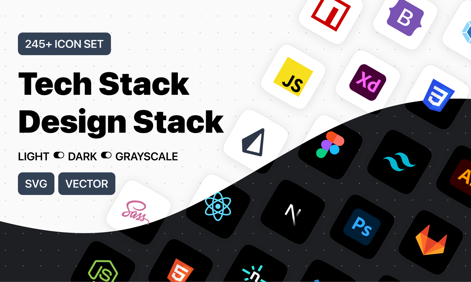
- 🌐 [**tech-stack-icons.com**](https://tech-stack-icons.com/) — Search, preview, copy JSX/SVG
- 🎨 [**Figma Plugin**](https://www.figma.com/community/plugin/1292847256216210035/tech-stack-design-stack-icons) — Drag & Drop into canvas
- 📁 [**Figma File**](https://www.figma.com/community/file/1095337897898466786/tech-stack-icons-design-stack-icons) — Duplicate for free
---
## ☕ Support
If you find this library helpful, consider supporting my work:
- ☕ [Buy Me a Coffee](https://buymeacoffee.com/plusuidesign)
- ☕ [Ko-fi](https://ko-fi.com/plusuidesign)
---
## ✨ Features
- 690+ original SVG icons
- Light, Dark, and Grayscale variants
- Fully typed with TypeScript autocomplete
- Zero dependencies
- Optimized for 100% width and height scaling
- Works out of the box with Tailwind CSS and styled-components
---
## 📦 Installation
```bash
npm install tech-stack-icons
# or
pnpm add tech-stack-icons
# or
yarn add tech-stack-icons
```
---
## 🧱 Usage
```tsx
import StackIcon from "tech-stack-icons";
export default function Example() {
return (
);
}
```
---
## 🧩 Props
| Prop | Type | Required | Description |
| ----------- | -------------------------------------- | -------- | ------------------------------------------------ |
| `name` | `IconName` | ✅ Yes | The ID of the icon (autocompletes in TypeScript) |
| `variant` | `"light"` \| `"dark"` \| `"grayscale"` | ❌ No | Defaults to `"light"` |
| `className` | `string` | ❌ No | CSS class for the wrapping `` |
| `style` | `React.CSSProperties` | ❌ No | Inline styles for the wrapper `` |
---
## 🎨 Variants
```tsx
```
---
## ✅ TypeScript Autocomplete
When using in a TypeScript project, the `name` prop autocompletes based on the internal icon list:
```tsx
import StackIcon, { IconName } from "tech-stack-icons";
const myIcon: IconName = "typescript";
```
---
# 🧪 Example: Styled with Tailwind
```tsx
```
# 🪄 Accessibility
Icons are inserted as `dangerouslySetInnerHTML` inside a ``, and are decorative by default.
If needed, you can wrap it in a `` or manually add ARIA attributes like:
```jsx
```
---
## 📂 Folder structure
Icons are embedded inline (no file loading needed). You do not need to manage separate assets.
---
## 📄 License
MIT — Made by [Eugenio Ciccale](https://www.plusuidesign.com/about/)