# Tailwind Grid Layout
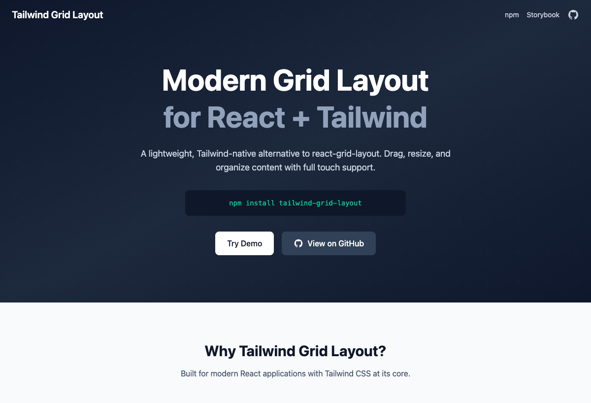
A modern, lightweight grid layout system for React built with Tailwind CSS. A powerful alternative to react-grid-layout with full feature parity and a smaller bundle size.
[](https://www.npmjs.com/package/tailwind-grid-layout)
[](https://github.com/Seungwoo321/tailwind-grid-layout/blob/main/LICENSE)
[](https://bundlephobia.com/package/tailwind-grid-layout)
> [Live Demo](https://tailwind-grid-layout.pages.dev/) | [Storybook](https://tailwind-grid-layout-storybook.pages.dev/)
> English | [한국어](./README.ko.md)
## Features
- **Full Feature Parity** with react-grid-layout
- **Lightweight** - Smaller bundle size (~15KB gzip)
- **Tailwind Native** - Built with Tailwind CSS v4
- **Responsive** - Works on all screen sizes
- **Mobile Touch** - Full touch device support
- **TypeScript** - Full TypeScript support
- **Well Tested** - 100% test coverage
## Installation
```bash
npm install tailwind-grid-layout
```
### Requirements
- React 19+
- Tailwind CSS 4.x
## Quick Start
```tsx
import { useState } from 'react'
import { GridContainer } from 'tailwind-grid-layout'
import type { GridItem } from 'tailwind-grid-layout'
const initialItems: GridItem[] = [
{ id: '1', x: 0, y: 0, w: 3, h: 2 },
{ id: '2', x: 3, y: 0, w: 5, h: 3 },
{ id: '3', x: 8, y: 0, w: 4, h: 2 },
]
function App() {
const [items, setItems] = useState(initialItems)
return (
{(item) => (
Item {item.id}
)}
)
}
```
## Components
### GridContainer
Basic grid container with drag and resize support.
```tsx
{(item) => Item {item.id}
}
```
#### GridContainer Props
| Prop | Type | Default | Description |
|------|------|---------|-------------|
| `items` | `GridItem[]` | **required** | Array of grid items |
| `children` | `(item: GridItem) => ReactNode` | **required** | Render function for each item |
| `cols` | `number` | `12` | Number of columns |
| `rowHeight` | `number` | `60` | Height of each row in pixels |
| `gap` | `number` | `16` | Gap between items in pixels |
| `margin` | `[number, number]` | `[gap, gap]` | Margin [horizontal, vertical] |
| `containerPadding` | `[number, number]` | `[16, 16]` | Container padding [horizontal, vertical] |
| `maxRows` | `number` | `undefined` | Maximum number of rows |
| `isDraggable` | `boolean` | `true` | Enable/disable dragging |
| `isResizable` | `boolean` | `true` | Enable/disable resizing |
| `preventCollision` | `boolean` | `false` | Prevent items from colliding |
| `allowOverlap` | `boolean` | `false` | Allow items to overlap |
| `isBounded` | `boolean` | `true` | Keep items within container bounds |
| `compactType` | `'vertical' \| 'horizontal' \| null` | `'vertical'` | Compaction direction |
| `resizeHandles` | `ResizeHandle[]` | `['se']` | Resize handle positions |
| `draggableCancel` | `string` | `undefined` | CSS selector for non-draggable elements |
| `draggableHandle` | `string` | `undefined` | CSS selector for drag handle |
| `autoSize` | `boolean` | `true` | Auto-adjust container height |
| `preserveInitialHeight` | `boolean` | `false` | Preserve initial layout height |
| `transformScale` | `number` | `1` | Transform scale for nested transforms |
| `className` | `string` | `undefined` | Additional CSS classes |
| `style` | `CSSProperties` | `undefined` | Additional inline styles |
#### GridContainer Callbacks
| Callback | Type | Description |
|----------|------|-------------|
| `onLayoutChange` | `(layout: GridItem[]) => void` | Called when layout changes |
| `onDragStart` | `(layout, oldItem, newItem, placeholder, e, element) => void` | Called when drag starts |
| `onDrag` | `(layout, oldItem, newItem, placeholder, e, element) => void` | Called during drag |
| `onDragStop` | `(layout, oldItem, newItem, placeholder, e, element) => void` | Called when drag ends |
| `onResizeStart` | `(layout, oldItem, newItem, placeholder, e, element) => void` | Called when resize starts |
| `onResize` | `(layout, oldItem, newItem, placeholder, e, element) => void` | Called during resize |
| `onResizeStop` | `(layout, oldItem, newItem, placeholder, e, element) => void` | Called when resize ends |
### ResponsiveGridContainer
Responsive grid with breakpoint-based layouts.
```tsx
import { ResponsiveGridContainer, WidthProvider } from 'tailwind-grid-layout'
const ResponsiveGrid = WidthProvider(ResponsiveGridContainer)
const layouts = {
lg: [{ id: '1', x: 0, y: 0, w: 6, h: 2 }],
md: [{ id: '1', x: 0, y: 0, w: 10, h: 2 }],
sm: [{ id: '1', x: 0, y: 0, w: 6, h: 2 }],
}
console.log(layouts)}
onBreakpointChange={(breakpoint, cols) => console.log(breakpoint)}
>
{(item) => Item {item.id}
}
```
#### ResponsiveGridContainer Props
Inherits all GridContainer props except `items`, `cols`, and `onLayoutChange`.
| Prop | Type | Default | Description |
|------|------|---------|-------------|
| `layouts` | `{ [breakpoint: string]: GridItem[] }` | **required** | Layout for each breakpoint |
| `breakpoints` | `{ [breakpoint: string]: number }` | `{ lg: 1200, md: 996, sm: 768, xs: 480, xxs: 0 }` | Breakpoint widths |
| `cols` | `{ [breakpoint: string]: number }` | `{ lg: 12, md: 10, sm: 6, xs: 4, xxs: 2 }` | Columns per breakpoint |
| `onLayoutChange` | `(layout: GridItem[], layouts: BreakpointLayouts) => void` | `undefined` | Called when layout changes |
| `onBreakpointChange` | `(breakpoint: string, cols: number) => void` | `undefined` | Called when breakpoint changes |
| `width` | `number` | `undefined` | Container width (for WidthProvider) |
### DroppableGridContainer
Grid with external drag-and-drop support.
```tsx
import { DroppableGridContainer } from 'tailwind-grid-layout'
setItems([...items, newItem])}
>
{(item) => Item {item.id}
}
```
#### DroppableGridContainer Props
Inherits all GridContainer props except `onDrop`.
| Prop | Type | Default | Description |
|------|------|---------|-------------|
| `droppingItem` | `Partial` | `{ w: 2, h: 2 }` | Size of dropping item |
| `onDrop` | `(item: GridItem) => void` | `undefined` | Called when item is dropped |
### WidthProvider
HOC that provides width to ResponsiveGridContainer.
```tsx
import { ResponsiveGridContainer, WidthProvider } from 'tailwind-grid-layout'
const ResponsiveGrid = WidthProvider(ResponsiveGridContainer)
// Or with options
const ResponsiveGrid = WidthProvider(ResponsiveGridContainer)
{/* ... */}
```
#### WidthProvider Props
| Prop | Type | Default | Description |
|------|------|---------|-------------|
| `measureBeforeMount` | `boolean` | `false` | Measure width before mounting |
## GridItem Properties
| Property | Type | Required | Description |
|----------|------|----------|-------------|
| `id` | `string` | Yes | Unique identifier |
| `x` | `number` | Yes | X position in grid units |
| `y` | `number` | Yes | Y position in grid units |
| `w` | `number` | Yes | Width in grid units |
| `h` | `number` | Yes | Height in grid units |
| `minW` | `number` | No | Minimum width |
| `maxW` | `number` | No | Maximum width |
| `minH` | `number` | No | Minimum height |
| `maxH` | `number` | No | Maximum height |
| `static` | `boolean` | No | Make item unmovable and unresizable |
| `isDraggable` | `boolean` | No | Override container's isDraggable |
| `isResizable` | `boolean` | No | Override container's isResizable |
| `className` | `string` | No | Additional CSS class for item |
## Resize Handles
Available resize handle positions:
| Handle | Position |
|--------|----------|
| `n` | North (top center) |
| `s` | South (bottom center) |
| `e` | East (right center) |
| `w` | West (left center) |
| `ne` | North-East (top right corner) |
| `nw` | North-West (top left corner) |
| `se` | South-East (bottom right corner) |
| `sw` | South-West (bottom left corner) |
## Utility Functions
```tsx
import { generateLayouts, generateResponsiveLayouts } from 'tailwind-grid-layout'
// Generate layout from items
const layout = generateLayouts(items)
// Generate responsive layouts
const responsiveLayouts = generateResponsiveLayouts(items, breakpoints, cols)
```
## Comparison with react-grid-layout
| Feature | react-grid-layout | tailwind-grid-layout |
|---------|-------------------|---------------------|
| Bundle Size | ~30KB | ~15KB |
| Tailwind Native | No | Yes |
| TypeScript | Yes | Yes |
| Touch Support | Yes | Yes |
| Responsive | Yes | Yes |
| External CSS | Required | Not needed |
## License
MIT © [Seungwoo, Lee](./LICENSE)