# Tailwind Grid Layout
React용 현대적이고 가벼운 그리드 레이아웃 시스템. Tailwind CSS로 구축되었으며, react-grid-layout의 강력한 대안입니다.
[](https://www.npmjs.com/package/tailwind-grid-layout)
[](https://github.com/Seungwoo321/tailwind-grid-layout/blob/main/LICENSE)
[](https://bundlephobia.com/package/tailwind-grid-layout)
> [Live Demo](https://tailwind-grid-layout.pages.dev/) | [Storybook](https://tailwind-grid-layout-storybook.pages.dev/)
> [English](./README.md) | 한국어
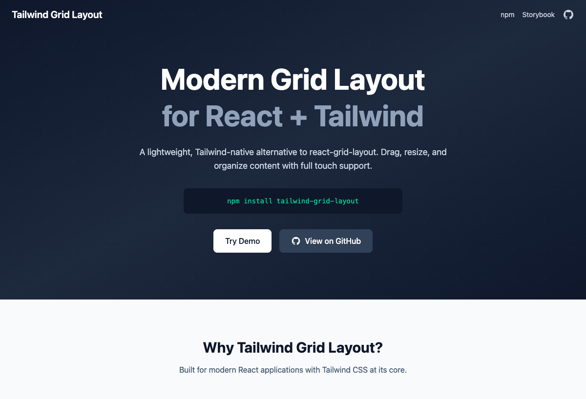
## 특징
- **react-grid-layout과 완벽한 기능 호환**
- **경량화** - 더 작은 번들 크기 (~15KB gzip)
- **Tailwind 네이티브** - Tailwind CSS v4 기반
- **반응형** - 모든 화면 크기 지원
- **모바일 터치** - 터치 디바이스 완전 지원
- **TypeScript** - 완벽한 타입 지원
- **철저한 테스트** - 100% 테스트 커버리지
## 설치
```bash
npm install tailwind-grid-layout
```
### 요구사항
- React 19+
- Tailwind CSS 4.x
## 빠른 시작
```tsx
import { useState } from 'react'
import { GridContainer } from 'tailwind-grid-layout'
import type { GridItem } from 'tailwind-grid-layout'
const initialItems: GridItem[] = [
{ id: '1', x: 0, y: 0, w: 3, h: 2 },
{ id: '2', x: 3, y: 0, w: 5, h: 3 },
{ id: '3', x: 8, y: 0, w: 4, h: 2 },
]
function App() {
const [items, setItems] = useState(initialItems)
return (
{(item) => (
아이템 {item.id}
)}
)
}
```
## 컴포넌트
### GridContainer
드래그 및 크기 조절을 지원하는 기본 그리드 컨테이너.
```tsx
{(item) => 아이템 {item.id}
}
```
#### GridContainer Props
| Prop | 타입 | 기본값 | 설명 |
|------|------|--------|------|
| `items` | `GridItem[]` | **필수** | 그리드 아이템 배열 |
| `children` | `(item: GridItem) => ReactNode` | **필수** | 각 아이템의 렌더 함수 |
| `cols` | `number` | `12` | 컬럼 수 |
| `rowHeight` | `number` | `60` | 행 높이 (픽셀) |
| `gap` | `number` | `16` | 아이템 간격 (픽셀) |
| `margin` | `[number, number]` | `[gap, gap]` | 마진 [가로, 세로] |
| `containerPadding` | `[number, number]` | `[16, 16]` | 컨테이너 패딩 [가로, 세로] |
| `maxRows` | `number` | `undefined` | 최대 행 수 |
| `isDraggable` | `boolean` | `true` | 드래그 활성화/비활성화 |
| `isResizable` | `boolean` | `true` | 크기 조절 활성화/비활성화 |
| `preventCollision` | `boolean` | `false` | 아이템 충돌 방지 |
| `allowOverlap` | `boolean` | `false` | 아이템 겹침 허용 |
| `isBounded` | `boolean` | `true` | 컨테이너 경계 내 유지 |
| `compactType` | `'vertical' \| 'horizontal' \| null` | `'vertical'` | 압축 방향 |
| `resizeHandles` | `ResizeHandle[]` | `['se']` | 크기 조절 핸들 위치 |
| `draggableCancel` | `string` | `undefined` | 드래그 불가 요소 CSS 선택자 |
| `draggableHandle` | `string` | `undefined` | 드래그 핸들 CSS 선택자 |
| `autoSize` | `boolean` | `true` | 컨테이너 높이 자동 조절 |
| `preserveInitialHeight` | `boolean` | `false` | 초기 레이아웃 높이 유지 |
| `transformScale` | `number` | `1` | 중첩 트랜스폼용 스케일 |
| `className` | `string` | `undefined` | 추가 CSS 클래스 |
| `style` | `CSSProperties` | `undefined` | 추가 인라인 스타일 |
#### GridContainer 콜백
| 콜백 | 타입 | 설명 |
|------|------|------|
| `onLayoutChange` | `(layout: GridItem[]) => void` | 레이아웃 변경 시 호출 |
| `onDragStart` | `(layout, oldItem, newItem, placeholder, e, element) => void` | 드래그 시작 시 호출 |
| `onDrag` | `(layout, oldItem, newItem, placeholder, e, element) => void` | 드래그 중 호출 |
| `onDragStop` | `(layout, oldItem, newItem, placeholder, e, element) => void` | 드래그 종료 시 호출 |
| `onResizeStart` | `(layout, oldItem, newItem, placeholder, e, element) => void` | 크기 조절 시작 시 호출 |
| `onResize` | `(layout, oldItem, newItem, placeholder, e, element) => void` | 크기 조절 중 호출 |
| `onResizeStop` | `(layout, oldItem, newItem, placeholder, e, element) => void` | 크기 조절 종료 시 호출 |
### ResponsiveGridContainer
브레이크포인트 기반 반응형 그리드.
```tsx
import { ResponsiveGridContainer, WidthProvider } from 'tailwind-grid-layout'
const ResponsiveGrid = WidthProvider(ResponsiveGridContainer)
const layouts = {
lg: [{ id: '1', x: 0, y: 0, w: 6, h: 2 }],
md: [{ id: '1', x: 0, y: 0, w: 10, h: 2 }],
sm: [{ id: '1', x: 0, y: 0, w: 6, h: 2 }],
}
console.log(layouts)}
onBreakpointChange={(breakpoint, cols) => console.log(breakpoint)}
>
{(item) => 아이템 {item.id}
}
```
#### ResponsiveGridContainer Props
GridContainer의 모든 props를 상속하며, `items`, `cols`, `onLayoutChange`는 제외됩니다.
| Prop | 타입 | 기본값 | 설명 |
|------|------|--------|------|
| `layouts` | `{ [breakpoint: string]: GridItem[] }` | **필수** | 각 브레이크포인트별 레이아웃 |
| `breakpoints` | `{ [breakpoint: string]: number }` | `{ lg: 1200, md: 996, sm: 768, xs: 480, xxs: 0 }` | 브레이크포인트 너비 |
| `cols` | `{ [breakpoint: string]: number }` | `{ lg: 12, md: 10, sm: 6, xs: 4, xxs: 2 }` | 브레이크포인트별 컬럼 수 |
| `onLayoutChange` | `(layout: GridItem[], layouts: BreakpointLayouts) => void` | `undefined` | 레이아웃 변경 시 호출 |
| `onBreakpointChange` | `(breakpoint: string, cols: number) => void` | `undefined` | 브레이크포인트 변경 시 호출 |
| `width` | `number` | `undefined` | 컨테이너 너비 (WidthProvider용) |
### DroppableGridContainer
외부 드래그 앤 드롭을 지원하는 그리드.
```tsx
import { DroppableGridContainer } from 'tailwind-grid-layout'
setItems([...items, newItem])}
>
{(item) => 아이템 {item.id}
}
```
#### DroppableGridContainer Props
GridContainer의 모든 props를 상속하며, `onDrop`은 제외됩니다.
| Prop | 타입 | 기본값 | 설명 |
|------|------|--------|------|
| `droppingItem` | `Partial` | `{ w: 2, h: 2 }` | 드롭되는 아이템 크기 |
| `onDrop` | `(item: GridItem) => void` | `undefined` | 아이템 드롭 시 호출 |
### WidthProvider
ResponsiveGridContainer에 너비를 제공하는 HOC.
```tsx
import { ResponsiveGridContainer, WidthProvider } from 'tailwind-grid-layout'
const ResponsiveGrid = WidthProvider(ResponsiveGridContainer)
{/* ... */}
```
#### WidthProvider Props
| Prop | 타입 | 기본값 | 설명 |
|------|------|--------|------|
| `measureBeforeMount` | `boolean` | `false` | 마운트 전 너비 측정 |
## GridItem 속성
| 속성 | 타입 | 필수 | 설명 |
|------|------|------|------|
| `id` | `string` | Yes | 고유 식별자 |
| `x` | `number` | Yes | 그리드 단위 X 위치 |
| `y` | `number` | Yes | 그리드 단위 Y 위치 |
| `w` | `number` | Yes | 그리드 단위 너비 |
| `h` | `number` | Yes | 그리드 단위 높이 |
| `minW` | `number` | No | 최소 너비 |
| `maxW` | `number` | No | 최대 너비 |
| `minH` | `number` | No | 최소 높이 |
| `maxH` | `number` | No | 최대 높이 |
| `static` | `boolean` | No | 이동/크기조절 불가 설정 |
| `isDraggable` | `boolean` | No | 컨테이너의 isDraggable 재정의 |
| `isResizable` | `boolean` | No | 컨테이너의 isResizable 재정의 |
| `className` | `string` | No | 아이템 추가 CSS 클래스 |
## 크기 조절 핸들
사용 가능한 크기 조절 핸들 위치:
| 핸들 | 위치 |
|------|------|
| `n` | 북쪽 (상단 중앙) |
| `s` | 남쪽 (하단 중앙) |
| `e` | 동쪽 (우측 중앙) |
| `w` | 서쪽 (좌측 중앙) |
| `ne` | 북동쪽 (우상단 모서리) |
| `nw` | 북서쪽 (좌상단 모서리) |
| `se` | 남동쪽 (우하단 모서리) |
| `sw` | 남서쪽 (좌하단 모서리) |
## 유틸리티 함수
```tsx
import { generateLayouts, generateResponsiveLayouts } from 'tailwind-grid-layout'
// 아이템에서 레이아웃 생성
const layout = generateLayouts(items)
// 반응형 레이아웃 생성
const responsiveLayouts = generateResponsiveLayouts(items, breakpoints, cols)
```
## react-grid-layout과 비교
| 기능 | react-grid-layout | tailwind-grid-layout |
|------|-------------------|---------------------|
| 번들 크기 | ~30KB | ~15KB |
| Tailwind 네이티브 | No | Yes |
| TypeScript | Yes | Yes |
| 터치 지원 | Yes | Yes |
| 반응형 | Yes | Yes |
| 외부 CSS | 필요 | 불필요 |
## 라이선스
MIT © [Seungwoo, Lee](./LICENSE)