<div align="center">

<img src="https://raw.githubusercontent.com/alexisgvrcia/svelte-thinking-orbs/main/static/og-image.png" alt="Svelte Thinking Orbs" width="900" />

# Svelte Thinking Orbs


![Svelte 5](https://img.shields.io/badge/Svelte_5-111111?style=for-the-badge&logo=svelte&logoColor=FF3E00)
![TypeScript](https://img.shields.io/badge/TypeScript-111111?style=for-the-badge&logo=typescript&logoColor=3178C6)
![MIT](https://img.shields.io/badge/License-MIT-111111?style=for-the-badge&logo=opensourceinitiative&logoColor=white)

</div>

## What is Svelte Thinking Orbs?

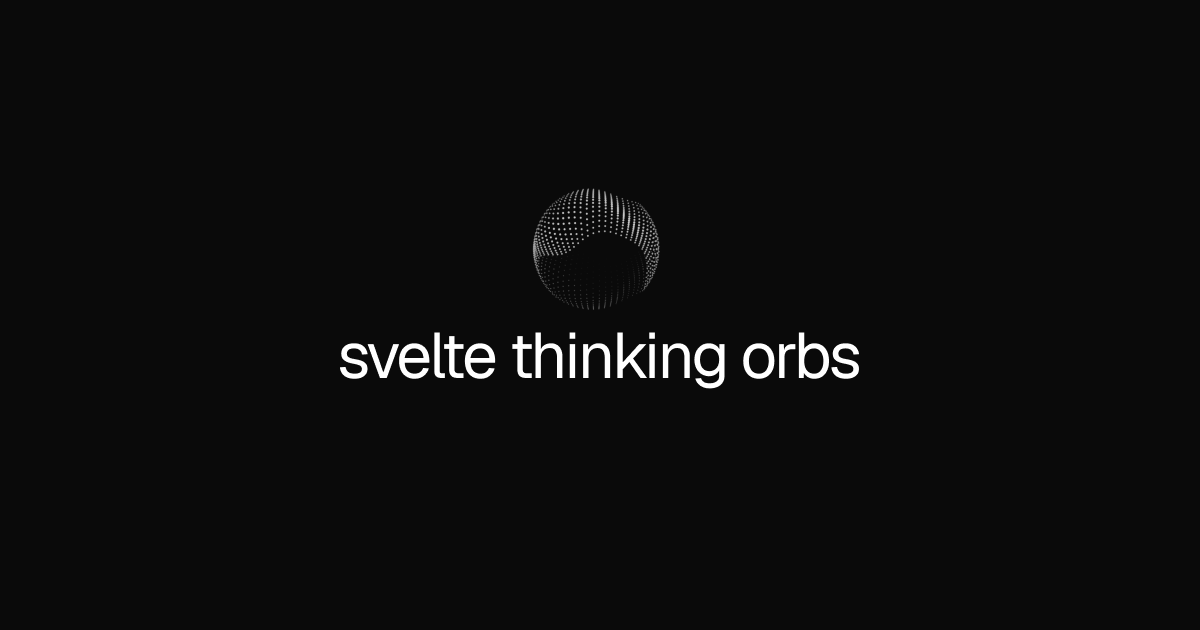
Dotted thought-orb indicators for AI and agent UIs in Svelte 5, with nine tuned states and theme-aware rendering. Use an orb to give assistants, editors, search experiences, and other interfaces a clear visual language for what the system is doing.

The animation engine is a Svelte 5 port and adaptation of [thinking-orbs](https://github.com/Jakubantalik/thinking-orbs) by [Jakub Antalik](https://github.com/Jakubantalik), released under the MIT License. This project adds the Svelte component API, lifecycle handling, theming, accessibility behavior, and package tooling.

### Features

- **Nine thinking states** — `working`, `searching`, `solving`, `listening`, `connecting`, `weaving`, `composing`, `breathing`, and `shaping`.
- **Transparent canvas** — Place the orb inside your existing UI without an extra surface or wrapper.
- **Theme aware** — Automatically follows the host theme or accepts an explicit `dark` or `light` mode.
- **Custom color** — Override the resolved theme color with any CSS color.
- **Motion controls** — Adjust speed, pause animation, or render one static representative frame.
- **Reduced motion support** — Respects the user's `prefers-reduced-motion` preference.
- **Efficient animation** — Animated instances share one `requestAnimationFrame` clock and stop while offscreen or when the document is hidden.
- **Fully typed** — Written in TypeScript for Svelte 5.

## Installation

```bash
npm install svelte-thinking-orbs
# or
pnpm add svelte-thinking-orbs
# or
yarn add svelte-thinking-orbs
# or
bun add svelte-thinking-orbs
```

## Quick Start

```svelte
<script lang="ts">
	import { ThinkingOrb } from "svelte-thinking-orbs";
</script>

<ThinkingOrb state="composing" size={48} />
```

The component renders a transparent canvas and forwards `class`, `style`, ARIA attributes, and other native canvas attributes.

## States

Choose the state that describes the current system activity:

| State | Use case |
| --- | --- |
| `working` | General processing and active work. |
| `searching` | Retrieval, browsing, and discovery. |
| `solving` | Reasoning through a complex problem. |
| `listening` | Waiting for voice or user input. |
| `connecting` | Linking tools, agents, and data sources. |
| `weaving` | Combining multiple threads into one result. |
| `composing` | Generating a response or artifact. |
| `breathing` | Quietly thinking or waiting between steps. |
| `shaping` | Structuring or transforming content. |

## Props

| Prop | Type | Default | Description |
| --- | --- | --- | --- |
| `state` | `OrbState` | `working` | Which thinking state to render. |
| `size` | `number` | `64` | Canvas size in CSS pixels. Values are clamped to `12–256`. |
| `theme` | `auto \| dark \| light` | `auto` | Theme used to resolve the orb's ink color. |
| `color` | `string` | — | CSS color override. |
| `speed` | `number` | `1` | Animation speed multiplier. |
| `paused` | `boolean` | `false` | Freezes the animation at its current frame. |
| `static` | `boolean` | `false` | Draws one representative frame without joining the animation clock. |
| `class` | `string` | — | Forwarded to the canvas. |
| `style` | `string` | — | Forwarded to the canvas after its dimensions. |

## Common Patterns

### Custom color

```svelte
<ThinkingOrb state="searching" color="#7dd3fc" />
```

### Static output

Use `static` for screenshots, documentation, email captures, or any context that does not need animation.

```svelte
<ThinkingOrb state="solving" static />
```

### Accessible context

The orb has a state-based accessible label by default. Provide your own label when the surrounding context needs more detail.

```svelte
<ThinkingOrb state="working" aria-label="Generating report" />
```

### Pause and resume

```svelte
<script lang="ts">
	import { ThinkingOrb } from "svelte-thinking-orbs";

	let paused = false;
</script>

<button onclick={() => (paused = !paused)}>
	{paused ? "Resume" : "Pause"}
</button>

<ThinkingOrb state="listening" {paused} />
```

## Accessibility

- The canvas uses `role="img"` with a useful state label by default.
- Pass `aria-label` when the orb represents a specific task.
- The component respects `prefers-reduced-motion` automatically.
- Keep nearby text when the state alone is not enough to explain the system status.

## Performance

All animated instances share a single animation clock. Each orb automatically stops its animation when it is offscreen or when the page is hidden. Use `static` when animation is not needed.

## License

[![LICENSE - MIT](https://img.shields.io/badge/LICENSE-MIT-111111?style=for-the-badge&labelColor=111111&logo=open-source-initiative&logoColor=white)](LICENSE)
