


[](https://packagephobia.now.sh/result?p=ssart)
# Open Source Project SSART
**SSART** is the best library to apply chart in your Product !
You can freely use ssart in various frameworks such as Vue and React.
Using the vector image-based svg as a basic, it has clearer resolution and can be easily modified.
It also provides reactive charts, svg image storage, and data color change functions.
Use [**SSart**]() and apply various charts in your project 📊
한국어
ssart는 다양한 차트를 프로젝트에 적용할 수 있는 최고의 라이브러리입니다
Vue 와 React 같은 다양한 프레임 워크에서 자유롭게 사용할 수 있습니다.
vector 이미지 기반의 svg를 사용하여 선명한 해상도를 가진 차트를 자유롭게 수정할 수 있습니다.
또한, 반응형 차트, svg 이미지 저장 기능, 데이터 색상 변경 기능 등을 제공합니다.
ssart를 이용하여 다양한 차트를 여러분의 프로젝트에 적용해 보세요
## Installing
If you use npm, ```npm install SSart``` You can also download the latest release on [GitHub](https://github.com/ssartchart/ssart)
``` bash
$ npm install ssart
```
or
``` bash
$ npm i ssart
```
If you want to import the whole chart bundle, just add this in your code:
``` vue
import "ssart" ;
```
## Environment
All contents of the library were created using JavaScript.
## Examples
AreaChart
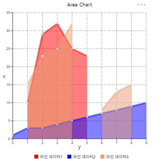
This chart which is based on the line chart displays graphically quantitative data.
The area between axis and line are commonly emphasized with colors, textures and hatchings.
Commonly one compares two or more quantities with an area chart.
영역 차트 (Araa chart) 는 도형의 넓이를 이용하여 데이터의 정량적 크기를 나타냅니다.
면적 그래프는 두개 이상의 자료를 비교하는데 용이하게 사용됩니다.
BarChart


This chart that represents categorical data as vertical rectangular bars with height and length proportional to the representation values
막대 차트(bar chart) 는 표현 값에 비례하여 높이와 길이를 가진 직사각형 막대로 범주형 데이터를 표현하는 차트를 말합니다.
자료의 대소관계를 한눈에 알아보기 쉽고 직관적입니다.
Bubble Chart
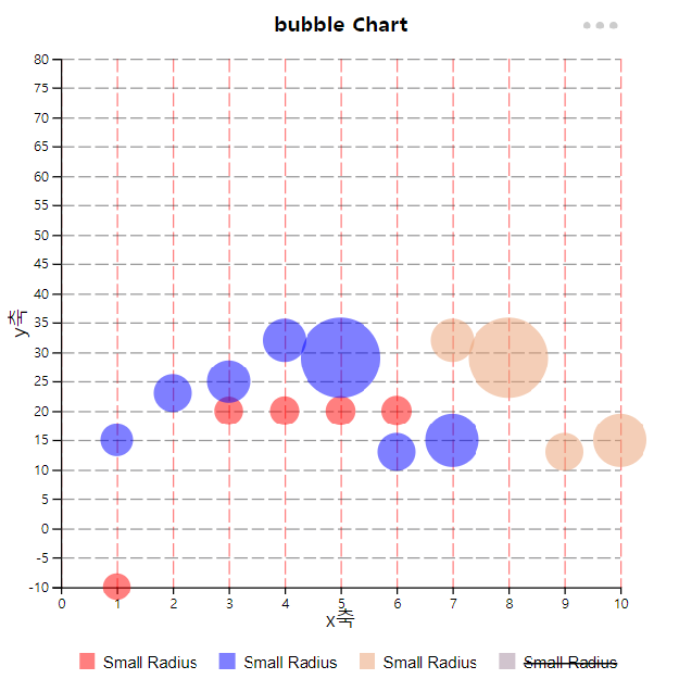
This chart displays three dimensions of data.
Each entity is plotted as a disk that express two of the values through the disk's x-axis and y-axis and the thrid thrugh its size.
거품형 차트(Bubble Chart)는 3차원 데이터를 나타내는 차트 유형입니다. 각각의 좌표 x,y 값과 이의 가중치 ( v , 거품의 크기 ) 로 구성되어있습니다.
거품형 차트는 사회, 경제, 의료 및 기타 과학적 관계에 대한 이해를 용이하게 할 수 있습니다.
CircleChart


This chart is a graph showing the ratio of each part to the whole as a percentage in a fan shape.
The central angle of each sector represents the proportion of the total, and has the advantage of being able to see the ratio at a glance.
원형 차트(Circle chart)는 전체에 대한 각 부분의 비율을 부채꼴 모양으로 백분률 로 나타낸 그래프입니다.
각 부채꼴의 중심각이 전체에서 차지하는 비율을 나타내며, 비율을 한눈에 볼 수 있습니다.
전체적인 비율을 쉽게 파악할 수 있어서 언론사에서 통계 수치를 공개할 때 자주 활용됩니다.
LineChart

This chart that uses lines to show how different pieces of information are related to each other.
각 데이터를 점으로 표시하고 그 점들을 선분으로 이어 그린 차트입니다.
데이터 값이 변화하는 모양과 정도를 쉽게 알 수 있습니다.
Polar Chart
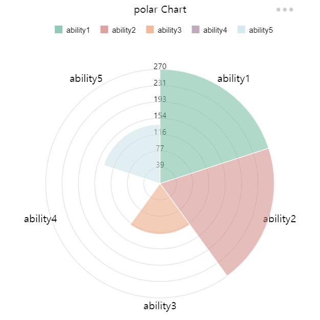
Polar charts are similar to pie charts, but each dataset has the same angle.
Each data set has a different radius size depending on the value. Useful when displaying comparison data similar to pie charts.
극지방 차트는 원 차트와 비슷하지만 각 데이터셋이 같은 각을 가집니다.
각 데이터셋은 값에 따라 반지름의 크기가 다릅니다.
원형차트와 유사한 비교 데이터를 표시할 때 유용합니다. 단 해당 데이터셋의 값 또한 표시합니다
RadarChart

This is a diagram that divides various evaluation items into polygons according to the number of items,
draws points according to the score of the items, and connects the points to form a line so that the balance between items can be seen at a glance.
레이다 차트(Radar Chart)는 어떤 측정 목표에 대한 평가항목이 여러 개일 때 항목 수에 따라 원을 같은 간격으로 나누고,
중심으로부터 일정 간격으로 동심으로 척도를 재는 칸을 나누어 각 평가항목의 정량화된 점수에 따라
그 위치에 점을 찍고 평가항목간 점을 이어 선으로 만들어 항목 간 균형을 한눈에 볼 수 있도록 해주는 차트입니다.
여러 측정 목표를 함께 겹쳐 놓아 비교하기에도 편리합니다. 각 항목 간 비율뿐만 아니라 균형과 경향을 직관적으로 알 수 있습니다.
ScatterChart

This chart is a type of plot or mathematical diagram using coordinates to display values for typically two variables for a set of data.
The data are displayed as a collection of points on the horizontal axis and the vertical axis.
산점도 차트(Scatter chart)는 직교 좌표계 (도표) 를 이용해 좌표상의 점을 표시함으로써 두 개 변수간의 관계를 나타내는 방법입니다.
두 변수 사이의 관계를 알 수 있습니다.
if you want to see more Examples , plz visit our sites and see more chart [SSART](https://ssart-library.netlify.app).
## How to Use
Area
```js
const data = {
labels: [0, 1, 2, 3, 4, 5, 6, 7, 8, 9],
datasets: [
{
label: '라인 데이터1',
data: [
{ name: 1, value: 10 },
{ name: 2, value: 29 },
{ name: 3, value: 32 },
{ name: 4, value: 25 },
{ name: 5, value: 23 },
{ name: 10, value: 15 }
],
backgroundColor: "red",
},
{
label: '라인 데이터2',
data: [1, 3, 3, 4, 5, 6, 7, 8, 9, 10]
,
backgroundColor: "blue",
},
{
label: '라인 데이터3',
data: [
{ x: 1, y: 15 },
{ x: 2, y: 23 },
{ x: 3, y: 25 },
{ x: 4, y: 32 },
{ x: 5, y: NaN },
{ x: 6, y: 8 },
{ x: 7, y: 13 },
{ x: 8, y: 15 },
],
}
]
};
```
```js
const config = {
type: 'area',
width: 500,
height: 500,
margin: { top: 40, left: 40, bottom: 40, right: 40 },
padding: 0.1,
data: data,
options: {
responsive: true,
plugins: {
legend: {
position: 'bottom',// top bottom left right
},
title: {
display: true,
text: 'Area Chart'
},
xTitle: {
display: true,
text: 'y'
},
yTitle: {
display: true,
text: 'x'
},
xGrid : {
display: true,
color: "#323233",// "rgb(255, 0, 0)" "rgba(255, 0, 0, 0.3)"
dash: "10,3",// 점선, 10만큼 칠하고 3만큼 빈공간
weight: 1, // 선 두께
opacity: .5 // 선 투명도
},
yGrid: {
display: true,
color: "#323233", // "rgb(255, 0, 0)" "rgba(255, 0, 0, 0.3)"
dash: "10,3",// 점선, 10만큼 칠하고 3만큼 빈공간
weight: 1, // 선 두께
opacity: .5 // 선 투명도
},
menu: {
// grid: true,
xGrid: true,
yGrid: true,
download: true,
}
},
scales: {
xAxis : {
type : "number",
ticks:{
}
},
yAxis : {
ticks:{
}
},
line :{
width : 5,
opacity : .5
},
dot :{
size : 0,
opacity : 1,
visible : true,
}
}
},
};
```
Bar (Vertical)
```js
const data = {
labels: ['a', 'b', 'c', 'd', 'e', 'f'],
datasets: [
{
label: '데이터 1',
data: [
{ name: 'a', value: -10 },
{ name: 'b', value: -29 },
{ name: 'c', value: -32 },
{ name: 'd', value: 25 },
{ name: 'e', value: 23 },
{ name: 'f', value: 15 }
],
// backgroundColor: "red",
},
{
label: '데이터 2',
data: [1, 2, 3, 4, 5, 6, -7, -8, -9, -10]
,
// backgroundColor: "blue",
},
{
label: '데이터 3',
data:
[
{ name: 'a', value: 15 },
{ name: 'b', value: 23 },
{ name: 'c', value: 25 },
{ name: 'd', value: -32 },
{ name: 'e', value: -29 },
{ name: 'f', value: -12 },
{ name: 'g', value: -15 },
{ name: 'ㅎ', value: 1 },
{ name: 't', value: 12 }
],
},
]
};
```
``` js
const config = {
type: 'bar',
width: 500,
height: 500,
margin: { top: 40, left: 40, bottom: 40, right: 40 },
padding: 0.1,
data: data,
options: {
responsive: true,
plugins: {
legend: {
position: 'right',// top bottom left right
fontSize: '10px',
fontWeight: 'normal',
fontFamily: 'comic sans ms',
legendType: 'rect', // rect(default), circle,
},
title: {
display: true,
text: 'Bar Chart'
},
xTitle: {
display: true,
text: 'name'
},
yTitle: {
display: true,
text: 'value'
},
xGrid: {
// color: "rgb(255, 0, 0)", // "rgb(255, 0, 0)" "rgba(255, 0, 0, 0.3)"
// dash: "10,3",
// weight: 5,
// opacity: .5,
},
yGrid: {
// color: "#323233", // "rgb(255, 0, 0)" "rgba(255, 0, 0, 0.3)"
// dash: "10,3", // 점선, 10만큼 칠하고 3만큼 빈공간
// weight: 1, // 선 두께
// opacity: .5, // 선 투명도
},
// background: {
// },
menu: {
grid: true,
xGrid: true,
yGrid: true,
background: true,
download: true,
legend: true
},
axis: {
color: "rgb(255, 0, 0)", // "rgb(255, 0, 0)" "rgba(255, 0, 0, 0.3)",
weight: 5,
opacity: .5,
dots: {
display: false,
color: "rgb(255, 0, 255)", // "rgb(255, 0, 0)" "rgba(255, 0, 0, 0.3)",
weight: 5,
opacity: .5
},
xAxis: {
color: "rgb(0, 255, 0)", // "rgb(255, 0, 0)" "rgba(255, 0, 0, 0.3)",
weight: 5,
opacity: 1,
dots: {
display: false,
color: "rgb(255, 0, 0)", // "rgb(255, 0, 0)" "rgba(255, 0, 0, 0.3)",
weight: 5,
opacity: 1
}
},
yAxis: {
color: "rgb(255, 0, 255)", // "rgb(255, 0, 0)" "rgba(255, 0, 0, 0.3)",
weight: 1,
opacity: .5,
dots: {
display: false,
color: "rgb(0, 0, 255)", // "rgb(255, 0, 0)" "rgba(255, 0, 0, 0.3)",
weight: 5,
opacity: .5
}
}
},
},
scales: {
yAxis: {
ticks: {
// min: -20,
max: 40
}
},
fillopacity: 0.5
}
},
};
```
Bar (Horizontal)
```js
const data = {
labels: ['a', 'b', 'c', 'd', 'e'],
datasets: [
{
label: '1번 막대 label',
data: [
{ name: 'a', value: 100 },
{ name: 'b', value: 290 },
{ name: 'c', value: 750 },
{ name: 'd', value: 250 },
{ name: 'e', value: 750 },
],
backgroundColor: "red",
},
{
label: '2번 막대 label',
data: [100, 200, 320, 45],
backgroundColor: "blue",
},
{
label: '3번 막대 label',
data: [90, 170, 300, 415],
backgroundColor: "yellow",
},
]
};
```
```js
const config = {
type: 'barH',
width: 500,
height: 500,
margin: { top: 40, left: 40, bottom: 40, right: 40 },
padding: 0.1,
data: data,
options: {
responsive: true,
plugins: {
legend: {
position: 'bottom',// top bottom left right
},
title: {
display: true,
text: '가로막대 그래프'
},
xTitle: {
display: true,
text: 'name'
},
yTitle: {
display: true,
text: 'value'
},
xGrid: {
color: "rgb(255, 0, 0)", //"rgb(255, 0, 0)" "rgba(255, 0, 0, 0.3)"
dash: "10,3",
weight: 1,
opacity: .5,
},
yGrid: {
color: "#323233", // "rgb(255, 0, 0)" "rgba(255, 0, 0, 0.3)"
dash: "10,3", // 점선, 10만큼 칠하고 3만큼 빈공간
weight: 1, // 선 두께
opacity: .5, // 선 투명도
},
},
scales:{
yAxis : {
ticks:{
// min : -10,
max : 900
}
},
}
}
};
```
Bubble chart
```js
const data = {
labels: [0, 1, 2, 3, 4, 5, 6, 7, 8, 9],
datasets: [
{
label: 'Small Radius',
data:
[
[1, -10, 1], [20, 20, 2], [3, 20, 3], [4, 20, 4], [5, 20, 5], [6, 20, 6]
],
},
{
label: 'Small Radius',
data: [
{ x: 1, y: 15, r: 10 },
{ x: 2, y: 23, r: 20 },
{ x: 3, y: 25, r: 30 },
{ x: 4, y: 32, r: 30 },
{ x: 5, y: 29, r: 100 },
{ x: 6, y: 13, r: 20 },
{ x: 7, y: 15, r: 50 },
],
},
{
label: 'Small Radius',
data: [
{ x: 10, y: 150, r: 10 },
{ x: 5, y: 230, r: 20 },
{ x: 6, y: 250, r: 30 },
{ x: 7, y: 32, r: 30 },
{ x: 8, y: 29, r: 100 },
{ x: 9, y: 13, r: 20 },
{ x: 10, y: 15, r: 50 },
],
},
{
label: 'Small Radius',
data: [
{ x: 1, y: 15, r: 10 },
{ x: 2, y: 23, r: 20 },
{ x: 3, y: 25, r: 30 },
{ x: 4, y: 32, r: 30 },
{ x: 5, y: 29, r: 100 },
{ x: 6, y: 13, r: 20 },
{ x: 7, y: 15, r: 50 },
],
}
]
};
```
```js
const config = {
type: 'bubble',
width: 500,
height: 500,
margin: { top: 40, left: 40, bottom: 40, right: 40 },
padding: 0.1,
data: data,
options: {
responsive: true,
plugins: {
legend: {
position: 'bottom',// top bottom left right
},
title: {
display: true,
text: 'bubble Chart',
color: '#000000',
align: 'center' //start, end, center
},
xTitle: {
display: true,
text: 'x축',
size: "15px",
// color: 'rgba(100, 150, 0, .5)',
align: 'center' //start, end, center
},
yTitle: {
display: true,
text: 'y축',
size: "15px",
rotate: true,
position: 'left',
color: '#000000',
align: 'center' //top, bottom, center
},
xGrid: {
color: "rgb(255, 0, 0)", // "rgb(255, 0, 0)" "rgba(255, 0, 0, 0.3)"
dash: "10,3",
weight: 1,
opacity: .5,
},
yGrid: {
color: "#323233", // "rgb(255, 0, 0)" "rgba(255, 0, 0, 0.3)"
dash: "10,3", // 점선, 10만큼 칠하고 3만큼 빈공간
weight: 1, // 선 두께
opacity: .5, // 선 투명도
},
menu: {
}
},
scales: {
xAxis: {
// type: "number",
ticks: {
min: 0,
max: 10
}
},
yAxis: {
ticks: {
max: 80,
tick: 20
}
},
r: {
size: {
min: 10,
max: 30
}
},
fillopacity: 0.5
}
},
};
```
Circle chart(Donut / Pie)
```js
const data = {
labels: ['dd', 'B', 'C', 'D', 'E', 'F', 'G', 'H'],
datasets: [{
data : [
{ name: 'AAAA', value: 1000, color: '#efa86b' },
{ name: 'BBB', value: 1500, color: '#c1484f' },
{ name: 'C', value: 1300 },
{ name: 'D', value: 900, color: '#f4c17c' },
{ name: 'E', value: 700, color: '#fae8a4' },
{ name: 'F', value: 1200, color: '#df7454' },
{ name: 'G', value: 1100, color: '#e88d5d' },
{ name: 'H', value: 600, color: '#f8d690' },
]
}
]
};
```
```js
const config = {
type: 'donut',// if you want pie chart , change the type to pie!
width: 500,
height: 500,
margin: { top: 40, left: 40, bottom: 40, right: 40 },
padding: 0.1,
data: data,
options: {
responsive: true,
plugins: {
legend: {
position: 'left',// top bottom left right
},
title: {
display: true,
text: 'Donut Chart'
},
sort: true,
view: true,
},
}
}
```
Line chart
```js
const data = {
labels: [0, 1, 2, 3, 4, 5, 6, 7, 8, 9],
datasets: [
{
label: '라인 데이터1',
data: [
{ name: 1, value: 10 },
{ name: 2, value: 29 },
{ name: 3, value: 32 },
{ name: 4, value: 25 },
{ name: 5, value: 23 },
{ name: 10, value: 15 }
],
backgroundColor: "red",
},
{
label: '라인 데이터2',
data: [1, 3, 3, 4, 5, 6, 7, 8, 9, 10],
backgroundColor: "blue",
},
{
label: '라인 데이터3',
data: [
{ x: 1, y: 15 },
{ x: 2, y: 23 },
{ x: 3, y: 25 },
{ x: 4, y: 32 },
{ x: 5, y: NaN },
{ x: 6, y: 8 },
{ x: 7, y: 13 },
{ x: 8, y: 15 },
],
}
]
};
```
```js
const config = {
type: 'line',
width: 500,
height: 500,
margin: { top: 40, left: 40, bottom: 40, right: 40 },
padding: 0.1,
data: data,
options: {
responsive: true,
plugins: {
legend: {
position: 'bottom',// top bottom left right
},
title: {
display: true,
text: 'Line Chart'
},
xTitle: {
display: true,
text: 'y'
},
yTitle: {
display: true,
text: 'x'
},
xGrid : {
display: true,
color: "#323233",// "rgb(255, 0, 0)" "rgba(255, 0, 0, 0.3)"
dash: "10,3", // 점선, 10만큼 칠하고 3만큼 빈공간
weight: 1, // 선 두께
opacity: .5 // 선 투명도
},
yGrid: {
display: true,
color: "#323233",// "rgb(255, 0, 0)" "rgba(255, 0, 0, 0.3)"
dash: "10,3",// 점선, 10만큼 칠하고 3만큼 빈공간
weight: 1, // 선 두께
opacity: .5 // 선 투명도
},
menu: {
// grid: true,
xGrid: true,
yGrid: true,
download: true,
}
},
scales: {
xAxis: {
type: "number",
ticks: {
}
},
yAxis: {
ticks: {
max: 20
}
},
line: {
width: 5,
opacity: 0.6
},
dot: {
size: 0,
opacity: 1,
visible: true,
}
}
},
};
```
Polar chart
```js
const data = {
labels: ['A', 'B', 'C', 'D', 'E', 'F', 'G', 'H'],
datasets: [{
data : [
{ name: 'John', value: 1000, backgroundColor: '#efa86b' },
{ name: 'Abraham', value: 1500, backgroundColor: '#c1484f' },
{ name: 'Jack', value: 1300 },
{ name: 'Madison', value: 900, backgroundColor: '#f4c17c' },
{ name: 'Olivia', value: 700, backgroundColor: '#fae8a4' },
{ name: 'Quincy', value: 1200, backgroundColor: '#df7454' },
{ name: 'Talan', value: 1100, backgroundColor: '#e88d5d' },
{ name: 'Wendy', value: 600, backgroundColor: '#f8d690' },
]
}
]
};
```
```js
const config = {
type: 'polar',
width: 500,
height: 500,
margin: { top: 40, left: 40, bottom: 40, right: 40 },
padding: 0.1,
data: data,
depth:7, // 구간 갯수
options: {
responsive: true,
plugins: {
legend: {
position: 'top',// top bottom left right
},
title: {
display: true,
text: 'polar Chart'
},
sort: true,
view: true,
menu: {
download: true
}
},
scales:{
depth : 7
}
}
};
```
Radar chart
```js
const data = {
labels: ['ability1', 'ability2', 'ability3', 'ability4' ,'ability5'],
datasets: [
{
label: 'A',
data : [270,270,120,1,140]
},
{
label: 'B',
data :[140,100,280,250,120],
},
{
label: 'C',
data : [100,190,140,12,270],
},
{
label : 'D',
data : [20,200,200,52,230],
}
],
};
```
```js
const config = {
type: 'radar',
width: 500,
height: 500,
margin: { top: 40, left: 40, bottom: 40, right: 40 },
padding: 0.1,
data: data,
depth:7, // 구간 갯수
poly:true,
options: {
responsive: true,
plugins: {
legend: {
position: 'top',// top bottom left right
},
title: {
display: true,
text: 'Radar Chart'
},
sort: true,
view: true,
menu: {
download: true
}
},
scales:{
depth : 7
}
}
}
```
Scatter chart
```js
const data = {
labels: [0, 1, 2, 3, 4, 5, 6, 7, 8, 9],
datasets: [
{
label: 'Fully Rounded',
data: [
{ name: 1, value: 10 },
{ name: 2, value: 29 },
{ name: 3, value: 32 },
{ name: 4, value: 25 },
{ name: 5, value: 23 },
{ name: 10, value: 15 }
],
backgroundColor: "red",
},
{
label: 'Small Radius',
data: [1, 3, 3, 4, 5, 6, 7, 8, 9, 10]
,
backgroundColor: "blue",
},
{
label: 'Small Radius',
data:
[
[1.5, 1], [2, 2], [3, 2], [4, 2], [5, 2], [6, 2]
],
},
{
label: 'Small Radius',
data: [
{ x: 1, y: 15 },
{ x: 2, y: 23 },
{ x: 3, y: 25 },
{ x: 4, y: 32 },
{ x: 5, y: 29 },
{ x: -6, y: 13 },
{ x: 7, y: 15 },
],
}
]
};
```
```js
const config2 = {
type: 'scatter',
width: 500,
height: 500,
margin: { top: 40, left: 40, bottom: 40, right: 40 },
padding: 0.1,
data: data,
options: {
responsive: true,
plugins: {
// legend: {
// // position: 'right',// top bottom left right
// },
title: {
display: true,
text: 'Scatter Chart'
},
xTitle: {
display: true,
text: 'y'
},
yTitle: {
display: true,
text: 'x'
},
xGrid: {
color: "#323233", // "rgb(255, 0, 0)" "rgba(255, 0, 0, 0.3)"
dash: "10,3",
weight: 2,
opacity: .5
},
yGrid: {
display: true,
color: "#323233", // "rgb(255, 0, 0)" "rgba(255, 0, 0, 0.3)"
dash: "10,3", // 점선, 10만큼 칠하고 3만큼 빈공간
weight: 2, // 선 두께
opacity: .5 // 선 투명도
},
background: {
},
menu: {
grid: true,
xGrid: true,
yGrid: true,
background: true,
download: true
},
},
scales: {
xAxis: {
type: "number",
ticks: {
min: -10,
max: 10
}
},
dot: {
size: 10,
opacity: 1
}
}
},
};
```
Common Code
``` js
```
``` js
```
## Browser Support
 |  | |
--- | --- | --- |
Latest ✔ | Latest ✔ | Latest ✔ |
## Developers
[ssart microsites](https://ssart-library.netlify.app)
* Lee JungHun : person00333@gmail.com
* Kim YoungJin : kimyj1288@gmail.com
* Bae YongHan : byh5112@naver.com
* Ahn JaeYoung : abogado2113@gmail.com
* Jeong HaeYun : godbs98@naver.com
* Jo wonbin : jwb7214@gmail.com
개인 깃헙 링크 혹은 마이크로 사이트에서 정리
## License
**Ssart** is available under the [MIT license](LICENSE).