## List
### Usage
- [Using Map Function. Implemented with avatar.](#using-map-function-implemented-with-avatar-)
- [Using RN ListView. Implemented with avatar.](#using-rn-listview-implemented-with-avatar-)
- [Using Map Function. Implemented with icon.](using-map-function-implemented-with-icon-.md)
- [Using RN ListView. Implemented with custom avatar component and custom view for subtitle.
](#using-rn-listview-implemented-with-custom-avatar-component-and-custom-view-for-subtitle-)
- [Using RN ListView. Implemented with badge.](#using-rn-listview-implemented-with-badge-)
- [Using RN ListView. Implemented with switch.](#using-rn-listview-implemented-with-switch-)
- [Using RN ListView. Implemented with custom header and footer.](#using-rn-listview-implemented-with-custom-header-and-footer-)
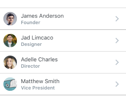
#### Using Map Function. Implemented with avatar.
```javascript
const list = [
{
name: 'James Anderson',
avatar_url: 'https://s3.amazonaws.com/uifaces/faces/twitter/jsa/128.jpg',
subtitle: 'Founder'
},
{
name: 'Jad Limcaco',
avatar_url: 'https://s3.amazonaws.com/uifaces/faces/twitter/jadlimcaco/128.jpg',
subtitle: 'Designer'
},
... // more items
]
{
list.map((item, index) => (
))
}
```
#### Using RN ListView. Implemented with avatar.
```javascript
constructor(props) {
super(props);
var ds = new ListView.DataSource({rowHasChanged: (r1, r2) => r1 !== r2})
this.state = {
dataSource: ds.cloneWithRows([
{
name: 'James Anderson',
avatar_url: 'https://s3.amazonaws.com/uifaces/faces/twitter/jsa/128.jpg',
subtitle: 'Founder'
},
{
name: 'Jad Limcaco',
avatar_url: 'https://s3.amazonaws.com/uifaces/faces/twitter/jadlimcaco/128.jpg',
subtitle: 'Designer'
},
... // more items
])
}
}
renderRow (rowData, sectionID, rowID) {
return (
)
}
```
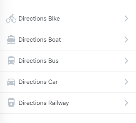
#### Using Map Function. Implemented with icon.
```javascript
const list = [
{
name: 'Directions Car',
icon: {
type : 'MaterialIcons',
name : 'directions-car'
}
},
{
name: 'Directions Bus',
icon: {
type : 'MaterialIcons',
name : 'directions-bus'
}
... // more items
]
{
list.map((item, index) => (
))
}
```
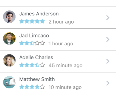
#### Using RN ListView. Implemented with custom avatar component and custom view for subtitle.
```javascript
constructor(props) {
super(props);
var ds = new ListView.DataSource({rowHasChanged: (r1, r2) => r1 !== r2})
this.state = {
dataSource: ds.cloneWithRows([
{
name: 'James Anderson',
avatar_url: 'https://s3.amazonaws.com/uifaces/faces/twitter/jsa/128.jpg',
subtitle: 'Founder',
rating: 5,
time: '2 hour ago'
},
{
name: 'Jad Limcaco',
avatar_url: 'https://s3.amazonaws.com/uifaces/faces/twitter/jadlimcaco/128.jpg',
subtitle: 'Designer',
rating: 2.5,
time: '1 hour ago'
},
... // more items
])
}
}
renderRow (rowData, sectionID, rowID) {
return (
}
key={rowID}
title={rowData.name}
subtitle={rowData.subtitle}
subtitle={
{rowData.time}
}
/>
)
}
const styles = StyleSheet.create({
subtitleView: {
flexDirection: 'row',
paddingLeft: 10,
paddingTop: 5
},
ratingText: {
paddingLeft: 10,
color: 'grey'
}
})
```
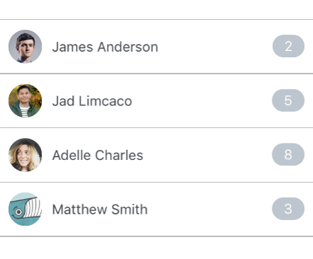
#### Using RN ListView. Implemented with badge.
```javascript
constructor(props) {
super(props);
var ds = new ListView.DataSource({rowHasChanged: (r1, r2) => r1 !== r2})
this.state = {
dataSource: ds.cloneWithRows([
{
name: 'James Anderson',
avatar_url: 'https://s3.amazonaws.com/uifaces/faces/twitter/jsa/128.jpg',
badge: '2'
},
{
name: 'Jad Limcaco',
avatar_url: 'https://s3.amazonaws.com/uifaces/faces/twitter/jadlimcaco/128.jpg',
badge: '5'
},
... // more items
])
}
}
renderRow (rowData, sectionID, rowID) {
return (
)
}
```
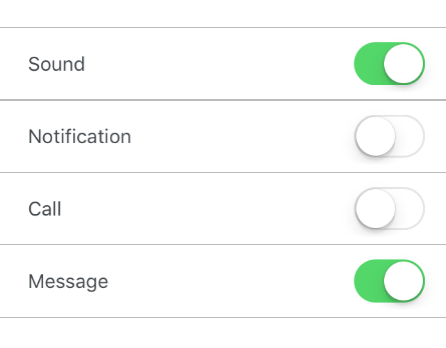
#### Using RN ListView. Implemented with switch.
```javascript
constructor(props) {
super(props);
var ds = new ListView.DataSource({rowHasChanged: (r1, r2) => r1 !== r2})
this.state = {
dataSource: ds.cloneWithRows([
{
name: 'James Anderson',
avatar_url: 'https://s3.amazonaws.com/uifaces/faces/twitter/jsa/128.jpg',
badge: '2'
},
{
name: 'Jad Limcaco',
avatar_url: 'https://s3.amazonaws.com/uifaces/faces/twitter/jadlimcaco/128.jpg',
badge: '5'
},
... // more items
])
}
}
renderRow (rowData, sectionID, rowID) {
return (
)
}
```
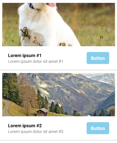
#### Using RN ListView. Implemented with custom header and footer.
```javascript
constructor(props) {
super(props);
var ds = new ListView.DataSource({rowHasChanged: (r1, r2) => r1 !== r2})
this.state = {
dataSource: ds.cloneWithRows([
{
thumbnail: 'https://placeimg.com/640/480/animals',
title: 'Lorem ipsum #1',
subtitle: 'Lorem ipsum dolor sit amet #1'
},
{
thumbnail: 'https://placeimg.com/640/480/nature',
title: 'Lorem ipsum #2',
subtitle: 'Lorem ipsum dolor sit amet #2'
},
... // more items
])
}
}
renderHeader(rowData) {
return (
);
}
renderFooter(rowData) {
return (
{rowData.title}
{rowData.subtitle}
Button
);
}
renderRow (rowData, sectionID, rowID) {
return (
)
}
const styles = StyleSheet.create({
containerHeader: {
flex: 1,
width: '100%'
},
imageThumbnail: {
width: '100%',
height: 150,
marginBottom: 10
},
containerFooter: {
flex: 1,
width: '100%',
flexDirection: 'row',
justifyContent: 'center',
alignItems: 'center',
paddingVertical: 10,
paddingHorizontal: 20
},
rowLeft: {
flex: 2,
flexDirection: 'column',
alignItems: 'flex-start',
justifyContent: 'center'
},
rowRight: {
flex: 1,
flexDirection: 'column',
alignItems: 'flex-end',
justifyContent: 'center'
},
textTitle: {
color: 'black',
fontWeight: 'bold',
fontSize: 16
},
textSubtitle: {
color: 'grey',
fontSize: 14
},
containerButton: {
backgroundColor: 'skyblue',
borderRadius: 5,
paddingHorizontal: 15,
paddingVertical: 10
},
textButton: {
fontSize: 16,
fontWeight: 'bold',
color: 'white',
textAlign: 'center'
},
})
```
### Props List
| prop | default | type | required | description |
| --- | :---: | :---: | :---: | --- |
| containerStyle | marginTop: 20, borderTopWidth: 1, borderBottomWidth: 1, borderBottomColor: #cbd2d9 | object (style) | optional | style for the list container |
### Props List Item
| prop | default | type | required | description |
| --- | :---: | :---: | :---: | --- |
| onPress | none | func | optional | onPress method for link |
| onLongPress | none | func | optional | onLongPress method for link |
| underlayColor | white | string | optional | define underlay color for TouchableHighlight |
| containerStyle | inherited styling | object (style) | optional | style for the list item container |
| component | View or TouchableHighlight if onPress method is added as prop | React Native element | optional | replace element with custom element (optional) |
| wrapperStyle | inherited styling | object (style) | optional | style for the outer list item component |
| fontFamily | HelveticaNeue (iOS), Sans Serif (android) |string | optional | specify different font family |
| leftIcon | none | object {name, color, style, type} (type defaults to material icons)
OR
react native element | optional | source icon for the left icon |
| leftIconContainerStyle | inherited styling | object (style) | optional | style for the list icon container |
| avatarStyle | inherited styling | object (style) | optional | style for the avatar |
| avatarContainerStyle | inherited styling | object (style) | optional | style for the avatar container |
| avatarOverlayContainerStyle | inherited styling | object (style) | optional | style for the avatar overlay container |
| roundAvatar | false | boolean | optional | make left avatar round |
| titleContainerStyle | inherited styling | object (style) | optional | style for the title container |
| titleNumberOfLines | 1 | number | optional | number of lines for title |
| title | none | string, number or object | optional | main title for list item, can be text or custom view |
| titleStyle | inherited styling | object (style) | optional | style for the title |
| subtitleContainerStyle | inherited styling | object (style) | optional | style for the subtitle container |
| subtitle | none | string, number or object | optional | subtitle text or custom view |
| subtitleStyle | inherited styling | object (style) | optional | style for the subtitle |
| subtitleNumberOfLines | 1 | number | optional | number of lines for subtitle |
| rightTitle | none | string | optional | provide a rightTitle to have a title show up on the right side of the button |
| rightTitleContainerStyle | inherited styling | object (style) | optional | style for the right title container |
| rightTitleStyle | inherited styling | object (style) | optional | style for the right title |
| rightTitleNumberOfLines | 1 | number | optional | number of lines for right title |
| badge | none | object, accepts the following properties: value (string), containerStyle (object), textStyle (object). You can override the default badge by providing your own component with it's own styling by providing badge={{ element: }} | optional | add a badge to the ListItem by using this prop |
| hideChevron | false | boolean | optional | set if you do not want a chevro |
| chevronColor | #bdc6cf | string | optional | set chevron color |
| rightIcon | { type: 'MaterialIcons', name: 'chevron-right', size: 28 } | object {name, color, style, type} (type defaults to material icons)
OR
react native element | optional | source icon for the right icon |
| switchButton | false | boolean | optional | add a switch to the right side of your component (note: in order to display the switchButton you need to add the `hideChevron` |
| onSwitch | none | func | optional | add a callback function when the switch is toggled |
| switchDisabled | false | boolean | optional | if true the user won't be able to toggle the switch |
| switchOnTintColor | none | string | optional | background color when the switch is turned on |
| switchThumbTintColor | none | string | optional | color of the foreground switch grip |
| switchTintColor | none | string | optional | border color on iOS and background color on Android when the switch is turned off |
| switched | false | boolean | optional | the value of the switch. if true the switch will be turned on |
| label | none | react native component | optional | add a label with your own styling by providing a label={} prop to ListItem |
| header | none | react native component | optional | add a header with your own styling by providing a header={} prop to ListItem |
| footer | none | react native component | optional | add a footer with your own styling by providing a footer={} prop to ListItem |