## Form Text
### Usage
```javascript
this.setState({ input })}
value={this.state.input} />
```
### Props
| prop | default | type | required | description |
| --- | :---: | :---: | :---: | --- |
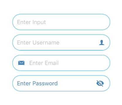
| icon | none | object(left or right) {size, name, type, color, outline, style} | optional | source icon of the form text |
| placeholder | none | none | optional | placeholder of the form text |
| autoCorrect | false | boolean | optional | determines autocorrect of the form text |
| autoCapitalize | none | string | optional | auto captialize of the form text |
| border | false | boolean | optional | determines border of the form text |
| borderColor | black | string | optional | color of the boder form text |
| borderWidth | 1.5 | number | optional | width of the boder form text |
| editable | true | boolean | optional | determines the form text is editable |
| fontFamily | none | none | optional | specify different font family |
| isPassword | false | boolean | optional | determines type of the form text |
| passwordIconPosition | right | left or right | optional | position password icon on form text |
| passwordIconColor | black | string | optional | color of the password icon |
| passwordIconSize | none | string | optional | size of the password icon |
| maxLength | none | number | optional | max length of form text |
| returnKeyType | done | string | optional | return key type keyboard |
| secureTextEntry | none | boolean | optional | set secure text entry |
| onChangeText | none | func | optional | function called when text is change |
| placeholderTextColor | silver | string | optional | color of the placeholder form text |
| textColor | black | string | optional | color of the form text |
| textSize | 14 | number | optional | size of the form text |
| textBackgroundColor | white | string | optional | background color of the form text |
| value | none | string | optional | value of the form text |