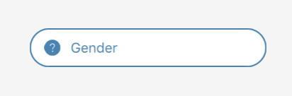
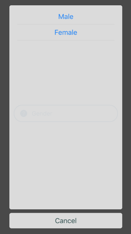
## Form Chooser
 ### Usage
```javascript
constructor(props) {
super(props);
this.state = {
gender: null
};
}
const genders = [{
key: 0,
label: 'Male',
icon: 'male'
}, {
key: 1,
label: 'Female',
icon: 'female'
}];
{
this.setState({
gender: option,
})
}}
/>
```
### Props
| prop | default | type | required | description |
| --- | :---: | :---: | :---: | --- |
| data | none | array[{key , label}] | required | array of objects with a unique key and label to select in the modal |
| onChange | none | func | optional | callback function, when the users has selected an option |
| initValue | none | string | optional | text that is initially shown on the button |
| border | false | boolean | optional | determines border of the form text |
| borderColor | black | string | optional | color of the boder form text |
| icon | none | object { name, type, size, color, outline } | optional | source icon of the form text |
| iconPosition | left | left or right | optional | position icon on form text |
| placeholder | none | string | optional | placeholder of the form text |
| placeholderTextColor | none | string | optional | color of the placeholder form text |
| textColor | none | string | optional | color of the form text |
| animationType | none | string | optional | type of animation to be used to show the modal. Must be one of none, slide or fade. |
| style | inherited styling | object (style) | optional | style for the outer form chooser component |
| optionStyle | inherited styling | object (style) | optional | style for the outer option |
| optionTextStyle | inherited styling | object (style) | optional | style for the option text |
| optionContainerStyle | inherited styling | object (style) | optional | style for the option container |
| sectionStyle | inherited styling | object (style)| optional | style for the section container |
| sectionTextStyle | inherited styling | object (style) | optional | style for the section text |
| cancelStyle | inherited styling | object (style) | optional | style for the cancel container |
| cancelTextStyle | inherited styling | object (style) | optional | style for the cancel text |
| overlayStyle | inherited styling | object (style) | optional | tyle for the overlay modal |
| cancelText | Cancel | string | optional | text value to be displayed in cancel button |
| disabled | false | boolean | optional | flag for disable opening of the modal |
| supportedOrientations | ['portrait', 'landscape'] | array ['portrait', 'landscape', 'portrait-upside-down', 'landscape-left', 'landscape-right'] | optional | orientations the modal supports |
| keyboardShouldPersistTaps | always | string or boolean | optional | passed to underlying ScrollView |
### Usage
```javascript
constructor(props) {
super(props);
this.state = {
gender: null
};
}
const genders = [{
key: 0,
label: 'Male',
icon: 'male'
}, {
key: 1,
label: 'Female',
icon: 'female'
}];
{
this.setState({
gender: option,
})
}}
/>
```
### Props
| prop | default | type | required | description |
| --- | :---: | :---: | :---: | --- |
| data | none | array[{key , label}] | required | array of objects with a unique key and label to select in the modal |
| onChange | none | func | optional | callback function, when the users has selected an option |
| initValue | none | string | optional | text that is initially shown on the button |
| border | false | boolean | optional | determines border of the form text |
| borderColor | black | string | optional | color of the boder form text |
| icon | none | object { name, type, size, color, outline } | optional | source icon of the form text |
| iconPosition | left | left or right | optional | position icon on form text |
| placeholder | none | string | optional | placeholder of the form text |
| placeholderTextColor | none | string | optional | color of the placeholder form text |
| textColor | none | string | optional | color of the form text |
| animationType | none | string | optional | type of animation to be used to show the modal. Must be one of none, slide or fade. |
| style | inherited styling | object (style) | optional | style for the outer form chooser component |
| optionStyle | inherited styling | object (style) | optional | style for the outer option |
| optionTextStyle | inherited styling | object (style) | optional | style for the option text |
| optionContainerStyle | inherited styling | object (style) | optional | style for the option container |
| sectionStyle | inherited styling | object (style)| optional | style for the section container |
| sectionTextStyle | inherited styling | object (style) | optional | style for the section text |
| cancelStyle | inherited styling | object (style) | optional | style for the cancel container |
| cancelTextStyle | inherited styling | object (style) | optional | style for the cancel text |
| overlayStyle | inherited styling | object (style) | optional | tyle for the overlay modal |
| cancelText | Cancel | string | optional | text value to be displayed in cancel button |
| disabled | false | boolean | optional | flag for disable opening of the modal |
| supportedOrientations | ['portrait', 'landscape'] | array ['portrait', 'landscape', 'portrait-upside-down', 'landscape-left', 'landscape-right'] | optional | orientations the modal supports |
| keyboardShouldPersistTaps | always | string or boolean | optional | passed to underlying ScrollView |