# Smart UI for React - 90+ Enterprise React UI Components
**`smart-webcomponents-react` is a commercial React UI component library providing 91 components for
React 19, including a data grid, pivot table, scheduler, Gantt chart, Kanban board, charts and a rich
text editor. TypeScript definitions are bundled, and every component is importable from its own
subpath for tree-shaking.**
[](https://www.npmjs.com/package/smart-webcomponents-react)
[](https://www.npmjs.com/package/smart-webcomponents-react)
[](https://www.htmlelements.com/license/)
[Live demos](https://www.htmlelements.com/demos/) ·
[Documentation](https://www.htmlelements.com/docs/react/) ·
[Theme Builder](https://www.htmlelements.com/themebuilder/) ·
[Pricing and licensing](https://www.htmlelements.com/license/)
## Contents
- [What is Smart UI for React?](#what-is-smart-ui-for-react)
- [Requirements](#requirements)
- [Installation](#installation)
- [Quick start](#quick-start)
- [React data grid example](#react-data-grid-example)
- [Components](#components)
- [Theming](#theming)
- [TypeScript](#typescript)
- [FAQ](#frequently-asked-questions)
- [License](#license)
## What is Smart UI for React?
Smart UI for React is a UI component library for building data-heavy business applications in React.
Components expose typed props, React events and refs, so they compose naturally with React state,
hooks and controlled-input patterns.
The library is aimed at applications that need enterprise data components, such as sortable and
filterable data grids, pivot tables, schedulers and Gantt charts, rather than a general-purpose
styling kit. It ships with no third-party runtime dependencies.
## Requirements
| Requirement | Version |
| --- | --- |
| React | 19 (`react` and `react-dom` are peer dependencies) |
| TypeScript | Optional; type definitions are bundled |
| Browsers | Current Chrome, Edge, Firefox, Safari and Opera |
## Installation
```sh
npm install smart-webcomponents-react
```
```sh
yarn add smart-webcomponents-react
```
```sh
pnpm add smart-webcomponents-react
```
## Quick start
Import a theme once in your application entry point, then import components from their own subpaths:
```jsx
import 'smart-webcomponents-react/source/styles/smart.default.css';
import React from 'react';
import { Accordion, AccordionItem } from 'smart-webcomponents-react/accordion';
const App = () => (
First Item Content.
Second Item Content.
);
export default App;
```
Each component has its own entry point, such as `smart-webcomponents-react/grid`,
`smart-webcomponents-react/scheduler` and `smart-webcomponents-react/chart`, with separate `main`,
`module` and `typings` fields, so bundlers include only the components you import.
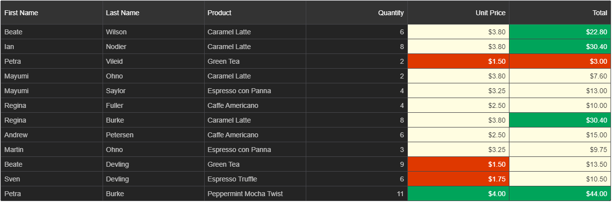
## React data grid example
The data grid is reached through a ref, which exposes the component's full API:
```jsx
import 'smart-webcomponents-react/source/styles/smart.default.css';
import React, { useRef, useEffect } from 'react';
import { Grid } from 'smart-webcomponents-react/grid';
const App = () => {
const grid = useRef(null);
useEffect(() => {
grid.current.dataSource = [
{ firstName: 'Andrew', lastName: 'Burke', quantity: 3 },
{ firstName: 'Nancy', lastName: 'Devolder', quantity: 5 }
];
}, []);
return (
);
};
export default App;
```
## Components
91 components ship in the package. Each name links to its API reference.
**Data grids and tables**
[Grid](https://www.htmlelements.com/docs/grid/) · [Table](https://www.htmlelements.com/docs/table/) · [Pivot Table](https://www.htmlelements.com/docs/pivot-table/) · [Card View](https://www.htmlelements.com/docs/card-view/) · Column Panel · [Group Panel](https://www.htmlelements.com/docs/group-panel/) · [Sort Panel](https://www.htmlelements.com/docs/sort-panel/) · [Filter Panel](https://www.htmlelements.com/docs/filter-panel/) · [Filter Builder](https://www.htmlelements.com/docs/filter-builder/) · [Multi Column Filter Panel](https://www.htmlelements.com/docs/multi-column-filter-panel/) · [Query Builder](https://www.htmlelements.com/docs/query-builder/) · [Pager](https://www.htmlelements.com/docs/pager/) · [Array](https://www.htmlelements.com/docs/array/) · [Sortable](https://www.htmlelements.com/docs/sortable/)
**Scheduling and project management**
[Scheduler](https://www.htmlelements.com/docs/scheduler/) · [Gantt Chart](https://www.htmlelements.com/docs/gantt-chart/) · [Kanban](https://www.htmlelements.com/docs/kanban/) · Timeline · [Calendar](https://www.htmlelements.com/docs/calendar/)
**Charts and data visualization**
[Chart](https://www.htmlelements.com/docs/chart/) · [3D Chart](https://www.htmlelements.com/docs/3d-chart/) · [Gauge](https://www.htmlelements.com/docs/gauge/) · [Tank](https://www.htmlelements.com/docs/tank/) · [Led](https://www.htmlelements.com/docs/led/) · [Progress Bar](https://www.htmlelements.com/docs/progress-bar/) · [Path](https://www.htmlelements.com/docs/path/) · [Map](https://www.htmlelements.com/docs/map/) · [Bar Code](https://www.htmlelements.com/docs/barcode/) · [QR Code](https://www.htmlelements.com/docs/qr-code/)
**Layout and navigation**
[Docking Layout](https://www.htmlelements.com/docs/docking-layout/) · [Accordion](https://www.htmlelements.com/docs/accordion/) · [Tabs](https://www.htmlelements.com/docs/tabs/) · [Tabs Window](https://www.htmlelements.com/docs/tabs-window/) · [Window](https://www.htmlelements.com/docs/window/) · Alert Window · Dialog Window · Multiline Window · Progress Window · Prompt Window · Wait Window · [Splitter](https://www.htmlelements.com/docs/splitter/) · [Menu](https://www.htmlelements.com/docs/menu/) · [List Menu](https://www.htmlelements.com/docs/list-menu/) · [Ribbon](https://www.htmlelements.com/docs/ribbon/) · [Breadcrumb](https://www.htmlelements.com/docs/breadcrumb/) · [Carousel](https://www.htmlelements.com/docs/carousel/) · [Card](https://www.htmlelements.com/docs/card/) · [Chip](https://www.htmlelements.com/docs/chip/) · [Toast](https://www.htmlelements.com/docs/toast/) · [Tooltip](https://www.htmlelements.com/docs/tooltip/) · [Scroll Bar](https://www.htmlelements.com/docs/scroll-bar/)
**Editors and inputs**
[Editor](https://www.htmlelements.com/docs/editor/) · [Input](https://www.htmlelements.com/docs/input/) · [Text Box](https://www.htmlelements.com/docs/text-box/) · Text Area · [Multiline Text Box](https://www.htmlelements.com/docs/multiline-text-box/) · [Masked Text Box](https://www.htmlelements.com/docs/masked-text-box/) · [Numeric Text Box](https://www.htmlelements.com/docs/numeric-text-box/) · Number Input · [Password Text Box](https://www.htmlelements.com/docs/password-text-box/) · Password Input · [Combo Box](https://www.htmlelements.com/docs/combo-box/) · Multi Combo Input · Multi Input · [Drop Down List](https://www.htmlelements.com/docs/drop-down-list/) · [Drop Down Button](https://www.htmlelements.com/docs/drop-down-button/) · [List Box](https://www.htmlelements.com/docs/list-box/) · [Tree](https://www.htmlelements.com/docs/tree/) · [Date Time Picker](https://www.htmlelements.com/docs/date-time-picker/) · Date Input · Date Range Input · Time Input · [Time Picker](https://www.htmlelements.com/docs/time-picker/) · Check Input · Country Input · Phone Input · [Color Picker](https://www.htmlelements.com/docs/color-picker/) · [Color Panel](https://www.htmlelements.com/docs/color-panel/) · [Color Input](https://www.htmlelements.com/docs/color-input/) · [File Upload](https://www.htmlelements.com/docs/file-upload/) · [Rating](https://www.htmlelements.com/docs/rating/) · [Slider](https://www.htmlelements.com/docs/slider/) · [Form](https://www.htmlelements.com/docs/form/) · [Validator](https://www.htmlelements.com/docs/validator/) · [Customization Dialog](https://www.htmlelements.com/docs/customization-dialog/)
**Buttons**
[Button](https://www.htmlelements.com/docs/button/) · Button Group · [Switch Button](https://www.htmlelements.com/docs/switch-button/) · [Radio Button](https://www.htmlelements.com/docs/radio-button/) · [Check Box](https://www.htmlelements.com/docs/check-box/) · [Multi Split Button](https://www.htmlelements.com/docs/multi-split-button/)
## Theming
31 themes ship in the package. Change the whole application by swapping a single import:
```jsx
import 'smart-webcomponents-react/source/styles/smart.dark-indigo.css';
```
| Theme family | Count | Stylesheets |
| --- | --- | --- |
| Default | 1 | `smart.default.css` |
| Light accents | 9 | `smart.cyan.css`, `smart.green.css`, `smart.indigo.css`, `smart.orange.css`, `smart.pink.css`, `smart.purple.css`, `smart.red.css`, `smart.teal.css`, `smart.turquoise.css` |
| Dark accents | 9 | `smart.dark-cyan.css`, `smart.dark-green.css`, `smart.dark-indigo.css`, `smart.dark-orange.css`, `smart.dark-pink.css`, `smart.dark-purple.css`, `smart.dark-red.css`, `smart.dark-teal.css`, `smart.dark-turquoise.css` |
| Bootstrap | 12 | `bootstrap/smart.bootstrap.css` plus `black`, `blue`, `cyan`, `green`, `indigo`, `orange`, `pink`, `purple`, `red`, `teal` and `turquoise` variants |
Per-component stylesheets are available in `source/styles/default/` if you prefer to load only the
CSS for the components you use.
Custom palettes can be generated with the [Theme Builder](https://www.htmlelements.com/themebuilder/).
## TypeScript
Type definitions are bundled, so no `@types` package is required. Every subpath ships its own `.d.ts`
with the component's props interface and enums:
```tsx
import { Grid, GridProps } from 'smart-webcomponents-react/grid';
```
## Frequently asked questions
### Does Smart UI support React 19?
Yes. `react` and `react-dom` version 19 are declared as peer dependencies.
### Is Smart UI for React free?
No. It is a commercial library. You can evaluate it free for 30 days with full technical support; a
[license](https://www.htmlelements.com/license/) is required for production use. A free, open-source
subset of the components is published separately as
[`smart-webcomponents-community`](https://www.npmjs.com/package/smart-webcomponents-community).
### Does the package include TypeScript definitions?
Yes. Every component subpath ships a `.d.ts` file. No separate `@types` package is needed.
### How many themes are included?
31: a default theme, 9 light accent themes, 9 dark accent themes and 12 Bootstrap variants. Custom
palettes can be built with the [Theme Builder](https://www.htmlelements.com/themebuilder/).
### How do I change the theme?
Import a different stylesheet from `smart-webcomponents-react/source/styles/`.
### Which browsers are supported?
Current versions of Chrome, Edge, Firefox, Safari and Opera.
### How do I reduce bundle size?
Import components from their individual subpaths rather than a barrel file. Each subpath is a
separate entry point marked `sideEffects: false`, so unused components are tree-shaken. Per-component
stylesheets in `source/styles/default/` let you trim CSS the same way.
### What is the difference between Smart UI and the community edition?
The commercial package includes the full suite, with Grid, Pivot Table, Scheduler, Gantt Chart,
Kanban, Editor and Docking Layout among them. The community edition contains 38 components covering
inputs, buttons, layout and navigation only. See the
[comparison](https://www.htmlelements.com/docs/community-and-enterprise/).
## Related packages
| Package | Description |
| --- | --- |
| [`smart-webcomponents`](https://www.npmjs.com/package/smart-webcomponents) | The components as framework-agnostic custom elements |
| [`smart-webcomponents-angular`](https://www.npmjs.com/package/smart-webcomponents-angular) | Angular modules |
| [`smart-webcomponents-community`](https://www.npmjs.com/package/smart-webcomponents-community) | Free, open-source subset |
## License
Commercial. Free 30-day evaluation with technical support; a license is required for production use.
See . The EULA ships in the package as `EULA.pdf`.
Support: [support@htmlelements.com](mailto:support@htmlelements.com) ·
[Forum](https://www.htmlelements.com/forum/)