# Slim Select

## [slimselectjs.com](https://slimselectjs.com)

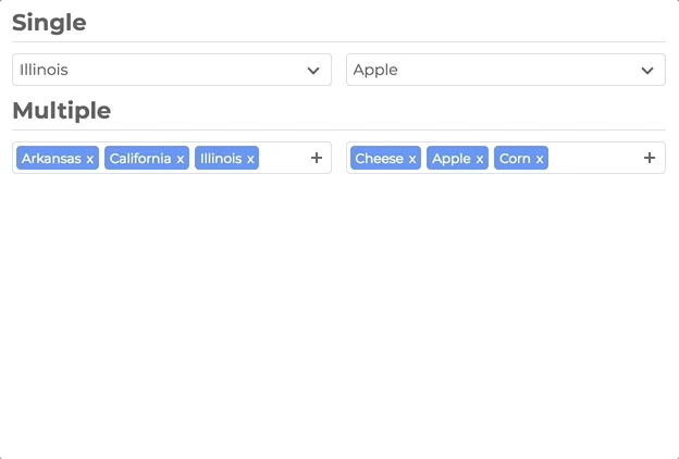
Advanced select dropdown

[![NPM Downloads](https://img.shields.io/npm/dt/slim-select.svg)](https://www.npmjs.com/package/slim-select)
![GitHub Actions Workflow Status](https://img.shields.io/github/actions/workflow/status/brianvoe/slim-select/vitest.yml?logo=vitest&label=unit%20tests) ![Tests](https://img.shields.io/badge/tests-314%20passing-brightgreen) [![slim-select](https://snyk.io/advisor/npm-package/slim-select/badge.svg)](https://snyk.io/advisor/npm-package/slim-select)

## Support

[![](https://img.shields.io/static/v1?label=Sponsor&message=%E2%9D%A4&logo=GitHub&color=%23fe8e86)](https://github.com/sponsors/brianvoe)

<a href="https://www.buymeacoffee.com/brianvoe" target="_blank"><img src="https://www.buymeacoffee.com/assets/img/custom_images/orange_img.png" alt="Buy Me A Coffee" style="height: auto !important;width: auto !important;" ></a>

## [Documentation and Examples](https://slimselectjs.com)

See [website](https://slimselectjs.com) for the full list of [settings](https://slimselectjs.com/settings), [methods](https://slimselectjs.com/methods) and [event callbacks](https://slimselectjs.com/events)

![](https://raw.githubusercontent.com/brianvoe/slim-select/master/docs/slimselect.gif)

## Features

- No Dependencies
- JS: 48kb - 10kb gzip
- CSS: 11kb - 2kb gzip
- Single Select
- Multi Select
- User Addable Options
- Html Options
- Settable Data
- Callback Events
- Label Support
- Placeholders
- Search
- Disable Options
- Light CSS
- Light Color Scheme
- Style and Class Inheritance
- Clean Animations
- Performant
- Typescript
- ARIA Accessibility (WCAG 2.1 Level AA compliant)

## Frameworks

- [Vue](#vue)
- [React](#react)

## Installation

```bash
npm install slim-select
```

### or

```html
<script src="https://unpkg.com/slim-select@latest/dist/slimselect.js"></script>
<link rel="stylesheet" href="https://unpkg.com/slim-select@latest/dist/slimselect.css" />
```

## Simple Usage

```javascript
import SlimSelect from 'slim-select'
import 'slim-select/styles' // optional css import method
import 'slim-select/scss' // optional scss import method

new SlimSelect({
  select: '#selectElement'
})
```

```html
<select id="selectElement">
  <option value="value1">Value 1</option>
</select>
```

## Data

Data is an array of objects that represent both option and optgroups.

See below for list of data types

```javascript
new SlimSelect({
  select: '#selectElement',

  // Array of Option objects
  data: [{ text: 'Value 1', value: 'value1' }],

  // or

  // Array of Optgroups and/or Options
  data: [{ label: 'Optgroup Label', options: { text: 'Value 1', value: 'value1' } }]
})
```

## Data Types

```javascript
// <optgroup>
var optgroup = {
  label: 'label', // Required
  selectAll: false, // Optional - default false
  closable: 'off', // Optional - default 'off' - 'off', 'open', 'close'
  options: [] // Required - value is an array of options
}

// <option>
var option = {
  text: 'text', // Required
  value: 'value', // Optional - value will be set by text if not set
  html: '<b>Html</b>', // Optional - if set, used for display purposes
  selected: false, // Optional - default is false
  display: true, // Optional - default is true
  disabled: false, // Optional - default is false
  mandatory: false, // Optional - default is false
  placeholder: false, // Optional - default is false
  class: '', // Optional - default is not set
  style: '', // Optional - default is not set
  data: {} // Optional - If you have data attributes
}
```

## Settings

Settings are optional fields that customize how SlimSelect operates. All values shown are defaults.

[Full Settings Documentation](https://slimselectjs.com/settings)

```javascript
new SlimSelect({
  select: '#selectElement',

  settings: {
    disabled: false, // Disable the select
    alwaysOpen: false, // Keep dropdown always open
    showSearch: true, // Show search input
    focusSearch: true, // Auto focus search on open
    keepSearch: false, // Keep search input value when dropdown closes
    ariaLabel: 'Combobox', // ARIA label for accessibility
    searchPlaceholder: 'Search', // Search input placeholder
    searchText: 'No Results', // Text when no results found
    searchingText: 'Searching...', // Text while searching
    searchHighlight: false, // Highlight search terms
    closeOnSelect: true, // Close dropdown after selection
    contentLocation: document.body, // Where to append dropdown
    contentPosition: 'absolute', // CSS position: absolute, relative, fixed
    contentWidth: '', // Content width: "500px" exact, ">500px" min-width, "<500px" max-width
    openPosition: 'auto', // Open direction: auto, up, down
    placeholderText: 'Select Value', // Placeholder text
    allowDeselect: false, // Allow deselecting in single select
    hideSelected: false, // Hide selected options in dropdown
    keepOrder: false, // Keep user click order (not DOM order) for getSelected
    showOptionTooltips: false, // Show tooltips on options
    minSelected: 0, // Minimum selections (multi-select)
    maxSelected: 1000, // Maximum selections (multi-select)
    timeoutDelay: 200, // Delay for callbacks (ms)
    maxValuesShown: 20, // Max values shown before message
    maxValuesMessage: '{number} selected', // Message when max values exceeded
    addableText: 'Press "Enter" to add {value}' // Text for addable option
  }
})
```

## Events

Events are function callbacks for when certain actions happen

[Full Events Documentation](https://slimselectjs.com/events)

```javascript
new SlimSelect({
  select: '#selectElement',

  events: {
    // Custom search function - return Promise or data array
    search: (searchValue: string, currentData: (Option | Optgroup)[]) => Promise<(Partial<Option> | Partial<Optgroup>)[]> | (Partial<Option> | Partial<Optgroup>)[],

    // Filter function for search - return true to show option
    searchFilter: (option: Option, search: string) => boolean,

    // Allow user to add options - return new option or error
    addable: (value: string) => Promise<Partial<Option> | string> | Partial<Option> | string | Error,

    // Before selection changes - return false to prevent change
    beforeChange: (newVal: Option[], oldVal: Option[]) => boolean | void,

    // After selection changes
    afterChange: (newVal: Option[]) => void,

    // Before dropdown opens
    beforeOpen: () => void,

    // After dropdown opens
    afterOpen: () => void,

    // Before dropdown closes
    beforeClose: () => void,

    // After dropdown closes
    afterClose: () => void,

    // Error handler
    error: (err: Error) => void
  }
})
```

## Methods

SlimSelect provides methods to programmatically control the select

[Full Methods Documentation](https://slimselectjs.com/methods)

```javascript
const slim = new SlimSelect({ select: '#selectElement' })

slim.enable() // Enable the select
slim.disable() // Disable the select
slim.getData() // Get current data array
slim.setData(data) // Set new data array
slim.getSelected() // Get selected values as string[]
slim.setSelected(['value1', 'value2']) // Set selected by values
slim.addOption(option) // Add a single option
slim.open() // Open the dropdown
slim.close() // Close the dropdown
slim.search('searchValue') // Programmatically search
slim.destroy() // Destroy the instance
```

## Vue

SlimSelect has official Vue 3 component support with full reactivity.

For more Vue examples and advanced usage, see the [Vue documentation](https://slimselectjs.com/vue).

### Installation

```bash
npm install slim-select
```

### Usage

```vue
<script lang="ts">
import SlimSelect from 'slim-select/vue'
import 'slim-select/styles'

export default {
  components: { SlimSelect },
  data() {
    return {
      selected: 'value2',
      options: [
        { text: 'Value 1', value: 'value1' },
        { text: 'Value 2', value: 'value2' },
        { text: 'Value 3', value: 'value3' }
      ]
    }
  }
}
</script>

<template>
  <SlimSelect v-model="selected" :data="options" />
</template>
```

## React

SlimSelect has official React component support with hooks.

For more React examples and advanced usage, see the [documentation](https://slimselectjs.com).

### Installation

```bash
npm install slim-select
```

### Usage

```tsx
import { useState } from 'react'
import SlimSelect from 'slim-select/react'
import 'slim-select/styles'

function MyComponent() {
  const [selected, setSelected] = useState('value2')
  const options = [
    { text: 'Value 1', value: 'value1' },
    { text: 'Value 2', value: 'value2' },
    { text: 'Value 3', value: 'value3' }
  ]

  return <SlimSelect data={options} value={selected} onChange={setSelected} />
}
```

### Advanced Usage with Ref

```tsx
import { useRef } from 'react'
import SlimSelect, { SlimSelectRef } from 'slim-select/react'
import 'slim-select/styles'

function MyComponent() {
  const slimRef = useRef<SlimSelectRef>(null)

  const handleClick = () => {
    // Access SlimSelect methods via ref
    slimRef.current?.slimSelect?.open()
  }

  return (
    <>
      <SlimSelect ref={slimRef} data={options} />
      <button onClick={handleClick}>Open Dropdown</button>
    </>
  )
}
```
