# slidev-theme-vuetiful-uno
Update slidev-theme-vuetiful with unocss. Below is original readme:
# slidev-theme-vuetiful
[](https://www.npmjs.com/package/slidev-theme-vuetiful)
A Vue-inspired theme for [Slidev](https://github.com/slidevjs/slidev).
Live demo: https://slidev-theme-vuetiful.netlify.app/
### Features
* Pretty Vue Theme
* Subtle Animations on Cover, Section etc. slides
* Code Highlighting with Sarah Drasner's Night Owl Theme
* SFC Playground Integration
* Flexible Default Layout using Grids
*

## Install
Add the following frontmatter to your `slides.md`. Start Slidev then it will prompt you to install the theme automatically.
---
theme: vuetiful
---
Learn more about [how to use a theme](https://sli.dev/themes/use).
## Layouts
> Note: I'm still in the process of adding more slide variations.
This theme provides the following layouts:
- Default (improved w/grid)
- BigPoints
- Cover
- Section
- Quote
- SFC
- Video
- Outro
### Default
The default slide has a few tricks up it's sleeve.
It an of course be used as-is:
```
---
# This will be the heading
And this can be used as test below it
- We can have a list.
- With a few items.
---
```
But it can also have the title in a special row:
```
---
title: This will now be the heading
titleRow: true
---
This content can now be styled/positioned independent of the title,
because it will be in a separate grid cell.
---
```
We can also do a quick column:
```
---
cols: 1-1 # Other values: 2-1 or 1-2, as well as any valid grid-cols-* class from windiwcss
---
This will go in the left column
:::right:::
This will go into the right column
---
```
You can also combine this with the separate titleRow:
```
---
title: This will span both columns
titleRow: true
cols: 2-1
---
This will be in the wider, left column
:::right:::
This will be in the smaller, right column
```
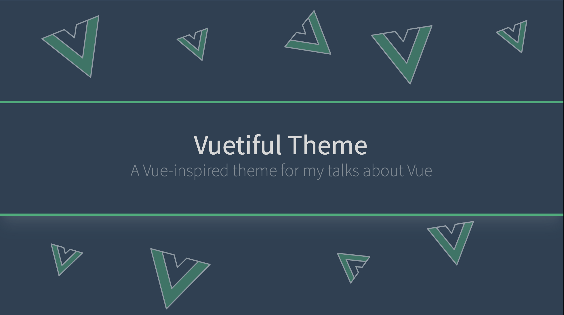
### Cover
A Cover slide for the Talk Title & Subtitle
#### Example
```frontmatter
---
layout: cover
cover: alt # to enable alternative cover
clicks: 1
---
# Vuetiful Theme
A Vue-inspired theme for my talks about Vue
```
> Note: the `clicks: 1` is necessary for the entry transition to work properly

Click for more screens
Default cover:

White alt cover:

### Big Points
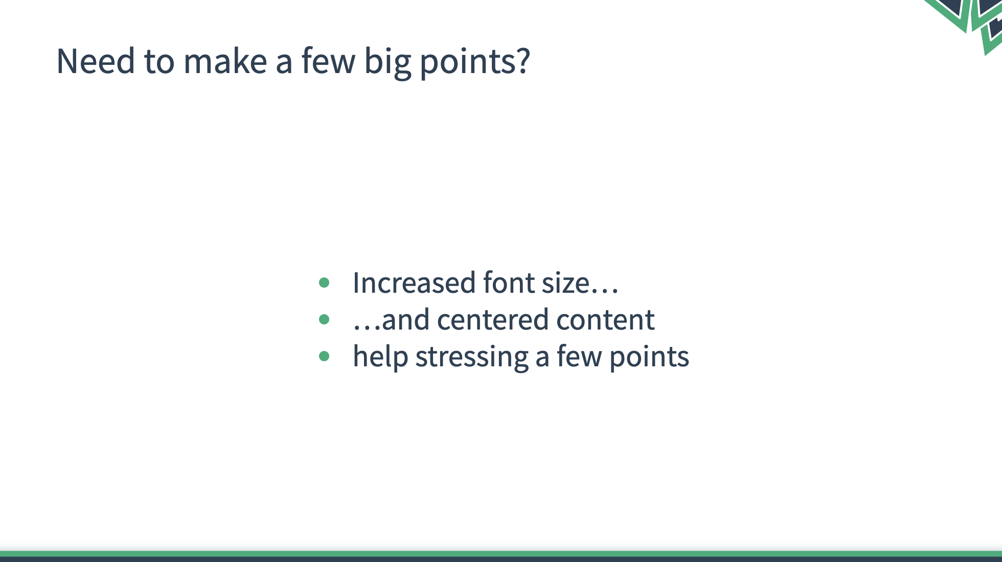
This slide type is much like the default slide, the main difference is that the content font-size is bigger and the content in centered.
Useful for slides that just contain a few points or sentences.
#### Example
```frontmatter
---
layout: big-points
title: Need to make a few big points?
titleRow: true
---
- Increased font size...
- ...and centered content
- help stressing a few points
```
### Section
This slide can be used to split your talks into sections. It's meant to only have a single heading.

### Quote
Sometimes you want to drive home a point with a quote. This slide provides a nice way of doing that.
#### Example
```
---
layout: quote
author: Linus Borg (2021)
---
# Big quotes make your talk look fancy
---
```

### SFC (Single File Component Preview)
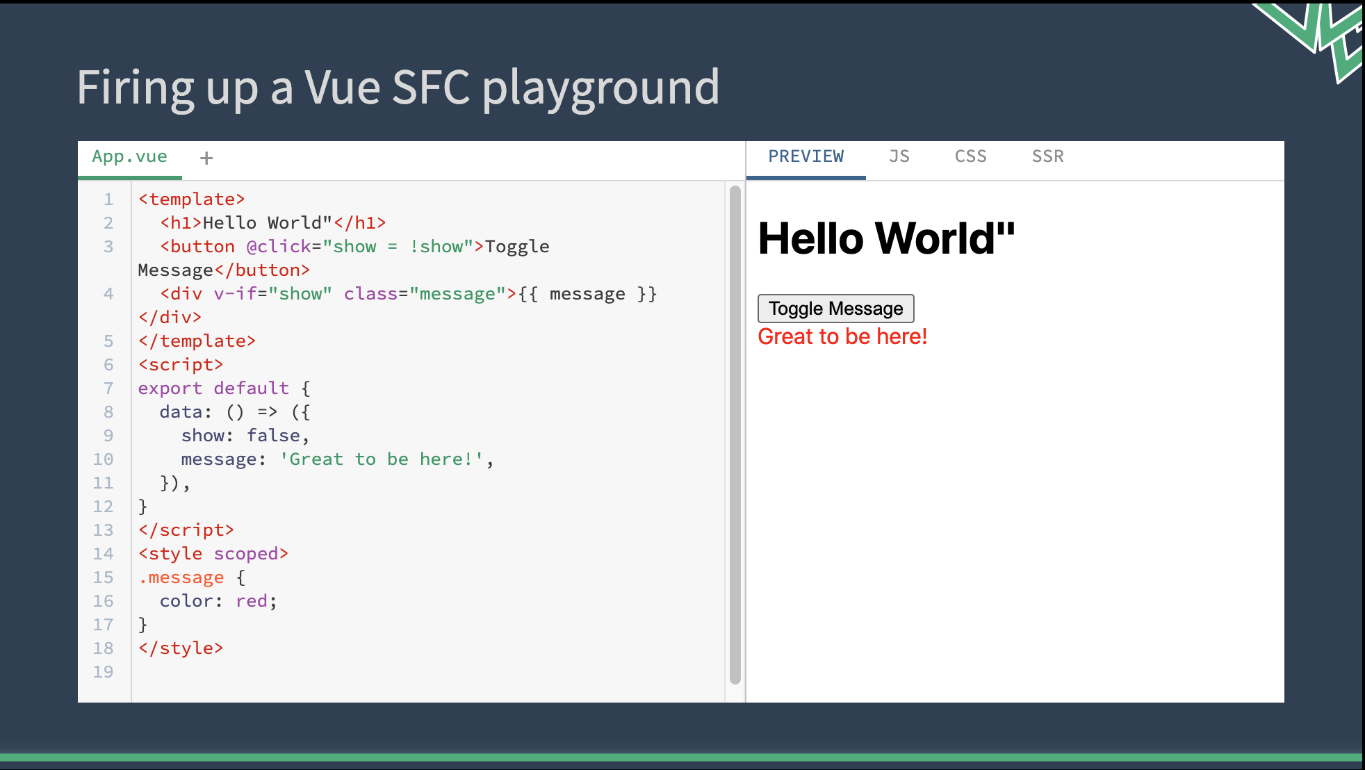
This template integrates the SFC playground ([sfc.vuejs.org](https://sfc.vuejs.org)) which allows for live demos. It's usage requires a bit of preparation/config.
#### Config
```ts
// ./setup/main.ts
import { defineAppSetup } from '@slidev/types'
// use Vite's raw imports to get file content as string
// (see: https://vitejs.dev/guide/features.html#static-assets)
import Test from '../examples/Test.vue?raw'
import App from '../examples/App.vue?raw'
import Child from '../examples/Child.vue?raw'
interface Examples {
[key: string]: {
[key: string]: string
}
}
const examples: Examples = {
// for examples consisting of a single file,
// just pass its content as value
// File will be named App.vue
Test: {
'App.vue': Test,
},
// to construct an example from multiple files,
// or have a custom name for the file,
// pass an object where each key is the filename
// and value is the file content string
Multiple: {
'App.vue': App,
'Child.vue': Child,
}
}
export default defineAppSetup(({ app }) => {
// use app.provide to make all examples
// available to the SFC Slide implementation
app.provide('repl-content', examples)
})
```
### Usage in a slide
```frontmatter
---
layout: sfc
example: Test
---
# This will be the slide's title
```
#### Example
### Video

### FullImage
```bash
layout: full-image
image: coverImage.png # needs to be in /public, path should not have leading slashes
```
## Contributing
- `npm install`
- `npm run dev` to start theme preview of `example.md`
- Edit the `example.md` and style to see the changes
- `npm run export` to generate the preview PDF
- `npm run screenshot` to generate the preview PNG