# 🤖 robot-toast
Lightweight toast notifications with complete control.
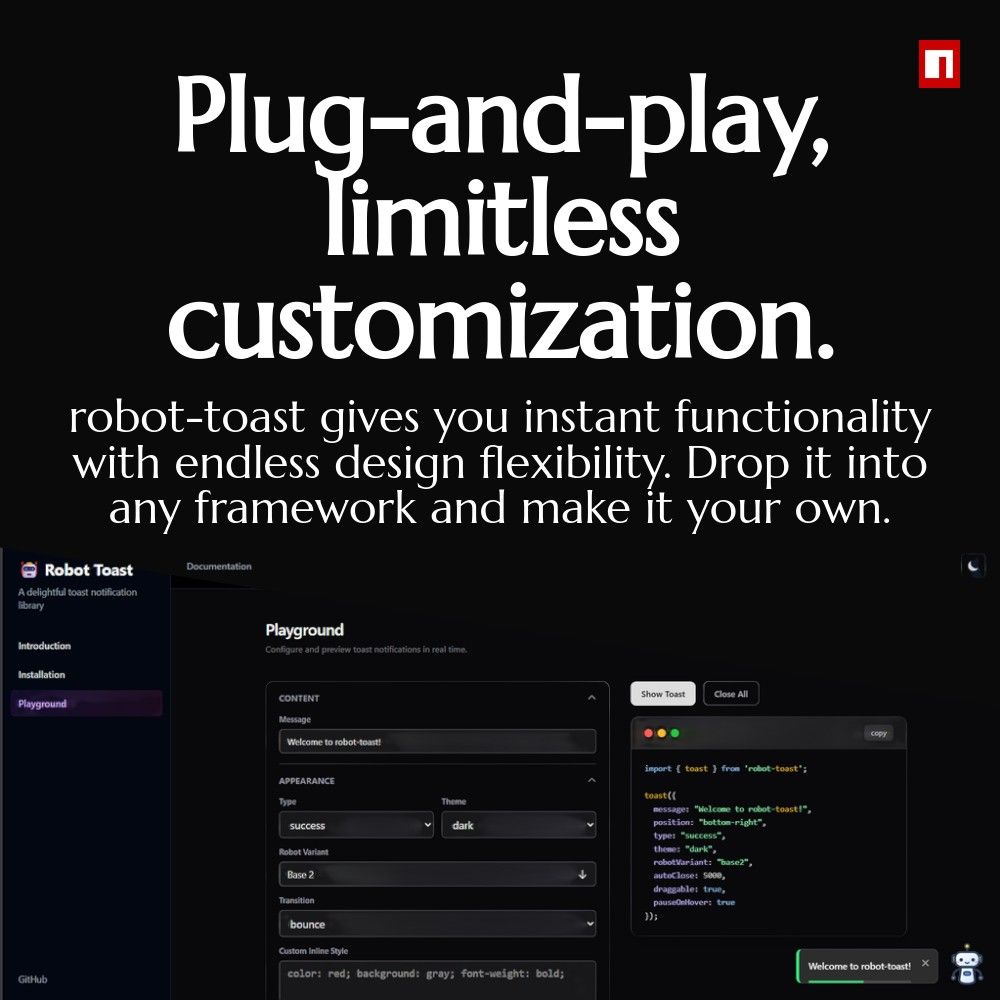
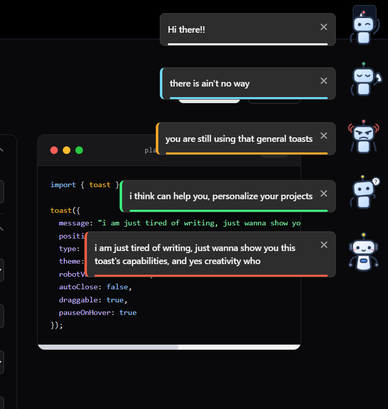
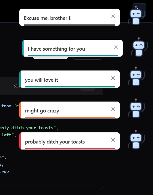
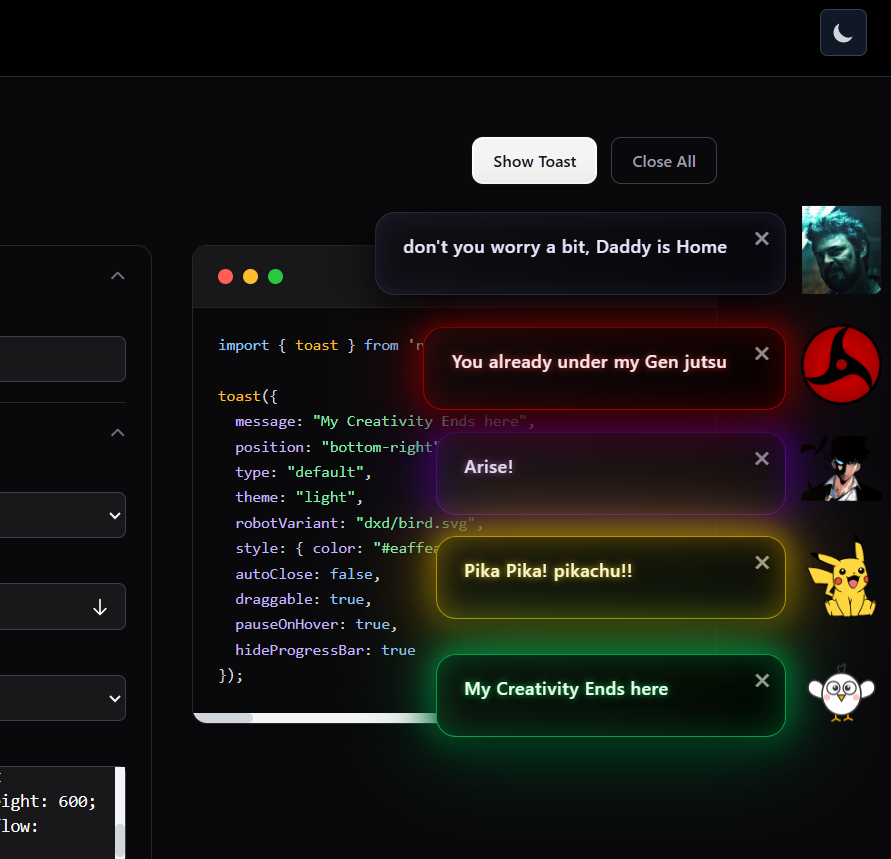
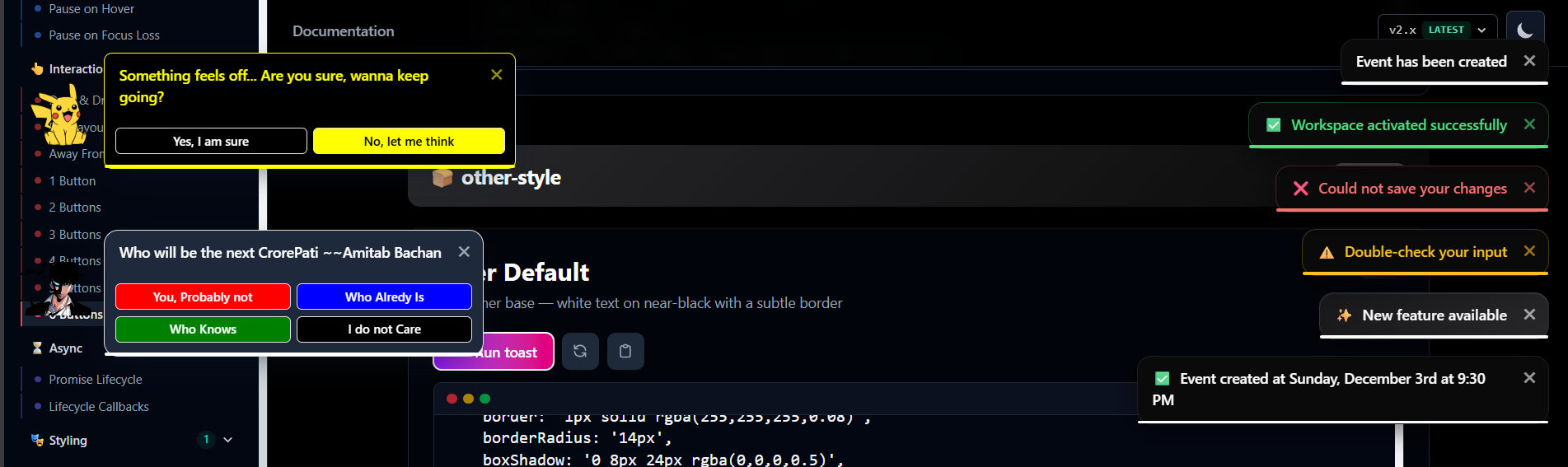
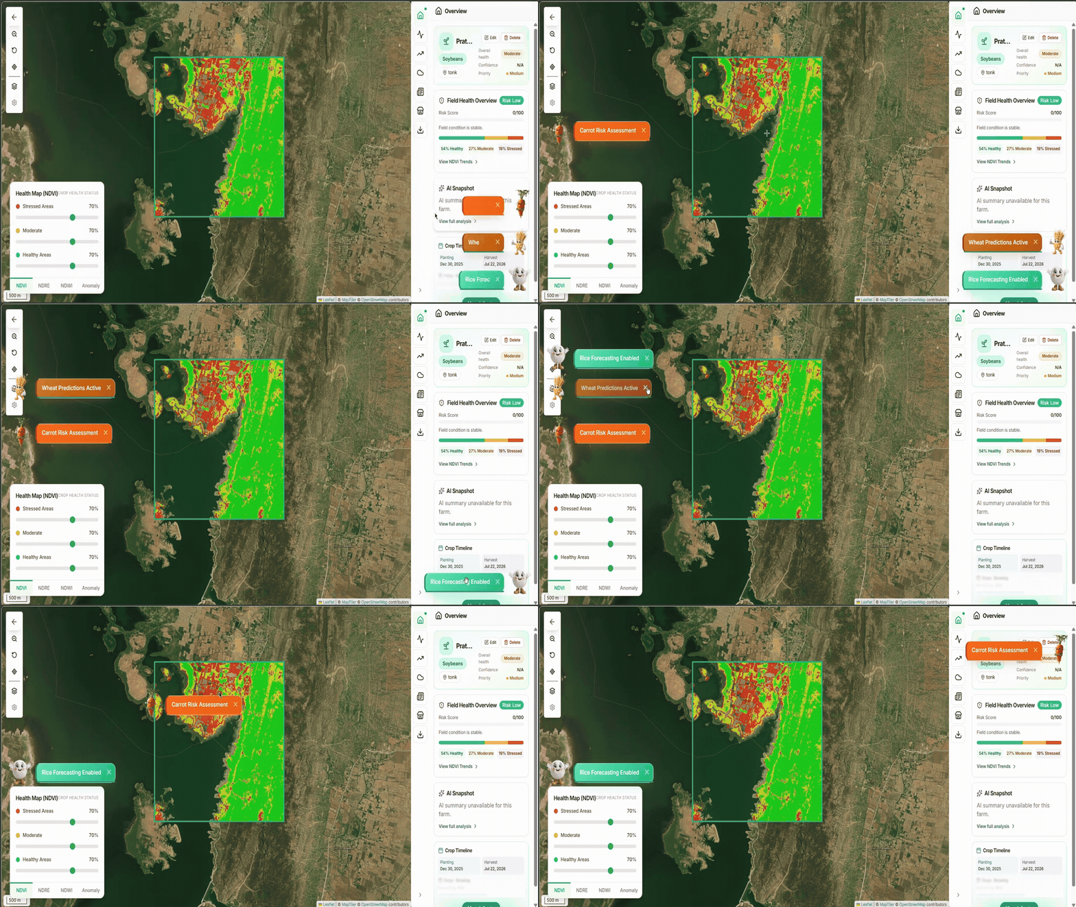
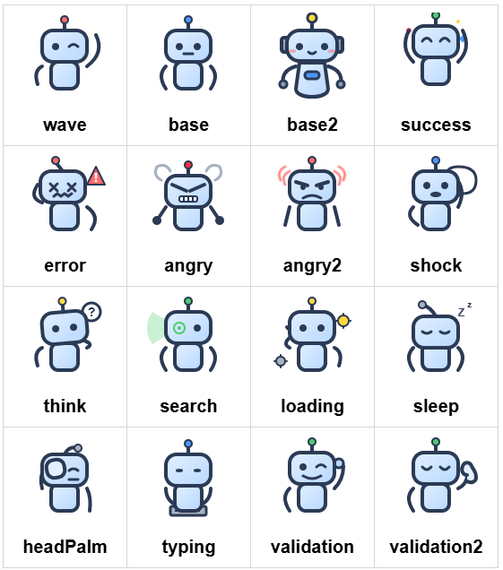
robot-toast gives you a canvas, not a prescription — bring your own robot, colors, buttons, and timing. 16 tree-shakeable robots, fully draggable, zero dependencies.
Demo & Playground →
## 🤖 Built-in Robots
## 🎨 Features in Action
## Install
```bash
npm install robot-toast
```
## Quick Start
```ts
import { toast } from "robot-toast";
import { wave } from "robot-toast/robots";
toast({ message: "Hello! 🤖", robotVariant: wave });
toast.success("Operation successful!");
toast.error("Something went wrong");
```
## Features at a Glance
| Robots | Layout | Styling | Behavior |
| ----------------------- | ------------------ | ------------------------------ | --------------------- |
| 16 built-in variants | 6 position options | 3 themes | Fully draggable |
| Tree-shakeable imports | Auto-queuing | Custom inline styles | Typewriter effect |
| Custom images (SVG/PNG) | Progress bar | Tailwind-friendly `className` | Promise helpers |
| Custom image paths | Multi-toast queue | CSS overrides | React hook included |
---
## Usage
### Basic Usage
```ts
import { toast } from "robot-toast";
import { wave, success, error } from "robot-toast/robots";
toast("Simple notification");
toast({ message: "With options", type: "success", robotVariant: wave });
toast.success("Shorthand");
```
### All Options
```ts
toast({
// Content
message: 'Notification text',
// Appearance
type: 'default' | 'info' | 'success' | 'warning' | 'error',
theme: 'light' | 'dark' | 'colored',
transition: 'bounce' | 'flip' | 'zoom' | 'slide',
position: 'top-left' | 'top-center' | 'top-right' |
'bottom-left' | 'bottom-center' | 'bottom-right',
// Robot & Styling
robotVariant: wave | base | success | error | '...' | 'default' | '/path.svg',
nearScreen: true,
className: 'bg-emerald-600 text-white rounded-2xl shadow-lg',
style: { background: '...', color: '...' },
className: 'bg-emerald-600 text-white',
// Timing & Behavior
autoClose: 5000 | false,
typeSpeed: 30,
hideProgressBar: false,
draggable: true,
pauseOnHover: true,
pauseOnFocusLoss: true,
rtl: false,
// Multi-toast
limit: 0,
newestOnTop: false,
// Buttons & Callbacks
buttons: [{ label: 'Undo', onClick: () => {...} }],
onOpen: () => {...},
onClose: () => {...},
});
```
### Inline Buttons
Add undo/confirm/cancel style buttons to toasts:
```ts
toast({
message: "File deleted",
buttons: [
{ label: "Undo", onClick: () => restoreFile() },
{ label: "Keep", onClick: () => {}, style: { color: "gray" } },
],
});
```
### Promise Lifecycle
Attach loading/success/error messages to any promise:
```ts
toast.promise(
fetch("/api/save").then((r) => r.json()),
{
loading: "Saving…",
success: (data) => `Saved as ${data.name}`,
error: (err) => `Failed: ${err.message}`,
},
);
```
### React Bindings
```tsx
import { useRobotToast, useToastOnMount } from "robot-toast/react";
function App() {
const toast = useRobotToast();
return toast.success("Saved!")}>Save ;
}
function InitBanner() {
useToastOnMount({ message: "Welcome!", autoClose: false });
return null;
}
```
### Complete Example
Combine robots, buttons, theming, and promises in one powerful toast:
```tsx
import { useRobotToast } from "robot-toast/react";
import { success, error, loading } from "robot-toast/robots";
function CompleteExample() {
const toast = useRobotToast();
const handleUpload = () => {
toast.promise(
fetch("/api/upload").then((r) => r.json()),
{
loading: {
message: "Uploading your file...",
robotVariant: loading,
theme: "dark",
},
success: {
message: "File uploaded! Ready to go? 🎉",
robotVariant: success,
theme: "colored",
style: { background: "#10b981", color: "white" },
buttons: [
{ label: "View", onClick: () => window.open("/files") },
{ label: "Done", onClick: () => {} },
],
},
error: {
message: "Upload failed. Try again?",
robotVariant: error,
theme: "dark",
style: { background: "#ef4444" },
buttons: [{ label: "Retry", onClick: handleUpload }],
},
},
);
};
return Upload File ;
}
```
### Programmatic Control
```ts
const id = toast("Working…");
toast.closeById(id);
toast.closeAll();
```
### Themes & Custom Styles
```ts
toast({ message: "Light", theme: "light" });
toast({ message: "Dark", theme: "dark" });
toast({
message: "Custom gradient",
style: {
background: "linear-gradient(135deg, #667eea, #764ba2)",
color: "#fff",
borderRadius: "16px",
},
});
```
### Tailwind and `className`
`className` is applied to the toast message container, so you can use your own
utility classes for surface styling without replacing the toast layout,
animation, buttons, or progress behavior.
When your `className` or inline `style` sets surface properties such as
`background` or `color`, those user-defined values win over the built-in theme
surface colors. That makes utilities like `bg-*`, `text-*`, `rounded-*`, and
`shadow-*` work predictably.
```tsx
toast({
message: "Build finished",
theme: "dark",
className:
"bg-slate-950 text-slate-50 rounded-2xl border border-slate-700 shadow-2xl",
});
```
Use `className` when your app stylesheet or Tailwind tokens should drive the
toast appearance, and use `style` when you need runtime-calculated values.
### Accessibility
- `error` / `warning` toasts: `role="alert"` + `aria-live="assertive"`
- Other types: `role="status"` + `aria-live="polite"`
- `aria-atomic="true"` ensures full message re-announcement
- Labeled close button for screen readers