# RN-Search-Option-Bar

* `npm install rn-search-option-bar --save`
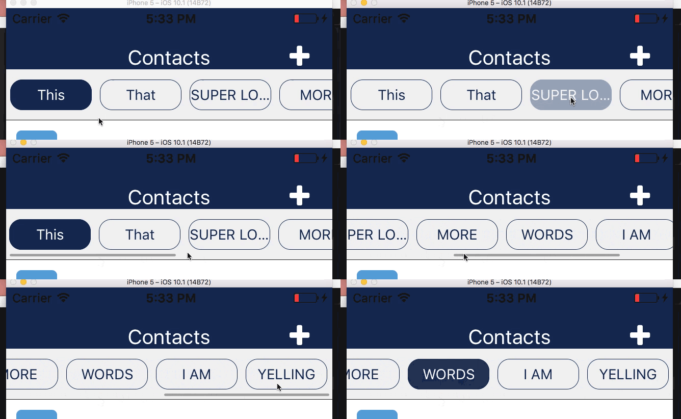
#### How it works
* The first option shows as selected by default
* The `buttonStyle` `backgroundColor` will be applied to the selected option
* Unselected options are transparent background
* Unselected option's text gets the button's backgroundColor as it's color
```js
import React from 'react';
import { StyleSheet } from 'react-native';
const styles = StyleSheet.create({
searchOptionBar:{
height: 50,
backgroundColor: colors.pageBackground,
borderBottomColor: 'black',
borderBottomWidth: StyleSheet.hairlineWidth
},
searchOptionButton: {
width: 80,
height: 30,
borderRadius: 12,
borderWidth: StyleSheet.hairlineWidth,
borderColor: 'blue',
backgroundColor: 'blue'
},
buttonText:{
color:'white',
fontSize:14
}
})
import SearchOptionBar from 'rn-search-option-bar';
class SearchOptionBarExample extends React.Component {
render(){
return(
console.log(opt) }
options={ peopleSearchCategories }
containerStyle={ styles.searchOptionBar }
buttonStyle={ styles.searchOptionButton }
textStyle={ styles.buttonText }
/>
)
};
}
```
### Props
| Prop | Type | Description | Required |
| --- | --- | --- | --- |
| options | Array of Strings | The options listed in the buttons | **YES** |
| onPress | function | the function called when the button is pressed, called with the string as the argument | **YES** |
| buttonStyle | object | styles applied to the buttons | **YES** must include `backgroundColor` |
| containerStyle | object | styles applied to the container | **YES** |
| textStyle | object | styles for the text, `color` will only be applied to the selected option, unselected will default to the `backgroundColor` of the button | **YES** must include `color` |
| showsHorizontalScrollIndicator | boolean | show the scroll indicator | no |