# UnlockRewards
## UnlockRewards Documentation
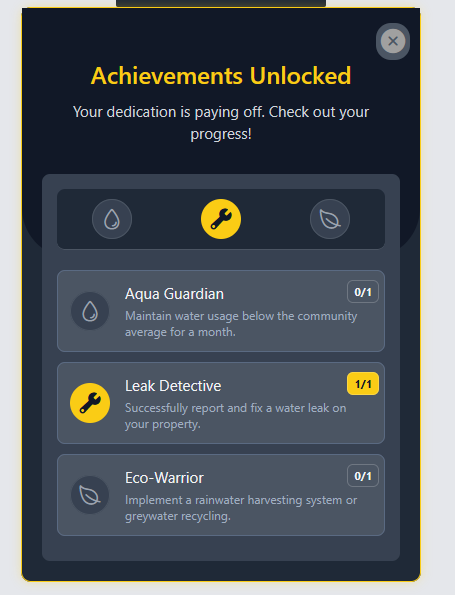
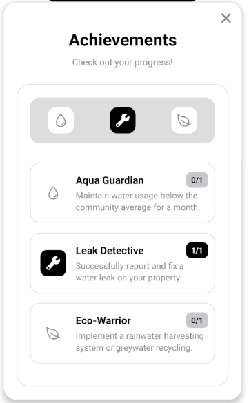
The `UnlockRewards` is a comprehensive component designed for displaying user rewards, achievements, or unlockable features. It provides a customizable interface with support for background images, icons, titles, descriptions, and status indicators for each reward. The component is fully RTL-compatible and offers different variants for close button positioning.
### Usage
```tsx
import UnlockRewards from "@/components/UnlockRewards/UnlockRewards";
import { useTheme } from "../../theme";
import { Ionicons } from "@expo/vector-icons";
const MyComponent = () => {
const theme = useTheme();
const handleClose = () => {
// Handle close action
};
const rewardsData = [
{
icon: ,
activeIcon: ,
title: "Aqua Guardian",
description:
"Maintain water usage below the community average for a month.",
isActive: false,
status: "0/1",
statusBackgroundColor: theme.disabled,
statusTextColor: theme.text,
},
{
icon: ,
activeIcon: ,
title: "Leak Detective",
description: "Successfully report and fix a water leak on your property.",
isActive: true,
status: "1/1",
statusBackgroundColor: theme.primary,
statusTextColor: theme.secondary,
},
{
icon: ,
activeIcon: ,
title: "Eco-Warrior",
description:
"Implement a rainwater harvesting system or greywater recycling.",
isActive: false,
status: "0/1",
statusBackgroundColor: theme.disabled,
statusTextColor: theme.text,
},
];
return (
}
/>
);
};
export default MyComponent
```
### RTL Example
```tsx
```
### Props
#### Core Props
| Prop | Type | Default | Description |
|------|------|---------|-------------|
| `rewards` | `Reward[]` | Required | Array of reward objects to display |
| `title` | `string` | `undefined` | Main title text |
| `description` | `string` | `undefined` | Description text displayed below title |
| `onClose` | `() => void` | `undefined` | Function to call when close icon is pressed |
| `isRTL` | `boolean` | `false` | Whether to render in right-to-left mode |
#### Top Background Props
| Prop | Type | Default | Description |
|------|------|---------|-------------|
| `topBackgroundImage` | `ImageSourcePropType` | `undefined` | Background image for the top section |
| `topBackgroundColor` | `string` | `theme.background` | Background color for the top section |
| `topBackgroundHeight` | `number` | `250` | Height of the top background section |
| `topBackgroundImageStyle` | `StyleProp` | `undefined` | Additional styles for the background image |
| `topBackgroundStyle` | `StyleProp` | `undefined` | Additional styles for the background container |
#### Gradient Props
| Prop | Type | Default | Description |
|------|------|---------|-------------|
| `topGradientColors` | `string[]` | `undefined` | Array of colors for creating a gradient background in the top section |
| `topGradientStart` | `{ x: number; y: number }` | `{ x: 0.5, y: 0 }` | Starting point for the gradient |
| `topGradientEnd` | `{ x: number; y: number }` | `{ x: 0.5, y: 1 }` | Ending point for the gradient |
| `topGradientLocations` | `number[]` | `undefined` | Locations for the gradient color stops |
#### Style Props
| Prop | Type | Default | Description |
|------|------|---------|-------------|
| `cardContainerStyle` | `StyleProp` | `undefined` | Additional styles for the main container |
| `mainTitleStyle` | `StyleProp` | `undefined` | Additional styles for the title text |
| `subtitleStyle` | `StyleProp` | `undefined` | Additional styles for the subtitle/description text |
| `rewardsContainerStyle` | `StyleProp` | `undefined` | Additional styles for the rewards container |
| `smallIconsRowStyle` | `StyleProp` | `undefined` | Additional styles for the icons row at the top |
| `activeIconStyle` | `StyleProp` | `undefined` | Additional styles for active reward icons |
| `inactiveIconStyle` | `StyleProp` | `undefined` | Additional styles for inactive reward icons |
| `modalOverlayStyle` | `StyleProp` | `undefined` | Additional styles for the modal overlay (if component is used in a modal) |
#### Reward Item Style Props
| Prop | Type | Default | Description |
|------|------|---------|-------------|
| `rewardItemContainerStyle` | `StyleProp` | `undefined` | Additional styles for each reward item container |
| `rewardItemIconWrapperStyle` | `StyleProp` | `undefined` | Additional styles for the reward icon wrapper |
| `rewardItemTextContainerStyle` | `StyleProp` | `undefined` | Additional styles for the reward text container |
| `rewardItemTitleTextStyle` | `StyleProp` | `undefined` | Additional styles for the reward title text |
| `rewardItemDescriptionTextStyle` | `StyleProp` | `undefined` | Additional styles for the reward description text |
| `rewardItemStatusBadgeStyle` | `StyleProp` | `undefined` | Additional styles for the status badge |
| `rewardItemStatusTextStyle` | `StyleProp` | `undefined` | Additional styles for the status text |
#### Close Button Props
| Prop | Type | Default | Description |
|------|------|---------|-------------|
| `showCloseIcon` | `boolean` | `true` | Whether to show the close icon button |
| `customCloseIcon` | `ReactNode` | `undefined` | Custom component to use as close icon |
| `closeIconVariant` | `"floating" \| "nested"` | `"nested"` | Style variant for the close icon position |
| `closeIconContainerStyle` | `StyleProp` | `undefined` | Additional styles for the close icon container |
| `closeIconStyle` | `StyleProp` | `undefined` | Additional styles for the close icon |
| `closeIconColor` | `string` | `theme.helper` | Color for the default close icon |
| `closeIconSize` | `number` | `28` | Size for the default close icon |
### Reward Object Structure
Each reward in the `rewards` array should conform to this structure:
```typescript
type Reward = {
icon?: React.ReactNode; // Icon for inactive state
activeIcon?: React.ReactNode; // Icon for active state
title: string; // Reward title
description: string; // Reward description
isActive: boolean; // Whether the reward is active/unlocked
status: string; // Status text (e.g., "UNLOCKED", "LOCKED")
statusBackgroundColor: string; // Background color for status badge
statusTextColor: string; // Text color for status badge
};
```
### Close Icon Variants
- **Floating**: The close icon appears outside the card's main border, creating a floating effect
- **Nested**: The close icon appears inside the card's border in the top-right (or top-left in RTL mode)
### Related Components
- `Badge`: Used for displaying reward icons in active/inactive states
- `RewardItem`: Used for rendering individual reward entries
- `ImageBackground`: Used when a top background image is provided
- `TouchableOpacity`: Used for the close icon
- `Text`: Used for rendering text content
- `LinearGradient`: Used for creating gradient backgrounds