🎨可视化模型设计器


[English](./README.en-US.md) | 简体中文
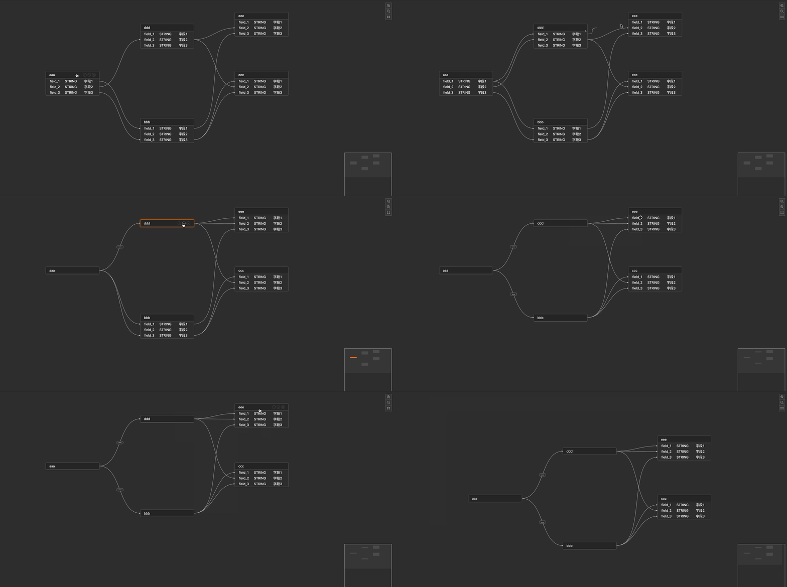
## ✨ 特性
* 支持定制字段属性
* 支持定制title,title的icon
* 支持节点的收缩/展开状态,以及收缩后的映射关系
* 支持定制线段的属性以及自定义label
* 支持节点,字段的hover,focus,linked以及全链路高亮状态
* 支持节点,线段的右键菜单
* 支持minimap,以及minimap的联动移动和高亮状态
* 支持空字段内容定制
## 📦 安装
``` shell
$ npm install react-visual-modeling butterfly-dag -S
```
## 🧤`Props`
|参数|说明|类型|默认值|
|----|----|----|----|
|data|画布数据|any|-|
|width|组件宽度| `number` \| `string` |-|
|height|组件高度| `number` \| `string` |-|
|className|组件类名 | `string` |-|
|columns| 列的配置描述, 见[columns props](#columns) | Array<[columns](#columns)> | - |
|nodeMenu| 节点右键菜单配置| Array<[menu](#menu-type)> | [ ] |
|edgeMenu| 线段右键菜单配置| Array<[menu](#menu-type)> | [ ] |
|actionMenu | 右上角菜单配置 | `action[]` | [] |
|config| 组件的画布配置,见[config props](#config) | any | |-|
|emptyContent| 当表字段为空时显示内容 | `string` \| `JSX. Element`| - |
|emptyWidth| 当表字段为空时表容器宽度 | `number` \| `string`| - |
|onLoaded| 渲染完毕事件 |`(canvas) => void` | - |
|onChange| 图内数据变化事件|`(data) => void`| - |
|onFocusNode |聚焦节点事件 |`(node) => void`| - |
|onFocusEdge |聚焦线段事件 |`(edge) => void`| - |
|onFocusCanvas | 聚焦空白处事件 | `() => void` | |-|
|onDblClickNode| 双击节点事件 |`(node) => void`| - |
| selectable | 是否开启框选 | `boolean` | false |
|onSelect | 框选事件 | `(nodes, edges) => void`| - |
### columns
> 节点字段每列的属性设置
|参数|说明|类型|默认值|
|---|---|---|---|
|title|每列的名字| `string` |-|
| key| 每列的唯一标志,对应数据上的key值 | `string` |-|
|width|每列宽度| `number` ||-|
| primaryKey | 这列的key对应的value是否作为键值对 | `boolean` |-|
|render|支持每列的自定义样式|`(key) => void`|-|
### menu
> '节点/线段'的右键菜单配置
|参数| 说明|类型| 默认值 |
|---|---|---|---|
| title |每列的展示的名字| `string` ||-|
|key| 每列的唯一标志,对应数据上的key值 | `string` ||-|
| render | 支持每列的自定义样式 | `(key) => void` ||-|
| onClick | 每列的点击回调| `(key, data) => void` | |-|
### config
> 画布配置
|参数|说明|类型|默认值|
|---|---|---|---|
|showActionIcon| 是否展示操作icon:放大,缩小,聚焦 | `boolean` |-|
|allowKeyboard|允许键盘删除事件| `boolean` |-|
| collapse |是否允许节点收缩| [collapse prop](#collapse-prop) { }|-|
| titleRender| 节点title的渲染方法 | `(title) => void` |-|
| titleExtIconRender | 节点右侧按钮的渲染方法 | `(node) => void` |-|
| labelRender| 线段label的渲染方法 | `(label) => void` |-|
|minimap | 是否开启缩略图| [minimap prop](#minimap-prop) { }|-|
### collapse
> 节点收缩属性
| 参数| 说明 | 类型| 默认值 |
|---|---|---|---|
|enable| 是否允许节点收缩 | `boolean` | - |
| defaultMode |默认展示形式 | `string` | 默认以"展开/收缩"形式展示 |
### minimap
> 缩略图属性
|参数|说明|类型|默认值|
|---|---|---|---|
| enable | 是否开启缩略图 | `boolean` | false |
| config | 缩略图的配置 | [minimap props](#minimap-config-prop) | {} |
### minimap config
> 缩略图的配置
|参数|说明|类型|默认值|
|---|---|---|---|
|nodeColor|节点颜色|`string`|-|
|activeNodeColor|节点激活颜色|`string`| -|
## Usage
``` JSX
import VisualModeling from 'react-visual-modeling';
import 'react-visual-modeling/dist/index.css';
// data 参考 example/mock_data/data.jsx
{}}
onChange={() => {}}
onFocusNode={() => {}}
onFocusEdge={() => {}}
onFocusCanvas={() => {}}
onDblClickNode={(node) => {}} // Double Click Node Event
/>
```
## Interface
```ts
// 组件 Props 定义
interface IProps {
width?: number | string, // 组件宽
height?: number | string, // 组件高
className?: string, // 组件classname
columns: Array< columns > , // 跟antd的table的column的概念类似
nodeMenu?: Array< menu > , // 节点右键菜单配置
edgeMenu?: Array< menu > , // 线段右键菜单配置
actionMenu?: action[], // 右上角菜单配置,默认配置的key为 zoom-in(缩小), zoom-out(放大), fit(适配画布)
config?: config, // 往下看
data: IData, // 数据入参,往下看
emptyContent?: JSX.Element; // 当表字段为空时显示内容
emptyWidth?: number | string; // 当表字段为空时表容器宽度
onLoaded(canvas: any): void, // 渲染完毕事件
onChange(data: any): void, // 图内数据变化事件
onFocusNode(node: any): void, // 聚焦节点事件
onFocusEdge(edge: any): void, // 聚焦线段事件
onFocusCanvas(): void, // 聚焦空白处事件
onDblClickNode ? (node: any) : void, // 双击节点事件
onSelect(nodes: any, edges: any): void, // 画布框选事件
selectable: boolean, // 是否可框选
};
// 节点字段每列的属性设置
interface columns {
title?: string, // 每列的名字
key: string, // 每列的唯一标志,对应数据上的key值
width?: number, // 每列宽度(px)
primaryKey: boolean, // 这列的key对应的value是否作为键值对
render?: (value: any, rowData: any) => void // 可自定义每列的样式
}
// 画布显示配置
interface config {
butterfly: any; // butterfly-dag的配置,参考:https://github.com/alibaba/butterfly/blob/dev/v4/docs/zh-CN/canvas.md
showActionIcon?: boolean, // 是否展示操作icon:放大,缩小,聚焦
allowKeyboard?: boolean, // 允许键盘删除事件,TODO: 以后支持shift多选
collapse:{
enable: boolean, // 允许节点收缩
defaultMode: string // 默认以"展开/收缩"形式展示
},
titleRender?: (title: JSX.Element) => void, // 节点title的渲染方法
titleExtIconRender?: (node: JSX.Element) => void, // 节点右侧按钮的渲染方法
labelRender?: (label: JSX.Element) => void, // 线段label的渲染方法
minimap: { // 是否开启缩略图
enable: boolean,
config: {
nodeColor: any, // 节点颜色
activeNodeColor: any // 节点激活颜色
}
}
}
// 输入数据定义
interface IData {
nodes: { // 节点
id: string | number;
title: string;
fields: {id: string, [key: string]: any}[]; // 当前节点字段列表
[key: string]: any;
}[],
edges: {
id: string | number,
sourceNode: string, // 源节点ID
targetNode: string, // 目标节点ID
source: string, // 源节点列ID
target: string, // 目标节点列ID
}[]
}
// '节点/线段'的右键菜单配置
interface menu {
title?: string, // 每列的展示的名字
key: string, // 每列的唯一标志,对应数据上的key值
render?: (key: string) => JSX.Element, // 支持每列的自定义样式
onClick?: (key: string, data: any) => void, // 每列的点击回调
}
// action菜单(右上角)
interface action {
key: string; // 唯一标识
title: string; // 名字
icon: string | JSX.Element; // 图标
onClick: (canvas: any) => void; // 响应函数
disable: boolean; // false 则不显示
}
```
## 常用功能
### 1. 隐藏默认 `actionMenu` 和添加自定义 `actionMenu`
```jsx
import {StarOutlined} from '@ant-design/icons';
// 默认的三个 actionMenu 为 zoom-in, zoom-out, fit
const actionMenu = [
{
key: 'zoom-in',
disable: true
},
{
icon: ,
key: 'star',
onClick: () => {
alert('点击收藏!')
}
}
]
```
### 2. 设置连线配置
```jsx
const config = {
butterfly: {
theme: {
edge: {
shapeType: 'Manhattan',
}
}
}
}
```
### 3. 实现框选功能
```jsx
// 框选结果
const onSelect = (nodes, edges) => {
console.log(nodes, edges);
}
```
如需要更多定制的需求,您可以提issue或者参考[Butterfly](https://github.com/alibaba/butterfly)来定制您需要的需求