A React-based DAG diagram for data visualization modeling, suitable for UML, database modeling, data warehouse construction and other businesses.
English | [简体中文](./README.md)
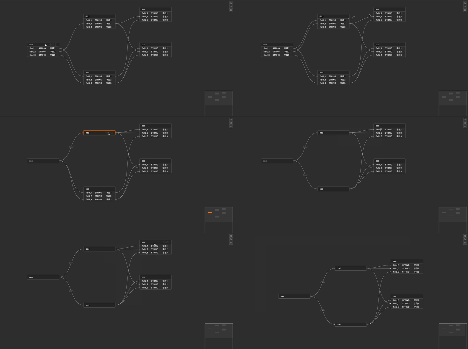
## ✨ Feature
* support custom field properties
* support custom title, title Icon
* support the shrinking / expanding state of nodes, and show the mapping relationship after shrinking
* support custom edge attributes and custom edge label
* support the node, field's status of hover, focus, linked and full chain highlight
* support the right-click menu of node and edge
* support minimap and highlight state of minimap
* support custom empty field content
## 📦 Install
```
npm install react-visual-modeling
```
## API:
### VisualModeling properties
| Property | Description | Type | Default |
|:-------------:|:-------------------------------------------------------------------:|:----------------------------------------------------------------:|:-------:|
| data | data | any | - |
| width | component width | number | string | - |
| height | component height | number | string | - |
| className | component className | string | - |
| columns | property settings for each column of fields[columns Prop](#columns) | Array< [columns](#columns)> | - |
| nodeMenu | Node Right-click Menu Configuration | Array< [menu](#menu-type)> | [ ] |
| edgeMenu | Edge Right-click Menu Configuration | Array< [menu](#menu-type)> | [ ] |
| config | As configured above[config Prop](#config) | any | - |
| emptyContent | show content when table field is empty | string | JSX. Element | - |
| emptyWidth | table container width when table field is empty | number | string | - |
| onLoaded | canvas loaded event | (canvas) => void | - |
| onChange | canvas data change event | (data) => void | - |
| onFocusNode | focus node events | (node) => void | - |
| onFocusEdge | focus edge events | (edge) => void | - |
| onFocusCanvas | focus canvas blank events | () => void | - |
| onDblClickNode| double click node events | () => void | - |
### columns
property settings for each column of fields
| Property | Description | Type | Default |
|:----------:|:----------------------------------------------------------------------------------:|:-----------------------------------------:|:-------:|
| title | name of each column | string | - |
| key | the unique mark of each column, corresponding to the key value on the data | string | - |
| width | width of each column | number | - |
| primaryKey | whether the value corresponding to the key in this column is used as a unique sign | boolean | - |
| render | Customize the style of each column | (key) => void | - |
### menu
right-click menu configuration for'Node/Edge'
| Property | Description | Type | Default |
|:--------:|:---------------------------------------:|:-----------------------------------------------:|:-------:|
| title | name of each column | string | - |
| key | unique flag for each column menu | string | - |
| render | Customize the style of each column menu | (key) => void | - |
| onClick | Click Callback for Each Column | (key, data) => void | - |
### config
the configuration of canvas
| Property | Description | Type | Default |
|:------------------:|:------------------------------------------------------------------------------:|:---------------------------------------------------------------:|:-------:|
| showActionIcon | whether show operation icon: zoom in, zoom out, focus | boolean | - |
| allowKeyboard | allow keyboard to delete events. Todo: supports shift multiple selection later | boolean | - |
| collapse | whether to allow node shrinkage | [collapse Prop](#collapse-prop) { } | - |
| titleRender | rendering methods for node's title | (title) => void | - |
| titleExtIconRender | rendering method of buttons on right side of node | (node) => void | - |
| labelRender | rendering method of edge's label | (label) => void | - |
| minimap | whether to show minimap | [minimap Prop](#minimap-prop) { } | - |
### collapse
the configuration of node contraction
| Property | Description | Type | Default |
|:-----------:|:-------------------------------:|:-----------------------------------:|:------------------------------------:|
| enable | whether to allow node shrinkage | boolean | - |
| defaultMode | default presentation form | string | show as 'expand/collapse' by default |
### minimap
the configuration of minimap
| Property | Description | Type | Default |
|:--------:|:-----------------------:|:---------------------------------------------------------------------------:|:-------:|
| enable | whether to show minimap | boolean | - |
| config | the config of minimap | [minimap Config Prop](#minimap-config-prop) { } | - |
### minimap Config
the config of minimap
| Property | Description | Type | Default |
|:---------------:|:-----------------:|:-------------------------------:|:-------:|
| nodeColor | node color | any | - |
| activeNodeColor | node active color | any | - |
## 🔗API
``` JSX
import VisualModeling from 'react-visual-modeling';
import 'react-visual-modeling/dist/index.css';
{}}
onChange={() => {}}
onFocusNode={() => {}}
onFocusEdge={() => {}}
onFocusCanvas={() => {}}
onDblClickNode={() => {}}
>
```
## 🔗API
``` javascript
interface columns { // property settings for each column of fields
title ? : string, // name of each column
key: string, // the unique mark of each column, corresponding to the key value on the data
width ? : number, // width of each column
primaryKey: boolean, // whether the value corresponding to the key in this column is used as a unique sign
render ? (value: any, rowData: any) : void // Customize the style of each column
}
interface config { //
showActionIcon ? : boolean, // whether show operation icon: zoom in, zoom out, focus
allowKeyboard ? : boolean, // allow keyboard to delete events. Todo: supports shift multiple selection later
collapse: {
enable: boolean, // allow node shrinkage
defaultMode: string // show as 'expand/collapse' by default
},
titleRender ? (title: JSX.Element) : void, // rendering methods for node's title
titleExtIconRender ? (node: JSX.Element) : void, // rendering method of buttons on right side of node
labelRender ? (label: JSX.Element) : void, // rendering method of edge's label
minimap: { // whether to show minimap
enable: boolean,
config: {
nodeColor: any, // node color
activeNodeColor: any // active node color
}
}
}
interface menu { // right-click menu configuration for'Node/Edge'
title ? : string, // name of each column
key: string, // unique flag for each column menu
render ? (key: string) : void, // Customize the style of each column menu
onClick ? (key: string, data: any) : void, // Click Callback for Each Column
}
interface props {
width ? : number | string, // component width
height ? : number | string, // component height
className ? : string, // component className
columns: Array < columns > , // similar to antd's table column concept
nodeMenu: Array < menu > , // Node Right-click Menu Configuration
edgeMenu: Array < menu > , // Edge Right-click Menu Configuration
config: config, // As configured above
data: any, // data
emptyContent ? : string | JSX.Element; // show content when table field is empty
emptyWidth ? : number | string; // table container width when table field is empty
onLoaded(canvas: any): void, // canvas loaded event
onChange(data: any): void, // canvas data change event
onFocusNode(node: any): void, // focus node events
onFocusEdge(edge: any): void, // focus edge events
onFocusCanvas(): void, // focus canvas blank events
};
```
If you need more customized requirements, you can refer to issue or [butterfly](https://github.com/alibaba/butterfly/blob/master/README.en-US.md) to customize your needs