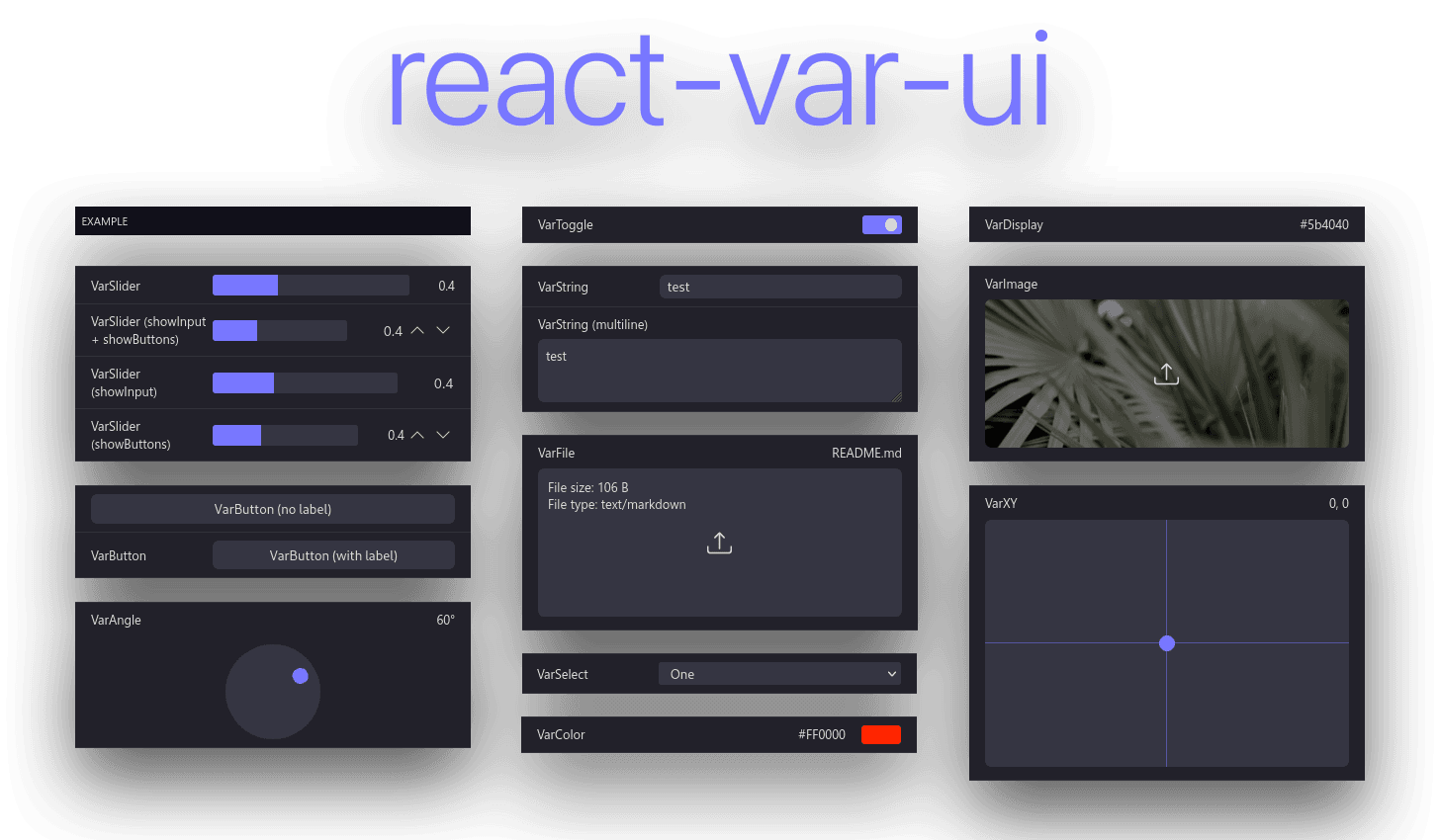
**react-var-ui** is a simple React component library for variable setting and preview, inspired by iOS settings, [react-dat-gui](https://github.com/claus/react-dat-gui) and [dat.gui](https://github.com/dataarts/dat.gui).
While some code from react-dat-gui was used, this library functions in a completely different way. The codebase uses modern React code practices such as hooks and functional components. Instead of iterating over the children array, react-var-ui uses a Context. Creation of custom components is also easier.
What makes react-var-ui different when compared to similar libraries such as [Leva](https://github.com/pmndrs/leva) or [react-dat-gui](https://github.com/claus/react-dat-gui), react-var-ui doesn't force itself to float over all your content, instead react-var-ui lives peacefully inside of the React node it is placed in. Unlike Leva and much more like react-dat-gui, react-var-ui relies on a local state variable, providing the developer with more flexibility. While this might seem less convenient, it allows for more customization and usage of multiple instances of react-dat-gui within one project.
## Table of contents
- [Installation](#installation)
- [Example usage](#example-usage)
- [Testing](#testing)
- [Utility components](#utility-components)
- [VarUI](#varui-)
- [VarCategory](#varcategory-)
- [VarArray](#vararray-)
- [Input components](#input-components)
- [Base properties](#base-properties)
- [VarAngle](#varangle-)
- [VarBase](#varbase-)
- [VarButton](#varbutton-)
- [VarColor](#varcolor-)
- [VarDisplay](#vardisplay-)
- [VarFile](#varfile-)
- [VarImage](#varimage-)
- [VarMedia](#varmedia-)
- [VarNumber](#varnumber-)
- [VarSelect](#varselect-)
- [VarSlider](#varslider-)
- [VarString](#varstring-)
- [VarToggle](#vartoggle-)
- [VarXY](#varxy-)
- [Theme customization](#theme-customization)
- [Custom input components](#custom-input-components)
## Installation
Install `react-var-ui` with either npm or yarn:
```
yarn add react-var-ui
# or
npm install react-var-ui
```
Then include the CSS with:
```css
/* In your CSS/SCSS file: */
@import 'react-var-ui/index.css';
```
or:
```js
// In your JS/TS file (assuming your bundler supports loading CSS files):
import 'react-var-ui/index.css';
```
## Example usage
```jsx
const [values, setValues] = React.useState({
toggle: true,
color: '#FF0000',
select: 1,
slider: 0.4,
xy: [0, 0.2],
string: 'Hello world!',
});
return (
alert('clicked!')} />
);
```
## Testing
react-var-ui uses jest for automated unit tests and storybook for manually testing the UI.
You can run unit tests after installing by running:
yarn test
Storybook can be ran with:
yarn storybook
To run the example app, you first need to start the project with:
yarn start
And then enter the example directory and start the app:
cd ./example
yarn start
(make sure to run `yarn install` before.)
## Utility components
<VarUI />
This is the main component which provides a Context for other components. It is not required to use this component - other components accept `onChange` and `value` properties which provide a similar functionality.
#### Required properties
| Property | Description | Type |
| ------------- | ------------------------------------------------------------------- | ------------------------------------- |
| values | A JavaScript object or array to be mutated by the input components. | object |
| onChange | The function to be called with the entire changed object. | (values: object) => void |
| onChangeValue | The function to be called when one value is changed. | (path: string, newValue: any) => void |
#### Optional properties
| Property | Description | Type |
| --------- | ---------------------------------------------- | ------ |
| className | Additional class names for the wrapper object. | string |
<VarCategory />
Category component for grouping inputs.
#### Required properties
| Property | Description | Type |
| -------- | --------------- | --------- |
| label | Category label. | ReactNode |
#### Optional properties
| Property | Description | Type |
| ----------- | --------------------------------------------------- | ------- |
| className | Additional class names on the wrapping div element. | string |
| collapsible | Should display the Collapse/Expand button. | boolean |
<VarArray />
Renders an array value as a list of elements.
#### Optional properties
| Property | Description | Type |
| --------- | ------------------------------------------------------- | ----------------------------------------------------------------- |
| className | Additional class names on the wrapping div element. | string |
| disabled | Should the component and its children be disabled. | boolean |
| children | Renders children with the array element as its context. | ReactNode \| (element: T, index: number, array: T[]) => ReactNode |
<VarScope />
Creates a context with a certain path as base.
#### Optional properties
| Property | Description | Type |
| -------- | ----------------------------- | ------ |
| path | Path to use as the base path. | string |
#### Examples
With ReactNode children:
```tsx
```
With function:
```tsx
{(element, index) => }
```
## Input components
### Base properties
Most input components accept the following base properties.
Does not apply to ``.
#### Optional properties
_T is component's value type._
| Property | Description | Type |
| ------------ | --------------------------------------------------------------------------------------------------------------- | ------------------ |
| label | Label to be shown left to the input. | ReactNode |
| className | Additional class names on the wrapping div element. | string |
| path | Variable path in the data object. | string |
| value | Current value (only used if context and path aren't available). In most cases you aren't going to need this. | T |
| defaultValue | Default value for components that support resetting (on double click for example). | T |
| disabled | Should the component be disabled. | boolean |
| readOnly | Should the component be read-only. | boolean |
| onChange | On change event, called with the new value if provided. In most cases you aren't going to need this. | (value: T) => void |
| children | Children. Only rendered when provided directly to the VarBase component. | ReactNode |
Base VarUI input component. Doesn't do anything besides displaying the label.
Used to construct other components from.
<VarButton />
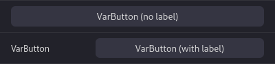
Button component.
**Does not accept any of the base component properties.**
#### Required properties
| Property | Description | Type |
| ----------- | --------------- | --------- |
| buttonLabel | Category label. | ReactNode |
#### Optional properties
| Property | Description | Type |
| -------- | ---------------------------------- | ---------- |
| onClick | Called when the button is clicked. | () => void |
| disabled | Should the component be disabled. | boolean |
<VarColor />
Color picker component. Returns and accepts values in form of hex color strings.
Uses [@uiw/react-color-sketch](https://uiwjs.github.io/react-color/#/sketch) to render the color picker.
_T = string_ (#XXXXXX)
#### Optional properties
| Property | Description | Type |
| -------- | ------------------------------------------------------------------------------------------------------------------------------------------------- | ------- |
| alpha | Should allow picking alpha values? If true, the result hex code will contain extra two characters representing the alpha value, from 00 to FF. | boolean |
<VarDisplay />
A simple component that displays a string or a numeric value.
**Only accepts path and value. Does not change any values.**
_T = string | number_
<VarFile />
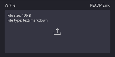
A simple file input component. Accepts and provides File instances.
_T = File_
#### Optional properties
| Property | Description | Type |
| --------------- | -------------------------------------------------------------------------- | ------- |
| accept | List of accepted file types. | string |
| displayMetadata | Whether file information should be displayed in the field. (default: true) | boolean |
<VarImage />
A simple image input component. Accepts and provides blob/data URLs.
_T = string_
<VarMedia />
Media (audio/video/image) input component. Accepts and provides a blob URL.
If acceptImage, acceptAudio and acceptVideo are all false, the component will accept all 3.
_T = string_
#### Optional properties
| Property | Description | Type |
| ----------- | --------------------------------------------------- | ------- |
| acceptImage | Whether the component should accept image/\* files. | boolean |
| acceptAudio | Whether the component should accept audio/\* files. | boolean |
| acceptVideo | Whether the component should accept video/\* files. | boolean |
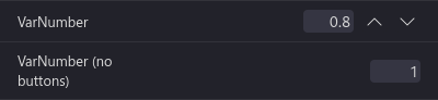
<VarNumber />
Integer/float number component. Accepts and provides numbers.
_T = number_
#### Optional properties
| Property | Description | Type |
| ----------- | -------------------------------------------------------------------------- | ------- |
| min | Minimum value. | number |
| max | Maximum value. | number |
| step | Step. | number |
| integer | Should the end result be rounded to an integer value. | boolean |
| showInput | If true will display an editable input, otherwise shows a read only value. | boolean |
| showButtons | If true will display buttons that increase and decrease the value by step. | boolean |
<VarSelect />
Select component. Returns and accepts either `value` from option object or `key` when `value` is not provided.
_T = any_
#### Required properties
| Property | Description | Type |
| -------- | ------------------------ | ------------------ |
| options | Options to be displayed. | IVarSelectOption[] |
#### Interface: `IVarSelectOption`
**Required:**
| Property | Description | Type |
| -------- | ------------------------------------------------------------------- | --------- |
| key | Key for the option. Also used as value if `value` is not specified. | ReactText |
| label | Option label. | string |
**Optional:**
| Property | Description | Type |
| -------- | ------------------------------------------------------------------------------------------------------------------------ | ---- |
| value | Option value. Key will be used if not specified. **Note: Will be serialized to JSON and deserialized when selected.** | any |
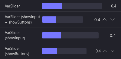
<VarSlider />
Integer/float slider component. Accepts and provides numbers.
_T = number_
#### Required properties
| Property | Description | Type |
| -------- | -------------- | ------ |
| min | Minimum value. | number |
| max | Maximum value. | number |
| step | Step. | number |
#### Optional properties
| Property | Description | Type |
| ----------- | -------------------------------------------------------------------------- | ------- |
| integer | Should the end result be rounded to an integer value. | boolean |
| showInput | If true will display an editable input, otherwise shows a read only value. | boolean |
| showButtons | If true will display buttons that increase and decrease the value by step. | boolean |
<VarString />
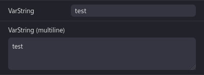
String input component. Accepts and provides a string value.
_T = string_
#### Optional properties
| Property | Description | Type |
| --------- | ------------------------------- | ------- |
| maxLength | Maximum length of the text. | number |
| multiline | Should the field be a textarea? | boolean |
<VarToggle />
Checkbox/toggle component. Accepts and returns a boolean (true/false).
_T = boolean_
<VarXY />
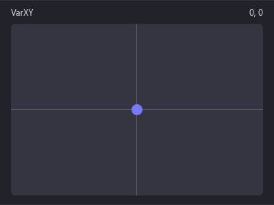
XY offset picker. Accepts and provides an array in form of [x, y].
_T = [number (x), number (y)]_
#### Optional properties
| Property | Description | Type |
| -------- | -------------- | ------------------------ |
| min | Minimum value. | [number (x), number (y)] |
| max | Maximum value. | [number (x), number (y)] |
| step | Step. | [number (x), number (y)] |
## Theme customization
The colors can be customized as such (provided are default values):
```css
.react-var-ui {
/* Foreground color, used for text. */
--react-var-ui-foreground-color: #ddd;
/* Background color, used for category header backgrounds. */
--react-var-ui-background-color: #11111a;
/* Accent color, used for active parts of sliders, toggles and XY. */
--react-var-ui-accent-color: #77f;
/* Input background color. */
--react-var-ui-input-background-color: #353542;
/* Input background color (when hovered). */
--react-var-ui-input-background-hover-color: #424253;
/* Input background color (when pressed). Only applies to buttons. */
--react-var-ui-input-background-pressed-color: #2b2b37;
/* Label background color. */
--react-var-ui-label-background-normal-color: #22222a;
/* Label background color (when hovered). */
--react-var-ui-label-background-hover-color: #2a2a33;
/* Label border color. */
--react-var-ui-label-border-color: #33333a;
}
```
## Custom input components
react-var-ui provides a `` component and a `useVarUIValue` hook designed to facilitate creation of custom components.
### Example usage
```tsx
import React from 'react';
import { useVarUIValue, IVarBaseInputProps, VarBase } from 'react-var-ui';
// Please specify the .
export interface IVarCustomProps extends IVarBaseInputProps {}
/**
* Custom input component. In this example, it's a simple text input.
*/
export const VarCustom = ({
label,
path,
value,
onChange,
disabled,
className,
}: IVarCustomProps): JSX.Element => {
/**
* currentValue will contain the current value from the value object
* (at a given path) or value from properties if that's not available.
*
* setCurrentValue will set the value onto a given path in the object
* and call onChange if available.
*
* All arguments are optional, path/object-based value changes take
* precedence.
*/
const [currentValue, setCurrentValue] = useVarUIValue(path, value, onChange);
/**
* We're wrapping our component in VarBase which provides the default
* label.
*
* It is necessary to wrap what should appear on the right in a .
* If this behavior is undesired, a
with grid-column: 1 / 3; can
* be used.
*/
return (
setCurrentValue(e.target.value)}
/>
);
};
```