# react-three-gui

A graphical user interface for changing variable states in React.

## Examples

https://codesandbox.io/s/react-three-fiber-gui-62pvp
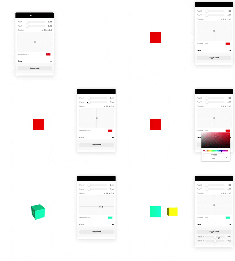
![Example](https://media.giphy.com/media/hrvUiMXTTu1aEprRhj/giphy.gif)

## Usage

Basic example

```tsx
import { Controls, useControl } from 'react-three-gui';

export const App = () => {
  const rotationX = useControl('Rotation X', { type: 'number' });
  return (
    <Controls.Provider>
      <Controls.Canvas>
        <mesh rotation-x={rotationX} />
      </Controls.Canvas>
      <Controls />
    </Controls.Provider>
  );
};
```

Use the spring option to return a react-spring value:

```tsx
useControl('My ctrl', {
  type: 'number',
  spring: true,
});

// or pass a react-spring configuration value

useControl('My ctrl', {
  type: 'number',
  spring: { mass: 5, tension: 280, friction: 50 },
});
```

Also possible to pass in your own state:

```tsx
const [value, set] = useState(0);

useControl('Adjust value', {
  type: 'number',
  state: [value, set],
});
```

Also you can pass your own control component:

```tsx
const MyControl = ({ value, setValue }) => (
  <input
    type="number"
    onChange={e => setValue(e.currentTarget.value)}
    value={value}
  />
);

useControl('Test', {
  type: 'custom',
  value: 2,
  component: MyControl,
});
```

## Use your own Canvas

```tsx
import { Canvas } from 'react-three-fiber';
import { withControls } from 'react-three-gui';

// Wrap the <Canvas> with `withControls`
const YourCanvas = withControls(Canvas);

const Scene = () => (
  <YourCanvas>
    <mesh rotation-x={rotationX} />
  </YourCanvas>
);

const App = () => {
  const rotationX = useControl('Rotation X', { type: 'number' });
  return (
    <Controls.Provider>
      <Scene />
      <Controls />
    </Controls.Provider>
  );
};
```

## API

```tsx
import { useControl, Controls } from 'react-three-gui';

// All the possible options
useControl(name: string, {
  // General
  type: 'number' | 'xypad' | 'boolean' | 'button' | 'color' | 'select' | 'string' | 'file' | 'custom';
  value: any; // Initial value
  spring: boolean | SpringConfig; // Use spring
  group: string; // Group name
  state: [any, Dispatch<SetStateAction<any>>]; // Use your own state
  onChange(value: any): void; // onChange callback

  // number | xypad
  min: number; // Minimum value (default: 0)
  max: number; // Maximum value (default: 1)
  distance: number; // The end-to-end slider distance (default: 1)
  scrub: boolean; // When slider is released it will reset to the center but keep its value

  // select
  items: string[];

  // button
  onClick(): void;

  // file
  loader?: THREE.TextureLoader | THREE.FileLoader | etc;

  // custom
  component?: React.Component;
});

// Controls component
<Controls
  title="react-three-gui"
  collapsed={true}
  defaultClosedGroups={['Other', 'Stuff']}
  width={300} // default 300
  anchor={'top_left' | 'bottom_left' | 'top_right' | 'bottom_right'} // see ControlsAnchor enum
  style={{ ... }} // pass any kind of styles here. Supports @react-spring/web styles.
/>
```

## Supported controls

- number
  - Returns `number`
- xypad
  - Returns `{ x: number, y: number }` object
- boolean
  - Returns `boolean`
- button
  - Returns `void`
- color
  - Returns `string` (as hex: #ffffff)
- select
  - Returns `string`
- file
  - Returns `new THREE.FileLoader`
- string
  - Returns `string`

### Future plans

- [x] Support custom control components
- [x] File upload loader control
- [x] Groups
- [x] Draggable Widget
- [x] Collapsable widget
- [x] Persist state localstorage
- [ ] Multi platform?
