React-Tags
===
[](https://github.com/prakhar1989/react-tags/blob/master/LICENSE)
[](https://www.npmjs.com/package/react-tag-input)
[](https://www.npmjs.com/package/react-tag-input)
[](https://travis-ci.org/prakhar1989/react-tags)
React-tags is a simple tagging component ready to drop in your React projects. The component is inspired by GMail's *To* field in the compose window.
### Features
- Autocomplete based on a suggestion list
- Keyboard friendly and mouse support
- Reorder tags using drag and drop
### Why
Because I was looking for an excuse to build a standalone component and publish it in the wild? To be honest, I needed a tagging component that provided the above features for my [React-Surveyman](http://github.com/prakhar1989/react-surveyman) project. Since I was unable to find one which met my requirements (and the fact that I generally enjoy re-inventing the wheel) this is what I came up with.
### Demo
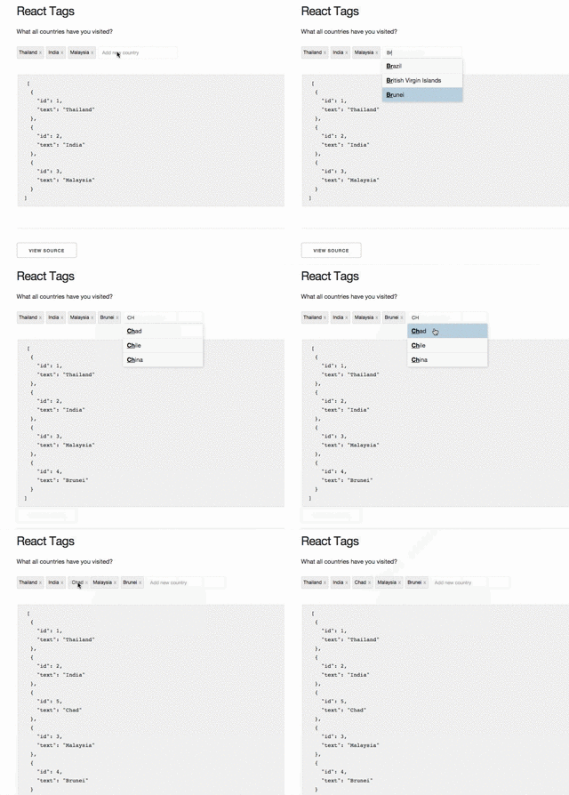
Check it out [here](http://prakhar.me/react-tags/example)
### Installation
The preferred way of using the component is via NPM
```
npm install --save react-tag-input-latest
```
It is, however, also available to be used separately (`dist/ReactTags.min.js`). If you prefer this method remember to include [ReactDND](https://github.com/gaearon/react-dnd) as a dependancy. Refer to the [demo](http://prakhar.me/react-tags/example) to see how this works.
### Usage
Here's a sample implementation that initializes the component with a list of initial `tags` and `suggestions` list. Apart from this, there are multiple events, handlers for which need to be set. For more details, go through the [API](#Options).
You can also play with live code on [WebpackBin](http://www.webpackbin.com/41DVgMvv-).
```javascript
import React from 'react';
import ReactDOM from 'react-dom';
import { WithContext as ReactTags } from 'react-tag-input';
const App = React.createClass({
getInitialState() {
return {
tags: [ {id: 1, text: "Apples"} ],
suggestions: ["Banana", "Mango", "Pear", "Apricot"] // Can also be object - [{text: 'mango', addon: 'fruit'}, {text: 'india'}]
}
},
handleDelete(i) {
let tags = this.state.tags;
tags.splice(i, 1);
this.setState({tags: tags});
},
handleAddition(tag) {
let tags = this.state.tags;
tags.push({
id: tags.length + 1,
text: tag
});
this.setState({tags: tags});
},
handleDrag(tag, currPos, newPos) {
let tags = this.state.tags;
// mutate array
tags.splice(currPos, 1);
tags.splice(newPos, 0, tag);
// re-render
this.setState({ tags: tags });
},
render() {
let tags = this.state.tags;
let suggestions = this.state.suggestions;
return (
)
}
});
ReactDOM.render(, document.getElementById('app'));
```
**A note about `Contexts`**
One of the dependencies of this component is the [react-dnd](https://github.com/gaearon/react-dnd) library. Since the 1.0 version, the original author has changed the API and requires the application using any draggable components to have a top-level [backend](http://gaearon.github.io/react-dnd/docs-html5-backend.html) context. So if you're using this component in an existing Application that uses React-DND you will already have a backend defined, in which case, you should `require` the component *without* the context.
```javascript
const ReactTags = require('react-tag-input').WithOutContext;
```
Otherwise, you can simply import along with the backend itself (as shown above). If you have ideas to make this API better, I'd [love to hear](https://github.com/prakhar1989/react-tags/issues/new).
### Options
- [`tags`](#tagsOption)
- [`suggestions`](#suggestionsOption)
- [`delimiters`](#delimiters)
- [`placeholder`](#placeholderOption)
- [`labelField`](#labelFieldOption)
- [`handleAddition`](#handleAdditionOption)
- [`handleDelete`](#handleDeleteOption)
- [`handleDrag`](#handleDragOption)
- [`handleFilterSuggestions`](#handleFilterSuggestions)
- [`autofocus`](#autofocus)
- [`allowDeleteFromEmptyInput`](#allowDeleteFromEmptyInput)
- [`handleInputChange`](#handleInputChange)
- [`handleInputBlur`](#handleInputBlur)
- [`minQueryLength`](#minQueryLength)
- [`removeComponent`](#removeComponent)
- [`autocomplete`](#autocomplete)
- [`readOnly`](#readOnly)
- [`handleTagClick`](#handleTagClick)
##### tags (optional)
An array of tags that are displayed as pre-selected. Each tag should have an `id` and a `text` property which is used to display.
```js
let tags = [ {id: 1, text: "Apples"} ]
```
##### suggestions (optional)
An array of suggestions that are used as basis for showing suggestions. At the moment, this should be an array of strings or array of objects with two keys text and addon where addon key is optional.
```js
let suggestions = ["mango", "pineapple", "orange", "pear"];
or
let suggestions = [{text: 'mango', addon: 'fruit'}, {text: 'india'}];
```
##### delimiters (optional)
Specifies which characters should terminate tags input (default: enter and tab). A list of character codes.
##### placeholder (optional)
The placeholder shown for the input. Defaults to `Add new tag`.
```
let placeholder = "Add new country"
```
##### labelField (optional)
Provide an alternative `label` property for the tags. Defaults to `text`.
```
```
This is useful if your data uses the `text` property for something else.
##### handleAddition (required)
Function called when the user wants to add a tag (either a click, a tab press or carriage return), will receive object if suggestion is object.
```js
function(tag) {
// add the tag to the tag list
}
```
##### handleDelete (required)
Function called when the user wants to delete a tag
```js
function(i) {
// delete the tag at index i
}
```
##### handleDrag (optional)
If you want tags to be draggable, you need to provide this function.
Function called when the user drags a tag.
```js
function(tag, currPos, newPos) {
// remove tag from currPos and add in newPos
}
```
##### handleFilterSuggestions (optional)
To assert control over the suggestions filter, you may contribute a function that is executed whenever a filtered set
of suggestions is expected. By default, the text input value will be matched against each suggestion, and [those that
**start with** the entered text][default-suggestions-filter-logic] will be included in the filters suggestions list. If you do contribute a custom filter
function, you must return an array of suggestions. Please do not mutate the passed suggestions array.
For example, if you prefer to override the default filter behavior and instead match any suggestions that contain
the entered text _anywhere_ in the suggestion, your `handleFilterSuggestions` property may look like this:
```js
function(textInputValue, possibleSuggestionsArray) {
var lowerCaseQuery = textInputValue.toLowerCase()
return possibleSuggestionsArray.filter(function(suggestion) {
return suggestion.toLowerCase().includes(lowerCaseQuery)
})
}
```
Note: The above custom filter uses `String.prototype.includes`, which was added to JavaScript as part of the ECMAScript 7
specification. If you need to support a browser that does not yet include support for this method, you will need to
either refactor the above filter based on the capabilities of your supported browsers, or import a [polyfill for
`String.prototype.includes`][includes-polyfill].
##### autofocus (optional)
Optional boolean param to control whether the text-input should be autofocused on mount.
```js
```
##### allowDeleteFromEmptyInput (optional)
Optional boolean param to control whether tags should be deleted when the 'Delete' key is pressed in an empty Input Box.
```js
```
##### handleInputChange (optional)
Optional event handler for input onChange
```js
```
##### handleInputBlur (optional)
Optional event handler for input onBlur
```js
```
##### minQueryLength (optional)
How many characters are needed for suggestions to appear (default: 2).
##### removeComponent (optional)
If you'd like to supply your own tag delete/remove element, create a React component and pass it as a property to ReactTags using the `removeComponent` option. By default, a simple anchor link with an "x" text node as its only child is rendered, but if you'd like to, say, replace this with a `