# React tabs (Redux compatible)
[](https://travis-ci.org/patrik-piskay/react-tabs-redux) [](https://www.npmjs.com/package/react-tabs-redux)
Simple, fully customizable, accessible React tabs component that can be used in plain React application or with any Flux-like architecture with external application state, e.g. Redux.
## Installation
Using npm:
$ npm install react-tabs-redux
UMD build is also available:
```html
```
with components accessible via `window.ReactTabs` object.
**_NOTE:_** _This component requires_ **_React_** _to be installed separately._
## Usage
- **with plain React** (using component's internal state) - [see example](https://github.com/patrik-piskay/react-tabs-redux/tree/master/examples/plain-react)
```jsx
Tab1
Tab2
Tab3
/* content for tab #1 */
/* content for tab #2 */
/* content for tab #3 */
```
- **with Redux** (or any other external state management library) - [see example](https://github.com/patrik-piskay/react-tabs-redux/tree/master/examples/redux)
The only change needed from _plain React_ example is to provide `handleSelect` and `selectedTab` (`name` as well if you want to have multiple `` instances in your app) props to `` component so that you are able to save and retrieve information about which tab is currently active from your external application state.
```jsx
instance so you can keep track of
multiple instances in your external state */
name="tabs1"
handleSelect={(selectedTab, namespace) => {
// fire Redux action here
}}
/* selected tab name retrieved from external state */
selectedTab="tab2"
>
Tab1
Tab2
Tab3
...
...
...
```
---
By default, the first `` component is set to active. You can change this by specifying `default` in props of the `` component you want to become active instead.
```jsx
Tab1
Tab2
Tab3
...
... // this gets visible
...
```
---
`` and `` **don't need** to be first level children of `` component. You can put them as deep in your markup as you need to (_e.g. because of styling_) making `` component **fully customizable**.
This will work then:
```jsx
...
...
...
```
---
If, for performance or other reasons, you wish to render only the content of the active tab to HTML and not render anything for the rest (not visible content), you may set an `renderActiveTabContentOnly` prop on `` component.
```jsx
Content 1 /* rendered in HTML */
Content 2 /* empty in HTML */
Content 3 /* empty in HTML */
```
---
### `` props
| Prop name | Type | Default value | Description |
| :------------------------- | :---------------------------- | :------------ | --------------------------------------------------------------------------------------------------------------------------------------------------------------------------------------------------------------------- |
| name | _string_ | | Sets namespace of a `` component. Useful when multiple instances are used |
| onChange | _function(selectedTab, name)_ | | Called everytime the selected tab is changed. _(it gets called for the initial selected tab too)_ |
| handleSelect | _function(tab, name)_ | | **(Optional) control prop** - called everytime a Tab Link is clicked
_Useful in an "external state" scenario (Redux, etc.), use `onChange` for tracking purposes._ |
| selectedTab | _string_ | | **(Optional) control prop** - controls which tab is currently active.
_Useful in an "external state" scenario (Redux, etc.), when not set, the `` component will maintain the "selected tab" state._ |
| activeLinkStyle | _object_ | | Style that gets applied to the selected `` |
| visibleTabStyle | _object_ | | Style that gets applied to the visible `` |
| disableInlineStyles | _boolean_ | false | Useful if you are using `className` to style the components and don't want the default inline styles to get applied. |
| renderActiveTabContentOnly | _boolean_ | false | _Performance_: When set, only the visible content gets actually rendered to DOM _(instead of all `` being rendered and hidden)_. |
| tabComponent | _string_ | | DOM element all `` render to.
_This can be set on `` level too, by setting the `component` prop on `` components._ |
### `` props
| Prop name | Type | Default value | Description |
| :-------------- | :------- | ----------------- | --------------------------------------------------------------------- |
| component | _string_ | "button" | DOM element `` renders to. |
| className | _string_ | "tab-link" | Class name that's applied to elements |
| activeClassName | _string_ | "tab-link-active" | Class name that's applied to the element when it's active |
### `` props
| Prop name | Type | Default value | Description |
| :-------------- | :------- | --------------------- | ------------------------------------------------------------------------- |
| className | _string_ | "tab-content" | Class name that's applied to elements |
| activeClassName | _string_ | "tab-content-visible" | Class name that's applied to the element when it's visible |
---
See more in [examples](https://github.com/patrik-piskay/react-tabs-redux/tree/master/examples)
## Styling components
#### Class names
There is a couple of class names dynamically added to the components:
`` will receive `tab-link` class name with `tab-link-active` added when tab is active.
```jsx
/* will receive `className="tab-link"` in props */
Tab1
/* will receive `className="tab-link tab-link-active"` in props */
Tab1
```
To override the default class names, `` accepts a `className` prop, as well as an `activeClassName` prop.
---
`` will receive `tab-content` class name with `tab-content-visible` added when the content is visible (its corresponding `` is active).
```jsx
/* will receive `className="tab-content"` or `className="tab-content tab-content-visible"` in props */
...
```
To override the default class names, `` accepts a `className` prop, as well as a `visibleClassName` prop.
#### Inline styles
If you prefer to use inline styles, you can set `style` in props of each of ``, `` and `` components.
To apply style for an active tab link, set the style as `activeLinkStyle` in props of `` component.
To apply style for a visible tab content, set the style as `visibleTabStyle` in props of `` component.
By default, react-tabs-redux will apply `display: none` styles to the appropriate `` component, and `font-weight: bold` to the appropriate `` component. If you would like to use classes to handle all of the styling, and disable even the default inline styles, you may pass `disableInlineStyles` as a prop to the parent `` component.
```jsx
` */}
visibleTabStyle={/* style that will be applied on the visible `` */}
disableInlineStyles={/* Boolean to toggle all inline styles */}
>
Tab1
Tab2
...
...
```
---
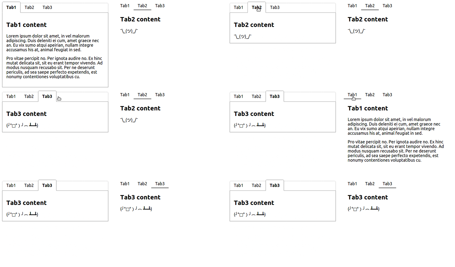
In each [example](https://github.com/patrik-piskay/react-tabs-redux/tree/master/demo) there is one `` components styled using class names and the other one styled using inline styles.
## License
MIT