# React Supacons Mantine
[](https://www.npmjs.com/package/react-supacons-mantine)
[](https://packagephobia.com/result?p=react-supacons-mantine)
[](https://npm-stat.com/charts.html?package=react-supacons-mantine)
React Supacons Mantine is a React component library that integrates with the Supacons Core Icon Library, providing an icon selector component built with Mantine UI (tested on v6).
## Installation
To install the library, use the following command:
```bash
npx react-supacons-mantine -h # To see the help message
npx react-supacons-mantine add -h # To see the help message for the add command
npx react-supacons-mantine add [component] # To add a specific component to your project
```
## Available Components
| Component | Type | Command | Description |
|---------------------|-----------|--------------------------------------------------|------------------------------------------------------------------------------------------------------------------------|
| `PopoverSearchIcon` | component | npx react-supacons-mantine add PopoverSearchIcon | The PopoverSearchIcon component is a React component that provides a searchable popover interface for selecting icons. |
## Usage
To use the `PopoverSearchIcon` component, import it into your React application:
```typescript jsx
import React from 'react';
import { MantineProvider } from '@mantine/core';
import PopoverSearchIcon from './components/PopoverSearchIcon';
const App = () => {
const handleIconSelect = (iconName: string) => {
console.log(`Selected icon: ${iconName}`);
};
return (
);
};
export default App;
```
### Example with Config
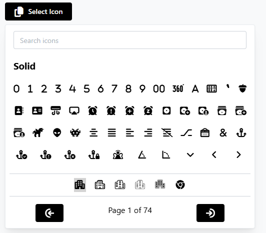
To use the `PopoverSearchIcon` component with a configuration object:
```typescript jsx
import React, { useState } from 'react';
import { MantineProvider } from '@mantine/core';
import PopoverSearchIcon, { PopoverSearchIconConfig } from './components/PopoverSearchIcon';
const App = () => {
const [isDarkMode, setIsDarkMode] = useState(false);
const handleIconSelect = (iconName: string) => {
console.log(`Selected icon: ${iconName}`);
};
const config: PopoverSearchIconConfig = {
resultsPerPage: 52,
availableStyles: ["solid", "sharp"],
contentColor: isDarkMode ? "#fff" : "#000",
contentSize: 18,
searchLabel: "Search icons",
paginationLabel: "Page %d of %s",
buttonLabel: "Select Icon",
buttonIconName: "fa-solid fa-copy",
buttonIconSize: 20,
buttonIconColor: isDarkMode ? "#000" : "#fff",
buttonColor: isDarkMode ? "#fff" : "#000",
showBothIconAndText: true,
noIconsFoundText: "No icons found",
};
return (
);
};
export default App;
```
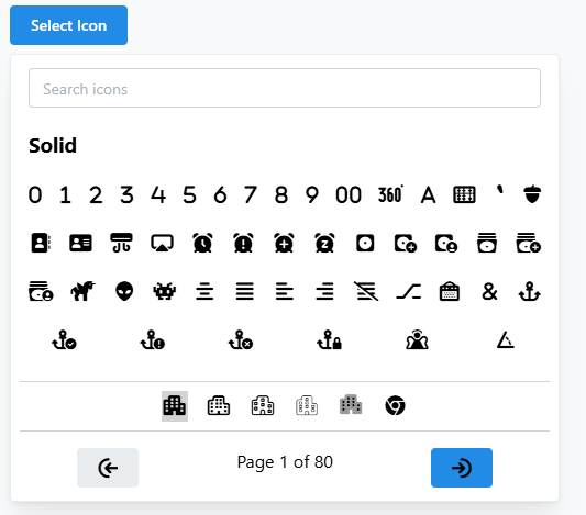
### Example with and without configuration
| Not Configured | Configured |
|--------------------------------------------------------|----------------------------------------------------|
|  |  |
## Props
### `PopoverSearchIcon`
| Prop | Type | Description |
|------------|----------|-------------------------------------------------------------------------------|
| `onSelect` | function | Callback function that is called when an icon is selected. |
| `config` | object | Configuration object for customizing the component's behavior and appearance. |
### `config` Object
| Property | Type | Description |
|-----------------------|-----------|-----------------------------------------------------------------------------------------------------------------------------|
| `resultsPerPage` | number | Number of icons to display per page. |
| `availableStyles` | string[] | Array of available icon styles. |
| `contentColor` | string | Color of the icons. |
| `contentSize` | number | Size of the icons. |
| `buttonNode` | ReactNode | Custom React node to replace the default button. Allows for complete customization of the button's appearance and behavior. |
| `buttonLabel` | string | Label for the button that opens the popover. |
| `buttonIconName` | string | Name of the icon to display on the button. |
| `buttonIconSize` | number | Size of the icon on the button. |
| `buttonIconColor` | string | Color of the icon on the button. |
| `buttonColor` | string | Background color of the button. |
| `showBothIconAndText` | boolean | Whether to show both icon and text on the button. |
| `noIconsFoundText` | string | Text to display when no icons are found. |
| `paginationText` | string | Text to display for pagination, use `%d` for current page and `%s` for total pages. |
## Development
To build and test the library locally, use the following commands:
```bash
npm run test # Run tests
```
## License
This project is licensed under the Creative Commons Attribution-NonCommercial 4.0 International License. See the [LICENSE](LICENSE) file for details.
## Contributing
Contributions are welcome! Please open an issue or submit a pull request on GitHub.
## Author
- [@RawkFX](https://github.com/RawkFX)
## Repository
[GitHub Repository](https://github.com/RawkFX/react-supacons-mantine)
## Bugs
For bug reports, please visit the [issues page](https://github.com/RawkFX/react-supacons-mantine/issues).
## Keywords
- [React.Js 18](https://react.dev/)
- [Mantine v6](https://v6.mantine.dev/)
- [Supacons Core](https://supacons.netlify.app/)