# react-segmented-choice
[](https://codecov.io/gh/innrvoice/react-segmented-choice)
[](https://app.codecov.io/github/innrvoice/react-segmented-choice/bundles/main/react-segmented-choice-esm)
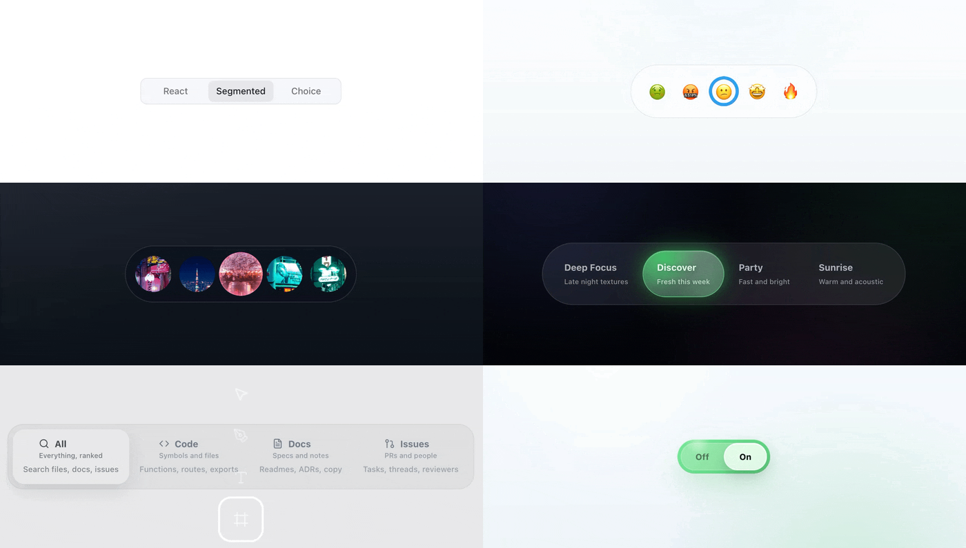
`react-segmented-choice` is a React segmented control component for web apps that need accessible single-choice UI without falling back to styled tabs.
It keeps the boring parts in place: HTML radio inputs, labelled radio-group semantics, keyboard behavior, form-friendly state and drag-to-select. From there, you can shape the same component into segmented buttons, sliding pill switches, toolbar controls, option pickers, tab-like UI or compact mode selectors with a sliding indicator, CSS variables and measured geometry.
Typical use cases:
- report ranges, billing periods, density switches and mode selectors
- segmented buttons, icon rails and toolbar controls where every option needs a stable target
- sliding pill switches, option pickers and tab-like UI that should still behave like form controls
The hosted [Storybook](https://sb.segmentedchoice.visiofutura.com/) shows the range: plain controls, rails, thumbnails, filters, toggles and the geometry stories behind them.
## Install
```bash
pnpm add react-segmented-choice
# or
npm install react-segmented-choice
# or
yarn add react-segmented-choice
```
Import bundled styles once:
```tsx
import 'react-segmented-choice/styles.css';
```
Import the bundled stylesheet before your app or component CSS. That keeps the default skin available while letting your own classes override public `--rsc-*` variables and stable `.rsc-*` hooks in normal CSS order.
## Quick Start
```tsx
import { SegmentedChoice } from 'react-segmented-choice';
import 'react-segmented-choice/styles.css';
export function ReportRange() {
return (
);
}
```
## Value Type (`string` only)
`SegmentedChoiceValue` is `string`. Treat option values as stable public IDs. If the selected thing is a richer object, keep that object in your app state and pass the ID to the control.
For complex domain values, keep external mapping by ID:
```tsx
const items = [
{ id: 'plan-free', plan: { seats: 1, tier: 'free' } },
{ id: 'plan-pro', plan: { seats: 10, tier: 'pro' } },
] as const;
const byId = Object.fromEntries(items.map(x => [x.id, x.plan]));
{
setSelectedId(id);
setSelectedPlan(byId[id]);
}}
options={items.map(x => ({ value: x.id, label: x.plan.tier }))}
/>;
```
## Public API
The package has one component entry point and a small type surface. This README keeps the map short; `API.md` is where the prop-by-prop reference and longer examples live.
Exports:
- `SegmentedChoice`
- types: `SegmentedChoiceProps`, `SegmentedChoiceOption`, `SegmentedChoiceValue`, `SegmentedChoiceGeometry`, `SegmentedChoiceSlotProps`
- geometry/types: `SegmentedChoiceTrackLayout`, `SegmentedChoiceTrackStyle`, `SegmentedChoiceIndicatorStyle`, `SegmentedChoiceIndicatorContentMode`, `SegmentedChoiceIndicatorTransition`
- typography helpers: `SEGMENTED_CHOICE_FONT_FAMILY`, `SEGMENTED_CHOICE_TYPOGRAPHY_TOKENS`, `getSegmentedChoiceTypographyTokens`, `SegmentedChoiceTypographyTokens`
Top-level props:
- `options`, `value`, `defaultValue`, `onValueChange`, `name`
- `disabled`, `required`, `orientation`, `optionSizing`, `optionDistribution`, `size`
- `draggable`, `loop`
- `ariaLabel`, `ariaLabelledby`, `ariaDescribedby`
- `className`, `styleNonce`, `unstyled`, `slotProps`, `geometry`
Layout props worth knowing early:
- `optionSizing` controls option box dimensions: `equal` uses the widest measured option content for every option, `content` lets each option follow its own content width and `geometry.optionSize` switches to fixed square option boxes.
- `optionDistribution` controls option placement when the surface has extra space. The default is `space-between`; `space-around` adds outer breathing room too. Surface width itself still comes from normal CSS layout.
Structural runtime guarantees:
- `options` must contain at least 2 entries
- every `options[i].value` must be a unique string
- invalid option structures render nothing and warn in development
- the radiogroup must be labelled with `ariaLabel` or `ariaLabelledby`
For complete prop-by-prop reference with examples, see `API.md`.
Option fields:
- `value`: unique string selection value
- `label`: rendered option content
- `ariaLabel`: accessible label for icon-only or non-text labels
- `description`: optional secondary content
- `disabled`: disables one option
- `accentColor`: optional per-option indicator color, sanitized before runtime CSS injection
### `geometry`
Use `geometry` when the layout mechanics need to change, not just the colors. It controls things like underlay vs overlay behavior, track span, fixed option or indicator sizes, drag scale, cloned indicator content and indicator motion.
```ts
geometry?: {
mode?: "underlay" | "overlay";
dragScale?: boolean | number;
optionSize?: number;
anchor?: {
size?: number;
width?: number;
height?: number;
};
track?: {
layout?: "container" | "center-span";
style?: "surface" | "none";
};
indicator?: {
size?: number;
width?: number;
height?: number;
style?: "fill" | "ring" | "none";
content?: "none" | "clone-active";
transition?: "smooth" | "instant";
inset?: number;
borderWidth?: number;
};
}
```
Defaults:
- `geometry.mode = "underlay"`
- `geometry.track.layout = "container"`
- `geometry.track.style = "surface"`
- `geometry.indicator.style = "fill"`
- `geometry.indicator.content = "none"`
- `geometry.indicator.transition = "smooth"`
`geometry.indicator.transition` is only about the moving selection indicator:
- `"smooth"` animates selection indicator position and size changes.
- `"instant"` updates indicator position and size without movement or resize animation.
It does not delay value changes or change drag preview behavior.
### `slotProps`
`slotProps` is for integration hooks, not visual styling:
- allowed: `className`, `data-*`, non-conflicting `aria-*`, handlers (`onPointerEnter`, etc.)
- not supported: `style`
`style` is intentionally ignored at runtime even if forced through a cast.
For `slotProps.list`, internal pointer/focus handlers run before user-provided handlers.
Use list-level handlers to observe or add to interactions. Do not rely on them to override the built-in drag and commit flow.
Root radiogroup semantics stay controlled by top-level props such as `ariaLabel`, `ariaLabelledby` and `ariaDescribedby`.
Example:
```tsx
```
## CSS-First Customization Contract
`SegmentedChoice` does not put `style={...}` on its rendered slots.
The styling contract is intentionally CSS-first:
- stable `.rsc-*` classes for slot targeting
- core state `data-*` attrs for state-specific styling
- public `--rsc-*` variables for theme tokens
- no rendered slot inline styles, so your CSS can still override variables such as `--rsc-surface`
Runtime geometry is separate from theme styling. Measured positions and sizes are written through an internal scoped stylesheet, not through slot inline styles.
### CSP-safe runtime styles
Dynamic layout values are injected into a shared document stylesheet.
- pass `styleNonce` when your app uses strict CSP without `unsafe-inline`
- instances in the same document share one runtime style host per nonce value
- controls with different `styleNonce` values create separate runtime style hosts
### Stable class hooks
- `.rsc-root`, `.rsc-list`, `.rsc-track`, `.rsc-indicator`, `.rsc-indicator-content`
- `.rsc-option`, `.rsc-option-input`, `.rsc-option-anchor`, `.rsc-option-content`
- `.rsc-option-label`, `.rsc-option-description`
Use class hooks for stable slot targeting. Use data attrs for semantic state and interaction state.
### Stable root data attrs
- `data-orientation`, `data-size`
- `data-disabled`, `data-unstyled`, `data-dragging`, `data-drag-released`
`data-dragging` marks an active pointer drag. `data-drag-released` is briefly `true` after a pointer drag ends so CSS can add optional release feedback such as a bounce or glow. The default stylesheet does not animate release.
### Stable option data attrs
- `data-selected`, `data-disabled`, `data-focus-visible`
- `data-has-description`, `data-previewed`
`data-previewed` marks the option currently targeted during an active drag. It can differ from `data-selected` until the drag commits.
### Stable CSS variables
Always active:
- `--rsc-bg`, `--rsc-surface`, `--rsc-border-color`, `--rsc-border-radius`
- `--rsc-font-family`, `--rsc-font-weight`, `--rsc-line-height`, `--rsc-letter-spacing`
- `--rsc-font-size`, `--rsc-description-font-size`
- `--rsc-container-offset`, `--rsc-padding`, `--rsc-gap`, `--rsc-label-gap`
- `--rsc-disabled-opacity`
- `--rsc-option-min-size`, `--rsc-option-padding-block`, `--rsc-option-padding-inline`, `--rsc-option-radius`
- `--rsc-track-size`
- `--rsc-text-color`, `--rsc-active-text-color`
- `--rsc-indicator-bg`, `--rsc-indicator-color`
- `--rsc-indicator-border-width`, `--rsc-indicator-shadow`, `--rsc-focus-ring-color`
Optional public override:
- `--rsc-indicator-hover-bg` overrides the overlay fill hover color. Without it, overlay fill hover preserves active `accentColor`; controls without an active accent use the default gray hover fill.
### Public vs internal CSS variables
Public variables are the documented `--rsc-*` tokens above. They are safe to theme from external CSS.
Internal runtime selectors and variables use `data-rsc-*` and `--_rsc-*`. They belong to the bundled stylesheet and scoped runtime layout rules. Do not build app-level styling contracts on them.
### SSR and Hydration
Server rendering does not emit the internal runtime stylesheet.
- SSR markup is safe to render without touching `window`, `document` or `navigator`
- the scoped runtime CSS is installed on the client after hydration during the first layout effect
- expect indicator geometry to settle on the client after hydration
## API Precedence
1. Component state and `geometry` define mechanics/layout.
2. Internal runtime stylesheet applies instance-scoped layout values.
3. Public CSS variables define theme and visual output.
4. Class/data selectors define contextual styling.
5. `slotProps` adds attrs/events/class names to slots.
Use `geometry` when the component should measure or move differently. Use CSS when the same mechanics should look different.
`unstyled` means "remove the default visual skin". It is not a headless primitive. Structure, semantics, slots and layout logic still come from the component.
For deeper guidance, examples and sentence-level descriptions of each stable class/data hook, read `API.md`.
## Storybook
Storybook is the easiest place to see the component pushed past the default pill control.
It covers:
- baseline variants and state examples
- geometry and indicator architecture
- CSS-first customization patterns
- rails, thumbnails, filters, custom switches and toggle-like controls
- keyboard, pointer, drag and accessibility interaction behavior
- styling examples built only on the documented public API
Run it locally with `pnpm storybook`, or browse the hosted examples at [sb.segmentedchoice.visiofutura.com](https://sb.segmentedchoice.visiofutura.com/).
For quick forks, the main examples are also available on CodeSandbox.
Open CodeSandbox examples
- [Basic Example](https://codesandbox.io/p/sandbox/tender-albattani-5rpn94)
- [Primary Scale](https://codesandbox.io/p/sandbox/react-segmented-choice-primary-scale-5rj8n7)
- [Emoji Ring](https://codesandbox.io/p/sandbox/react-segmented-choice-emoji-ring-xpwhc5)
- [Tip Selector](https://codesandbox.io/p/sandbox/react-segmented-choice-tip-selector-hy6qkn)
- [Impressions](https://codesandbox.io/p/sandbox/react-segmented-choice-impressions-fccry2)
- [Range-like](https://codesandbox.io/p/sandbox/react-segmented-choice-range-like-8hjh4g)
- [Modern Thumbnail](https://codesandbox.io/p/sandbox/react-segmented-choice-modern-thumbnail-x7mf2m)
- [Camera Modes](https://codesandbox.io/p/sandbox/react-segmented-choice-camera-modes-clone-active-v3jct6)
- [Ant-style Filter Bar](https://codesandbox.io/p/sandbox/react-segmented-choice-ant-style-filter-bar-97y7fl)
- [Spotify Mood Mixer](https://codesandbox.io/p/sandbox/react-segmented-choice-spotify-mood-mixer-d6mls4)
- [Glass Dock](https://codesandbox.io/p/sandbox/react-segmented-choice-glass-dock-njnng8)
- [Arcade Difficulty](https://codesandbox.io/p/sandbox/react-segmented-choice-arcade-difficulty-krwrp3)
- [Command Scope Picker](https://codesandbox.io/p/sandbox/react-segmented-choice-command-scope-picker-9r539y)
- [Figma Tool Rail](https://codesandbox.io/p/sandbox/react-segmented-choice-figma-tool-rail-m35cgv)
- [Editorial Tone Selector](https://codesandbox.io/p/sandbox/react-segmented-choice-editorial-tone-selector-qys8zk)
- [Android-like Toggle](https://codesandbox.io/p/sandbox/react-segmented-choice-android-like-toggle-4vjmk5)
- [iOS-like Toggle](https://codesandbox.io/p/sandbox/react-segmented-choice-ios-like-toggle-ymm9xd)
## Browser Support
The supported baseline is current and previous major releases of:
- Chrome / Edge
- Safari
The library is tested with Chromium and WebKit in CI.
## Visual Regression Workflow
```bash
pnpm test:visual
pnpm test:visual:update
```
`test:visual` builds Storybook and compares screenshots for the curated `tags: ["visual"]` stories.
## Accessibility
- Native radio inputs and radiogroup semantics
- Arrow/Home/End keyboard support
- Disabled options skipped in keyboard navigation
- Immediate form compatibility via shared `name`
- For non-text labels, pass `ariaLabel` per option
## Security / SBOM
Tagged releases publish a CycloneDX SBOM generated from the pnpm lockfile.
Security and compliance tooling can use the SBOM to inspect dependency metadata.
## Quality Gates
- Format: `pnpm format:check`
- Lint: `pnpm lint`
- Typecheck: `pnpm typecheck`
- Build/declaration output: `pnpm build`
- Unit: `pnpm test:unit`
- Storybook interactions: `pnpm test:storybook`
- Source/build contract: `pnpm test:contract`
- Package sanity: `pnpm pack:check`
- Visual regression: `pnpm test:visual`
- Coverage: `pnpm test:coverage`
CI runs format checks, lint, unit coverage, package build, public contract checks, package-content checks, Storybook browser tests and Chromium/WebKit visual regression.
`prepack` runs: build -> contract check -> pack check.
## Supported Versions
- React: `^18.2.0 || ^19.0.0`
- Node: `>=22.13.0`