[:||||||||||||:] React Scrollable Accordion
[](https://travis-ci.org/andrii-maglovanyi/react-scrollable-accordion)

An easily designable, cross browser, basic HTML list, that allows you to define sticky list items, called headers, like this:
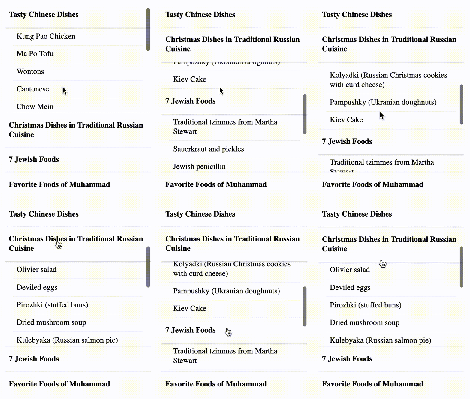
The purpose of this package is to provide a cross-browser alternative to the `position: sticky` [CSS property](https://developer.mozilla.org/en-US/docs/Web/CSS/position) with some improvements like scrolling the list to the beginning of section when clicking on the header;
A `stickily` positioned header is an element whose computed position value is sticky. It's treated as relatively positioned until the container it scrolls within crosses a specified threshold (the edge of the containing block, or previous/next header), at which point it is treated as fixed until meeting the opposite boundary.
## Install
```bash
npm install react-scrollable-accordion
```
### Why do I need this ?
- CSS position _sticky_ attribute still doesn't have a full cross browser support.
- It's possible to have extra features, for example, specify to which side of the list the _header_ should stick.
- With current solution it's possible to specify the design of _sticked_ elements in different states, for example, you can set the header to have a border-bottom when it sticks to the top, and vise versa when it sticks to the bottom.
## Prerequisites
[React v16.8.0](https://github.com/facebook/react/releases/tag/v16.8.0) and up since I'm very fancy of hooks.
## Getting Started
Please find here the **[Live Example](https://codesandbox.io/s/react-scrollable-accordion-bbtis?fontsize=14)**.
A basic list, which is almost no different from standard HTML list, although it has no visible bullet points:
```jsx
import { List, ListHeader, ListItem } from "react-scrollable-accordion";
Header 1
Item 1
Item 2
Header 2
Item 3
Item 4
;
```
### How to change the design ?
For starters, you can apply this minimal styling:
```css
.Header {
background-color: white;
cursor: pointer;
display: block;
font-weight: bold;
padding: 2px 0;
}
```
You are free to provide custom CSS classes to a **className** property to all _List_, _ListHeader_, _LIstItem_ components with any given properties, except of _position_ attribute, which can disrupt the component behavior.
### What options are available?
To convert it to accordion, pass **stickyHeaders** property to the _List_ element:
```jsx
import { List, ListHeader, ListItem } from "react-scrollable-accordion";
Header 1
Item 1
Item 2
Header 2
Item 3
Item 4
;
```
You can customize the layout by passing a string to use a DOM element via _component_ property as we all as providing _CSS_ class with _className_ property:
```jsx
import { List, ListHeader, ListItem } from "react-scrollable-accordion";
Header 1
Item 1
Item 2
Header 2
Item 3
Item 4
;
```
You may also customize a **scroll-behavior** CSS property by passing _scrollBehavior_ property to the _List_ component with either _auto_ (default) or _smooth_ values:
```jsx
...
```
If you you'd like the headings to stick to only one side of the list, you can set the _scrollTo_ propert to the _List_ with one of values:
- _all_ - stick headers to both sides of the list (default).
- _bottom_ - stick headers to bottom only.
- _top_ - stick headers to top only.
```jsx
...
```
Read more about [scroll-behavior](https://developer.mozilla.org/en-US/docs/Web/CSS/scroll-behavior) property.
## Contributing
Pull requests are very welcome! For major changes, please open an issue first to discuss what you would like to change.
Please make sure to update tests as appropriate.
## Sponsors
These services support me by providing free infrastructure.


## License
[MIT](https://choosealicense.com/licenses/mit/)