 ## Feature
* support ie9+,chrome,firefox,safari
### Keyboard
## install
[](https://npmjs.org/package/rc-progress)
## Usage
```js
var Line = require('rc-progress').Line;
var Circle = require('rc-progress').Circle;
var React = require('react');
React.render(
## Feature
* support ie9+,chrome,firefox,safari
### Keyboard
## install
[](https://npmjs.org/package/rc-progress)
## Usage
```js
var Line = require('rc-progress').Line;
var Circle = require('rc-progress').Circle;
var React = require('react');
React.render(| name | type | default | description |
|---|---|---|---|
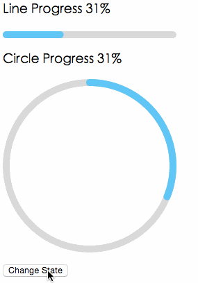
| strokeWidth | Number | 1 | Width of the stroke. Unit is percentage of SVG canvas size. |
| strokeColor | String | #3FC7FA | Stroke color. |
| trailWidth | Number | 1 | Width of the trail stroke. Unit is percentage of SVG canvas size. Trail is always centered relative to actual progress path. If trailWidth are not defined, it same as strokeWidth. |
| trailColor | String | #D9D9D9 | Color for lighter trail stroke underneath the actual progress path. |