# React numpad
A numpad for number, date and time, built with and for React.
It's written with the extensibility in mind. The idea of this project is to cover the majority of input types in a form.
## Installation
To use React-Numpad, install it from NPM and include it in your own React build process (using Webpack, etc).
```shell
npm i -S react-numpad-material
```
At this point you can import react-numpad in your application
```shell
import NumPad from 'react-numpad-material';
```
## Usage
React-NumPad generates an input field containing the selected value, so you can submit it as part of a standard form. You can also listen for changes with the onChange event property.
When the value is changed, onChange(selectedValue) will fire.
React-NumPad is built based on a "main" component (PopoverNumPad.js). Following the higher-order component technique, is possible to create new components by simply overriding few common properties.
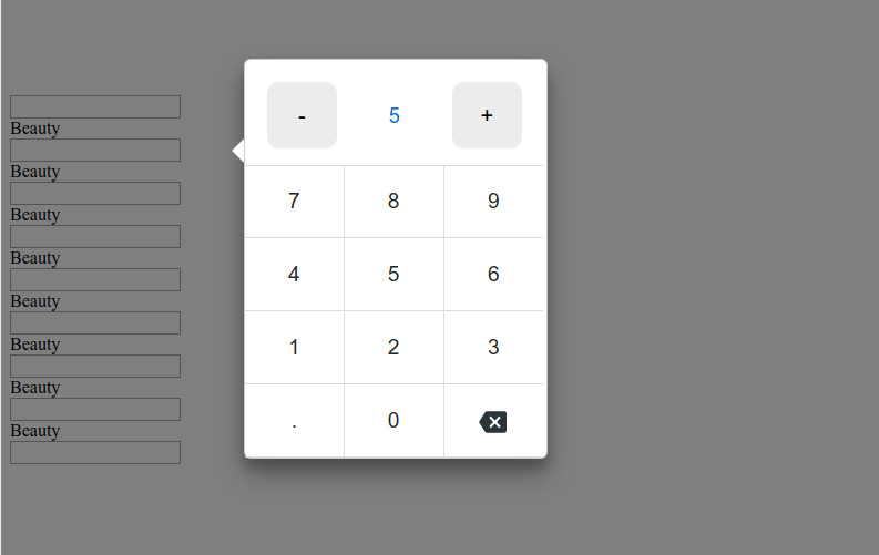
### NumPad.Popover
Input field for numeric value. There are also **PositiveNumber**, **IntegerNumber**, **PositiveIntegerNumber** components with the same properties.
```shell
{
console.log('value', value);
}}
position="centerRight"
arrow="left"
qtyIncrement={2.5}
isDecimal
decimalSeparator="."
max={30}
min={0}
value={10}
>
```
## NumPad Properties
| Property | Type | Default | Description |
| :----------------- | :------------------- | :----------- | :--------------------------------------------------------------------------------------------------------------------------------- |
| `onChange` | `function` | **required** | function called when value change and is valid. |
| `position` | `string` | `flex-end` | Position to the screen. `center`, `flex-start`, `flex-end`, `startBottomLeft`, `startBottomRight`, `startTopLeft`, `startTopRight` |
| `theme` | `string` or `object` | `numpad` | string as the name of the theme or object as custom styles. |
| `value` | `string` or `number` | none | value (default) for the input field. |
| `sync` | `boolean` | false | if true, callbacks calls while typing if the input is valid |
| `min` | `string` | none | min value for validation |
| `max` | `string` | none | max value for validation |
| `arrow` | `string` | none | show arrow `left` or `right` |
| `qtyIncrement` | `number` | none | set quantity Increment |
| `isDecimal` | `boolean` | false | show comma button for decimal number |
| `decimalSeparator` | `string` | `.` | define decimal separator symbol for decimal number |
| `max` | `number` | none | maximum value, if type over, the change will be prevented |
| `min` | `number` | none | minimum value, if type over, the change will be prevented |
## Themes
There is only one theme available for now, in /styles folder, **numpad**.
Any css style is customizable using styled components.
It is possible to override a theme by defining an object with the theme properties:
```shell
const myTheme = {
header: {
primaryColor: '#263238',
secondaryColor: '#f9f9f9',
highlightColor: '#FFC107',
backgroundColor: '#607D8B',
},
body: {
primaryColor: '#263238',
secondaryColor: '#32a5f2',
highlightColor: '#FFC107',
backgroundColor: '#f9f9f9',
},
panel: {
backgroundColor: '#CFD8DC'
}
};
```
## Keyboard support
`0, 1, 2, ... 9`: input number.
`- and .`: input symbol.
`Esc`: close keypad or calendar.
`Enter`: submit value.
## Calendar swipe support
On mobile is possible to switch between months by swipe.
## Demo / Examples
```shell
git clone https://github.com/hungnt167/react-numpad
cd react-numpad/
npm install
npm start
npm run storybook
```
Visit localhost:6006 to see the NumPad components available so far.
### Build
```shell
npm run build
```
A bundle will be created in the dist directory.