# react-native-underline-tabbar
[](https://badge.fury.io/js/react-native-underline-tabbar) [](https://github.com/prettier/prettier)
Custom Tabbar for https://github.com/skv-headless/react-native-scrollable-tab-view.
It consists of some features e.g. scrollable content in tabs. Animations are build on matrix transformations and fully compatible with `Animated` library.
In a new version there was significant improvement of tabbar behaviour.
## Contribution
**Issues** are welcome. Please add a screenshot of bug and code snippet. Quickest way to solve issue is to reproduce it on one of the examples.
**Pull requests** are welcome. If you want to change API or making something big better to create issue and discuss it first. Before submiting PR please run ```eslint .``` Also all eslint fixes are welcome.
Please attach video or gif to PR's and issues it is super helpful.
## Instalation
```
npm install react-native-underline-tabbar --save
Or using Yarn
yarn add react-native-underline-tabbar
```
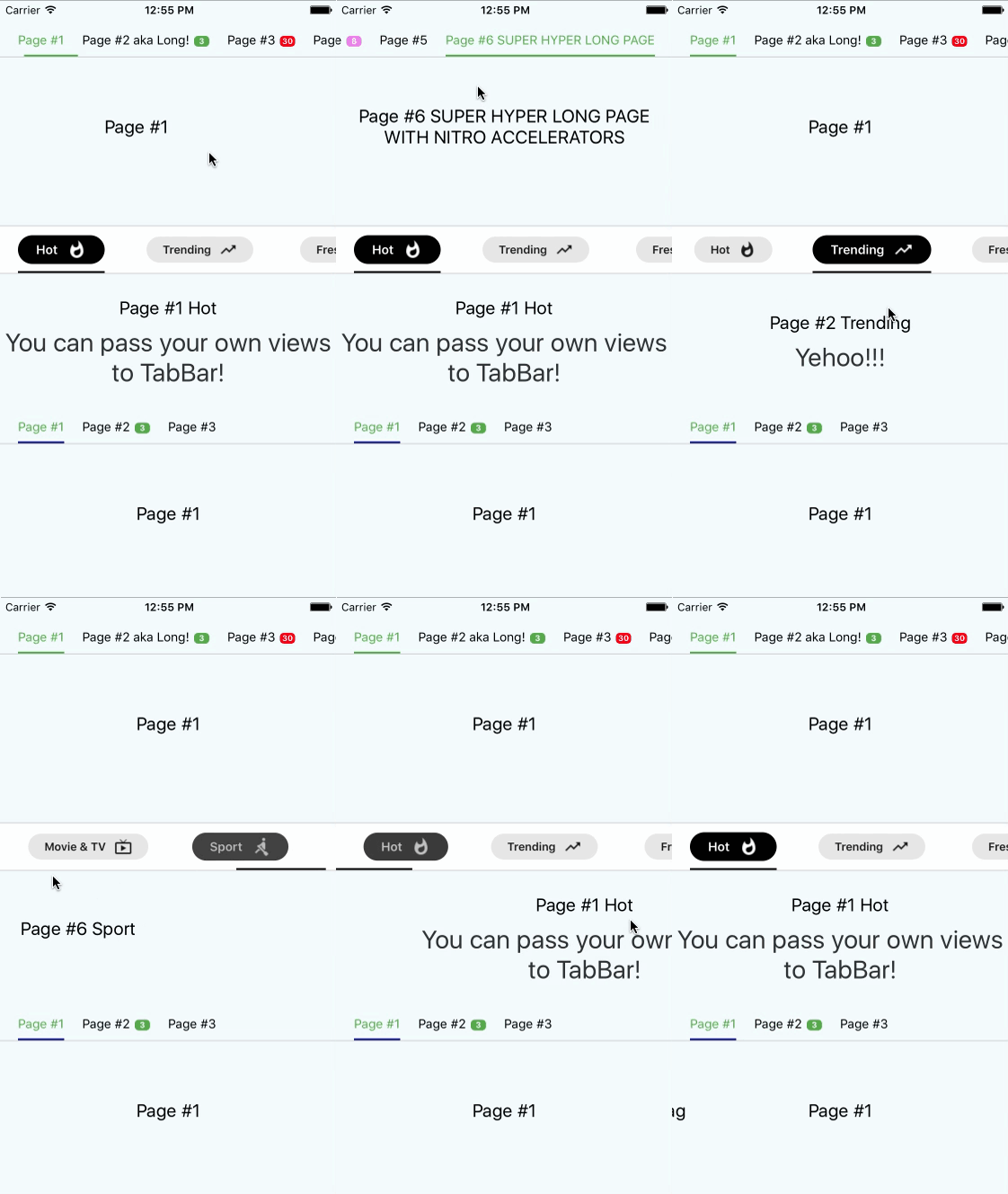
## Showcase
## Documentation
| Property | Type | Default | Description |
|-----------|---------------------|----------|--------------------------------------------|
| `tabs` | ```{ label: string, badge:string, badgeColor?: string, [string]: any}[]``` | `required` | You don't have to pass this prop directly to tabbar. Istead, it's automatically passed from `ScrollableTabView` from `tabLabel` of your page. In defaultTabbar it is used only to pass a label, but we use it to pass there information about badges. Example ```tabLabel={{label: "Page #4", badge: 8, badgeColor: 'violet'}}```. Also you can pass any data you need as it's used as `Map`|
| `underlineColor` | `string` | `"navy"` | Set a color for underline. You can use also `transparent` to hide underline |
| `underlineHeight` | `number` | `2` | Set a height for underline |
| `underlineBottomPosition` | `number` | `0` | Set a bottom for underline |
| `tabBarStyle` | `Object` | `{}` | Set styles to TabBar container |
| `activeTabTextStyle` | `Object` | `{}` | Set styles to text in tabs while tab is active |
| `tabBarTextStyle` | `Object` | `{}` | Set styles to text in tabs |
| `tabBadgeColor` | `string` | `{}` | Set a common color for all badges. To set badgeColor individually use `badgeColor` in `tab` property |
| `tabMargin` | `number` | `20` | Set space between tabs |
| `tabStyles` | ``` { tab?: Object, badgeBubble?: Object, badgeText?: Object }``` | ``` { tab: {}, badgeBubble: {}, badgeText: {} }``` | Set styles for every tab and bubble |
## Simple Usage
```javascript
import React, { Component } from 'react';
import {
AppRegistry,
StyleSheet,
Text,
View
} from 'react-native';
import ScrollableTabView from 'react-native-scrollable-tab-view';
import TabBar from "react-native-underline-tabbar";
const Page = ({label}) => (
{label}
To get started, edit index.ios.js
Press Cmd+R to reload,{'\n'}
Cmd+D or shake for dev menu
);
class example extends Component {
render() {
return (
}>
);
}
}
```
## Advanced usage
```javascript
import React, { Component } from 'react';
import { StyleSheet, Text, View, TouchableOpacity, Animated } from 'react-native';
import ScrollableTabView from 'react-native-scrollable-tab-view';
import TabBar from 'react-native-underline-tabbar';
const styles = StyleSheet.create({
container: {
flex: 1,
justifyContent: 'center',
alignItems: 'center',
backgroundColor: '#F5FCFF',
},
welcome: {
fontSize: 20,
textAlign: 'center',
margin: 10,
},
instructions: {
textAlign: 'center',
color: '#333333',
marginBottom: 5,
fontSize: 28,
},
});
const Page = ({label, text = ''}) => (
{label}
{text}
);
const iconsSet = {
hot: require('./images/ic_whatshot.png'),
trending: require('./images/ic_trending_up.png'),
fresh: require('./images/ic_fiber_new.png'),
funny: require('./images/ic_tag_faces.png'),
movieAndTv: require('./images/ic_live_tv.png'),
sport: require('./images/ic_rowing.png'),
};
const Tab = ({ tab, page, isTabActive, onPressHandler, onTabLayout, styles }) => {
const { label, icon } = tab;
const style = {
marginHorizontal: 20,
paddingVertical: 10,
};
const containerStyle = {
paddingHorizontal: 20,
paddingVertical: 5,
borderRadius: 25,
flexDirection: 'row',
alignItems: 'center',
backgroundColor: styles.backgroundColor,
opacity: styles.opacity,
transform: [{ scale: styles.opacity }],
};
const textStyle = {
color: styles.textColor,
fontWeight: '600',
};
const iconStyle = {
tintColor: styles.textColor,
resizeMode: 'contain',
width: 22,
height: 22,
marginLeft: 10,
};
return (
{label}
);
};
class UnderlineTabBarExample extends Component {
_scrollX = new Animated.Value(0);
// 6 is a quantity of tabs
interpolators = Array.from({ length: 6 }, (_, i) => i).map(idx => ({
scale: this._scrollX.interpolate({
inputRange: [idx - 1, idx, idx + 1],
outputRange: [1, 1.2, 1],
extrapolate: 'clamp',
}),
opacity: this._scrollX.interpolate({
inputRange: [idx - 1, idx, idx + 1],
outputRange: [0.9, 1, 0.9],
extrapolate: 'clamp',
}),
textColor: this._scrollX.interpolate({
inputRange: [idx - 1, idx, idx + 1],
outputRange: ['#000', '#fff', '#000'],
}),
backgroundColor: this._scrollX.interpolate({
inputRange: [idx - 1, idx, idx + 1],
outputRange: ['rgba(0,0,0,0.1)', '#000', 'rgba(0,0,0,0.1)'],
extrapolate: 'clamp',
}),
}));
render() {
return (
(
(
)}
/>
)}
onScroll={(x) => this._scrollX.setValue(x)}
>
);
}
}
```
Notice! In case of using this tabbar we must pass object into tabLabel property. It is necessary to set labels and badges.
## Example
[Example is here](https://github.com/Slowyn/UnderlineTabBarExample)
## Changelog
- **[1.3.6]**
+ Improve recalculation of scroll values
- [1.3.5]
+ Improve underline rerender on tab layout updates
+ Minor code improvments
- [1.3.4]
+ Improve and update `Advanced usage` example
- [1.3.3]
+ Improve initial setup with `initialPage` property
+ Remove `shouldScroll` parameter due to its non-ideal work
- [1.3.2]
+ Update Readme
- [1.3.1]
+ Describe tabStyles with flow
+ Add tab customization in documentation
+ Update Readme
- [1.3.0]
+ Fix an error related to types export
- [1.2.8]
+ Minor fix
- [1.2.7]
+ Types are available for importing
- [1.2.6]
+ Improve offset calculations for tabs which are located in the end of TabBar
+ Now you can pass more than 10 tabs to component
- [1.2.5]
+ Fix bug when `activeTabTextStyle` had lower priority than just `textStyle`
+ Add customization for underline
- [1.2.4]
+ Update descriptions.
- [1.2.3]
+ Fixed bug when user provide less than two tabs.
- [1.2.2]
+ Minor changes
- [1.2.1]
+ Now it's possible to pass your own `renderTab` function (hooray!). It opens many opportunities for customization
+ Type of `Tab` has been changed. Now it's a map where you can pass any data you need to use in your custom Tab view
+ Example has been added
- [1.2.0]
+ Initial setup now depends on `initialPage` prop.
+ Calculating of interpolations now doesn't apply transformations to underline. It prevents flickering when tab has styles which resize it
+ Better manual scrolling performance of TabBar
- [1.1.7]
+ Possibly unnecessary transformations to underline have been removed. It improves behaviour on Android
- [1.1.6]
+ Change hardcoded marginValue on value from props to calculate scroll positions properly
- [1.1.5]
+ Prevent crashing on android devices
- [1.1.4]
+ Interpolation values are calculated only when all mandatory views are measured. It prevents incorrect behaviour of tabs scrolling and underline.
+ Now you can set default colour for badges using `tabBadgeColor` prop
+ Now you can set margins between tabs using `tabMargin` prop