
Typescript material ui collection
[](http://standardjs.com/)
Here you can see a Created by me and some hand picked collection of material components from various ui libraries. The goal is making ui development easy and seamless (Ui/ux itself with material design rules and Coding Experience) For now, components are in a limited number but i'm working on increasing their number to fulfill all ui/ux needed components
Table of contents
* [Installation](#installation)
* [Components and Utils](#components-and-utils)
* [Material Colors](#material-colors)
* [Material Container](#material-container)
* [Material Collapsible Toolbar Container](#material-collapsible-toolbar-container)
* [Material Backdrop](#material-backdrop)
* [Material Vertical Linear](#material-vertical-linear)
* [Material Horizontal Linear](#material-horizontal-linear)
* [Material Card](#material-card)
* [Material Toolbar](#material-toolbar)
* [Material Bottom Tabbar](#material-bottom-tabbar)
* [Material Text Input](#material-text-input)
* [Material Progress](#material-progress)
* [Material Buttons](#material-buttons)
* [Material FAB](#material-fab)
* [Material Checkbox](#material-checkbox)
* [Material Switch](#material-switch)
* [Material Radio Group](#material-radio-group)
Installation
The library is installed and linked by default inside my boilerplate ignite-boilerplate-andross-typescript
If you have an ignite project you can add it by this command :
```
ignite add material-ui
```
You can also install it standalone by below commands :
```
npm install react-native-material-textfield react-native-vector-icons react-native-typescript-material-ui-collection react-native-material-ripple --save
react-native link
```
Recommended react-native version is >0.56
But if you using older versions and not configured typescript on it use below link
https://facebook.github.io/react-native/blog/2018/05/07/using-typescript-with-react-native
Components and Utils
### Material Colors
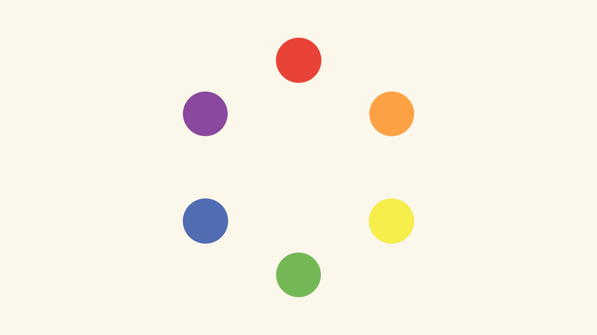
I just converted www.materialui.co/colors colors to an object for easier use of these colors
#### Usage :
```typescript jsx
import {MaterialColors} from 'react-native-typescript-material-ui-collection';
MaterialColors.colorName.CcolorTone
eg:
MaterialColors.deepPurple.C400 //returns: #7E57C2 as string
```
### Material Container
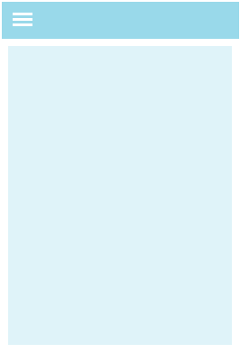
This component is a full width/height view for container view you can use it for more ui/ux code readability
#### Usage :
```typescript jsx
import {MaterialContainer} from 'react-native-typescript-material-ui-collection';
}
/>}> // this view will render at top of the view if you set isRoot true
```
#### Props
```typescript jsx
isRoot: boolean // if you set this prop true , your component will have no padding and you can render a toolbar view at top of it the default padding is 16
toolbar:React.ReactNode // this view will render at top of the view if you set isRoot true
```
### Material Collapsible Toolbar Container
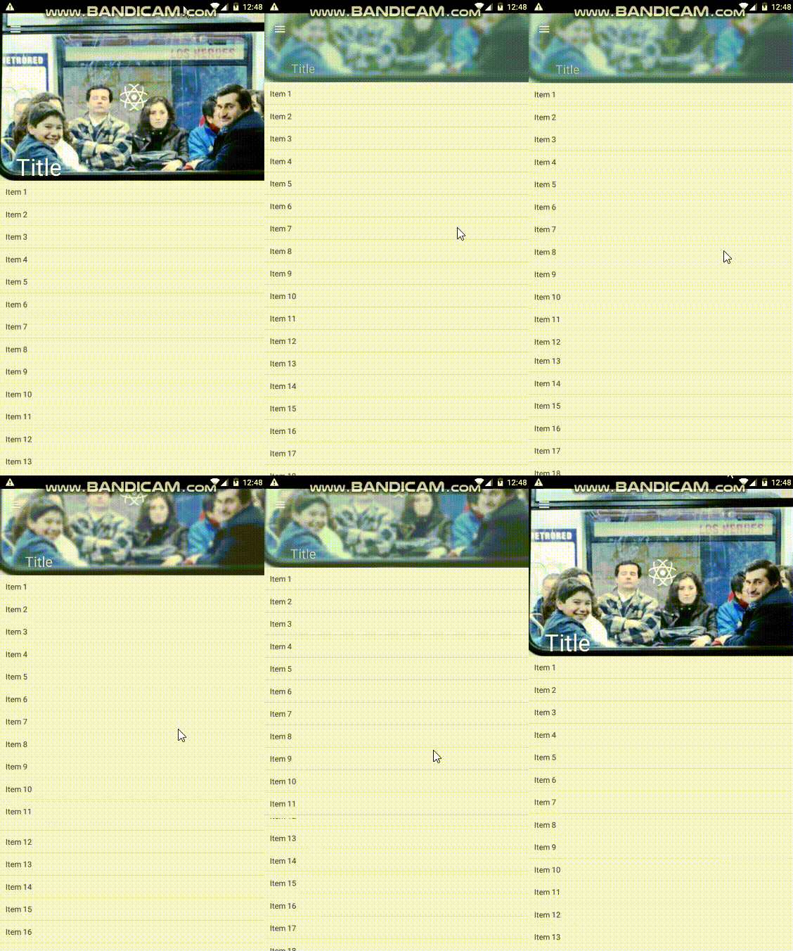
This is a pure js material collapsible toolbar container
#### Usage :
The exact code of above gif
```typescript jsx
import * as React from 'react'
import {Component} from 'react';
import {Image, Text, View} from 'react-native'
import {MaterialCollapsibleToolbarContainer} from 'react-native-typescript-material-ui-collection'
export default class LaunchScreen extends Component {
componentWillMount() {
}
renderContent = () => (
{new Array(40).fill().map((_, i) => (
{`Item ${i + 1}`}
))}
);
renderCollapsedToolbarContent = () => ;
render() {
return (
console.log('onlefticonpress')}
title="Title"
// toolBarHeight={300}
/>
);
}
}
```
#### Props :
```typescript jsx
collapsedNavBarBackgroundColor?: string,
imageSource?: string,
onContentScroll?(): void,
renderContent?(): React.ReactNode,
renderCollapsedToolbarContent?():React.ReactNode, // this component will be rendered on the toolbar
toolBarHeight?: number,
translucentStatusBar?: boolean,
textColor?: string,
leftButtonIcon?: string,
onLeftIconPress?(): void,
rightButtonIcon?: string,
onRightIconPress?(): void
```
### Material Backdrop
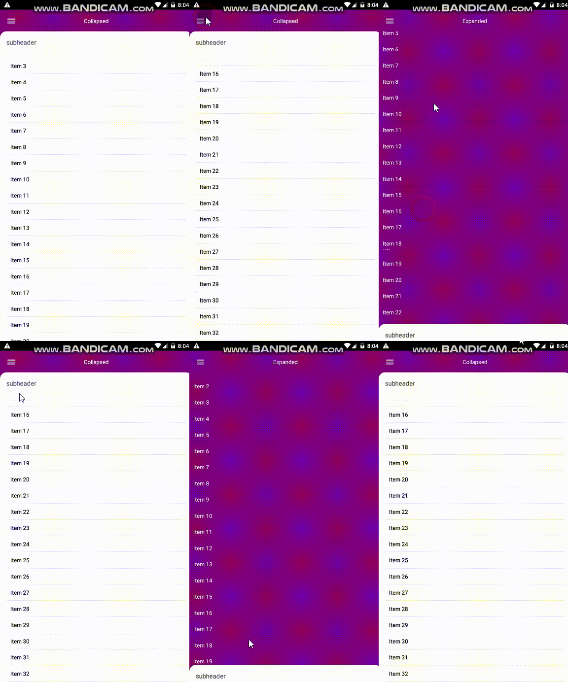
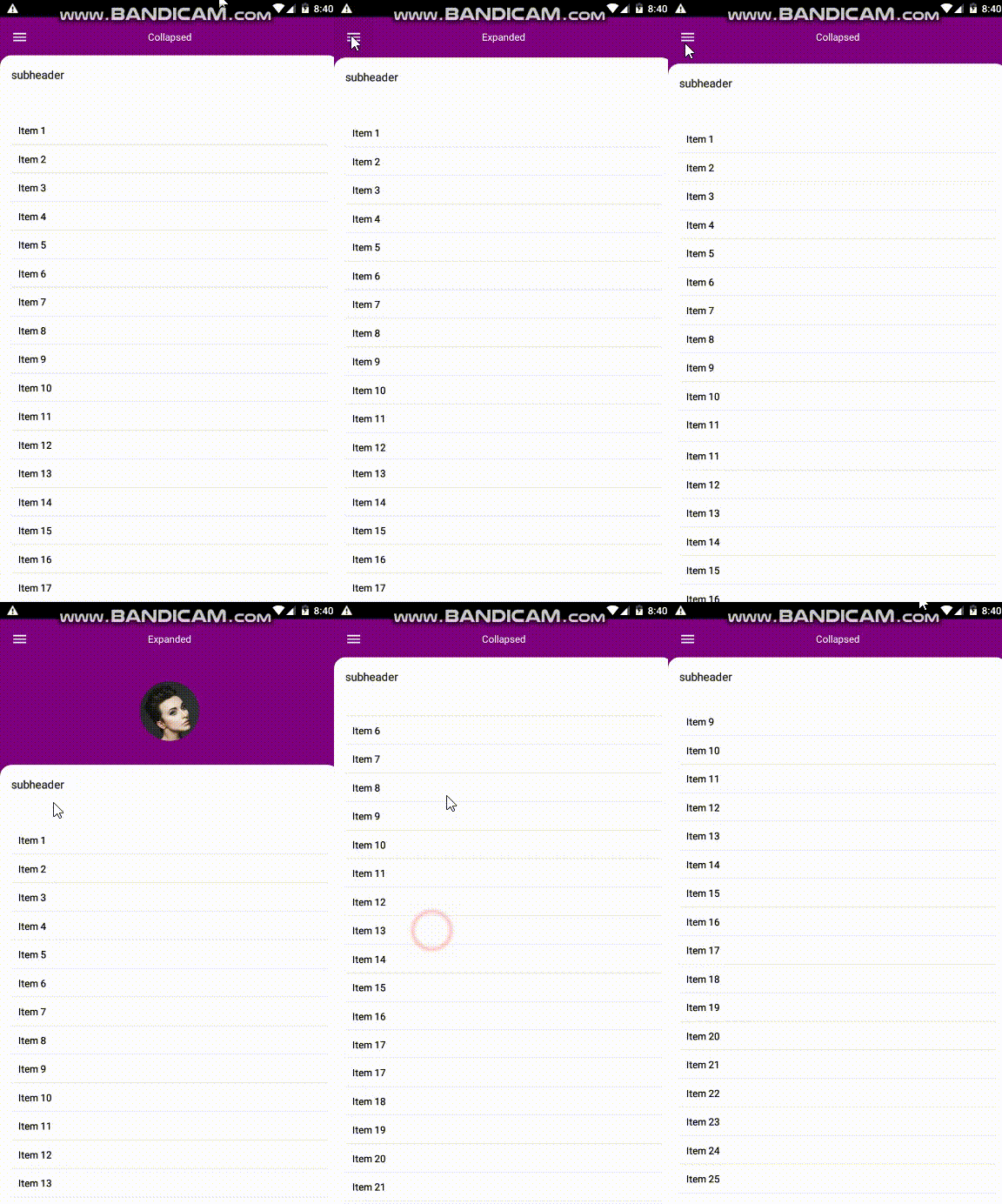
I tried to create this component using material.io guidelines in this link
#### Usage :
```typescript jsx
import * as React from 'react'
import {Component} from 'react';
import {connect} from 'react-redux'
import {MaterialBackdrop} from "react-native-typescript-material-ui-collection";
import {Image, Text, View} from "react-native";
class ScreenName extends Component {
constructor(props) {
super(props);
this.state = {isExpanded: false}
}
render() {
return (
this.renderRevealComponent()}
leftButtonIcon='menu'
expandedTitle='Expanded'
collapsedTitle='Collapsed'
content={()=>this.renderContent('black')}
textColor='white'
subHeaderText='subheader'
backdropBackgroundColor='purple'
contentBackgroundColor='white'
subheaderTextColor='#212121'
/>
)
}
renderRevealComponent=()=>
renderContent=(color)=>
{new Array(40).fill().map((_, i) => (
{`Item ${i + 1}`}
))}
}
```
#### Props :
```typescript jsx
revealComponent?(): React.ReactNode,
backdropBackgroundColor?: string,
leftButtonIcon?: string, // an icon name from https://materialdesignicons.com (this component using react-native-vector icons inside)
expandedTitle?: string,
collapsedTitle?: string,
content?(): React.ReactNode,
textColor?: string,
subHeaderText?: string,
horizontalContent?: boolean,
onSubheaderClick?(): void,
onLeftButtonClick?(): void,
onRightButtonClick?(): void,
contentBackgroundColor?: string,
subheaderTextColor?: string,
onExpand?(): void,
onCollapse?(): void,
rightButtonIcon?: string // an icon name from https://materialdesignicons.com (this component using react-native-vector icons inside)
// if you give it an icon name icon will be rendered top right of backdrop and you can use it as you want
```
### Material Vertical Linear
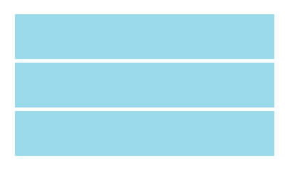
this component is a view with default column direction it can be used for better readability of jsx ui code
#### Usage :
```typescript jsx
import {MaterialHorizontalLinear} from 'react-native-typescript-material-ui-collection';
```
### Material Horizontal Linear
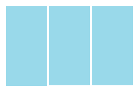
this component is a view with default row direction it can be used for better readability of jsx ui code
#### Usage :
```typescript jsx
import {MaterialVerticalLinear} from 'react-native-typescript-material-ui-collection';
```
### Material Card
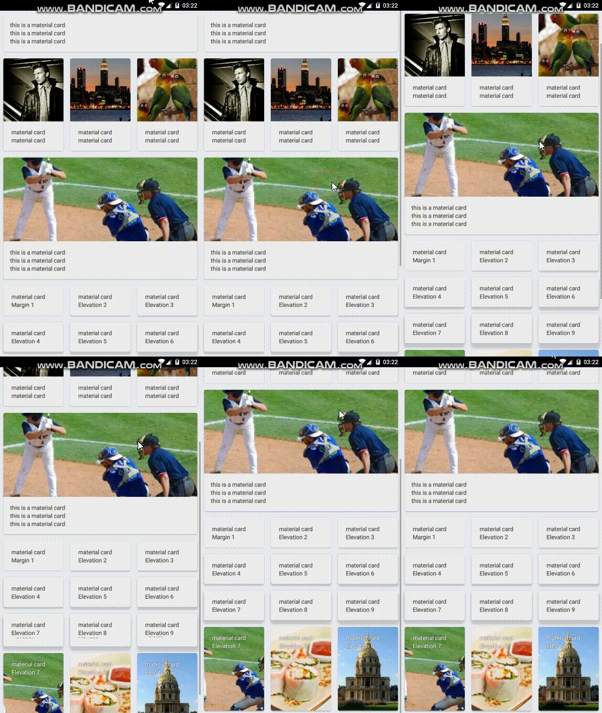
A card component created using material.io guidelines , Also CardContent Component is inside this is actually a view with 16dp padding
#### Usage :
Above gif's code (just important things)
```typescript jsx
//import
import {MaterialCard, MaterialCardContent} from 'react-native-typescript-material-ui-collection';
```
```typescript jsx
//with image header
}>
material card
material card
```
```typescript jsx
//setting elevation
material card
Elevation 3
```
```typescript jsx
//minimal usage
this is a material card
this is a material card
this is a material card
```
```typescript jsx
//with background image
material card
Elevation 7
```
#### Props
```typescript jsx
elevation?: number,
margin?:number,
header?(): React.ReactNode,
style?:ViewStyle,
backgroundImageSource?: ImageSourcePropType,
backgroundColor?:string
```
#### Default Props
```typescript jsx
elevation:2,
margin:8,
backgroundColor:'#eeeeee'
```
### Material Toolbar
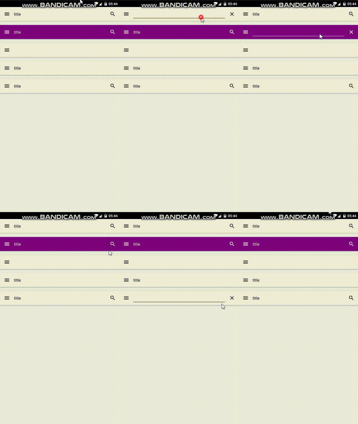
A toolbar designed based on material.io guidelines
And
MaterialToolbarContent you can use it for some content on your toolbar , you can also use your custom component
Can be used by [Material Container](#material-container)
#### Usage
Import :
```typescript jsx
import {MaterialToolbar, MaterialToolbarContent} from 'react-native-typescript-material-ui-collection';
```
Use:
```typescript jsx
}
/>
```
```typescript jsx
}
/>
```
```typescript jsx
// Minimal
```
```typescript jsx
}
/>
```
#### Props
```typescript jsx
MaterialToolbarProps {
color?: string,
onLeftIconPress?():void,
onRightIconPress?():void,
content?():ReactNode
iconsColor?:string,
leftIcon?:string, // one of https://materialdesignicons.com/ icons
rightIcon?:string // one of https://materialdesignicons.com/ icons
}
MaterialToolbarContentProps {
color?: string,
font?: string,
text?: string,
haveTypeMode?: boolean,
typeModeIcon?:string, // one of https://materialdesignicons.com/ icons
onChangeText?(text:string),
onTypeModePress?(): void,
}
```
#### Default Props
```typescript jsx
//Material Toolbar Content
color: '#212121',
typeModeIcon:'magnify',
onTypeModePress: () => {
},
onChangeText:()=>{}
//Material Toolbar
color: '#eeeeee',
onLeftIconPress:()=>{},
onRightIconPress:()=>{},
iconsColor:'#212121'
```
### Material Bottom Tabbar
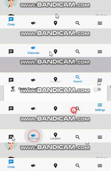
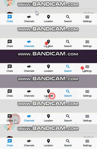
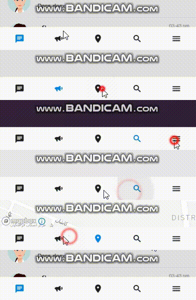
A material tab bar designed and created based on material.io instructions, tested and developed on react-navigation version 3.0.0
#### Usage
```typescript jsx
import {createBottomTabNavigator,createAppContainer} from 'react-navigation';
import MaterialBottomTabbar from '../../Components/MaterialBottomTabbar';
// A bunch of other imports
const commonNavigationOptions = ({navigation}) => ({
header: null,
title: navigation.state.routeName,
});
const ChatsRouteOptions = {
screen: Tab1,
navigationOptions: commonNavigationOptions,
};
const SearchRouteOptions = {
screen: Tab2,
navigationOptions: commonNavigationOptions,
};
const ChannelsRouteOptions = {
screen: Tab3,
navigationOptions: commonNavigationOptions,
};
const LocationRouteOptions = {
screen: Tab4,
navigationOptions: commonNavigationOptions,
};
const SettingsRouteOptions = {
screen: Tab5,
navigationOptions: commonNavigationOptions,
};
// different routes for all, active and completed todos
export default (props) => React.createElement(
createAppContainer(createBottomTabNavigator(
{
[I18n.t('Tab1')]: ChatsRouteOptions,
[I18n.t('Tab2')]: ChannelsRouteOptions,
[I18n.t('Tab3')]: LocationRouteOptions,
[I18n.t('Tab4')]: SearchRouteOptions,
[I18n.t('Tab5')]: SettingsRouteOptions
},
{
tabBarComponent:MaterialBottomTabbar, // here you can set this component
tabBarPosition: 'bottom',
tabBarOptions:{ // here are main settings of this component
animated:true,
isRtl:props.isRtl,
fontSize:12,
noLabel:false,
iconName:(key)=>iconChooser(key),
fontFamily: Fonts.type.base,
defaultColor:props.colorScheme.fullToneText,
selectedColor:primaryColor,
style: {
backgroundColor: props.colorScheme.tabBarBackground
},
},
initialRouteName: I18n.t('chats')
},
))
);
function iconChooser(key) {
let iconName;
switch (key) {
case I18n.t('chats'):
iconName = 'message-text'; // icon names from https://materialdesignicons.com/ website
break;
case I18n.t('search'):
iconName = 'magnify';
break;
case I18n.t('channels'):
iconName = 'bullhorn';
break;
case I18n.t('location'):
iconName = 'map-marker';
break;
case I18n.t('settings'):
iconName = 'menu'
}
return iconName;
}
```
### Material Text Input

this component is basically
react-native-material-textfield
i just added it's types to typescript and rtl support (for it's label)
#### Usage :
```typescript jsx
import {MaterialTextInput} from 'react-native-typescript-material-ui-collection';
```
### Material Progress
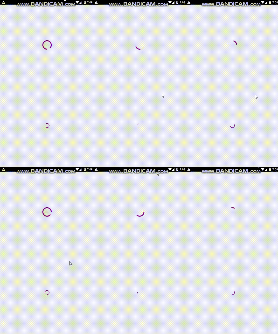
I used react-native-indicators code to do this with a few changes and turning the used code to typescript
I have also used this component for progress inside below button components
#### Usage:
this is exactly the code of above gif
```typescript jsx
import * as React from 'react'
import {Component} from 'react';
import { View} from 'react-native'
import styles from './Styles/LaunchScreenStyles'
import {MaterialProgress} from 'react-native-typescript-material-ui-collection';
export default class LaunchScreen extends Component {
render() {
return (
)
}
}
```
#### Props:
```typescript jsx
color:string,//just the color
small?:boolean// using this will render small progress i'ts good for using inside buttons or etc.
```
### Material Buttons
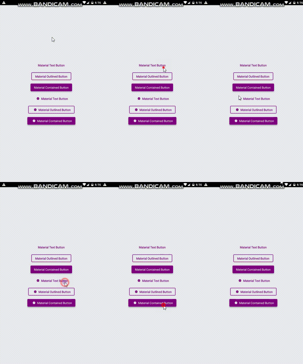
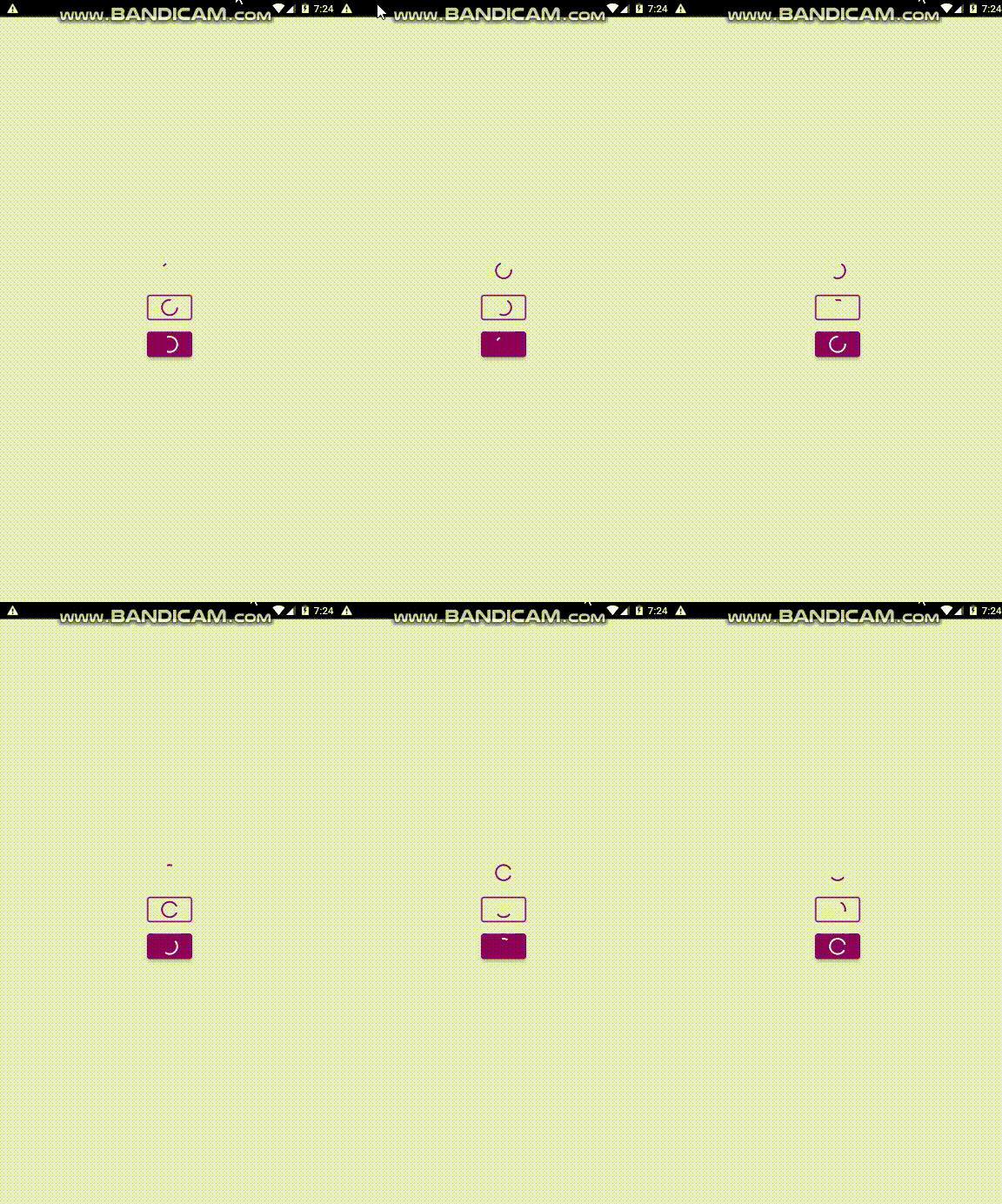
I Made these three buttons exactly based on material.io design guidelines
#### Usage:
this is exactly the code of above gif
```typescript jsx
import * as React from 'react'
import {Component} from 'react';
import { View} from 'react-native'
import styles from './Styles/LaunchScreenStyles'
import {MaterialTextButton,
MaterialOutlinedButton,
MaterialContainedButton} from 'react-native-typescript-material-ui-collection';
export default class LaunchScreen extends Component {
render() {
return (
{
console.log("pressed")
}}
text="Material Text Button"
textColor="purple"
margin={8}
/>
{
console.log("pressed")
}}
text="Material Outlined Button"
textColor="purple"
margin={8}
/>
{
console.log("pressed")
}}
color='purple'
text="Material Contained Button"
textColor="white"
margin={8}
/>
{
console.log("pressed")
}}
text="Material Text Button"
textColor="purple"
margin={8}
iconName="check-circle"
/>
{
console.log("pressed")
}}
text="Material Outlined Button"
textColor="purple"
margin={8}
iconName="check-circle"
/>
{
console.log("pressed")
}}
color='purple'
text="Material Contained Button"
textColor="white"
margin={8}
iconName="check-circle"
/>
)
}
}
```
#### Props:
##### MaterialTextButton:
```typescript jsx
text: string,
icon?: React.ReactNode, // you can use your custom icon component , whatever, the button have react-native-vector-icons inside
margin?:number,
textColor?: string,
textFont?: string,
iconName?:string, // if you set the material icon name from https://materialdesignicons.com/ the icon will displayed
onPress?():void,
progress:boolean // if you set this true the button will render a circular progressbar inside like above gifs
```
##### MaterialOutlinedButton:
```typescript jsx
text: string,
icon?: React.ReactNode, // you can use your custom icon component , whatever, the button have react-native-vector-icons inside
margin?:number,
textColor?: string,
textFont?: string,
onPress?():void,
iconName?:string, // if you set the material icon name from https://materialdesignicons.com/ the icon will displayed
progress:boolean // if you set this true the button will render a circular progressbar inside like above gifs
```
##### MaterialContainedButton:
```typescript jsx
text: string,
icon?: React.ReactNode, // you can use your custom icon component , whatever, the button have react-native-vector-icons inside
margin?:number,
color?:string,
textColor?: string,
textFont?: string,
onPress?():void,
iconName?:string,// if you set the material icon name from https://materialdesignicons.com/ the icon will displayed
progress:boolean // if you set this true the button will render a circular progressbar inside like above gifs
```
### Material FAB
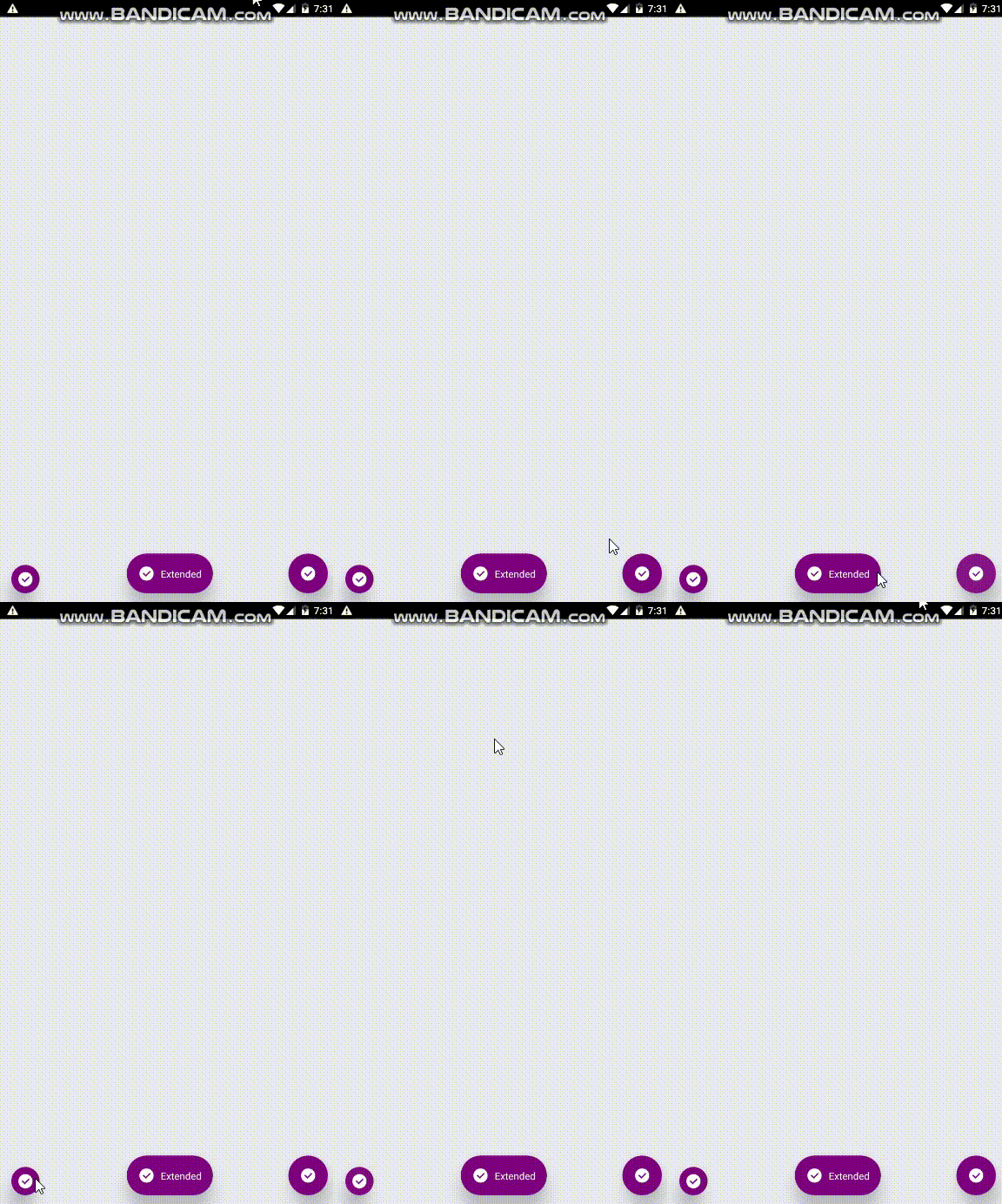
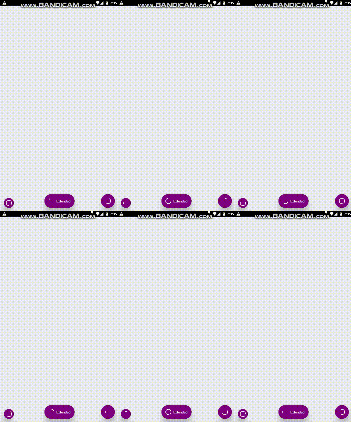
I Made these two FABs exactly based on material.io design guidelines
#### Usage :
this is exactly the code of above gif
```typescript jsx
import * as React from 'react'
import {Component} from 'react';
import { View} from 'react-native'
import styles from './Styles/LaunchScreenStyles'
import {MaterialFab, MaterialExtendedFab} from 'react-native-typescript-material-ui-collection';
export default class LaunchScreen extends Component {
render() {
return (
{console.log('onpress')}}
position="bottomLeft"
iconColor="white"
iconName='check-circle' color="purple"
/>
{console.log('onpress')}}
position="bottomRight"
iconColor="white"
iconName='check-circle'
color="purple"
/>
{console.log('onpress')}}
text="Extended"
position="bottom"
iconColor="white"
iconName='check-circle'
color="purple"
/>
)
}
}
```
#### Props:
##### MaterialFab:
```typescript jsx
icon?: React.ReactNode, // you can use your custom icon component , whatever, the button have react-native-vector-icons inside
color?:string,
iconColor?: string,
onPress?():void,
iconName:string,// if you set the material icon name from https://materialdesignicons.com/ the icon will displayed
mini?:boolean,
position:string,// one of {'bottomLeft','topRight','topLeft','bottomRight'}
progress:boolean // if you set this true the button will render a circular progressbar inside like above gifs
```
##### MaterialExtendedFab:
```typescript jsx
icon?: React.ReactNode, // you can use your custom icon component , whatever, the button have react-native-vector-icons inside
color?:string,
iconColor?: string,
onPress?():void,
iconName:string,// if you set the material icon name from https://materialdesignicons.com/ the icon will displayed
textFont?:string,
text:string,
position:string,// one of {'top','bottom'}
progress:boolean // if you set this true the button will render a circular progressbar inside like above gifs
```
### Material Checkbox
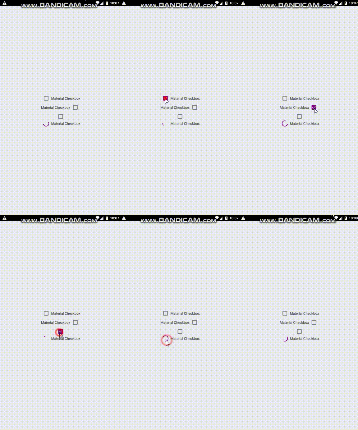
I Made this checkbox component exactly based on material.io design guidelines
#### Usage :
this is exactly the code of above gif
```typescript jsx
import * as React from 'react'
import {Component} from 'react';
import {View} from 'react-native'
import styles from './Styles/LaunchScreenStyles'
import {MaterialCheckbox} from "react-native-typescript-material-ui-collection";
export default class LaunchScreen extends Component {
render() {
return (
{
console.log(isChecked)
}}
/>
{
console.log(isChecked)
}}
/>
{
console.log(isChecked)
}}
/>
{
console.log(isChecked)
}}
progress
/>
)
}
}
```
#### Props:
```typescript jsx
text?: string,
isChecked?: boolean,
textFont?: string,
onCheckedChange?(isChecked: boolean): void,
checkBoxColor?: string,
textColor?: string,
rtl?: boolean,
progress?: boolean
```
### Material Switch
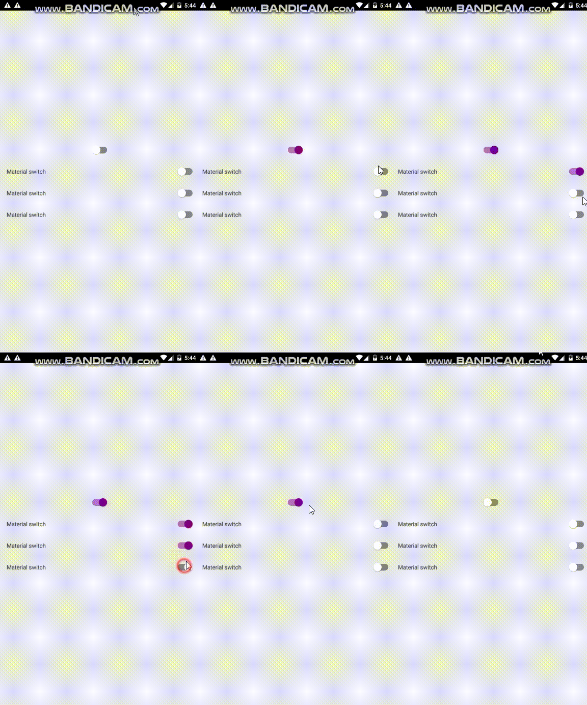
I Made this switch component exactly based on material.io design guidelines
#### Usage
this is exactly the code of above gif
```typescript jsx
import * as React from 'react'
import { View } from 'react-native'
import MaterialSwitch from "react-native-typescript-material-ui-collection";
// Styles
import styles from './Styles/LaunchScreenStyles'
interface LaunchScreenComponentProps {}
export default class LaunchScreen extends React.Component {
render () {
return (
)
}
}
```
#### Props:
```typescript jsx
textFont?:string,
textColor?:string,
text?:string,
color?:string
onValueChanged?(value:boolean):void
```
### Material Radio Group
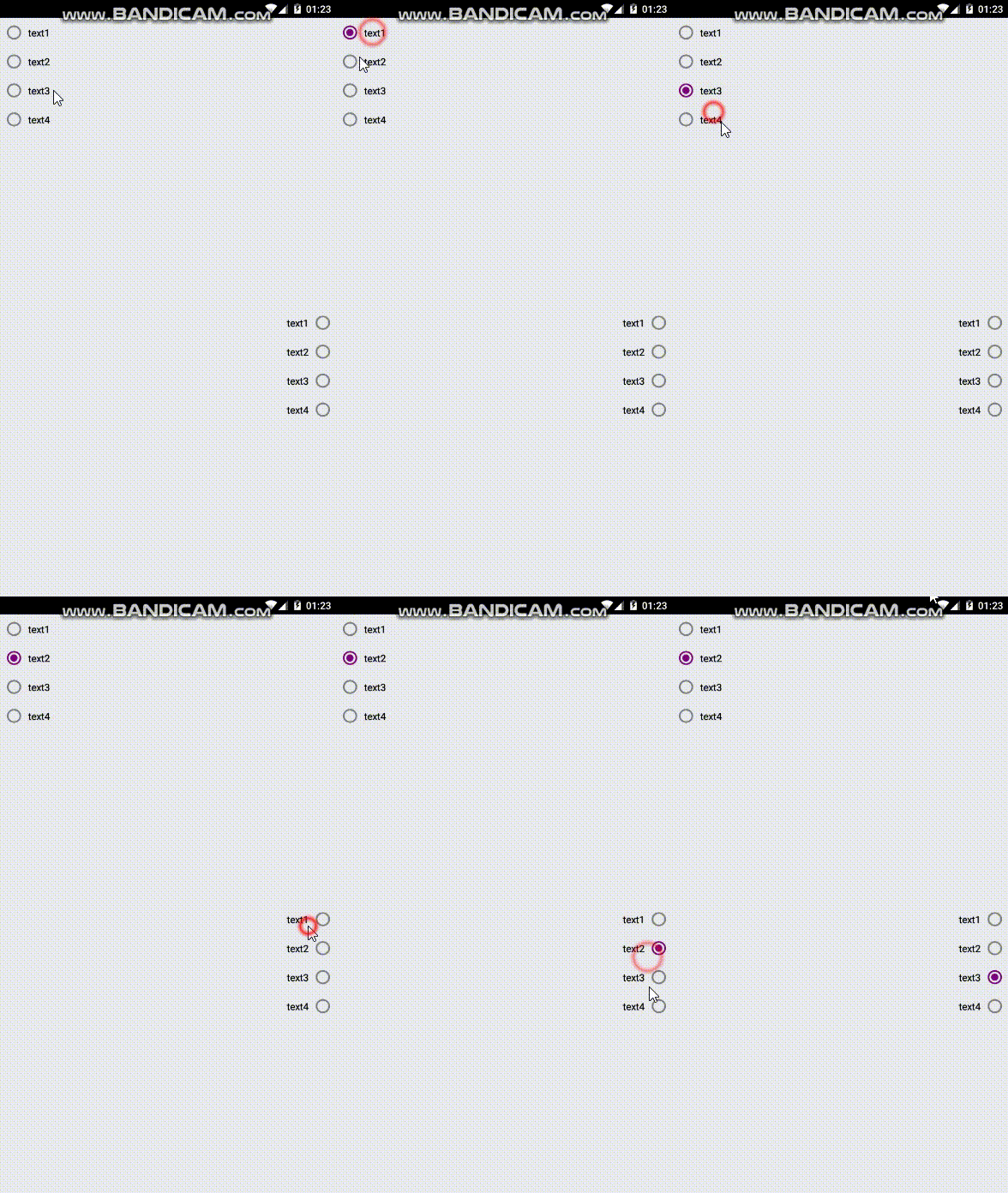
I Made this radio group component exactly based on material.io design guidelines
#### Usage
this is exactly the code of above gif
```typescript jsx
import * as React from 'react'
import { View } from 'react-native'
import MaterialSwitch from "react-native-typescript-material-ui-collection";
// Styles
import styles from './Styles/LaunchScreenStyles'
interface LaunchScreenComponentProps {}
export default class LaunchScreen extends React.Component {
render () {
return (
)
}
}
```
#### Props:
```typescript jsx
data: any, // just be sure you have text:string field in datarows
color: string,
textFont?: string,
textColor?: string,
isRtl?:boolean,
onItemPress?(item, index): void
```