# react-native-text-field
`react-native-text-field` is a text field that wraps React Native TextInput with customizable field title and placeholder, **masked text input**, and **text validation**.
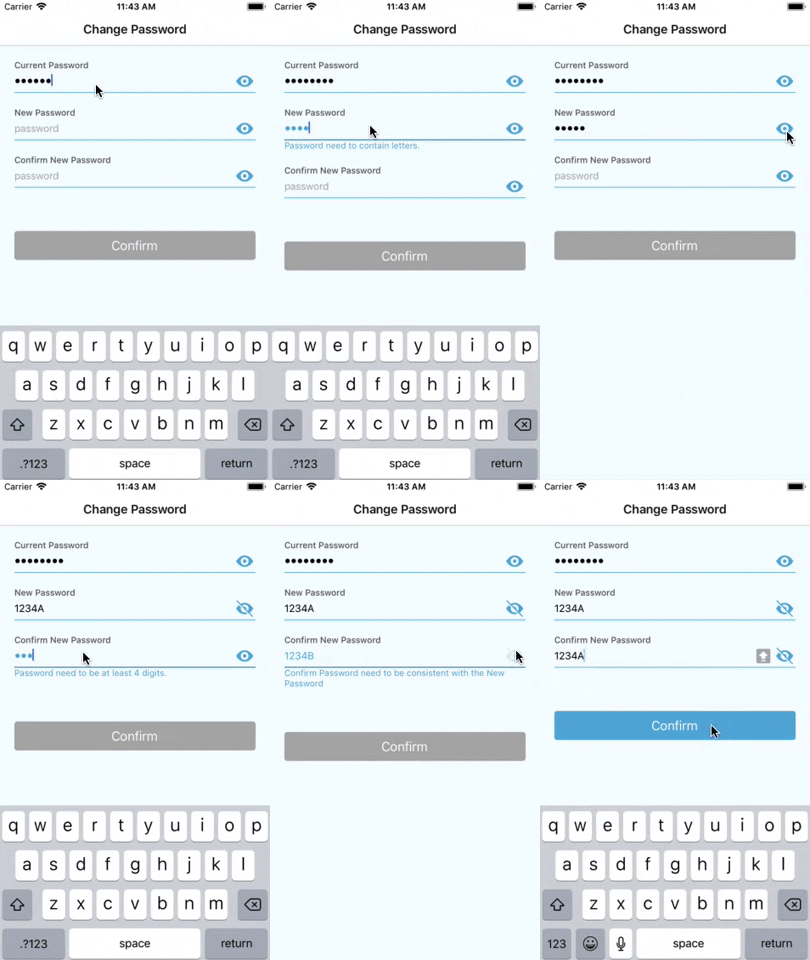
For the text validation, the `react-native-text-field` provides `onValidate` props to allow developers customize validation methods. Before version 3.0, `react-native-text-field` gives a general error to indicate the content in the text field is unexpected. However, for **versions after 3.0**, developers can provide **multiple** different **error messages** for **various cases** that could happen during the validation process.
For example, a Password field might need to be **longer than 4 digits**, and **contains letters** at the same time.
 ## Installation
### Install Dependencies
`npm install react-native-masked-text`
### Install react-native-text-field
`npm install react-native-text-field`
## Basic Usage
```
import TextField from 'react-native-text-field';
render() {
return (
this.onInputChange(text)}
/>
)
}
onInputChange(text) {
console.log(text)
}
```
| Props | Description |
|-------------| -------------|
| title | Title of the text field.|
| placeholder | Placeholder of the text field.|
| onInputChange | Same function as `onChangeText` of React Native TextInput. Callback that is called when the text field has any text changes. Changed text is passed as a single string argument to the callback handler.|
## Text Validation
```
render() {
return(
this.onInputChange({ password: text })
}
onValidate={text => this.validatePassword(text)}
invalidHint="Password is not valid."
validateAsTyping={true}
isSecured={true}
isRequired={true}
isRequiredHint="Password cannot be empty."
/>
)
}
validatePassword = (password) => {
if (!password.length >= 4) {
// Return error message as string if the text is not valid.
return 'Password need to be at least 4 digits.'
}
if (!/[a-zA-Z]/.test(password)) {
// Return a different error message if the text doesn't match certain criteria.
return 'Password need to contain letters.'
}
return true // Return 'true' to indicate the text is valid.
}
```
| Props | Description |
|-------------| -------------|
| onValidate | Optional. Validation handler method that will be called when the text in the text field changes. Return `true` to indicate the text is valid. Return error message string to indicate the text doesn't match certain criteria. Return `false` to use the general error message, which is the value of `invalidHint` props. **If this props is omitted, the validation won't be triggered.** |
| invalidHint | Optional. General error message if the text validation fails. The default value of this props is 'Your input is not valid.' |
| validateAsTyping | Optional. If you need to validate the text content whenever the text changes, set this to true. By default, the validation will only be triggered when the user leaves the text field. |
| isSecured | Optional. Display text in the text field as `*`. The text field will have a switchable icon to change between visible and invisible.|
| isRequired | Optional. If a field is marked as required, the text field automatically check whether or not the content is empty, and display error message. The default value is false.|
| isRequiredHint | Optional. The error message string when a text field is marked as required, but the content is empty. By default, the message is 'Field is required.' |
## Style Customization
Samples of text fields that were made with `react-native-text-field`.

```
render() {
return(
this.onInputChange(text)}
onValidate={(text) => this.validatePassword(text)}
isSecured={true}
cellHeight={40}
isMultiline={false}
width={300}
selectionColor={'#5D95EF'}
autoCapitalize={'none'}
autoCorrect={false}
style={{ marginTop: 20, marginBottom: 100 }}
titleStyle={{ color: '#5D95EF' }}
textFieldStyle={{ borderColor: '#BCC4D1' }}
textInputStyle={{ color: '#000000' }
placeholderStyle={{ color: '#BCC4D1' }}
invalidTextFieldStyle={{ borderColor: '#EF6C40' }}
invalidTextInputStyle={{ color: '#FF0000' }}
invalidHintStyle=={{ fontSize: 10 }}
visibilityIconTintColor={"#00ff00"}
visibilityIconSource={require('@Images/defaultIcon.png') }
invisibilityIconSource={require('@Images/defaultIcon.png') }
/>
)
}
```
| Props | Description |
|-------------| -------------|
| cellHeight | Optional. Height of the text input. |
| width | Optional. Width of the text field. By default, the `style` props will determine how the text field looks like. When `width` is specifically assigned, the value of `width` take advantage of the 'width' in `style`. |
| autoCapitalize | Optional. 'none'/'sentences'/'words'/'characters'. The default value is 'none'. |
| autoCorrect | Optional. true/false. By default, the value is false. |
| selectorColor | Optional. Color of the selector in the text input. |
| style | Optional. Style of the whole text field container. |
| titleStyle | Optional. Style of the text field title. |
| textFieldStyle | Optional. Style of the text field. For example, making it as a round cornered box or a single underline slot. |
| textInputStyle | Optional. Style of the text in the text field.|
| placeholderStyle | Optional. Style of the placeholder. |
| invalidTextFieldStyle | Optional. Style of the text field when the validation fails. For example, highlight the text field border as red when there's error in the content of the text field. |
| invalidTextInputStyle | Optional. Style of invalid text style in the text field. By defaut, it's using the same value of `textInputStyle`|
| invalidHintStyle | Optional. Style of the error message which will be displayed under the text field if there are any errors. |
| visibilityIconTintColor | Optional. The tint color of the visible/invisible icon for secured text field. By default, tint color is null.|
| visibilityIconSource | Optional. Image source of the icon to indicate visiblity for secured text field. |
| invisibilityIconSource | Optional. Image source of the icon to indicate visiblity for secured text field. |
## Mask Input
### Use Predefined Mask
`react-native-text-field` integrated `react-native-masked-text`for masked text, there for `react-native-text-field` supports almost all types of masks that `react-native-masked-text` provided. Check [https://www.npmjs.com/package/react-native-masked-text](https://www.npmjs.com/package/react-native-masked-text) for more details about how to defined your `maskOptions` object.
| Predefined Mask Type |
|-------------|
| 'cel-phone' |
| 'credit-card' |
| 'datetime' |
| 'money' |
| 'only-numbers' |
| 'zip-code' |
To use `react-native-masked-text` predefined masks, assign desired predefeind mask type to `textType` props. Each predefiend mask type has default maskOptions object, which can be overwritten via passing `maskOptions` props into the Text Field instance.
```
this.onInputChange(text)}
textType={'money'}
maskOptions={{
unit: '€',
separator: '.',
delimiter: ','
}}
/>
```
| Props | Description |
|-------------| -------------|
| textType | Optional. Type of predefined mask that include 'cel-phone', 'credit-card', 'datetime', 'money', 'only-numbers', 'zip-code', etc.|
| maskOptions | Optional. Each predefined type has default `maskOptions` object, which can be overwritten via passing `maskOptions` props into the Text Field instance.
### Customize Mask
Besides using predefined masks, `react-native-masked-text` provide us the capability to customize masks. `react-native-text-field` support customizing masks as well.
To customize mask, assign 'custom' to props `textType`, and pass **mask string** into `customMask` props. Mask string is a string that contains '9', 'A', 'S' and '\*', where '9' represents digit, 'A' represents alpha, 'S' represents alphanumeric, and '*' represents all except white space.
```
this.onInputChange(text)}
textType={'custom'}
customMask={'(999)-999-9999'}
/>
```
In the example above, the text field is masking a phone number, for example,'7788550000' as '(778)-855-0000'.
## Migrating from 2.x to 3.x
In 2.x, the `react-native-text-field` is validating the text field content as per typing. In 3.x, `validateAsTyping` props were added with default value false. If you need to keep validating your text field whenever the text changes, please manually assign `validateAsTyping` to `true`. Otherwise, the validation will be executed **once only** when user leaves the text field.
If you are using `width` props of `react-native-text-field`, you might be just well without changing anything since the `width` takes higher priority than `width` in `style` props. If you notice that your horizontal margin looks not correct, please use `marginLeft` and `marginRight` in `style` props to adjust the margin to the left and right edge of the screen.
## Installation
### Install Dependencies
`npm install react-native-masked-text`
### Install react-native-text-field
`npm install react-native-text-field`
## Basic Usage
```
import TextField from 'react-native-text-field';
render() {
return (
this.onInputChange(text)}
/>
)
}
onInputChange(text) {
console.log(text)
}
```
| Props | Description |
|-------------| -------------|
| title | Title of the text field.|
| placeholder | Placeholder of the text field.|
| onInputChange | Same function as `onChangeText` of React Native TextInput. Callback that is called when the text field has any text changes. Changed text is passed as a single string argument to the callback handler.|
## Text Validation
```
render() {
return(
this.onInputChange({ password: text })
}
onValidate={text => this.validatePassword(text)}
invalidHint="Password is not valid."
validateAsTyping={true}
isSecured={true}
isRequired={true}
isRequiredHint="Password cannot be empty."
/>
)
}
validatePassword = (password) => {
if (!password.length >= 4) {
// Return error message as string if the text is not valid.
return 'Password need to be at least 4 digits.'
}
if (!/[a-zA-Z]/.test(password)) {
// Return a different error message if the text doesn't match certain criteria.
return 'Password need to contain letters.'
}
return true // Return 'true' to indicate the text is valid.
}
```
| Props | Description |
|-------------| -------------|
| onValidate | Optional. Validation handler method that will be called when the text in the text field changes. Return `true` to indicate the text is valid. Return error message string to indicate the text doesn't match certain criteria. Return `false` to use the general error message, which is the value of `invalidHint` props. **If this props is omitted, the validation won't be triggered.** |
| invalidHint | Optional. General error message if the text validation fails. The default value of this props is 'Your input is not valid.' |
| validateAsTyping | Optional. If you need to validate the text content whenever the text changes, set this to true. By default, the validation will only be triggered when the user leaves the text field. |
| isSecured | Optional. Display text in the text field as `*`. The text field will have a switchable icon to change between visible and invisible.|
| isRequired | Optional. If a field is marked as required, the text field automatically check whether or not the content is empty, and display error message. The default value is false.|
| isRequiredHint | Optional. The error message string when a text field is marked as required, but the content is empty. By default, the message is 'Field is required.' |
## Style Customization
Samples of text fields that were made with `react-native-text-field`.

```
render() {
return(
this.onInputChange(text)}
onValidate={(text) => this.validatePassword(text)}
isSecured={true}
cellHeight={40}
isMultiline={false}
width={300}
selectionColor={'#5D95EF'}
autoCapitalize={'none'}
autoCorrect={false}
style={{ marginTop: 20, marginBottom: 100 }}
titleStyle={{ color: '#5D95EF' }}
textFieldStyle={{ borderColor: '#BCC4D1' }}
textInputStyle={{ color: '#000000' }
placeholderStyle={{ color: '#BCC4D1' }}
invalidTextFieldStyle={{ borderColor: '#EF6C40' }}
invalidTextInputStyle={{ color: '#FF0000' }}
invalidHintStyle=={{ fontSize: 10 }}
visibilityIconTintColor={"#00ff00"}
visibilityIconSource={require('@Images/defaultIcon.png') }
invisibilityIconSource={require('@Images/defaultIcon.png') }
/>
)
}
```
| Props | Description |
|-------------| -------------|
| cellHeight | Optional. Height of the text input. |
| width | Optional. Width of the text field. By default, the `style` props will determine how the text field looks like. When `width` is specifically assigned, the value of `width` take advantage of the 'width' in `style`. |
| autoCapitalize | Optional. 'none'/'sentences'/'words'/'characters'. The default value is 'none'. |
| autoCorrect | Optional. true/false. By default, the value is false. |
| selectorColor | Optional. Color of the selector in the text input. |
| style | Optional. Style of the whole text field container. |
| titleStyle | Optional. Style of the text field title. |
| textFieldStyle | Optional. Style of the text field. For example, making it as a round cornered box or a single underline slot. |
| textInputStyle | Optional. Style of the text in the text field.|
| placeholderStyle | Optional. Style of the placeholder. |
| invalidTextFieldStyle | Optional. Style of the text field when the validation fails. For example, highlight the text field border as red when there's error in the content of the text field. |
| invalidTextInputStyle | Optional. Style of invalid text style in the text field. By defaut, it's using the same value of `textInputStyle`|
| invalidHintStyle | Optional. Style of the error message which will be displayed under the text field if there are any errors. |
| visibilityIconTintColor | Optional. The tint color of the visible/invisible icon for secured text field. By default, tint color is null.|
| visibilityIconSource | Optional. Image source of the icon to indicate visiblity for secured text field. |
| invisibilityIconSource | Optional. Image source of the icon to indicate visiblity for secured text field. |
## Mask Input
### Use Predefined Mask
`react-native-text-field` integrated `react-native-masked-text`for masked text, there for `react-native-text-field` supports almost all types of masks that `react-native-masked-text` provided. Check [https://www.npmjs.com/package/react-native-masked-text](https://www.npmjs.com/package/react-native-masked-text) for more details about how to defined your `maskOptions` object.
| Predefined Mask Type |
|-------------|
| 'cel-phone' |
| 'credit-card' |
| 'datetime' |
| 'money' |
| 'only-numbers' |
| 'zip-code' |
To use `react-native-masked-text` predefined masks, assign desired predefeind mask type to `textType` props. Each predefiend mask type has default maskOptions object, which can be overwritten via passing `maskOptions` props into the Text Field instance.
```
this.onInputChange(text)}
textType={'money'}
maskOptions={{
unit: '€',
separator: '.',
delimiter: ','
}}
/>
```
| Props | Description |
|-------------| -------------|
| textType | Optional. Type of predefined mask that include 'cel-phone', 'credit-card', 'datetime', 'money', 'only-numbers', 'zip-code', etc.|
| maskOptions | Optional. Each predefined type has default `maskOptions` object, which can be overwritten via passing `maskOptions` props into the Text Field instance.
### Customize Mask
Besides using predefined masks, `react-native-masked-text` provide us the capability to customize masks. `react-native-text-field` support customizing masks as well.
To customize mask, assign 'custom' to props `textType`, and pass **mask string** into `customMask` props. Mask string is a string that contains '9', 'A', 'S' and '\*', where '9' represents digit, 'A' represents alpha, 'S' represents alphanumeric, and '*' represents all except white space.
```
this.onInputChange(text)}
textType={'custom'}
customMask={'(999)-999-9999'}
/>
```
In the example above, the text field is masking a phone number, for example,'7788550000' as '(778)-855-0000'.
## Migrating from 2.x to 3.x
In 2.x, the `react-native-text-field` is validating the text field content as per typing. In 3.x, `validateAsTyping` props were added with default value false. If you need to keep validating your text field whenever the text changes, please manually assign `validateAsTyping` to `true`. Otherwise, the validation will be executed **once only** when user leaves the text field.
If you are using `width` props of `react-native-text-field`, you might be just well without changing anything since the `width` takes higher priority than `width` in `style` props. If you notice that your horizontal margin looks not correct, please use `marginLeft` and `marginRight` in `style` props to adjust the margin to the left and right edge of the screen.