# react-native-tags-input
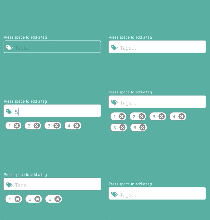
Fully customizable React Native input-component to add tags to an array. The tags are displayed as chips that can be deleted.
 ## Npm repo
https://www.npmjs.com/package/react-native-tags-input
## Git repo
https://github.com/jimmybengtsson/react-native-tags-input
## Getting started
`$ npm install react-native-tags-input --save`
## Props
| | necessary | types | about
|----|-----|-----|---------|
|tags| ✓ | object | Object containing a empty string called **tag** and a empty array called **tagsArray**|
|updateState| ✓ | func | Function to pass for component to be able to update parents state |
|keysForTag| |string|String to decide when a tag will be added. **Space** for standard|
|containerStyle| | styles | Styles for the most outer view component |
|label| |string|Text to appear on top of input|
|labelStyle| |styles|Styles for label text|
|inputContainerStyle| | styles | Styles for the outer input component |
|inputStyle| | styles | Styles for the inner input component |
|leftElement| |element|Element to be passed to input. Such as an icon.|
|leftElementContainerStyle| | styles | Styles for the left element inside input |
|rightElement| |element|Element to be passed to input. Such as an icon.|
|rightElementContainerStyle| | styles | Styles for the right element inside input |
|tagsViewStyle| | styles | Styles for the view component containing the tag-chips |
|tagStyle| | styles | Styles for the tag-chips |
|tagTextStyle| | styles | Styles for the text inside a tag-chip |
|disabled| |boolean|Active input or not? **false** for standard|
|disabledInputStyle| |styles| Styles for when the input is disabled|
|deleteElement| |element|If this is included, the delete icon will be replaced by the element provided. (Thanks to periabyte)|
|deleteIconStyles| |styles|Styles for the delete icon|
|customElement| |element|Element to be displayed between input and tags. For example suggestions. (Auto suggestions will be implemented in a future release)|
> This component also inherits
> [all native TextInput props that come with a standard React Native TextInput element](https://facebook.github.io/react-native/docs/textinput.html).
## Examples
[Standard and Custom example](https://github.com/jimmybengtsson/react-native-tags-input/tree/master/example/StandardAndCustomExample)
[Auto suggest example by using customElement-prop](https://github.com/jimmybengtsson/react-native-tags-input/tree/master/example/AutoSuggestExample)
## Standard example
## Npm repo
https://www.npmjs.com/package/react-native-tags-input
## Git repo
https://github.com/jimmybengtsson/react-native-tags-input
## Getting started
`$ npm install react-native-tags-input --save`
## Props
| | necessary | types | about
|----|-----|-----|---------|
|tags| ✓ | object | Object containing a empty string called **tag** and a empty array called **tagsArray**|
|updateState| ✓ | func | Function to pass for component to be able to update parents state |
|keysForTag| |string|String to decide when a tag will be added. **Space** for standard|
|containerStyle| | styles | Styles for the most outer view component |
|label| |string|Text to appear on top of input|
|labelStyle| |styles|Styles for label text|
|inputContainerStyle| | styles | Styles for the outer input component |
|inputStyle| | styles | Styles for the inner input component |
|leftElement| |element|Element to be passed to input. Such as an icon.|
|leftElementContainerStyle| | styles | Styles for the left element inside input |
|rightElement| |element|Element to be passed to input. Such as an icon.|
|rightElementContainerStyle| | styles | Styles for the right element inside input |
|tagsViewStyle| | styles | Styles for the view component containing the tag-chips |
|tagStyle| | styles | Styles for the tag-chips |
|tagTextStyle| | styles | Styles for the text inside a tag-chip |
|disabled| |boolean|Active input or not? **false** for standard|
|disabledInputStyle| |styles| Styles for when the input is disabled|
|deleteElement| |element|If this is included, the delete icon will be replaced by the element provided. (Thanks to periabyte)|
|deleteIconStyles| |styles|Styles for the delete icon|
|customElement| |element|Element to be displayed between input and tags. For example suggestions. (Auto suggestions will be implemented in a future release)|
> This component also inherits
> [all native TextInput props that come with a standard React Native TextInput element](https://facebook.github.io/react-native/docs/textinput.html).
## Examples
[Standard and Custom example](https://github.com/jimmybengtsson/react-native-tags-input/tree/master/example/StandardAndCustomExample)
[Auto suggest example by using customElement-prop](https://github.com/jimmybengtsson/react-native-tags-input/tree/master/example/AutoSuggestExample)
## Standard example
 ```javascript
import React, { Component } from 'react';
import {
Dimensions,
StyleSheet,
View
} from 'react-native';
import TagInput from 'react-native-tags-input';
export default class App extends React.Component {
constructor(props) {
super(props);
this.state = {
tags: {
tag: '',
tagsArray: []
},
};
}
updateTagState = (state) => {
this.setState({
tags: state
})
};
render() {
return (
);
}
}
const styles = StyleSheet.create({
container: {
flex: 1,
justifyContent: 'center',
alignItems: 'center',
},
});
```
## Custom example
```javascript
import React, { Component } from 'react';
import {
Dimensions,
StyleSheet,
View
} from 'react-native';
import {Icon} from 'react-native-elements';
import TagInput from 'react-native-tags-input';
const mainColor = '#3ca897';
export default class App extends React.Component {
constructor(props) {
super(props);
this.state = {
tags: {
tag: '',
tagsArray: []
},
tagsColor: mainColor,
tagsText: '#fff',
};
}
updateTagState = (state) => {
this.setState({
tags: state
})
};
render() {
return (
}
leftElementContainerStyle={{marginLeft: 3}}
containerStyle={{width: (Dimensions.get('window').width - 40)}}
inputContainerStyle={[styles.textInput, {backgroundColor: this.state.tagsColor}]}
inputStyle={{color: this.state.tagsText}}
onFocus={() => this.setState({tagsColor: '#fff', tagsText: mainColor})}
onBlur={() => this.setState({tagsColor: mainColor, tagsText: '#fff'})}
autoCorrect={false}
tagStyle={styles.tag}
tagTextStyle={styles.tagText}
keysForTag={', '}/>
);
}
}
const styles = StyleSheet.create({
container: {
flex: 1,
justifyContent: 'center',
alignItems: 'center',
backgroundColor: mainColor,
},
textInput: {
height: 40,
borderColor: 'white',
borderWidth: 1,
marginTop: 8,
borderRadius: 5,
padding: 3,
},
tag: {
backgroundColor: '#fff'
},
tagText: {
color: mainColor
},
});
```
## Contributing
Pull requests are welcome. For major changes, please open an issue first to discuss what you would like to change.
## License
react-native-tags-input is [MIT](https://choosealicense.com/licenses/mit/) License @ Jimmy Bengtsson
```javascript
import React, { Component } from 'react';
import {
Dimensions,
StyleSheet,
View
} from 'react-native';
import TagInput from 'react-native-tags-input';
export default class App extends React.Component {
constructor(props) {
super(props);
this.state = {
tags: {
tag: '',
tagsArray: []
},
};
}
updateTagState = (state) => {
this.setState({
tags: state
})
};
render() {
return (
);
}
}
const styles = StyleSheet.create({
container: {
flex: 1,
justifyContent: 'center',
alignItems: 'center',
},
});
```
## Custom example
```javascript
import React, { Component } from 'react';
import {
Dimensions,
StyleSheet,
View
} from 'react-native';
import {Icon} from 'react-native-elements';
import TagInput from 'react-native-tags-input';
const mainColor = '#3ca897';
export default class App extends React.Component {
constructor(props) {
super(props);
this.state = {
tags: {
tag: '',
tagsArray: []
},
tagsColor: mainColor,
tagsText: '#fff',
};
}
updateTagState = (state) => {
this.setState({
tags: state
})
};
render() {
return (
}
leftElementContainerStyle={{marginLeft: 3}}
containerStyle={{width: (Dimensions.get('window').width - 40)}}
inputContainerStyle={[styles.textInput, {backgroundColor: this.state.tagsColor}]}
inputStyle={{color: this.state.tagsText}}
onFocus={() => this.setState({tagsColor: '#fff', tagsText: mainColor})}
onBlur={() => this.setState({tagsColor: mainColor, tagsText: '#fff'})}
autoCorrect={false}
tagStyle={styles.tag}
tagTextStyle={styles.tagText}
keysForTag={', '}/>
);
}
}
const styles = StyleSheet.create({
container: {
flex: 1,
justifyContent: 'center',
alignItems: 'center',
backgroundColor: mainColor,
},
textInput: {
height: 40,
borderColor: 'white',
borderWidth: 1,
marginTop: 8,
borderRadius: 5,
padding: 3,
},
tag: {
backgroundColor: '#fff'
},
tagText: {
color: mainColor
},
});
```
## Contributing
Pull requests are welcome. For major changes, please open an issue first to discuss what you would like to change.
## License
react-native-tags-input is [MIT](https://choosealicense.com/licenses/mit/) License @ Jimmy Bengtsson