# React Native Swipe Up Down
[](https://badge.fury.io/js/react-native-swipe-up-down)    
## Why using this lib?
- Support iOS & Android
- The best performance 60FPS for UI and JS when swipe up down
- Easy to use, easy to install - no more another package, only JS
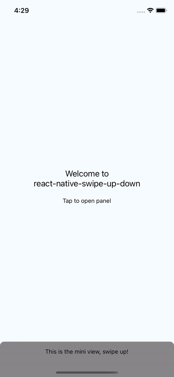
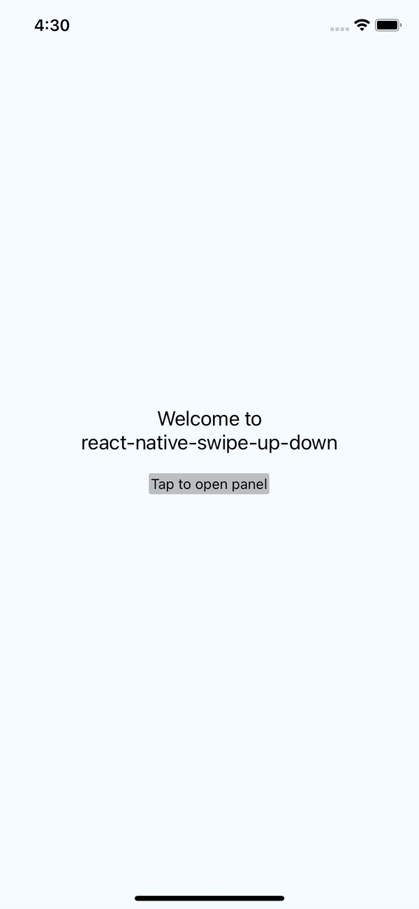
## Demo
|Full/Mini|Hidden component|
|---|---|
|||
## Install
`npm install react-native-swipe-up-down --save`
- OR
`yarn add react-native-swipe-up-down`
## Usage
```javascript
import SwipeUpDown from 'react-native-swipe-up-down';
// TODO: What to do with the module?
}
itemFull={(hide) => }
onShowMini={() => console.log('mini')}
onShowFull={() => console.log('full')}
animation="spring"
disableSwipeIcon
extraMarginTop={100}
iconColor='yellow'
iconSize={30}
style={{ backgroundColor: '#000' }} // style for swipe
/>
```
## Note
- If you want hidden component just don't pass props `itemMini`. It's will hidden. And then you can use `hasRef` to show it when you want.
And try to using this method to show FullComponent
```jsx
const swipeUpDownRef = useRef();
// Show component
swipeUpDownRef.current.showFull();
// This ref can help you show component when hidden component
}
ref={swipeUpDownRef}
/>
```
- If you want to use `ScrollView` inside `itemFull`, please add `TouchableWithoutFeedback` inside `ScrollView`.
Example
```jsx
{...}
```
## More Props
### `animation`
```jsx
animation="easeInEaseOut"
```
Optional
* 'linear'
* 'spring'
* 'easeInEaseOut'
* 'none'
### `swipeHeight`
```jsx
swipeHeight={100} // Default 60
```
### `extraMarginTop`
```jsx
extraMarginTop={24} // Default iOS: 24 | Android: 0 - Using for padding status bar iOS or max height full component
```
### `disableSwipeIcon`
```jsx
disableSwipeIcon={true}
```
---
## License
This module is [MIT licensed](./LICENSE)
---

 |
| |
## Install
`npm install react-native-swipe-up-down --save`
- OR
`yarn add react-native-swipe-up-down`
## Usage
```javascript
import SwipeUpDown from 'react-native-swipe-up-down';
// TODO: What to do with the module?
|
## Install
`npm install react-native-swipe-up-down --save`
- OR
`yarn add react-native-swipe-up-down`
## Usage
```javascript
import SwipeUpDown from 'react-native-swipe-up-down';
// TODO: What to do with the module?