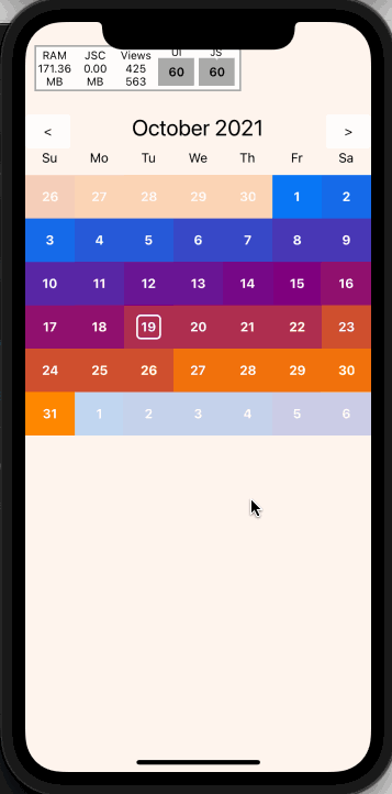
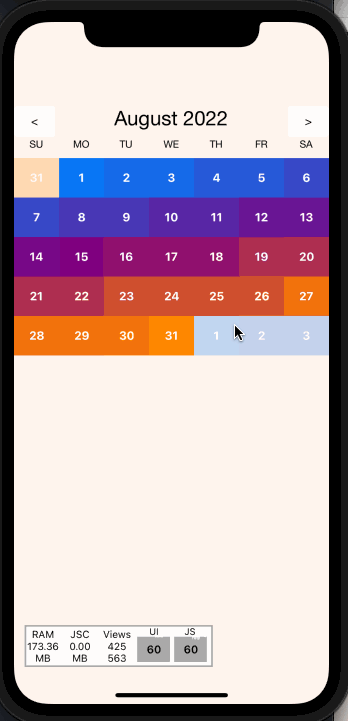
# React Native Swipe Calendar
A swipeable calendar component for React Native.
Fully native interactions powered by [Reanimated 2](https://github.com/kmagiera/react-native-reanimated) and [React Native Gesture Handler](https://github.com/kmagiera/react-native-gesture-handler).
## Install
1. Follow installation instructions for [reanimated](https://github.com/kmagiera/react-native-reanimated) and [react-native-gesture-handler](https://github.com/kmagiera/react-native-gesture-handler)
2. `npm install` or `yarn add` `react-native-swipe-calendar`
3. `import Calendar from 'react-native-swipe-calendar'`
### Props
```typescript
type HeaderComponent = (props: { date: Date }) => JSX.Element | null;
type DayLabelComponentType = (props: { date: Date }) => JSX.Element | null;
type DayComponentType = (props: {
date: Date;
isInDisplayedMonth: boolean;
isSelected: boolean;
isToday: boolean;
}) => JSX.Element | null;
export type WeekComponentType = (props: {
days: Date[];
}) => JSX.Element | null;
export type MonthComponentType = (props: {
weeks: Date[][];
firstDayOfMonth: Date;
}) => JSX.Element | null;
export type PageInterval = "day" | "week" | "month";
export type CalendarProps = {
selectedDate?: Date | null;
onDateSelect?: OnDateSelect;
onPageChange?: (date: Date) => void;
currentDate?: Date;
HeaderComponent?: HeaderComponentType;
DayLabelComponent?: DayLabelComponentType;
DayComponent?: DayComponentType;
WeekComponent?: WeekComponentType;
MonthComponent?: MonthComponentType;
theme?: Partial;
pageBuffer?: number;
minDate?: Date;
maxDate?: Date;
pageInterpolator?: CalendarPageInterpolator;
simultaneousGestures?: (ComposedGesture | GestureType)[];
monthAnimCallbackNode?: Animated.SharedValue;
gesturesDisabled?: boolean;
animationConfig?: Partial;
weekStartsOn?: WeekDayIndex;
pageInterval?: PageInterval;
};
```
| Name | Type |Description |
| :--------------- | :------------------------------ | :------- |
| `selectedDate` | `Date | null` | Calendar date to be marked as "selected". |
| `onDateSelect` | `(date: Date) => void` | Callback invoked when the a date is selected. |
| `onPageChange` | `(date: Date) => void` | Callback invoked when the month is changed. |
| `currentDate` | `Date` | Date to initialize the calendar with. |
| `theme` | `Partial` | Overrides for default fonts and colors. |
| `HeaderComponent` | `HeaderComponentType` | Custom replacement for Header component. |
| `DayComponent` | `DayComponentType` | Custom replacement for Day compoent. |
| `WeekComponent` | `WeekComponentType` | Custom replacement for Week compoent. |
| `MonthComponent` | `MonthComponentType` | Custom replacement for Month compoent. |
| `DayLabelComponent` | `DayLabelComponentType` | Custom replacement for Day Label component ("Su", "Mo", etc). |
|`minDate`|`Date`|The minimum date the calendar will display|
|`maxDate`|`Date`|The maximum date the calendar will display|
|`pageInterpolator`|`typeof defaultPageInterpolator`| A worklet to customize page transition animations. Returns an animated style|
|`animationConfig`|`Partial`| An animation spring config object to customize how page transitions animate.|
|`simultaneousGestures`|`(ComposedGesture | GestureType)[]`| Any RNGH gestures that wrap the calendar.|
|`weekStartsOn`|`number`| Index of the day week starts on.|
|`pageInterval`|`"month" | "week" | "day"`| Time span of each page.|
### Imperative Api
Access the imperative api by passing a `ref` to the `Calendar` component:
```typescript
type ImperativeApiOptions = {
animated?: boolean;
}
type CalendarImperativeApi = {
incrementPage: (options?: ImperativeApiOptions) => void;
decrementPage: (options?: ImperativeApiOptions) => void;
setPage: (date: Date, options?: ImperativeApiOptions) => void;
}
// Example
function MyComponent() {
const calendarRef = useRef(null)
const onIncrementButtonPress = () => calendarRef.current?.incrementPage()
return (
<>
)
}
```
| Name | Type | Description |
| :--------------- | :--------------------- | :-------------------- |
| `incrementPage` | `(options: ImperativeApiOptions) => void` | Go to next month. |
| `decrementPage` | `(options: ImperativeApiOptions) => void` | Go to previous month. |
| `setPage` | `(date: Date, options: ImperativeApiOptions) => void` | Go to given month. |
### Hooks
If you render your own components via `DayComponent` prop or other custom view, you may need access to more internal state than is available on props. This state may be accessed via the exported `useCalendarContext()` hook.
>NOTE: Be careful about performance! Lots of instances of `DayComponent` are rendered at any given time. You may need to wrap memoized inner wrappers around your custom components.
```typescript
type CalendarContextValue = {
referenceDate: Date,
selectedDate: Date | null | undefined,
onDateSelect: OnDateSelect,
DayComponent: DayComponentType | undefined,
WeekComponent: WeekComponentType | undefined,
MonthComponent: MonthComponentType | undefined,
DayLabelComponent: DayLabelComponentType | undefined,
HeaderComponent: HeaderComponentType | undefined,
theme: typeof DEFAULT_THEME,
pageInterpolator: typeof defaultPageInterpolator,
weekStartsOn: number,
}
// Example
function MyCustomDayComponent({ date, isSelected }) {
const { onDateSelect } = useCalendarContext()
// Forward to the `onDateSelect` prop
const onDayPress = () => onDateSelect(date, { isSelected })
return (
{date.getDate()}
)
}
```
#### Custom pageInterpolator
The `pageInterpolator` prop enables customization of page animations using a Reanimated "worklet" function. For example, the following `pageInterpolator` will scale up upcoming months and fade in as they enter, then rotate and fade out as they leave:
```typescript
// Example
function pageInterpolator({ focusAnim }: CalendarPageInterpolatorParams) {
"worklet"
const inputRange = [-1, 0, 1]
// Ensure the current month has a higher zIndex than the surrounding months
const zIndex = interpolate(focusAnim.value, inputRange, [0, 99, 0])
// Fade the current month as it enters/leaves focus
const opacity = interpolate(focusAnim.value, inputRange, [0, 1, 0])
// Rotate the current month as it leaves focus
const rotationDeg = interpolate(focusAnim.value, inputRange, [360, 0, 0])
// Scale up the incoming month
const scale = interpolate(focusAnim.value, inputRange, [2, 1, 0.25])
return {
opacity,
zIndex,
transform: [{ rotate: `${rotationDeg}deg` }, { scale }]
}
}
```
### Example
https://snack.expo.dev/@computerjazz/react-native-swipe-calendar
```typescript
import React, {
useState,
useRef,
} from "react";
import {
Text,
View,
StyleSheet,
LayoutAnimation,
TouchableOpacity,
Platform,
UIManager,
} from "react-native";
import Calendar from "react-native-swipe-calendar";
if (Platform.OS === "android") {
UIManager.setLayoutAnimationEnabledExperimental &&
UIManager.setLayoutAnimationEnabledExperimental(true);
}
export default function App() {
const [currentDate, setCurrentDate] = useState(new Date());
const [selectedDate, setSelectedDate] = useState(null);
const calendarRef = useRef(null);
return (
setSelectedDate(isSelected ? null : date )}
selectedDate={selectedDate}
onPageChange={(date) => {
setCurrentDate(date);
LayoutAnimation.configureNext(LayoutAnimation.Presets.easeInEaseOut);
}}
/>
calendarRef.current?.decrementPage()}
>
{"<"}
calendarRef.current?.incrementPage()}
>
{">"}
);
}
const styles = StyleSheet.create({
container: {
flex: 1,
backgroundColor: "white",
paddingTop: 100
},
incDec: {
paddingHorizontal: 20,
padding: 10,
backgroundColor: "lightgrey",
alignItems: "center",
justifyContent: "center",
borderRadius: 5,
},
controlBar: {
position: "absolute",
top: 100,
left: 0,
right: 0,
flexDirection: "row",
justifyContent: "space-between",
},
});
```