# react-native-sfsymbols
Use SF Symbols in React Native for iOS
- ⚠️ iOS 14+ only ([& more soon](https://github.com/birkir/react-native-sfsymbols/issues/1))
- 💔 [Android or other platforms cannot be supported](https://github.com/birkir/react-native-sfsymbols/issues/3)
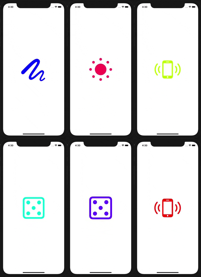 
## Setup
```console
npm install --save react-native-sfsymbols
# --- or ---
yarn add react-native-sfsymbols
```
_Don't forget to run `cd ios && pod install && cd ..` after that !_
### Manual installation
#### iOS
1. In XCode, in the project navigator, right click `Libraries` ➜ `Add Files to [your project's name]`
2. Go to `node_modules` ➜ `react-native-sfsymbols` and add `RNSfsymbols.xcodeproj`
3. In XCode, in the project navigator, select your project. Add `libRNSfsymbols.a` to your project's `Build Phases` ➜ `Link Binary With Libraries`
4. Run your project (`Cmd+R`)<
## Usage
```jsx
import { SFSymbol } from "react-native-sfsymbols";
export function Example() {
return (
);
}
```
They can be animated with Animated
```jsx
import { Animated } from "react-native";
import { SFSymbol } from "react-native-sfsymbols";
const AnimatedSFSymbol = Animated.createAnimatedComponent(SFSymbol);
;
```
## Props
### name
The symbol name you want to display, can be seen in the [SF Symbols application](https://developer.apple.com/sf-symbols/).
### color (optional)
The color of the symbol written as a hex or color value. PlatformColor and DynamicColorIOS also works.
### weight (optional)
The (font) weight of the symbol.
```
ultralight
light
thin
regular
medium
semibold
bold
heavy
```
Multicolor has issues with this "thin" weight.
### scale (optional)
The scale of the symbol, it will optimise the thickness of detail strokes in the icon for different sizes.
```
small
medium
large
```
### multicolor (optional)
Enable multicolor, don't pass a "color" for it to work properly.
### size (optional)
Font size of the icon as a number.
### resizeMode (optional)
Resize mode of the icon. When "size" is given, it will default to "center" otherwise "scale-aspect-fill".
```
scale-to-fill
scale-aspect-fit
scale-aspect-fill
redraw
center
top
bottom
left
right
top-left
top-right
bottom-left
bottom-right
cover
contain
stretch
```