# react-native-select-dropdown
react-native-select-dropdown is a highly customized dropdown | select | picker | menu for react native that works for android and iOS platforms.
## Installation
#### # Using npm
```bash
npm install react-native-select-dropdown
```
#### # Using yarn
```bash
yarn add react-native-select-dropdown
```
## Demo
#### Code provided in Examples folder.
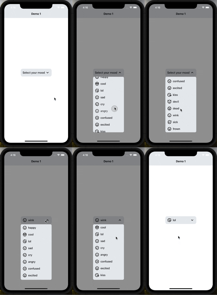
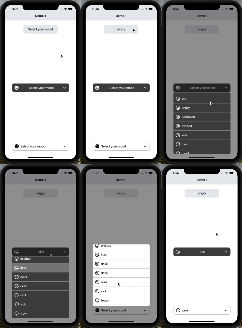
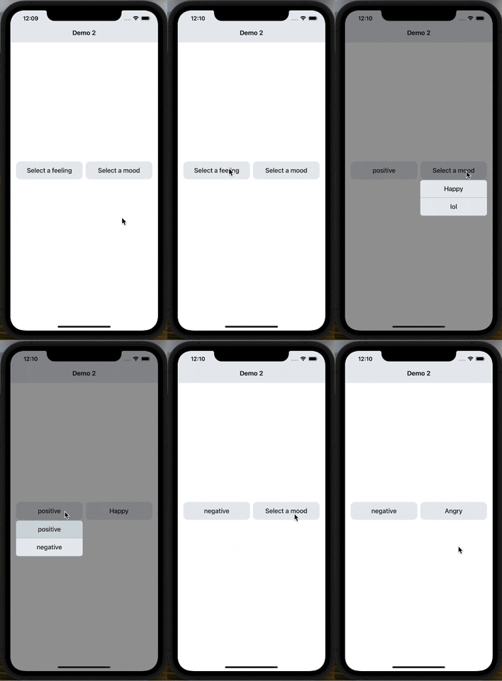
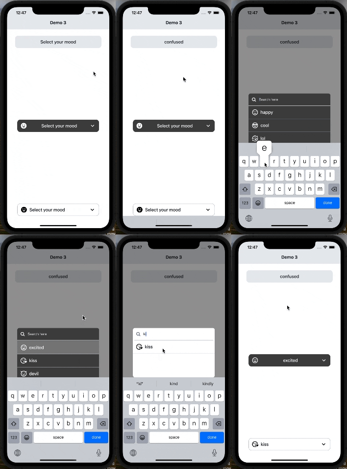
#### Search Functionality (Code provided in Examples folder).
## 🚀 Major Changes
### Version 4.0
- (defaultButtonText, buttonTextAfterSelection, buttonStyle, buttonTextStyle, renderCustomizedButtonChild, renderDropdownIcon, dropdownIconPosition) have been removed and (renderButton) has been added to customize dropdown button
- (rowTextForSelection, rowStyle, rowTextStyle, selectedRowStyle, selectedRowTextStyle, renderCustomizedRowChild) have been removed and (renderItem) has been added to customize each dropdown item
- testID added to scroll the dropdown menu in e2e tests.
- Most of issues have been fixed.
- Updated readme.md file
- More examples in examples folder.
## Usage
```
import SelectDropdown from 'react-native-select-dropdown'
import Icon from 'react-native-vector-icons/MaterialCommunityIcons';
...
const emojisWithIcons = [
{title: 'happy', icon: 'emoticon-happy-outline'},
{title: 'cool', icon: 'emoticon-cool-outline'},
{title: 'lol', icon: 'emoticon-lol-outline'},
{title: 'sad', icon: 'emoticon-sad-outline'},
{title: 'cry', icon: 'emoticon-cry-outline'},
{title: 'angry', icon: 'emoticon-angry-outline'},
{title: 'confused', icon: 'emoticon-confused-outline'},
{title: 'excited', icon: 'emoticon-excited-outline'},
{title: 'kiss', icon: 'emoticon-kiss-outline'},
{title: 'devil', icon: 'emoticon-devil-outline'},
{title: 'dead', icon: 'emoticon-dead-outline'},
{title: 'wink', icon: 'emoticon-wink-outline'},
{title: 'sick', icon: 'emoticon-sick-outline'},
{title: 'frown', icon: 'emoticon-frown-outline'},
];
...
{
console.log(selectedItem, index);
}}
renderButton={(selectedItem, isOpened) => {
return (
{selectedItem && (
)}
{(selectedItem && selectedItem.title) || 'Select your mood'}
);
}}
renderItem={(item, index, isSelected) => {
return (
{item.title}
);
}}
showsVerticalScrollIndicator={false}
dropdownStyle={styles.dropdownMenuStyle}
/>
...
const styles = StyleSheet.create({
dropdownButtonStyle: {
width: 200,
height: 50,
backgroundColor: '#E9ECEF',
borderRadius: 12,
flexDirection: 'row',
justifyContent: 'center',
alignItems: 'center',
paddingHorizontal: 12,
},
dropdownButtonTxtStyle: {
flex: 1,
fontSize: 18,
fontWeight: '500',
color: '#151E26',
},
dropdownButtonArrowStyle: {
fontSize: 28,
},
dropdownButtonIconStyle: {
fontSize: 28,
marginRight: 8,
},
dropdownMenuStyle: {
backgroundColor: '#E9ECEF',
borderRadius: 8,
},
dropdownItemStyle: {
width: '100%',
flexDirection: 'row',
paddingHorizontal: 12,
justifyContent: 'center',
alignItems: 'center',
paddingVertical: 8,
},
dropdownItemTxtStyle: {
flex: 1,
fontSize: 18,
fontWeight: '500',
color: '#151E26',
},
dropdownItemIconStyle: {
fontSize: 28,
marginRight: 8,
},
});
```
### Props
- [`data`](#data)
- [`onSelect`](#onSelect)
- [`renderButton`](#renderButton)
- [`renderItem`](#renderItem)
- [`defaultValue`](#defaultValue)
- [`defaultValueByIndex`](#defaultValueByIndex)
- [`disabled`](#disabled)
- [`disabledIndexes`](#disabledIndexes)
- [`disableAutoScroll`](#disableAutoScroll)
- [`testID`](#testID)
- [`onFocus`](#onFocus)
- [`onBlur`](#onBlur)
- [`onScrollEndReached`](#onScrollEndReached)
- [`statusBarTranslucent`](#statusBarTranslucent)
- [`dropdownStyle`](#dropdownStyle)
- [`dropdownOverlayColor`](#dropdownOverlayColor)
- [`showsVerticalScrollIndicator`](#showsVerticalScrollIndicator)
- [`search`](#search)
- [`searchInputStyle`](#searchInputStyle)
- [`searchInputTxtColor`](#searchInputTxtColor)
- [`searchInputTxtStyle`](#searchInputTxtStyle)
- [`searchPlaceHolder`](#searchPlaceHolder)
- [`searchPlaceHolderColor`](#searchPlaceHolderColor)
- [`renderSearchInputLeftIcon`](#renderSearchInputLeftIcon)
- [`renderSearchInputRightIcon`](#renderSearchInputRightIcon)
- [`onChangeSearchInputText`](#onChangeSearchInputText)
### Methods
- [`reset`](#License)
- [`openDropdown`](#License)
- [`closeDropdown`](#License)
- [`selectIndex`](#License)
---
### data
array of data that will be represented in dropdown 'can be array of objects
| Type | Required |
| ----- | -------- |
| array | Yes |
---
### onSelect
function recieves selected item and its index in data array
| Type | Required |
| -------- | -------- |
| function | Yes |
---
### renderButton
function returns React component for the dropdown button
| Type | Required |
| -------- | -------- |
| function | Yes |
---
### renderItem
function returns React component for each dropdown item
| Type | Required |
| -------- | -------- |
| function | Yes |
---
### defaultValue
default selected item in dropdown ( check examples in Demo1)
| Type | Required |
| ---- | -------- |
| any | No |
---
### defaultValueByIndex
default selected item index
| Type | Required |
| ------- | -------- |
| integer | No |
---
### disabled
disable dropdown
| Type | Required |
| ------- | -------- |
| boolean | No |
---
### disabledIndexes
array of disabled items index
| Type | Required |
| ----- | -------- |
| array | No |
---
### disableAutoScroll
disable auto scroll to selected value
| Type | Required |
| ------- | -------- |
| boolean | No |
---
### testID
dropdown menu testID
| Type | Required |
| ------ | -------- |
| string | No |
---
### onFocus
function fires when dropdown is opened
| Type | Required |
| -------- | -------- |
| function | No |
---
### onBlur
function fires when dropdown is closed
| Type | Required |
| -------- | -------- |
| function | No |
---
### onScrollEndReached
function fires when dropdown scrolls to the end (for paginations)
| Type | Required |
| -------- | -------- |
| function | No |
---
### statusBarTranslucent
required to set true when statusbar is translucent `(android only)`
| Type | Required |
| ------- | -------- |
| boolean | No |
---
### dropdownStyle
style object for dropdown view
| Type | Required |
| ------ | -------- |
| object | No |
---
### dropdownOverlayColor
backdrop color when dropdown is opened
| Type | Required |
| ------ | -------- |
| string | No |
---
### showsVerticalScrollIndicator
When true, shows a vertical scroll indicator.
| Type | Required |
| ------- | -------- |
| boolean | No |
---
### search
enable search functionality
| Type | Required |
| ------- | -------- |
| boolean | No |
---
### searchInputStyle
style object for search input
| Type | Required |
| ------ | -------- |
| object | No |
---
### searchInputTxtColor
text color for search input
| Type | Required |
| ------ | -------- |
| string | No |
---
### searchInputTxtStyle
style object for search input text
| Type | Required |
| ------ | -------- |
| object | No |
---
### searchPlaceHolder
placeholder text for search input
| Type | Required |
| ------ | -------- |
| string | No |
---
### searchPlaceHolderColor
text color for search input placeholder
| Type | Required |
| ------ | -------- |
| string | No |
---
### renderSearchInputLeftIcon
function returns React component for search input icon
| Type | Required |
| -------- | -------- |
| function | No |
---
### renderSearchInputRightIcon
function returns React component for search input icon
| Type | Required |
| -------- | -------- |
| function | No |
---
### onChangeSearchInputText
function callback when the search input text changes, this will automatically disable the dropdown's internal search to be implemented manually outside the component
| Type | Required |
| -------- | -------- |
| function | No |
---
| Method | Description |
| -------------------- | -------------------------------- |
| `reset()` | Remove selection & reset it |
| `openDropdown()` | Open the dropdown. |
| `closeDropdown()` | Close the dropdown. |
| `selectIndex(index)` | Select a specific item by index. |
---
## License
[MIT](https://choosealicense.com/licenses/mit/)