# react-native-select-dropdown
react-native-select-dropdown is a highly customized dropdown | select | picker | menu for react native that works for andriod and iOS platforms.
## Installation
#### # Using npm
```bash
npm install react-native-select-dropdown-v2
```
#### # Using yarn
```bash
yarn add react-native-select-dropdown-v2
```
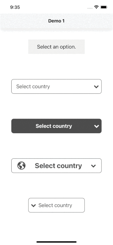
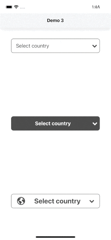
## Demo
#### Code provided in Examples folder.

#### Search Functionality (Code provided in Examples folder).
## Usage
```
import SelectDropdown from 'react-native-select-dropdown'
...
const countries = ["Egypt", "Canada", "Australia", "Ireland"]
...
{
console.log(selectedItem, index)
}}
buttonTextAfterSelection={(selectedItem, index) => {
// text represented after item is selected
// if data array is an array of objects then return selectedItem.property to render after item is selected
return selectedItem
}}
rowTextForSelection={(item, index) => {
// text represented for each item in dropdown
// if data array is an array of objects then return item.property to represent item in dropdown
return item
}}
/>
```
### Props
- [`data`](#data)
- [`onSelect`](#onSelect)
- [`defaultButtonText`](#defaultButtonText)
- [`buttonTextAfterSelection`](#buttonTextAfterSelection)
- [`rowTextForSelection`](#rowTextForSelection)
- [`defaultValue`](#defaultValue)
- [`defaultValueByIndex`](#defaultValueByIndex)
- [`disabled`](#disabled)
- [`disableAutoScroll`](#disableAutoScroll)
- [`onFocus`](#onFocus)
- [`onBlur`](#onBlur)
- [`buttonStyle`](#buttonStyle)
- [`buttonTextStyle`](#buttonTextStyle)
- [`renderCustomizedButtonChild`](#renderCustomizedButtonChild)
- [`renderDropdownIcon`](#renderDropdownIcon)
- [`dropdownIconPosition`](#dropdownIconPosition)
- [`statusBarTranslucent`](#statusBarTranslucent)
- [`dropdownStyle`](#dropdownStyle)
- [`dropdownOverlayColor`](#dropdownOverlayColor)
- [`dropdownBackgroundColor`](#dropdownBackgroundColor)
- [`rowStyle`](#rowStyle)
- [`rowTextStyle`](#rowTextStyle)
- [`selectedRowStyle`](#selectedRowStyle)
- [`selectedRowTextStyle`](#selectedRowTextStyle)
- [`renderCustomizedRowChild`](#renderCustomizedRowChild)
- [`search`](#search)
- [`searchInputStyle`](#searchInputStyle)
- [`searchInputTxtColor`](#searchInputTxtColor)
- [`searchPlaceHolder`](#searchPlaceHolder)
- [`searchPlaceHolderColor`](#searchPlaceHolderColor)
- [`renderSearchInputLeftIcon`](#renderSearchInputLeftIcon)
- [`renderSearchInputRightIcon`](#renderSearchInputRightIcon)
### Methods
- [`reset`](#License)
- [`openDropdown`](#License)
- [`closeDropdown`](#License)
---
### data
array of data that will be represented in dropdown 'can be array of objects
| Type | Required |
| ----- | -------- |
| array | Yes |
---
### onSelect
function recieves selected item and its index in data array
| Type | Required |
| -------- | -------- |
| function | Yes |
---
### defaultButtonText
default button text when no item is selected
| Type | Required |
| ------ | -------- |
| String | No |
---
### buttonTextAfterSelection
function recieves selected item and its index, this function should return a string that will be represented in button after item is selected
| Type | Required |
| -------- | -------------------------------------------------------------------- |
| function | Yes "unless you customized button using renderCustomizedButtonChild" |
---
### rowTextForSelection
function recieves item and index for each row in dropdown, this function shoud return a string that will be represented in each row in dropdown
| Type | Required |
| -------- | ----------------------------------------------------------------- |
| function | Yes "unless you customized button using renderCustomizedRowChild" |
---
### defaultValue
default selected item in dropdown ( check examples in Demo1)
| Type | Required |
| ---- | -------- |
| any | No |
---
### defaultValueByIndex
default selected item index
| Type | Required |
| ------- | -------- |
| integer | No |
---
### disabled
disable dropdown
| Type | Required |
| ------- | -------- |
| boolean | No |
---
### disableAutoScroll
disable auto scroll to selected value
| Type | Required |
| ------- | -------- |
| boolean | No |
---
### onFocus
function fires when dropdown is opened
| Type | Required |
| -------- | -------- |
| function | No |
---
### onBlur
function fires when dropdown is closed
| Type | Required |
| -------- | -------- |
| function | No |
---
### buttonStyle
style object for button
| Type | Required |
| ------ | -------- |
| object | Yes |
---
### buttonTextStyle
style object for button text
| Type | Required |
| ------ | -------- |
| object | No |
---
### renderCustomizedButtonChild
function recieves selected item and its index, this function should return a React component as a child for dropdown button `buttonStyle` should be used for parent button view style.
#### # check examples folder to make things clear
| Type | Required |
| -------- | -------- |
| function | No |
---
### renderDropdownIcon
function that should return a React component for dropdown icon
| Type | Required |
| -------- | -------- |
| function | No |
---
### dropdownIconPosition
dropdown icon position "left" || "right"
| Type | Required |
| ------ | -------- |
| string | No |
---
### statusBarTranslucent
required to set true when statusbar is translucent `(android only)`
| Type | Required |
| ------- | -------- |
| boolean | No |
---
### dropdownStyle
style object for dropdown view
| Type | Required |
| ------ | -------- |
| object | No |
---
### dropdownOverlayColor
backdrop color when dropdown is opened
| Type | Required |
| ------ | -------- |
| string | No |
---
### dropdownBackgroundColor
background color behind list items when dropdown is opened
| Type | Required |
| ------ | -------- |
| string | No |
---
### rowStyle
style object for row
| Type | Required |
| ------ | -------- |
| object | Yes |
---
### rowTextStyle
style object for row text
| Type | Required |
| ------ | -------- |
| object | No |
---
### selectedRowStyle
style object for selected row
| Type | Required |
| ------ | -------- |
| object | Yes |
---
### selectedRowTextStyle
style object for selected row text
| Type | Required |
| ------ | -------- |
| object | No |
---
### renderCustomizedRowChild
function recieves item and its index, this function should return React component as a child for customized row `rowStyle` should be used for parent row view style.
#### # check examples folder to make things clear
| Type | Required |
| -------- | -------- |
| function | No |
---
### search
enable search functionality
| Type | Required |
| ------- | -------- |
| boolean | No |
---
### searchInputStyle
style object for search input
| Type | Required |
| ------ | -------- |
| object | Yes |
---
### searchInputTxtColor
text color for search input
| Type | Required |
| ------ | -------- |
| string | No |
---
### searchPlaceHolder
placeholder text for search input
| Type | Required |
| ------ | -------- |
| string | No |
---
### searchPlaceHolderColor
text color for search input placeholder
| Type | Required |
| ------ | -------- |
| string | No |
---
### renderSearchInputLeftIcon
function returns React component for search input icon
| Type | Required |
| -------- | -------- |
| function | No |
---
### renderSearchInputRightIcon
function returns React component for search input icon
| Type | Required |
| -------- | -------- |
| function | No |
---
| Method | Description |
| ----------------- | ----------------------------------------------------------------------------------------------------------------------------------------------------------- |
| `reset()` | Remove selection & reset it to display `defaultButtonText` check https://github.com/AdelRedaa97/react-native-select-dropdown/pull/1#issuecomment-818307624. |
| `openDropdown()` | Open the dropdown. |
| `closeDropdown()` | Close the dropdown. |
---
## License
[MIT](https://choosealicense.com/licenses/mit/)